The Santa Barbara County California Land Cover Map is dominated by open natural cover rather than continuous urban land. Shrubland accounts for 58.83% of the 2025 classification and grassland another 18.15%. Development is much smaller in area, but it is easy to spot because it clusters along the South Coast and in the northern population center, while forest and agriculture occupy different mountain and valley settings. Four coordinated maps on this page separate those patterns into land cover, forest and farmland, impervious surface, and 1985–2025 class change.
The body images are WebP previews, and the four original 2480 × 1754 JPG maps are available together in one download. They work best as county-scale reference graphics: one image establishes the 2025 cover classes, another makes forest and agriculture easier to compare, a third measures the fraction of hard surfaces such as pavement and rooftops, and the last locates places whose mapped class differs between 1985 and 2025. Land cover describes the surface observed by the classification; it does not establish zoning, ownership, parcel boundaries, or development rights.
Table of Contents
Open shrub and grass cover outweighs urban land across the county
The 2025 county summary gives the clearest starting point. Shrubland is 58.83%, grassland 18.15%, forest 9.97%, developed land 5.68%, agriculture 5.30%, wetlands 1.29%, and water 0.34%. Those values explain why most of the county appears in open-cover colors even though Santa Barbara County also contains well-known cities, coastal communities, farms, and transportation corridors.
| Shrubland, 2025 | 58.83% |
|---|---|
| Grassland, 2025 | 18.15% |
| Forest, 2025 | 9.97% |
| Developed, 2025 | 5.68% |
| Agriculture, 2025 | 5.30% |
| Wetlands, 2025 | 1.29% |
| Water, 2025 | 0.34% |
Broad shrub colors fill much of the interior and extend through large upland areas. Grassland is interwoven with that shrub cover rather than confined to one corner of the county. Forest appears more selectively in mountain belts and higher terrain, while agricultural colors are more concentrated in northern and inland valley settings. This mix produces a patchwork that is very different from a county in which farmland or forest is the single overwhelming class.
Developed land covers only 5.68% of the county, yet the pattern is visually strong because the class is concentrated. The South Coast carries a narrow but distinct chain of developed cells. A second major cluster appears in the north, with smaller pockets elsewhere. Countywide percentages therefore need a map beside them: a modest share of total land can still be locally dominant where people, streets, and buildings are concentrated.
Offshore islands are also inside the mapped county extent. Their surfaces are largely represented by shrub and grass classes rather than the dense developed colors found in parts of the mainland coast. Seeing the islands and mainland with one legend helps show the range of environments within the county, but the graphic is not intended to identify detailed preserve boundaries, roads, facilities, or individual ecological communities on the islands.
The South Coast and northern communities stand out on the impervious map
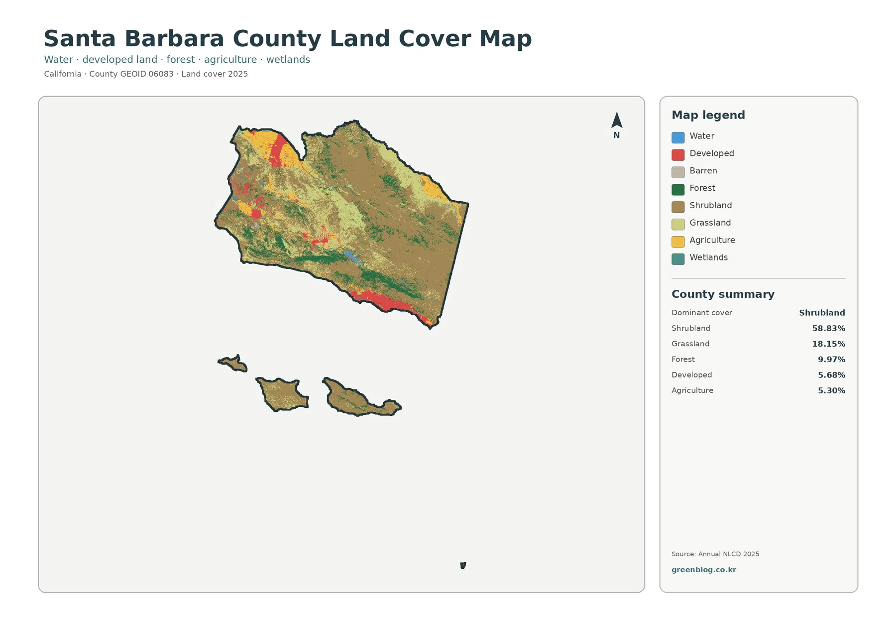
Impervious surface means hard cover that does not readily absorb rainfall, including pavement, parking areas, and rooftops. The countywide mean is 1.88%, and 1.55% of the mapped area falls in cells with at least 50% impervious surface. Those low countywide numbers reflect the enormous amount of open land, but they do not make the urban pattern disappear. High values are tightly concentrated in a few recognizable settlement areas.
The South Coast is the clearest example. Darker impervious classes form compact clusters around the Santa Barbara and Goleta area and continue in smaller developed sections toward Carpinteria. Santa Barbara County planning materials treat the Goleta Valley, Mission Canyon, Summerland, and nearby South Coast communities as distinct planning areas, which provides useful geographic context for the hard-surface pattern without turning this land-cover map into a zoning map.
A second strong cluster appears in the north. The county describes Orcutt as immediately south of Santa Maria, and the impervious map shows the northern urban area as a sharp contrast with the low-impervious land around it. Smaller developed pockets elsewhere are visible as well, but they do not create a continuous urban blanket across the county.
The 5.68% developed-cover figure and the 1.88% mean impervious figure should not be expected to match. A developed land-cover class can include lawns, trees, exposed soil, and other permeable surfaces within a built setting. Fractional impervious data instead express how much of each raster cell is covered by hard surfaces. Comparing the two products is useful precisely because they answer related but different questions.
This distinction matters in environmental discussions. A neighborhood may be classified as developed even when substantial vegetation remains between buildings, while a commercial or transportation area can contain cells with a much higher hard-surface fraction. The map is useful for recognizing that contrast at county scale, but it is not a stormwater model and should not be used to calculate runoff, drainage capacity, or flood risk.
Forest and farming occupy different pieces of the landscape
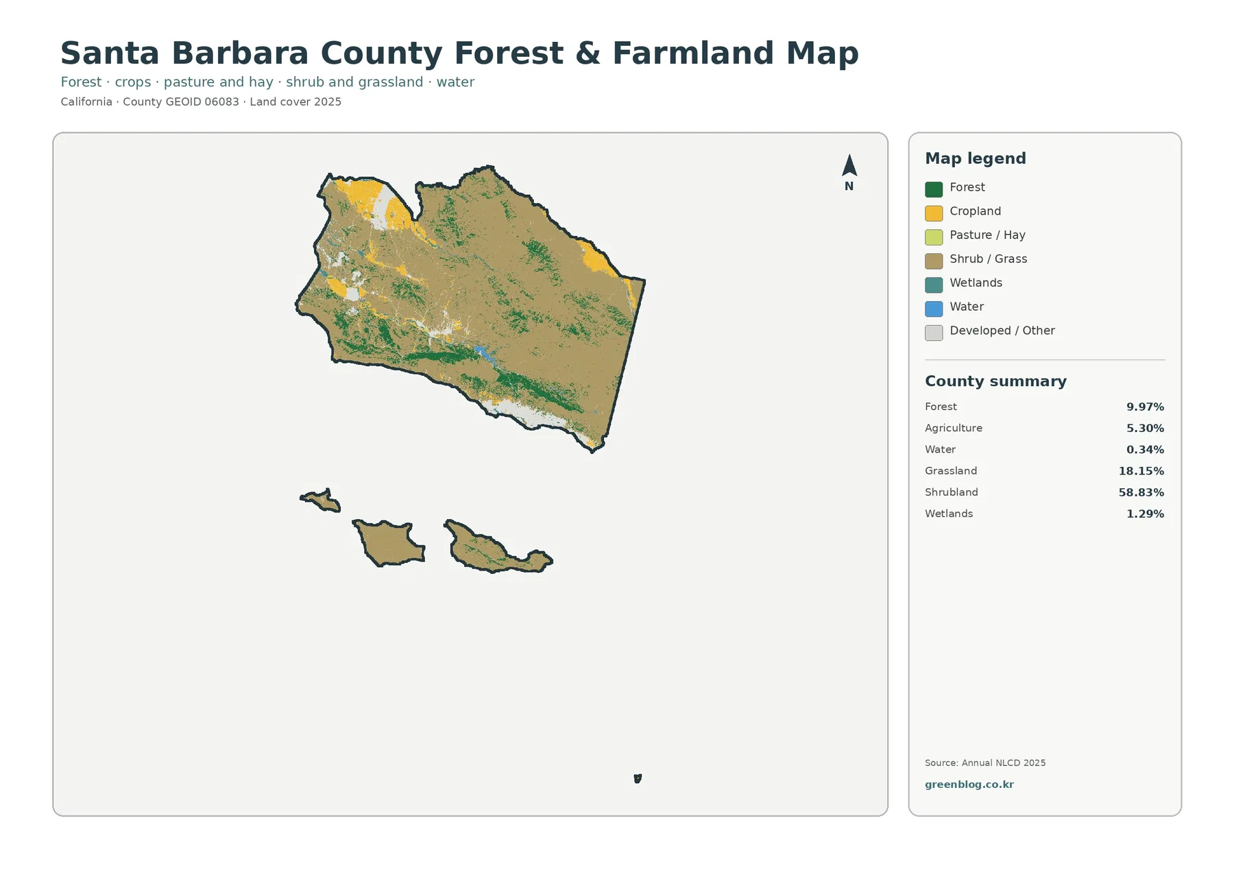
The forest-and-farmland view simplifies the color scheme so those two classes are easier to locate. Forest covers 9.97% of the 2025 classification and is most evident in mountain and upland portions of the county. Agriculture accounts for 5.30% and appears more strongly in valleys and flatter northern or inland areas. Shrub and grass remain the broad surrounding cover, so neither forest nor agriculture should be imagined as filling the whole interior.
Santa Ynez Valley offers a useful local reference for the agricultural pattern. County planning documents describe the valley as having a strong agricultural tradition and a scenic pastoral character, with communities such as Santa Ynez, Ballard, and Los Olivos surrounded by rural and agricultural lands. On the map, agricultural cells can be read alongside the nearby shrub, grass, and forest classes to understand how a working valley differs from the mountain terrain around it.
Cuyama Valley provides a different inland example. The county places it in northern Santa Barbara County between the San Luis Obispo County line and the northern slopes of the Sierra Madre Mountains. Agricultural colors in the eastern interior make more sense when that valley position is known, yet the land-cover map does not report crop type, irrigation method, production value, or groundwater use. Those questions require agricultural and water-management sources rather than a surface-classification raster.
The Gaviota Coast adds another contrast. County planning describes the area as a rural landscape of rugged mountains, rolling hills, lower coastal terrain, and important agricultural and biological resources. In the land-cover products, open shrub and grass colors remain extensive there, with forest and agricultural patches appearing in a much less urban setting than the Santa Barbara-Goleta corridor farther east.
Wetlands make up 1.29% and mapped water 0.34% of the county summary. Their small countywide shares do not mean they are unimportant at the scale of an estuary, creek corridor, or coastal habitat. A 30-meter land-cover map is best for finding broad patterns and possible areas of interest; detailed wetland delineation or jurisdictional decisions require more specialized and current sources.
The 1985–2025 comparison needs cautious reading
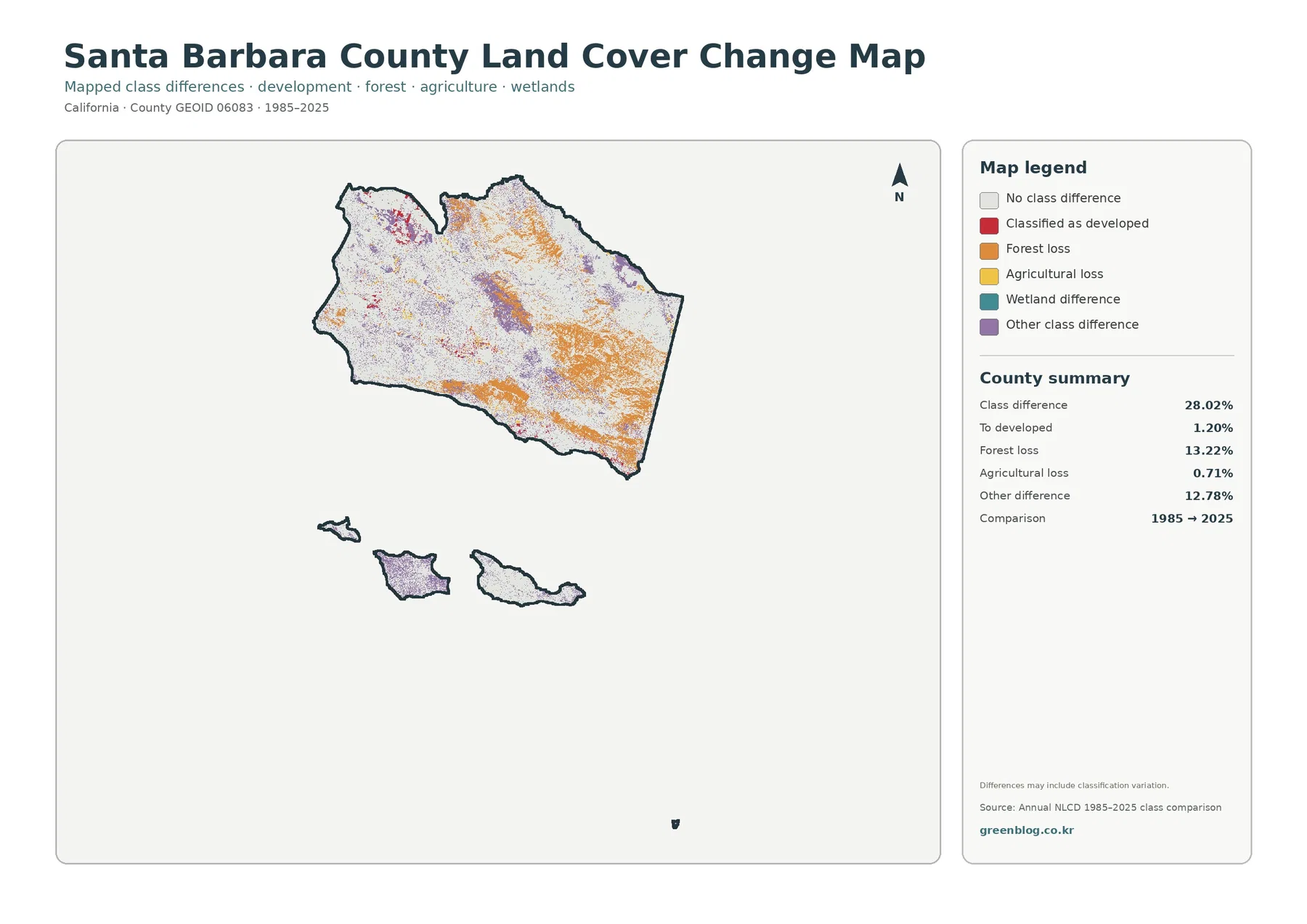
The change product compares classifications from 1985 and 2025. It reports a class difference across 28.02% of the county, with 1.20% classified as a transition to developed land, 13.22% listed as forest loss, 0.71% as agricultural loss, and 12.78% as other class difference. The categories are useful for locating change signals, but they do not supply a cause for each changed cell.
Areas mapped as changed to developed land tend to occur near the same settlement clusters that stand out on the 2025 developed and impervious products. That spatial agreement makes the map useful for a first comparison of long-term development patterns. It does not, however, identify the project, date, policy, road, or economic event responsible for any individual change. Local planning records and historical imagery are needed for that level of explanation.
The 13.22% forest-loss figure requires even more care. In this product, forest loss means that a cell classified as forest in 1985 has a different class in 2025. It is not automatically equivalent to permanent deforestation or logging. Fire, post-fire vegetation stages, shrub or grass transitions, regrowth timing, sensor differences, and classification variation can all affect a long comparison.
The map itself notes that differences may include classification variation. For that reason, a broad orange area should be treated as a place to investigate rather than proof of ecological decline. If a specific site matters, compare historical aerial imagery, fire history, vegetation records, and more detailed land-management information before drawing conclusions about what happened.
Agricultural loss, shown as 0.71%, follows the same logic. A change out of the agriculture class says that the mapped surface category is different at the two comparison dates. It does not by itself prove that a farm closed, a parcel was rezoned, or a particular crop disappeared. Keeping “what changed in the classification” separate from “why land management changed” prevents the map from being asked to answer questions it was not designed to answer.
Local valley, coast, mountain, and island names make the colors easier to place
A land-cover map can feel abstract when it contains no street network or dense place labels. Santa Barbara County is easier to interpret when a few verified geographic contexts are used as reference points. The developed South Coast, the agricultural Santa Ynez and Cuyama valleys, the rural Gaviota Coast, northern Santa Maria-Orcutt area, mountain belts, and offshore islands each correspond to noticeably different combinations of cover classes.
On the South Coast, developed and impervious colors sit close to large areas of shrub, grass, and forest associated with the foothills and mountains. That quick transition is one reason a countywide average can hide strong local contrasts. A presentation comparing urban and natural cover can use this coast-to-upland shift without claiming that the land-cover raster contains official urban-growth boundaries.
The inland valleys are more useful for discussing agriculture. In Santa Ynez Valley, agricultural cells appear within a broader rural landscape, while Cuyama provides an eastern interior example between mountain ranges. Northern agricultural areas around the Santa Maria region add another pattern. These are not identical farming landscapes, so the map should be used to compare where agriculture is visible rather than to generalize about one countywide farming system.
Offshore islands provide a strong nonurban contrast. Their large shrub and grass areas make it easy to see how much of the county’s mapped extent falls outside the mainland settlement pattern. Because the same legend is used, students can compare island and mainland cover directly. More detailed questions about island habitat, species, facilities, or protected-area management need dedicated ecological or park datasets.
What the 30-meter data can and cannot answer
Annual NLCD land cover is a raster product at 30-meter resolution. A raster divides the landscape into square cells and assigns each cell a value. At this resolution, one cell represents an area roughly 30 meters by 30 meters on the ground. Countywide patterns are clear, but narrow features and complex boundaries are necessarily generalized.
Mixed pixels are part of that limitation. A cell near the edge of a neighborhood may contain a roof, trees, a driveway, and grass. A cell beside a creek may contain both water and vegetation. The classification has to represent that mixed ground with a defined class or fractional value, so the sharp colored boundary on the map should not be treated as a surveyed boundary in the field.
The observation year matters as well. The main products on this page represent 2025, while the change map compares 1985 with 2025. Fire, construction, vegetation recovery, agricultural rotation, restoration, or other changes after the observation date will not appear in the 2025 classification. A current project should therefore check whether newer local imagery or site information is available.
Parcel questions are outside the scope of these graphics. The maps do not identify ownership, assessor parcels, zoning, conservation easements, building permits, legal access, or property lines. They can provide environmental context before a more detailed investigation, but they cannot replace a parcel map, survey, title record, planning map, or field inspection.
Countywide percentages also need location-based interpretation. The 1.88% mean impervious value is low, yet cells above 50% are plainly visible in compact urban areas. The 5.30% agriculture share is modest, yet particular valleys have a much stronger agricultural identity. A good reading always pairs the summary number with the location of the colored cells.
A practical four-map workflow for class, report, and planning context
For a quick county overview, begin with the general land-cover map and identify the large shrub and grass areas before focusing on the smaller developed, forest, and agricultural classes. That first step prevents the urban clusters from visually dominating the interpretation simply because their colors are bright and concentrated. It also establishes the county outline and the offshore extent used by the other three maps.
Next, use the forest-and-farmland product to compare valley and mountain settings. A class project can mark Santa Ynez Valley, the Cuyama area, the northern agricultural zone, and the forested uplands as reference locations. The exercise works best when students are reminded that the colored pixels are land-cover classes, not parcel-level farm or forest ownership.
Then open the impervious map at the same scale. The South Coast and northern urban cluster become much easier to compare with the surrounding low-impervious land. This is a useful way to explain why “developed land” and “impervious surface” are related but not interchangeable measures. The general map supplies the categorical developed class; the fractional product shows how hard-surfaced individual cells are.
Finish with the 1985–2025 change map. Instead of asking students to explain every changed cell, use it to identify where follow-up research would be most valuable. A cluster of developed change can be checked against historical imagery, while a forest-change area can be compared with fire and vegetation records. That approach turns the change map into a research index rather than a source of unsupported causal claims.
For reports and presentations, keep the observation year in the caption. Label the first three maps as 2025 products and the change image as a 1985–2025 comparison. If the graphic is cropped, retain the legend and county context whenever possible. Removing the date or legend can make a clean slide, but it also removes the information needed to interpret the colors correctly.
Download the four original JPG maps
The download archive matches the four previews in the article. The general land-cover JPG provides the broad 2025 class view. The forest-and-farmland JPG makes those two land covers easier to distinguish from shrub, grass, wetland, water, and developed/other areas. The impervious JPG uses percentage ranges from 0% to 100%, and the change JPG summarizes mapped differences between 1985 and 2025.
Each original image is 2480 × 1754 pixels. The package does not identify these files as meeting its A3 high-resolution reference, so anyone planning a large print should check the legend and small text at the intended output size before producing a full set. The archive contains JPG maps rather than vector artwork, GIS layers, parcel data, or editable source files.
When comparing the files on screen, keep the zoom level consistent and use the county coastline, northern developed cluster, interior valleys, and offshore islands as reference points. That makes it easier to move from a land-cover class to its impervious setting or long-term change signal without mistaking a different location for the same feature.
Frequently Asked Questions
Does 58.83% shrubland mean most of Santa Barbara County is wasteland?
No. Shrubland is a land-cover class describing ground dominated by shrubs; it is not a judgment about land value, usefulness, ownership, or legal status. Shrub communities are a major part of the county’s natural landscape, especially in upland and drier settings. The 58.83% value simply reports the share classified as shrubland in the 2025 product.
Why is developed cover 5.68% while mean impervious surface is only 1.88%?
They measure different things. Developed land is a categorical land-cover class and can contain trees, lawns, soil, and other permeable surfaces within a built environment. Fractional impervious surface measures the percentage of each 30-meter cell covered by hard materials such as pavement or rooftops. A county can therefore have a larger developed-class area than its average impervious percentage.
Can the 13.22% forest-loss value be read as confirmed deforestation?
No. The change category means cells classified as forest in 1985 are classified differently in 2025. It does not identify the cause and should not automatically be interpreted as logging or permanent forest clearing. Fire, vegetation succession, transitions to shrub or grass, regrowth timing, and classification variation can contribute to the mapped difference. Site-specific conclusions require historical imagery and additional environmental records.
Map File Information
The ZIP contains the four original JPG maps discussed on this page. Each 2480 × 1754 image is larger than the body WebP preview and can be used for printed reference sheets, class materials, reports, presentations, or personal map comparison.
- Included Files: Land cover · Forest and farmland · Impervious surface/developed land · 1985–2025 land-cover change
- File Type: Four JPG files in one ZIP archive
Related Maps
- Alameda County California Land Cover Map
- Alpine County California Land Cover Map
- Amador County California Land Cover Map
Sources and Reference
The following official resources are useful for checking the dataset definition, county boundary context, and local geographic setting used in this interpretation. They are also the appropriate starting points when a county-scale land-cover graphic needs to be supplemented with current planning or agricultural information.
- MRLC Annual NLCD — official project information for annual land-cover and related products.
- USGS Annual NLCD Collection 1.2 Land Cover — official description of the 30-meter collection that includes 2025 land cover.
- Santa Barbara County Community & Area Plans — official geographic and planning context for Goleta, Gaviota, Santa Ynez, Cuyama, Orcutt, and other county areas.
- Santa Barbara County Agricultural Planning — county information for agricultural planning and policy context.
- U.S. Census Bureau TIGER/Line Shapefiles — official geographic boundary files used for county and GEOID reference.
Green Map creates custom-edited map images using open geographic data sources such as geoBoundaries, Natural Earth, OpenStreetMap, and government open data.
These maps are edited visual materials, not raw data files, and are provided for education, documents, presentations, and graphic reference.