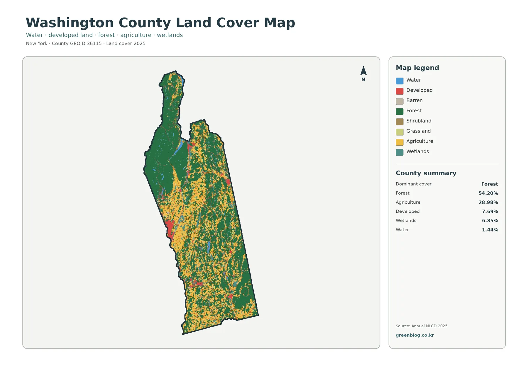
Washington County stretches north to south along New York’s border with Vermont, and its land cover changes noticeably from one end of the county to the other. The 2025 map set records forest as the dominant cover at 54.20 percent, followed by agriculture at 28.98 percent. Developed land accounts for 7.69 percent, wetlands 6.85 percent, and water 1.44 percent. Together, those figures match the strong contrast visible between the wooded north and the more farmed central and southern sections.
Four map views are included here: general land cover, forest and farmland, fractional impervious surface, and mapped class differences from 1985 to 2025. The four original JPG maps are available in one download near the end of the page, which makes it easy to save the set for printing, classroom work, presentations, or side-by-side geographic comparison.
Table of Contents
A county where forest and farmland share the landscape
Washington County is long and relatively narrow, with Vermont along its eastern edge. County and New York State descriptions place the Hudson River and Lake George along the western side, Lake Champlain near the north, and the Adirondack influence in the northern towns. Farther south and east, rolling hills and flatter ground have long supported farming. That broad north-to-south shift is one reason the county works especially well as a land-cover example.
The map does not describe zoning, ownership, or the legal use of a parcel. Land cover is a classification of what the ground surface looks like in satellite-based data: forest, agricultural cover, developed land, wetland, water, and other broad classes. A field may therefore appear as agriculture without saying anything about its zoning designation, and a developed pixel does not identify the boundaries of a particular property.
What stands out on the 2025 land-cover view
Forest is the first pattern to notice. Dark green covers a large, connected area in the northern and northwestern part of the county, rather than appearing only as small woodlots. That concentration is consistent with the county’s transition toward the Adirondack landscape in the north. Moving south, the green cover becomes more broken and increasingly shares the map with agricultural colors.
Agricultural cover is widespread through the central and southern parts of the county and also appears in long belts toward the eastern side. It is not one continuous block. Fields and pasture are interwoven with woods, wetlands, roads, and village-scale development, creating a patchwork that is very different from the more heavily forested northern end. The county’s own agriculture pages describe farming as a leading local industry supported by productive soils, so the broad agricultural footprint is an important part of the regional context rather than a minor map detail.
Developed land is a smaller share of the county, but the red classes form recognizable clusters. The strongest concentration is along the west-central side around the Hudson Falls and Fort Edward area, while smaller patches occur near other village centers. Washington County describes itself as largely rural and agricultural, with commercial and industrial development concentrated in and around its villages, which helps explain why most of the map remains green or agricultural rather than continuously urbanized.
Wetlands and water occupy much less area than forest or agriculture, yet they help explain the texture of the map. Narrow blue and teal features appear along drainage corridors and in low-lying areas, while the county’s larger water context includes the Hudson River, Lake George, Lake Champlain, the Champlain Canal, and several rivers and ponds. These classes are particularly useful when the map is being used for watershed education or to compare natural cover around developed and agricultural areas.
Forest and farmland become clearer when the legend is simplified
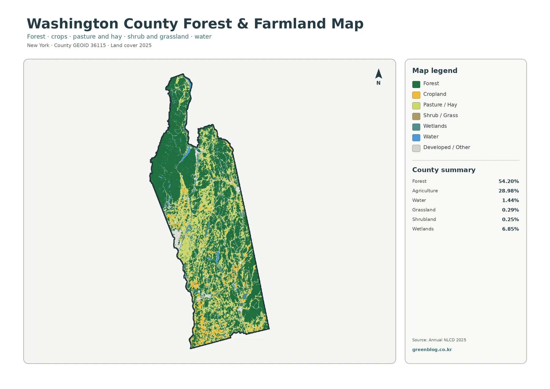
The forest-and-farmland map removes much of the visual competition from the general legend. The northern forest block becomes easier to trace, while cropland and pasture stand out through the middle and southern portions. In several places, agricultural areas follow broad open zones between wooded uplands instead of covering entire townships. That pattern is useful for explaining why a county with more than half of its surface classified as forest can still have a substantial agricultural economy and a strong farm landscape.
The 28.98 percent agriculture figure should be read as a broad land-cover category, not as a crop inventory. Washington County agriculture includes dairy, livestock, field crops, maple products, apples, and other activities, but this map does not tell the reader which commodity occupies any specific colored patch. It is better suited to questions such as where agricultural cover is concentrated, how it meets forest, and how open land differs between the north and south.
Grassland and shrubland are small in the county summary, at 0.29 percent and 0.25 percent respectively. Because those classes occupy little area, a countywide view can make them hard to distinguish. For most readers, the best approach is to identify the major forest and agricultural zones first, then zoom into smaller classes only when a project specifically calls for them. Wetlands, by contrast, account for 6.85 percent and appear often enough to matter when comparing farmed valleys with wetter corridors.
This simplified map also makes transitions easier to discuss. The southern end contains a denser mixture of farm colors, while the northern end is dominated by forest with comparatively limited agricultural cover. Through the middle of the county, neither category completely excludes the other. That mixed zone is often more informative than a single percentage because it shows how quickly the surface can change over short distances.
Impervious surface reveals the small but concentrated developed footprint
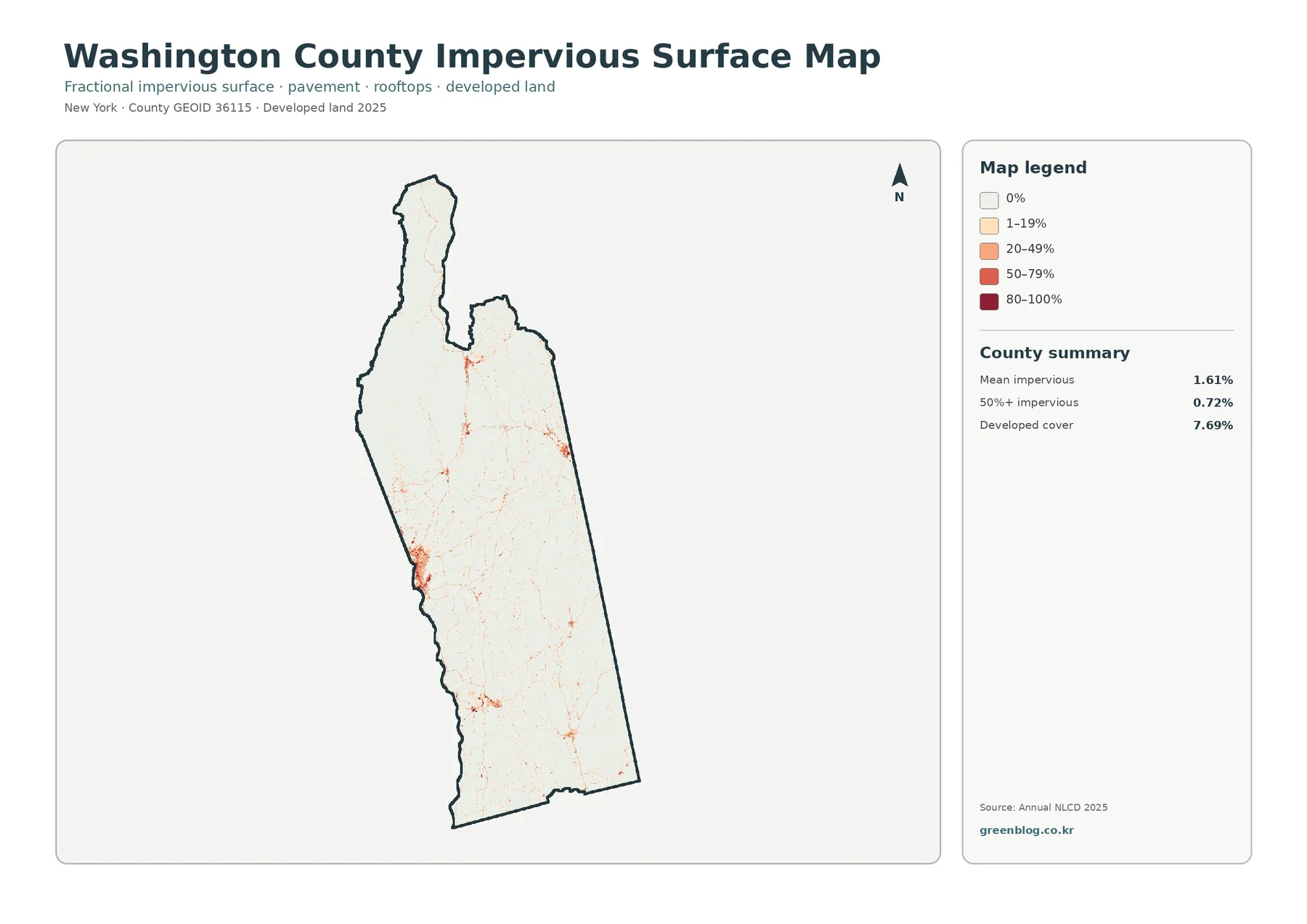
Impervious surface means pavement, rooftops, parking areas, and other surfaces where rain cannot easily soak into the ground. Most of Washington County is close to the lowest end of the impervious scale, which fits its rural character. The countywide mean is 1.61 percent, and only 0.72 percent of the mapped area reaches 50 percent impervious or more. High values therefore appear as compact spots and thin lines instead of broad urban fields.
The west-central developed cluster is especially easy to see on this map. Higher impervious values gather around the Hudson Falls–Fort Edward area and extend along connected settlement and transportation corridors. Smaller concentrations occur elsewhere near villages and road junctions. The map supports a statement that development and roads are spatially concentrated together; it does not, by itself, establish that a particular road caused a particular development pattern.
Developed cover and impervious percentage answer related but different questions. The general land-cover map assigns 7.69 percent of the county to developed classes, while the mean impervious value is only 1.61 percent. A low-density residential landscape may still be labeled developed even when lawns, trees, and other permeable surfaces occupy most of a 30-meter cell. The impervious product is therefore useful for separating a broad developed setting from the harder surfaces inside it.
For environmental education, this view can help introduce runoff and watershed questions without pretending to be a drainage-engineering map. A high-impervious cluster can be compared with nearby streams, wetlands, or agricultural land to decide where more detailed information might be useful. Parcel design, stormwater sizing, road engineering, and property-level decisions require much finer local data.
Reading the 1985–2025 class-difference map carefully
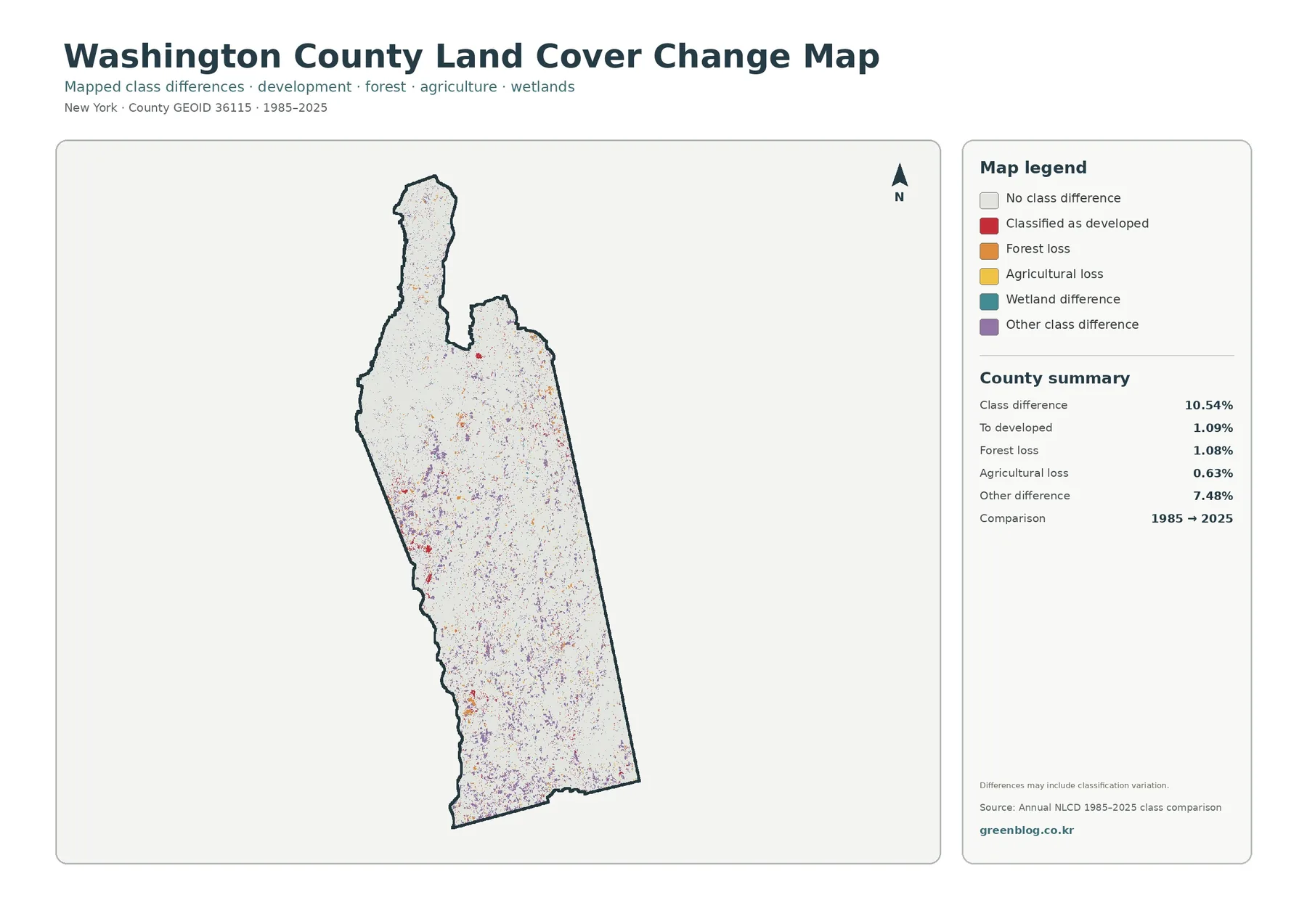
The change view reports a class difference across 10.54 percent of the county. Within that total, 1.09 percent is labeled as a change to developed, 1.08 percent as forest loss, and 0.63 percent as agricultural loss. The largest share is the 7.48 percent grouped as other class difference. That breakdown is important because it prevents the map from being summarized as a single story of urban growth or forest removal.
Colored pixels are scattered across the county rather than confined to one corner. There are noticeable groups in parts of the south and west, as well as smaller marks through forested and agricultural areas farther north. A reader looking for a specific place should therefore use the current 2025 map first, locate the area of interest, and then compare the corresponding position on the change layer instead of treating every colored mark as equally significant.
A mapped class difference is not automatically proof of a physical land conversion. The preview itself warns that the differences may include classification variation. Satellite conditions, mixed pixels, changes in the mapping model, or differences near class boundaries can all contribute. The safest wording is that the map identifies locations where the 1985 and 2025 classifications differ; confirming the reason calls for aerial imagery, local records, or other time-series evidence.
That limitation does not make the layer unhelpful. It works very well as a screening map. Areas with repeated class differences around a village, along a farm-and-forest boundary, or near a wetland can be flagged for closer review. In a classroom, it also provides a useful way to distinguish “change detected by a classification” from “cause of change proven by independent evidence.”
Connecting map patterns with Washington County geography
The county’s official descriptions help put the color patterns into a geographic frame. The northernmost towns extend into the Adirondack Park and are described as mountainous and forested. The southern and eastern parts contain more rolling hills and flatter farmland. Major waters outline several county edges, including the Hudson River on the southwest and Lake George and Lake Champlain near the north. These are broad landscape facts, not explanations for every individual pixel, but they make the countywide pattern much easier to understand.
The Hudson Falls–Fort Edward area provides another useful comparison. County planning material identifies this part of the western side as a population and manufacturing concentration. On the impervious map, the same general area contains the largest continuous group of higher values. On the land-cover map, developed classes are more visible there than across most rural townships. Looking at both products together is more informative than using a population description or a land-cover color alone.
Farther north, the forest-heavy landscape meets the Lake George and Lake Champlain region. Water and wetland classes remain much smaller than forest in the county summary, yet they can have an outsized local importance along shorelines and drainage corridors. For a watershed study, the useful question is not simply how much water exists countywide, but what cover surrounds a particular stream, pond, wetland, or shoreline segment.
The eastern and southern farm belts are well suited to another type of comparison. Agricultural colors can be followed across broad open areas and then checked against the change layer for locations where the classification differs between 1985 and 2025. That does not establish whether a farm was sold, protected, abandoned, or developed. It identifies a place where more specific agricultural, parcel, or historical records may be worth consulting.
Which of the four files is best for your purpose?
Use the general land-cover map when you need one image that explains the county at a glance. It balances forest, agriculture, developed land, wetlands, and water in a single legend and makes the north-to-south contrast easy to introduce. For a report or article, it is usually the best first figure because the other three maps can then be described as focused views of the same county.
Choose the forest-and-farmland map when the relationship between working land and woodland matters more than urban detail. Its simpler color scheme is useful in agriculture presentations, conservation discussions, and lessons about rural landscapes. The impervious map is better when the question is where hard surfaces are concentrated or how village-scale development differs from the surrounding countryside.
The 1985–2025 class-difference file belongs in comparisons over time. It should normally be paired with the 2025 land-cover map so the reader can see both current cover and the location of mapped differences. Using it alone can encourage overinterpretation because a colored pixel does not explain the cause, timing, or legal meaning of a change.
For printing, keep the legend large enough to read and retain color whenever possible. Forest, agriculture, developed land, wetland, and change categories are much easier to separate in color than in grayscale. If a black-and-white printout is unavoidable, add a caption that names the major locations and classes being discussed rather than expecting readers to infer every category from similar gray tones.
Scale, classification, and other limits to remember
Annual NLCD is raster data derived from Landsat imagery at a 30-meter spatial resolution. Each cell summarizes a square area about 30 meters across, so narrow streams, individual houses, small farm lanes, and exact parcel edges can be generalized or missed. The maps are designed for landscape-scale comparison, not for surveying a property boundary.
Mixed pixels are another reason to be cautious near edges. A single cell may contain trees, lawn, pavement, and a building, yet the land-cover product still needs to assign a class, while the impervious product estimates the fraction of hard surface. That is why boundaries between forest, agriculture, and development may not line up perfectly with what a person sees in a high-resolution aerial photograph.
The 2025 map represents the classification for that mapping year. New construction, logging, farm conversion, flooding, vegetation recovery, or other events after the observation period will not appear until newer data are incorporated. Anyone needing the latest condition should compare the map with current local GIS, recent aerial imagery, or field information.
These files are reference maps rather than legal land records. They do not define zoning, protected-land boundaries, ownership, building rights, flood-insurance status, or environmental permits. A useful workflow is to use the land-cover set to identify the pattern or area you want to understand and then move to the official local dataset that answers the legal or property-specific question.
Download the Washington County land-cover JPG set
The ZIP below contains the four original JPG files used for this page: the 2025 general land-cover map, the forest-and-farmland map, the fractional impervious/developed-land view, and the 1985–2025 class-difference map. Keeping the original files is useful when you need a larger image for printing, a slide, a school project, or a side-by-side comparison.
You can use one file by itself or keep all four together as a compact reference set. When the maps are reused in a formal project, check the underlying data source, mapping year, and any applicable source or licensing notes so the image is presented with the right context.
Frequently Asked Questions
What is the largest land-cover class in Washington County?
Forest is the largest class in the supplied 2025 summary at 54.20 percent. Agriculture follows at 28.98 percent, while developed land is 7.69 percent, wetlands 6.85 percent, and water 1.44 percent. The broad forest concentration in the north and northwest is visible even before reading the percentages.
Why is developed cover 7.69% when mean impervious surface is only 1.61%?
The two measures describe different things. A developed land-cover class can include homes, lawns, trees, and other open surfaces within a developed setting. Impervious percentage focuses on hard surfaces such as pavement and rooftops. Low-density development can therefore count as developed while still having a relatively low impervious fraction.
Does every colored pixel on the 1985–2025 map represent confirmed land conversion?
No. It represents a difference between mapped classes for the two comparison years. Some differences may reflect real change, while others can be affected by classification variation, mixed pixels, imagery conditions, or boundaries between similar classes. Important changes should be checked against aerial photographs, local records, or another reliable time-series source.
Can these maps be used to check zoning or parcel boundaries?
No. Annual NLCD is a 30-meter land-cover product and is not a parcel survey. It does not identify ownership, zoning districts, legal building rights, or exact property lines. Use county or municipal GIS and official land records for those questions.
Map File Information
Washington County land-cover maps – four original JPG files
- Included Files: Use only the versions confirmed in the article and supplied images
- File Type: Use the confirmed download contents
- Intended Use: Printing, education, presentations, and map-based projects
Related Maps
- Albany County Land Cover Map
- Allegany County New York Land Cover Map
- Bronx County New York Land Cover Map
Sources and reference material
- MRLC Annual NLCD Data – access to current Annual NLCD products
- USGS Annual National Land Cover Database – product overview and 30 m annual mapping context
- USGS Annual NLCD Land Cover Classification – definitions for the mapped land-cover classes
- Washington County, NY – About Washington County – county geography, rural character, and settlement context
- Washington County Agriculture – local agricultural economy and production context
Green Map creates custom-edited map images using open geographic data sources such as geoBoundaries, Natural Earth, OpenStreetMap, and government open data.
These maps are edited visual materials, not raw data files, and are provided for education, documents, presentations, and graphic reference.