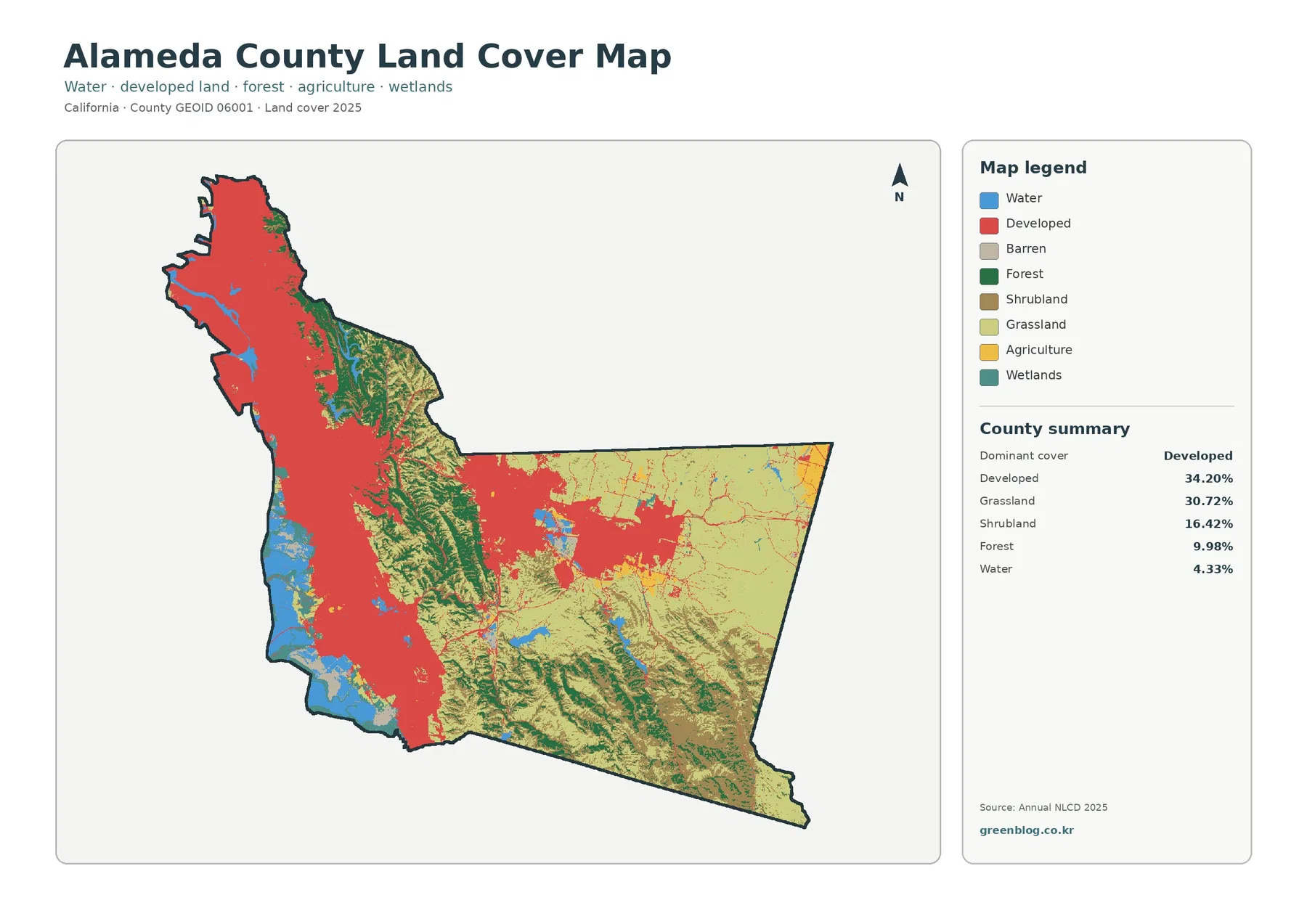
Alameda County’s 2025 land-cover pattern is defined by a sharp contrast between a heavily developed west and much more open cover across the east. Developed land is the largest countywide class at 34.20%, while grassland accounts for 30.72% and shrubland for 16.42%. Forest covers 9.98% and water 4.33%. Those percentages are useful, but the map matters just as much as the totals because the dominant classes occupy very different parts of the county rather than forming an even mixture.
This page brings together four views of the same county boundary: current land cover, forest and farmland, impervious surfaces and developed land, and mapped class differences from 1985 to 2025. The WebP versions are provided for quick viewing, and the four original JPG maps are available in one ZIP download. Looking across the set makes it possible to separate broad development from hard-surface intensity and to distinguish today’s pattern from places where classification changed between the two comparison years.
Table of Contents
A developed western belt gives way to grassland and shrubland across the eastern half of the county
The general land-cover view places a continuous mass of developed color along much of the western side. The strongest concentration extends from the northwest through the west-central area and toward the southwest. Moving inland, that red cover becomes less continuous and a winding band of forest appears through the middle of the county. Farther east, grassland and shrubland occupy large uninterrupted areas, although several developed clusters interrupt the open cover in the center-east.
Grassland is nearly as extensive countywide as developed land, at 30.72%. Shrubland adds another 16.42%, so the eastern side is not simply “undeveloped” blank space. It is mapped as specific open-cover classes with their own distribution. Forest, at 9.98%, is much less extensive than grassland or shrubland, yet it forms a visually important middle zone. Green areas follow irregular, ridge-like shapes through the central portion and reappear in several southern patches.
Water covers 4.33% of the county in the summary. The largest blue areas lie along the western edge and southwest, with smaller inland water bodies scattered farther east. Wetlands are reported separately at 2.07% on the forest-and-farmland map and are most noticeable near parts of the western and southwestern water edge. Treating open water and wetland as different classes is important because a shoreline can contain both, and the two categories describe different surface conditions.
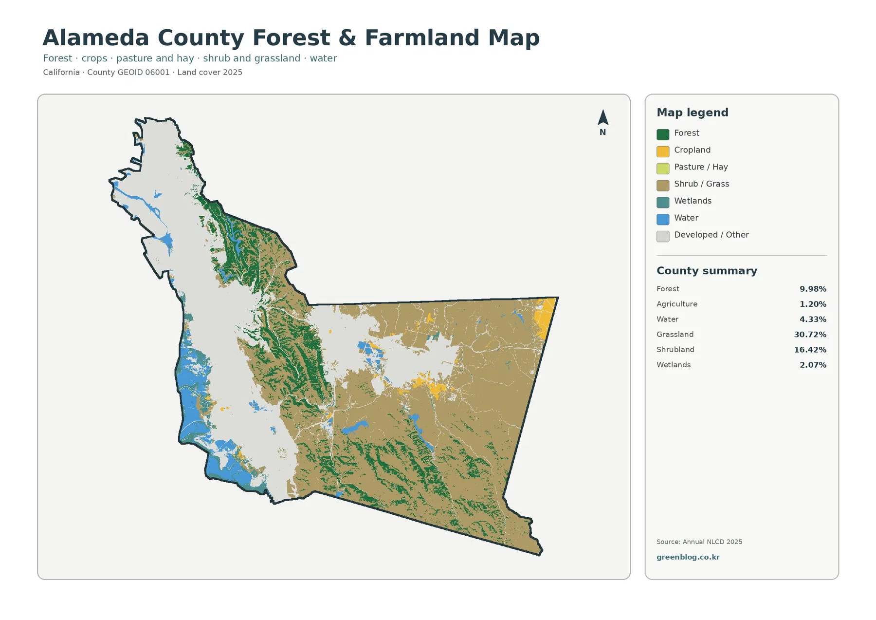
The forest-and-farmland view makes the central wooded corridor easier to see without the western development dominating the page
On the simplified forest-and-farmland map, developed and other cover is muted in gray. That change in emphasis reveals the green forest patches that run through the center much more clearly. The wooded areas are neither one solid block nor a thin line. They form a series of connected and broken shapes between the gray western area and the open grass-and-shrub cover farther east. Smaller forest patches also appear toward the south and southeast.
Agriculture is only 1.20% in the supplied 2025 summary. Yellow agricultural patches occur mainly in limited eastern and center-eastern locations, while grassland and shrubland cover much more of the inland side. This distinction prevents a common reading error: an open-looking landscape on the map should not automatically be called farmland. In Alameda County, most of the mapped open eastern surface belongs to grassland and shrubland categories rather than to the agricultural class.
The same image also lists water at 4.33% and wetlands at 2.07%. Blue and teal cover is most conspicuous along the west and southwest, with smaller inland features elsewhere. When the goal is to compare natural cover rather than the built footprint, this map is especially useful because it separates forest, grass/shrub cover, agriculture, water, and wetlands while pushing the developed background into a quieter visual role.
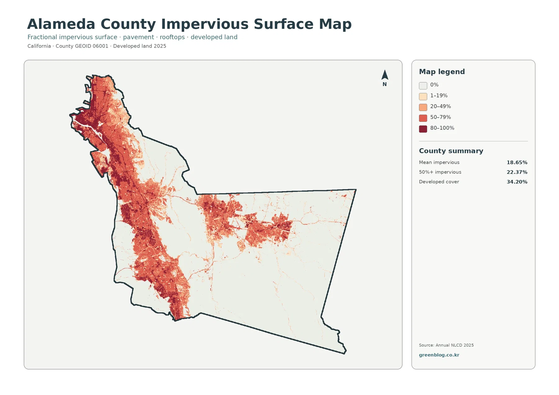
Impervious surfaces show where roofs and pavement are concentrated inside a county that is 34.20% developed
Impervious surface means hard cover such as rooftops, paved streets, and parking areas that does not readily absorb rainfall. Alameda County’s mean impervious value is 18.65%, and 22.37% of the mapped area is reported at 50% impervious or higher. Those figures are different from the 34.20% developed-land share because developed classes can include lawns, trees, soil, and other permeable surfaces along with buildings and pavement.
The impervious map is darkest across the western belt, where high values form broad, nearly connected areas from north to south. Strong clusters also appear in the center-east, but they are separated by much larger pale areas. Thin linear features extend outward from several developed concentrations. The map does not label those lines as specific roads, so they are best read simply as narrow corridors of harder surface unless another reference is used to identify them.
Across much of the far east and southeast, the impervious layer becomes very light. That low-intensity pattern agrees with the grassland and shrubland dominance shown on the other maps. The comparison is useful because it demonstrates that developed land and impervious surface are related without being interchangeable. A place can fall within a developed land-cover class while still containing a substantial amount of permeable ground, and small hard surfaces can appear as thin features inside otherwise open cover.
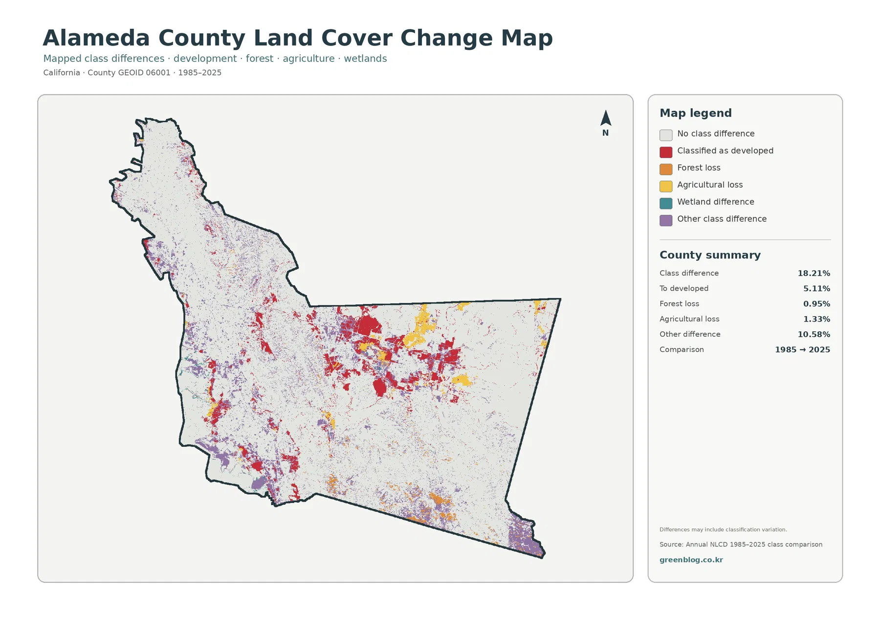
The 1985–2025 comparison identifies 18.21% class difference, with mapped development change concentrated in several distinct areas
The change map compares the 1985 and 2025 classifications cell by cell. Its summary reports a total class difference of 18.21%. Areas classified as change to developed land account for 5.11% and appear as red patches in several parts of the county. The largest visible groupings lie in the center-east, with smaller concentrations scattered across the western and southwestern sides. This is not the same picture as the current developed-land map, which shows all areas classified as developed in 2025 regardless of when they took on that class.
Forest loss is listed at 0.95%, while agricultural loss is 1.33%. Yellow agricultural-loss patches stand out in parts of the center-east, and smaller orange forest-loss areas appear in the south and elsewhere. The summary also reports 10.58% as other class difference, shown in purple in the legend. A separate wetland-difference category is present on the map as well. Because several kinds of class difference are mapped, the 18.21% total should never be interpreted as a single type of land conversion.
A note on the image warns that differences may include classification variation. That caution matters around boundaries where grassland, shrubland, forest, developed cover, and agriculture occur in small adjoining patches. A raster cell may contain more than one real-world surface, yet it receives a representative class. Changes in observation conditions or classification can therefore produce a different label even when the ground has not experienced a simple one-direction conversion. The map is best used to locate change hotspots for follow-up, not to establish a parcel-level history.
The western water edge, central forest, and eastern open cover are easier to understand as three different landscape settings
Along the west, water and wetland colors sit close to the county’s most continuous developed cover. This creates short transitions from open water to wetland or other shoreline cover and then to developed surface. The land-cover map can show that adjacency, but it does not establish shoreline ownership, flood regulation, or wetland jurisdiction. Those questions require separate official records. For visual interpretation, the useful point is simply that water-related classes and dense development occur close together along parts of the western edge.
The middle of the county has a different role. Forest occupies irregular green ridges and patches that separate or interrupt the stronger developed and open-cover zones. Those wooded shapes are particularly clear on the forest-and-farmland view, where the western developed background is gray. Looking at the same central belt on the change map adds another layer: some cells show development or other class differences, while many nearby cells remain unchanged between the two mapped years.
Farther east, grassland and shrubland dominate much of the current map, with only limited agriculture and several developed clusters. The impervious layer is correspondingly light over broad areas, except where those clusters appear. This three-part reading—western developed/water edge, central forest, and eastern open cover—captures the major spatial contrast without pretending that every boundary is sharp. Small patches of other classes are mixed through all three settings.
Choosing the right map depends on whether the question is about present cover, hard surfaces, or long-term class differences
For an overall county portrait, start with the 2025 land-cover map. It keeps the main classes together and immediately reveals the west-to-east contrast. If the focus is forest, agricultural cover, water, wetlands, or open grass/shrub areas, the simplified forest-and-farmland map removes much of the visual weight of development and makes those classes easier to compare. This is useful when the developed west would otherwise dominate the reader’s attention.
The impervious layer is more appropriate when the question concerns hard surface rather than the broader developed class. It highlights where roofs and pavement are concentrated and helps explain why a developed percentage can be much larger than the countywide mean impervious value. For historical comparison, use the 1985–2025 map. It identifies cells with different classes in the two years and separates several change categories rather than treating all change as development.
In a presentation or classroom sequence, the four maps can be read as a progression of questions rather than as four versions of the same picture. First establish what covers the ground now. Then isolate forest, open cover, agriculture, water, and wetlands. Next examine hard-surface intensity inside the built pattern. Finish by asking where the two comparison years differ. Keeping those questions separate reduces the risk of using a current land-cover class as proof of when or why a change happened.
Land cover is a surface classification, not a zoning map, property map, or site survey
Land cover describes what is on the ground in broad categories such as developed surface, forest, grassland, shrubland, agriculture, wetland, and water. It does not determine legal land use. A developed cell is not the same as a zoning district, a forest cell does not prove that land is protected, and an agricultural class does not establish a farm parcel or agricultural easement. Ownership, zoning, permits, and regulatory status must be checked in the appropriate current records.
Annual NLCD products are raster data. In a raster, the landscape is divided into grid cells and each cell is assigned a representative value. Real ground is more complicated than a single cell label: trees, pavement, bare soil, grass, and water can occur together within one cell. That mixed-pixel effect helps explain blocky edges and some small differences between years. Countywide pattern analysis is a good use of the map; precise parcel measurement is not.
The current map is labeled 2025, and the comparison map uses 1985 and 2025. Neither image is a continuous year-by-year record. Development, restoration, vegetation shifts, or other changes that occurred after the observation year will not be captured in the 2025 classification, and the comparison does not reveal the exact year when a cell changed. Additional annual data, aerial imagery, or local records are needed for that level of detail.
The four original JPG files are best for larger on-screen use and moderate printing, with one resolution caveat
The downloadable ZIP contains one JPG for current land cover, one for forest and farmland, one for impervious surfaces and developed land, and one for the 1985–2025 change comparison. Each original JPG is 2480×1754 pixels. The supplied asset manifest marks that size as below its A3 high-resolution reference, so anyone planning a large poster should test print quality at the intended size rather than assuming A3-level detail.
The WebP previews in the article are convenient for browsing and quick comparison. The JPG files provide the larger source images when a slide, report, worksheet, or moderate-size print needs more pixels. The ZIP is a map-image package rather than a raw GIS dataset, so it should not be described as a source for recalculating percentages or extracting precise parcel geometry. Links in the source section point to official data documentation for readers who need the underlying land-cover framework.
Frequently Asked Questions
What is the largest 2025 land-cover class in Alameda County?
Developed land is the largest class at 34.20%, followed closely by grassland at 30.72%. The developed cover is concentrated most strongly in the west, while grassland and shrubland occupy much larger areas in the east.
Why is developed cover 34.20% when mean impervious surface is 18.65%?
Developed classes can include permeable ground such as lawns, trees, and soil in addition to buildings and pavement. The impervious layer focuses on hard surfaces, so its countywide mean does not need to match the developed-land percentage.
Does the 18.21% 1985–2025 class difference mean that 18.21% of Alameda County was developed?
No. Change to developed land is reported separately at 5.11%. The map also lists 0.95% forest loss, 1.33% agricultural loss, 10.58% other class difference, and a separate wetland-difference category, while noting that classification variation may be included.
Map File Information
The ZIP contains four original JPG maps for Alameda County: 2025 land cover, forest and farmland, impervious surfaces and developed land, and the 1985–2025 land-cover change comparison.
- File Type: ZIP containing four JPG files
Related Maps
- A Craighead County Arkansas Land Cover Map
- Albany County Land Cover Map
- Allegany County New York Land Cover Map
Sources and References
Percentages and 1985–2025 values cited in this article come from the supplied Alameda County map package. The links below provide official or trusted context for Annual NLCD classes, county boundaries, local planning, resource conservation, and open-space information.
- MRLC Annual NLCD Data — official access point for Annual NLCD land-cover products.
- USGS Annual NLCD Land Cover Classification — explains the land-cover classes used in Annual NLCD products.
- U.S. Census Bureau TIGER/Line Shapefiles — official geographic boundary data used for county mapping.
- Alameda County Planning Department — local planning information for Alameda County.
- Alameda County Resource Conservation District — local information related to soil, water, agriculture, and natural-resource conservation.
- East Bay Regional Park District — regional park and open-space information for the East Bay, including Alameda County.
Green Map creates custom-edited map images using open geographic data sources such as geoBoundaries, Natural Earth, OpenStreetMap, and government open data.
These maps are edited visual materials, not raw data files, and are provided for education, documents, presentations, and graphic reference.