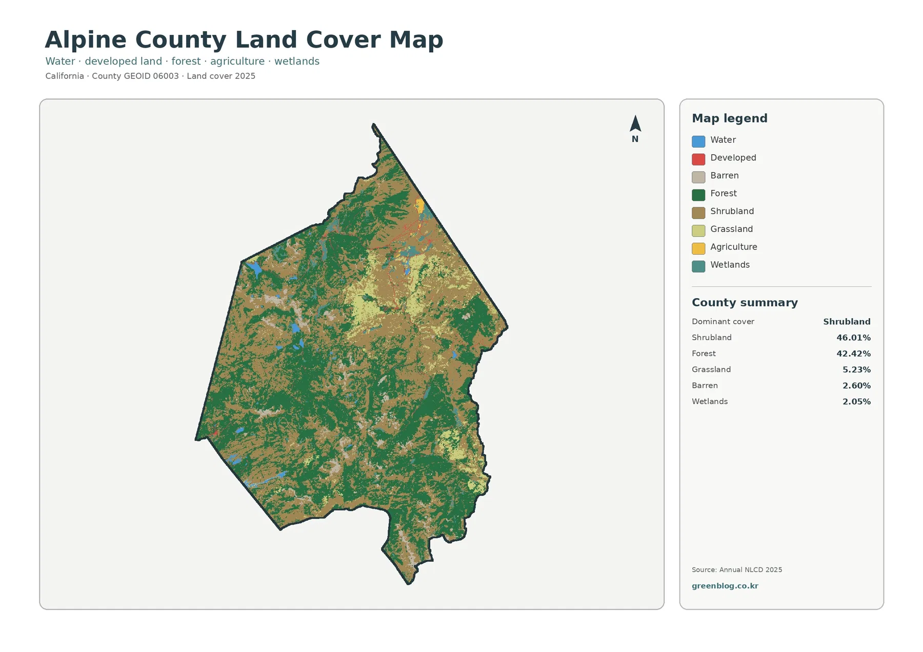
Alpine County’s 2025 land-cover map is dominated by two natural classes rather than by a large urban or agricultural footprint. Shrubland accounts for 46.01% of the county and forest for 42.42%, so together they cover more than 88% of the mapped area. Grassland is a much smaller 5.23%, followed by barren cover at 2.60% and wetlands at 2.05%. Water, agriculture, and developed land occupy only small shares. The most useful way to begin reading this county is therefore to compare where shrubland and forest form broad patches and where the smaller classes interrupt that pattern.
This page provides four views of the same county: current land cover, forest and farmland, impervious surfaces and developed land, and the 1985–2025 land-cover change comparison. The WebP images work as quick previews, while the four original JPG maps are available together in one ZIP download. Using the set as a group makes it possible to separate present surface cover from hard-surface intensity and from long-term class differences instead of asking one map to answer every question.
Table of Contents
The countywide pattern is a mosaic of shrubland and forest, not one continuous block of either class
The 2025 land-cover image shows tan shrubland and dark green forest repeated across the county in large, irregular patches. Shrubland is especially broad through much of the central and northeastern portion of the map, while forest forms substantial belts and blocks through western, southern, and other interior areas. Neither class owns a clean half of the county. Instead, green forest fingers extend into tan openings and shrubland wraps around wooded patches, producing a mixed pattern that is easy to miss if the percentages are read without the map.
Grassland adds another open-cover class, but at 5.23% it is far less extensive than shrubland. Light green patches appear among the two dominant classes rather than forming the main background. Barren cover represents 2.60% and appears as scattered light areas. That distinction matters because pale map colors should not automatically be interpreted as settlement. Developed land is only 0.80% of the 2025 cover, so most bright or gray-looking ground belongs to other mapped categories.
Water covers 0.66% and wetlands 2.05%. Blue and teal features are comparatively small and dispersed, yet they help orient the reader because they break up the broad shrub-and-forest pattern. Open water and wetland are separate classes: a water body is not the same as wet ground with vegetation, and a wetland cell may contain substantial plant cover. Reading those two colors separately prevents the county’s small aquatic share from being simplified into a single category.
A mean impervious value of 0.20% makes hard surfaces a small but still readable layer
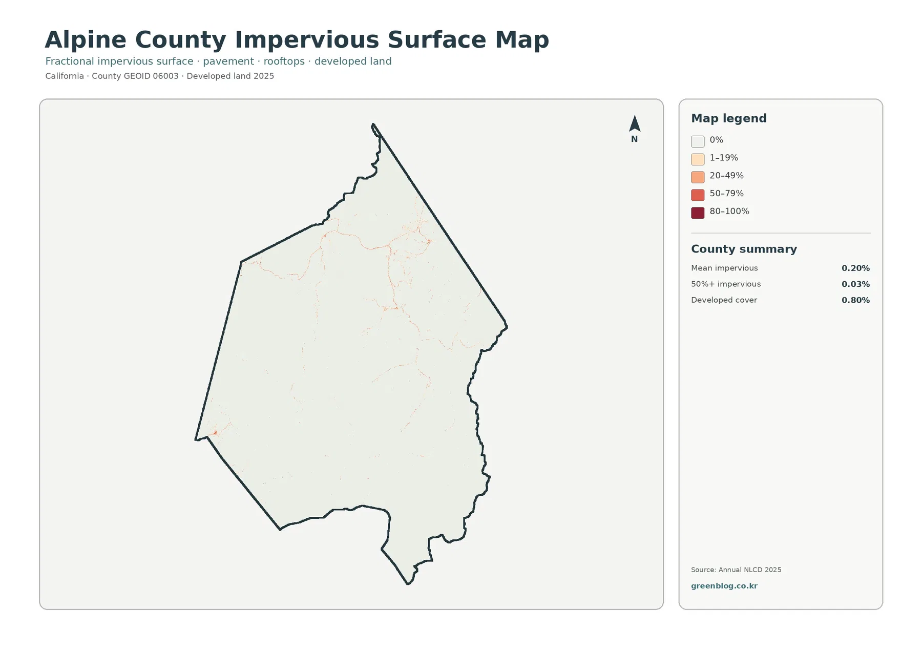
The impervious-surface map is visually very different from the current land-cover image. Most of the county is close to the lightest class, while higher values appear as thin lines and small spots rather than broad red or orange zones. The county summary reports a mean impervious surface of only 0.20%. Areas with at least 50% impervious cover account for 0.03%, and the broader developed land-cover class represents 0.80%.
Those numbers describe related but different measurements. Developed land cover can include permeable ground such as soil, trees, or grass mixed with buildings and roads. Impervious data focus on the share of hard surfaces such as pavement and rooftops within a cell. A location can therefore fall into a developed land-cover class without being mostly impervious, while a narrow road may show up as a thin impervious line through otherwise natural cover. The sparse network visible here is easier to understand when the two layers are compared side by side.
The extremely low countywide values also help prevent a common visual mistake. Small high-value marks can look prominent against a nearly white background even though they represent very little area overall. The correct conclusion is not that those marks are unimportant, but that they are spatially concentrated. They are useful for locating the limited hard-surface footprint, while the current land-cover map remains the better tool for describing the county’s overall surface composition.
The forest-and-farmland view clarifies why open ground should not be mistaken for agriculture
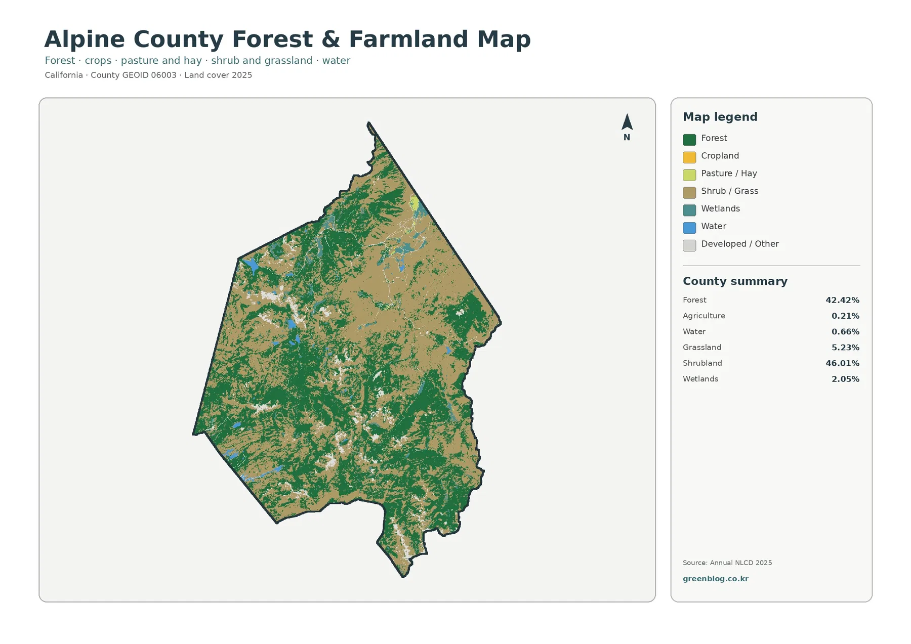
Agriculture accounts for only 0.21% of the county in the supplied 2025 summary. By contrast, shrubland is 46.01% and grassland 5.23%. The simplified forest-and-farmland map makes this difference obvious: broad tan and light green areas represent shrub and grass cover, while agricultural colors occur only in very small patches. A reader who treats every treeless opening as farmland would therefore overstate agriculture by a very large margin.
Forest at 42.42% becomes easier to trace on this version because developed and other cover are visually subdued. The dark green class forms broad masses, narrow connections, and irregular edges against the extensive shrubland background. That shape is useful for comparing wooded and open natural cover without the extra categories in the full land-cover legend competing for attention. Water at 0.66% and wetlands at 2.05% remain visible as smaller features that break the continuity of the two dominant terrestrial classes.
This map is about surface cover, not legal farming status. A cell labeled shrubland, grassland, forest, or agriculture does not establish ownership, zoning, grazing rights, agricultural contracts, or development permission. Those questions belong to current county records and other regulatory sources. The map is most useful for broad landscape comparison: it can show where mapped forest is continuous, where open cover expands, and how little of the county is classified as agriculture in this particular dataset.
The 1985–2025 map reports 18.97% class difference, with forest loss as the largest listed component
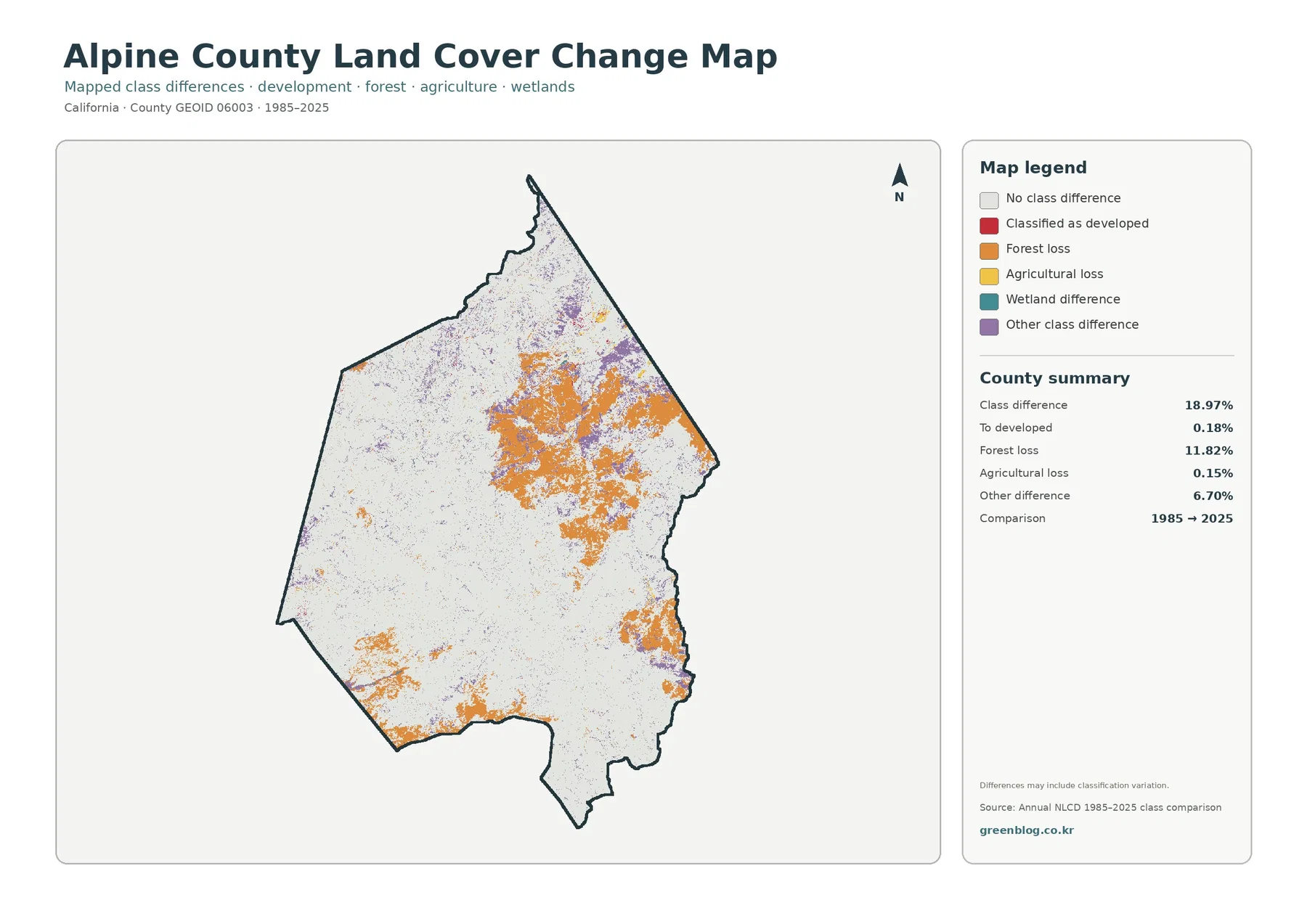
The change map compares classes assigned to the same locations in 1985 and 2025. Its county summary reports 18.97% class difference. Forest loss is the largest listed component at 11.82%, and orange areas form noticeable clusters across parts of the interior, northeast, south, and east. Other class difference accounts for 6.70% and appears in purple patches mixed through several areas. These colors make the change image much busier than the almost blank impervious map, even though the two products answer completely different questions.
Change to developed land is just 0.18%, while agricultural loss is 0.15%. The legend also includes a separate wetland-difference class, although the sidebar summary does not provide a separate percentage for it. For that reason, the 18.97% total should not be reconstructed by assuming that only the four printed component percentages exist. The safest approach is to use the supplied total as the overall class-difference figure and the listed categories as the specific values that the map explicitly reports.
The map also warns that differences may include classification variation. That note is important. A changed class does not prove a specific event such as logging, construction, or a land-management decision. Satellite conditions, mixed pixels, vegetation state, and classification methods can all affect how a cell is labeled. The 11.82% forest-loss value is therefore best treated as a mapped class comparison that identifies areas worth further investigation, not as a final measure of timber harvest or permanent forest conversion.
Current cover and class change should be read in sequence rather than blended into one conclusion
The 2025 map says forest still covers 42.42% of Alpine County. The change map says 11.82% is mapped as forest loss between the comparison years. Both statements can be true because they refer to different measurements. One is a snapshot of the 2025 class assigned to each cell. The other marks cells whose 1985 and 2025 classifications fit a particular change category. Reading the current map first establishes what is present now; the change map can then be used to locate where the two dates differ.
The same rule applies to development. Developed land currently occupies 0.80%, but change to developed is 0.18%. The first percentage describes the 2025 cover class. The second is a two-date transition category. A location that was already developed in 1985 would contribute to current developed cover without appearing as newly developed in the change comparison. Keeping those concepts separate prevents the change layer from being misread as a map of all present development.
Because the comparison uses two endpoints, it also does not reveal the exact year when a class changed. A cell could have changed more than once between 1985 and 2025 and still be represented only by the two endpoint labels. Readers who need a detailed timeline should consult annual data, aerial imagery, or local records. The map’s strongest use is screening: it shows where long-term class differences are concentrated so that more detailed research can be directed to those areas.
Alpine County’s official planning material provides a useful local frame for the sparse developed footprint
Alpine County’s official General Plan Land Use Element describes the county as fundamentally rural and emphasizes natural setting, wide open spaces, public lands, and outdoor recreation among valued community characteristics. A land-cover map is not a planning or zoning map, but the supplied 2025 data provide a compatible visual context: shrubland and forest exceed 88% together, developed cover is 0.80%, and mean impervious surface is only 0.20%. Those figures help explain what a low-density surface pattern looks like in the land-cover classification.
The distinction between the two sources still matters. The General Plan addresses policy, community character, growth, and land-use decisions. Annual NLCD describes mapped surface conditions. A forest pixel does not mean the land is legally protected, a shrubland pixel does not establish a permitted use, and a developed pixel does not document a building permit. The county planning site should be consulted for regulatory questions, while the maps here are better suited to landscape-scale visual comparison.
Choosing the right map depends on whether the task is composition, natural cover, hard surface, or historical comparison
Use the current land-cover map when the main question is what covers the county now. It keeps shrubland, forest, grassland, barren cover, wetlands, water, agriculture, and development in the same legend. The forest-and-farmland view is better when the reader wants to simplify the scene and focus on wooded versus open natural cover, especially because agriculture is such a small class here. For hard-surface questions, the impervious map avoids confusing the broader developed class with pavement and rooftops.
The change map belongs at the end of that sequence. Once the present pattern is understood, the 1985–2025 comparison can show where classes differ and which change categories were assigned. In a classroom, report, or presentation, this order makes the four images function as a set of related questions rather than four decorative versions of one county outline. The legends should remain visible whenever possible because identical or similar colors can carry different meanings from one product to another.
For close inspection, the smaller classes deserve attention even though they contribute little to countywide percentages. Water, wetlands, barren cover, and the limited developed footprint often create useful reference points inside the larger shrubland-and-forest mosaic. When a reader zooms into one part of the county, those minor classes can explain why a local pattern looks different from the county average. Countywide statistics summarize composition; the map shows where that composition actually occurs.
The downloadable JPG maps are 2480×1754 pixels, so large-format printing should be tested first
The ZIP contains one original JPG for 2025 land cover, one for forest and farmland, one for impervious surfaces and developed land, and one for the 1985–2025 change comparison. Each JPG is 2480×1754 pixels. The supplied asset manifest specifically marks that resolution as below its A3 high-resolution reference, so the files should not be advertised as guaranteed high-resolution A3 maps. A test print at the intended size is the best way to confirm whether labels and legend text are sharp enough for a particular use.
The WebP images on the page are useful for quick browsing, while the JPG files provide the larger map images for slides, documents, worksheets, and moderate-size printing. They are finished map graphics rather than raw GIS layers. Anyone who needs to recalculate classes, analyze individual raster cells, or combine the data with parcel geometry should use the official source datasets linked below instead of extracting analytical values from the JPG itself.
Frequently Asked Questions
What are the two largest 2025 land-cover classes in Alpine County?
Shrubland is the largest at 46.01%, followed by forest at 42.42%. Together they exceed 88% of the county, which is why the current map is visually dominated by tan shrubland and dark green forest rather than by development or agriculture.
Does Alpine County have a large impervious or developed footprint in this dataset?
No. Mean impervious surface is 0.20%, the area with at least 50% impervious cover is 0.03%, and developed land cover is 0.80%. Higher impervious values appear mainly as limited thin lines and small concentrations rather than broad zones.
Does 11.82% forest loss mean that the same share was permanently cleared between 1985 and 2025?
Not necessarily. The map is a class comparison and warns that classification variation may be included. The 11.82% value identifies cells assigned to the forest-loss category, but confirming permanent clearing would require additional annual data, imagery, or local records.
Map File Information
The ZIP contains four original JPG maps for Alpine County: 2025 land cover, forest and farmland, impervious surfaces and developed land, and the 1985–2025 land-cover change comparison.
- File Type: ZIP containing four JPG files
Related Maps
- Alameda County California Land Cover Map
- A Craighead County Arkansas Land Cover Map
- Albany County Land Cover Map
Sources and References
Percentages and 1985–2025 values in this article come from the supplied Alpine County map package. The following official sources provide the Annual NLCD classification framework, county boundary data, and county-specific planning context used to interpret the maps carefully.
- MRLC Annual NLCD Data — official access to Annual NLCD land-cover products.
- USGS Annual NLCD Land Cover Classification — explains the land-cover classes used in Annual NLCD products.
- U.S. Census Bureau TIGER/Line Shapefiles — official geographic boundary data used for county mapping.
- Alpine County Planning Division — official county information on planning, maps and GIS, project review, and related programs.
- Alpine County General Plan — Land Use Element — county-specific background on rural community character, open space, and land-use policy.
Green Map creates custom-edited map images using open geographic data sources such as geoBoundaries, Natural Earth, OpenStreetMap, and government open data.
These maps are edited visual materials, not raw data files, and are provided for education, documents, presentations, and graphic reference.