San Mateo County has one of the clearest land-cover contrasts on the California coast. Forest is the largest 2025 class at 36.93%, yet developed cover is close behind at 30.19%. Most of the dense built footprint lies along the northern and bay-facing eastern side of the peninsula, while a broad wooded interior runs through the center and south. Shrubland, which accounts for another 22.49%, is especially important on the coastside and around the edges of the forested uplands.
This page brings together four views of the same county: current land cover, forest and farmland, impervious surface with developed land, and a 1985–2025 class comparison. The four original JPG maps are available in one ZIP download below, while the WebP previews make it easier to compare patterns on the page. Using the set together helps separate the size of the urban footprint from its hard-surface density, and it keeps forest, agriculture, wetlands, and mapped change from being treated as the same kind of information.
Table of Contents
A peninsula with a dense bayside edge and a wooded interior
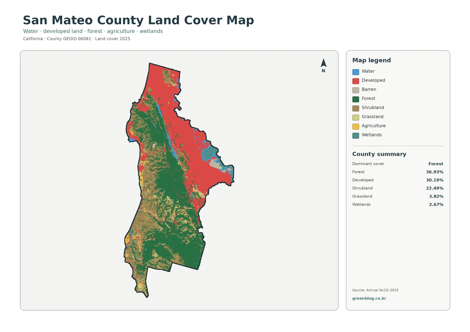
The current land-cover map is dominated by two very different shapes. Red developed cover forms a broad band in the north and along the eastern side facing San Francisco Bay. Green forest occupies much of the central interior and continues into the southern half of the county. Those areas are close to one another on the peninsula, but they are not evenly mixed. The result is a strong east-to-interior contrast rather than a countywide urban pattern.
Forest reaches 36.93% of the mapped county, making it the largest single class. Developed cover is 30.19%, so the two leading classes together account for a large share of the map. Their similar percentages can be misleading if the location is ignored: the forest is concentrated in a long interior block, whereas development is much more continuous on the bayside. A chart of percentages would not reveal that separation nearly as clearly as the map does.
Shrubland covers 22.49% and fills much of the coastside and the transitions around wooded areas. Grassland is smaller at 3.82%, and wetlands account for 2.67%. Water appears as a separate class, most visibly around the bay margin and smaller coastal features. These classes keep the western half of the county from reading as one uninterrupted forest. Instead, wooded land, shrub cover, small open areas, water, and limited development alternate across a relatively narrow peninsula.
San Mateo County Parks describes its system as spanning coastside marine settings, a bayside recreation area, coastal mountain woodlands, and urban sites. That official description is useful context for the variety visible in the land-cover map. It does not mean every forest cell is parkland, however. The map classifies the surface observed by the land-cover dataset; it does not show park ownership, conservation status, zoning, or parcel boundaries.
Impervious surface separates urban footprint from urban density
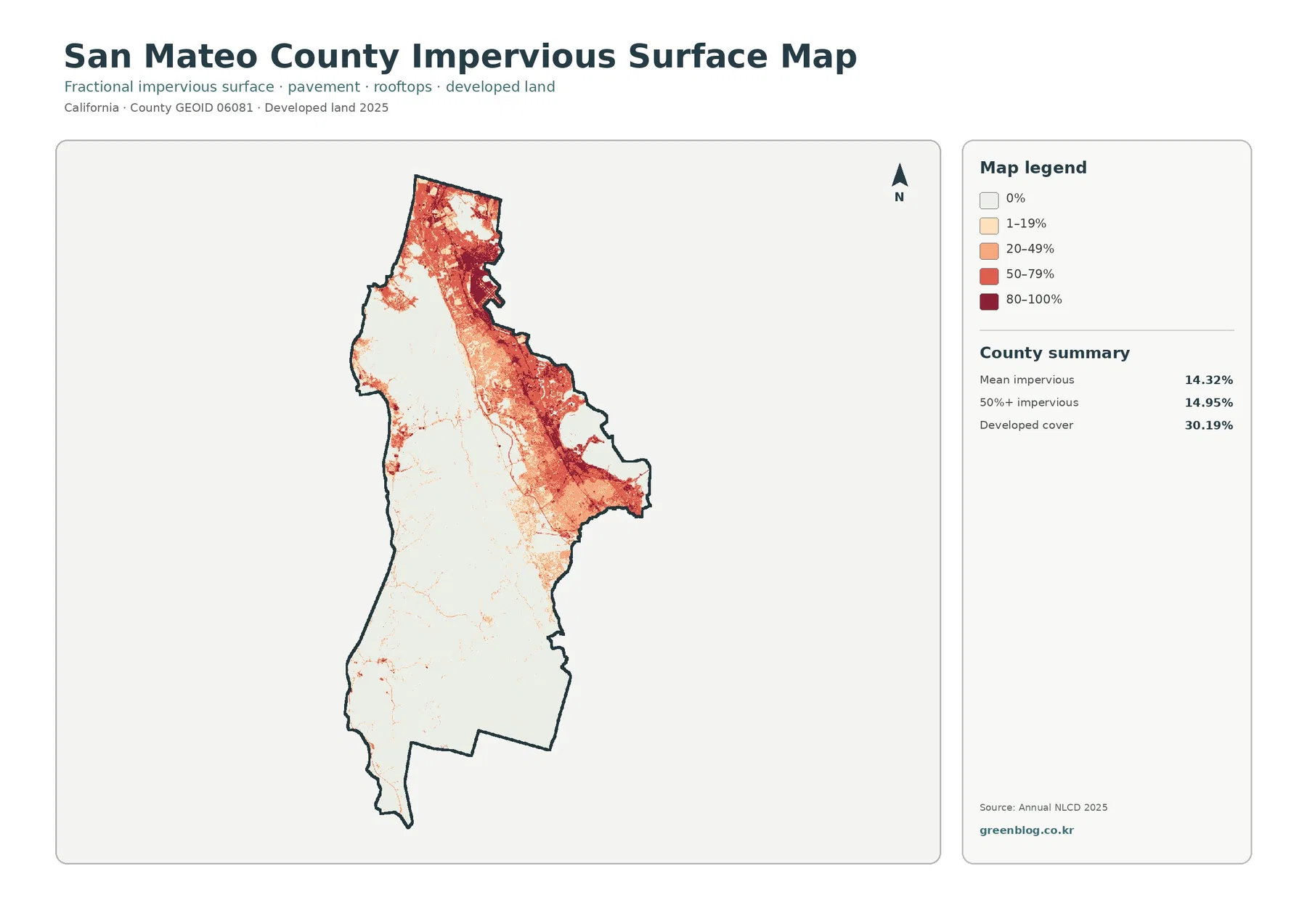
The impervious map asks a narrower question than the red developed class on the first map. Impervious surface means rooftops, pavement, parking lots, and other hard surfaces that do not readily absorb water. San Mateo County has a countywide mean impervious value of 14.32%. Areas where impervious cover reaches at least 50% occupy 14.95% of the mapped county, while the broader developed-cover class covers 30.19%. The difference between those numbers is expected because developed land can also contain lawns, trees, soil, and other permeable surfaces.
High values cluster strongly in the north and along the bay-facing east. Darker 50–79% and 80–100% cells form connected patches inside the larger urban belt, while lighter 1–19% and 20–49% areas spread around them. That internal variation is important. Two neighborhoods can both fall within a developed land-cover class even though one has far more pavement and roof area than the other. The impervious layer provides a better first look at that density difference.
The wooded center and much of the southern interior remain very light, which creates an especially sharp contrast with the bayside. On the Pacific side, hard-surface clusters are smaller and more separated. This does not prove that a particular road or city caused a nearby pattern; the map only shows where built surfaces are concentrated. Transportation history, population growth, development approvals, and drainage systems require other records.
Impervious cover is often useful in watershed or stormwater studies, but it should not be treated as a flood-hazard map. Runoff also depends on rainfall, slopes, soils, drainage infrastructure, stream conditions, and coastal processes. A dark cell means a high share of hard surface within the mapped grid, not a measured flood probability. For hazard work, combine this layer with current hydrology and official risk mapping rather than drawing a direct conclusion from color alone.
Forest and coastside agriculture need different measures
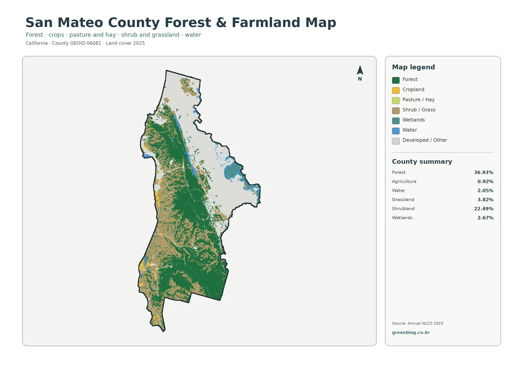
Removing most of the urban detail makes the forest pattern even more obvious. Green cover runs through the center and south as a broad, connected interior zone, with additional wooded patches toward the northwest. The forest-and-farmland map is therefore useful when the question is not where cities are, but where wooded land remains continuous and where open or cultivated cover interrupts it. The eastern urban belt fades into the light background instead of competing for attention.
Mapped agriculture is only 0.92%. Yellow agricultural cells appear mainly in limited coastside and southwestern locations rather than as a large inland farming block. That figure should not be used as a percentage of the county agricultural economy or of every acre managed by a farm. Annual NLCD classifies visible surface cover, while agricultural reports count production, commodities, and economic value under a different system. Greenhouses, facilities, grazing areas, and mixed operations do not necessarily translate into one large yellow land-cover class.
The county’s 2024 Agricultural Crop Report illustrates why that distinction matters. It reported total agricultural production of $106.488 million and covered vegetables, flowers and nursery products, fruit and nut crops, wine grapes, livestock, and other commodities. Brussels sprouts, pumpkins, and leeks were listed among the leading vegetable commodities. Those facts describe the agricultural sector, not the spatial share of the NLCD Agriculture class. A small yellow footprint can coexist with an economically important coastside agricultural industry.
Water is 2.05% and wetlands are 2.67% in the simplified map. Their blue and teal cells are limited in area but useful when comparing the bay edge, the Pacific coast, and the boundaries of developed land. Small percentages can still matter locally because wetlands and water tend to occur in specific shoreline or low-lying settings rather than being spread evenly through the county. For site-level wetland boundaries, however, a dedicated wetland inventory is more appropriate than this generalized land-cover layer.
The 1985–2025 map is mostly stable, but not empty
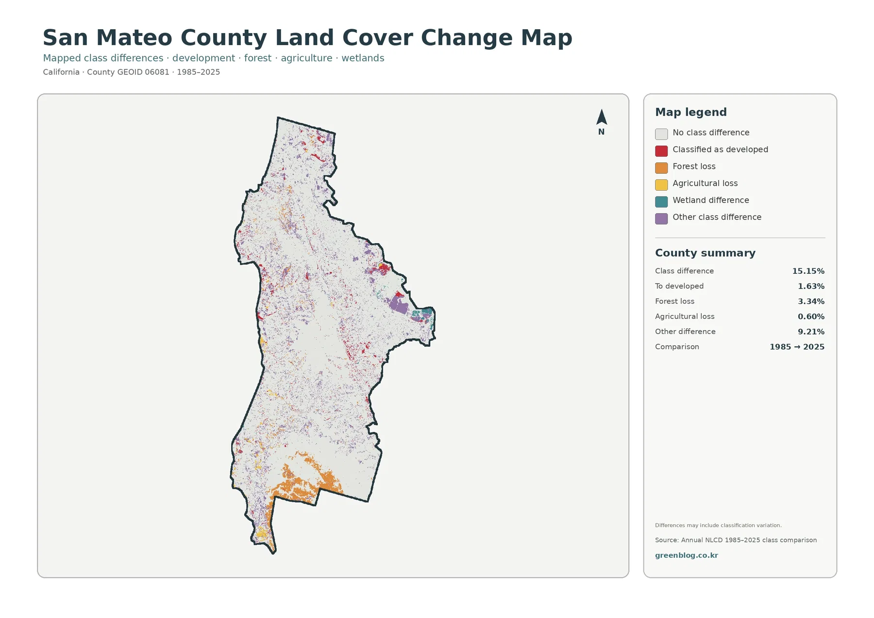
The endpoint comparison marks 15.15% of the county as a class difference between 1985 and 2025. Most of the map remains in the no-difference category, so the correct starting point is stability rather than wholesale transformation. Within the changed cells, 1.63% is categorized as to developed, 3.34% as forest loss, 0.60% as agricultural loss, and 9.21% as other class difference. The largest category is therefore not new development but a collection of other classification changes.
Cells categorized as to developed are most noticeable around the established northern and eastern urban pattern, with smaller scattered patches elsewhere. The 1.63% value is not a building-permit total or a direct measurement of all land developed during forty years. It means the endpoint land-cover classifications differ in a way grouped into the developed category. A precise development history would need intermediate imagery, parcel records, and local planning information.
Forest-loss cells are visually prominent in parts of the southern and southwestern county and occur in smaller patches through the wooded interior. The map does not identify the cause. Vegetation condition, fire, clearing, classification boundaries, image timing, and mixed pixels can all affect an endpoint comparison. A colored patch can identify a place worth investigating, but it cannot by itself establish whether the underlying process was logging, development, disturbance, or another change.
Other class difference, at 9.21%, deserves special caution because it groups multiple kinds of transitions. A purple or otherwise grouped difference may represent a shift among shrub, grass, wetland, water, barren, or other mapped classes rather than a single environmental trend. If a particular coastside or bayside patch is important, reviewing multiple Annual NLCD years is more informative than treating the 1985 and 2025 endpoints as a complete timeline.
Choosing the right pair of maps for a San Mateo question
For urban questions, pair current land cover with impervious surface. The first map locates the broad developed footprint; the second shows where hard surfaces are most concentrated within it. This is especially effective on the bayside, where a large red developed belt contains several levels of impervious intensity. The combination avoids describing every developed cell as equally dense.
For natural-resource context, pair current land cover with the forest-and-farmland map. The wooded peninsula interior, shrub-dominated coastside areas, small agricultural pockets, water, and wetlands become easier to compare once the dense urban detail is muted. The county parks page can provide local context for coastal, bayside, woodland, and urban settings, but the park system should remain a separate layer because its boundaries are not encoded in these maps.
For agriculture, place the forest-and-farmland map beside the county Crop Report rather than trying to make one source answer both questions. The map tells you where the surface was classified as agriculture in 2025. The report tells you what the local agricultural sector produced and its economic value. Keeping those measures separate is particularly important in San Mateo County, where the mapped Agriculture class is only 0.92% even though coastside farming remains a documented part of the county economy.
For long-term comparison, use the current map and the 1985–2025 difference map at the same scale. The current forest block can be compared with forest-loss cells, the bayside urban belt with to-developed cells, and shoreline areas with other differences. If the purpose is to make a claim about trend or cause, add intermediate Annual NLCD years and local records. Two endpoint maps can locate differences, but they cannot show every transition that happened in between.
Map File Information
The download ZIP contains four original JPG maps for San Mateo County: current land cover, forest and farmland, impervious surface with developed land, and the 1985–2025 land-cover comparison. Each image uses the same county boundary, which makes it straightforward to match the bayside urban belt, the wooded interior, coastside open cover, shoreline features, and mapped class differences from one view to the next.
Each source JPG is listed in the asset manifest at 2480 by 1754 pixels. The files are marked as the original supplied resolution, but the manifest does not mark them as meeting an A3 high-resolution reference. For large printing, check the legends and small change cells at the intended output size before final use. Enlarging a JPG cannot create detail beyond the underlying land-cover classification or make a generalized 30-meter raster behave like a parcel map.
What a 30-meter land-cover map cannot decide
Annual NLCD is a raster product derived from Landsat imagery at approximately 30-meter spatial resolution. In plain terms, the county is divided into grid cells and each cell receives a broad land-cover classification. A single cell may contain trees, a road edge, a yard, part of a building, and bare ground. That mixed-pixel effect is one reason mapped class boundaries do not follow surveyed parcels, narrow roads, or every shoreline feature exactly.
Land cover is also different from zoning, ownership, municipal boundaries, and development rights. San Mateo County’s Local Coastal Program, for example, addresses planning policies and coastal development permits in the unincorporated Coastal Zone. The land-cover map does not contain those rules. A forest cell is not proof that development is prohibited, and a developed cell does not establish what additional construction is legally allowed. Property questions require county or city planning and parcel records.
The 2025 layer is a snapshot of its mapping year. Later construction, vegetation disturbance and recovery, crop cycles, or shoreline changes may not appear. The 1985–2025 difference layer has a related limitation: class differences can reflect real surface change, but classification variation and image conditions can contribute as well. Use current imagery for present conditions and multiple Annual NLCD years when the question is about a sustained trend.
Frequently Asked Questions
Why does developed cover reach 30.19% while mean impervious cover is 14.32%?
Developed land classes include both hard and permeable surfaces. A developed cell can contain rooftops and pavement together with lawns, trees, yards, or soil. The impervious layer measures the hard-surface fraction more directly, so the countywide mean can be much lower than the total share classified as developed. The two values describe related but different properties of the urban landscape.
Does 0.92% mapped agriculture mean farming is unimportant in San Mateo County?
No. The 0.92% figure is the share classified as agricultural surface cover in this land-cover dataset. The county Crop Report measures production and economic activity and documents vegetables, flowers, fruit, wine grapes, livestock, and other commodities. Land-cover area and agricultural economic importance should not be treated as the same measure.
Does the 15.15% class difference equal permanent land change?
Not necessarily. It means the 1985 and 2025 endpoint classifications differ across 15.15% of the mapped area in this comparison. Real change can be part of that result, but vegetation condition, mixed pixels, image timing, and classification variation can also matter. Confirm a permanent or causal change with intermediate years and local evidence.
Map File Information
Download the four original San Mateo County land-cover JPG maps together in one ZIP file.
- File Type: ZIP containing four JPG files
Related Maps
- Alameda County California Land Cover Map
- Alpine County California Land Cover Map
- Amador County California Land Cover Map
Sources and official references
These official sources provide the data and local context used to read the maps: Annual NLCD land-cover and impervious products, county boundary data, San Mateo County park settings, agricultural reporting, and coastal planning. They answer different questions, so surface classification should not be substituted for park ownership, agricultural production, or legal land-use regulation.
- MRLC Annual NLCD Data — Annual NLCD land-cover and related data products
- USGS Annual NLCD Land Cover Classification — 30-meter land-cover classes and classification background
- U.S. Census Bureau TIGER/Line Shapefiles — county boundary reference data
- San Mateo County Parks Department — official context for coastside, bayside, woodland, and urban park settings
- San Mateo County Agricultural Crop Report — annual agricultural production and commodity reporting
- San Mateo County Local Coastal Program — coastal planning policies and development-permit context
Green Map creates custom-edited map images using open geographic data sources such as geoBoundaries, Natural Earth, OpenStreetMap, and government open data.
These maps are edited visual materials, not raw data files, and are provided for education, documents, presentations, and graphic reference.