Montgomery County stretches along New York’s Mohawk River, where farmland fills much of the valley and developed areas cluster around Amsterdam and smaller river communities. Four maps on this page separate the county’s current cover, forests and farms, impervious surfaces, and mapped class differences from 1985 to 2025.
You can inspect each WebP preview below, then download the four original JPG maps together in one ZIP. The set works well for classroom activities, regional reference, reports, and presentations that need a clear county outline and a readable legend.
Table of Contents
A county organized around the Mohawk Valley
The Mohawk River supplies the easiest reference line for reading all four maps. It winds eastward through the long middle section of the county. Agriculture spreads widely on both sides, while developed cover follows the river communities and becomes especially broad at Amsterdam in the east. Larger forest blocks sit away from the main valley, most noticeably across the southeastern and south-central parts of the county. This arrangement makes the area useful for comparing a settled transportation corridor with working farmland and wooded uplands without leaving one county boundary.
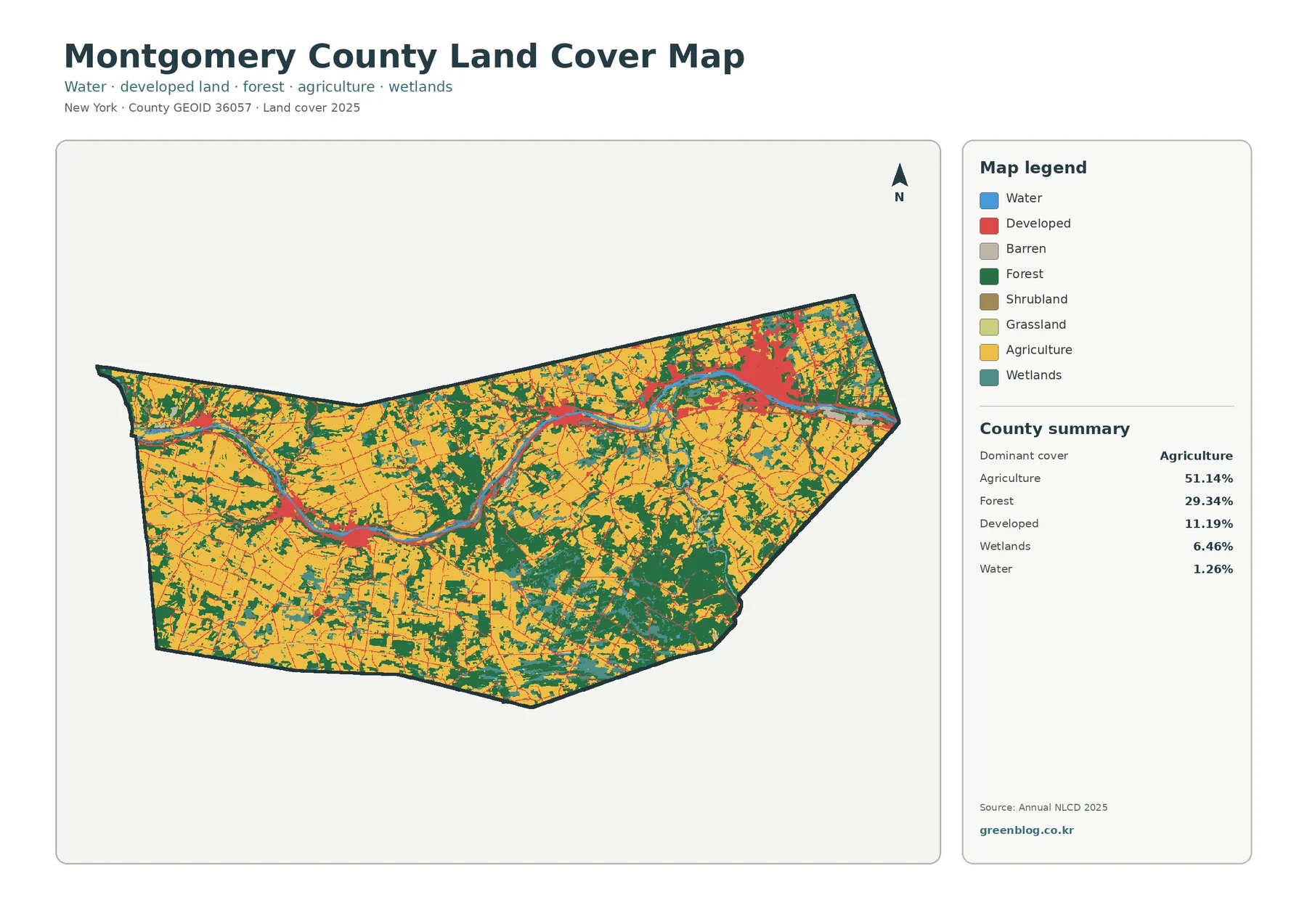
The 2025 summary identifies agriculture as the dominant cover at 51.14 percent. Forest accounts for 29.34 percent, developed land for 11.19 percent, wetlands for 6.46 percent, and water for 1.26 percent. These figures describe classified ground cover within the mapped boundary. They are not parcel acreages, agricultural-district totals, or zoning statistics. A field may be mapped as agriculture whether or not it belongs to a designated agricultural district, and a wooded property may have any number of owners or legal uses.
Land cover answers a visual question: what appears to be on the ground at the dataset’s scale? Satellite observations and classification methods place each raster cell into a category such as forest, crops, water, wetland, or developed land. Land use answers a different question about how people use or regulate a place. Keeping that distinction in mind prevents a broad environmental map from being mistaken for a survey, property map, or development approval document.
What the full land-cover map reveals
Yellow agricultural cover forms the largest continuous visual theme. It fills much of the western half, appears extensively north of the river, and surrounds many forest patches in the center. The pattern is not a single uninterrupted field. Green woodland, teal wetland, local roads, and settlements break it into irregular pieces. That detail matters because a countywide percentage can suggest uniformity even when the map records a fine-grained rural mixture.
Forest becomes more prominent toward the southern edge and creates a particularly broad cluster in the southeast. Smaller wooded areas also cross the west and north, often beside or between agricultural cover. The general map therefore provides more than a simple farm-versus-forest split. It shows where the two covers meet, where wetlands interrupt them, and where the river corridor introduces water and development into the same landscape.
Developed land is concentrated rather than evenly scattered. Amsterdam produces the largest red area near the eastern end of the river corridor. Fonda and Fultonville in the central valley, along with Canajoharie and Fort Plain farther west, correspond to smaller clusters. Thin developed traces extend beyond these centers along local routes. This is an association visible in the map, not proof that a particular road caused growth. Transportation, settlement history, topography, and many local decisions can all contribute to the present pattern.
Separating wooded hills from farm country
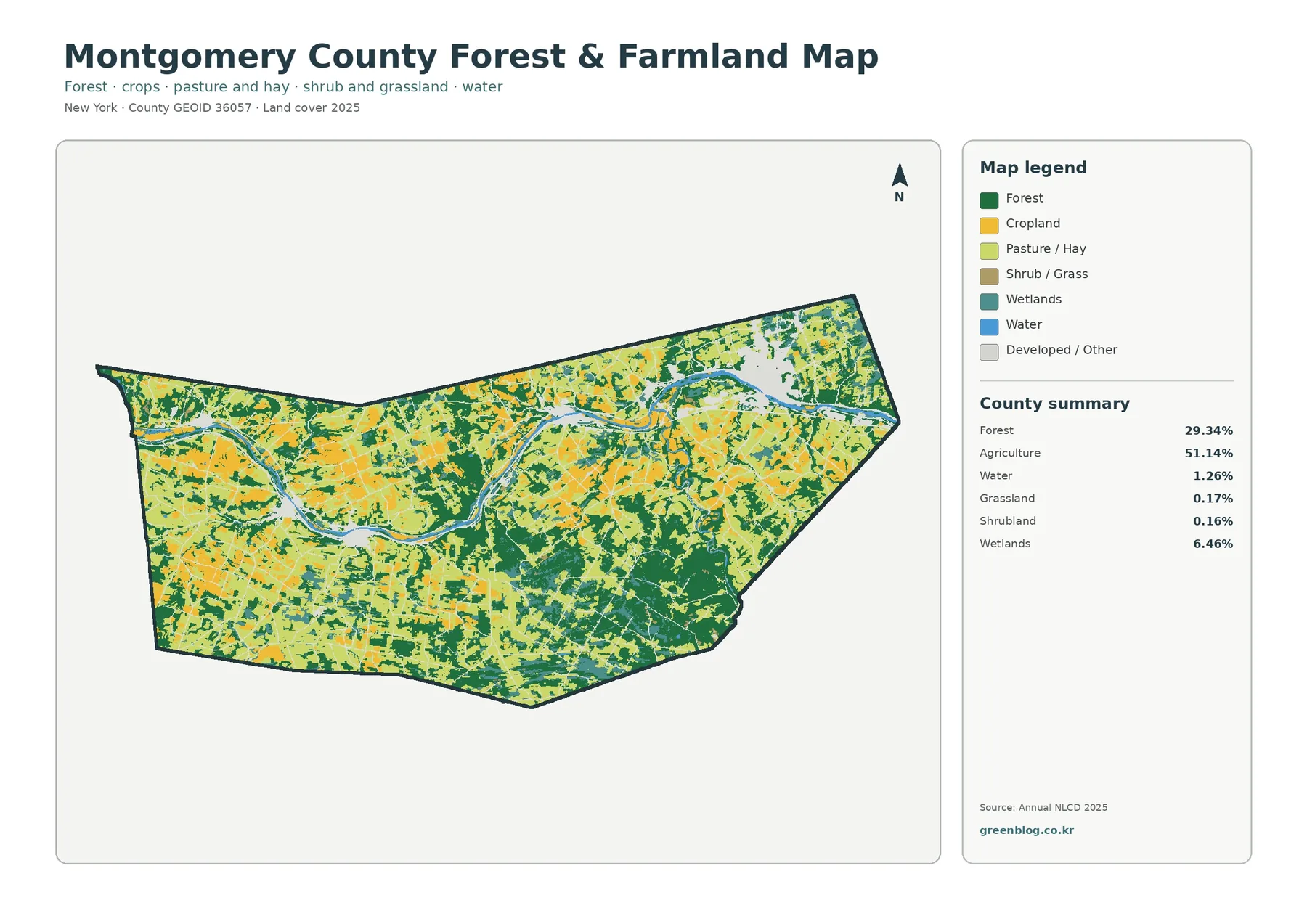
The forest and farmland view removes much of the visual competition from developed classes. Cropland, pasture or hay, forest, shrub and grass, wetlands, and water remain distinct, while developed and other surfaces share a neutral background. The simplified palette makes the broad agricultural area easier to follow across the county. It also shows that farmland extends well beyond the narrow riverbank and occupies large northern, central, and western sections.
Dark green forest is most continuous south and southeast of the Mohawk. It does not stop at a clean boundary. Fingers and patches of woodland alternate with agricultural colors, particularly through the middle of the county. Those irregular edges are useful for habitat discussions because they indicate where larger woods give way to a more fragmented farm landscape. The map cannot identify tree species, forest age, management status, or habitat quality, but it can help select areas for closer study.
The companion summary lists grassland at 0.17 percent and shrubland at 0.16 percent. At a full-county scale, categories this small may be hard to distinguish without enlarging the image. Wetlands, at 6.46 percent, are more substantial and appear as narrow or irregular features among farms and forests. Water covers only 1.26 percent by area, yet the river remains a powerful locator because its long shape crosses so much of the county. Area share and geographic importance are not always the same thing.
Impervious surfaces pinpoint the settled corridor
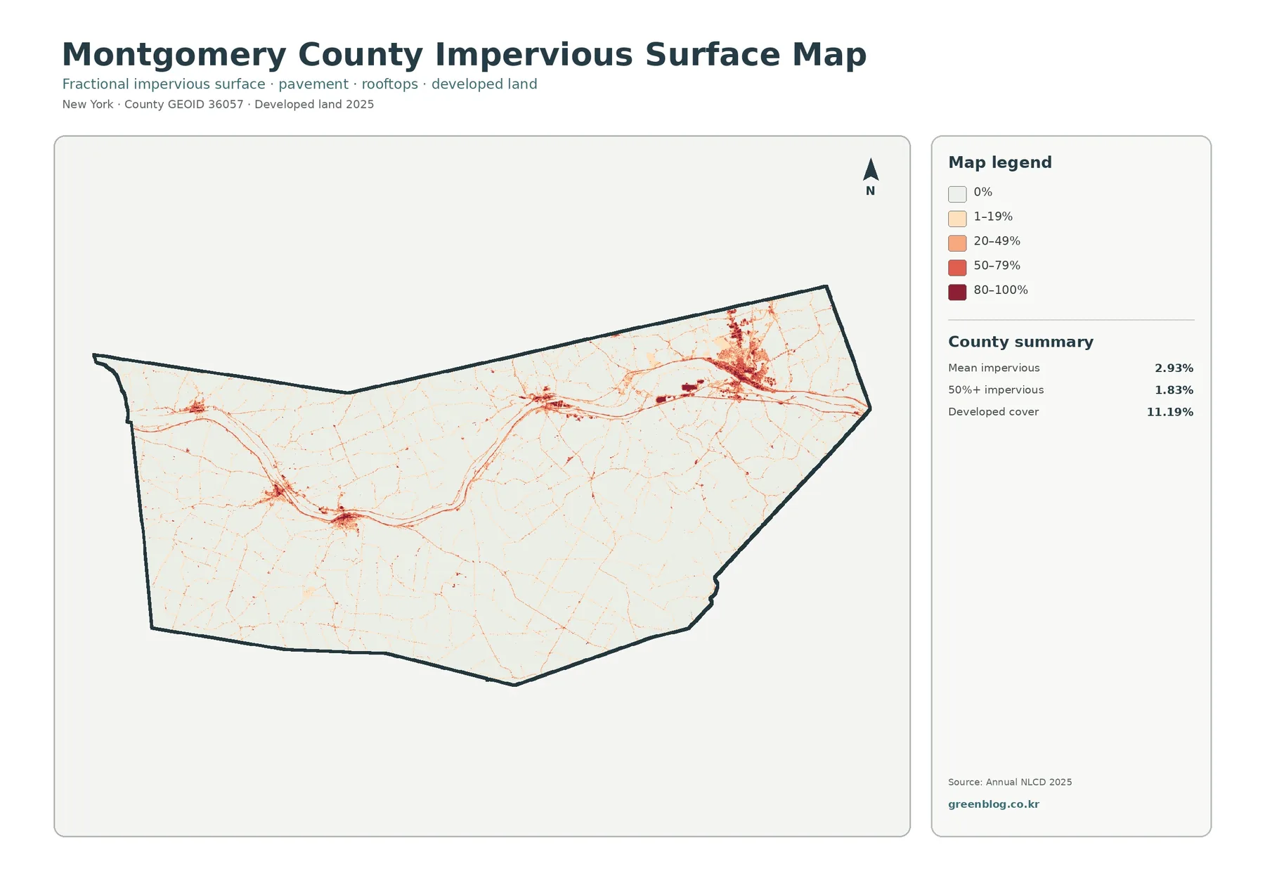
An impervious surface is a roof, paved road, parking area, or similar surface that does not readily absorb water. Instead of assigning one developed-land class, this map estimates how much of each cell is impervious. Its legend ranges from zero through 1–19, 20–49, 50–79, and 80–100 percent. Pale tones mark cells with little pavement or roofing; deeper reds identify places where hard surfaces occupy much more of the ground.
Amsterdam stands out immediately as the county’s largest and darkest concentration. A narrower series of lines and nodes continues west along the valley. Central and western river communities create smaller concentrations, while rural roads appear as fine traces through otherwise light areas. Most of the wooded southern section remains white or very pale. This stripped-down view communicates the difference between a dense urban center, compact villages, dispersed rural buildings, and land with little mapped impervious cover.
The countywide mean is 2.93 percent impervious, and cells with at least 50 percent impervious cover account for 1.83 percent. Neither figure should be expected to match the 11.19 percent developed-land share. A low-density residential cell can include lawns, trees, and a building, so it may qualify as developed cover while containing only a modest amount of pavement and roof area. That distinction helps when discussing stormwater: developed context and hard-surface concentration are related measures, but they are not interchangeable.
This map can guide an initial conversation about runoff, stream buffers, or urban growth, especially when paired with the river and wetland pattern. It does not display storm drains, culverts, soil infiltration, slope, or flood elevations. A dark cell is therefore not a flood-risk verdict, and a light cell is not proof of safety. Site-scale work requires current engineering, soil, elevation, and drainage information.
Reading the 1985–2025 comparison cautiously
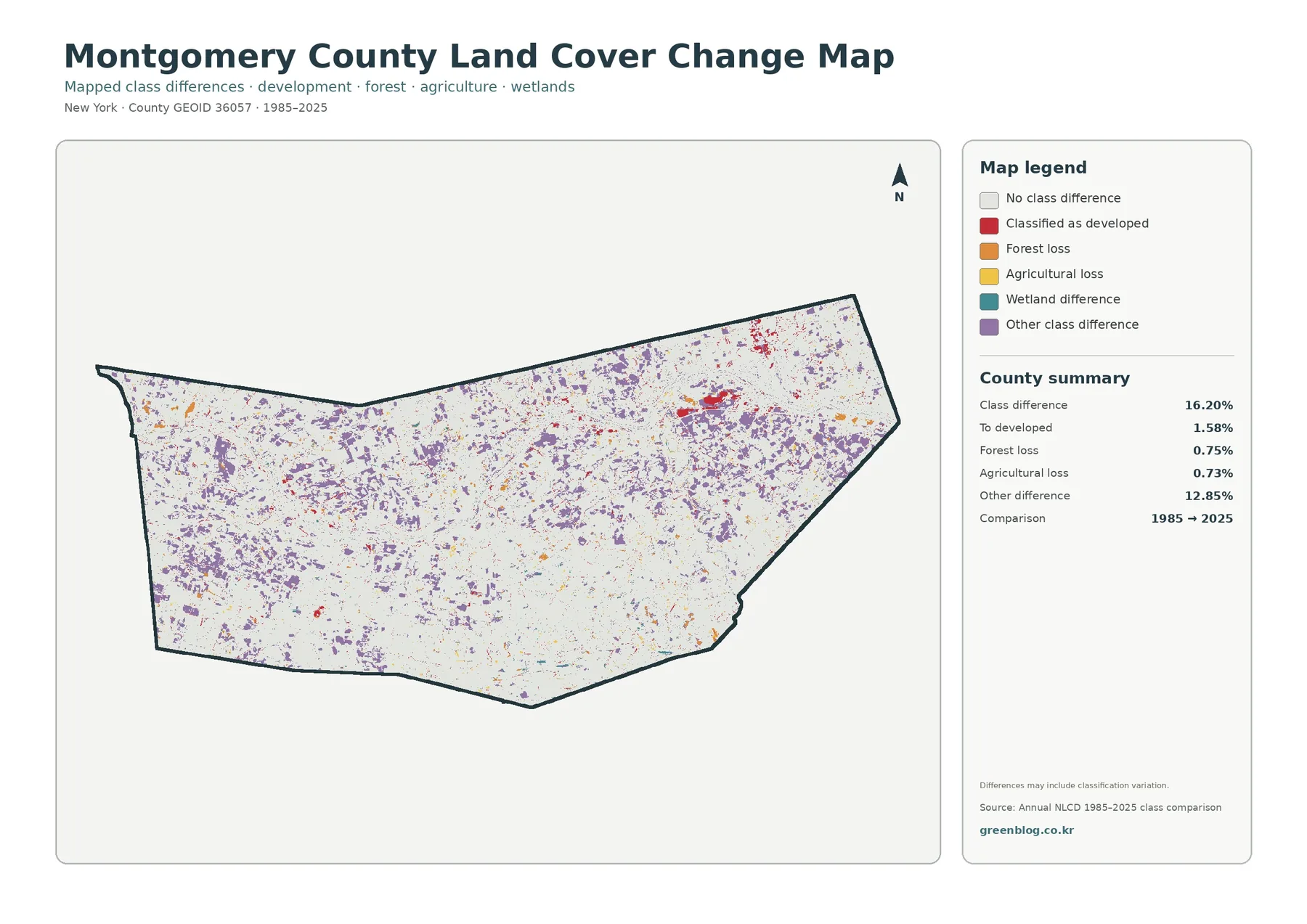
The change view compares mapped classes in 1985 and 2025. White means no class difference, red marks areas classified as developed by the later date, orange identifies forest loss, yellow identifies agricultural-cover loss, teal records a wetland difference, and purple groups other class differences. The summary reports some type of class difference across 16.20 percent of the county. Most of that total—12.85 percent—is in the broad “other difference” category.
Areas classified as developed account for 1.58 percent of the comparison. The most visible red cluster lies around Amsterdam and the eastern river corridor, with smaller patches near other settled places. Forest loss is listed at 0.75 percent and agricultural loss at 0.73 percent. Their orange and yellow marks are scattered rather than forming one countywide front. That distribution supports local follow-up, but it does not by itself explain whether a difference came from construction, harvest, field rotation, regrowth, weather, or classification behavior.
A four-decade comparison combines genuine surface change with possible differences in sensors, source imagery, and classification rules. Mixed cells near forest edges, wetlands, narrow roads, or small fields can switch classes even when the ground changed only slightly. For that reason, the map footer warns that the displayed differences may include classification variation. Treat colored areas as places to investigate, then compare historical aerial photographs, local records, and the original annual datasets before drawing a site-specific conclusion.
A practical sequence for comparing the maps
Begin with the full land-cover map and identify three anchors: the Mohawk River, the Amsterdam developed area, and the large southeastern forest. Once those locations are familiar, move to the forest and farmland map. The simplified version makes it easier to follow agricultural cover across the valley and see how woodland becomes more continuous toward the southern edge.
Next, find the same settled areas on the impervious map. A developed category in the first map does not necessarily produce a dark red surface in the third. Comparing them reveals where developed land contains substantial hard surface and where lower-density development retains more vegetation. Finish with the change map, checking whether present-day developed clusters overlap red comparison areas or mostly remain white.
Always read the legend again when moving between images. Red means current developed cover in the general map, a range of impervious intensity in the surface map, and a class change to developed in the comparison map. Green likewise changes meaning depending on the selected product. Matching a color without matching its legend is one of the easiest ways to reach the wrong conclusion.
For a classroom exercise, students can trace the river, outline the largest farm and forest areas, and then mark high-impervious centers on a separate sheet. A second activity can compare the 16.20 percent total difference with the 1.58 percent developed figure. This shows why a broad change statistic should not be presented as a single kind of change. It also introduces the idea that map categories summarize complex ground conditions.
Choosing a map for reports, lessons, and local reference
Use the general map when a report needs the widest environmental overview. It places water, wetlands, development, agriculture, and forest in one frame and includes the principal percentage summary. The forest and farmland map is better for a lesson or presentation centered on rural landscapes. Its limited palette keeps attention on the county’s two dominant covers while retaining water and wetlands for context.
The impervious product is the strongest choice for an introductory discussion of development intensity or stormwater. It highlights compact centers and connecting routes that can be difficult to separate in the multicolor map. The historical comparison belongs in work that explicitly addresses time. Because the purple “other difference” class is so large, any presentation using it should explain the legend rather than labeling every colored pixel as loss or urbanization.
County planning materials note the importance of agricultural districts and natural-resource conservation, while the county’s economic profile describes Interstate 90 as running through the county. Those local contexts help explain why the agricultural landscape and the settled river corridor deserve attention. They do not convert this land-cover product into an official agricultural-district or highway map. Use the linked county sources when legal boundaries, programs, or transportation details are the actual subject.
Download the four original JPG maps
The ZIP contains one original JPG for each subject: general land cover, forest and farmland, impervious surface and developed land, and land-cover class differences from 1985 to 2025. Every image includes its own county outline, north arrow, legend, source year, and numerical summary. You can select one image for a slide, print several for side-by-side comparison, or keep the complete set with a research folder.
The on-page WebP files are optimized for quick preview, while the downloadable JPGs preserve the source image dimensions supplied with the map package. Keep the 2025 date and the 1985–2025 comparison period visible when you crop or place the maps in another document. If you plan to republish them, review the underlying data providers’ attribution and use guidance as well.
Scale, classification, and other limits
Annual NLCD products generally classify the landscape in 30-meter raster cells. A raster cell is simply a square unit in a grid. One cell can contain a house, lawn, trees, and part of a road, yet the land-cover layer must assign a representative class. These mixed pixels simplify narrow streams, small buildings, field edges, and thin woodland strips. The maps are appropriate for county and community patterns, not for locating a legal boundary on an individual property.
The mapped year is another practical limit. Construction, tree removal, crop rotation, flooding, or regrowth after the observation period may not appear. Seasonal water and recently harvested fields can also look different depending on image timing. For decisions involving a specific site, combine the land-cover view with current aerial imagery, field inspection, parcel records, soils, elevation, and any relevant municipal or county documents.
Percentages should be cited with their subject and year. “Agriculture 51.14 percent” refers to the 2025 classified cover in this map, while “1.58 percent to developed” belongs to the 1985–2025 comparison. Mixing those figures would combine a present-day share with a change category. Clear labels make the maps more useful and keep a visual summary from becoming an unsupported claim.
Frequently Asked Questions
What is the dominant land cover in Montgomery County?
Agriculture is the largest 2025 class at 51.14 percent. Forest follows at 29.34 percent. Agricultural colors cover much of the western, northern, and central county, while the largest continuous woodland areas appear south and southeast of the Mohawk Valley.
Why is developed cover 11.19 percent when mean imperviousness is only 2.93 percent?
Developed cover describes a broader landscape class that can include vegetation around buildings. Imperviousness measures the fraction occupied by hard surfaces such as roofs and pavement. A low-density neighborhood may be classified as developed while most of its cell remains lawn or trees, so the two countywide values measure different things.
Does the 16.20 percent class difference represent urban growth?
No. The 16.20 percent figure includes every mapped class difference between 1985 and 2025. Only 1.58 percent is labeled as classified to developed, while 12.85 percent falls in the other-difference group. Some differences may also reflect classification variation, so detailed claims require additional evidence.
What files are included in the download?
The ZIP includes four original JPG images: the complete land-cover map, the forest and farmland map, the impervious/developed-land map, and the 1985–2025 change map. The WebP images in the article are previews; use the JPG files for printing, presentation layouts, or offline reference.
Map File Information
Get the four original JPG maps—general cover, forest and farmland, impervious surface, and the 1985–2025 class comparison—in one ZIP.
- Included Files: Use only the versions confirmed in the article and supplied images
- File Type: Use the confirmed download contents
- Intended Use: Printing, education, presentations, and map-based projects
Related Maps
- Albany County Land Cover Map
- Allegany County New York Land Cover Map
- Bronx County New York Land Cover Map
Sources and references
- MRLC Annual NLCD Data — official access and product information for national land-cover datasets
- USGS Annual NLCD Land Cover Classification — class definitions and interpretation guidance
- U.S. Census Bureau TIGER/Line Shapefiles — county boundary data
- Montgomery County Planning Services — county agricultural-district and natural-resource planning information
- Montgomery County Economic Profile — official county context for transportation and local industries
Green Map creates custom-edited map images using open geographic data sources such as geoBoundaries, Natural Earth, OpenStreetMap, and government open data.
These maps are edited visual materials, not raw data files, and are provided for education, documents, presentations, and graphic reference.