Ventura County has a land-cover pattern that changes quickly from rugged interior uplands to farmed valleys and heavily developed lowlands near the coast. The 2025 maps on this page separate those surfaces into four views: general land cover, forest and farmland, impervious surface, and a 1985–2025 land-cover comparison. Together they make the county’s strong north-to-south contrast much easier to see.
The four original JPG maps are available in one download after the map explanations. The WebP images in the article are useful for quick viewing, while the JPG files are better when you need a larger reference image for a class handout, presentation, printed comparison, or a closer look at small patches along the agricultural and urban edges.
Table of Contents
Shrubland Defines Most of the County Before the Cities Come Into View
Shrubland is the dominant 2025 class at 59.52 percent. That single figure matters because it prevents a common first impression of Ventura County as mainly an urban and agricultural coastal county. Developed cover accounts for 11.99 percent, grassland 10.67 percent, forest 9.11 percent, and agriculture 6.38 percent. Wetlands make up 1.42 percent and water 0.44 percent. Barren land is present in the legend, but the map summary does not supply a separate exact percentage, so it should not be estimated from the image.
The broad tan-brown shrubland color fills much of the northern interior and continues through large parts of the central and southern mountains. Forest appears as darker green patches, with a stronger presence in the northern uplands and scattered areas farther south. Grassland creates lighter open areas between those two covers. The result is a varied mountain landscape rather than one continuous block of forest.
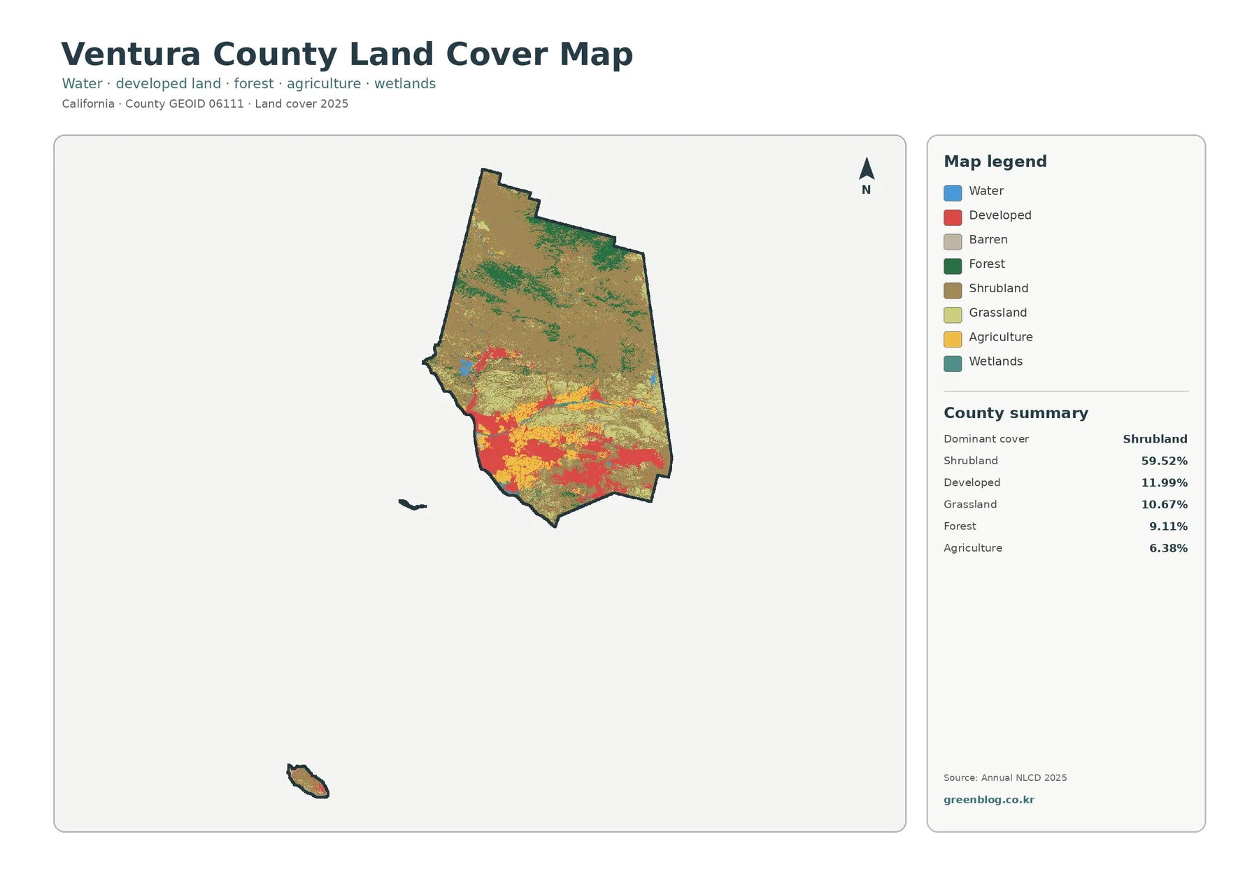
The developed class has a very different shape. Red areas cluster along the southwestern lowlands, spread across several southern population centers, and form smaller connected patches through inland valleys. The map itself does not label individual cities, so city names should not be read directly from the pixels. County planning information, however, places major communities such as Oxnard, Ventura, Camarillo, Thousand Oaks, and Simi Valley in the same broad lowland and southern areas where developed cover is most visible.
Water and wetlands occupy only a small share of the county by area, yet they are useful landmarks when the map is enlarged. Narrow blue or blue-green features appear near the coast, river corridors, and several inland locations. Because these classes can be only a few pixels wide at the county scale, the downloadable JPG is more useful than the reduced preview when the goal is to compare a small wetland or water feature with nearby agriculture or development.
The Farm Pattern Is Concentrated, Not Countywide
Agriculture represents 6.38 percent of the 2025 land-cover summary, but its visual importance is greater than that number may suggest. Agricultural colors form clear blocks across the southwestern plain and extend through lower inland valleys. They are largely absent from the mountainous north. This makes Ventura County a good example of why a countywide percentage should always be read together with the actual distribution on the map.
The Oxnard Plain is especially easy to recognize because agricultural cover and developed cover sit close together. An official groundwater plan for the Oxnard Subbasin describes the plain as a place where agricultural and urban land uses both occupy large areas. That planning document uses land-use categories rather than Annual NLCD land-cover classes, so its percentages should not be substituted for the map values here. It is useful as local context, however, because it explains why farm fields and built surfaces appear in such close proximity in the southwestern part of the county.
Farther inland, agricultural patches follow lower terrain instead of spreading into the broad shrub-covered mountains. This creates several sharp transitions where yellow agricultural areas meet grassland or shrubland. Those boundaries are not property lines and do not define agricultural zoning. They mark where a 30-meter land-cover grid classifies the surface differently, so they are best used for regional comparison rather than parcel-level decisions.
Forest and Farmland Become Easier to Compare in the Simplified View
The forest-and-farmland map removes much of the detail from the full legend so the main natural and agricultural covers can be compared more quickly. Forest remains 9.11 percent and agriculture 6.38 percent, while shrub and grass cover still occupies most of the county. Water is 0.44 percent and wetlands 1.42 percent. The simplified legend makes the north-versus-lowlands pattern more obvious without requiring the reader to separate several developed and open-land classes at the same time.
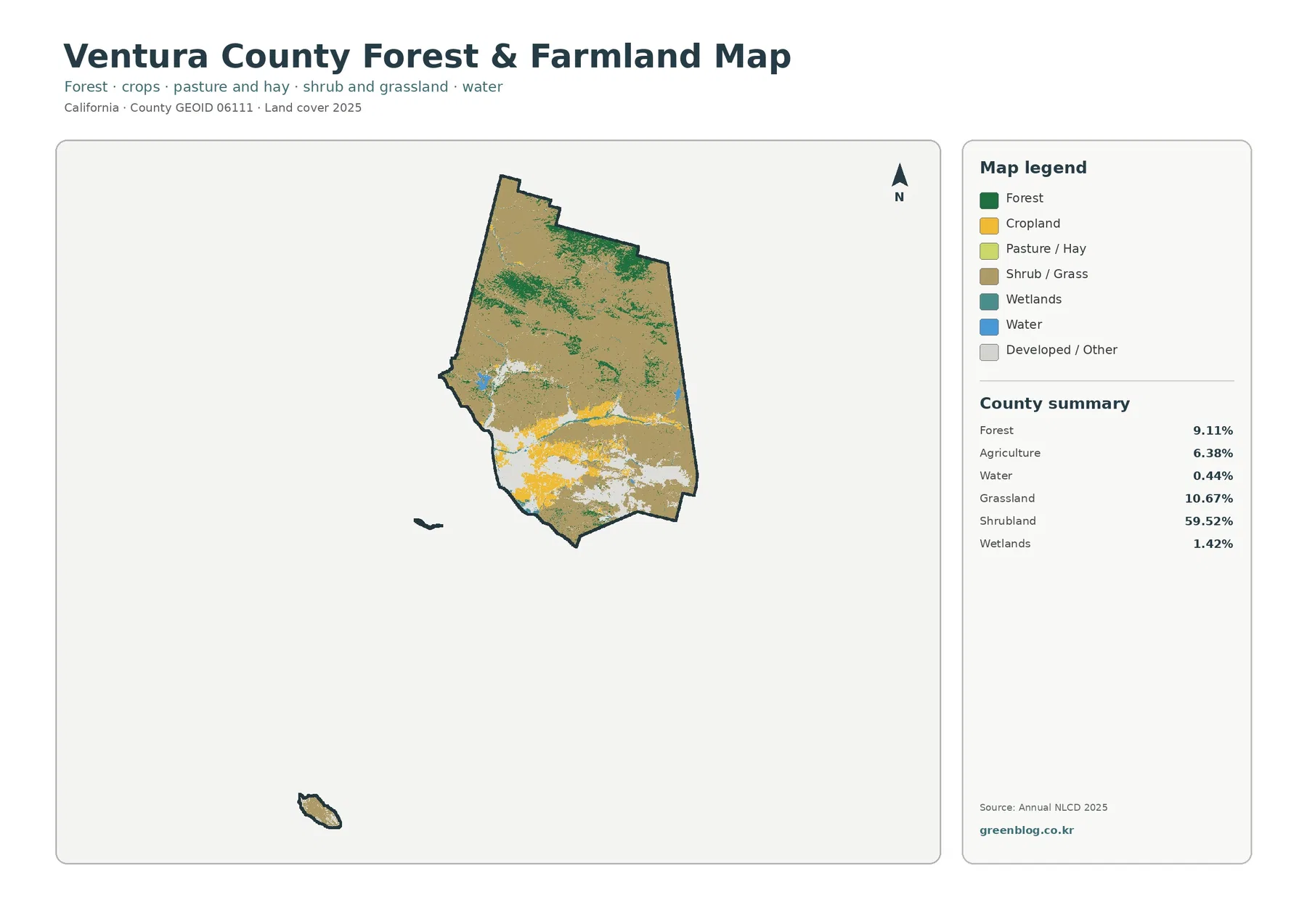
This view is useful when the question is not “What is every class?” but “Where are the wooded and farmed parts of the county?” The northern section contains broad shrub-and-grass areas with green forest patches, while the southern and western lowlands contain much more agriculture and developed/other cover. A presentation about the county’s environmental setting can therefore use this map to establish the large landscape contrast before introducing the more detailed general map.
The Agriculture Element of Ventura County’s 2040 General Plan gives a separate policy and land-use perspective on farming. It discusses agricultural resources, preservation, and long-term planning. That official material should not be confused with the 6.38 percent Annual NLCD agriculture value. A field can be part of an agricultural planning designation without being classified as active agricultural cover in a particular satellite-based year, and the reverse relationship can also be more complicated than a single map color suggests.
The contrast is also helpful when comparing the coast with the interior. In the southwest, agriculture, developed land, and smaller wetland or water features are packed into a relatively narrow lowland setting. In the mountain interior, shrubland and grassland dominate the visual field, with forest appearing in larger patches but little agricultural cover. Those two combinations make the county look almost like two different landscapes on the same map.
Impervious Surface Picks Out the Urban Lowlands More Clearly
Impervious surface means pavement, rooftops, parking areas, and similar surfaces that do not readily absorb water. Ventura County’s mean impervious value is 5.04 percent, while 5.12 percent of the county falls in the 50-percent-or-higher impervious category. Developed land cover is 11.99 percent. These numbers are not supposed to match because they measure different things: one estimates the fraction of hard surface within a cell, while the other assigns a dominant land-cover class.
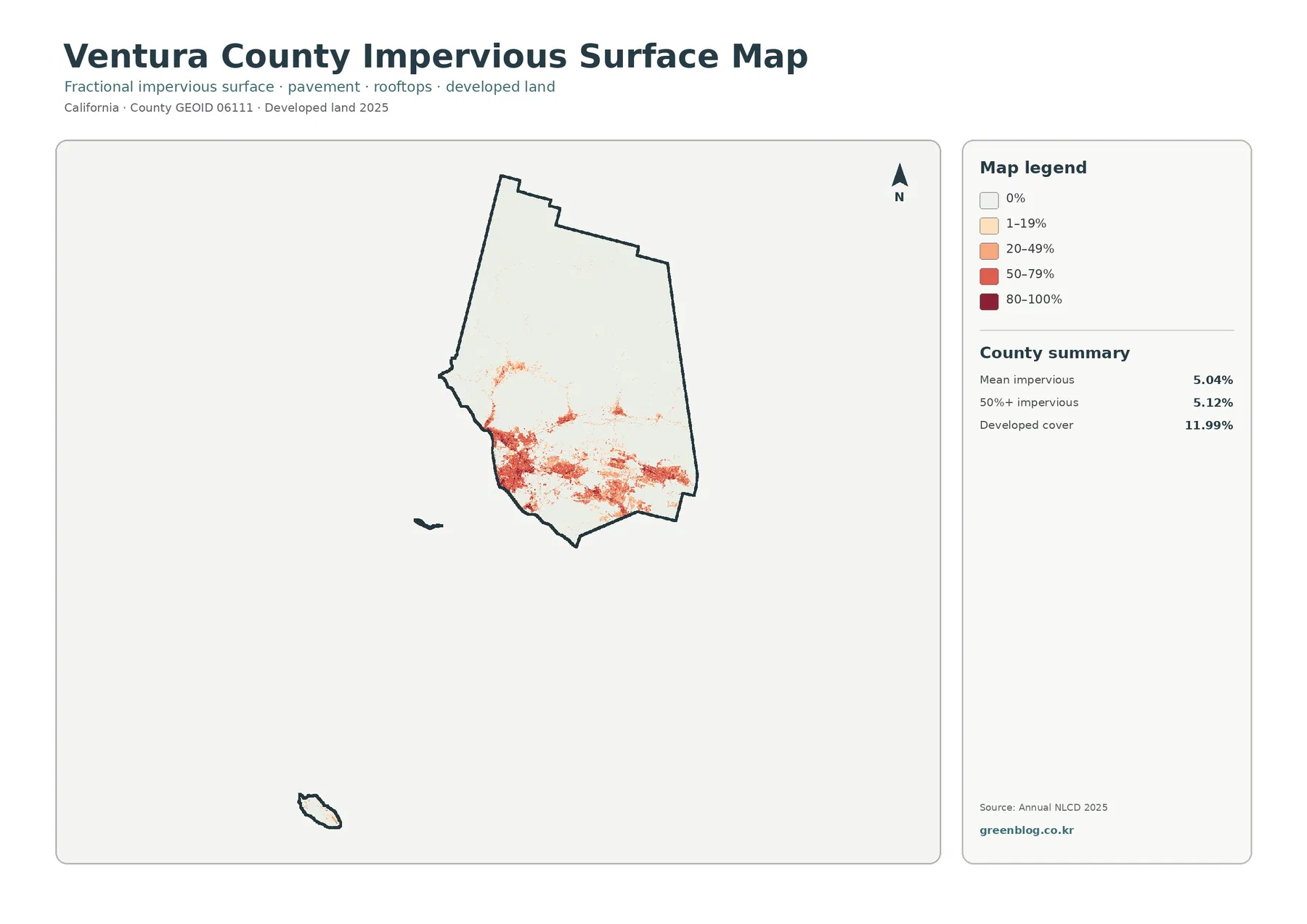
The strongest impervious colors form a large southwestern cluster and several southern and southeastern clusters. Thin connections and smaller patches extend through the more populated inland corridors. By comparison, most of the northern county is nearly white on this map. That does not mean there are no roads or buildings in the north; it means hard surfaces occupy a much smaller fraction of the landscape at this countywide scale.
Comparing this view with the forest-and-farmland map is particularly useful around the Oxnard Plain. Agricultural areas that appear bright and prominent on the farming map sit beside zones with much higher impervious values. The two maps separate two types of human-altered surface that can look similar on a simple aerial image: cultivated ground and built, paved ground. That distinction is useful for classroom comparisons, watershed discussions, and general planning context.
Impervious surface should still not be treated as a city-boundary map. Low-density neighborhoods can contain trees, yards, and open ground that lower the impervious fraction, while highways or large facilities can create high values outside a compact urban center. If an exact municipal boundary, zoning district, or parcel is needed, the appropriate county or city GIS should be used instead of tracing the red classes on this image.
The 1985–2025 Map Shows Where Classifications Differ, Not Why They Changed
The long-term change map compares land-cover classifications from 1985 and 2025. Across Ventura County, 26.81 percent is marked as a class difference. The summary identifies 3.32 percent as change to developed, 9.43 percent as forest loss, 0.86 percent as agricultural loss, and 13.04 percent as other class difference. These categories are a starting point for investigation, not a complete history of what happened on the ground.
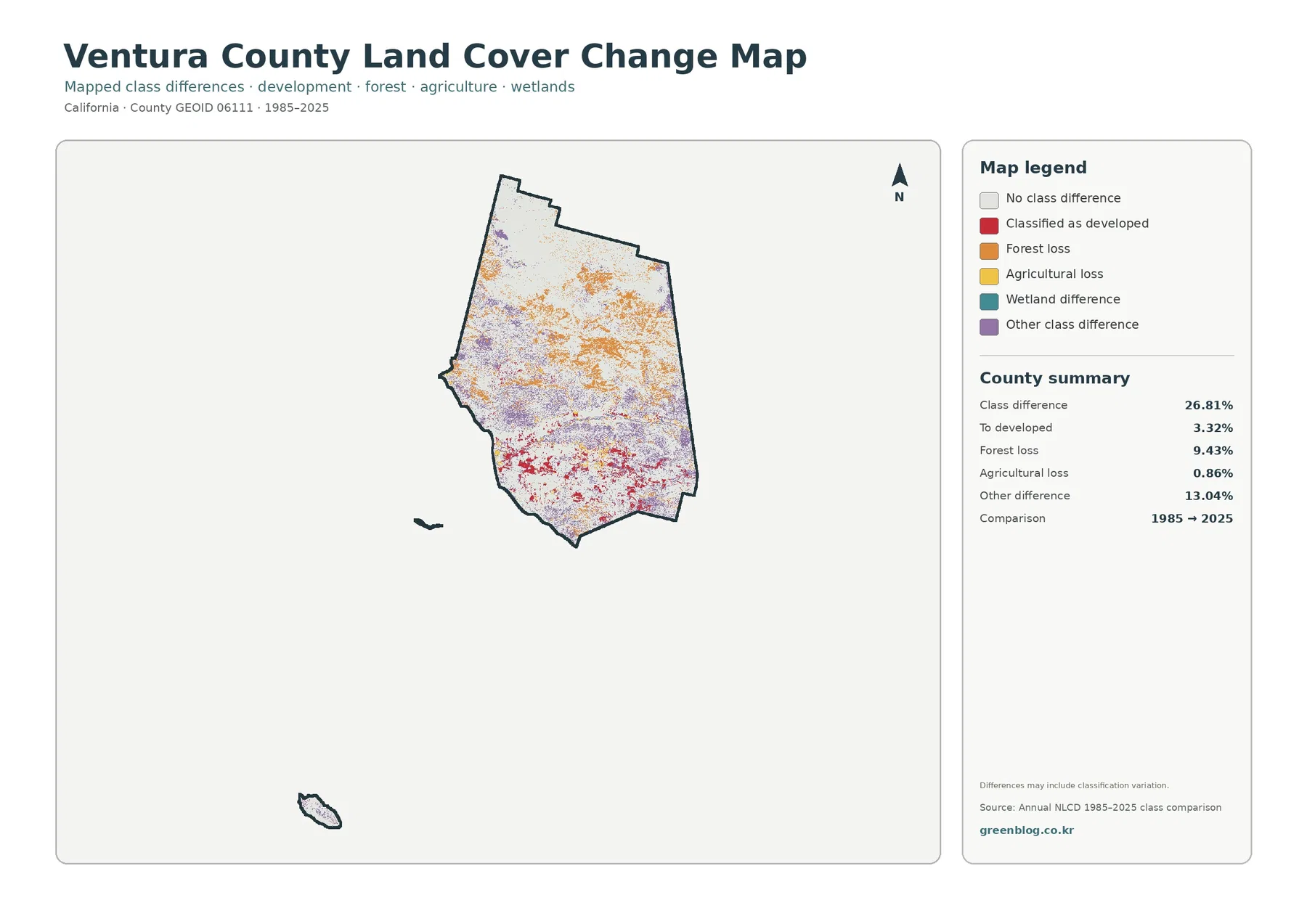
Red change-to-developed patches are most noticeable in the southern and western areas that also contain today’s developed and impervious clusters. Orange forest-loss and purple other-difference classes are more widely scattered through the interior, including mountain areas that are not heavily urbanized. Agricultural-loss colors occupy a smaller share and appear mainly near the lowland agricultural pattern. The geography therefore points to several types of change rather than one countywide process.
The 9.43 percent forest-loss category should not be rewritten as “Ventura County lost 9.43 percent of its forest” without further analysis. Annual NLCD is a raster classification based on remotely sensed information, and differences between two years can include real vegetation change as well as classification variation. Fire, regrowth, drought stress, vegetation type, mixed pixels, and mapping methods can all affect what a cell is called. A cause requires additional evidence.
The same caution applies to the 3.32 percent change-to-developed value. It locates cells that are classified differently in the two comparison years; it does not provide a construction date or a development permit history. If a project needs to know when a neighborhood, road, or facility was built, the change map can identify an area to investigate, but aerial imagery, planning records, and local GIS data are needed to establish the actual sequence.
Switching Map Views Makes the Lowland–Mountain Contrast Clearer
For a first look at the county, the general land-cover map is the best starting point because it establishes the dominance of shrubland and the location of the developed and agricultural lowlands. The forest-and-farmland view then simplifies the same area so the wooded north and farmed southwest can be compared without the full set of classes. This sequence works well for readers who are unfamiliar with Ventura County.
If the question shifts to urban form, the impervious map becomes more informative than the general map. It shows that built surfaces are not evenly spread across every developed pixel. Large lowland clusters contain much higher hard-surface fractions, while many rural and mountain areas remain close to zero. Placing the impervious map beside the agriculture map is especially useful where farm fields and urban areas meet.
The change map belongs at the end of the comparison because it makes more sense after the current pattern is understood. A red change-to-developed patch can be checked against today’s developed cover, and a forest-loss patch can be checked against today’s shrubland, grassland, or forest. This does not reveal the cause, but it prevents the change colors from being interpreted without knowing what the location looks like in 2025.
Different projects do not need all four images. A short environmental overview may use the general map and forest/farmland map. A watershed or runoff discussion may add the impervious surface view. A historical comparison can pair the 2025 map with the 1985–2025 change map. Keeping the map selection tied to the question makes the page easier to use than presenting every image as if it served the same purpose.
Land Cover Is Not Zoning, and the Pixels Have Real Limits
Land cover describes what the ground surface is classified as at the observation date. It does not say who owns the land, whether a parcel can be developed, whether farming is legally permitted, or where a city zoning boundary runs. Ventura County has separate planning, agricultural-preservation, and zoning programs for those questions. A brown shrubland pixel, for example, should not be interpreted as an open-space zoning designation.
Annual NLCD is built as raster data at a 30-meter scale. In simple terms, the landscape is divided into grid cells and each cell receives mapped information. A single cell can contain trees, a road, a lawn, a building, or several of those at once. Small features may therefore be generalized, and mixed pixels can make a narrow boundary look less precise than it would in a parcel map or high-resolution aerial photograph.
The map date matters too. The general land-cover and impervious views represent 2025, while the change product compares 1985 with 2025. New construction, field conversion, wildfire effects, or vegetation recovery after 2025 are outside this snapshot. For current site-specific work, these county maps should be paired with recent imagery and official local data rather than treated as the final authority.
Ventura County’s official planning material is useful for this distinction. The county’s Agriculture Element addresses farmland policy and preservation, and Planning and Land Use resources address zoning and permitted uses. Those are legal and policy frameworks. Annual NLCD instead provides a consistent way to compare surface cover across the entire county, which is why the two kinds of information work best as complements rather than substitutes.
Download the Four Original JPG Maps and Check Print Size Before Use
The download package contains one original JPG for each map shown above: general land cover, forest and farmland, impervious/developed land, and 1985–2025 land-cover change. Each image is 2480 × 1754 pixels. The files are provided at their original package size, while the WebP images in the article are smaller previews intended for faster viewing on the page.
The asset manifest does not mark these 2480 × 1754 files as meeting the package’s A3 high-resolution reference. If you plan a large print, keep the original aspect ratio and test the legend at the intended size before printing a full batch. Enlarging the file does not create new map detail, and aggressive re-encoding can make small labels and thin boundaries harder to read.
For presentation use, a cropped enlargement can be helpful when the topic is the Oxnard Plain, an inland agricultural strip, or one urban cluster. Keep the map year and legend with the crop so viewers know what the colors mean. If the task requires GIS analysis rather than a visual reference, use the MRLC source data instead of extracting values from the JPG.
Frequently Asked Questions
Why does shrubland dominate Ventura County even though the county is known for farms and cities?
The county includes extensive mountainous interior land in addition to the coastal and valley lowlands. The 2025 summary places shrubland at 59.52 percent, far above agriculture at 6.38 percent and developed cover at 11.99 percent. Farms and cities are highly visible because they are concentrated, but they do not cover most of the county’s total area.
Which map is best for separating the Oxnard Plain’s farms from built areas?
Start with the general land-cover map to locate agricultural and developed classes, then compare the same area on the impervious-surface map. Cultivated land can sit very close to urban development in the southwestern lowlands, while the impervious view highlights where pavement and rooftops make up a larger share of the surface.
Does the 9.43% forest-loss category mean that exactly 9.43% of the county’s forest was physically removed?
No. It is a land-cover comparison category for cells classified differently between 1985 and 2025. Real vegetation change may be part of that pattern, but classification variation and mixed pixels can also contribute. Determining a cause requires additional evidence such as time-series imagery, fire records, forest-management information, or site observations.
Sources and Reference Material
The 2025 land-cover percentages, impervious summary, and 1985–2025 change categories used here come from the supplied Annual NLCD-based Ventura County maps. County documents are used only for local context about agriculture, urban land use, and planning. They should not be treated as interchangeable with the satellite-based land-cover percentages.
- MRLC Annual NLCD — Official access to Annual NLCD land cover, change, impervious, and related products covering 1985–2025.
- USGS Annual NLCD Land Cover Classification — Official explanation of the land-cover classes and legend used by Annual NLCD.
- Ventura County 2040 General Plan – Agriculture — County background on agricultural resources, farmland preservation, and long-term planning.
- Oxnard Subbasin Groundwater Sustainability Plan — Official local context for the agricultural and urban land-use pattern on the Oxnard Plain.
- Ventura County 2040 General Plan – Land Use — Official land-use context for agriculture in the Santa Clara River Valley and Oxnard Plain and for the county’s southern population pattern.
- Ventura County Planning and Land Use — County planning resources for zoning and land-use questions that are separate from land-cover classification.
Map File Information
The ZIP contains the four original Ventura County JPG maps shown in this article: land cover, forest and farmland, impervious/developed land, and 1985–2025 land-cover change.
- Included Files: Land cover map, forest and farmland map, impervious/developed land map, land-cover change map
- Printable Size: 2480 × 1754 pixels each
Related Maps
- Alameda County California Land Cover Map
- Alpine County California Land Cover Map
- Amador County California Land Cover Map
Green Map creates custom-edited map images using open geographic data sources such as geoBoundaries, Natural Earth, OpenStreetMap, and government open data.
These maps are edited visual materials, not raw data files, and are provided for education, documents, presentations, and graphic reference.