Broomfield County has a distinctly urban land-cover signature even though open and agricultural surfaces remain visible around its edges. The 2025 summary classifies 70.88% of the county as developed, while grassland and agriculture account for another 13.30% and 12.72%. The four maps on this page separate those patterns into current land cover, forest and farmland, impervious surface, and change between 1985 and 2025.
The four original JPG maps are available together in one download farther down the page. Use the map set when you want to compare the built-up core with remaining grassland and farm areas, see where hard surfaces are concentrated, or place the present-day pattern beside a forty-year land-cover comparison.
Table of Contents
A small county with a strong urban land-cover signature
The general land-cover map is dominated by developed classes across the broad central and southern portions of Broomfield. Developed cover also extends into several narrow arms of the county, which has a notably irregular boundary. Agriculture becomes much more prominent in the long northeastern section, while grassland appears in patches around the outer portions and within gaps between developed areas. Small water and wetland features add a few contrasting spots but occupy only a small share of the county.
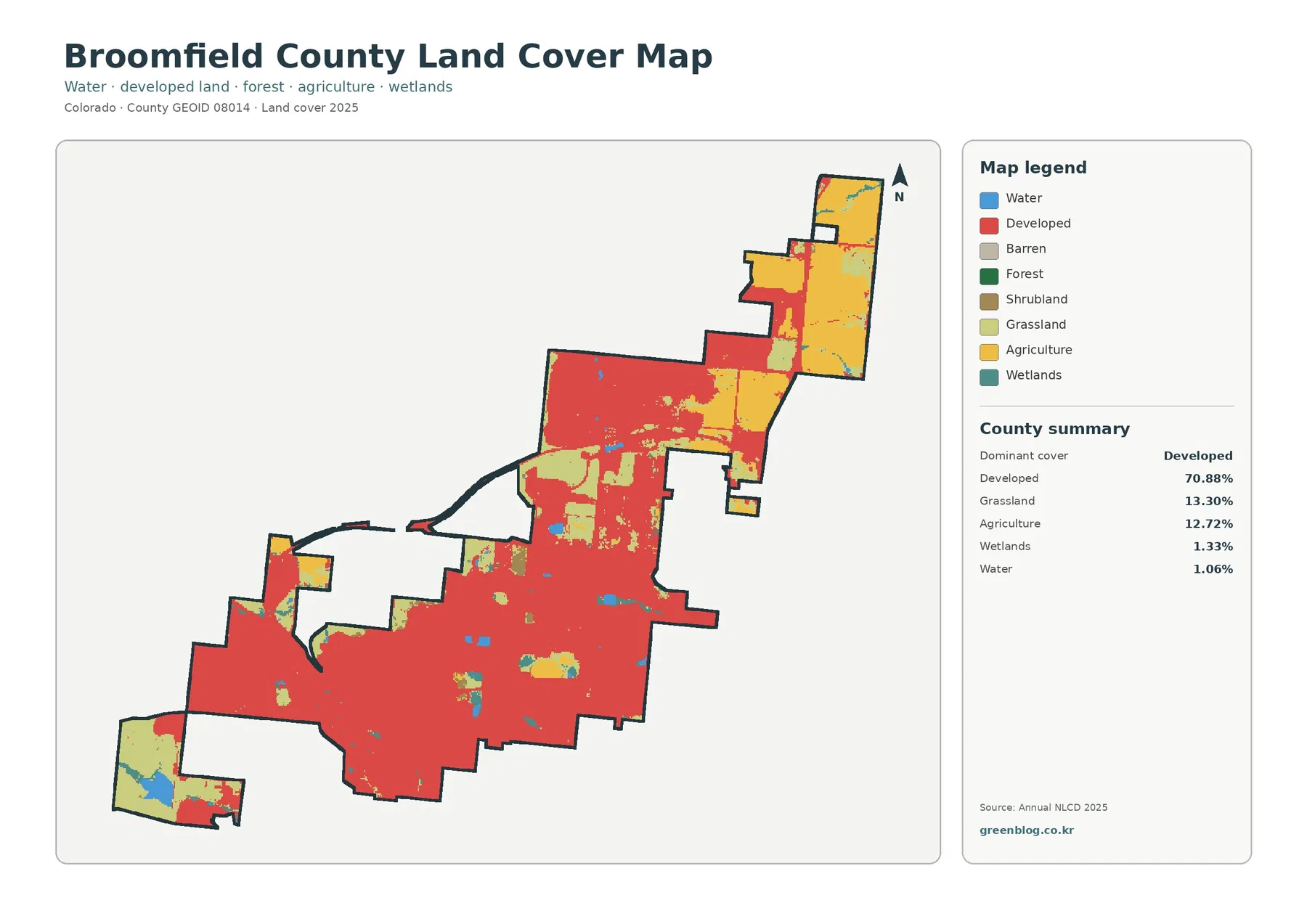
The county summary quantifies the contrast: developed land 70.88%, grassland 13.30%, agriculture 12.72%, wetlands 1.33%, and water 1.06%. Those numbers matter because Broomfield is compact enough that the remaining nondeveloped classes are not simply distant background areas. They sit close to developed land in several parts of the county. That makes the map useful for comparing urban cover and open surfaces within a short geographic distance rather than across a large rural county.
Land cover should not be confused with zoning, property ownership, or a legal land-use designation. Annual NLCD classifies what the ground surface is interpreted to be from remotely sensed data. A developed cell can contain buildings, pavement, lawns, trees, and other surfaces, while an agricultural or grassland cell says nothing by itself about who owns the parcel or what future development is allowed. The map is therefore best used as an environmental and geographic overview rather than as a regulatory map.
Broomfield’s unusual outline also affects how the pattern looks. Narrow connections and separate-looking lobes can make one county appear like several adjoining pieces. Reading each portion separately helps: the central and southern body is heavily developed, the northeastern extension contains larger agricultural blocks, and some outer areas retain more grass or open surfaces. Comparing those sections is more informative than treating the county as one uniform urban area.
Farmland and grassland still stand out beyond the built-up majority
The forest and farmland view removes much of the visual weight of developed land and highlights the classes that remain outside it. The northeastern arm contains the most obvious cropland, while grass and shrub cover appears in smaller blocks across the county. Water and wetland cells are limited but easier to notice here because the large developed background is muted. This view is especially useful when the question is not where the city is, but where agricultural and more open surfaces still occur.
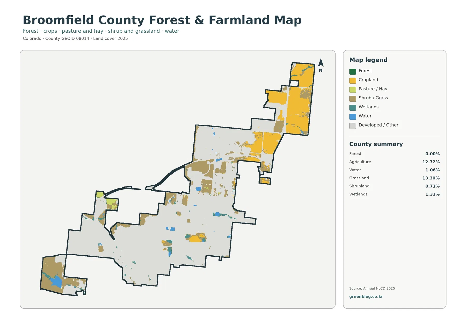
The map summary lists agriculture at 12.72%, grassland at 13.30%, shrubland at 0.72%, wetlands at 1.33%, water at 1.06%, and forest at 0.00%. A zero forest value does not mean there are literally no trees in Broomfield. It means that the dataset did not assign a measurable share of the mapped county to a forest land-cover class at this scale and under this classification. Street trees, landscaped trees, and small wooded patches can be mixed into developed or other cells.
That distinction is important in Broomfield because the City and County maintains a substantial system of open space, parks, trails, and other open lands. The official Open Lands and Trails Statistics page reports 8,713 acres of public and private open space, parks, and other open lands within a 23,887-acre planning area, about 36.5%, as of July 30, 2026. Those administrative open-land categories are not the same thing as NLCD grassland, agriculture, wetland, or water classes. A park can contain turf, pavement, buildings, ponds, and trees all within the same managed property.
Using the two types of information together can still be helpful as long as their meanings stay separate. Broomfield’s official open-space maps identify managed and protected lands, while the land-cover map describes the surface classes detected across the county. This difference explains why an urban county can have a high developed percentage and still maintain extensive open lands. It also prevents a common mistake: adding open-space acreage directly to NLCD percentages as though they were measuring the same category.
Where rooftops and pavement are most concentrated
The impervious-surface map focuses on surfaces that water does not readily soak through, such as rooftops, streets, parking areas, and other pavement. Darker reds indicate cells with higher impervious fractions. Across Broomfield, the strongest concentrations form broad connected areas in the central and southern portions of the county. The long northern extension becomes noticeably lighter where agricultural and open surfaces replace dense built cover.
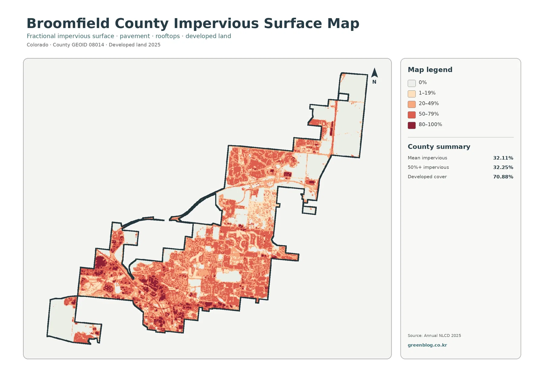
The supplied summary reports a mean impervious value of 32.11%. It also shows that 32.25% of the county falls in the 50% or greater impervious category, while developed land cover occupies 70.88%. Those figures should not be expected to match. Developed land can include lawns, landscaped soil, trees, and other permeable surfaces, so a cell may be classified as developed without being mostly impervious.
This map is useful for broad comparisons related to runoff, urban form, and the contrast between built and open areas. It is not detailed enough to measure a particular parking lot, roof, or street. Impervious information is summarized within raster cells, so the value for one cell can combine several surface types. For neighborhood-scale context or a watershed overview, that generalization is useful; for parcel engineering or drainage design, a more detailed local dataset would be required.
What the 1985–2025 comparison says about change
The change map compares land-cover classes from 1985 with those from 2025. Red marks cells classified as a change to developed land, while yellow indicates agricultural loss and other colors represent different class differences. Large red areas are visible through parts of the central, southern, and northern developed sections. Gray areas represent cells with no class difference in this two-date comparison, helping separate stable classifications from places where the assigned class changed.
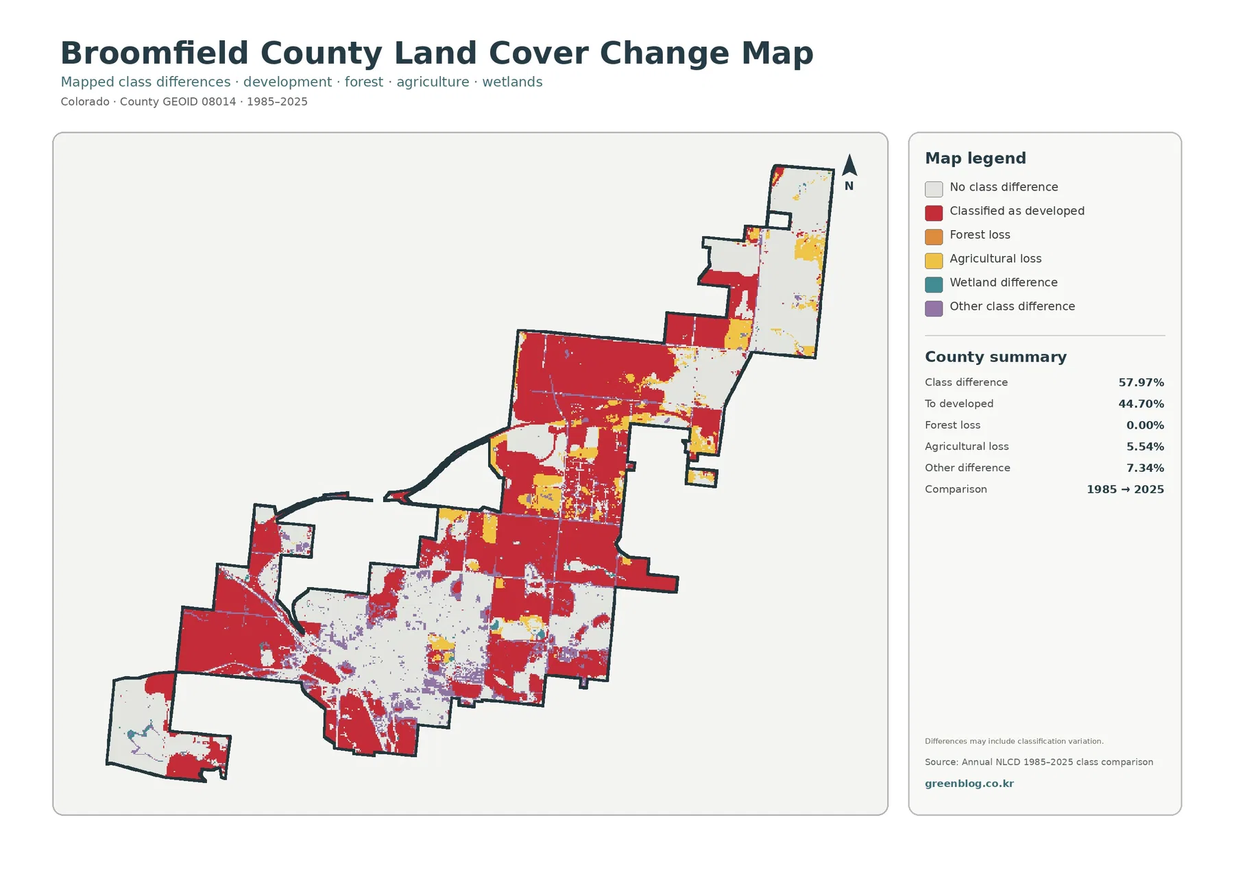
The county summary reports a class difference across 57.97% of the area. Of the county total, 44.70% is mapped as change to developed, 5.54% as agricultural loss, 7.34% as other difference, and 0.00% as forest loss. The scale of the developed-change category fits the present-day map, where developed cover is already the dominant class. It provides a broad picture of long-term conversion without assigning a specific date or cause to each changed cell.
A change cell should not automatically be interpreted as a documented construction event. Differences can reflect real land-cover conversion, but the map also notes that classification variation may contribute to some mapped differences. The safest reading is to pay more attention to broad, coherent areas of change than to isolated pixels. If a project requires the exact timing of development on a particular property, historic aerial imagery, planning records, or parcel-level sources would be more appropriate.
A practical way to compare all four maps
Start with the general 2025 map to identify the largest developed, agricultural, grassland, wetland, and water areas. Then move to the forest and farmland view, where the northern agricultural blocks and smaller open classes are easier to isolate. The impervious map adds another layer by showing which developed areas contain the greatest share of hard surface. Finally, the change map reveals where the assigned class differs between 1985 and 2025.
This sequence is particularly effective in the northeastern part of Broomfield. Agriculture is easy to see in the current and farmland-focused maps, while the same area contains much lighter impervious values than the urban core. In the central and southern portions, the opposite relationship stands out: developed cover is broad, impervious fractions are generally higher, and the change map includes many cells assigned to the developed-change category. The four views therefore describe different aspects of the same geography rather than four interchangeable versions of one map.
For a classroom or presentation, pair the current map with the change map to discuss how the county’s surface classification differs over four decades. For an environmental overview, place the impervious map beside the water and wetland classes to see where hard surfaces and water-related cover occur within the same county. For agriculture or open-land discussions, the forest and farmland view is the quickest starting point because it reduces the dominance of developed colors. None of these uses turns the maps into parcel surveys or legal planning documents; they remain generalized reference maps.
Download the Broomfield County map files
The download package contains the four original JPG maps used for this article: general land cover, forest and farmland, impervious/developed land, and land-cover change. Each original JPG is 2480×1754 pixels. The package preserves the supplied source size rather than enlarging or re-encoding the files to imply a higher resolution. The WebP versions in the article are intended for on-page viewing, while the JPG set is more convenient for offline comparison, document insertion, and archiving.
Scale, classification, and reading limits
Annual NLCD is raster data, meaning the landscape is divided into grid cells and each cell receives a class or a fractional value. At the commonly used 30-meter land-cover scale, a single cell can contain more than one real-world surface. A house, lawn, sidewalk, and trees may all fall within one cell. This produces mixed pixels and generalized edges, which is why the map should not be read as an exact outline of a building, field, wetland, or property boundary.
The 2025 map is also a time-specific snapshot. Development, landscaping, agriculture, water levels, and other surface conditions can change after the observation period. The 1985–2025 comparison only shows differences between the two represented dates; it does not show every intermediate step. A location that changed more than once could still end up in a category that hides some of its history, so detailed temporal work requires additional years of imagery or land-cover data.
Broomfield’s official Comprehensive Plan and Open Space resources answer different questions from this map set. The plan addresses growth, transportation, land-use policy, parks, and open-space goals. The land-cover maps describe observed surface classes. Keeping those purposes separate allows the maps to complement official planning information without suggesting that an NLCD class is a zoning district, a protected property, or a statement about future development rights.
Frequently Asked Questions
What is the dominant land cover in Broomfield County?
Developed land is the dominant 2025 class at 70.88%. Grassland accounts for 13.30% and agriculture for 12.72%, with wetlands at 1.33% and water at 1.06%. The visual pattern matches the summary: the central and southern county is heavily developed, while larger farm and grass areas remain toward the north and around some outer sections.
Does 0.00% forest mean Broomfield has no trees?
No. It means the supplied land-cover summary did not assign a measurable county share to a forest class at this mapping scale. Individual trees, landscaped areas, street trees, and small groves can occur inside developed or other raster cells. Forest-class percentage is therefore not the same as a tree inventory.
How should the 44.70% change-to-developed value be used?
It indicates that 44.70% of the county is placed in the change-to-developed category when the 1985 and 2025 classifications are compared. It is useful for a broad long-term view, but it does not identify the construction date, project, or cause for each location. Small differences can also include classification variation, so larger coherent change areas deserve more weight than isolated cells.
Map File Information
The ZIP package contains the four original Broomfield County land-cover JPG maps used on this page.
- File Type: Four JPG files in one ZIP archive
Related Maps
- Adams County Colorado Land Cover Map
- Alamosa County Colorado Land Cover Map
- Arapahoe County Colorado Land Cover Map
Sources and Reference
The map-specific percentages and change values above come from the supplied Broomfield County map package. The following official sources provide the land-cover classification background, county boundary data, and local open-space and planning context used to interpret the maps.
- MRLC Annual NLCD Data — official access point for Annual NLCD products and related data.
- USGS Annual NLCD Land Cover Classification — explanations of the land-cover classes used by Annual NLCD.
- City and County of Broomfield Open Space and Trails Maps — official maps of open space, parks, trails, and other open lands.
- City and County of Broomfield Open Lands and Trails Statistics — current local acreage and trail statistics for open lands.
- U.S. Census Bureau TIGER/Line Shapefiles — official geographic boundary data source.
Green Map creates custom-edited map images using open geographic data sources such as geoBoundaries, Natural Earth, OpenStreetMap, and government open data.
These maps are edited visual materials, not raw data files, and are provided for education, documents, presentations, and graphic reference.