Denver County is overwhelmingly developed in the 2025 land-cover summary, with developed cover accounting for 81.82% of the county. The map is not uniform, however. The large main body is dominated by developed classes, while the long northeastern extension contains broad areas of grassland and agriculture. Small water and wetland patches remain visible within and around the developed landscape, creating a county pattern that is more varied than the headline percentage suggests.
This page compares four views of the same county boundary: current land cover, forest and farmland, impervious surface and developed land, and mapped class differences from 1985 to 2025. The four original JPG maps are available together in one ZIP download below. They are useful when a project needs to compare present surface cover, the intensity of hard built surfaces, and long-term classification differences without switching between unrelated boundaries.
Table of Contents
An 81.82% developed majority does not make the county visually uniform
The 2025 land-cover summary identifies developed cover as the dominant class at 81.82%. Across the county’s main body, red developed classes form a broad, nearly continuous field, although small pieces of other cover remain scattered through it. The northeastern extension looks markedly different. Large agricultural and grassland blocks occupy much more of the map there, with developed cover appearing as concentrated clusters and connecting lines rather than a single uninterrupted surface.
Grassland accounts for 8.84% of the county and agriculture for 7.60%. Those percentages are modest compared with developed cover, but their location matters. Much of the yellow and light-green open cover is concentrated in the northeast, so it becomes a major visual component of that part of the county. A countywide percentage tells how much of a class exists; the map adds the equally important information of where that class is concentrated.
Water represents 1.07% and wetlands 0.58% in the supplied summary. Blue patches are sparse but easy to identify once the dominant developed color is set aside, including a more noticeable water area near the southwestern edge and smaller pieces elsewhere. Wetland-colored cells are much more limited. These small classes should be read as generalized surface classifications rather than surveyed water or wetland boundaries.
Forest is reported as 0.00% in the forest-and-farmland summary, and shrubland is only 0.09%. That makes Denver County very different from a county where forest or shrub cover defines the broad background. Here, the central comparison is between an extensive developed landscape and the northeastern concentration of agricultural and grass-covered land, with water and wetlands appearing as smaller features.
Frequently Asked Questions
What is the dominant 2025 land-cover class in Denver County?
Developed cover is dominant at 81.82%. Grassland is 8.84% and agriculture is 7.60%, with much of those open-cover classes concentrated in the northeastern section. Water is 1.07% and wetlands 0.58%, while forest is reported at 0.00% in the supplied forest-and-farmland summary.
Why is developed cover 81.82% when mean imperviousness is only 41.00%?
They measure different things. Developed cover is a land-cover classification, while imperviousness estimates how much of a raster cell is occupied by hard surfaces such as pavement and rooftops. Developed areas can include lower-intensity and open developed surfaces, so the two percentages are not expected to match.
Does the 33.08% class-difference value mean one third of Denver County was physically rebuilt?
No. It means 33.08% of the mapped area received a different land-cover classification in the 1985–2025 comparison. The supplied summary identifies 16.61% as change to developed, 6.74% as agricultural loss, and 9.65% as other difference. Classification variation can also contribute, so the map does not by itself prove the cause of each change.
The 2025 land-cover map puts the full class mix back together
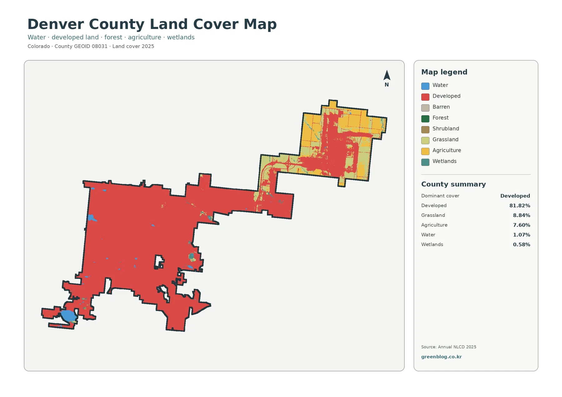
The general land-cover map is the best starting point when the goal is to explain the county as a whole. It combines developed land with grassland, agriculture, water, wetlands, barren cover, forest, and shrubland in one legend. In Denver County, most attention naturally goes to the developed majority, but the open northeast prevents the map from becoming a simple single-color story.
Across the main body, developed cover extends over most of the mapped area. Small nondeveloped cells and water patches interrupt that field, but they do not form a second countywide dominant class. Along the elongated connection toward the northeast, the mix becomes more varied. By the time the map reaches the broad northeastern section, agriculture and grassland occupy large blocks alongside developed areas.
This location pattern is useful for interpretation because it keeps totals from being misleading. Grassland at 8.84% and agriculture at 7.60% might sound minor when read as a list, yet together they visually define much of the northeastern section. Water at 1.07% and wetlands at 0.58% are genuinely small at county scale, but they remain relevant for projects that need to locate surface-water and wetland-class cells within a predominantly urbanized area.
The colors describe physical surface cover, not zoning, ownership, permitted use, or parcel boundaries. A cell classified as agriculture does not establish an agricultural zoning designation, and a developed cell does not establish a building entitlement. The distinction is especially important in a county where the developed class is so large, because readers may otherwise mistake a broad land-cover category for a legal land-use map.
Agriculture and grassland become much easier to see in the northeastern section
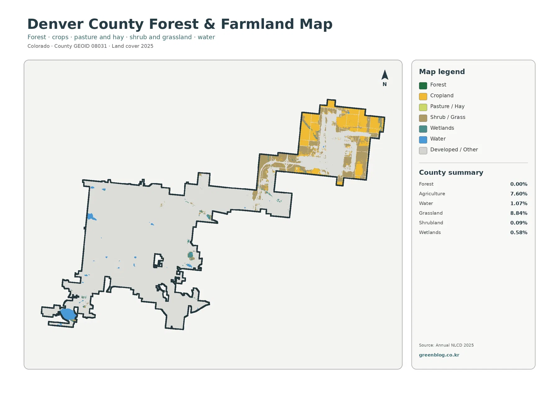
The forest-and-farmland map simplifies the class mix so open land stands out more clearly. Forest is reported at 0.00%, agriculture at 7.60%, grassland at 8.84%, shrubland at 0.09%, water at 1.07%, and wetlands at 0.58%. Because forest contributes virtually no mapped area, the most informative colors are the agricultural and grass-covered blocks in the northeast, plus the sparse water and wetland features elsewhere.
Agricultural cover appears in large yellow blocks across the northeastern section. Grass and related open cover fill neighboring areas, while developed or other surfaces occupy the spaces between them. The county’s main body is almost entirely rendered as developed or other in this simplified view, which makes the northeast-versus-main-body contrast stronger than it appears in the full land-cover map.
Water remains scattered through the main body and becomes more noticeable where blue patches sit against the pale developed background. Wetlands are much smaller and appear only in limited cells. The map is useful for locating these generalized classes, but it is not a wetland delineation. Narrow shorelines, small channels, and mixed surfaces may be generalized within the raster grid.
This view is also a reminder that “farmland map” does not mean a map of farm ownership or legal agricultural parcels. The yellow class records a surface-cover classification from the dataset. A project that needs parcel acreage, crop type, ownership, or regulatory status would require a different source. Here, the value is the broad spatial comparison between open agricultural or grassy cover and the surrounding developed landscape.
One third of the county has a mapped class difference from 1985 to 2025
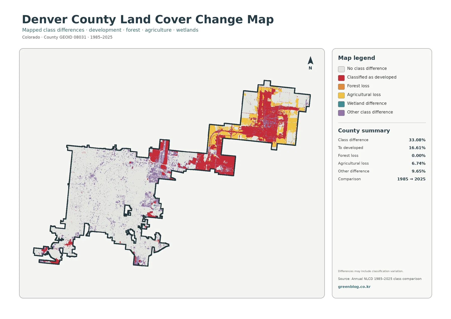
The change map compares classifications from 1985 with those from 2025. Its county summary reports class differences across 33.08% of the area. Of the supplied categories, 16.61% is mapped as a change to developed, 6.74% as agricultural loss, and 9.65% as other difference. Forest loss is 0.00%. These numbers describe differences between two mapped classifications; they should not be presented as a direct inventory of construction, demolition, or individual land-use decisions.
Red areas classified as a change to developed are especially prominent in the northeast and along the elongated connection between the main body and northeastern section. Additional red blocks appear near edges and in several smaller locations. Much of the central main body is light, indicating no class difference, with scattered purple and other small difference cells. The uneven distribution is as important as the countywide total.
Yellow agricultural-loss cells are concentrated most visibly in the northeastern section, where agriculture is also an important part of the current 2025 cover. That overlap identifies a useful place for further investigation, but it does not establish a cause. The map cannot tell whether a specific change resulted from construction, field conversion, classification differences, or another process without additional evidence.
Purple “other difference” cells are scattered widely, including many small points within the main body. The map itself cautions that differences can include classification variation. Small isolated cells should therefore be interpreted conservatively. Broad clusters and repeated patterns are better starting points for comparison, especially across a forty-year interval in which imagery and classification methods can differ.
Following the same location through all four maps prevents category confusion
A practical way to use the set is to choose one location and follow it through every layer. In the northeastern section, the current land-cover map identifies broad agriculture and grassland beside developed areas. The forest-and-farmland map simplifies that open-cover pattern. The impervious layer then distinguishes lightly covered ground from concentrated hard surfaces, and the change map shows where classifications differ from 1985.
The main body produces a different sequence. Current land cover is overwhelmingly developed, but the impervious map breaks that developed area into multiple intensity classes. The change layer then shows that many central cells have no mapped class difference even though the present-day land-cover class is developed. This makes an important distinction: “developed in 2025,” “highly impervious in 2025,” and “changed to developed between 1985 and 2025” are three separate measurements.
Water and wetland cells can be compared the same way. They appear as blue and teal features in the current maps and generally as low-impervious locations in the hard-surface view. The change legend includes a wetland-difference category, but the package does not provide a separate countywide percentage for that class. Its location can be discussed visually, while a new numerical estimate should not be invented from the image.
Using the maps in this sequence is helpful for presentations because each image has a clear job. The current map answers what covers the ground now. The simplified vegetation and agriculture view makes open-land classes easier to isolate. The impervious layer measures hard-surface intensity, and the change layer compares two dates. Keeping those roles separate produces a more accurate explanation than treating all four as alternate designs of the same map.
County percentages need a location check before they become a useful explanation
Denver County provides a good example of why a percentage table is only the beginning. Developed cover at 81.82% accurately describes the countywide majority, yet it does not reveal the broad agricultural and grassland blocks in the northeast. The map adds that missing location information. Likewise, the 41.00% mean impervious value describes overall hard-surface intensity but cannot identify where the darkest 80–100% cells are concentrated.
The same caution applies to the change summary. A 33.08% class-difference rate does not mean every part of the county changed at the same rate or in the same way. The main body contains large light areas, while the northeast and connecting section carry much more prominent red and yellow change colors. A written explanation should combine the number with that uneven distribution rather than repeating the percentage alone.
Small classes also benefit from this approach. Water at 1.07% and wetlands at 0.58% might be overlooked in a table, but their location can matter for a watershed or environmental-education project. The maps support county-scale comparison of those cells. They do not provide the precision needed to trace a legal wetland boundary, a shoreline survey, or a parcel-specific environmental condition.
Choosing the right Denver County map for a specific task
For a general county profile, the 2025 land-cover map is usually the clearest first choice. It captures the dominant developed cover while still showing the northeastern agriculture and grassland that make the county internally varied. A classroom or presentation slide can use that contrast as the main message and then refer to the percentage summary for scale.
When the subject is agriculture or open vegetation, the forest-and-farmland map removes much of the visual competition from developed classes. It is especially useful for highlighting the northeastern concentration of agricultural and grassy cover. Because forest is reported at 0.00%, the map also makes clear that forest is not a meaningful countywide component in this dataset.
For questions about built surfaces, use the impervious map rather than relying only on the developed class. Its five intensity bands distinguish low-hard-surface areas from cells in which pavement and rooftops occupy much larger shares. That distinction matters in Denver County because the developed-cover percentage is almost twice the mean impervious percentage.
The 1985–2025 map is best for historical comparison, but it should normally be paired with one current map. A red change-to-developed cell is not the same thing as every area that is developed today. Showing the current cover next to the change map makes that distinction visible and reduces the risk that a reader treats the change layer as a present-day development footprint.
What the 30 m raster can show—and what it cannot
Annual NLCD is a raster classification, meaning the landscape is divided into grid cells and each cell receives a class or estimated impervious value. At roughly 30 m resolution, a single cell can contain more than one real-world surface. A narrow strip of pavement, vegetation, bare ground, and a small building can all fall within the same cell. The resulting class is a useful generalization, not a survey of every object inside that square.
Mixed pixels are especially important along edges. Small water features, narrow wet areas, field boundaries, and thin built corridors may be simplified or may shift slightly between classification dates. The crisp edge of a colored raster region should therefore not be copied as a legal parcel line or engineering boundary. The downloadable JPGs are designed for countywide viewing, comparison, printing, and reference.
Date is another limitation. The current cover and impervious maps are labeled 2025, while the change view compares 1985 with 2025. Surface conditions that changed after the observation period may not be represented. A project that depends on current construction, a recent water change, or a very recent land-cover transition should supplement these maps with newer imagery or an appropriate official record.
Classification differences also deserve caution. The change map explicitly notes that some differences may reflect classification variation. A few isolated pixels are weak evidence of a specific real-world event. Larger clusters can identify areas worth examining, but establishing a cause requires other records or imagery. That distinction keeps the map useful without asking it to answer questions it was not designed to resolve.
Using the four downloadable JPGs as a consistent comparison set
The ZIP on this page contains four original JPG maps for Denver County: land cover, forest and farmland, impervious surface and developed land, and land-cover change. The WebP images in the article are convenient for on-page viewing, while the JPG files are the downloadable set. Because all four use the same county outline, it is easy to compare the same northeastern section, main-body area, or boundary edge across different themes.
For a two-map comparison, pair current land cover with impervious surface to explain the difference between developed classification and hard-surface intensity. Pair current land cover with the 1985–2025 change map when the subject is present condition versus historical class difference. Pair the general map with the forest-and-farmland view when open agricultural and grass-covered land is the focus.
A good caption should include the map topic and date. The change map should always be identified as a 1985–2025 comparison, while the current maps should be labeled 2025. Keeping the legend visible is also important because red means developed land in one map, higher imperviousness in another, and change to developed in the change layer. Similar colors do not carry the same definition across all four files.
Map File Information
The download contains the four original JPG land-cover maps for Denver County in one ZIP archive.
- Included Files: Use only the versions confirmed in the article and supplied images
- File Type: Use the confirmed download contents
- Intended Use: Printing, education, presentations, and map-based projects
Related Maps
- Adams County Colorado Land Cover Map
- Alamosa County Colorado Land Cover Map
- Arapahoe County Colorado Land Cover Map
Sources and References
- MRLC Annual NLCD Data – official access to the Annual NLCD data products referenced by the map package.
- USGS Annual NLCD Land Cover Classification – official descriptions of the land-cover classes used in Annual NLCD.
- U.S. Census Bureau TIGER/Line Shapefiles – official geographic boundary data for counties and related mapping layers.
Green Map creates custom-edited map images using open geographic data sources such as geoBoundaries, Natural Earth, OpenStreetMap, and government open data.
These maps are edited visual materials, not raw data files, and are provided for education, documents, presentations, and graphic reference.