Forest is the defining cover in Dolores County in the 2025 map set, but the county is not uniform from west to east. Forest accounts for 59.26% of the mapped area and shrubland for another 30.26%. The western end breaks that broad pattern with much larger patches of agriculture and open cover, while the center and east remain much more heavily forested.
This page compares four views of the same county boundary: current land cover, forest and farmland, impervious surface, and mapped class change from 1985 to 2025. The maps can be read together to separate present-day cover from hard-surfaced development and long-term classification differences. The four original JPG maps are also available together in one ZIP near the end of the page.
Table of Contents
A forest-dominated county with a distinctly different western end
The 2025 county summary places forest first at 59.26%. On the map, dark green occupies large connected areas through the broad middle and continues into the eastern end. Shrubland is the second-largest class at 30.26%, appearing as broad brown areas and openings mixed through the forest rather than as one isolated block. Together, those two classes explain most of the county’s surface pattern.
The western portion looks noticeably more varied. Agriculture appears in yellow patches that are much larger and more frequent there than elsewhere in the county. Forest and shrubland are broken into smaller pieces around those fields and open areas, creating a patchwork that contrasts with the more continuous green cover toward the center and east. That concentration matters because agriculture is only 5.19% of the county as a whole.
Developed cover is 1.76%, grassland 1.47%, wetlands 0.74%, and water 0.08%. These smaller classes do not control the overall appearance, yet their locations still add useful detail. Development is visible as small scattered marks rather than a broad urban zone. Water occupies very little area, while wetland-colored cells appear in narrow or limited patches that can be easy to miss at a small display size.
Land cover describes what is physically covering the ground in the mapped data. It does not establish legal land use, ownership, zoning, building rights, or parcel boundaries. A cell classified as agriculture is not automatically a legally designated agricultural parcel, and a developed cell does not mean the entire cell is paved. Keeping that distinction in mind makes the other three maps easier to interpret.
Reading the 2025 land-cover pattern from west to east
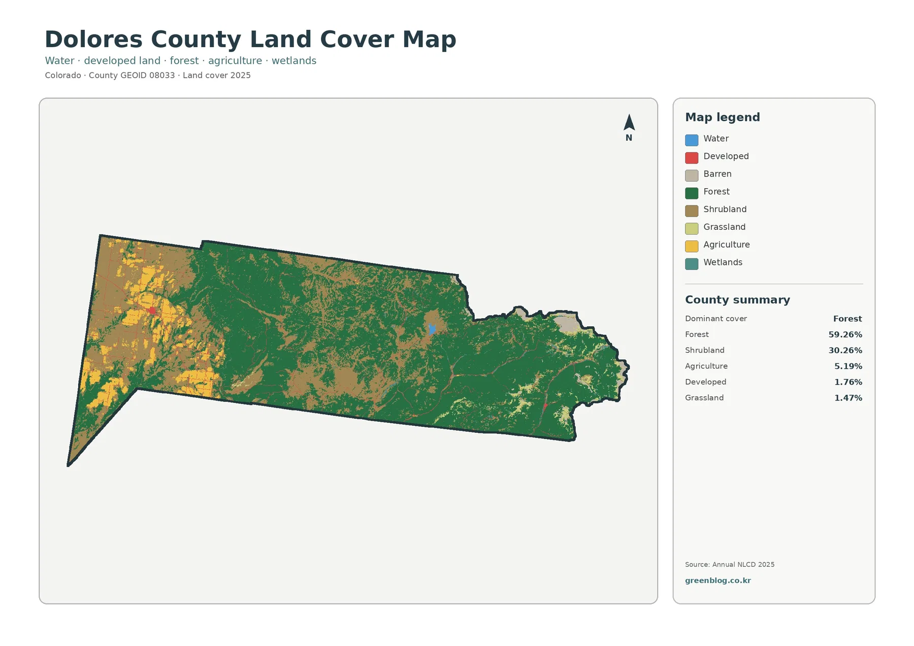
The general land-cover map is the best place to begin because it keeps all major classes visible at once. The central and eastern parts are dominated by green forest, with brown shrubland cutting through the forest in broad irregular areas. Small openings and other classes interrupt that cover, but neither agriculture nor development becomes a major background color in the eastern half.
Moving west changes the balance. Yellow agricultural areas become much more common, especially near the far western edge and in the western interior. Shrubland remains extensive, while forest becomes less continuous than it is farther east. Small red developed marks appear within this mixed landscape, but they remain tiny compared with the agricultural, shrubland, and forest patches around them.
The countywide percentages help describe the total amount of each class, but they do not explain where the classes are concentrated. Agriculture is a good example: 5.19% is a modest share of the county, yet the western clustering makes it visually prominent in that part of the map. Forest works in the opposite direction, covering such a large share that it becomes the continuous background through much of the center and east.
Water is only 0.08%. One small blue feature is easier to notice near the central-to-eastern portion of the county, with much smaller water marks elsewhere. Wetlands account for 0.74% and appear in narrow or localized areas. These small classes are better interpreted by combining the legend with a zoomed view rather than estimating their area by eye.
The forest-and-farmland view makes the western patchwork easier to see
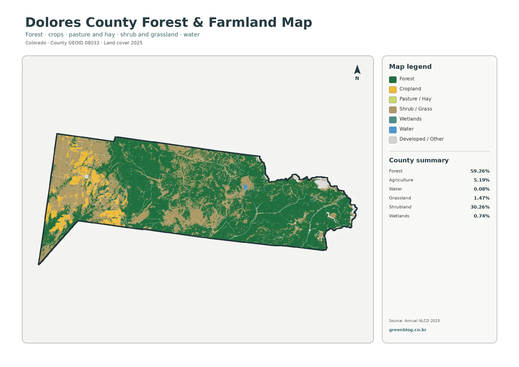
The forest-and-farmland map reduces some of the complexity of the general map. Forest remains dark green, agricultural cover is shown more directly in yellow tones, and shrub or grass cover forms a simpler open-land category. This makes the west-to-east contrast especially clear. The western side contains substantial agricultural patches, while the broad center and eastern end are dominated by forest.
Within the west, agricultural areas do not form one solid block. They occur as large and small pieces mixed with shrub or grass cover and separate forest patches. That pattern is important because a countywide percentage cannot show fragmentation or clustering. Two counties could both have 5.19% agriculture but look very different if one had a single concentrated belt and the other had small fields spread evenly across the landscape.
The map also distinguishes cropland from pasture or hay in the legend, but the supplied county summary reports the broader agriculture total. Those colors are useful for seeing how mapped agricultural surfaces are distributed, not for identifying individual crops, farm ownership, or current operating status. The boundaries of the colored cells should not be treated as surveyed field or parcel lines.
Forest should be read with the same caution. The 59.26% value tells us how much of the county is classified as forest, and the green map areas show where that class is concentrated. It does not identify tree species, stand age, timber condition, or management status. For this page, the useful conclusion is narrower and well supported: forest is the dominant mapped cover, especially through the middle and east.
Impervious cover is extremely limited across the county
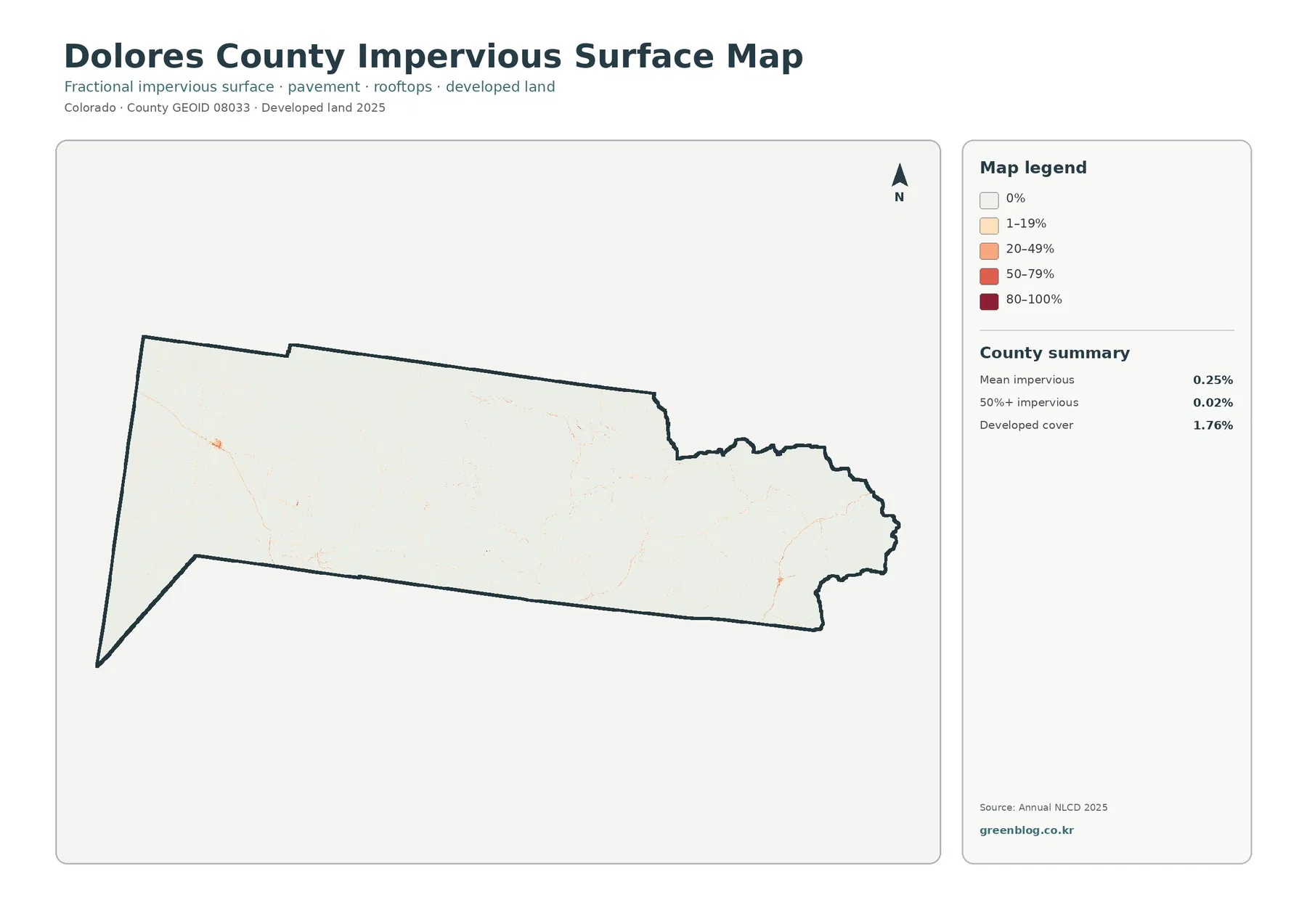
An impervious surface is a hard surface such as pavement or a rooftop that limits how readily water can soak into the ground. Dolores County has a mean impervious value of only 0.25%. Cells with at least 50% impervious cover account for just 0.02% of the county, while developed land in the general land-cover map totals 1.76%.
The map matches those small numbers. Most of the county is shown in the lightest category, indicating zero or very low impervious cover. A few orange or red points appear in the west and east, and faint linear traces can be seen across parts of the county, but there is no large continuous high-impervious area. The visual impression is much lighter than a densely urbanized county would be under the same legend.
Developed land and impervious surface are related but not interchangeable. The land-cover classification can include developed areas that still contain vegetation or other permeable surfaces. The impervious layer measures the hard-surface share within each mapped cell. That is why the 1.76% developed-cover figure should not be expected to equal the 0.25% mean impervious value.
This distinction is especially useful in Dolores County because both measures are small. The general map helps locate the developed class, while the impervious map shows how little of the county carries a strong hard-surface signal. Neither map provides building footprints, road names, parcel-level engineering data, or drainage measurements, so the colored cells should remain a county-scale reference rather than a site plan.
Agricultural-loss colors stand out in the 1985–2025 comparison
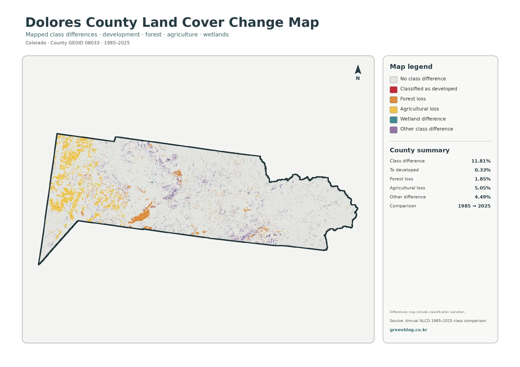
The change map does not describe 2025 land cover directly. Instead, it marks cells where the classification differs between 1985 and 2025. The county summary reports class differences across 11.81% of the mapped area. Agricultural loss is 5.05%, other differences 4.49%, forest loss 1.85%, and change classified to developed 0.33%.
Yellow agricultural-loss areas are particularly noticeable in the west, the same broad side of the county where present-day agriculture is most visible. This geographic overlap makes the two maps easy to compare, but it should not be turned into a simple causal story. The change layer identifies different classifications at two dates; it does not explain why a field changed classification or what happened at a particular parcel between those years.
Orange forest-loss patches are more scattered. Some larger orange areas appear in the western and central portions, while smaller marks occur elsewhere. Purple other-difference cells are more widely dispersed and often appear as small specks. Red areas classified as developed change are sparse, consistent with the small 0.33% summary value and the very low impervious-surface pattern in the 2025 map.
The large pale background represents places without the mapped class difference highlighted by the change categories. Small isolated marks should be interpreted cautiously because a two-date comparison can include classification variation in addition to real ground change. Broad clusters are more useful for a first reading. A detailed explanation of cause would require additional dates, imagery, or local records beyond what this package contains.
A practical way to compare all four maps without mixing their meanings
Choose a few fixed locations and follow them across the four maps. The western end is an effective starting point because agriculture, shrub or grass cover, forest fragments, small developed marks, and several change colors all occur close together. The general map establishes the current classes. The simplified forest-and-farmland map then makes the agricultural patches easier to isolate.
Next, switch to the impervious map and keep looking at that same western area. Much of it becomes very light, with only small harder-surface signals. That contrast prevents a common mistake: assuming that every developed-colored cell on a land-cover map represents a densely paved surface. The map pair shows that the developed class and the amount of hard surface answer different questions.
The change map adds a time comparison. Yellow agricultural-loss and orange forest-loss colors appear in parts of the west where the present-day map contains agriculture, shrubland, and forest. Those are useful positional comparisons, but the change colors should not be treated as today’s cover. They report a difference between classifications at two dates, not a replacement map for the current landscape.
The center and east offer a second useful comparison area. Forest dominates the current and forest-focused maps, the impervious layer remains mostly pale, and the change layer contains a large amount of no-difference background with smaller scattered differences. Looking at both ends of the county makes the internal contrast much clearer than reading four legends in isolation.
Why the west-to-east contrast is the best visual anchor
The strongest county-specific pattern in this map set is the shift from a varied agricultural and open-cover west to a more continuously forested center and east. The difference appears in both the full land-cover view and the simplified forest-and-farmland map. It gives readers a stable reference point for finding smaller features such as developed cells, water, wetlands, and change clusters.
Agriculture illustrates why location is as important as percentage. At 5.19%, it is a small part of Dolores County overall. In the western portion, however, agricultural yellow occupies enough connected patches to become one of the most obvious map features. Forest illustrates the opposite condition: its 59.26% share is both numerically dominant and visually continuous across a broad part of the county.
Shrubland at 30.26% helps connect those two broad zones. It appears around and between forested areas and is also common in the west, where it mixes with agricultural cover. Rather than treating shrubland as a third isolated region, the map supports a more nuanced reading in which shrubland is interwoven with both the forest-dominated interior and the more varied western landscape.
The change map reinforces the value of using the west as a reference. Agricultural-loss colors are concentrated there, while the center and east retain more of the pale no-difference background. The important point is not that every western agricultural patch changed, but that the western part contains both a distinctive current cover pattern and a distinctive concentration of mapped differences.
Scale, small classes, and classification limits
Land-cover maps are raster products, meaning the landscape is represented as a grid of cells with class values. A single cell can contain more than one real-world surface, especially along edges, narrow roads, small water features, or mixed vegetation. The colored boundary between two classes should therefore not be read as a surveyed parcel line or a precise fence, shoreline, or road edge.
Very small percentages are especially sensitive to display scale. Water is only 0.08%, and the area with at least 50% impervious cover is only 0.02%. A feature that is visible in the full image can nearly disappear in a thumbnail, while a few enlarged cells can look more important than their countywide share. Use the legend and percentage summary together when discussing these small categories.
The 1985–2025 comparison requires another layer of caution. A class difference of 11.81% does not mean that exactly 11.81% of the county underwent one type of physical conversion. It is a summary of mapped classification differences. The “other difference” category alone accounts for 4.49%, so not every colored cell can be assigned a simple interpretation without additional evidence.
The dates also matter. Current land cover and impervious surface are labeled 2025, while the change layer compares 1985 with 2025. Conditions after 2025 are outside this map set. For a current parcel decision, engineering question, legal boundary, or site-specific environmental review, use more recent and more detailed official sources designed for that purpose.
Which Dolores County map fits a particular task?
Use the general 2025 land-cover map when you need one image that summarizes the county. It presents the forest dominance, extensive shrubland, western agricultural concentration, and smaller developed or water classes in the same legend. It is the most complete introductory map, particularly when the audience has not seen the county’s land-cover pattern before.
The forest-and-farmland version is better when the main question concerns forest versus agricultural or open cover. With fewer competing colors, the western agricultural patchwork and the forested middle and east are easier to compare. The impervious map is the clearest choice for discussing hard surfaces because the mostly pale county and the 0.25% mean value tell that story directly.
Choose the change map for a long-term comparison, but pair it with a current map whenever possible. The yellow, orange, red, and purple colors represent class differences, not present-day cover categories. Showing the 2025 land-cover map beside the 1985–2025 change layer lets readers separate “what is there now” from “where the classifications differ between the two dates.”
For printing, presentations, or classroom comparison, two larger maps are usually easier to read than all four reduced to tiny panels. The shared county outline makes it straightforward to align the western end, broad center, and eastern end across images. This approach also keeps the legends readable and reduces the chance that similar colors from different maps will be mistaken for the same variable.
Download the four Dolores County JPG maps
The download ZIP contains four JPG files for Dolores County: the general land-cover map, forest-and-farmland map, impervious and developed-land map, and 1985–2025 land-cover change map. The WebP images in the article are intended for efficient on-page viewing, while the downloadable set provides the separate JPG files with their legends and county summaries.
Before reusing a file, check the map title, year, and legend. The general land-cover map and the impervious map both relate to development, but they do not measure the same thing. The change map uses a different time frame again. Keeping those labels with the image is the simplest way to prevent a current land-cover class from being confused with impervious percentage or a historical class difference.
These maps are appropriate for county-scale reference, comparison, education, and presentation. They are not substitutes for parcel surveys, zoning records, ownership information, legal wetland delineation, or site engineering. When a decision depends on those details, use the map set as an overview and consult the official source designed for the specific question.
Frequently Asked Questions
What is the largest land-cover class in Dolores County in 2025?
Forest is the largest class at 59.26%, followed by shrubland at 30.26%. The forest is visually strongest through the center and east, while the western part contains a much more mixed combination of agriculture, shrub or grass cover, and forest.
Why does agriculture look prominent in the west if it is only 5.19% countywide?
Because the agricultural cover is concentrated rather than evenly distributed. The western end contains substantial yellow patches, so agriculture becomes a major local feature even though it occupies a modest share of Dolores County as a whole.
Does the 11.81% class difference mean 11.81% of the county physically changed in one specific way?
No. The value summarizes cells with different classifications between 1985 and 2025. Real land change may be included, but classification variation can also contribute. The map is best used to locate broad difference patterns, with other records needed to explain individual causes.
Map File Information
The ZIP includes four original JPG land-cover maps for Dolores County.
- Included Files: Use only the versions confirmed in the article and supplied images
- File Type: Use the confirmed download contents
- Intended Use: Printing, education, presentations, and map-based projects
Related Maps
- Adams County Colorado Land Cover Map
- Alamosa County Colorado Land Cover Map
- Arapahoe County Colorado Land Cover Map
Sources and References
- MRLC Annual NLCD Data – official access point for Annual NLCD land-cover data used for the mapped years.
- USGS Annual NLCD Land Cover Classification – definitions and interpretation guidance for mapped land-cover classes.
- U.S. Census Bureau TIGER/Line Shapefiles – official geographic boundary data used for county-level mapping.
Green Map creates custom-edited map images using open geographic data sources such as geoBoundaries, Natural Earth, OpenStreetMap, and government open data.
These maps are edited visual materials, not raw data files, and are provided for education, documents, presentations, and graphic reference.