Forest sets the visual baseline for Sullivan County. In the supplied 2025 summary, forest covers 75.15 percent of the mapped county, while developed cover accounts for 9.51 percent, agriculture 7.58 percent, wetlands 4.40 percent, and water 2.36 percent. The percentages establish the countywide balance. The maps then show where that balance changes: farmland is more noticeable in parts of the west and northwest, development is concentrated around a limited number of centers and connecting routes, and water or wetlands interrupt the forest in several locations.
This page separates those patterns into four views rather than forcing every question onto one image. The web versions are quick previews, and the four original JPG maps are available together in one download for printing, lessons, presentations, and county comparison. Land cover describes the physical surface—forest, cultivated ground, water, wetland, developed cover, and related classes. It does not define zoning, ownership, parcel boundaries, development rights, or a legally regulated wetland.
Table of Contents
Forest defines Sullivan County’s 2025 land-cover baseline
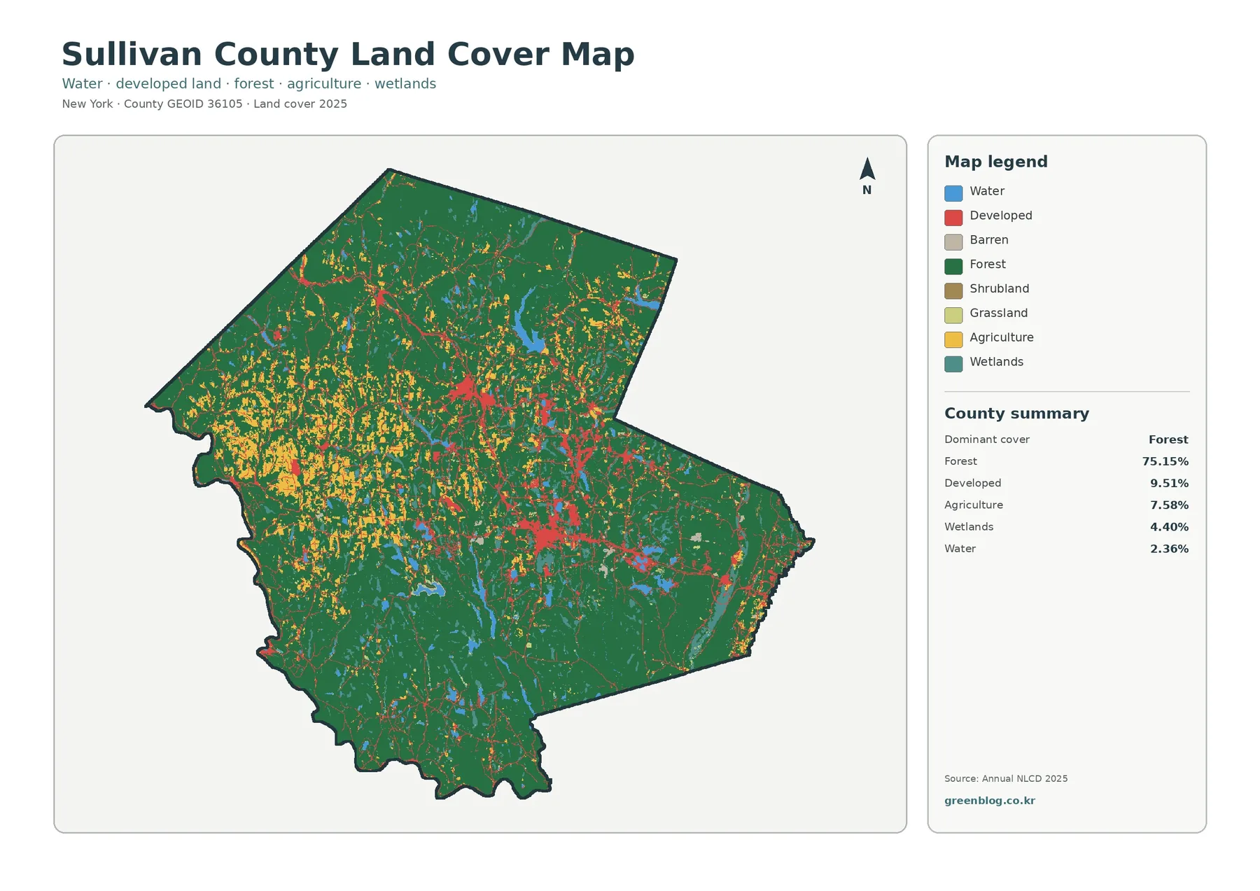
The general land-cover map is dominated by green, especially across the southern and eastern portions of the county. Large forest blocks continue through the north as well, so the 75.15 percent county total is easy to understand visually. The important detail is not simply the amount of forest, however. Agricultural clearings, developed clusters, wetlands, and water interrupt that green background in different ways, producing a county with several distinct local patterns inside one forest-dominated total.
Agriculture represents 7.58 percent of the mapped area. Yellow agricultural cover is much more noticeable in the west and northwest, where fields and other agricultural surfaces appear repeatedly among forest patches. The pattern is not a single continuous farm plain. It is a mixed rural landscape in which forest and agriculture meet along many edges. Cornell Cooperative Extension Sullivan County describes agriculture as an important part of the county’s economy and rural character, which provides useful local context for the agricultural patches visible in the map.
Developed cover, at 9.51 percent, is more concentrated than the forest or farm classes. Several red clusters stand out in the central part of the county, with smaller developed concentrations and thin connections extending toward other settlements. County planning materials describe Monticello as the county seat and a higher-density center at the junction of New York Routes 17 and 42. Municipal boundaries and road names are not labeled on the land-cover image, so it cannot define Monticello’s exact edge. What it does show clearly is that developed cover gathers in distinct centers instead of spreading evenly across the county.
Wetlands at 4.40 percent and water at 2.36 percent are smaller categories, yet both are useful for orientation. Blue water bodies appear in several parts of the county, while wetland color occurs as patches and narrow areas within the broader forest. Official county planning material identifies the Upper Delaware Scenic and Recreational River, Catskill Park, Bashakill Wetland, and Shawangunk Ridge as major parts of the local open-space setting. That information helps explain the county’s strong natural-landscape context, but none of those named resources should be treated as identical to a land-cover color or as a boundary traced by this raster map.
Smaller legend classes matter when the map is enlarged, but they should not distract from the major pattern at county scale. Grassland and shrubland are minor parts of the supplied forest-and-farmland summary, at 0.56 percent and 0.15 percent respectively. Barren land is also included in the general legend, although no separate county percentage is printed for it in the supplied summary. A practical reading sequence is to locate the broad forest first, then identify farm and developed concentrations, and finally use water, wetlands, grassland, shrubland, and barren patches to refine the picture.
What the impervious-surface map adds to the development story
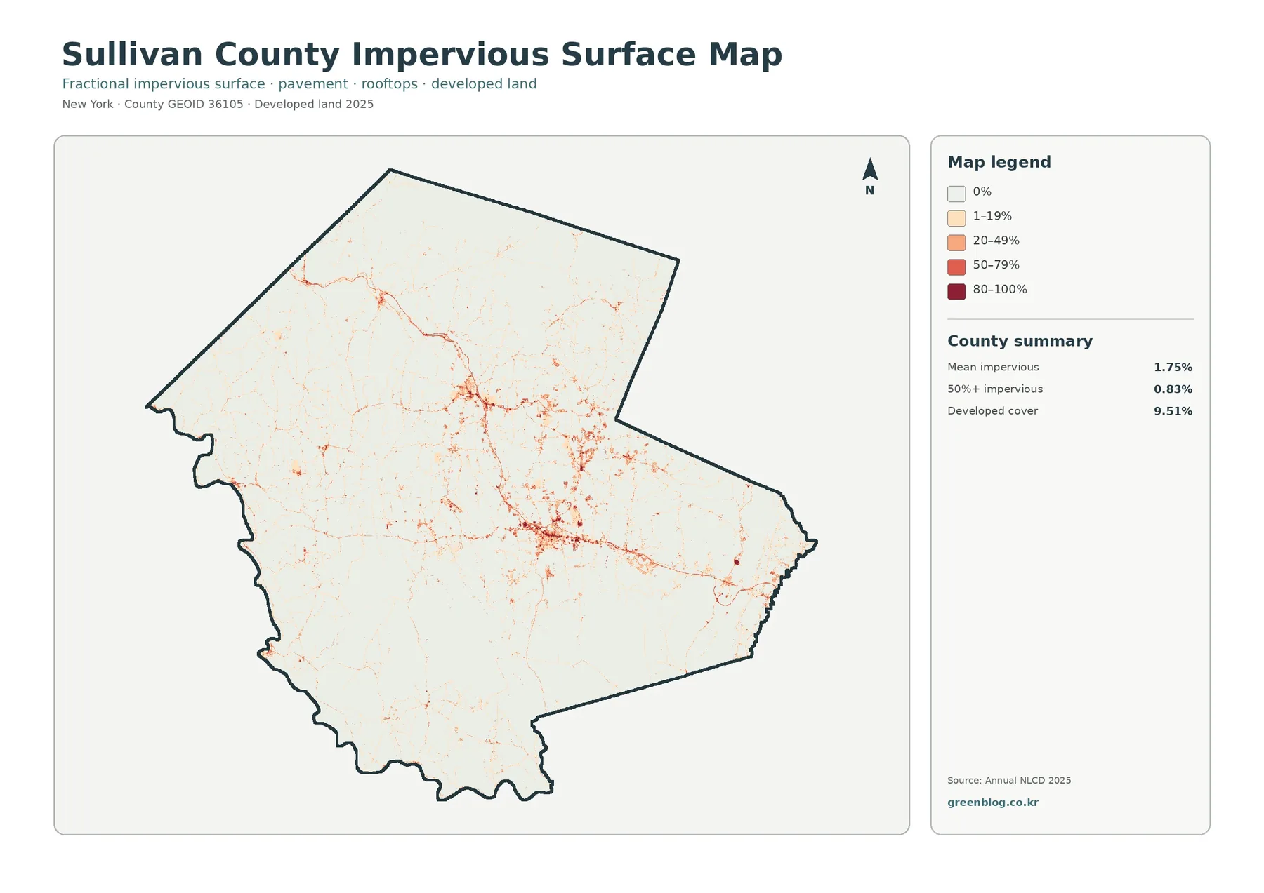
Impervious surface means hard cover such as pavement, rooftops, and parking areas where water cannot readily soak into the soil. Across the county, mean imperviousness is 1.75 percent, while cells at or above 50 percent imperviousness account for 0.83 percent of the mapped extent. Those numbers are far below the 9.51 percent developed-cover total because the two products measure different things. A developed landscape can still contain lawns, trees, soil, and other permeable surfaces.
Most of the impervious map is very light, which matches the county’s broad forest and rural land cover. The darker oranges and reds are concentrated in a handful of centers and along thin connecting features. Looking at those places after the general map is useful because it separates “developed” from “heavily covered by hard surface.” Two areas can both be classified as developed while having very different proportions of pavement and rooftops.
A countywide mean of 1.75 percent should not be read as if every part of Sullivan County has the same surface condition. Forested areas pull the average downward, while village centers, commercial areas, and major road corridors can contain much higher local values. The opposite mistake is also possible: zooming in on a dark cluster can make the county seem far more paved than it is. Pairing the county summary with the full map keeps both extremes in perspective.
Thin warm-colored lines may resemble roads, but this product is not a road map. It estimates hard-surface fraction within raster cells. A narrow road may share a cell with grass, trees, shoulder, or nearby buildings, and the result is a percentage rather than a named transportation feature. Use a transportation or parcel dataset when road names, lanes, rights-of-way, or site access matter. The impervious layer is best for locating broad concentrations of hard surface.
Imperviousness is often relevant to stormwater and watershed discussions, but the map does not calculate flood risk, runoff volume, or water quality. Slope, soils, drainage infrastructure, rainfall, vegetation, and distance to streams all influence how water moves. In Sullivan County, where forest, wetlands, rivers, and reservoirs form a large part of the physical setting, the impervious layer works well as one input for environmental education or preliminary watershed review, not as a stand-alone hazard assessment.
Forest and farmland make the county’s rural contrast easier to see
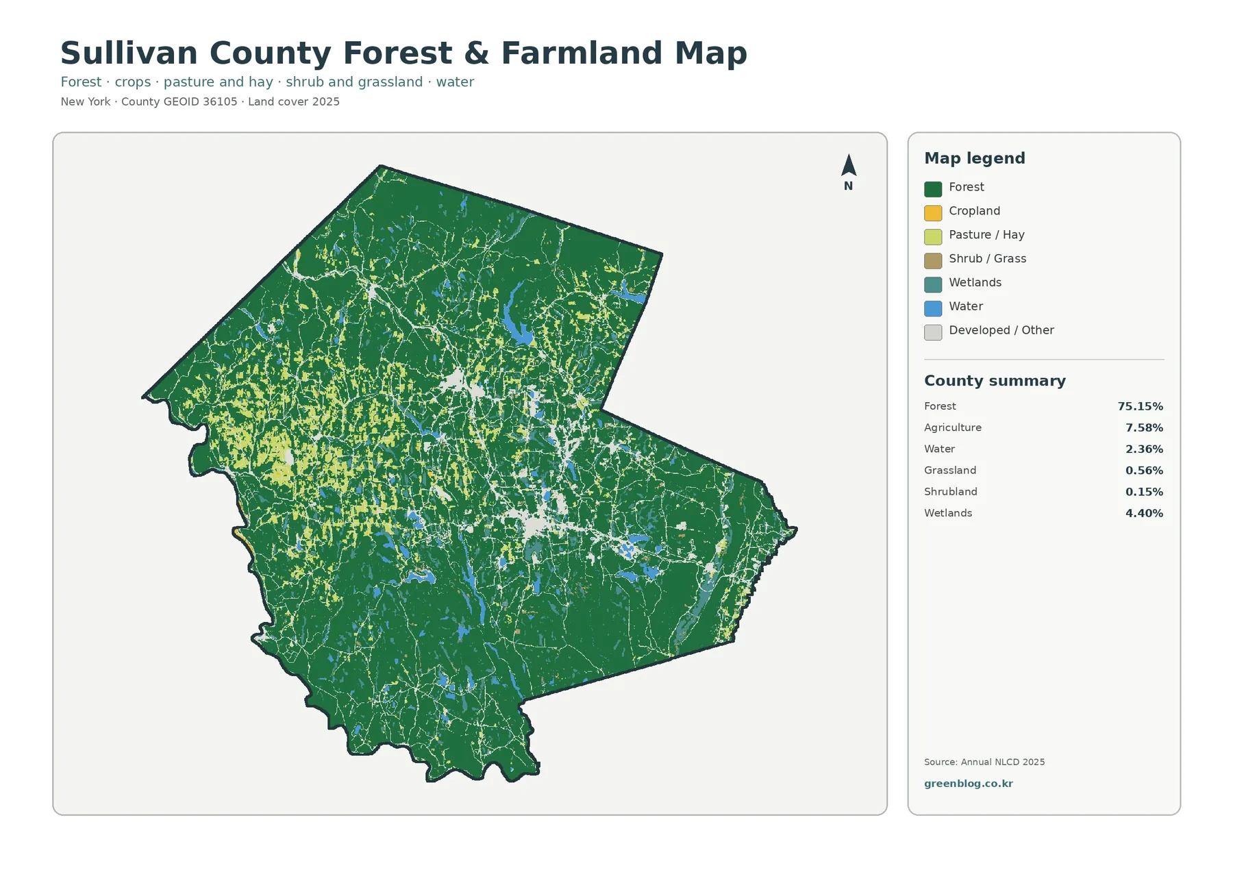
The forest-and-farmland view removes much of the visual competition from developed and other surfaces, making the west-to-east contrast easier to follow. Forest still fills most of the county, but agriculture becomes more prominent in western and northwestern sections. In the south and east, green tends to form larger continuous areas. That difference is more useful than the county percentage alone because it shows where agricultural cover actually interrupts the forest-dominated landscape.
Agricultural cover on this map should not be confused with an agricultural district. Agricultural districts are tracked separately by the county through a dedicated GIS layer used for assessment and administrative purposes. Land cover, by contrast, classifies what the surface looks like in the imagery and data. A farm property can contain forest, pasture, cropland, buildings, roads, ponds, and wet areas at the same time, so its legal or administrative boundary will not necessarily match the yellow land-cover cells.
Tree cover needs a similar caution because the forest class does not identify ownership or conservation status. Green cells indicate tree-dominated surface, not public ownership or conservation status. Catskill Park lands and a broad open-space network are part of the local setting, but private forest and other wooded land also contribute to the mapped pattern. The land-cover map is excellent for identifying where tree cover is extensive. It cannot tell the reader whether a forest parcel is publicly accessible, protected by easement, actively managed, or privately owned.
Water and wetlands remain visible in this simplified version, which makes them useful landmarks when moving between maps. New York City’s Department of Environmental Protection identifies Neversink Reservoir in Sullivan County, about five miles northeast of the Village of Liberty. The supplied land-cover image does not print water-body names, so a labeled reference map is needed before assigning a name to a particular blue shape. Once a water body is identified, however, it can help anchor comparisons among forest, farmland, developed cover, and imperviousness.
For a classroom exercise, choose one western area with many agricultural cells and one southern or eastern area dominated by forest. Compare the amount of wetland, water, and developed/other surface around each sample. Then return to the impervious map and examine whether hard-surface intensity changes in the same locations. Following the same two sample areas across multiple maps teaches more than selecting a different example for every image because the reader can see how each product answers a different question about one landscape.
Reading the 1985–2025 class-difference map without overstating change
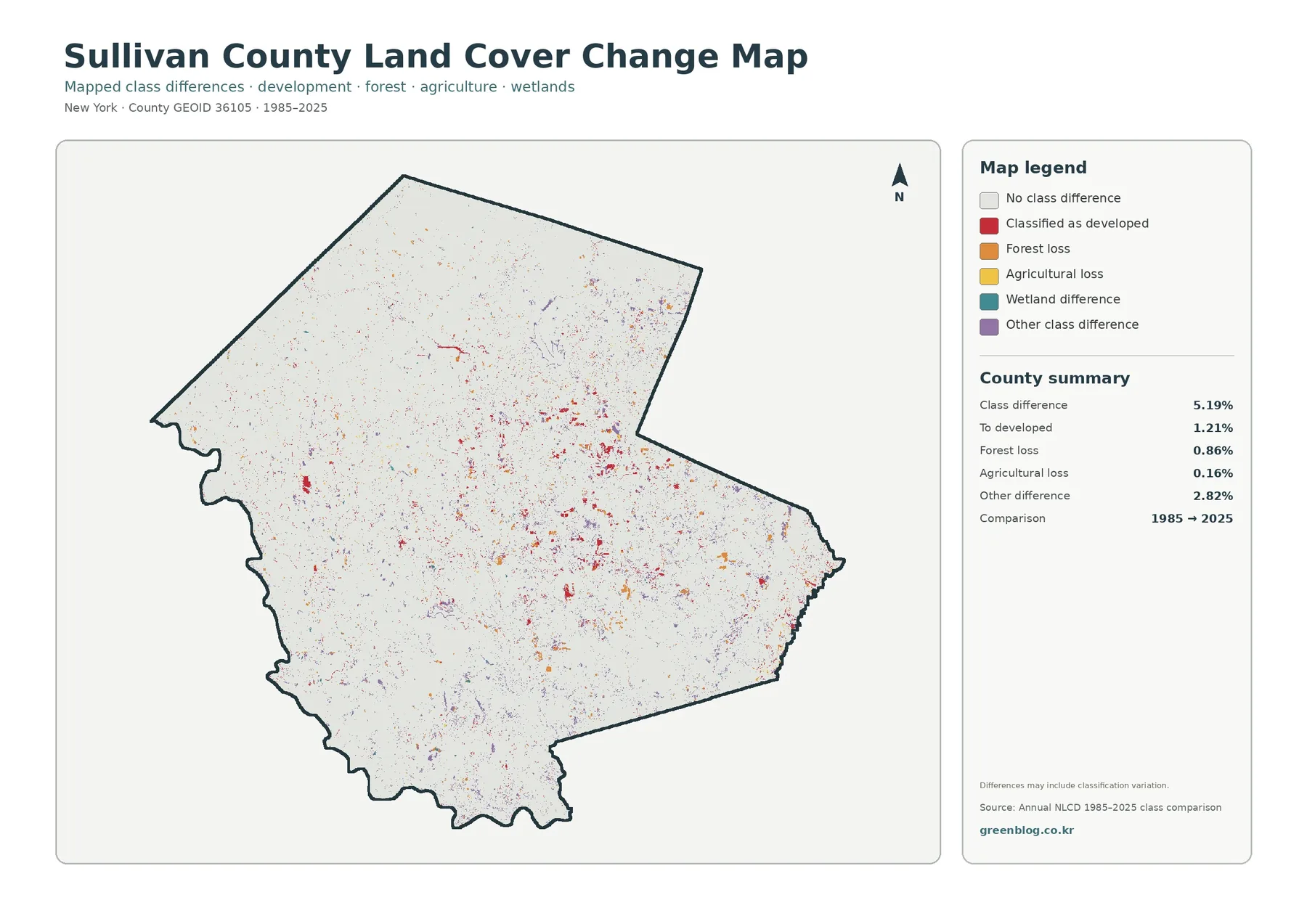
The comparison map reports class difference across 5.19 percent of the mapped county. Its summary lists 1.21 percent as change to developed, 0.86 percent as forest loss, 0.16 percent as agricultural loss, and 2.82 percent as other class difference. Wetland difference is also shown in the legend, but the supplied summary does not print a separate percentage for that category. It would be inappropriate to invent or infer a missing value for publication.
The 5.19 percent total is not a development rate. Only 1.21 percent is specifically labeled as change to developed, while several other types of class difference are mapped separately. Likewise, the current 9.51 percent developed-cover value does not mean that amount developed after 1985. The current map and the comparison map answer different questions: one describes the 2025 surface; the other identifies cells whose class differs between the two comparison years.
Difference colors are scattered in small patches across much of the county, with some more noticeable developed-change clusters around existing centers. Other differences also appear in forest-and-farm areas. A two-date map cannot reveal exactly when a change happened during the forty-year interval. It also cannot show whether a place changed more than once. Intermediate Annual NLCD years, historical aerial photography, and local records are needed to investigate timing.
Classification variation is another reason for caution. A raster cell near the edge of a forest, field, wetland, road, or settlement can contain several real surfaces. Differences in imagery, seasonal conditions, or classification may cause a cell to receive a different label even when the on-the-ground change is subtle. The supplied map itself warns that differences may include classification variation. Large repeated patterns are therefore more reliable for broad discussion than a single isolated pixel.
A good workflow is to begin with the 2025 map, identify the present-day surface at a location, and then check the comparison map for that same place. If the question is important enough to require an explanation, add intermediate-year data or aerial imagery before drawing conclusions. The class-difference map is especially useful for generating focused questions about where to investigate further; it should not be treated as automatic proof of why a landscape changed.
Local geography helps orient a forest-dominated county
Local planning documents place this area in the historic Catskills region and describe an open-space network that includes the Upper Delaware Scenic and Recreational River, Catskill Park, Bashakill Wetland, and Shawangunk Ridge. Those named landscapes are useful orientation references for a reader who wants to connect an unlabeled land-cover pattern with local geography. They are not interchangeable with the raster classes, however. A forest cell is not automatically Catskill Park, and a wetland-colored cell is not automatically the legal Bashakill boundary.
Natural land and compact settlement centers create another strong contrast across Sullivan County. The Resilient Sullivan plan describes incorporated villages as places able to support higher housing density and highlights Monticello as the county seat with a distinct main-street character. That planning context helps explain why development and imperviousness appear as concentrated clusters rather than a uniform blanket. The map itself only supplies surface evidence, so planning documents are best used as context rather than as a substitute for the mapped data.
Water provides another useful reference system. The Delaware River forms part of the county’s southwestern boundary, and the county planning program includes work on both the Upper Delaware and Neversink watersheds. A land-cover map cannot show flow direction, water quality, flood stage, or watershed policy, but it can place forest, agriculture, developed cover, wetlands, and open water in the same view. That makes it a practical first image for watershed lessons before moving to hydrology-specific datasets.
When comparing Sullivan with another county, keep the data year and map theme consistent. A 2025 forest percentage should be compared with another 2025 land-cover summary, not with a historical inventory using a different classification. Imperviousness should be compared with imperviousness, not with developed-cover percentage. The 1985–2025 difference layer belongs in a separate comparison because it describes change between dates rather than the current surface. Matching like with like prevents many common interpretation errors.
Picking the right JPG from the four-map download
Four original JPGs are bundled in the ZIP: the 2025 land-cover view, the forest-and-farmland view, the impervious/developed-land view, and the 1985–2025 class comparison. The files can be placed into a lesson, presentation, county-comparison sheet, preliminary environmental report, or printed reference. Each image retains its title, legend, and summary panel, which helps preserve the meaning when the map is used away from this article.
Start with the overall map when the question is simply, “What covers Sullivan County in 2025?” Choose the forest-and-farmland map for rural landscape comparisons, especially the difference between the farm-mixed west and more continuous forest elsewhere. Select the impervious map for hard-surface concentration around settlement centers. Reserve the comparison map for questions about differences between 1985 and 2025. Matching the map to the question keeps the explanation direct.
Keep the legend and year with the image whenever possible. Red means developed cover on the general map, higher hard-surface fraction on the impervious map, and change to developed on the comparison map. Removing the legend can therefore make three visually similar colors mean three different things without explanation. A short caption naming the theme and year is enough to prevent most reuse errors.
The original JPG dimensions listed in the package are 2480 × 1754 pixels. The files are the original supplied images, but the package does not certify them as meeting an A3 high-resolution reference. For large-format printing, test the legend and smaller text at the intended output size before producing many copies. The WebP versions are appropriate for quick browser viewing; the JPGs are the better starting point for print or editing.
Limits and good interpretation habits
Annual NLCD-style land cover is raster data. A raster divides the surface into cells and assigns a category or value to each cell. At a forest edge, along a narrow road, beside a wetland, or where a farm and homes meet, one cell can contain several real surfaces. The mapped edge is therefore generalized and should not be treated as a surveyed parcel boundary.
County percentages are summaries, not descriptions of every community. Forest at 75.15 percent does not mean each town is three-quarters forest. Agriculture is more visible in some western areas, while development is concentrated around selected centers. A county average is most useful when paired with the map showing where each class actually occurs.
Date is another important limit: a 2025 classification cannot include construction, vegetation change, farming changes, or wetland-edge changes that happen later. For a current parcel or project, consult recent aerial imagery and the responsible local or state datasets. These maps are strong for county-scale context, education, preliminary research, and comparison, but they do not replace a current site inspection.
Finally, land cover is not legal land use. Green forest is not automatically parkland. Yellow agriculture is not an agricultural-district boundary. Red developed cover does not identify residential, commercial, or industrial zoning. These maps are best used for broad surface patterns; property, regulation, permitting, wetland jurisdiction, and development rights require purpose-specific official records.
Frequently Asked Questions
What is the largest 2025 land-cover class in Sullivan County?
Forest is the largest class at 75.15 percent. Developed cover is 9.51 percent, agriculture 7.58 percent, wetlands 4.40 percent, and water 2.36 percent. The map is still important because farmland is more noticeable in parts of the west and northwest while developed cover clusters around a smaller number of centers.
Why is developed cover 9.51 percent while mean imperviousness is only 1.75 percent?
They measure different things. Developed cover classifies a broader developed landscape, which can include trees, lawns, soil, and other permeable surfaces. Imperviousness estimates the hard-surface share, such as pavement and rooftops, within each cell. Areas at or above 50 percent imperviousness make up 0.83 percent of the mapped county.
Does the 5.19 percent 1985–2025 difference mean that much of the county was developed?
No. Change to developed is 1.21 percent. The summary also reports forest loss at 0.86 percent, agricultural loss at 0.16 percent, and other class difference at 2.82 percent, while wetland difference appears as another legend category. The total combines several kinds of class difference and can include classification variation. Map File Information The ZIP contains four original Sullivan County JPG maps: 2025 land cover, forest and farmland, impervious/developed land, and the 1985–2025 land-cover class comparison.
Map File Information
Download the map files associated with this page for reference, printing, and compatible visual projects.
- Included Files: Use only the versions confirmed in the article and supplied images
- File Type: Use the confirmed download contents
- Intended Use: Printing, education, presentations, and map-based projects
Related Maps
- Albany County Land Cover Map
- Allegany County New York Land Cover Map
- Bronx County New York Land Cover Map
Sources and references
Percentages and legend descriptions in this article follow the supplied 2025 Annual NLCD-based maps and the 1985–2025 comparison summary. County-specific context about the Catskills, open space, agriculture, settlement planning, and Neversink Reservoir is supported by the official and trusted sources below.
- MRLC Annual NLCD Data – Annual NLCD product and data access
- USGS Annual NLCD Land Cover Classification – documentation for land-cover classes
- Sullivan County Planning, Community Development and Environmental Management – official county planning and open-space context
- Cornell Cooperative Extension Sullivan County Agriculture – local agriculture and rural-community context
- New York City DEP – Neversink Reservoir – official reservoir location and water-supply background
These sources provide data documentation and geographic context. They do not convert the land-cover classes into legal boundaries. For parcel ownership, zoning, permits, wetland jurisdiction, agricultural districts, or current site conditions, consult the responsible agency’s purpose-specific and most recent records.
Green Map creates custom-edited map images using open geographic data sources such as geoBoundaries, Natural Earth, OpenStreetMap, and government open data.
These maps are edited visual materials, not raw data files, and are provided for education, documents, presentations, and graphic reference.