Elkhart County is not a simple farm-county map. Agriculture is the largest 2025 class at 55.04%, yet developed land reaches 29.36%, creating one of the strongest built footprints in this Indiana county series. A broad urban concentration occupies the northwest around Elkhart, another large center lies farther southeast around Goshen, and wetlands become much more noticeable toward the east and northeast. This Elkhart County Indiana Land Cover Map helps separate those urban, agricultural, wetland, forest, and water patterns without treating them as zoning or parcel boundaries.
The page includes four views: current land cover, forest and farmland, impervious surface and developed land, and a 1985–2025 class-difference comparison. WebP previews are placed with the discussion, while the four original 2480 × 1754-pixel JPG maps are available together in one ZIP below. They work best for county profiles, classroom comparisons, watershed context, presentation graphics, and other broad reference uses rather than site-level decisions.
Table of Contents
A farm majority surrounds two major developed concentrations
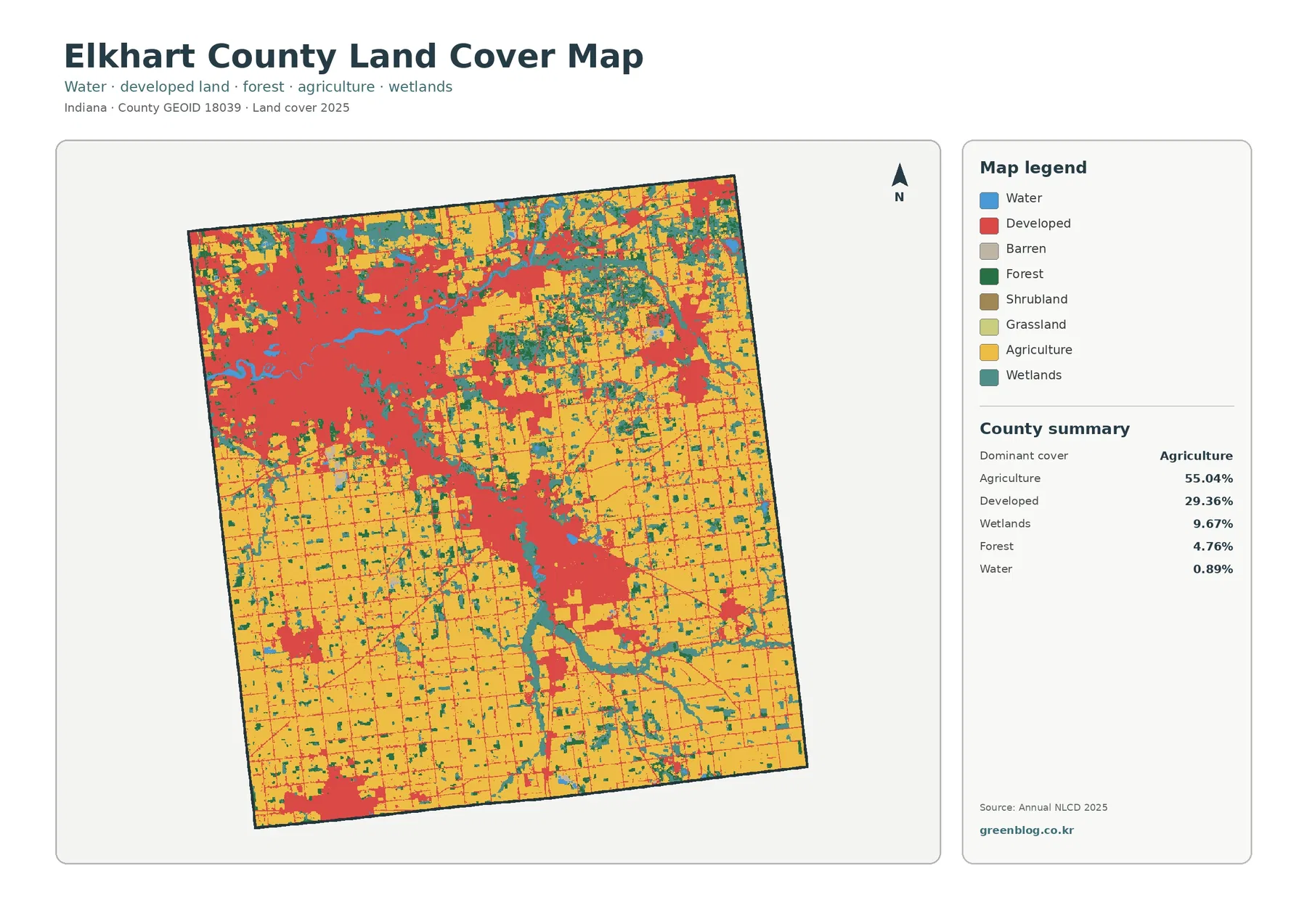
The county summary gives agriculture 55.04%, developed land 29.36%, wetlands 9.67%, forest 4.76%, and water 0.89%. Agriculture therefore leads numerically, but the red developed class is too extensive to be treated as a minor interruption in farm country. The northwest contains a large, nearly continuous built area. A second broad concentration appears southeast of it, while smaller developed patches and road-like traces continue through the agricultural interior.
The northwestern concentration broadly corresponds to Elkhart, and the large center farther southeast corresponds to Goshen. The county government also lists Bristol, Middlebury, Millersburg, Nappanee, and Wakarusa among its cities and towns. Those names are useful regional context, but the land-cover preview does not draw municipal boundaries. Small red patches should not be assigned to a particular town simply from their position or color; an official municipal or GIS layer is needed for that level of identification.
Beyond the two largest developed areas, yellow agricultural blocks become more continuous across the south, southeast, and parts of the northeast. The eastern side is less uniform, however, because teal wetland cells repeatedly break up fields and meet small forest patches. That contrast matters: two places can both be dominated by agriculture while looking quite different on the ground if one has a dense wetland network and the other has broad, uninterrupted field blocks.
Land cover classifies what the surface looked like in the imagery. It does not show legal land use, ownership, parcel lines, building rights, or future development approval. A developed cell can still contain lawns, trees, and exposed soil. An agricultural cell does not identify a crop, a farm operator, or an exact field boundary. Keeping those limits clear makes the other maps easier to interpret.
Fields return quickly outside the Elkhart–Goshen urban belt
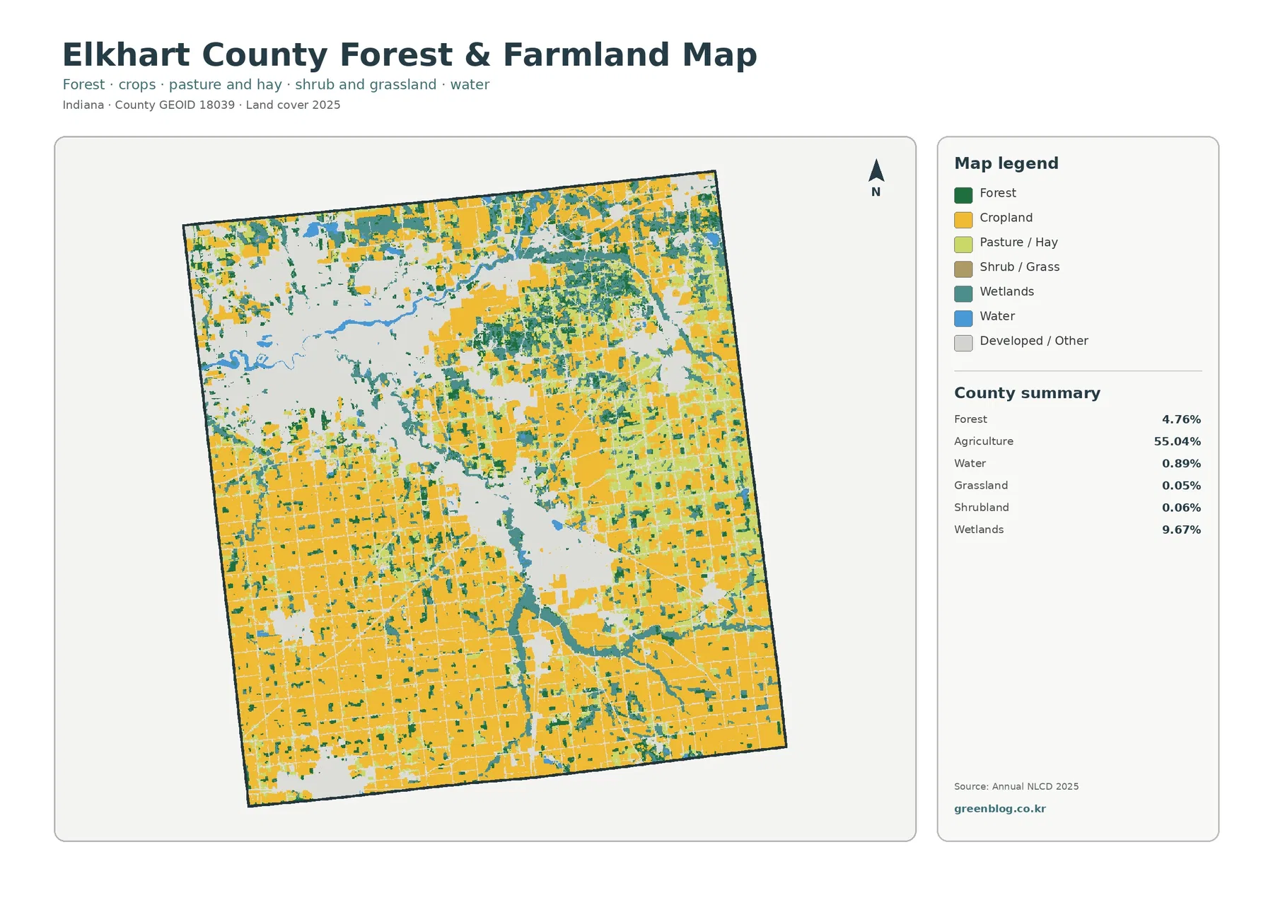
Once developed and miscellaneous surfaces fade, the scale of the agricultural landscape becomes much clearer. Large yellow blocks dominate the southern half and remain widespread in the east and northeast. The pale openings left by the major urban areas interrupt those fields, but agriculture resumes quickly beyond their edges. This makes the map useful for showing how a large built footprint can coexist with a county that is still more than half agricultural in the 2025 classification.
Wetlands account for 9.67%, a substantial share compared with many heavily farmed Indiana counties. They are especially visible in the east and northeast, where teal patches and narrow bands appear repeatedly among fields. Wetlands also occur near the river network and around some forested pieces. The pattern is not a single continuous wetland tract; it is a dispersed system that changes the texture of the agricultural landscape over many parts of the county.
Forest covers 4.76%. That is a small countywide percentage, but dark green pieces still matter locally because they often sit beside wetlands, water, and field edges. The northeast and east-central parts of the county show more of these small wooded areas than the broadest southern farm blocks. Forest here is better understood as a scattered component within a working agricultural and wetland landscape than as a separate forest region.
Grassland and shrubland are only 0.05% and 0.06% in the supplied summary. They should not be inflated into major county characteristics. Water is also modest at 0.89%, even though visible blue river lines are important landmarks. Open water and wetland are different classes: blue mainly marks exposed water, while wetland classes may include vegetation and seasonally saturated ground.
Hard surfaces make the northwest stand apart from the rural grid
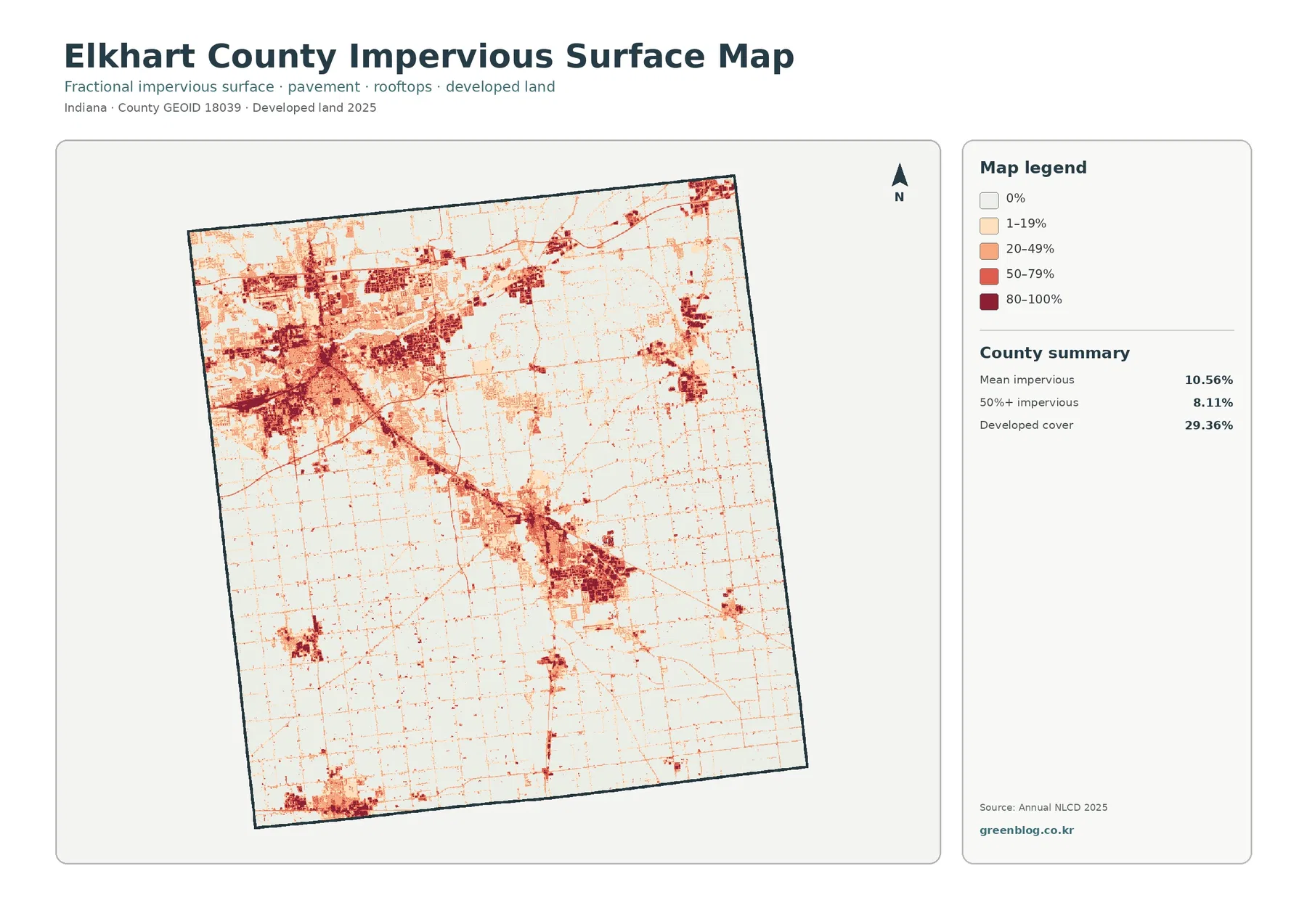
Mean impervious cover is 10.56%, and 8.11% of the county is mapped at 50% impervious or greater. Both values are lower than the 29.36% developed share because developed land can include permeable lawns, trees, soil, and open spaces around structures. The impervious layer narrows the question to roofs, pavement, parking areas, and similar surfaces that prevent or reduce infiltration.
The northwest contains the darkest and most extensive cluster. High values spread across a broad area rather than appearing only as a small downtown core. From there, lighter and darker traces extend eastward and southward. The Goshen-area concentration farther southeast is also distinct, with another dense center and connecting linear features. The preview does not label highways or local roads, so those lines should be described as transportation-like or developed traces unless a separate road layer is used.
Rural parts of the county are not blank. Fine impervious lines form a wide grid through farm country, and smaller concentrations appear near other settlements. Their intensity is much lower than the largest urban clusters, which is why the countywide average cannot describe every location equally well. For development intensity, the placement and continuity of the darker values tell more than the mean alone.
Impervious cover can be useful when framing runoff or watershed questions, but it is not a flood-risk map. Rainfall, soils, drainage systems, elevation, streams, wetlands, and local infrastructure all affect how water moves. A dark impervious patch identifies a surface condition, not a guaranteed hazard. Site-specific drainage or flood decisions need current engineering and regulatory sources.
The St. Joseph and Elkhart rivers connect urban areas with wetland country
Elkhart County Parks identifies the St. Joseph River and Elkhart River as major waterways in the county. Its recreation information places the Elkhart River through the Goshen area and the St. Joseph River farther north, including the Elkhart area. Blue water lines in the supplied land-cover map fit that broad county geography, and teal wetlands often appear nearby. Smaller channels are not labeled in the preview, so naming every blue or teal feature requires a hydrography layer rather than visual guesswork.
The rivers also help explain why water-related cover matters even though open water is only 0.89%. A narrow river can be visually important without occupying much county area, and wetlands can spread far beyond the visible blue channel. In the north and east, fields, wet ground, wooded fragments, and developed surfaces repeatedly meet near the same water network. That makes the county useful for teaching the difference between open water, wetland, agricultural cover, and urban surface within a relatively compact area.
Those relationships are associations, not causes. The maps do not prove that a road, river, wetland, or city created the neighboring land-cover class. They simply show where classes occur at the supplied observation date. Questions about river buffers, jurisdictional wetlands, floodplains, stream restoration, or water quality need current hydrologic and regulatory information in addition to the land-cover layer.
The 21.92% endpoint difference is much broader than new development
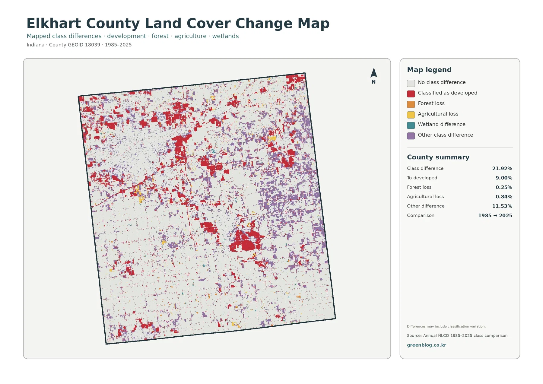
The total class difference between the 1985 and 2025 endpoints is 21.92%. The supplied components are 9.00% classified as developed, 0.25% forest loss, 0.84% agricultural loss, and 11.53% other class difference. Other difference is the largest listed component. That alone shows why the total should never be rewritten as “21.92% developed” or as a direct measure of land consumption.
Red developed-change cells are especially prominent in the northwest and around the other large built center, with additional patches along outward traces and smaller settlements. Those locations overlap broadly with current developed areas, but the two maps answer different questions. The current map shows the 2025 surface class. The change map marks cells whose endpoint classifications differ, so not every 2025 developed cell has to appear as a red change cell.
Purple other-difference cells are widespread, particularly through parts of the east and northeast. The map does not assign a single cause to that category. It should not be converted into a claim about crop rotation, wetland restoration, development, storm damage, or classification error without further evidence. A wetland-difference color also appears in the legend, but no independent percentage is supplied; estimating one by subtraction would create a number that the package does not verify.
“Forest loss” and “agricultural loss” describe endpoint class changes, not a documented cause or exact event date. A forest cell in 1985 may have a different 2025 class for several reasons, and the same is true for agriculture. Intermediate annual imagery, aerial photographs, permits, planning records, and field evidence are needed to establish timing and explanation. The comparison is a screening tool for where to look, not a forty-year event log.
Frequently Asked Questions
Why does Elkhart County look urban when agriculture is still 55.04%?
Developed land covers 29.36%, and much of it is concentrated in large connected areas around Elkhart and Goshen. Those clusters are visually dominant even though agriculture occupies more total area across the county. The southern and eastern farm blocks are extensive, but they are less concentrated than the largest urban footprint.
Are the teal areas all open water or mapped river channels?
No. Open water is a separate blue class and accounts for 0.89%. Wetlands are 9.67% and may include vegetation or saturated ground, so teal areas can extend well beyond an exposed channel. Exact river, stream, or wetland boundaries require current hydrography and regulatory data.
Does the 21.92% 1985–2025 class difference mean that much land was developed?
No. The listed developed-change component is 9.00%, while other class difference is 11.53%. Forest loss is 0.25% and agricultural loss is 0.84%. The 21.92% total combines several kinds of endpoint difference and cannot be used as a development-growth percentage.
Choose the map that matches the question before downloading
For a general county profile, begin with the 2025 land-cover overview. It places the 55.04% agricultural majority beside the 29.36% developed footprint and the 9.67% wetland share. If the topic is farmland and natural cover, use the forest-and-farmland image next. For urban intensity, the impervious map is more informative because it separates hard surfaces from the broader developed class.
The change map belongs after the current map, not before it. Its red, orange, yellow, teal, and purple colors are endpoint differences rather than present-day land-cover classes. Showing the current surface first gives the audience a location reference, then the 1985–2025 comparison can identify where classification changed. This sequence reduces the common mistake of reading change colors as if they were the 2025 legend.
Each original JPG is 2480 × 1754 pixels. The files are suitable for screen presentations, reports, classroom handouts, and general print reference, but the package does not label them as meeting an A3 high-resolution reference. Test a large print before committing to poster output. These graphics are not substitutes for surveys, parcel maps, official wetland determinations, flood-insurance products, road design plans, or engineering documents.
Map File Information
The ZIP contains four original JPG maps for comparing Elkhart County's agricultural majority, broad developed centers, wetland network, impervious surfaces, and 1985–2025 class differences.
- Included Files: Map images described in this article
- File Type: ZIP archive
- Intended Use: Printing, education, presentations, and map-based projects
Related Maps
- Adams County Indiana Land Cover Map
- Allen County Indiana Land Cover Map
- Bartholomew County Indiana Land Cover Map
Sources and Reference Data
- MRLC Annual NLCD Data – official access point for annual land-cover and comparison products
- USGS Annual NLCD Land Cover Classification – definitions and guidance for agriculture, developed land, forest, wetlands, water, and related classes
- U.S. Census Bureau TIGER/Line Shapefiles – official county-boundary reference for Elkhart County
- Elkhart County Parks – Outdoor Adventure – official local context for the St. Joseph River, Elkhart River, and county waterways
- Purdue Extension Elkhart County – Agriculture and Natural Resources – local agriculture and natural-resource education and county information
- Elkhart County Planning & Development – official county planning, zoning, building, and GIS context
Green Map creates custom-edited map images using open geographic data sources such as geoBoundaries, Natural Earth, OpenStreetMap, and government open data. These maps are edited visual materials, not raw data files, and are provided for education, documents, presentations, and graphic reference.