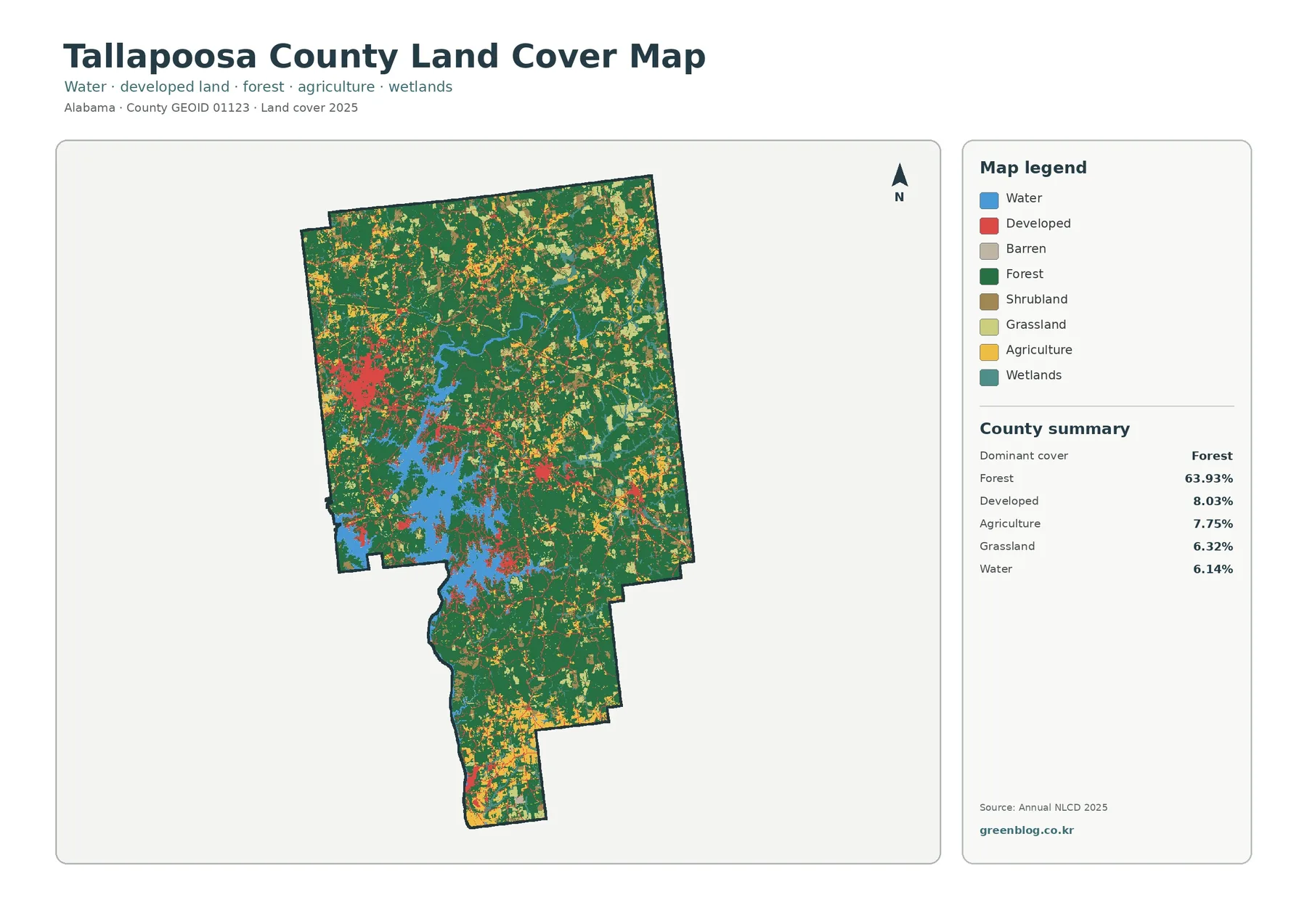
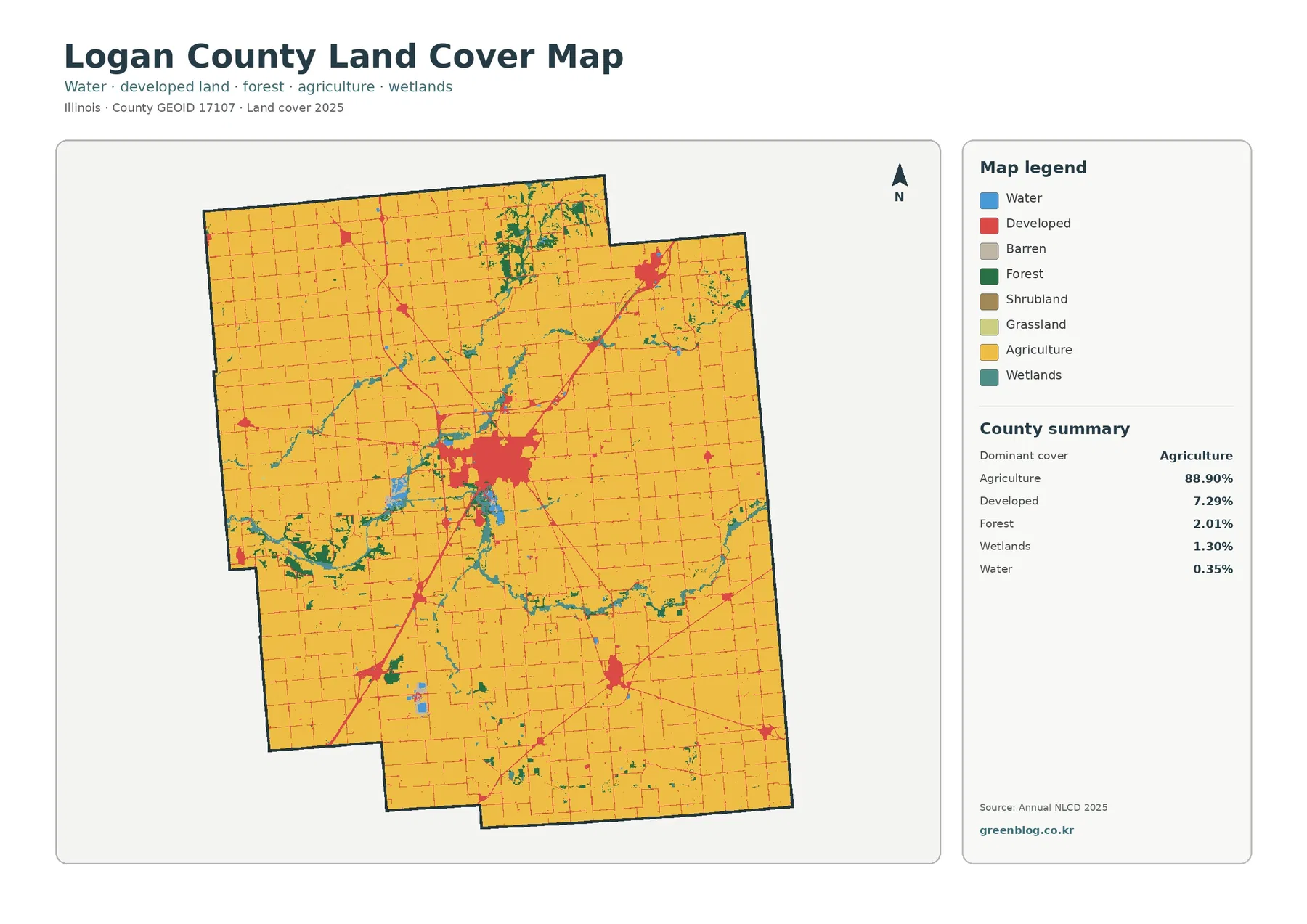
Agriculture covers 81.05% of Adams County in the supplied 2025 summary, giving the county a broad cropland background broken by several compact developed concentrations. Forest, wetlands, and water occupy much smaller shares, yet their scattered patches add important detail between the farm blocks. This Adams County Indiana Land Cover Map set is designed to make those contrasts easy to compare without treating the county as one uniform surface.
The page includes a current land-cover view, a forest-and-farmland view, an impervious-surface map, and a 1985–2025 class-difference map. Each WebP preview can be read beside the explanation below, while the four original 2480 × 1754 JPG maps are available together in one ZIP. They work well for county profiles, classroom discussion, presentations, and broad environmental comparison where parcel-level accuracy is not required.
Table of Contents
A farm-dominated county where developed land gathers in a few visible centers
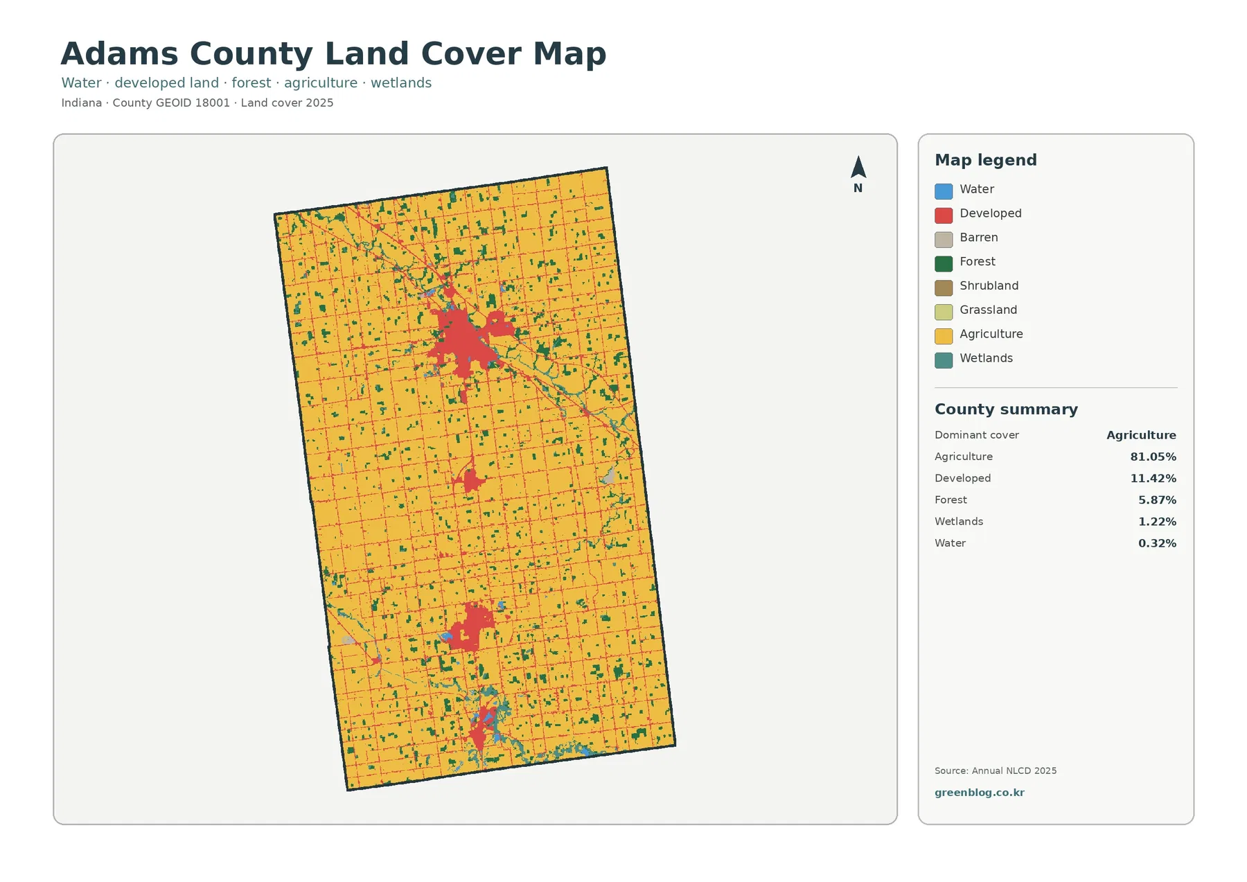
Yellow agricultural cover fills most of the county boundary, and that dominance is more important than any single small patch elsewhere on the map. The pattern is broad and continuous rather than confined to one side of the county. Thin lines and rectangular-looking breaks run through many farm areas, creating a regular visual grid. Because the image does not label roads or parcel lines, those features should be treated as broad surface patterns instead of named transportation routes or property boundaries.
Developed land accounts for 11.42%. Its smaller percentage does not make it visually subtle, because much of it is concentrated rather than evenly scattered. The largest red cluster sits in the northern half of the county, with additional clusters farther south and a small concentration close to the southern edge. Smaller red marks connect or surround these centers, but they do not form a continuous urban strip from north to south. Large farm areas remain between the principal built-up groups.
Forest covers 5.87%, appearing mostly as small green blocks and narrow patches embedded in the agricultural landscape. Wetlands add 1.22%, and open water is only 0.32%. Teal and blue areas are limited compared with the cropland, yet several occur beside or near wooded patches. That relationship is useful when examining where natural cover interrupts the farm matrix, although the map alone cannot identify a creek, drainage ditch, wetland jurisdiction, or ownership boundary.
Land cover describes what is visible at the surface—cropland, forest, developed cover, wetlands, water, and similar classes. It is not a zoning map, a legal land-use map, or a cadastral survey. A red developed cell does not tell the reader whether the site is residential, commercial, industrial, or public. Likewise, yellow agricultural cover does not identify a crop or farm operator. Those questions require other local records.
Hard-surface intensity separates town cores from the wider 11.42% developed footprint
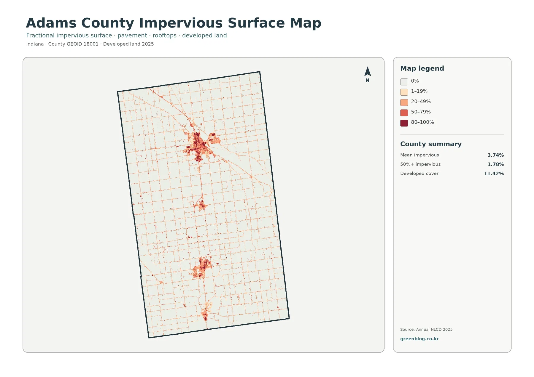
The mean impervious share is 3.74%, while 1.78% of the county is mapped at 50% or greater impervious surface. Both values are much lower than the 11.42% developed-cover figure. That difference is expected because a developed land-cover class can include lawns, trees, bare soil, and other surfaces around buildings and roads. The impervious layer isolates the harder portion of the built environment rather than counting every developed cell as fully paved.
The darkest values are concentrated inside the same general areas that stand out as red developed clusters on the current land-cover map. The northern concentration contains the broadest group of high-intensity cells. Smaller dark groups appear farther south, while most agricultural space remains pale. A countywide average therefore hides a strong local contrast: a limited number of places carry relatively dense hard surfaces, and the majority of the county does not.
Thin impervious traces also form a fine grid across the rural landscape. Some lines are long and diagonal, while many others run in straighter north-south or east-west patterns. They are useful clues to the footprint of transportation and development, but the map has no road names, functional classes, or traffic counts. A line should not be called a state highway or county road without checking a current transportation source.
Impervious cover is also not a flood-risk score. Pavement and rooftops can affect runoff, but drainage depends on rainfall, elevation, soils, ditches, streams, wetlands, and engineered systems. Use this image to locate concentrations of hard surface. Flood insurance, stormwater design, and drainage decisions require current FEMA, engineering, and local government data.
Forest and wetland patches break up the cropland field without forming one large natural block
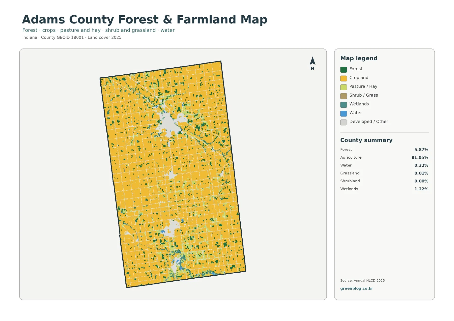
Removing the strong red development color makes the agricultural dominance even clearer. The supplied summary still reports agriculture at 81.05%, while forest remains 5.87%. Green patches are scattered through the county rather than concentrated in a single continuous woodland. Some are isolated within farm areas; others sit close to teal wetland cover. This arrangement makes the map useful for locating places where wooded and wetter surfaces interrupt a largely cultivated landscape.
The legend separates Cropland from Pasture/Hay, but the summary provides only the combined agriculture percentage. It would therefore be misleading to estimate separate acreage or percentage totals by eye. The same caution applies to the very small open-cover classes: grassland is listed at 0.01%, while shrubland rounds to 0.00%. A value rounded to 0.00% should not be read as proof that no shrubs exist anywhere on the ground.
Wetlands account for 1.22%, more than the 0.32% open-water share. These classes are related to water conditions but describe different surfaces. Blue marks exposed water, while teal wetland cover can include vegetation and seasonally wet ground. A teal strip is not automatically a named stream or lake, and it is not automatically a legally regulated wetland boundary. Local wetland inventories and field information are needed for that level of interpretation.
The local agricultural context is supported by Purdue Extension’s Adams County Agriculture & Natural Resources program, which publishes crop-related information and county test-plot results. That source helps explain why agriculture is an important local subject, but it does not convert the 81.05% land-cover figure into a count of farms, acres of a particular crop, or economic production. The land-cover layer and agricultural statistics answer different questions.
Decatur, Berne, and Geneva provide place context, but the maps do not draw city limits
Indiana’s official local-information page identifies Decatur as the county seat and lists Berne, Decatur, and Geneva among the county’s cities. Those names provide useful geographic context for understanding why Adams County has several separate built concentrations instead of one continuous urban area. The supplied land-cover images, however, contain no municipal labels or boundary lines, so the exact edge of a red patch should not be presented as a city limit.
The maps are better used to describe relative concentration. One built area is clearly larger than the others, another substantial cluster appears farther south, and additional smaller concentrations occur between or below them. The agricultural background continues around these places. To assign each cluster precisely to Decatur, Berne, Geneva, or another community, compare the land-cover layer with an official place-boundary or GIS layer rather than relying on shape alone.
This distinction matters for practical use. A classroom map may only need the broad contrast between farm country and town footprints, while a planning document might require legal boundaries and street names. The downloadable images are well suited to the first task. They should be paired with Census TIGER/Line data or county GIS information for the second.
The 1985–2025 layer reports 9.26% class difference, not 9.26% damaged land
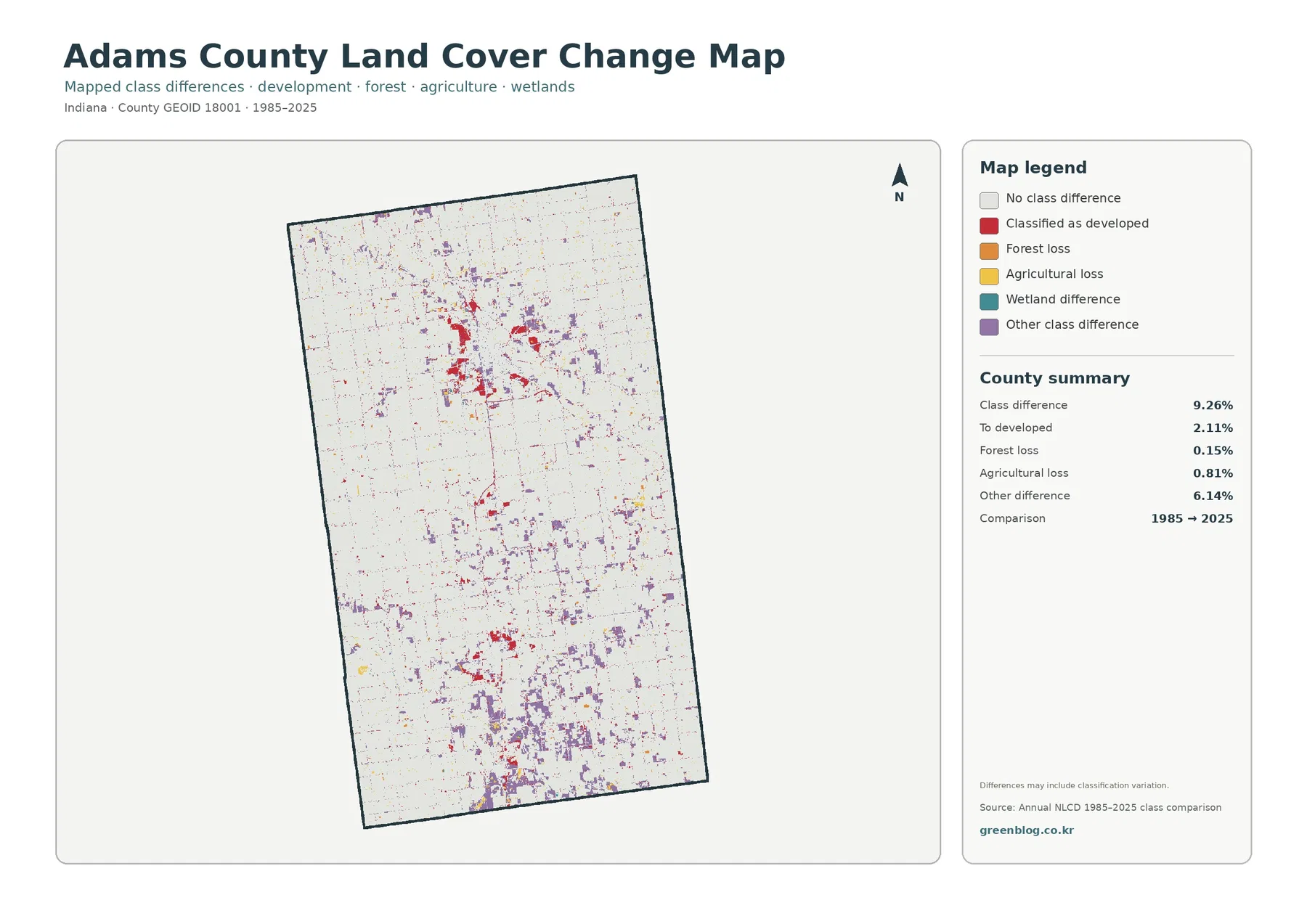
The map reports a total class difference of 9.26% between 1985 and 2025. That number is the share of cells with different endpoint classifications. It is not a statement that 9.26% of the county was degraded, destroyed, or permanently converted. The map itself warns that differences may include classification variation, an important caution when imagery timing, seasonal conditions, mixed pixels, and classification methods can affect the label assigned to a cell.
Its listed components are 2.11% classified as developed, 0.15% forest loss, 0.81% agricultural loss, and 6.14% other difference. Wetland difference appears in the legend but is not given a separate percentage. The safest approach is to report only the supplied values. Subtracting the listed categories from the total and labeling the remainder as an official wetland-change rate would ignore rounding and processing details that the package does not document.
Purple other-difference cells are scattered widely and make up the largest listed component. Red developed-difference cells are more concentrated around the existing built areas, especially in the northern half and near other developed centers farther south. Yellow agricultural-loss and orange forest-loss marks occupy smaller shares. This distribution can help a researcher choose where to look more closely, but it cannot identify why a particular cell changed class.
A cell marked as forest loss, for example, only indicates that its earlier forest label was replaced by another class at the 2025 endpoint. Timber harvest, construction, farming, storm effects, vegetation succession, and classification variability are different possibilities, and this image does not choose among them. Intermediate-year imagery, annual land-cover products, and local records are needed to establish timing and cause.
Reading the four views together prevents common map mistakes
Start with the 2025 land-cover map when the goal is to explain Adams County as a whole. It puts the 81.05% agricultural majority, the 11.42% developed share, scattered forest, and limited wetland and water cover in one frame. Move to the forest-and-farmland view when the question concerns natural patches within the cultivated landscape. Use the impervious map when hard-surface intensity matters more than the full developed class.
The change map should normally come after the current map. Its red cells represent an endpoint classification difference toward developed cover, not all development that exists today. Showing it first can lead readers to confuse change with current condition. Comparing the same area across the current and change layers makes the distinction much easier to explain.
Annual NLCD is a raster dataset built from approximately 30-meter cells. A cell can contain crops, trees, grass, a road, water, and a building at the same time, yet it must be summarized through a predominant class or an impervious percentage. Small ponds, narrow drainage features, thin tree rows, and compact farm buildings may therefore look wider, narrower, more fragmented, or less distinct than they do on the ground.
The 2025 view also has a date. Construction, crop conditions, standing water, or vegetation changes after that observation year may not appear. Enlarging the JPG improves readability of the symbols but does not create parcel detail that was absent from the original cells. For current site decisions, pair the maps with recent aerial imagery and authoritative local information.
Using the downloaded JPGs for reference, printing, and presentations
The ZIP contains one original JPG for each view: 2025 land cover, forest and farmland, impervious surface and developed land, and the 1985–2025 class-difference map. Each file measures 2480 × 1754 pixels. Using the originals instead of a browser screenshot preserves the map legend, percentages, and small linework more clearly in slides, handouts, or county summaries.
The asset manifest does not identify these images as meeting an A3 high-resolution reference, so a large poster should be proof-printed before final use. Keep the original proportions and avoid repeated recompression. The maps are appropriate for broad land-cover comparison and education, not for surveys, parcel boundaries, permit review, wetland jurisdiction, flood insurance, or engineering design.
Frequently Asked Questions
Why does developed land stand out when agriculture covers 81.05% of the county?
Developed cover is only 11.42%, but it is concentrated in several compact areas, so the red color forms obvious clusters. Agriculture is spread broadly across most of the county and reads more like a continuous background. Visual prominence and percentage share are different, which is why the map legend and summary should be read together.
Can the red clusters be used as exact boundaries for Decatur, Berne, or Geneva?
No. Indiana’s official local page lists those cities in Adams County, but the supplied land-cover images do not draw municipal boundaries or label individual places. The clusters show developed surface patterns. Exact city limits should be checked with Census place boundaries or local GIS data.
Does the 9.26% class difference mean that 9.26% of Adams County was damaged?
No. It is the share of cells with different classifications at the 1985 and 2025 endpoints, and the map notes that classification variation may be included. The listed components—2.11% classified as developed, 0.15% forest loss, 0.81% agricultural loss, and 6.14% other difference—identify categories for follow-up, not the cause or severity of change.
Sources and Reference Data
- MRLC Annual NLCD Data – official access point for annual land-cover and comparison products
- USGS Annual National Land Cover Database – description of the Annual NLCD 30-meter land-cover and change products
- USGS Annual NLCD Land Cover Classification – class definitions for agriculture, forest, developed land, wetlands, water, and related surfaces
- U.S. Census Bureau TIGER/Line Shapefiles – official county and place boundary reference
- IN.gov – Adams County – state local-information page identifying Decatur as the county seat and listing Berne, Decatur, and Geneva
- Purdue Extension – Adams County Agriculture & Natural Resources – local agricultural programs and county crop information
Map File Information
The ZIP contains four original JPG maps for comparing Adams County's farm-dominated land cover, forest and wetland patches, hard-surface concentrations, and 1985–2025 class differences.
- Included Files: Original high-resolution map files shown in this article
- File Type: JPG images packaged in a ZIP archive
- Intended Use: Printing, education, presentations, and map-based projects
Related Maps
- Indiana Population Density: Indianapolis Core and Fast-Growing Suburban Counties
- Why 92 Counties Fit a Tall Indiana State Map
- A Craighead County Arkansas Land Cover Map
Green Map creates custom-edited map images using open geographic data sources such as geoBoundaries, Natural Earth, OpenStreetMap, and government open data. These maps are edited visual materials, not raw data files, and are provided for education, documents, presentations, and graphic reference.