Agriculture is the dominant 2025 land-cover class in Woodford County at 77.28%, but the county is not a single unbroken farm field. Large yellow areas cover most of the interior, while wooded corridors and open water become much more visible along the western edge and across parts of the south. This Woodford County Illinois Land Cover Map set lets those contrasts be compared without treating land cover as zoning or parcel-level land use.
Four views are provided: 2025 land cover, forest and farmland, impervious surface and developed land, and an endpoint comparison from 1985 to 2025. The WebP images on the page are for viewing, while the download contains four original JPG maps at 2480 × 1754 pixels each. They can be used for county profiles, classroom work, presentations, and broad environmental comparisons.
Table of Contents
Most of the county is farmed, but the western and southern edges break the pattern
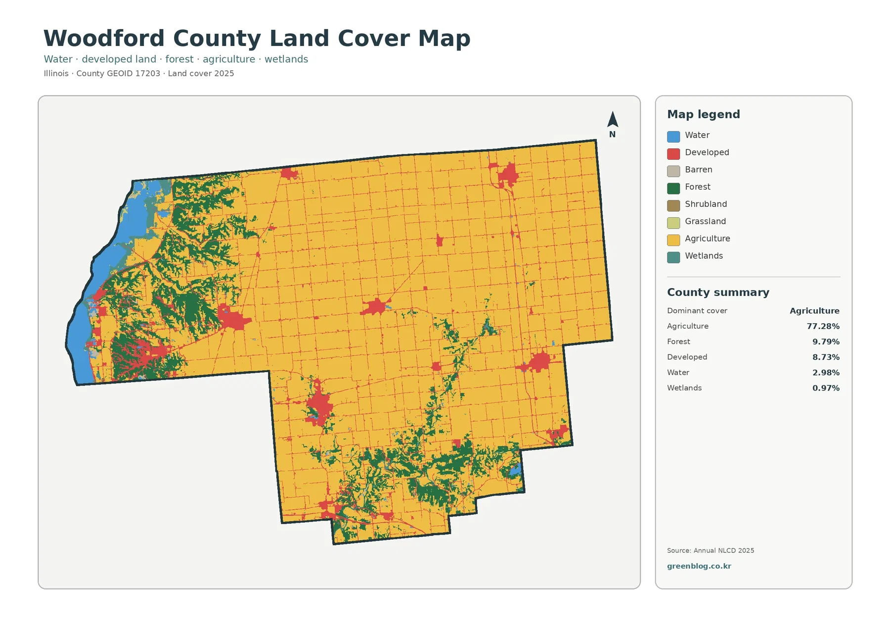
Yellow agriculture fills much of northern, central, and eastern Woodford County. It appears as broad blocks interrupted by a fine network of developed lines and several compact red clusters. The map summary reports agriculture at 77.28%, so the visual impression and the countywide statistic point in the same direction: farming is the main surface class across the interior.
Forest accounts for 9.79%. It is not spread evenly. The green areas are densest near the western side and in branching bands across the southern portion of the county, with smaller patches scattered through the agricultural interior. This concentration matters because a countywide percentage alone could make 9.79% sound minor, even though some local parts of the map are strongly wooded.
Developed cover is 8.73%. Darker red patches occur in several separate clusters rather than forming one continuous urban area. Thin red lines connect or extend away from some of those clusters, but the supplied image has no road names, municipal labels, or city boundaries. A particular red patch should therefore be described by its location on the county map unless it is checked against a current place or transportation layer.
Open water represents 2.98% and wetlands 0.97%. Blue water is especially prominent along the irregular western boundary, while smaller water features occur inland. Wetland cells are a different class from open water and can include vegetated or seasonally wet surfaces. Neither class should be treated as a legal wetland boundary, a flood zone, or a parcel survey.
Land cover answers a simple surface question: what is the ground predominantly covered by in the imagery and classification system? It does not state ownership, zoning, development rights, crop ownership, or parcel limits. A developed cell can still include trees or grass, and an agricultural cell does not identify a specific crop. Those distinctions are important when the map is used outside a general county profile.
River geography helps explain where to look, without turning map association into causation
An Illinois Department of Natural Resources plan for Woodford and McLean Counties states that the Illinois River forms Woodford County’s western border. It also names Richland Creek, Blue Creek, and Partridge River among streams flowing toward the Illinois River and notes that the Mackinaw River passes through Woodford County on its way west. That verified geography gives useful names to the broad river setting visible around the county.
On the land-cover image, blue water and green forest frequently occur close together along the west. Green bands also extend through the southern part of the county, where the Mackinaw River provides additional regional context. The map supports describing this association, but it does not prove that any specific forest patch exists because of flooding, slope, soil, conservation ownership, or another single factor. Those explanations require additional local evidence.
A county-specific example comes from Letcher Basin Land and Water Reserve in southern Woodford County. The Illinois Nature Preserves Commission describes a section of the Mackinaw River there along with wet floodplain forest, upland forest, an oxbow, and restored prairie on former agricultural fields. This is useful evidence that river, forest, and former agricultural landscapes occur together locally, but the reserve should not be used to label every green or purple cell in the southern map.
The agricultural dominance also appears in a separate official dataset. The USDA 2022 Census of Agriculture profile for Woodford County reports 277,669 acres of land in farms, including 244,452 acres of cropland and 16,043 acres of woodland. Those figures are not interchangeable with the 2025 Annual NLCD percentages because the dates, definitions, and measurement methods differ. They provide context rather than a second calculation of the map.
The forest-and-farmland view makes the agricultural interior easier to separate from wooded corridors
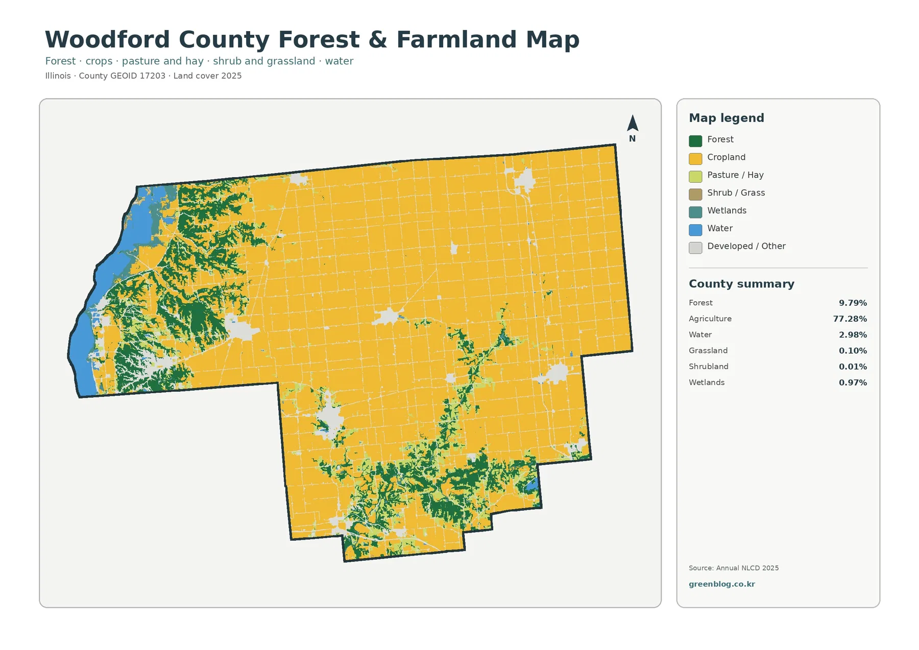
Removing much of the visual emphasis from developed and miscellaneous surfaces makes the main vegetation contrast clearer. Agriculture remains 77.28%, while forest is 9.79%. Broad crop areas fill the interior, and wooded strips become more noticeable along the west and through the southern drainage network. Smaller green patches also interrupt farm blocks elsewhere, but they are less continuous than the river-side concentrations.
The focused summary lists open water at 2.98%, wetlands at 0.97%, grassland at 0.10%, and shrubland at 0.01%. The last two classes are so small at county scale that they appear only as scattered pieces. A low percentage does not mean the cover type is unimportant at a site; it only means that it occupies a small share of the countywide classification.
Developed or other surfaces appear as light interruptions within the agricultural matrix. A grid of narrow lines crosses many farm areas, while several broader light patches correspond to the places where the general map showed stronger development. Because this is not a road map, those lines should not be assigned route numbers from shape alone. The useful comparison is the way built surfaces interrupt or border crop and forest classes.
For a presentation, this view works well after the full 2025 map. The general map establishes the countywide mix first, and the vegetation-focused version then simplifies the question to where crops, woods, water, wetlands, grass, and shrub cover occur. That sequence is especially helpful when the audience needs to compare the farm-heavy interior with the wooded river margins without being distracted by every developed class.
Impervious cover is concentrated inside a developed footprint that is much larger
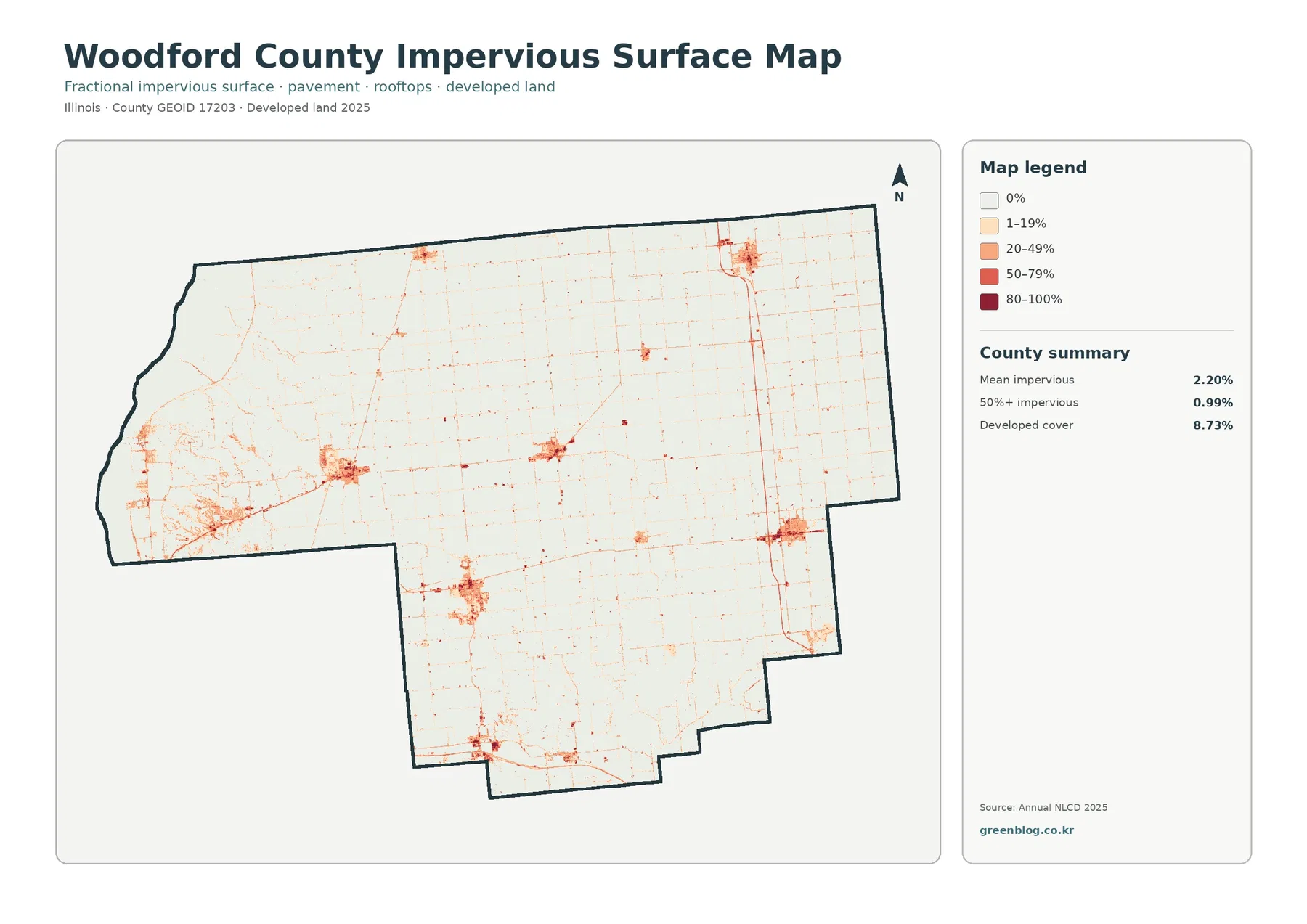
Mean impervious cover is 2.20%, and 0.99% of the county is mapped at 50% or more impervious surface. Both values are well below the 8.73% developed-cover share. The difference is expected because developed land can include lawns, trees, bare soil, and other permeable surfaces around buildings and roads, while the impervious layer isolates the harder portion of that developed landscape.
The darkest tones occur inside a limited number of developed clusters. Thin linear traces extend across the much lighter agricultural areas, creating a network that is easy to see even though the countywide mean is low. This is a good example of why an average can hide local concentration: most of the county has little hard-surface cover, while small areas carry substantially higher values.
The impervious map is useful for locating hard-surface intensity, but it is not a flood-risk map. Runoff and flooding depend on rainfall, terrain, soil, drainage systems, rivers, wetlands, and many other factors. A dark impervious patch can identify a place worth checking more closely, but engineering, floodplain, and stormwater decisions need current official sources.
Likewise, a narrow dark line is not enough evidence to name a highway, and a cluster of dark pixels is not a municipal boundary. The image contains no transportation labels or jurisdictional outlines. When a report needs exact place names, the impervious layer should be compared with Census boundaries, current road data, or another authoritative reference rather than labeled by visual guesswork.
Only 6.30% of cells carry a different endpoint class between 1985 and 2025
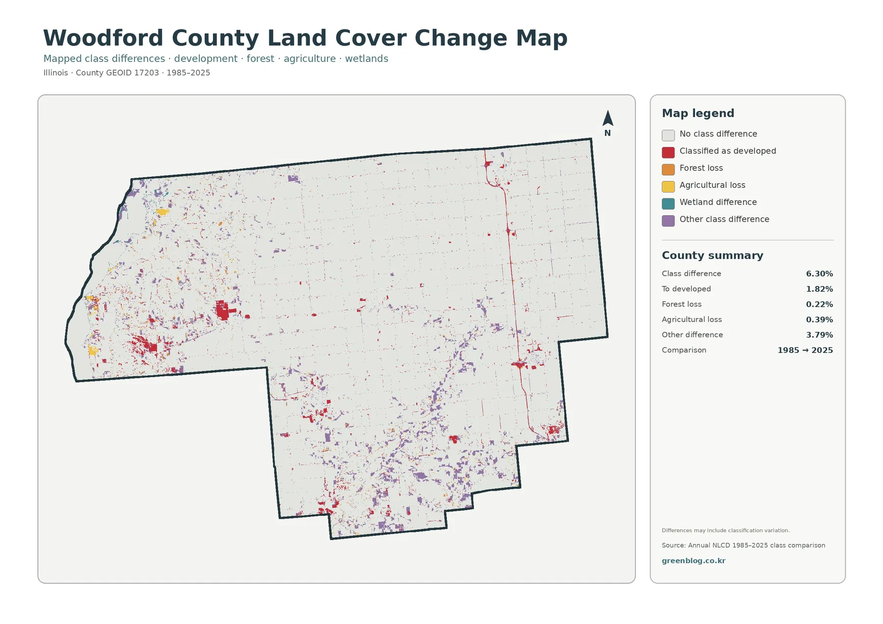
Most of the change map is the pale “no class difference” category. The county summary reports a total class difference of 6.30%, so the map is dominated by cells that received the same broad class at the two endpoints. Colored differences are more frequent in parts of the west and south and appear as smaller dots, lines, and patches through much of the agricultural interior.
The printed breakdown lists 1.82% classified as developed, 0.22% forest loss, 0.39% agricultural loss, and 3.79% other difference. Red developed-change cells stand out around several current development clusters and along some linear features. Purple other-difference cells are more widely scattered, while the orange and yellow loss classes occupy much smaller shares.
Wetland difference appears in the legend, but the summary does not print a separate percentage for it. Subtracting the listed categories from 6.30% and presenting the remainder as an official wetland-change rate would overstate what the image actually provides. The supported approach is to report the displayed figures and describe the visible locations of the wetland-difference color without inventing a new statistic.
“Forest loss” and “agricultural loss” are endpoint class labels, not explanations of cause. A cell may have changed because of actual land-cover conversion, vegetation recovery, seasonal imagery, mixed pixels, or classification variation. The map cannot identify the year when a change happened between 1985 and 2025. Intermediate annual products, aerial imagery, and local records are needed to establish timing and cause.
Use each map at the scale and level of certainty it can support
For a broad county introduction, begin with the 2025 land-cover overview. It puts agriculture, forest, development, water, and wetlands in one frame. Add the forest-and-farmland view when the discussion is about crops and wooded corridors, then use the impervious map only when hard-surface intensity is the question. The change map works best after the current-condition map so its colors are not mistaken for present-day cover.
Annual NLCD is a raster dataset built from 30-meter cells. Each cell receives a predominant class even when a field edge, tree row, road, lawn, pond, and building share the same area. Narrow streams and forest strips can therefore look broken or simplified, and small roads or ponds may be difficult to resolve. Enlarging the JPG makes the pixels bigger; it does not create parcel-level detail that is absent from the source.
The current maps represent the supplied 2025 observation year. Construction, crop changes, vegetation growth, water conditions, or other changes after that observation may not appear. For current land transactions, permits, wetland jurisdiction, flood insurance, engineering, or property boundaries, pair these maps with newer imagery and the relevant official records. The county maps are explanatory and comparative resources, not regulatory documents.
Each downloadable JPG is 2480 × 1754 pixels. That size is suitable for screen use, slides, many documents, and moderate printing, but the supplied asset manifest does not mark the files as meeting an A3 high-resolution reference. If a large poster is needed, make a test print and keep the original aspect ratio. The original JPG is preferable to repeated resizing or re-encoding when legend text and thin lines need to stay readable.
The four views are strongest when they are used together selectively rather than stacked without a purpose. A county profile might use the full land-cover map and one focused comparison. A lesson on farming and river environments can pair the forest-and-farmland view with the IDNR river context. A discussion of built surfaces can use the impervious image, while a historical screening exercise can add the 1985–2025 endpoint map with its limitations clearly stated.
What is included in the four-map JPG package
The ZIP contains one JPG for each view discussed above: 2025 land cover, forest and farmland, impervious surface and developed land, and 1985–2025 land-cover change. Start with the countywide map when the goal is a general overview, then add the map that directly supports the topic being explained. This keeps the visual story focused while preserving the full set for later comparison.
Frequently Asked Questions
Why does the map look strongly agricultural when forest is prominent along the west and south?
Agriculture is a countywide percentage, and 77.28% is large enough to dominate the total even when some local areas have a very different surface mix. The map shows broad agricultural blocks across the interior, north, and east, while forest becomes more concentrated near the Illinois River side and along southern river corridors. The percentage describes the whole county; the map reveals how that total is distributed unevenly.
Why is developed cover 8.73% when mean impervious cover is only 2.20%?
Developed land can include buildings and pavement together with lawns, trees, bare ground, and other surfaces that still absorb water. The impervious layer isolates the harder portion, such as rooftops, paved roads, and parking areas. That is why the developed footprint is broader than the mean impervious percentage. The map also reports that 0.99% of the county reaches at least 50% impervious surface.
Does the 6.30% class difference mean that 6.30% of Woodford County was damaged?
No. It is the share of cells with different broad classifications at the 1985 and 2025 endpoints. The listed components include 1.82% classified as developed, 0.22% forest loss, 0.39% agricultural loss, and 3.79% other difference, while wetland difference is shown without a separate printed percentage. Causes and timing require intermediate imagery and local evidence.
Sources and Reference Data
- MRLC Annual NLCD Data – official access point for annual land-cover and comparison products, including the dataset family used for the supplied maps
- USGS Annual NLCD Land Cover Classification – official descriptions of forest, agriculture, developed, water, wetland, and related land-cover classes
- U.S. Census Bureau TIGER/Line Shapefiles – official county-boundary reference for Woodford County and other U.S. geographic areas
- USDA 2022 Census of Agriculture – Woodford County Profile – county-specific figures for land in farms, cropland, woodland, farms, and agricultural production
- Illinois DNR – Woodford and McLean Counties Greenways and Trails Plan – local context for the Illinois River boundary, Mackinaw River, and named tributaries in Woodford County
- Illinois Nature Preserves Commission – Letcher Basin – a Woodford County example of Mackinaw River, floodplain forest, upland forest, oxbow habitat, and restored prairie
Map File Information
The ZIP contains four original JPG maps for comparing Woodford County’s farm-dominated interior, river-side forest and water, developed and impervious surfaces, and 1985–2025 endpoint class differences.
- Included Files: Four original JPG land-cover maps
- File Type: JPG files in one ZIP archive
- Intended Use: Printing, education, presentations, and map-based projects
Related Maps
- Adams County Illinois Land Cover Map
- Alexander County Illinois Land Cover Map
- Bond County Illinois Land Cover Map
Green Map creates custom-edited map images using open geographic data sources such as geoBoundaries, Natural Earth, OpenStreetMap, and government open data. These maps are edited visual materials, not raw data files, and are provided for education, documents, presentations, and graphic reference.