The Winnebago County Illinois Land Cover Map makes one contrast especially clear: broad farm country covers much of the west, while a large developed concentration occupies the eastern side around the Rockford urban area. The supplied 2025 summary assigns 57.55% of the county to agriculture and 28.68% to developed land, with forest, wetlands, and water following river-oriented strips and smaller patches between those two dominant settings.
Four views are provided here: current land cover, forest and farmland, impervious surface and developed land, and a 1985–2025 class-difference map. The WebP images are for reading on the page, while the four original 2480 × 1754-pixel JPG maps are available together in one ZIP. Start with the countywide map, then choose a focused view when you need to discuss hard surfaces, river-side natural cover, or long-term classification differences.
Table of Contents
Rockford turns the eastern side into a very different landscape from the farmed west
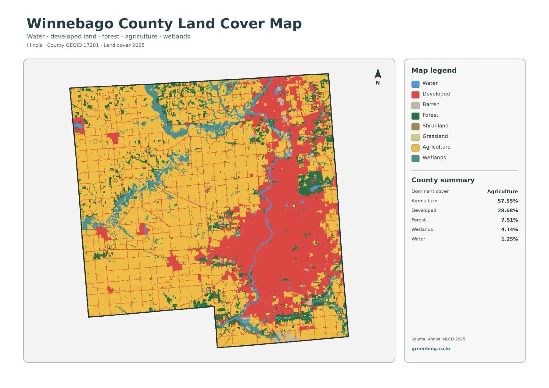
Yellow agricultural cover dominates the western half and remains extensive in the northwest and southwest. Red developed land is much more concentrated, forming a broad eastern mass rather than a series of equally sized town dots. The large blue and teal river system through the eastern side interrupts that built area, while smaller green and wetland pieces remain around waterways and at the edges of farm blocks. This is a county where the average percentages only make sense when the east-west distribution is also considered.
An older Winnebago County multi-hazard mitigation plan provides useful place context for that pattern. Using earlier NLCD information, it described agriculture as widespread and identified the main urban concentration along the eastern part of the county, including Rockford, Loves Park, Machesney Park, Roscoe, Rockton, and South Beloit. The 2025 map supplied here should not be treated as identical to the older plan, but the broad urban-versus-rural geography remains a useful way to orient the unlabeled land-cover colors.
Developed land is not the same thing as pavement. A developed NLCD cell can include lawns, trees, bare ground, and other permeable surfaces around houses, businesses, or roads. That distinction matters in Winnebago County because 28.68% is classified as developed even though the mean impervious share is much lower. The general map tells you where developed land-cover classes are common; the impervious map isolates the harder surfaces within and between those developed areas.
Hard-surface intensity is concentrated much more tightly than developed cover
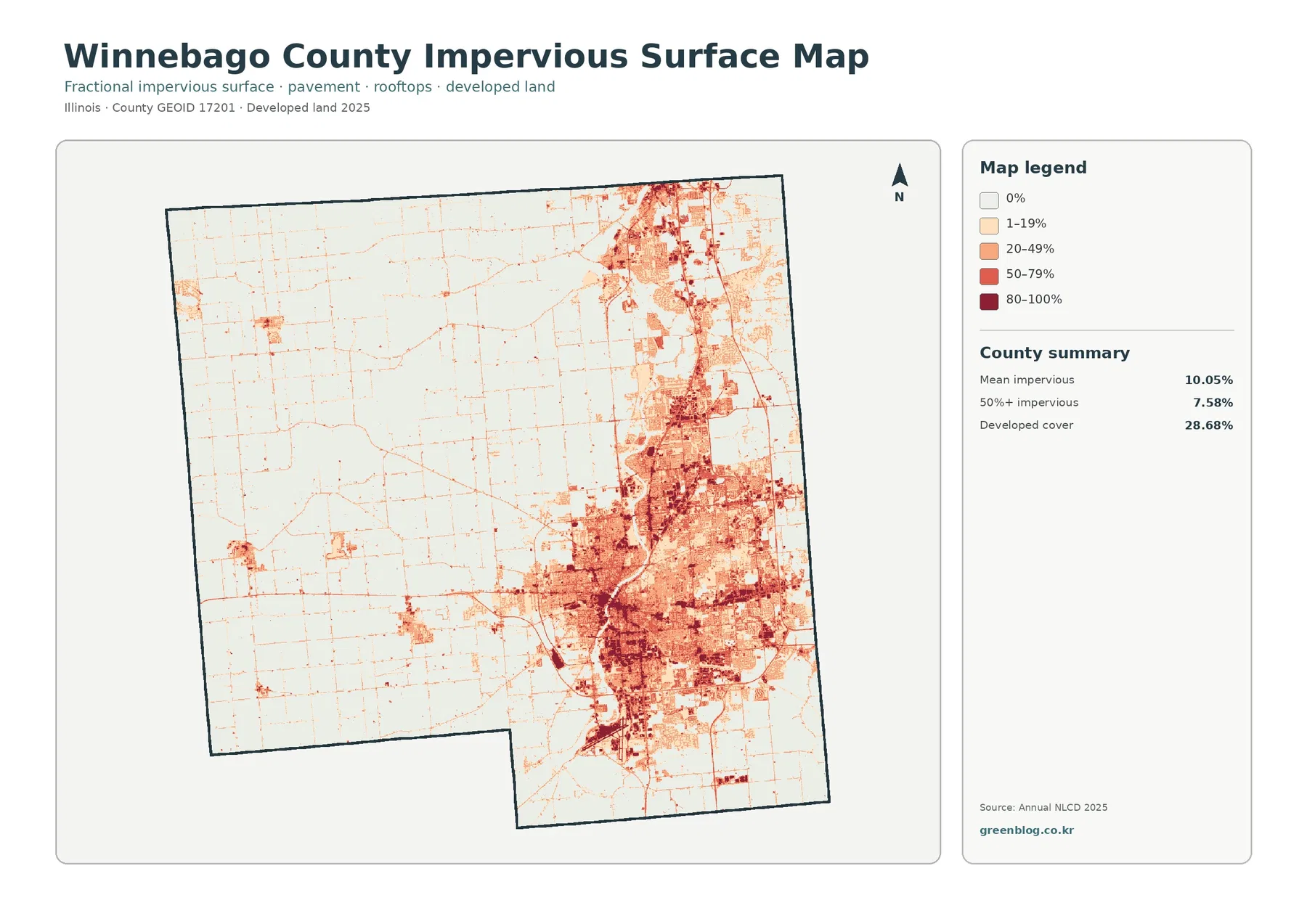
The countywide mean impervious cover is 10.05%, and 7.58% of the county is mapped in cells that are at least 50% impervious. Darker tones form a large cluster in the central and eastern urban area and continue northward in a narrower band. West of that concentration, most of the map becomes pale. Thin linear marks and small nodes still appear through the farm country, but they are far less extensive than the Rockford-side hard-surface network.
That difference helps explain why the impervious image is often better for discussing development intensity than the red developed class on the general map. A neighborhood can be classified as developed while still containing lawns and tree cover, whereas a dark impervious cell points to a higher concentration of roofs or pavement. Comparing the two images prevents a common mistake: treating all developed land as if it were sealed ground. In Winnebago County, the large gap between developed cover and mean impervious cover makes that distinction visually important.
Impervious cover can also help identify places where stormwater questions deserve closer study, but it does not predict flooding by itself. Rainfall, soil, slope, drainage systems, river capacity, and floodplain position all matter. Winnebago County maintains separate surface-water-management rules for detention, floodplain regulation, erosion, and sediment control. Those regulatory and engineering topics require their own data; this image is best used as a county-scale screen for where hard surfaces are concentrated.
Agriculture fills the west, while woods and wetlands follow the county’s river systems
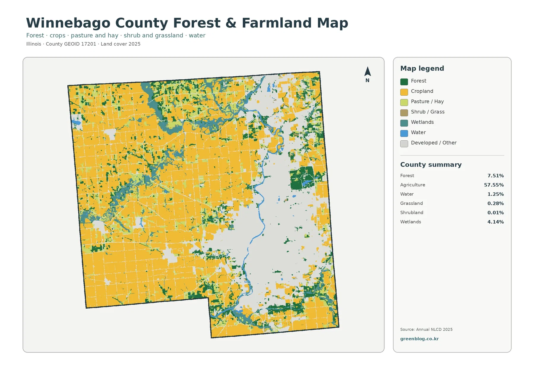
Removing the strong developed colors makes the scale of the agricultural landscape easier to see. Cropland forms large connected blocks across the western side and much of the northern and southern interior. Forest totals 7.51%, wetlands 4.14%, and open water 1.25%, yet those smaller shares appear repeatedly as narrow or branching features. Their shapes matter because they divide farm fields, trace drainage settings, and create natural-cover breaks between the broad agricultural areas and the built eastern side.
County planning material identifies the Rock River, Pecatonica River, Sugar River, and Kishwaukee River as important places where deciduous forest is concentrated. The supplied preview does not label individual rivers, so a particular green strip should not be named from this image alone. Still, the forest and wetland colors repeatedly accompany the major blue and teal drainage features, especially through the eastern half and across branching areas farther west. A labeled hydrography map is the right companion when a specific stream name is required.
The Forest Preserves of Winnebago County adds another useful piece of local context. Its official history page says the district manages more than 11,500 acres that include woods, wetlands, rivers, prairies, and ponds, and its current site lists 45 preserves. Those boundaries are not drawn on the land-cover image, so green or teal pixels should not be equated automatically with protected property. The value of the local source is to confirm that natural areas are a meaningful part of the county, not to turn this raster into a preserve map.
Agriculture itself should also be read as surface cover, not as a legal farm parcel layer. The 57.55% figure describes cells classified as agricultural cover in the supplied 2025 product. It does not identify ownership, zoning, crop type, lease status, agricultural-preservation areas, or whether a particular tract is currently available for development. Those questions belong to parcel records and planning documents, while this map answers the simpler visual question of what kind of surface predominates at county scale.
Only part of the 1985–2025 difference is conversion to developed land
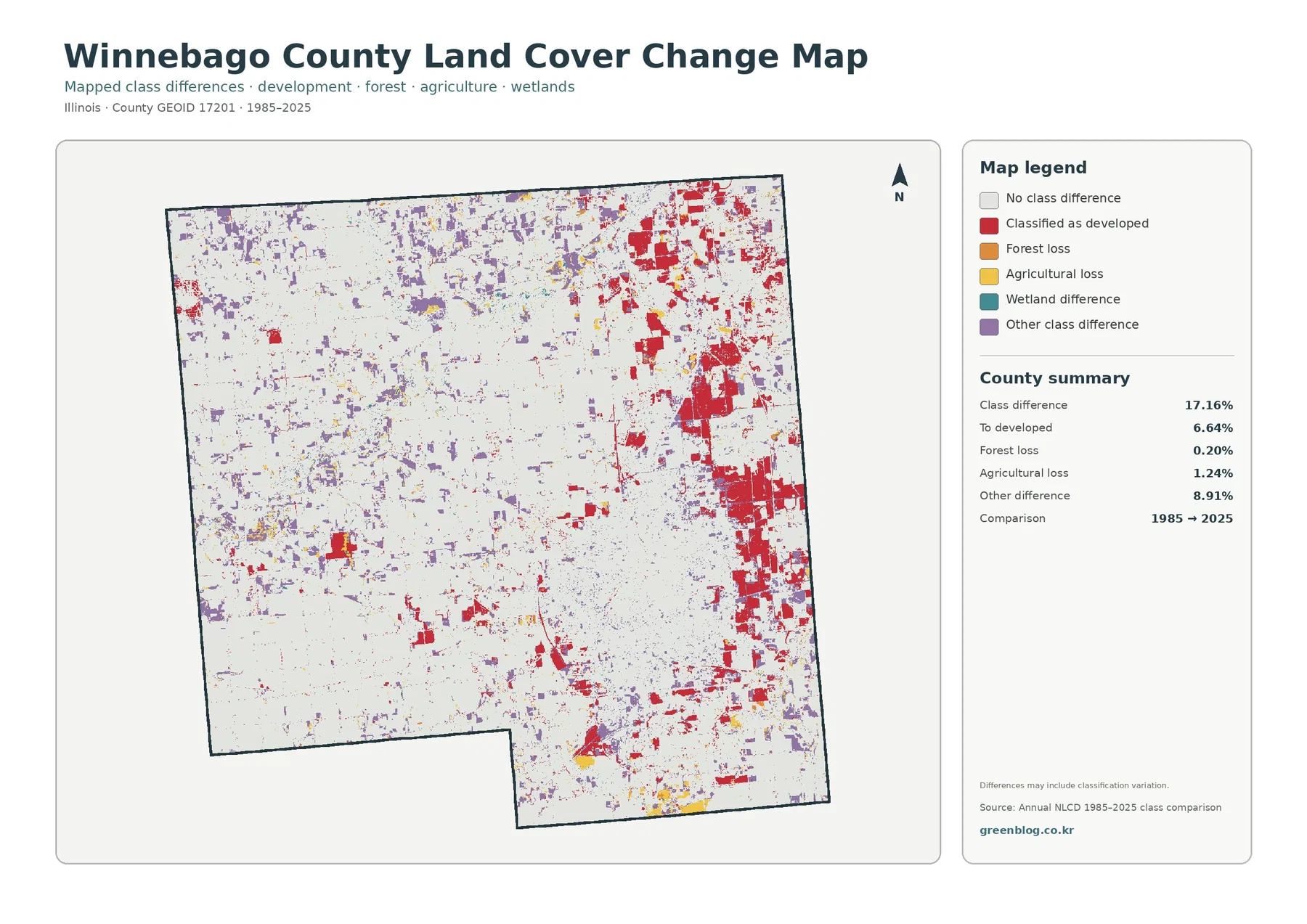
The class-difference summary reports 17.16% of the county with a different endpoint classification. Of that total, 6.64% is mapped as classified to developed, 0.20% as forest loss, 1.24% as agricultural loss, and 8.91% as other difference. Wetland difference appears in the legend without a separate percentage in the summary panel. Those categories make it clear that the 17.16% figure is not a measure of urban growth and should not be quoted as if one-sixth of the county was newly built.
Red developed-conversion cells are most conspicuous in the east and northeast, where present-day development is already concentrated, but smaller red patches also occur elsewhere. Purple other-difference cells are much more scattered through the western farm landscape, and the yellow agricultural-loss marks are relatively limited. Looking at the 2025 map first helps keep those colors in context: the change image tells you that the endpoint class differs, not what the land looks like in every year between 1985 and 2025.
“Forest loss” and “agricultural loss” are classification outcomes rather than explanations. A cell that moved away from forest could reflect clearing, storm effects, regeneration into another class, a different classification decision, or some combination that cannot be established from two endpoints. The map itself also warns that classification variation may be included. Intermediate aerial imagery, annual products, permits, and local records are needed before assigning a cause or a date to an individual change patch.
The percentages describe amount; the maps explain where those amounts occur
The five largest figures in the 2025 summary are agriculture at 57.55%, developed land at 28.68%, forest at 7.51%, wetlands at 4.14%, and water at 1.25%. A table alone might suggest a simple farm-dominated county with a sizable built share. The image adds the missing geography: farms are strongest to the west, development is heavily weighted to the east, and natural cover often follows drainage features instead of forming one large isolated block.
This is why a small countywide percentage can still matter visually. Water is only 1.25%, but the major blue river line runs through some of the most developed territory. Wetlands occupy 4.14%, yet teal branches reach through agricultural sections and around river systems. Forest at 7.51% often appears beside those wet areas. For watershed lessons, habitat context, or a presentation about the county’s rural-urban transition, location and shape can be more informative than ranking the percentages alone.
The same caution applies to the word “developed.” Winnebago County Planning & Zoning maintains legal land-use policies, zoning records, subdivision information, and aerial photographs for unincorporated areas. Those materials answer different questions from Annual NLCD. A red land-cover cell is not proof of a zoning district, building permission, municipal boundary, or parcel ownership, just as a teal wetland class is not an automatic regulatory wetland determination.
Choose one map for the main story and use the others as evidence
For a general county profile, the 2025 land-cover map is the strongest starting point because it shows the farmed west, the eastern urban concentration, and the river-related natural cover in one frame. The forest and farmland image is better when the subject is working land, wooded drainage, or wetland contacts. The impervious map should take the lead when the question concerns hard-surface intensity, while the change map belongs after the present-day pattern has been established.
A classroom or report about rivers can pair the vegetation image with a labeled hydrography source. A discussion of urbanization can compare the red developed class with the much tighter impervious pattern. For a long-term change graphic, place the 1985–2025 map beside the 2025 map so viewers do not mistake red change cells for all current development. These pairings use each view for what it actually measures instead of asking one image to answer zoning, drainage, habitat, and development questions at once.
The downloadable JPGs are 2480 × 1754 pixels. They work well for web pages, reports, presentations, and many ordinary print layouts, but the supplied asset manifest does not mark them as meeting an A3 high-resolution reference. If a large poster is planned, test the final output size before printing. Enlarging the image can make the symbols physically larger, but it cannot add detail that was not present in the original map or the underlying raster cells.
Thirty-meter cells and observation dates set the practical limit
Annual NLCD uses a raster grid with cells roughly 30 meters across. Each cell receives one predominant class even when a field edge, trees, a ditch, grass, pavement, and a building share the same square. Narrow roads, small ponds, thin forest strips, and mixed neighborhood edges can therefore look simplified. Zooming in on the JPG does not convert those generalized cells into parcel boundaries or a site survey.
The current maps represent the supplied 2025 observation year. Construction, demolition, vegetation recovery, crop changes, flooding, or other events after that observation may not appear. The change layer is a comparison between 1985 and 2025 endpoints, not a year-by-year animation. A location could change several times during the forty-year period and still end in a class close to the one it had at the beginning.
Use these maps to understand broad county patterns, select areas for follow-up research, compare Winnebago County with other counties under the same classification system, or build clear educational graphics. Parcel boundaries, wetland jurisdiction, flood insurance, zoning, property rights, engineering design, and current construction decisions require newer and more specialized records. The raster is a useful regional overview, not a substitute for those authoritative sources.
What the four-map JPG download contains
The ZIP includes one original JPG for each view discussed on this page: 2025 land cover, forest and farmland, impervious surface and developed land, and the 1985–2025 land-cover class comparison. Because all four use the same county footprint, it is easy to move from a farm-versus-city overview to a focused look at river-side natural cover, hard surfaces, or endpoint change without changing geographic scale.
If you only need one image, choose the view that matches the question rather than shrinking all four into a single crowded figure. Use the countywide map for composition, the forest and farmland map for working-land and natural-cover boundaries, the impervious map for hard-surface concentration, and the class-difference map for screening change between two dates. The ZIP contains finished JPG reference maps rather than editable GIS layers.
Frequently Asked Questions
What is the dominant land-cover class in Winnebago County?
Agriculture is the largest 2025 class at 57.55%. Developed land is second at 28.68%, followed by forest at 7.51%, wetlands at 4.14%, and water at 1.25%. The map adds an important location detail: agriculture is broadest in the western part of the county, while the largest developed concentration is on the eastern side around the Rockford urban area.
Why is developed land 28.68% when mean impervious cover is only 10.05%?
They measure different things. Developed classes can include lawns, trees, soil, and other permeable ground around buildings and roads. Impervious cover focuses on rooftops, pavement, parking areas, and similar hard surfaces. Winnebago County can therefore have a large developed-land share while its countywide average percentage of sealed surface remains considerably lower.
Does the 17.16% class difference mean 17.16% of the county was developed after 1985?
No. The 17.16% total includes several kinds of endpoint differences. The summary lists 6.64% classified to developed, 0.20% forest loss, 1.24% agricultural loss, 8.91% other difference, plus a wetland-difference category shown in the legend. The map is a screening tool for changed classifications; intermediate imagery and records are needed to determine the timing and cause of a specific change.
Sources and Reference Data
- MRLC Annual NLCD Data – official access point for annual land-cover products and comparison data
- USGS Annual NLCD Land Cover Classification – class definitions and guidance for agriculture, developed land, forest, wetlands, and related surfaces
- Winnebago County Multi-Hazard Mitigation Plan – county-specific context for agriculture, eastern urban development, and forest along the Rock, Pecatonica, Sugar, and Kishwaukee rivers
- Winnebago County Planning & Zoning – official planning, zoning, subdivision, aerial-photo, and land-use policy information for unincorporated Winnebago County
- Forest Preserves of Winnebago County – Purpose & History – official local information on the county’s woods, wetlands, rivers, prairies, ponds, and preserve system
Map File Information
The ZIP contains four original JPG maps for comparing Winnebago County’s 2025 land cover, farm and river-side natural cover, Rockford-area hard surfaces, and 1985–2025 class differences.
- Included Files: Four original JPG land-cover maps
- File Type: JPG files in one ZIP archive
- Intended Use: Printing, education, presentations, and map-based projects
Related Maps
- Adams County Illinois Land Cover Map
- Alexander County Illinois Land Cover Map
- Bond County Illinois Land Cover Map
Green Map creates custom-edited map images using open geographic data sources such as geoBoundaries, Natural Earth, OpenStreetMap, and government open data. These maps are edited visual materials, not raw data files, and are provided for education, documents, presentations, and graphic reference.