Broad farm country, wooded hills, long Finger Lakes, wetlands, and several compact developed centers all appear within Ontario County. The 2025 land-cover summary is led by agriculture at 46.30%, followed by forest at 30.26%, developed land at 13.90%, wetlands at 6.30%, and water at 2.81%. The four maps on this page separate those patterns into a general land-cover view, a forest-and-farmland view, an impervious-surface map, and a 1985–2025 change comparison.
Each map can be viewed on the page, and the four original JPG files are available together in one ZIP download. The set is useful for comparing the farm-dominated north and east with the more wooded lake country to the south, locating clusters of built surfaces, and checking where the mapped classification differs across four decades.
Table of Contents
A county where agriculture leads but does not define everything
Agriculture is the largest 2025 category in Ontario County, yet the map does not look like one continuous block of farmland. The northern and eastern portions contain large yellow agricultural areas, while forest becomes much more prominent toward the south and southwest. Built-up cover is concentrated in a few recognizable clusters rather than spread evenly across the county. Lakes and wetlands cut through this pattern, so the county changes noticeably as the eye moves from one side of the map to another.
The county’s official natural-resources page describes Ontario County as part of the Finger Lakes landscape and notes that five of the eleven Finger Lakes are associated with the county: Hemlock, Canadice, Canandaigua, Honeoye, and Seneca. That geography helps explain why water remains visually important even though it covers only 2.81% of the mapped area. Long, narrow lake shapes provide easy reference points for comparing nearby farms, forest, wetlands, and development.
Land cover should not be confused with zoning or property use. Annual NLCD classifies what the surface is predominantly covered by at the mapped date, using categories such as forest, agriculture, developed land, wetland, and water. A yellow agricultural cell is not automatically a legally protected farm parcel, and a developed cell does not tell you the parcel’s zoning, owner, or construction rights. Those questions require local planning, tax-map, or parcel records.
The 2025 land-cover map puts the farm belt in context
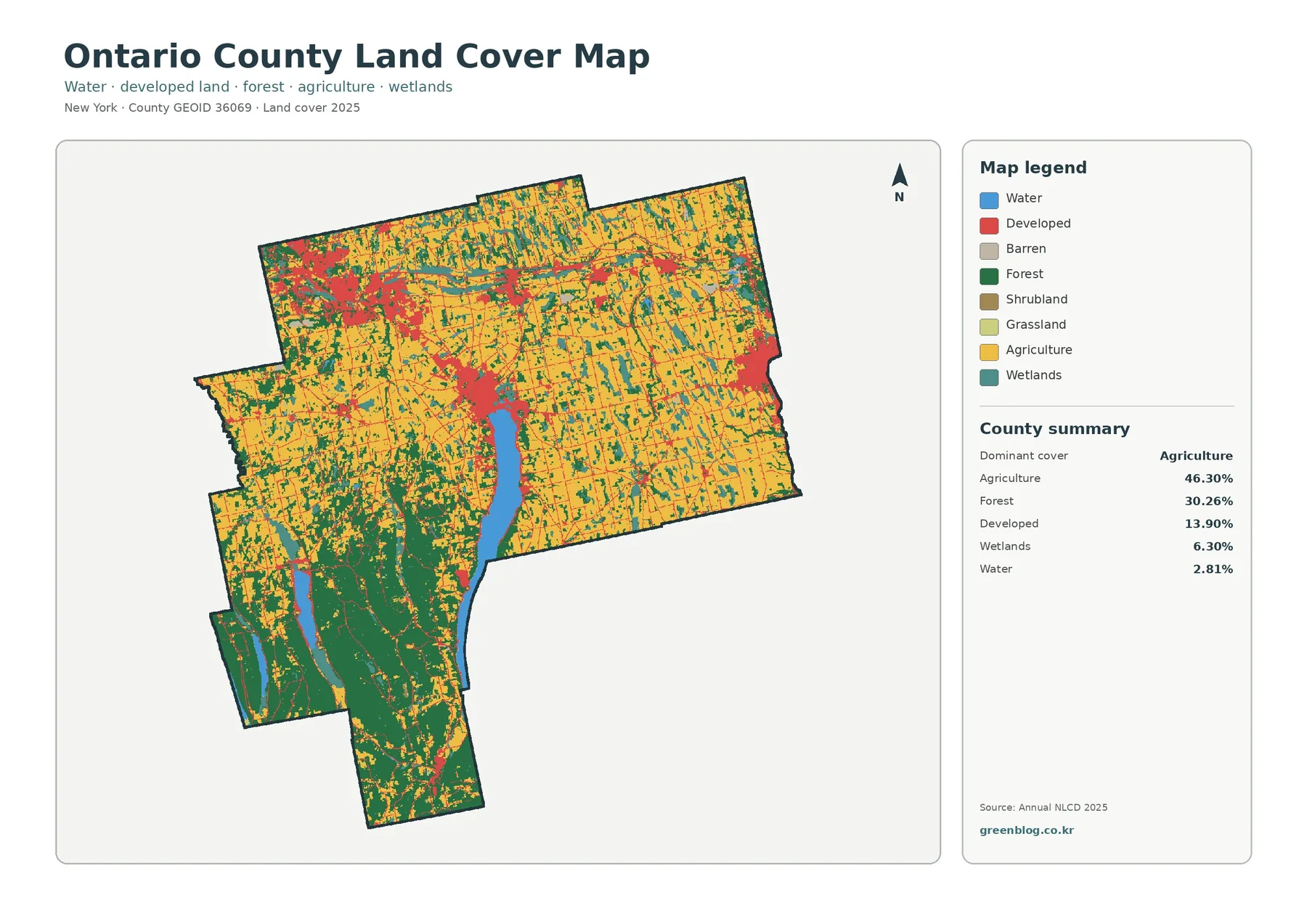
The general map is dominated by agriculture across much of the northern half and the eastern side. Yellow fields form large connected areas but are interrupted by forest strips, wetlands, developed settlements, and water. That visual pattern matches the countywide figure of 46.30% agriculture. Local natural-resources information also emphasizes the importance of farming, describing production that includes dairy, vegetables, field crops, fruit and grapes, nursery plants, beef, and poultry.
Farther south, the balance shifts toward lakes and forest. A long central water body, Canandaigua Lake, is bordered by large forest areas to the west and south. The southwestern portion contains additional narrow lakes set among extensive green forest cover. These areas look very different from the open agricultural pattern farther north. The shift is useful for teaching or presentation work because the contrast can be understood from the map without needing a long statistical table.
At 13.90% of the county, developed land forms a much smaller share than agriculture or forest. It forms a strong cluster in the northwest, another concentration at the north end of Canandaigua Lake, and a notable developed area toward the eastern edge. Smaller communities and transportation corridors appear as thinner red lines and scattered patches through the farm country. That spatial overlap shows where development and roads occur together, but it does not establish that a specific road caused surrounding development.
Wetlands make up 6.30%, more than twice the share of open water. They appear as irregular patches and narrow features near watercourses and within agricultural landscapes. That detail matters because a county that looks strongly agricultural at first glance still contains many wet areas between fields and forests. Comparing wetlands with lakes gives a more complete picture of the surface than simply setting farmland against development.
Forest and farmland separate more clearly in the south
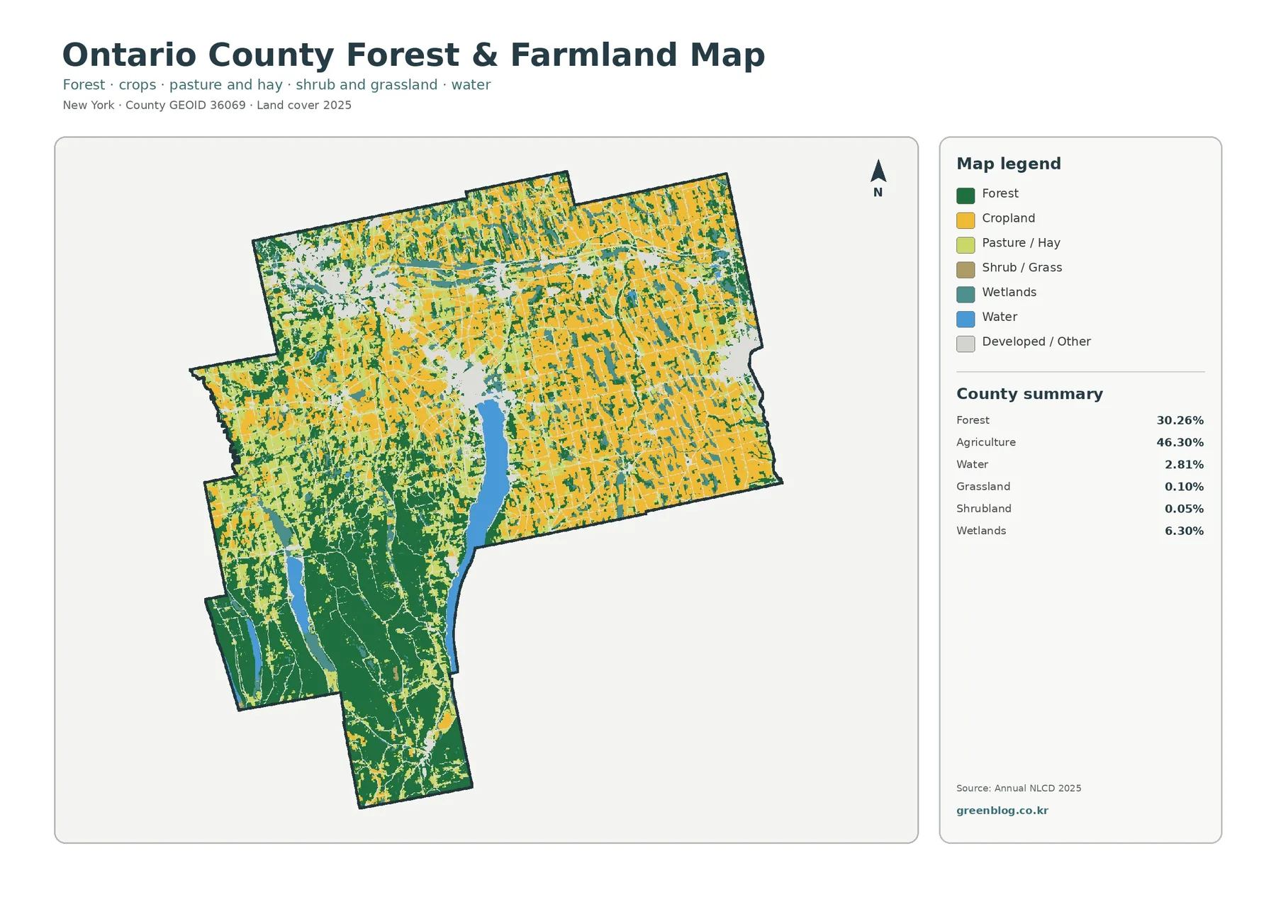
Removing much of the developed detail makes the rural pattern easier to read. Agriculture occupies broad areas in the north and east, while forest becomes increasingly continuous toward the south and southwest. Farther south and west, the Finger Lakes break up the wooded landscape and provide a natural set of landmarks. The result is not a simple north-south line, but the change from farm-dominated to more heavily wooded country is clear.
Forest covers 30.26% of the county and agriculture 46.30%. Grassland is only 0.10% and shrubland 0.05%, so those minor classes do not control the appearance of this map. Wetlands at 6.30% and water at 2.81% are more important to the visible pattern. For most readers, the most useful comparison is therefore the broad relationship among farmland, forest, wet ground, lakes, and the light areas that represent development or other cover.
A state-certified agricultural district also covers a large part of the county. Its 2020 profile lists 256,478 acres within the district and 184,186 acres in farms. Those figures should not be substituted for the NLCD agriculture percentage. An agricultural district is an administrative and legal program, while the land-cover map classifies the surface as observed for 2025. A parcel can be in an agricultural district without every cell being mapped as crop or pasture, and the reverse distinction can also matter.
This separation between surface cover and legal boundaries is useful when choosing a map for a project. A classroom county profile may only need the land-cover pattern, while a question about farmland protection should move to the county’s agricultural-district and planning maps. The same caution applies to forest. Green cells indicate mapped tree cover, not public ownership, protected status, or a specific forest-management designation.
Impervious surfaces reveal a compact built footprint
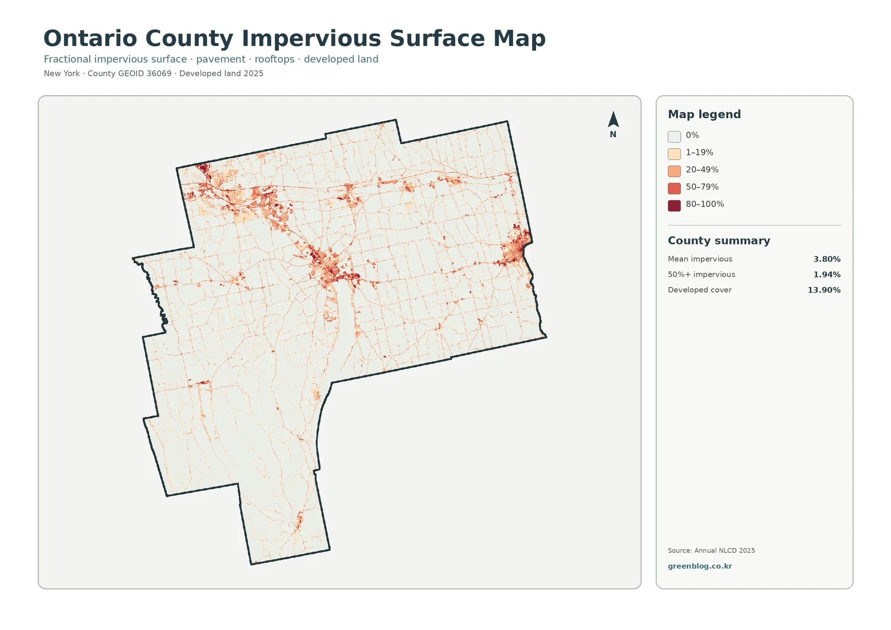
An impervious surface is a hard surface that water does not easily soak through, such as pavement, parking areas, and rooftops. Impervious values are grouped into 0%, 1–19%, 20–49%, 50–79%, and 80–100% classes. Ontario County’s mean impervious value is 3.80%, while only 1.94% of the county falls into the 50% or greater range. Those numbers are low compared with the 13.90% developed-land share.
The difference between developed cover and impervious surface is expected. Areas in the developed classes can include lawns, trees, landscaped yards, and other permeable ground around homes or commercial sites. For the built-surface layer, the key value is the fraction of each mapped cell covered by hard surfaces. A suburban neighborhood can therefore be developed while still having a relatively modest impervious percentage, whereas a dense commercial area or large parking complex can fall into a much higher class.
The strongest impervious concentrations line up with the major developed clusters visible on the general map. The northwest stands out, as does the area at the north end of Canandaigua Lake and development near the eastern edge. Thin lines extend between and beyond those centers along roads and smaller settlements. Much of the farm and forest country remains pale, with darker values appearing only in localized patches.
This layer can be useful in watershed education because it helps identify where harder surfaces are concentrated near lakes, wetlands, and drainage areas. It should not be used to claim that one developed site is responsible for a flooding or water-quality problem. Runoff depends on rainfall, soils, slopes, drainage systems, stream conditions, and many other factors. For that reason, the impervious map works best as one piece of the larger environmental picture.
What changed between the 1985 and 2025 classifications
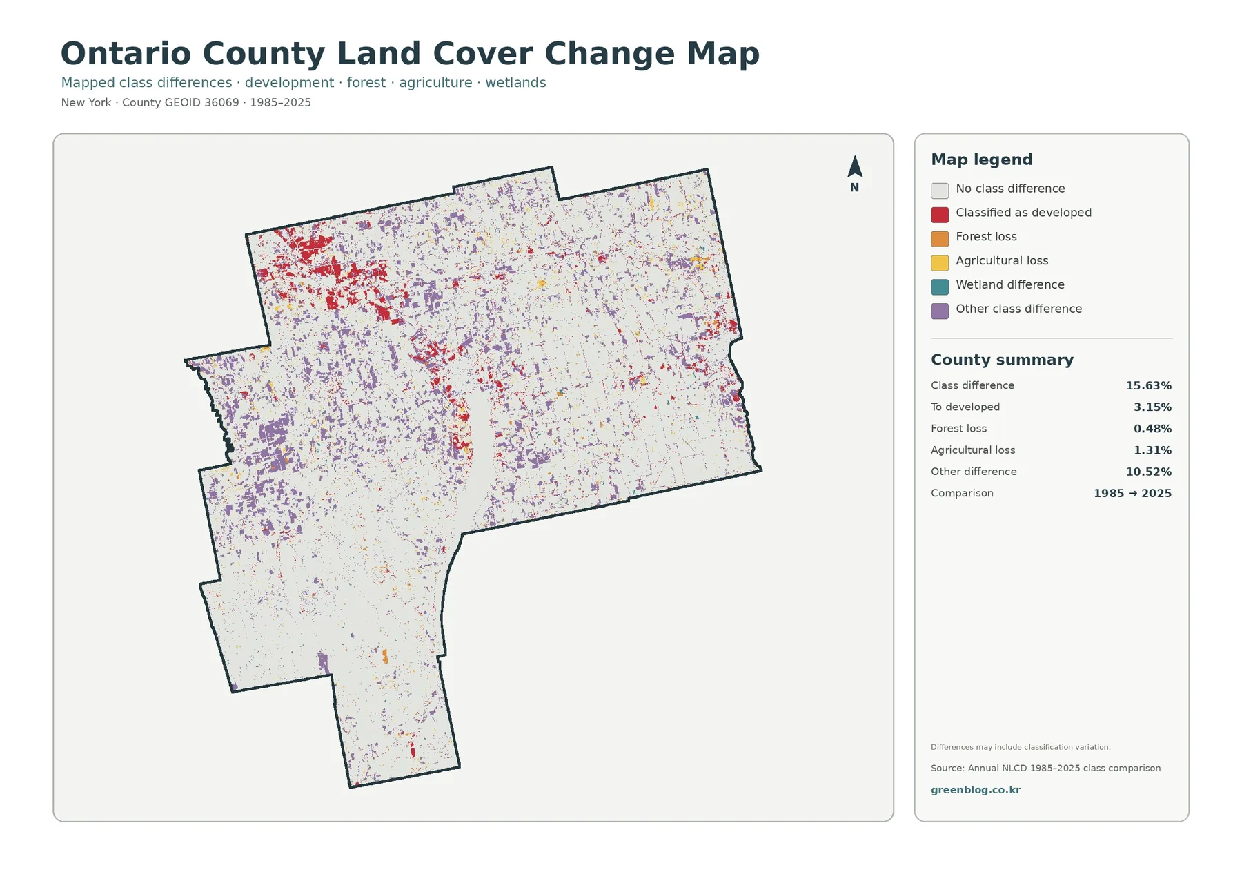
The change layer compares land-cover classifications from 1985 with those from 2025. A class difference is mapped across 15.63% of Ontario County. Within the 15.63% total class difference, 3.15% is mapped as change to developed land, 0.48% as forest loss, 1.31% as agricultural loss, and 10.52% as other class differences. Because “other difference” is the largest listed category, the map cannot be reduced to a simple story of development replacing rural land.
Red developed-change cells are especially noticeable around the northwest, the Canandaigua area, and the eastern side, with smaller pieces scattered elsewhere. Some long-established developed centers may show little change because they were already classified as developed in 1985. As a result, new red areas can be more visible around the edges of settled places than in their older cores. Comparing this layer with the current impervious map helps separate present-day built intensity from the location of mapped change.
Purple “other class difference” cells are much more widespread. They occur in farm areas, around forest edges, and in places where wetlands or several cover types meet. Some of those differences can represent genuine shifts on the ground, while others may reflect classification variability between dates. A note on the change layer warns that differences may include classification variation, an important limitation when interpreting small isolated patches.
For a specific property, the change map should be treated as a screening tool rather than a historical record. It can point to areas worth checking, but a parcel-level conclusion should be verified with dated aerial imagery, local planning documents, building records, or other detailed sources. At county scale, the map is valuable because it quickly separates stable areas from places with more extensive classification differences.
The Finger Lakes reshape the southern part of the county
The southern half of Ontario County deserves separate attention because its land-cover mix differs sharply from the broad northern farm belt. County natural-resources information describes Hemlock and Canadice Lakes as having largely undeveloped surroundings with steep hills and forest. That context matches the map’s heavy green cover in the southwest. The combination of long water bodies and wooded slopes gives this area a pattern that is easy to distinguish from the more open agricultural north.
Among the mapped water bodies, Canandaigua Lake is the strongest central landmark. Development is concentrated around its northern end, while the shore farther south is surrounded by a more varied mixture of forest and agriculture. County water-resource information notes that Canandaigua and nearby communities rely on the lake as a drinking-water source. The land-cover maps do not measure water quality, but they can provide useful background for seeing what types of surface cover occur around the lake and where built surfaces become more concentrated.
Seneca Lake on the east and Honeoye, Hemlock, and Canadice Lakes farther west add more variation to the county. Farms, forest, wetlands, and development meet the lakes in different combinations, so no single lake setting represents the entire county. That contrast makes the four-map set useful for comparative projects because the same scale can be used to examine several types of lake landscape within one county boundary.
Choosing a map, using the set, and downloading the JPG files
Start with the general land-cover map when you need a countywide overview. Switch to the forest-and-farmland map when the rural pattern is the main subject. Dense built surfaces stand out more clearly on the impervious layer, while the change map adds a time dimension by comparing 1985 and 2025 classifications. Checking the same location across all four maps prevents one layer from being asked to answer a question it was not designed for.
The maps can support school lessons, county profiles, environmental education, watershed introductions, agricultural comparisons, and presentation graphics. Keep the legend and boundary visible when cropping or printing because colors have different meanings on each map. Color meaning matters especially on the change layer: red marks a change classified as developed, while purple represents a broader group of other class differences.
The download ZIP contains four original JPG files: the 2025 general land-cover map, the forest-and-farmland map, the impervious/developed-land map, and the 1985–2025 land-cover change map. For practical use, the JPG files can be saved offline, printed, inserted into documents, or arranged side by side. Using the full set makes it easier to compare present cover, built-surface intensity, and long-term mapped difference without losing the countywide context.
Resolution, mixed pixels, and other limits to keep in mind
At 30-meter spatial resolution, Annual NLCD is produced as a raster dataset. A raster divides the landscape into grid cells, and each cell receives a representative land-cover class or an impervious-surface value. Small buildings, narrow roads, field edges, and strips of trees can share the same cell. The displayed boundary between two colors is therefore generalized and should not be treated like a surveyed parcel line.
When several surface types occur in one 30-meter cell, the result can be thought of as a mixed pixel. The classification still has to assign a predominant category, which simplifies what may be a complicated edge on the ground. That impervious estimate is generalized in a similar way. It estimates the fraction of hard surface within the cell rather than tracing the exact outline of every roof, driveway, or parking area.
Like any land-cover product, the 2025 map is a dated snapshot. Construction, clearing, restoration, crop rotation, or other changes after the observation period may not appear. Time-series interpretation needs another level of caution because both real land-cover change and classification variability can create differences between years. For important sites, use the map to identify an area of interest and then check more recent imagery and local records.
Within those limits, the maps are well suited to county-scale comparison. At county scale, the set can answer broad questions about where agriculture dominates, where forest is more extensive, where impervious surfaces cluster, and where classifications differ most often. They cannot answer parcel ownership, zoning, legal land use, exact acreage, or development-permit questions without additional data.
Frequently Asked Questions
What is the largest 2025 land-cover category in Ontario County?
Agriculture is the largest category at 46.30%. Forest follows at 30.26%, then developed land at 13.90%, wetlands at 6.30%, and water at 2.81%. The map places much of the broad agricultural cover in the north and east, while forest becomes more prominent around the southern lake country.
Why is developed land 13.90% while mean impervious surface is only 3.80%?
Developed land can include lawns, trees, yards, and other permeable ground around buildings and roads. Impervious surface measures the share occupied by harder materials such as pavement and rooftops. That narrower definition produces a lower countywide value. Only 1.94% of Ontario County is mapped at 50% impervious surface or greater.
Does the 15.63% change figure mean all of that land physically changed?
No. The percentage represents cells whose mapped class differs between the 1985 and 2025 comparison. Some differences can reflect real development, forest loss, agricultural loss, or other surface changes, while others may result from classification variability. Small patches should be checked against compatible imagery or local records before drawing a site-specific conclusion.
What is included in the Ontario County map download?
The ZIP includes four original JPG maps: general land cover, forest and farmland, impervious/developed land, and land-cover change from 1985 to 2025. Because the maps emphasize different information, they are especially useful as a set when a project needs both a current landscape overview and a separate view of built surfaces or long-term difference. Map File Information Four original Ontario County land-cover JPG maps are included in one ZIP file.
Map File Information
Download the map files associated with this page for reference, printing, and compatible visual projects.
- Included Files: Use only the versions confirmed in the article and supplied images
- File Type: Use the confirmed download contents
- Intended Use: Printing, education, presentations, and map-based projects
Related Maps
- Albany County Land Cover Map
- Allegany County New York Land Cover Map
- Bronx County New York Land Cover Map
Sources and references
- MRLC Annual NLCD Data – access to Annual NLCD land-cover and related products
- USGS Annual NLCD Land Cover Classification – land-cover classes and product definitions
- USGS Annual National Land Cover Database – 30-meter resolution and annual product information
- Ontario County Natural Resources – county information on the Finger Lakes, forests, and agriculture
- Ontario County Agricultural District – agricultural-district program and 2020 farm-area profile
- U.S. Census Bureau TIGER/Line Shapefiles – county boundary and geographic reference data
Green Map creates custom-edited map images using open geographic data sources such as geoBoundaries, Natural Earth, OpenStreetMap, and government open data.
These maps are edited visual materials, not raw data files, and are provided for education, documents, presentations, and graphic reference.