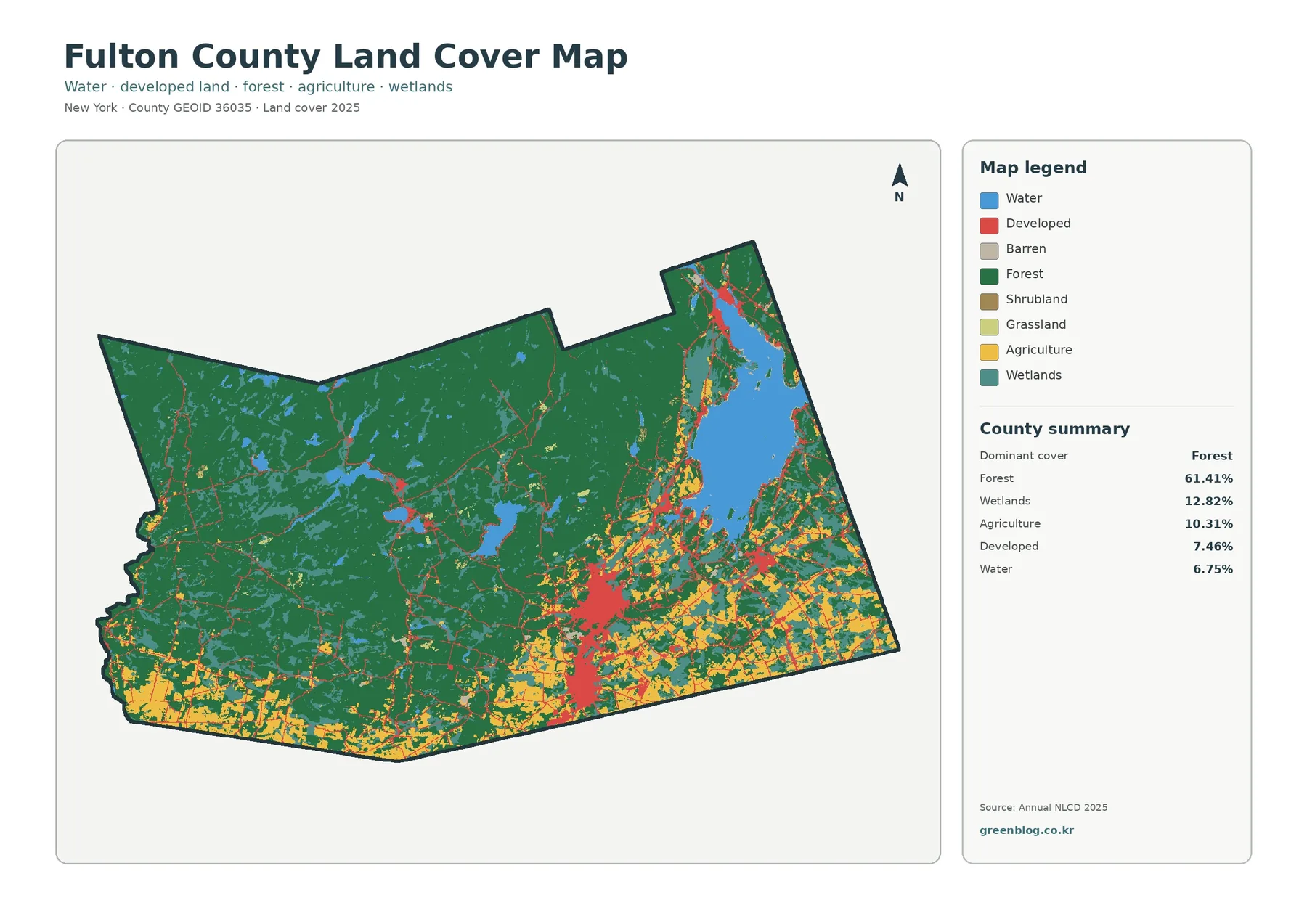
Fulton County, New York, shifts from a heavily wooded northern and western landscape to a more mixed southern area where farms, roads, and developed communities become more visible. Great Sacandaga Lake provides the clearest landmark in the northeast, while the Gloversville–Johnstown area stands out farther south. The maps on this page make those contrasts easy to compare without turning the article into a technical GIS report.
Four views are included: general land cover, forest and farmland, impervious and developed surfaces, and land-cover change from 1985 to 2025. The original JPG versions of all four maps are available together in one ZIP download below. That set works well for classroom handouts, reports, presentations, or anyone who wants to compare the same county through several land-cover themes.
Table of Contents
A county where forest, water, and settled land meet
The 2025 summary identifies forest as the largest class at 61.41%. Wetlands account for 12.82%, agriculture for 10.31%, developed land for 7.46%, and water for 6.75%. Those figures describe the countywide mix, but the map becomes more useful when the locations are considered. Forest dominates the north and west, while agriculture and development are more common toward the southern edge.
Great Sacandaga Lake anchors the northeastern corner of the map. Forest and wetlands surround much of the lake, and smaller water bodies appear farther west in the interior. Moving south changes the visual balance: agricultural colors become more frequent, and developed areas form a stronger presence around the county’s principal communities.
Land cover should not be confused with zoning, ownership, or parcel boundaries. It classifies the visible ground surface into categories such as forest, agriculture, water, wetland, and developed land using remotely sensed data. That makes it useful for broad countywide comparisons, but it cannot determine whether a parcel can be developed or where a legal property line lies.
Forest dominates the interior while farmland gathers toward the south
The forest-and-farmland view removes much of the extra detail found in the full land-cover map and makes the rural contrast easier to follow. Broad forest blocks cover much of the northern and western county. Small lakes and wetlands interrupt those wooded areas, while farm classes become noticeably less common away from the southern third.
Cropland and pasture or hay appear in irregular patches near the southern boundary and around more settled parts of south-central Fulton County. Farther north, those agricultural colors thin out as forest, wetland, and open water take over more of the landscape. The pattern shows that agriculture is not spread evenly across the county even though it represents more than ten percent of the mapped area.
Around the reservoir, the surrounding land cover provides another useful comparison. The western and northern approaches to the lake are strongly wooded, whereas roads, development, and some agricultural cover are more visible toward the south and east. The lake does not divide two completely separate landscapes, but it helps readers orient themselves before comparing smaller patterns.
Open-looking land is not automatically farmland. The legend separates cropland and pasture or hay from shrub, grass, wetland, and other classes. A land-cover map also cannot identify farm ownership, crop type, or agricultural-district status, so those questions require local agricultural records rather than the raster image alone.
Impervious surfaces reveal the county’s most concentrated developed areas
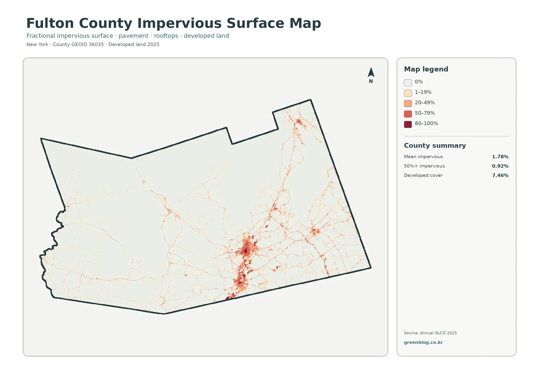
Impervious surface means pavement, rooftops, parking areas, and other hard surfaces that keep water from soaking easily into the ground. Fulton County’s mean impervious value is 1.78%, while 0.92% of the county is mapped at 50% impervious or greater. Those values are much lower than the 7.46% developed-cover share because developed classes can include lawns, trees, and other permeable surfaces.
Most of the impervious map remains pale across the wooded north and west. Roads appear as narrow lines, and small higher-value clusters mark settlements without creating a continuous urban field. Around Great Sacandaga Lake, the road network is visible in places, but high impervious values still occupy relatively limited areas compared with the surrounding forest and water.
The clearest concentration occurs around Gloversville and Johnstown in south-central Fulton County. Orange and darker tones form a compact cluster there, with thinner linear patterns extending outward along roads. Smaller settlements elsewhere create additional spots of higher impervious cover, but none match the size of the southern city cluster.
This view is especially helpful when the general developed class feels too broad. A low-density residential area can count as developed while retaining considerable vegetation, whereas a commercial block or dense street network may have a much higher share of hard surface. Reading both maps together gives a clearer picture of how intensely an area is built up.
Impervious cover can support discussions about stormwater and watershed conditions, but it is not a flood-risk map. Runoff also depends on slope, soil, rainfall, stream channels, drainage systems, and other factors that are outside the scope of this layer. It should be treated as one piece of environmental context rather than a stand-alone hazard assessment.
Mapped differences from 1985 to 2025 are scattered rather than concentrated
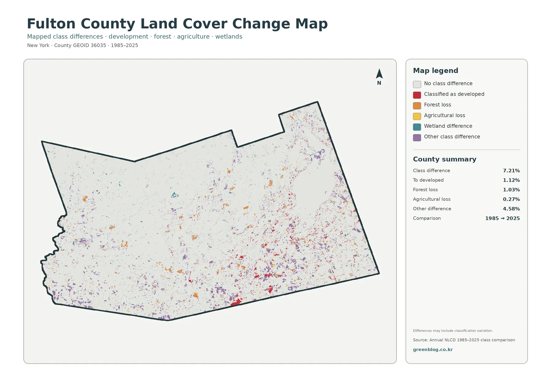
The change layer compares class assignments at two endpoints, 1985 and 2025. The supplied summary reports a total mapped class difference of 7.21%. Areas classified as change to developed account for 1.12%, forest loss for 1.03%, agricultural loss for 0.27%, and other class differences for 4.58%. These values describe mapped differences, not confirmed causes.
Red developed-change cells are easier to notice in the southern part of the county, especially near existing development and road corridors. Orange forest-loss cells also appear in the wooded interior, but they are dispersed rather than forming one continuous zone. Additional small changes are visible toward the east and northeast.
The large share assigned to other class differences deserves caution. A cell can differ because the land actually changed, but imagery season, mixed pixels, classification rules, or observation conditions can also influence the result. A colored patch therefore should not be treated automatically as proof of logging, construction, or farm conversion.
For a location that matters, the better next step is to compare the marked area with historical aerial photographs, newer imagery, county records, or field observations. The countywide change map works best as a screening layer that points to places worth investigating rather than as a final explanation of what happened.
Using Great Sacandaga Lake and the southern cities as reference points
Switching among four maps can be confusing if the reader loses track of location. Great Sacandaga Lake solves that problem in the northeast because its large shape is easy to recognize in every relevant view. Start with the lake on the general map, then compare nearby forest and farmland, and finally check where roads and hard surfaces appear around the shoreline.
The Gloversville–Johnstown area provides a second anchor. Development is concentrated there on the general land-cover map, and the impervious layer shows the same area with stronger hard-surface values. Looking back at the forest-and-farmland map then reveals how agricultural cover surrounds or approaches the settled southern landscape.
This cross-checking approach is more informative than reading a single color in isolation. A place mapped as developed may still contain substantial vegetation, while an agricultural patch may sit next to forest or wetland. Comparing the layers helps separate broad land-cover categories from the more specific surface conditions emphasized by each map.
Practical ways to use the four-map set
In a classroom, the maps can demonstrate how the same county changes appearance when the question changes. Students can begin with the general land-cover pattern, move to forest and farmland, examine hard surfaces, and then compare the historical change layer. That sequence makes the purpose of thematic mapping easier to understand.
For reports and presentations, the set allows a reader to choose the map that best matches the subject. A natural-resource discussion may rely on the general and forest-focused views, while a development or stormwater presentation may benefit more from the impervious layer. The change map can add historical context when a long-term comparison is needed.
Planning and agricultural discussions can also use these maps as background context. They quickly show where broad surface types are concentrated, but they do not replace parcel data, zoning maps, regulatory boundaries, or site surveys. Any decision involving ownership, permits, or legal land use should use the appropriate official records.
Raster maps are useful, but their boundaries are generalized
These maps use raster data, meaning the landscape is divided into small grid cells and each cell receives a representative class or percentage. Narrow roads, tiny buildings, stream edges, and small fields can be generalized because several surface types may fall inside the same cell.
A mixed pixel occurs when one cell contains more than one type of surface, such as forest, grass, and pavement near a road edge. The classification still has to assign a value, which is why sharp color boundaries on the map should not be treated as exact ground boundaries. Large forest blocks and broad water bodies are generally easier to interpret than isolated single-cell patches.
The observation date matters as well. The current land-cover, forest-and-farmland, and impervious views use the supplied 2025 classification. Construction, vegetation change, or agricultural activity after that observation period may not appear. The historical layer compares only 1985 and 2025, so it does not record every intermediate change year by year.
Download the Fulton County map files
The downloadable ZIP contains the four original JPG maps described on this page: general land cover, forest and farmland, impervious and developed surfaces, and the 1985–2025 land-cover comparison. Because the maps cover the same county extent, they are convenient to place side by side in slides, handouts, or reports.
Frequently Asked Questions
What is the dominant land-cover class in Fulton County?
Forest is the largest class in the supplied 2025 summary at 61.41%. Its dominance is also visible spatially, especially across the northern and western portions of the county.
Why is developed cover 7.46% while mean impervious surface is only 1.78%?
Developed land can include lawns, trees, and other surfaces that still absorb water. Impervious percentage focuses on pavement, rooftops, parking areas, and similar hard surfaces, so the two measures describe different aspects of the built environment.
Does the 7.21% class difference mean that all of that area definitely changed land use?
No. Real landscape change may be part of the difference, but imagery conditions, mixed pixels, and classification differences can also contribute. Important sites should be checked against aerial photographs, local records, or other independent evidence.
Map File Information
Fulton County Land Cover Map Files
- Included Files: Use only the versions confirmed in the article and supplied images
- File Type: Use the confirmed download contents
- Intended Use: Printing, education, presentations, and map-based projects
Related Maps
- Albany County Land Cover Map
- Bronx County New York Land Cover Map
- Cattaraugus County New York Land Cover Map
Sources and references
- MRLC Annual NLCD Data — official access to Annual NLCD products and supporting data.
- USGS Annual NLCD Land Cover Classification — descriptions of the classes used in Annual NLCD.
- Fulton County Planning Department — county planning and environmental information.
- Fulton County Agriculture — local agricultural-district and farmland-protection information.
Green Map creates custom-edited map images using open geographic data sources such as geoBoundaries, Natural Earth, OpenStreetMap, and government open data.
These maps are edited visual materials, not raw data files, and are provided for education, documents, presentations, and graphic reference.