Erie County has a clear land-cover contrast between its heavily developed northwest and the greener areas that spread across much of the south and east. This Erie County New York Land Cover Map set separates that pattern into four views: general land cover, forest and farmland, impervious surface, and mapped class differences from 1985 to 2025.
All four maps can be compared on this page, and the original JPG versions are also packaged together in one downloadable ZIP. Moving between the maps makes it easier to see where development is concentrated, how forest and agriculture share the rural landscape, which developed areas contain the most hard surface, and where mapped classes differ across the forty-year comparison.
Table of Contents
A 2025 landscape split among three major covers
Developed land is the largest mapped 2025 class at 32.25%, but it does not dominate the entire county. Forest follows closely at 30.32%, and agriculture accounts for 25.17%. Wetlands add another 10.46%, while water represents 1.14%. Those totals matter most when they are read together with the spatial pattern rather than as isolated percentages.
Across the map, the northwest contains the broadest continuous developed area. Forest becomes much more prominent toward the south, where large green blocks alternate with agricultural patches. Farmland also stands out in the northeast and in several southern sections. The result is not a simple urban-to-rural gradient; development, farms, forest, and wetlands overlap at many edges.
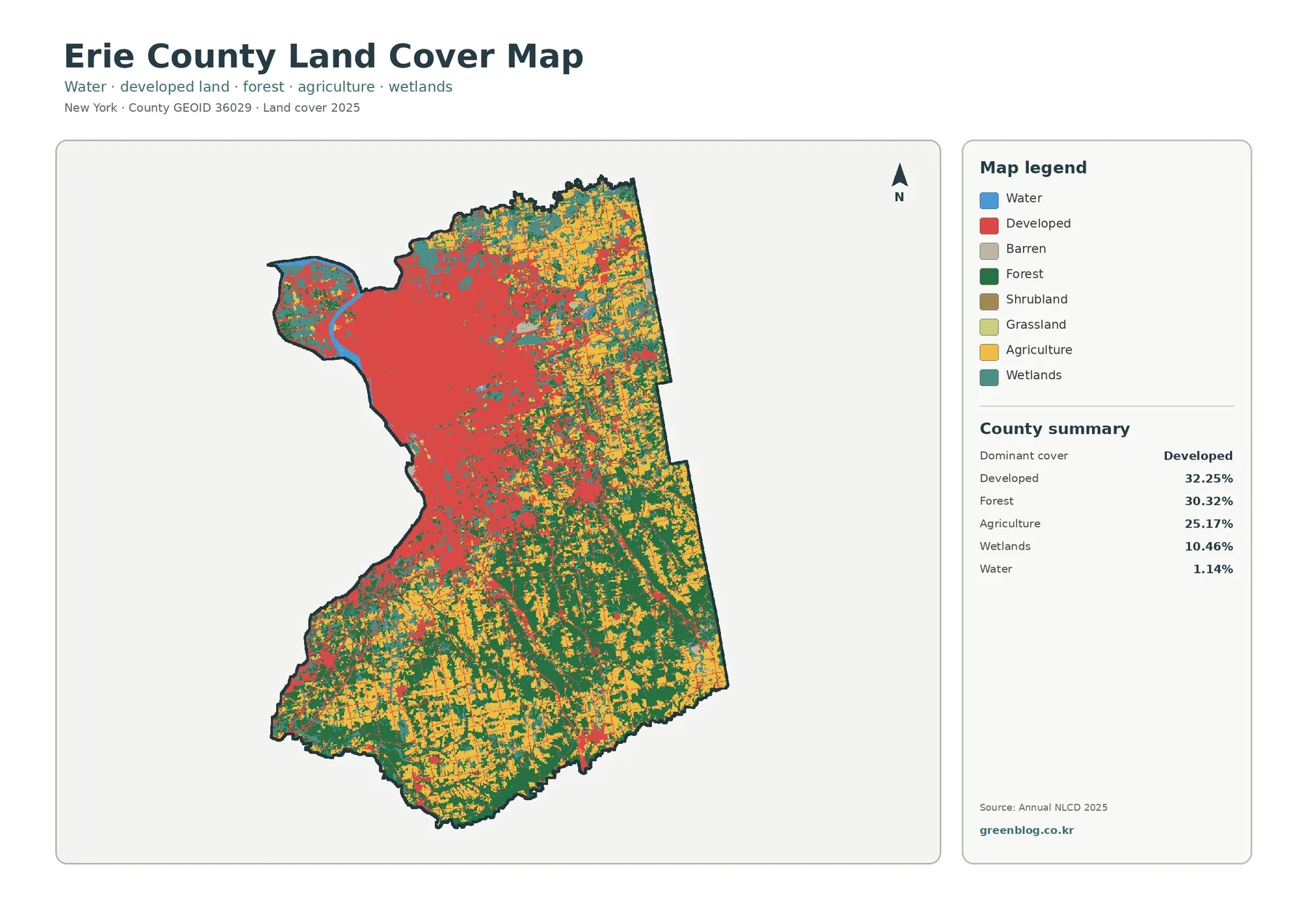
Land cover should not be confused with zoning, ownership, or legal land use. The classification describes what the ground surface is mapped as—such as forest, cropland, water, or developed cover. A parcel can therefore have a legal use that is not obvious from this raster classification, and the map should not be used to determine development rights or property boundaries.
Forest and farmland become clearer outside the urban core
Removing most of the visual weight from developed and other cover makes the rural pattern easier to follow. Large forest blocks fill much of the southern half, while cropland and pasture appear between them in smaller fields and broader agricultural zones. The northeast also shows a strong agricultural presence, although forest remains mixed through the same area.
The countywide totals—30.32% forest and 25.17% agriculture—suggest two landscape types of similar scale, yet their shapes are different. Woodland often forms larger connected areas, especially in the south. Agricultural cover is more fragmented, with fields broken by roads, settlements, wooded strips, and wetlands. That difference in shape is useful when comparing habitat continuity with working farmland.
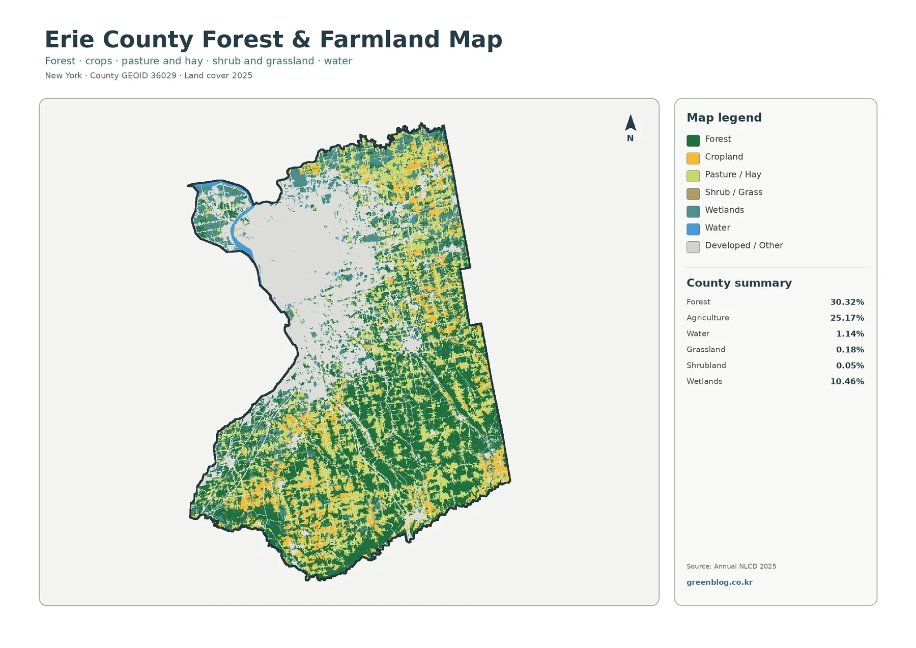
Wetlands account for 10.46% of the 2025 summary and appear throughout the county rather than in a single block. They are worth checking whenever a forest or agricultural edge is being interpreted. Small wetlands and narrow water features can be generalized by the raster cells, so the map is best used for county-scale context rather than site-level delineation.
Impervious surface isolates the hardest-built parts of Erie County
A developed-land class can include lawns, trees, and other permeable surfaces, so it does not show how completely an area is paved or covered by buildings. The impervious map answers a different question by estimating the share of hard surface within each mapped cell. Darker values cluster strongly in the northwest, while thinner lines extend outward along transportation and settlement corridors.
Mean impervious surface is 12.58% across the county, and 11.27% of the mapped area is summarized as at least 50% impervious. Those figures are much lower than the 32.25% developed-cover share because the measurements describe different things. A residential neighborhood, for example, may be classified as developed even though yards and trees leave much of the surface permeable.
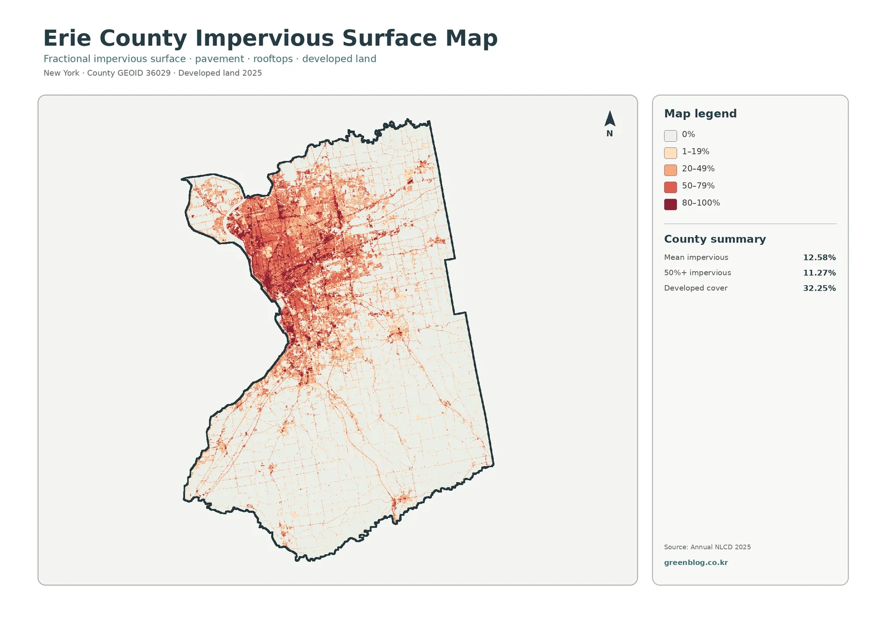
For stormwater discussions, urban heat context, or a quick comparison of built intensity, this layer is more informative than the general developed class alone. It is still a generalized surface, not a building footprint or pavement inventory. Exact site calculations require finer local data.
Mapped class differences from 1985 to 2025
The change map compares the 1985 and 2025 classifications cell by cell. A total of 16.65% of cells are summarized as having a class difference. The map further lists 4.32% as classified to developed, 1.24% as agricultural loss, 0.52% as forest loss, and 10.37% as other class differences.
Red patches appear around the developed northwest and at many smaller locations farther into the county. Some follow the edges of existing built areas, while others occur as scattered pieces along settlement corridors. Purple “other difference” cells are more dispersed and show that the forty-year comparison includes changes beyond the specific development, forest-loss, and agricultural-loss categories.
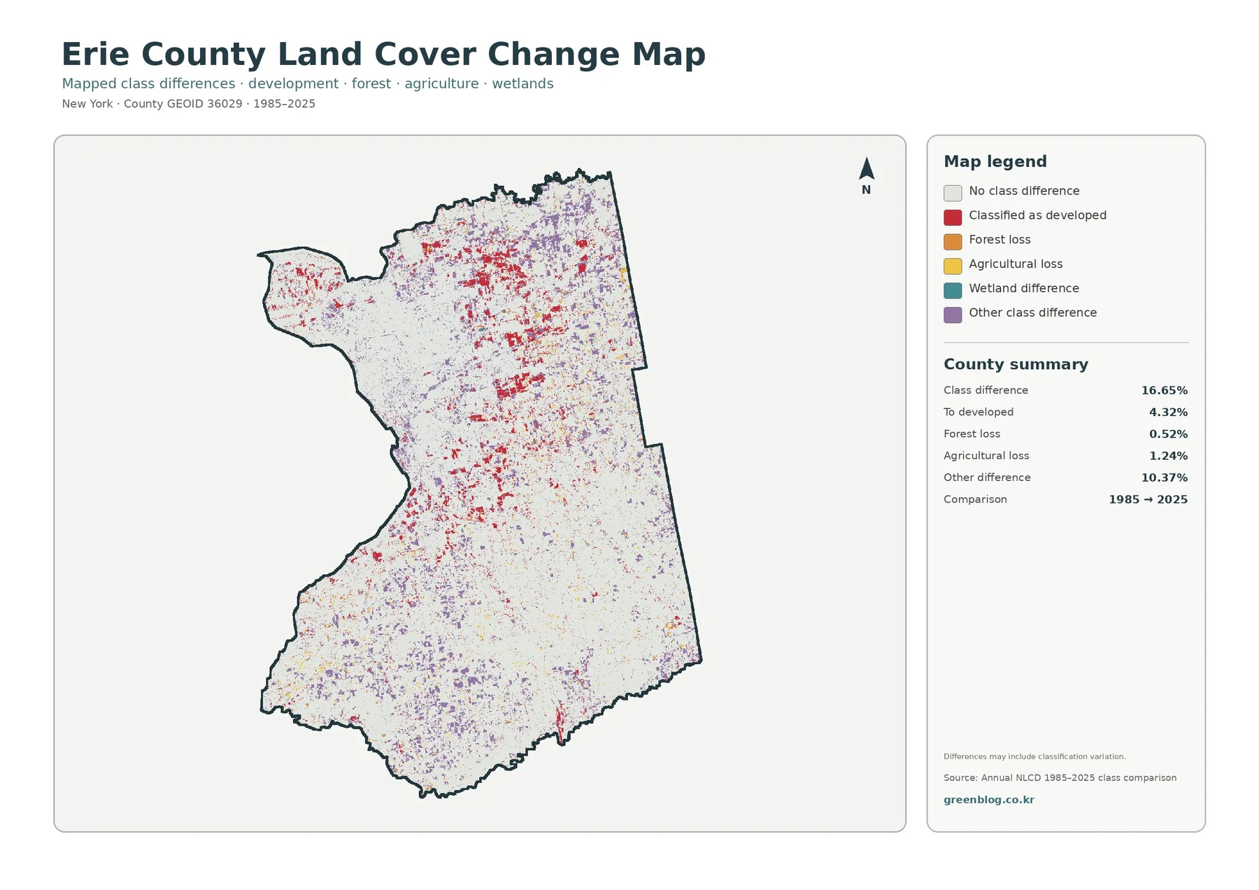
The 16.65% figure should not be read as a measured land-use conversion rate. Real land-cover change is part of the comparison, but imagery conditions, mixed pixels, and classification differences can also move a cell from one class to another. The strongest use of this map is to identify places worth checking with dated aerial imagery or other time-specific records.
What the four maps reveal when read together
Start with the general land-cover map to locate the broad developed, forested, agricultural, and wetland areas. Switching to the impervious map then separates the most intensely built portions from lower-density developed land. The forest-and-farmland view simplifies the rural side of the county, and the change layer adds a time comparison without hiding the current pattern.
This sequence is useful because the same location can tell a different story in each layer. A developed edge with high impervious values points to a harder-built setting, while a developed edge next to cropland may represent a very different transition. Likewise, a patch on the change map becomes easier to interpret after checking whether its present-day surroundings are mainly forest, agriculture, wetlands, or development.
Practical uses for education, environmental context, and presentations
In a classroom, the maps can demonstrate how one county contains dense development, working farmland, forest, wetlands, and water at the same time. Showing the general map first and then narrowing the discussion with the impervious or forest-and-farmland map keeps the categories easy to follow without turning the lesson into a technical GIS exercise.
Environmental reports can use the set as a visual starting point for discussing wetland distribution, forest continuity, developed intensity, or places where mapped classes differ through time. Presentation graphics benefit from choosing the layer that matches the question rather than placing all categories on one figure. The impervious map is clearer for built intensity, while the forest-and-farmland map communicates rural cover more directly.
Planning context is another reasonable use, provided the limits are kept in view. These maps describe broad land-cover patterns; they do not replace parcel boundaries, zoning maps, ownership records, wetland delineations, or site surveys. Decisions that depend on legal or property-level detail should rely on the appropriate local source.
Limits to keep in mind when reading the raster maps
Annual NLCD-style land-cover products classify the landscape in raster cells. A single cell can contain more than one real-world surface, such as trees beside a road or a house surrounded by lawn. That mixed-pixel effect means small features and narrow boundaries may look simpler than they do on the ground.
Timing matters as well. The current land-cover and impervious maps represent 2025 conditions, while the comparison layer uses 1985 and 2025 classifications. Development or land-management changes after the mapped date will not appear. For work that depends on current conditions, check the observation year and pair this overview with newer local imagery or records when available.
Download the four original JPG maps
The ZIP below contains the four original JPG maps shown on this page: general land cover, forest and farmland, impervious/developed land, and land-cover change. Use the archive when you want the files separately for printing, classroom materials, presentations, or your own map-based comparison.
Frequently Asked Questions
What is the largest mapped land-cover class in Erie County?
Developed land is the largest 2025 class at 32.25%. Forest is close behind at 30.32%, followed by agriculture at 25.17%. Most of the dense development is concentrated in the Buffalo-area northwest.
Why is developed cover 32.25% while mean impervious surface is 12.58%?
Developed land is a broad cover category that can include lawns, trees, and other permeable areas. Impervious surface measures hard materials such as pavement and rooftops, so the two percentages describe different aspects of the built environment.
Does the 16.65% class difference mean that 16.65% of the county was definitely converted to a new land use?
No. It indicates that the mapped class differs between 1985 and 2025 at those cells. Real land-cover change is part of the result, but image conditions, mixed pixels, and classification variation can also contribute.
Map File Information
Erie County Land Cover Map Files
- Included Files: Land cover, forest/farmland, impervious/developed land, and land cover change maps
- File Type: Four original JPG maps in one ZIP archive
- Intended Use: Printing, education, presentations, and map-based projects
Related Maps
- Albany County Land Cover Map
- Bronx County New York Land Cover Map
- Cattaraugus County New York Land Cover Map
Sources and references
- MRLC Annual NLCD Data — official access to Annual NLCD products and supporting data.
- USGS Annual NLCD Land Cover Classification — definitions for the major land-cover classes used in the dataset.
- Erie County Environment & Planning — county information on environmental and sustainability topics.
- Erie County Agricultural and Farmland Protection Plan — official county information on agriculture and farmland protection.
Green Map creates custom-edited map images using open geographic data sources such as geoBoundaries, Natural Earth, OpenStreetMap, and government open data.
These maps are edited visual materials, not raw data files, and are provided for education, documents, presentations, and graphic reference.