Forest is the defining surface in the supplied 2025 Okaloosa County land-cover summary, accounting for 45.80% of the county. Developed land is 14.09%, wetlands 13.71%, grassland 8.35%, water 6.19%, shrubland 5.68%, and agriculture 4.86%. The countywide image shows broad green forest through the north, center, and interior south, while the strongest developed areas appear in a central cluster and along the southern end. This Okaloosa County Florida Land Cover Map page uses those visible differences as the starting point rather than treating the percentages as a stand-alone table.
The article includes four related views: 2025 land cover, forest and farmland, impervious surface and developed land, and a 1985–2025 class-difference map. The WebP images are intended for direct comparison on the page, and the four original JPG maps are available together in one ZIP download. Reading the set in sequence makes it easier to separate current cover from change, developed area from hard surface, and broad forest or wetland distribution from the smaller agricultural and grassland patches.
Table of Contents
Forest covers nearly half the county, while development forms distinct clusters
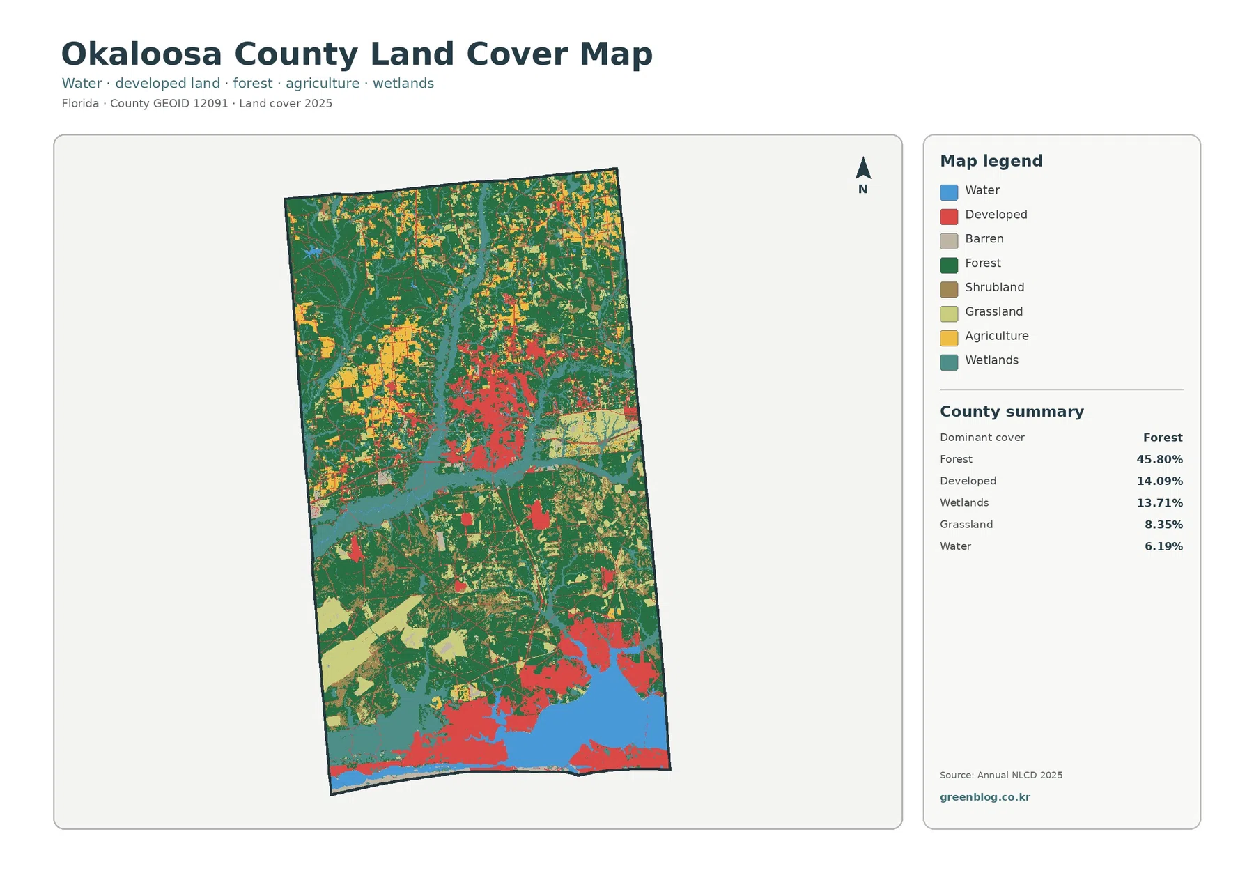
The first impression from the general map is continuity of forest. Dark green areas extend across much of the northern half, remain broad through the center, and continue into the southern interior. Even where other classes break the pattern, forest repeatedly returns as the surrounding cover. The 45.80% summary value therefore fits the visual structure of the map: forest is not confined to one corner or one isolated block, but appears as the main background across several parts of the county.
Developed land tells a different story. It occupies 14.09% of the county, yet it attracts attention because the red areas are concentrated rather than evenly scattered. A large developed cluster is visible around the middle of the county, and stronger red coverage appears toward the southern end. Northern areas contain smaller red pieces and thin traces, but they do not create the same continuous developed footprint. This contrast is important when describing the county: a visually prominent category can still cover much less area than the forest surrounding it.
Wetlands account for 13.71%, almost the same share as developed land, but their shape and location are very different. Teal wetland cover follows long bands and larger irregular patches through the central and southern portions of the map. Water is summarized at 6.19% and is especially noticeable in the broad blue area near the south as well as in elongated interior features. Wetlands and open water should remain separate in any explanation. A wetland can include vegetation and seasonally or persistently wet ground, while the water class represents open water surfaces.
Grassland at 8.35% and shrubland at 5.68% fill many of the transitions between forest, wetlands, agriculture, and developed areas. Agriculture is smaller at 4.86%, with several yellow-toned patches visible in the northwestern and central parts of the county. None of these colors should be read as property ownership, zoning, or a legal land-use designation. Land cover describes what the surface is classified as from remotely sensed data. A developed cell can still contain lawns and trees, and an agricultural cell does not identify a specific farm boundary, crop, or owner.
The vegetation-focused view reveals how farmland sits inside a much larger forest pattern
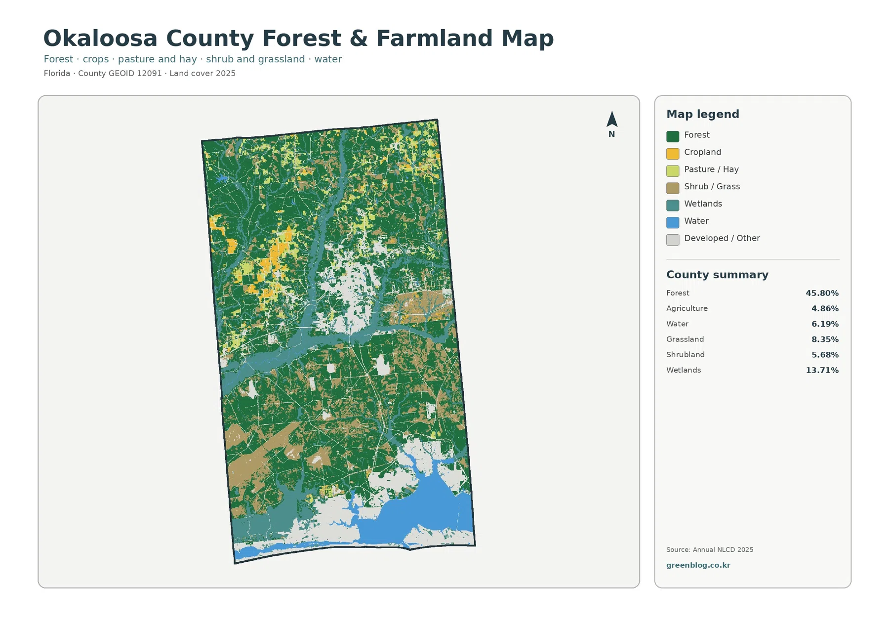
Removing the stronger developed colors changes what stands out. Forest remains dominant across the north and interior, and the green cover can be followed through areas that looked more visually complicated in the general map. In the northern half especially, forest forms the background while smaller agricultural, grassland, and shrubland patches interrupt it. Farther south, wetlands and water become more prominent and the forest pattern breaks into more complex shapes. This makes the focused map useful when the goal is to compare vegetation rather than development intensity.
Agriculture represents 4.86% of the county. Its largest visible concentrations occur as several block-like patches rather than one continuous agricultural region. Yellow crop colors are particularly noticeable toward the northwest, with additional smaller areas in the north and center. The legend visually distinguishes cropland from pasture or hay, but the supplied county summary combines agriculture into a single 4.86% value. It would therefore be misleading to estimate separate cropland and pasture percentages from the image alone.
Grassland is larger than agriculture at 8.35%, and shrubland accounts for 5.68%. Both occur in multiple parts of the county, often between forest, wetland, and agricultural patches. Small areas can look sharply bounded on the image, but the source is a raster classification. A real grid cell may contain trees, grass, water, rooftops, or bare ground at the same time and still be represented by one dominant class. The map is therefore strong for county-scale comparison but should not be treated as a survey of individual parcels.
Wetlands remain important in the vegetation view because they divide and border many of the green forest areas. The long central wetland pattern and larger southern wetland blocks provide useful reference points when comparing where agricultural patches occur. Instead of describing agriculture only as “4.86%,” a more informative reading is that working-land colors appear as smaller pieces within a much broader forest-and-wetland setting. That relationship is visible without inventing names or statistics that are not supplied in the package.
Impervious cover is low countywide but much stronger in the central and southern developed areas
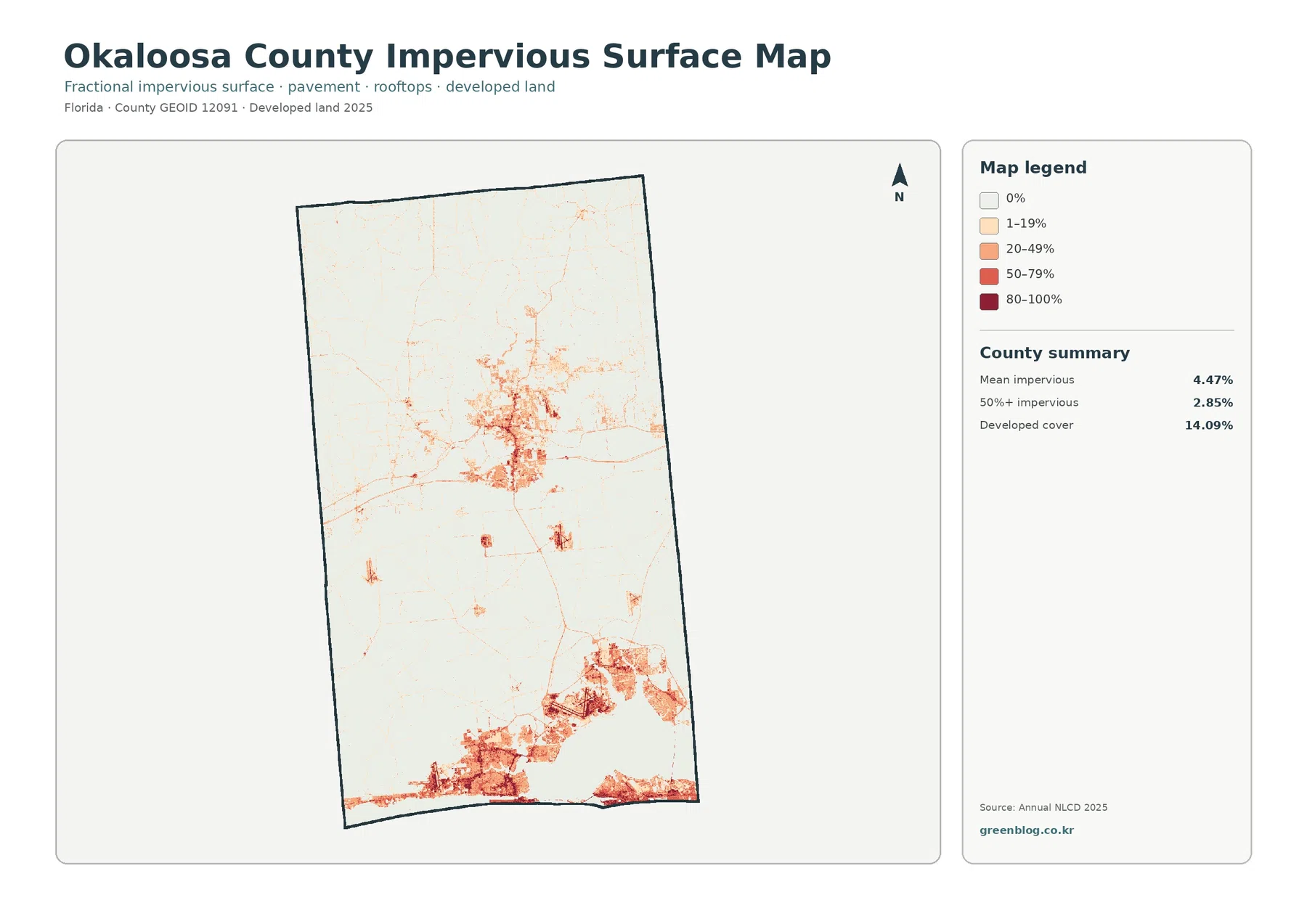
The impervious map measures a narrower characteristic than the developed land class. Mean impervious cover is 4.47%, and 2.85% of the county is mapped at 50% or greater impervious surface. Both figures are well below the 14.09% developed-cover share because developed land can contain permeable lawns, trees, landscaped areas, and open ground in addition to buildings and pavement. Impervious percentage isolates hard surfaces such as rooftops, roads, and parking areas, so it should not be used as another name for developed land.
The strongest hard-surface signal is concentrated toward the southern end of the county. Orange and red areas spread along the lower edge and form broad southern clusters, while another substantial concentration appears around the center. Much of the north remains near the lightest part of the scale, interrupted by a few narrow lines and small concentrations. The countywide mean of 4.47% therefore hides a strong internal contrast: large areas have very little hard surface, while selected developed zones have much higher values.
Some of the narrow impervious marks resemble roads, but this is not a transportation map. It does not provide route names, lane counts, traffic volumes, or pavement condition, and a thin line should not be assigned a specific road identity without another verified layer. The map is best read for the location and intensity of hard surfaces. Likewise, low impervious cover does not prove low flood risk because rainfall, elevation, soils, drainage, and wetland connections are separate factors that are not measured by this layer.
Comparing the general map with the impervious view is one of the most useful parts of the set. The first tells us that 14.09% of the county is classified as developed in 2025. The second shows that the countywide hard-surface average is only 4.47%, with the highest values concentrated in particular places. Using both prevents a common exaggeration in which every developed cell is described as paved or urbanized. It also explains why the visually strong southern development does not make the entire county highly impervious.
The 1985–2025 comparison marks widespread class differences without assigning a cause
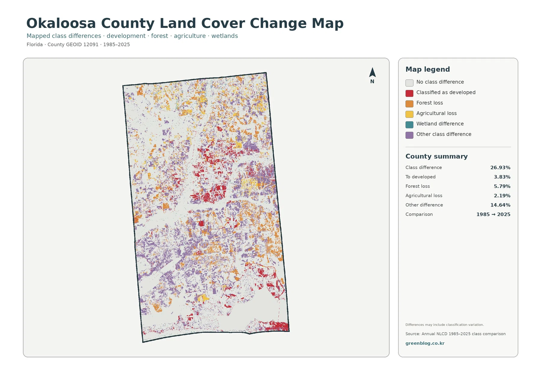
The change map reports a total class difference of 26.93% between 1985 and 2025. That statistic should not be rewritten as “26.93% of Okaloosa County was physically transformed.” The map itself warns that classification variation may be included. Differences in imagery, seasonal conditions, mixed pixels, and classification rules can appear alongside real land-cover change. The comparison is therefore most useful for identifying areas that deserve closer review rather than proving what caused a particular change.
Cells classified to developed account for 3.83% of the comparison. Red marks are especially concentrated in the central portion of the county, with additional groups toward the south and scattered smaller areas elsewhere. Some of those places are close to current developed and impervious concentrations, but the statistics describe different questions. The 14.09% figure is current developed cover in 2025; 3.83% is a highlighted two-date change category. Treating them as interchangeable would confuse present condition with change between two observations.
Forest loss is summarized at 5.79%. Orange marks appear through the north, center, and south in many separate patches. The map can tell us where the 1985 and 2025 forest classifications differ, but it cannot determine whether a specific patch reflects harvesting, development, disturbance, vegetation cycles, hydrologic change, or another process. Agricultural loss is 2.19% and is also distributed across multiple locations. A colored cell identifies a comparison category, not the identity of a farm, landowner, or management action.
Other difference is the largest named summary component at 14.64%, and purple marks are widespread across the county. This matters because it prevents the change map from being reduced to a simple development-versus-forest story. The legend also includes a wetland-difference category, but the supplied county summary does not provide a separate wetland-difference percentage. It is appropriate to describe the visible category, but not to invent a number by estimating colored pixels from the image. The same restraint should be applied to any class for which the package does not provide a verified percentage.
Using the four views together separates composition, intensity, and two-date change
For a general county profile, the 2025 land-cover map is the best starting point. It shows the 45.80% forest share in the same frame as the smaller developed, wetland, grassland, water, shrubland, and agricultural classes. The biggest countywide contrast is broad forest against concentrated development, while wetland and water add a second pattern through the central and southern areas. That overview works well before moving to a map designed for one narrower question.
The forest-and-farmland view is more useful when the purpose is to compare vegetation. It makes the continuity of forest easier to follow and places the smaller agricultural patches within their surrounding grassland, shrubland, wetland, and water context. The impervious map should be chosen when the question is development intensity rather than developed area. It shows that the strongest hard surfaces are concentrated in the central and southern clusters even though the countywide mean remains low.
The change map belongs later in the sequence because it does not show a second version of the current land-cover map. It identifies where the 1985 and 2025 classifications differ. Looking at the current maps first helps prevent a red change mark from being mistaken for a present-day developed class, or a forest-loss mark from being subtracted directly from the current forest share. For presentations, one clear base map plus one focused comparison is usually easier to read than four reduced images placed side by side.
The maps can also support county-to-county comparison when the same observation year and classification system are used. Okaloosa County’s supplied reference values include 45.80% forest, 14.09% developed land, 13.71% wetlands, and a 4.47% mean impervious value. Percentages should be compared together with spatial arrangement. A smaller category concentrated in one place can look more prominent than a larger category spread over the entire county, so area and visual intensity should not be treated as the same measure.
Raster scale and source dimensions set practical limits for printing and close inspection
Annual NLCD-style land-cover mapping divides the landscape into raster cells and assigns each cell a class or related value. A real cell can contain trees, grass, water, pavement, rooftops, and bare ground at the same time, yet the map simplifies that mixture for consistent regional comparison. Edges between forest and wetland, agriculture and grassland, or developed and undeveloped surfaces are therefore generalized rather than surveyed boundaries. A sharp color boundary should not be mistaken for a parcel line or regulatory limit.
The supplied original JPG files are 2480×1754 pixels each. The asset manifest does not mark them as meeting the manager’s A3 high-resolution reference. Enlarging the image can make colors and small patches easier to see, but it does not create new source detail. If a large-format print is needed, the file should be checked at the intended print size first. Fine parcel edges, narrow channels, small structures, or thin impervious features may require a higher-resolution or purpose-built source.
The 2025 maps represent the supplied observation year, so development, vegetation recovery, flooding, or land-management changes after that date may not appear. The 1985–2025 map is also a two-date comparison rather than a year-by-year history. A location could change several times during the forty-year interval and still end in a class similar to its starting class, producing little final difference. Conversely, differences in imagery or classification can contribute to a highlighted cell even when the physical change is less straightforward.
These limitations define the proper use of the map set rather than making it unhelpful. The maps are strong for explaining countywide patterns, selecting areas for further study, preparing classroom or presentation graphics, and comparing broad surface classes under one consistent system. Questions about legal boundaries, zoning, wetland jurisdiction, parcel suitability, or current site conditions require separate and more specialized sources. Keeping that distinction clear allows the maps to be used confidently for the tasks they actually support.
Frequently Asked Questions
What is the largest land-cover class in Okaloosa County?
Forest is the largest class in the supplied 2025 summary at 45.80%. Developed land follows at 14.09%, wetlands at 13.71%, grassland at 8.35%, water at 6.19%, shrubland at 5.68%, and agriculture at 4.86%. Forest is also visually widespread through the north, center, and southern interior of the county.
Why is developed cover 14.09% while mean impervious cover is only 4.47%?
Developed land can include lawns, trees, landscaped areas, and open ground along with buildings and pavement. Impervious cover isolates hard surfaces such as rooftops, roads, and parking areas. Because the two measures describe different characteristics, the countywide impervious mean can be much lower than the developed-land share. The map also shows that higher impervious values are concentrated mainly in central and southern developed areas.
Does the 26.93% class difference mean that 26.93% of Okaloosa County physically changed?
No. It is the share of cells classified differently in the 1985 and 2025 comparison, and the map warns that classification variation may be included. The 3.83% classified-to-developed, 5.79% forest-loss, 2.19% agricultural-loss, and 14.64% other-difference values are useful screening indicators, but the cause of a specific difference requires additional imagery or local records.
Sources and Reference Data
- MRLC Annual NLCD Data — official access and documentation for Annual NLCD land-cover products used for current and two-date comparison mapping.
- USGS Annual NLCD Land Cover Classification — definitions and background for forest, wetlands, developed land, agriculture, and other mapped classes.
- U.S. Census Bureau TIGER/Line Shapefiles — official geographic boundary reference for U.S. counties, including Okaloosa County.
Map File Information
The ZIP contains the four original JPG land-cover maps used for this Okaloosa County article.
- Included Files: Use only the versions confirmed in the article and supplied images
- File Type: Use the confirmed download contents
- Intended Use: Printing, education, presentations, and map-based projects
Related Maps
- Alachua County Florida Land Cover Map
- Baker County Florida Land Cover Map
- Bay County Florida Land Cover Map
Green Map creates custom-edited map images using open geographic data sources such as geoBoundaries, Natural Earth, OpenStreetMap, and government open data.
These maps are edited visual materials, not raw data files, and are provided for education, documents, presentations, and graphic reference.