Nassau County is dominated by two broad 2025 land-cover classes rather than one single surface. Forest accounts for 35.93% of the county and wetlands add another 30.97%, so together they cover roughly two-thirds of the mapped area. Developed land is 12.11%, while grassland, shrubland, agriculture, and water occupy smaller shares. The Nassau County Florida Land Cover Map makes those percentages more useful by showing where each class is concentrated instead of presenting the county as a simple list of numbers.
The page includes four related views: current land cover, forest and farmland, impervious surface and developed land, and a 1985–2025 class-difference map. The WebP previews are intended for quick comparison on the page. The four original JPG maps are also available together in one ZIP download below, which makes it easy to choose one map for a county profile or use several when a lesson or presentation needs a closer comparison.
Table of Contents
Forest and wetlands set the countywide pattern before development enters the picture
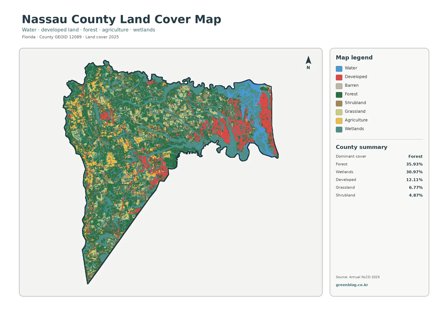
The strongest countywide fact is the combined extent of forest and wetlands. Forest leads the 2025 summary at 35.93%, while wetlands represent 30.97%. Large forest areas spread across the west, center, and south, and wetland patches appear throughout the county with especially noticeable areas toward the north and east. The two classes frequently meet rather than forming two completely separate zones, so the county is better described as a broad forest-wetland mosaic than as a landscape divided into one forest half and one wetland half.
Developed cover is smaller at 12.11%, but it has a strong visual presence because much of it is concentrated. The eastern edge contains the largest and most continuous developed clusters. Smaller developed areas appear farther inland and toward the south, while broad portions of the west contain much less red. This concentration matters when reading the percentage. Twelve percent of a county can look prominent on a map when much of that area is grouped into a few locations instead of being spread evenly across the boundary.
Land cover is a description of what physically covers the ground as classified from remotely sensed data. It is not a zoning map, ownership map, parcel map, or statement about whether land can be developed. A cell classified as developed can contain trees, lawns, and open ground along with pavement and buildings. A wetland class does not by itself establish a regulatory wetland boundary. Those distinctions are important because this map is designed for county-scale comparison rather than legal or parcel-level decisions.
Development is visible, but the hard-surface footprint is much smaller than the developed class
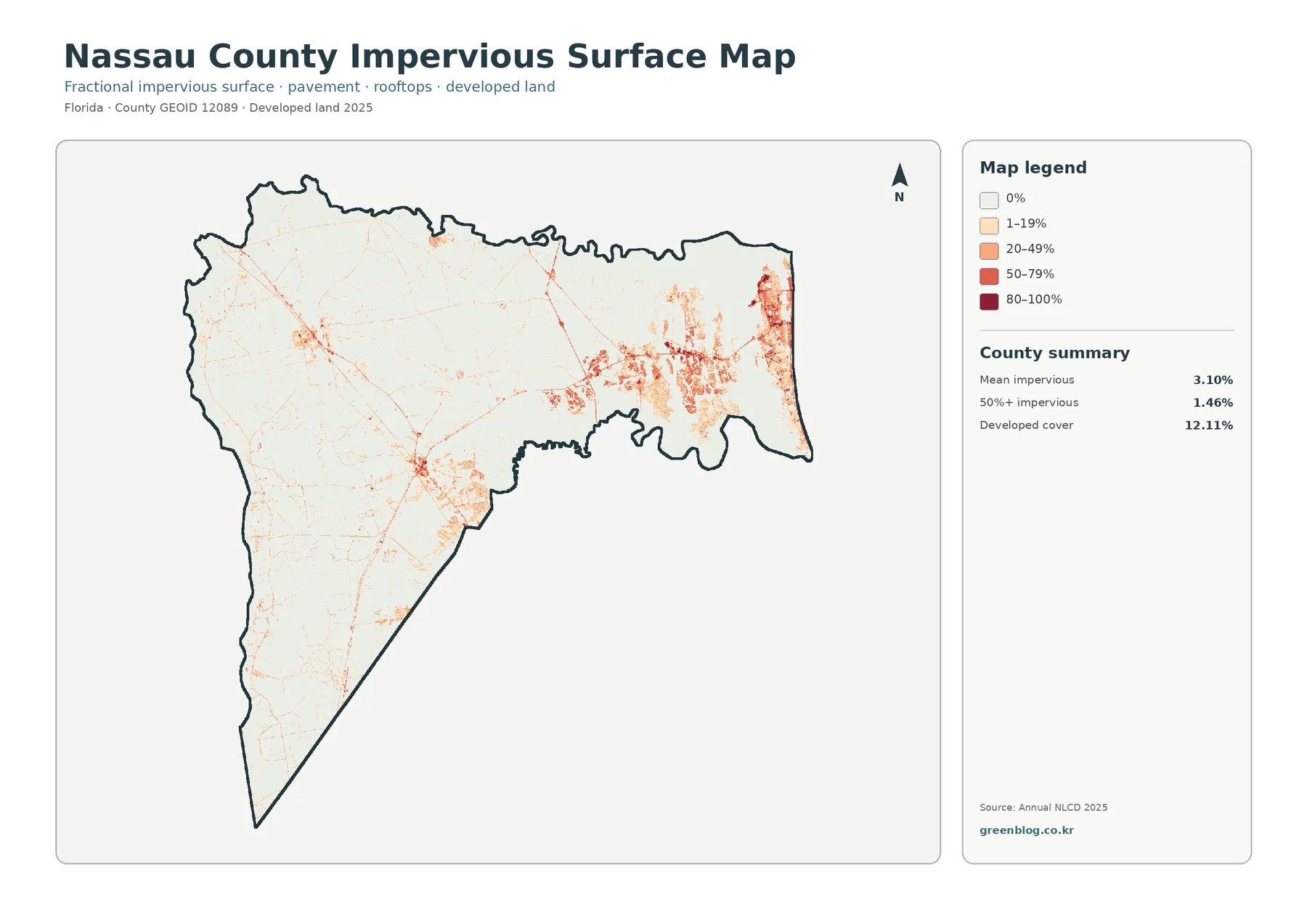
Impervious surface means hard material that does not readily absorb water, such as pavement, rooftops, and parking areas. Nassau County has a mean impervious value of 3.10%, and 1.46% of the county is mapped at 50% or greater impervious cover. Those values are far below the 12.11% developed-land share. The difference is expected because a developed land-cover class can include lawns, trees, open space, and other permeable surfaces within the same classified area.
The hardest surfaces are concentrated most clearly in the east, where the current land-cover map also shows the county’s largest developed clusters. Smaller concentrations occur inland and toward the south. Thin lines connect some of those areas, but the map should not be treated as a transportation map. It does not provide road names, lane counts, traffic volumes, or pavement condition. The narrow marks are useful only as evidence of where impervious surfaces are present.
Large parts of the west and northwest remain near the lightest end of the impervious scale. Comparing that view with the forest and wetland distribution makes the uneven development pattern easier to understand. The countywide mean stays low because extensive areas have very little hard surface even though the eastern concentration is visually strong. A bright cluster on the map therefore should not be generalized to the entire county.
A vegetation-focused view makes the smaller agricultural patches easier to place
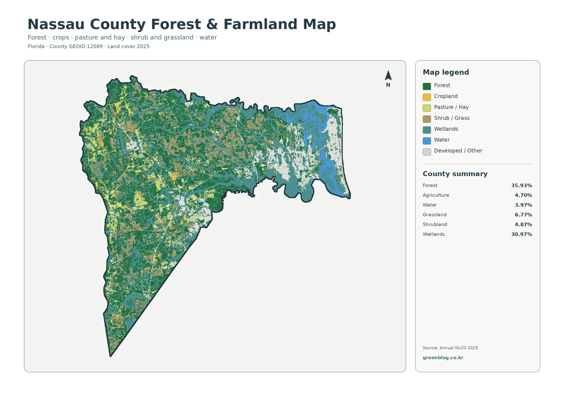
Removing the stronger developed colors changes what stands out. Forest remains the largest class at 35.93%, with broad green areas across the west, center, and south. Wetlands at 30.97% remain equally important to the overall pattern, especially toward the north and east. The focused map makes it easier to follow the boundaries between those two dominant natural-cover classes because development is no longer competing as strongly for attention.
Agriculture represents 4.70% of the county. It is visible in a series of smaller patches rather than one continuous agricultural district. The map separates cropland from pasture or hay visually, but the supplied county summary combines agriculture into one percentage. That means the map is suitable for comparing locations, but it would be misleading to invent exact cropland and pasture percentages by estimating colored pixels from the image.
The 1985–2025 comparison marks where classifications differ, not why they differ
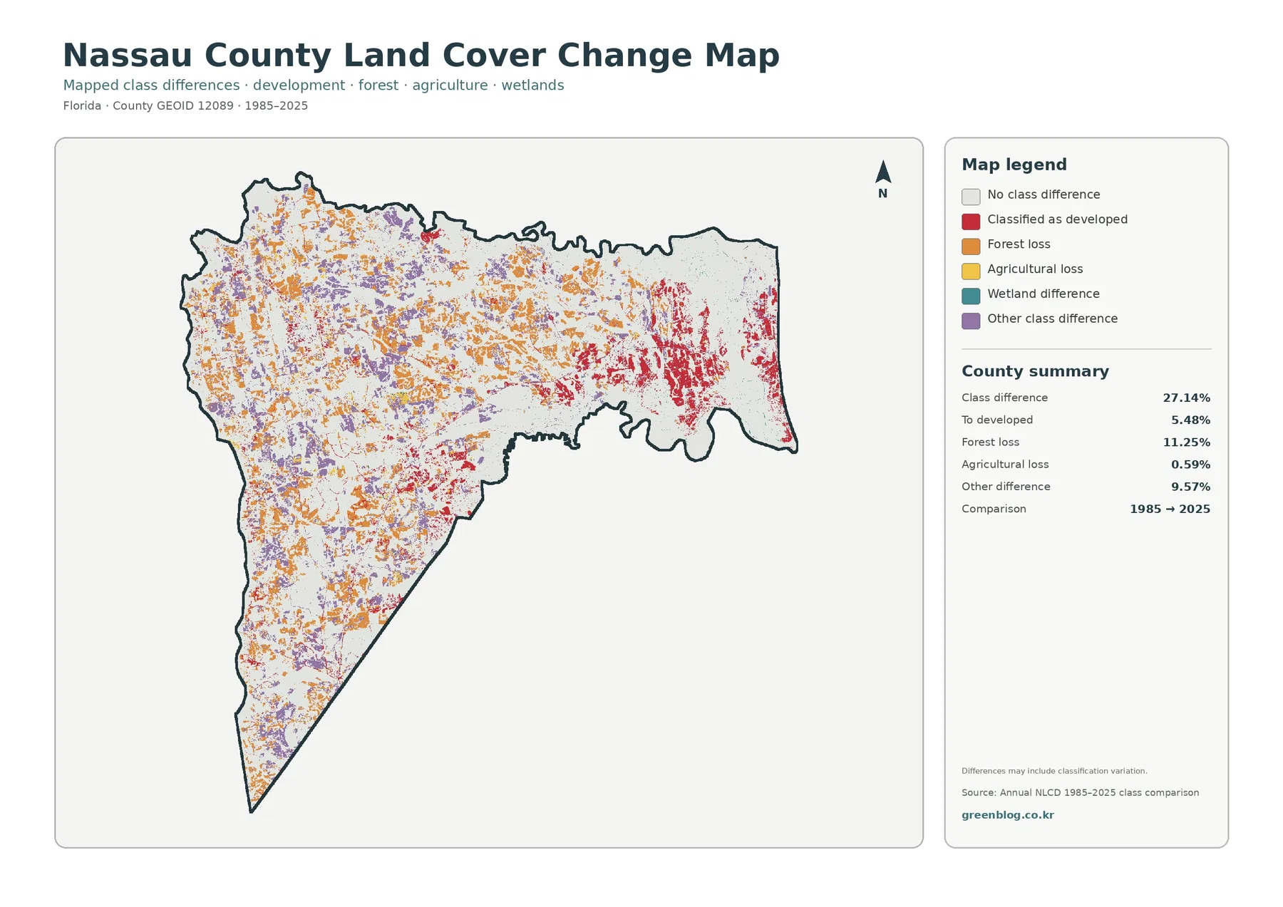
The change view reports a total class difference of 27.14% between 1985 and 2025. That number should not be rewritten as “27.14% of Nassau County was physically transformed.” The map notes that classification variation may be included. Differences in imagery, seasonal conditions, mixed cells, or classification rules can appear alongside real land-cover change, so the map identifies places for further investigation rather than proving a cause by itself.
Forest loss is the largest named change category at 11.25%. Orange marks are widespread across the west, center, and north and form several sizeable clusters. The comparison can show where the forest classification differs between the two dates, but it cannot determine whether a specific patch reflects harvesting, development, disturbance, regrowth cycles, hydrologic conditions, or another process. Intermediate imagery or local records are needed to answer that question.
Cells classified to developed account for 5.48% of the comparison. Red marks are strongest in the east and also appear in several inland locations. This is related to a different question than the current 12.11% developed-cover figure. The 12.11% value describes the 2025 surface, while 5.48% identifies a highlighted change category between 1985 and 2025. Keeping current condition and two-date difference separate prevents the same land from being counted conceptually in two incompatible ways.
Large prints improve visibility, but they do not create finer source detail
Annual NLCD-style land-cover mapping uses raster cells, meaning the landscape is divided into a grid and each cell receives a classification or related value. A real cell can contain trees, grass, standing water, rooftops, and pavement at the same time. The map simplifies that mixture so countywide patterns can be compared consistently. Boundaries between classes should therefore be treated as generalized rather than surveyed lines.
The supplied original JPG files are 2480×1754 pixels. The asset manifest does not mark them as meeting the manager’s A3 high-resolution reference. Enlarging a JPG can make colors and small patterns easier to see on screen, but it cannot add source information that was not present in the original raster. A large-format print should be checked at the intended size before use, especially when small change patches or narrow impervious features matter.
The 2025 maps represent the supplied observation year. Development, vegetation recovery, flooding, land management, or other changes after that date may not appear. The 1985–2025 map is also a two-date comparison rather than a year-by-year record. A location could have changed several times during the interval and still end in a class similar to its starting class, leaving little or no highlighted difference in the final comparison.
Frequently Asked Questions
What is the largest land-cover class in Nassau County?
Forest is the largest class in the supplied 2025 summary at 35.93%, followed closely by wetlands at 30.97%. Together they account for roughly two-thirds of the county. Forest is especially broad across the west and center, while wetlands are widespread and particularly noticeable toward the north and east.
Why is developed cover 12.11% while mean impervious cover is only 3.10%?
Developed land can contain lawns, trees, open ground, and other permeable surfaces along with buildings and pavement. Impervious cover measures only hard surfaces such as rooftops, roads, and parking areas. The two statistics describe different characteristics, so the countywide impervious average can be much lower than the developed-land share.
Does the 27.14% class difference mean 27.14% of Nassau County was physically changed?
No. It is the share of cells classified differently in the 1985 and 2025 comparison, and the map notes that classification variation may be included. The 11.25% forest-loss, 5.48% developed-conversion, and 0.59% agricultural-loss indicators are useful for screening, but the cause of a specific change requires additional imagery or local records.
Sources and Reference Data
- MRLC Annual NLCD Data — official access and documentation for Annual NLCD land-cover products used for current and two-date comparison mapping.
- USGS Annual NLCD Land Cover Classification — definitions and background for forest, wetlands, developed land, agriculture, and other mapped classes.
- U.S. Census Bureau TIGER/Line Shapefiles — official geographic boundary reference for U.S. counties, including Nassau County.
Map File Information
The ZIP contains the four original JPG land-cover maps used for this Nassau County article.
- Included Files: Use only the versions confirmed in the article and supplied images
- File Type: Use the confirmed download contents
- Intended Use: Printing, education, presentations, and map-based projects
Related Maps
- Alachua County Florida Land Cover Map
- Baker County Florida Land Cover Map
- Bay County Florida Land Cover Map
Green Map creates custom-edited map images using open geographic data sources such as geoBoundaries, Natural Earth, OpenStreetMap, and government open data.
These maps are edited visual materials, not raw data files, and are provided for education, documents, presentations, and graphic reference.