Monroe County looks very different from a typical inland Florida county when land cover is summarized across the whole boundary. In the supplied 2025 data, wetlands account for 71.25% and water for another 25.57%. Developed land is only 2.93%, while forest, agriculture, grassland, and barren cover appear in very small shares. The maps make those numbers easier to understand because the county combines a broad mainland area with a long chain of islands. This page explains the mapped distribution and provides the four original JPG maps together in one ZIP download.
The most useful way to read the Monroe County Florida Land Cover Map is to compare area with concentration. Wetlands dominate the mainland, water occupies a large part of the mapped county, and development is concentrated on relatively narrow pieces of land in the Keys. A small countywide percentage can therefore look visually important in the places where people and hard surfaces are clustered. The four views below separate overall land cover, forest and farmland, impervious surface, and 1985–2025 classification differences so each question can be examined without forcing every detail into one image.
Table of Contents
Wetlands and water dominate the 2025 countywide picture
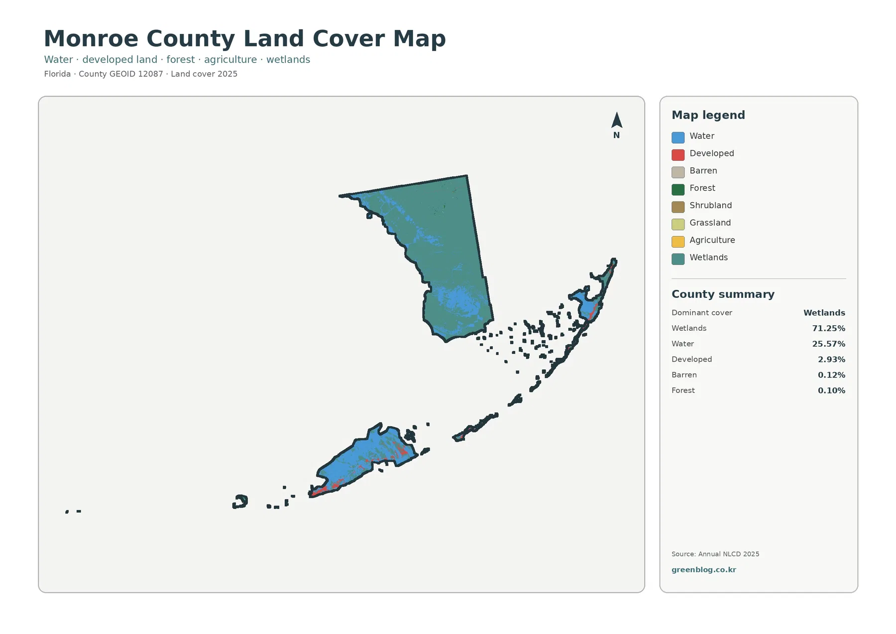
The broad mainland portion of Monroe County is overwhelmingly mapped as wetland. That visual pattern agrees with the 71.25% county summary and is the first feature to notice before looking at smaller categories. Blue water cells are mixed through the mainland and are also prominent around the island chain. The resulting map is not simply a land-versus-water picture; it shows a county where wet ground, open water, and narrow inhabited land occur within the same administrative boundary.
Water represents 25.57% of the supplied county summary. That percentage refers to cells classified as water inside the mapped county boundary, not to all surrounding ocean on the page. The white background outside the county should not be confused with mapped water. This distinction matters in Monroe County because the Florida Keys are surrounded by open water, while the land-cover statistics are calculated from the area included by the dataset and boundary used for the map.
Developed land is 2.93%, but the red areas are easy to notice because they are concentrated on relatively small pieces of land. Several island segments carry more developed color than the broad mainland, creating a strong visual contrast even though development is a small part of the total county area. This is a good reminder that percentage and prominence are different: a compact class can stand out on a map without being large in area.
Barren cover is reported at 0.12% and forest at 0.10%. The focused vegetation summary also lists agriculture at 0.01%, grassland at 0.02%, and shrubland at 0.00% after rounding. Those tiny categories should not be estimated again by eye. A few visible pixels can look important at high zoom, but the supplied percentages are the appropriate countywide reference for the classifications shown here.
Hard surfaces are concentrated even though the countywide mean is low
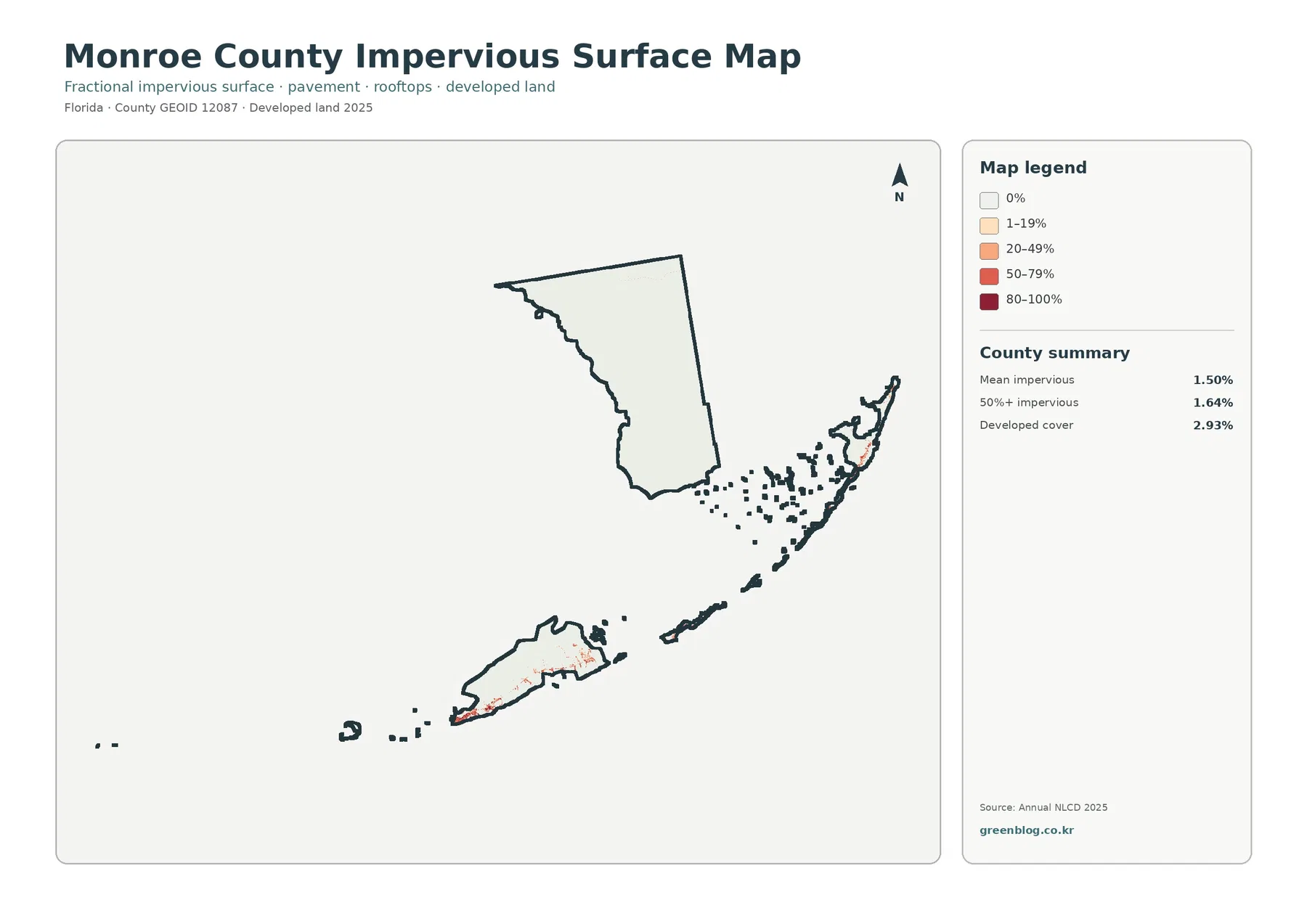
The impervious-surface map changes the emphasis from land-cover class to surface hardness. Mean impervious cover is 1.50% across the county, while 1.64% of the county is mapped at 50% or greater impervious cover. Developed land remains 2.93%. These figures are related, but they are not interchangeable. Developed land can contain lawns, trees, exposed soil, and other permeable surfaces in addition to buildings and pavement.
The strongest impervious colors appear on parts of the island chain rather than across the broad mainland. Much of the mainland stays close to the lightest end of the scale, while narrow developed areas show warmer colors. The pattern makes intuitive sense as a map comparison without requiring a claim about a particular road or town: hard surfaces are concentrated where the map also shows more developed land.
The 1.64% figure for areas at or above 50% impervious cover does not mean only 1.64% of Monroe County is developed. It identifies places where at least half of the mapped surface is impervious. The broader developed class is 2.93% because it can include lower-density development with substantial permeable ground. Keeping those definitions separate prevents the county’s developed areas from being described as uniformly paved.
Impervious cover is also not a flood-risk map. Drainage, rainfall, elevation, tides, soils, storm surge, and infrastructure all affect flooding. Those factors are particularly important in a low-lying island and coastal county, but they are outside what this image measures. Use the impervious map for surface comparison and development intensity, then consult official flood and coastal-hazard sources for risk decisions.
The mainland and the Keys create two very different map settings
Official Monroe County planning material describes a county that includes both the southern Florida mainland and the Florida Keys. County documents also note that the mainland portion lies within Everglades National Park or Big Cypress National Preserve, while the Keys form a long island chain extending southwest from the Florida peninsula. That geography helps explain why one county can contain an enormous wetland block and, at the same time, narrow developed island corridors.
On the 2025 map, the mainland is visually simple at first glance because wetlands cover most of it, with water interspersed through the area. The island chain is more fragmented. Land and water alternate across small shapes, and developed cells appear more frequently on some of the larger or more continuous pieces of land. The same legend therefore produces two very different visual patterns within the same county.
The 2.93% developed share should not be translated into a statement about population or settlement intensity without additional data. The denominator includes very large wetland and water areas. A relatively small developed percentage can still contain concentrated communities and transportation surfaces on narrow islands. Land-cover data answers where surface classes occur; it does not directly measure population, housing units, traffic, or economic activity.
Land cover also differs from zoning, ownership, protected-area boundaries, and development rights. A wetland-colored cell is not automatically a regulatory wetland boundary, and a developed cell does not establish that new construction is permitted. Monroe County maintains separate GIS and planning resources for those questions. The land-cover maps here are best treated as broad surface classification maps that can guide further research rather than replace official parcel or regulatory information.
The 1985–2025 comparison shows a 7.64% class difference
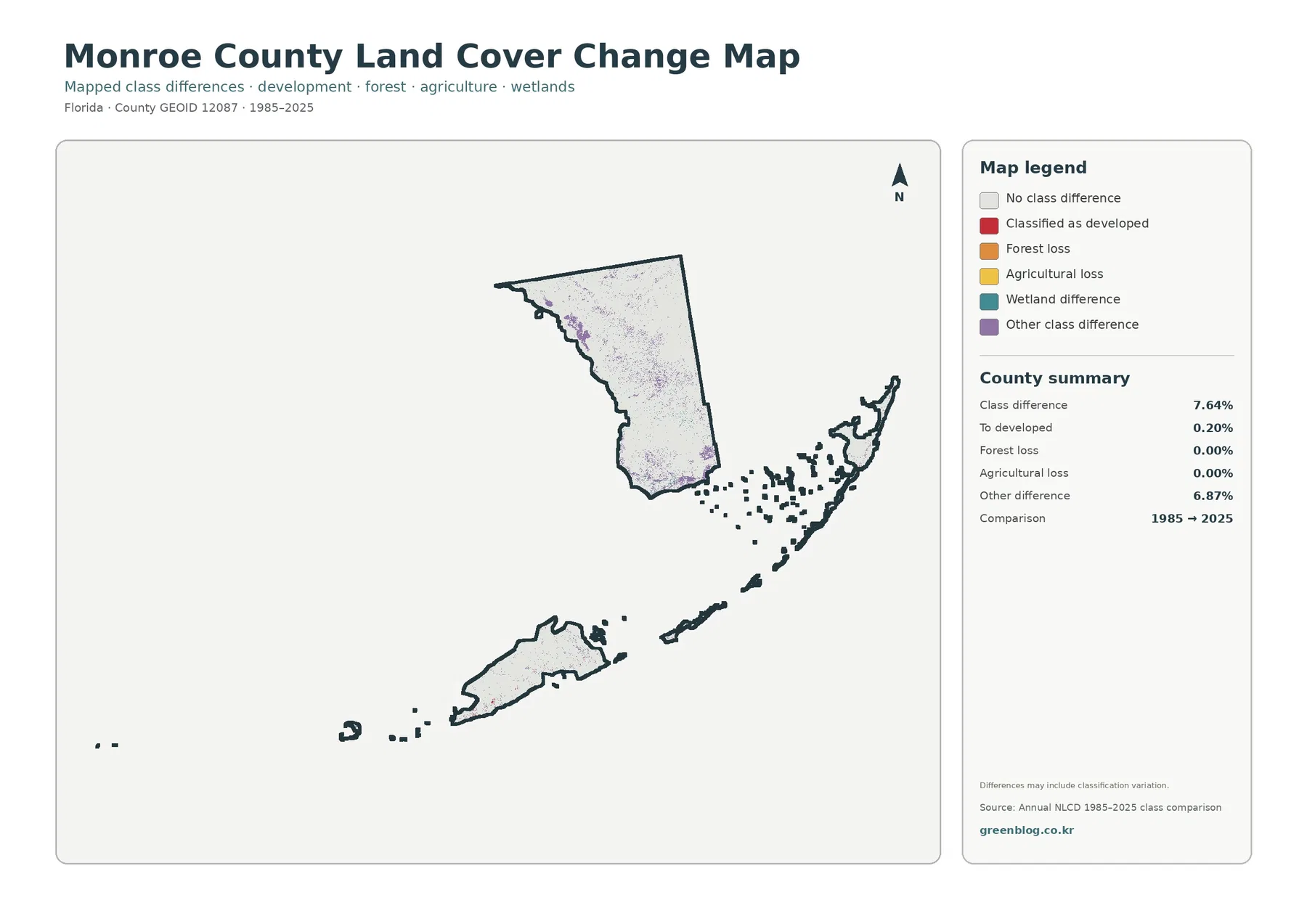
The change map compares classifications from 1985 and 2025 and reports a total class difference of 7.64%. That number should not be rewritten as a 7.64% rate of physical destruction, development, or habitat loss. The map itself warns that classification variation may be included. Differences between imagery, seasonal conditions, mixed pixels, or classification methods can contribute to the result alongside real landscape change.
Cells classified to developed account for 0.20% in the comparison. That value is not the same as the current 2.93% developed share. The first describes a highlighted change category between two dates, while the second describes the 2025 land-cover condition. Separating change from current state is essential when using the two maps in the same report or presentation.
Forest loss and agricultural loss are both shown as 0.00% in the supplied summary, while other difference is 6.87%. The legend also includes a wetland-difference class, but the summary does not provide a separate percentage for it. It is appropriate to say that wetland differences are mapped where the color appears; it would not be appropriate to calculate a new percentage from the preview image and present it as an official statistic.
The comparison works best as a screening tool. Areas with clusters of difference symbols can be selected for closer review with the 2025 map, intermediate imagery, local GIS layers, or planning records. The map points to locations where classifications differ, but it does not establish the cause of the difference, who owns the land, or whether any regulatory action occurred.
Forest and farmland are minor classes in the supplied county summary
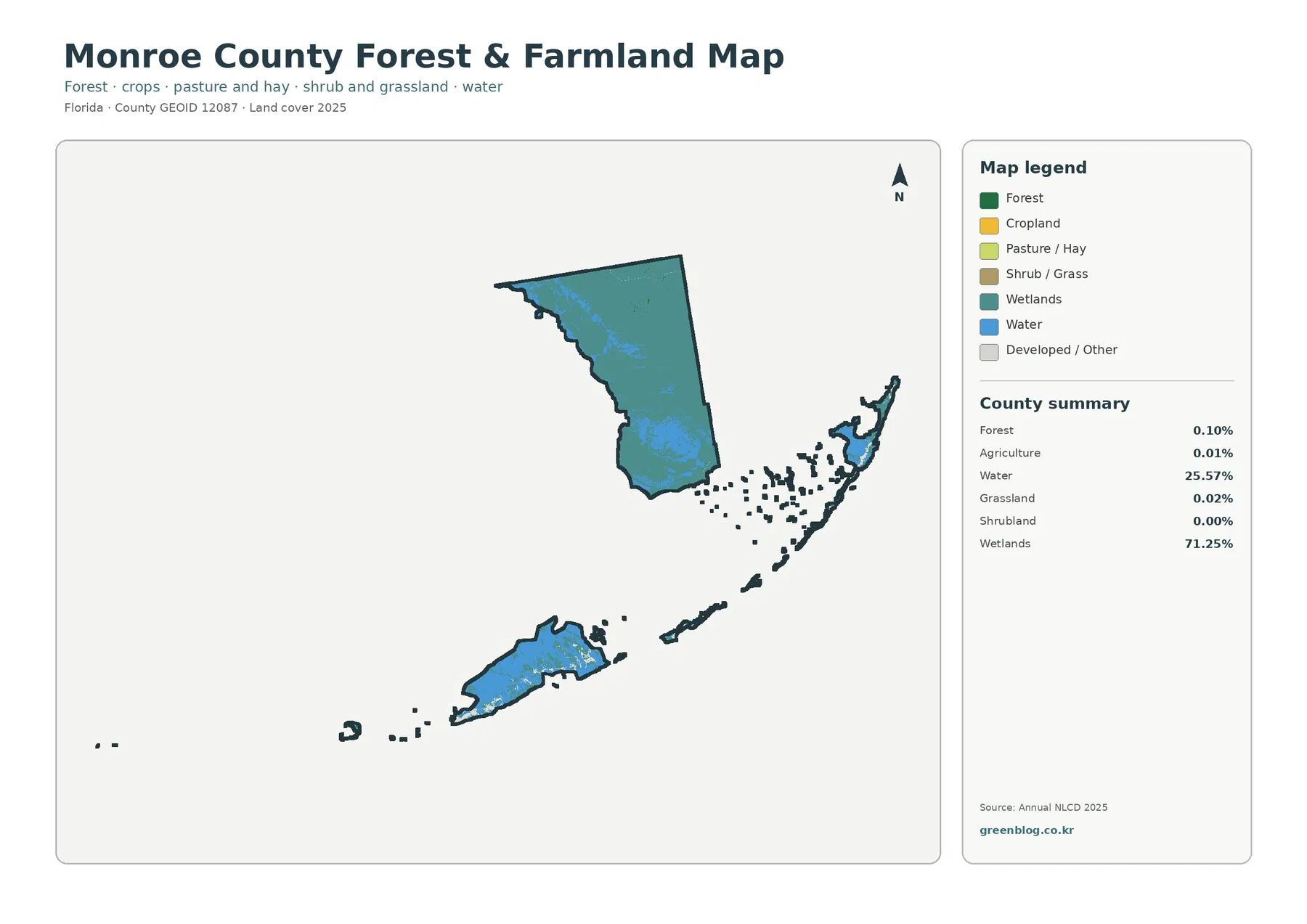
The forest-and-farmland view is useful precisely because those categories are so small. Forest accounts for 0.10% and agriculture for 0.01%, while wetlands and water still dominate the page. Removing some of the competing colors from the general map makes the small vegetation classes easier to locate, but it does not change their countywide importance. The map should be used to find where a class appears, with the percentages kept alongside it for scale.
Agriculture at 0.01% is a land-cover classification, not a complete measure of farming in Monroe County. It does not identify crop type, farm ownership, parcel boundaries, or agricultural sales. A classified agricultural cell only indicates that the surface met the criteria for the agricultural category in the dataset. Questions about actual farms or land management require agricultural statistics and local property or planning records.
The forest number needs similar care. A 0.10% forest class does not mean that only one-tenth of one percent of the county contains any trees. Vegetated wetlands can include woody plants while still being classified within wetland categories. The number represents cells assigned to the forest class, not every location where trees are present. This distinction is especially important in a county where wetlands dominate the classification.
Grassland is 0.02%, and shrubland rounds to 0.00% in the supplied summary. A rounded zero should not be presented as proof that no shrub vegetation exists anywhere. It means the mapped class is extremely small at the reporting precision used here. County-scale raster maps are good for broad proportions, but small habitats and narrow vegetation strips require finer imagery or specialized ecological mapping.
Choose one map for the main question, then add a comparison only when needed
For a general county profile, begin with the 2025 land-cover overview. It immediately shows the dominant wetland mainland, the large water share, and the relatively small developed areas. A reader can understand the broad composition before being asked to interpret more specialized measures. This makes the general map the strongest first image for a classroom handout, county comparison, or introductory slide.
For environmental education, the wetland-water contrast is especially useful. Ask why 71.25% wetland and 25.57% water are separate classes, then have readers identify where each appears. The exercise makes the legend meaningful instead of turning the map into a list of percentages. If the lesson moves into regulatory wetlands or protected lands, switch to an official boundary source rather than extending the land-cover map beyond its purpose.
For a development discussion, the impervious map is the better second image. The 1.50% countywide mean can be compared with the concentrated island areas where stronger colors appear. Pairing it with the 2.93% developed share demonstrates the difference between a developed classification and the amount of pavement or rooftop within it. This is more informative than using the developed percentage alone.
When comparing Monroe County with another Florida county, keep the year and classification system consistent. The key 2025 reference values here are 71.25% wetlands, 25.57% water, 2.93% developed land, 0.10% forest, 0.01% agriculture, and a 1.50% mean impervious cover. Compare the spatial arrangement as well as the percentages, because Monroe County’s mainland-and-island geometry strongly affects how the same percentage is experienced on the map.
Cross-checking the four maps gives a clearer county story
The first useful comparison is wetland versus open water. Wetlands make up 71.25% and water 25.57%, but the two classes represent different surfaces. Wetland cells can contain saturated ground and vegetation, while open-water cells represent water surfaces. Looking at both categories prevents the common mistake of treating every wet place as open water or ignoring the ecological importance of vegetated wetlands.
The second comparison is developed land versus impervious surface. The developed class is 2.93%, yet mean impervious cover is 1.50% and only 1.64% of the county reaches at least 50% impervious cover. The difference shows that development can contain permeable surfaces. It also explains why developed areas may occupy a larger footprint than the most intensely paved areas.
The third comparison is current condition versus two-date difference. The 2025 map tells you what class is assigned now, while the 1985–2025 map tells you where two classifications disagree. A red development-related change symbol is not itself the same thing as the current developed class. Using both maps together helps keep a change indicator from being mistaken for a present-day land-cover category.
The fourth comparison concerns very small vegetation classes. Forest at 0.10% and agriculture at 0.01% are easy to overlook in the general map, so the focused vegetation view is helpful for finding them. At the same time, the percentages keep those small colored areas in perspective. The map adds location information without turning a minor class into a dominant county feature.
Map scale and raster classification limit parcel-level conclusions
Annual NLCD is raster data, meaning the landscape is represented as cells and each cell receives a class or percentage value. A real piece of ground can contain water, vegetation, pavement, and structures together, but a categorical land-cover map simplifies that mixture. Boundaries between wetland, water, and narrow islands can therefore be affected by cell size and classification rules.
The original JPG maps in this package are 2480 by 1754 pixels. Enlarging the image can make the legend and small color patches easier to inspect, but it cannot create source detail that was not present in the dataset. Very small islands, narrow channels, individual buildings, property lines, and thin vegetation strips may be generalized. Use a higher-detail local GIS layer when the question depends on those features.
The 2025 map represents the supplied observation year. Later development, vegetation recovery, storm effects, or other changes will not appear until a newer dataset is used. The 1985–2025 comparison is also a two-date view, not a year-by-year history. A location could change several times between those years and still end with a class similar to its starting condition.
These limits define the appropriate use rather than making the maps unhelpful. They are well suited to county-scale explanation, teaching, visual comparison, and selecting places for further research. They are not substitutes for a survey, zoning map, wetland jurisdiction determination, property record, flood map, or development approval. Monroe County’s official GIS and planning resources should be used for those decisions.
What is included in the map download
The ZIP contains the four original JPG maps used in this article: the 2025 land-cover overview, the forest-and-farmland view, the impervious-surface and developed-land view, and the 1985–2025 land-cover comparison. Each original image is 2480 by 1754 pixels. The asset manifest does not mark these files as meeting the project’s A3 high-resolution reference, so check print quality before using them for large-format output.
Use the general map when overall composition matters, the vegetation map when the small forest and agricultural classes need to be located, the impervious map when hard-surface concentration is the subject, and the change map when two-date classification differences are being discussed. Starting with one clear image and adding only the comparison needed for the question usually produces a more readable report or presentation.
Frequently Asked Questions
What is the largest land-cover class in Monroe County?
Wetlands are the largest class in the supplied 2025 summary at 71.25%, followed by water at 25.57%. Developed land is 2.93%, barren cover 0.12%, and forest 0.10%. The focused vegetation summary also reports agriculture at 0.01% and grassland at 0.02%.
Why is developed land 2.93% while mean impervious cover is 1.50%?
They measure different things. Developed land is a broader surface class that can include lawns, trees, and other permeable ground along with buildings and roads. Impervious cover measures the hard-surface portion associated with materials such as rooftops and pavement, so its countywide mean can be lower.
Does the 7.64% class difference mean 7.64% of Monroe County was physically changed?
No. It is the share of cells classified differently in the 1985 and 2025 comparison, and the map warns that classification variation may be included. The supplied summary shows 0.20% classified to developed and 6.87% other difference. Identifying physical causes requires additional imagery or official local records.
Sources and Reference Data
- MRLC Annual NLCD Data — source data for the 2025 land-cover and 1985–2025 comparison views.
- USGS Annual NLCD Land Cover Classification — definitions for wetland, water, developed, forest, agricultural, and other land-cover classes.
- U.S. Census Bureau TIGER/Line Shapefiles — official county-boundary reference.
- Monroe County GIS — official county GIS resources and mapping information.
- Monroe County Planning & Environmental Resources — official planning and environmental information for the county’s island communities.
Map File Information
The ZIP contains the four original JPG land-cover maps used for this Monroe County article.
- Included Files: Use only the versions confirmed in the article and supplied images
- File Type: Use the confirmed download contents
- Intended Use: Printing, education, presentations, and map-based projects
Related Maps
- Alachua County Florida Land Cover Map
- Baker County Florida Land Cover Map
- Bay County Florida Land Cover Map
Green Map creates custom-edited map images using open geographic data sources such as geoBoundaries, Natural Earth, OpenStreetMap, and government open data.
These maps are edited visual materials, not raw data files, and are provided for education, documents, presentations, and graphic reference.