Monroe County in eastern Arkansas has an unusually clear two-part land-cover pattern in the 2025 map set. Agriculture accounts for 53.25% of the county, while wetlands make up another 38.70%. Large farm blocks dominate much of the north and east, but broad wetland areas fill much of the west and south. Developed land is only 4.06%, so the few settlement clusters stand out sharply against the agricultural and wetland background.
The page provides four views of the same county: general land cover, forest and farmland, impervious surface and developed land, and mapped differences between 1985 and 2025. WebP previews are used in the article, and the four original JPG maps are available together in one ZIP below. Comparing the maps is useful when you want to separate the countywide farm-wetland pattern from the smaller developed areas and from cells whose classification changed over time.
Table of Contents
More than nine-tenths of the county is mapped as agriculture or wetlands
The general land-cover map is the best place to start because it keeps all of the major classes in one view. Agriculture is the dominant category at 53.25%, appearing in large yellow blocks across the northern half and much of the eastern side. Wetlands account for 38.70% and form broad teal areas along the west and through much of the southern portion. The boundary between those two colors is irregular, with wetland fingers and narrow corridors cutting into areas that are otherwise strongly agricultural.
The remaining classes are much smaller in the county summary. Developed land is 4.06%, water is 2.49%, and forest is 1.45%. Those numbers matter because they prevent a misleading reading of the map. Monroe County is not a landscape where forest competes with farms for most of the area; the much larger contrast is between farmed ground and wetland cover. Open water occupies a relatively small share, yet it often appears next to or within the much broader wetland pattern.
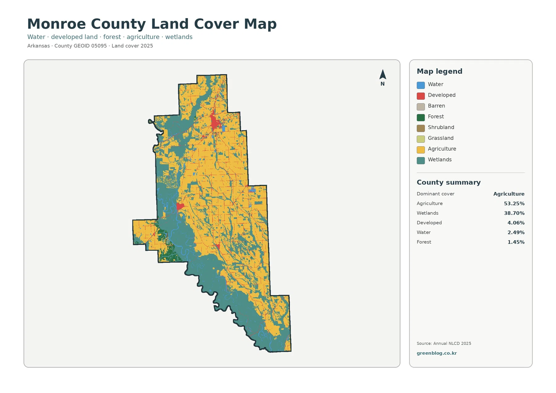
A large red developed cluster is visible in the northern part of the county, with smaller developed concentrations farther south and west. The City of Brinkley identifies Brinkley as a Monroe County community in the Arkansas Delta and notes its position along major transportation routes. That makes the northern developed concentration useful to compare with the Brinkley area, although the land-cover preview does not display municipal boundaries. The edge of a red class should not be treated as a legal city limit.
This distinction is important for other settlements too. Monroe County includes Clarendon and Holly Grove as well as Brinkley, but the preview is designed to compare surface classes rather than label each town. Small red patches can be discussed as developed clusters without assigning a city name unless a separate place map is consulted. For county-scale land-cover work, the larger point is that development occupies compact locations within a landscape overwhelmingly mapped as farms and wetlands.
The impervious map turns a small developed share into a much clearer settlement pattern
Impervious surface means pavement, rooftops, parking areas, and other hard surfaces that do not readily absorb rainfall. Monroe County’s mean impervious value is 0.96%, and only 0.27% of the county is summarized as cells with at least 50% impervious cover. A countywide average this low can make development sound almost absent, but the map shows why a countywide average needs to be checked against where the values are located. Orange and red values are concentrated in the large northern settlement cluster and appear as smaller spots or thin lines elsewhere.
The pattern differs from the general developed-land class. Developed cover totals 4.06%, which is much larger than the 0.96% mean impervious value because developed land can include lawns, trees, drainage areas, and other permeable surfaces mixed with buildings and roads. A low-density neighborhood may therefore be classified as developed while showing only modest impervious intensity. Reading both maps together avoids the mistake of assuming that every developed cell is mostly pavement or roof.
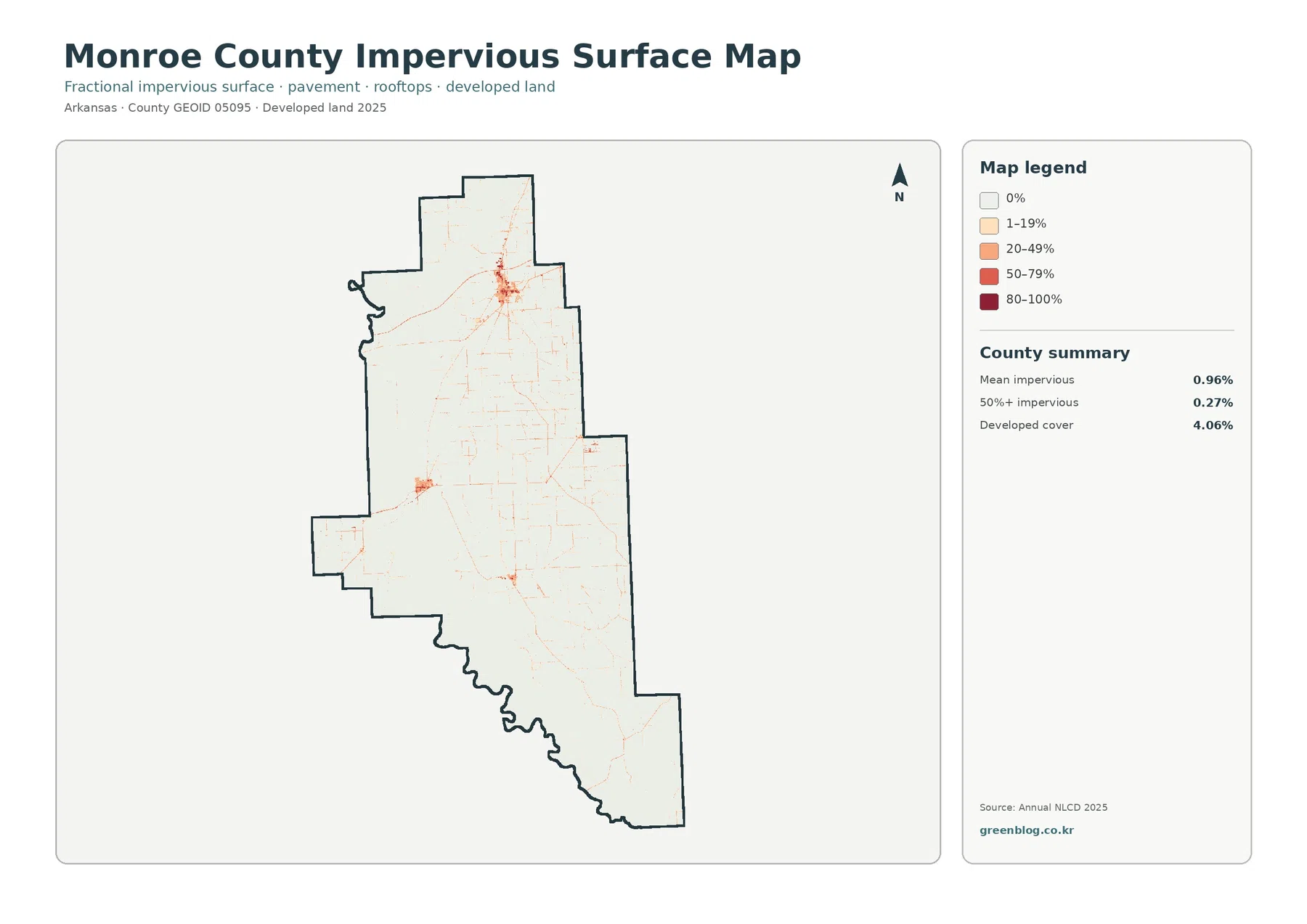
Outside the main cluster, several faint linear features cross the agricultural background. Some resemble transportation corridors, but the map does not label roads or distinguish highway classes. It is safe to say that hard surfaces occur in narrow corridors; it is not safe to assign a road number or infer traffic volume from color alone. For those questions, a current road map or transportation dataset is needed.
The impervious view is especially useful for presentations about the difference between a county’s dominant land cover and its developed centers. On the general map, farms and wetlands occupy nearly all of the visual space. On the impervious map, those same rural areas become nearly blank, allowing the compact settlement pattern to emerge. That makes the map useful for locating where development is concentrated without suggesting that Monroe County as a whole is heavily urbanized.
White River floodplain context helps explain why wetlands occupy 38.70%
The wetland share is large enough that it deserves to be read as a defining part of the county rather than a secondary class. U.S. Fish and Wildlife Service information for Dale Bumpers White River National Wildlife Refuge states that the refuge extends into Monroe County and lies within the White River floodplain. The agency describes a landscape of bottomland hardwood forest, lakes, streams, sloughs, and bayous. That official context is consistent with the broad wetland pattern visible on the western and southern parts of the county maps.
The map does not, however, outline the refuge. Wetland pixels outside a refuge boundary remain wetlands in the land-cover classification, and some refuge land may be assigned to other classes such as water or forest. The correct use of the FWS information is to explain the regional floodplain setting, not to turn the land-cover colors into protected-area boundaries. Anyone who needs refuge limits, access rules, or regulated wetland boundaries should use the appropriate official boundary datasets.
Open water, summarized at 2.49%, is visually different from the wetland class. Blue areas and narrow water features occupy far less space than the teal wetland zones around them. This matters when studying drainage or habitat because looking only for blue water would miss much of the water-influenced landscape. A useful comparison is to trace where farm blocks end, where wetlands widen, and where open-water cells appear inside that transition.
The west-to-south wetland concentration also gives the county a strong internal contrast. The northeastern and eastern agricultural areas contain many large, relatively continuous blocks. Moving toward the wetland-dominated side, those blocks are increasingly interrupted by irregular teal shapes. The maps do not provide flood frequency, wetland jurisdiction, or water depth, but they do show where the surface classification changes from predominantly agricultural to predominantly wetland.
The forest-and-farmland view makes the agricultural geometry easier to read
The forest and farmland map simplifies the visual competition among classes and makes the agricultural pattern especially easy to follow. Agriculture remains 53.25%, wetlands remain 38.70%, and forest is only 1.45%. Grassland is listed at 0.02%, while shrubland rounds to 0.00% in the map summary. Because forest and grass classes occupy such small shares, the map is dominated by the contrast between yellow agricultural blocks and teal wetland areas.
University of Arkansas System Division of Agriculture materials for Monroe County document crop demonstrations and research trials conducted for local producers. That county-specific agricultural program provides useful background for the large agricultural share on the map without requiring an assumption about which crop occupies any individual pixel. The land-cover product groups agricultural surfaces into broad classes; it is not a crop inventory and should not be used to infer rice, soybean, corn, or cotton acreage from color alone.
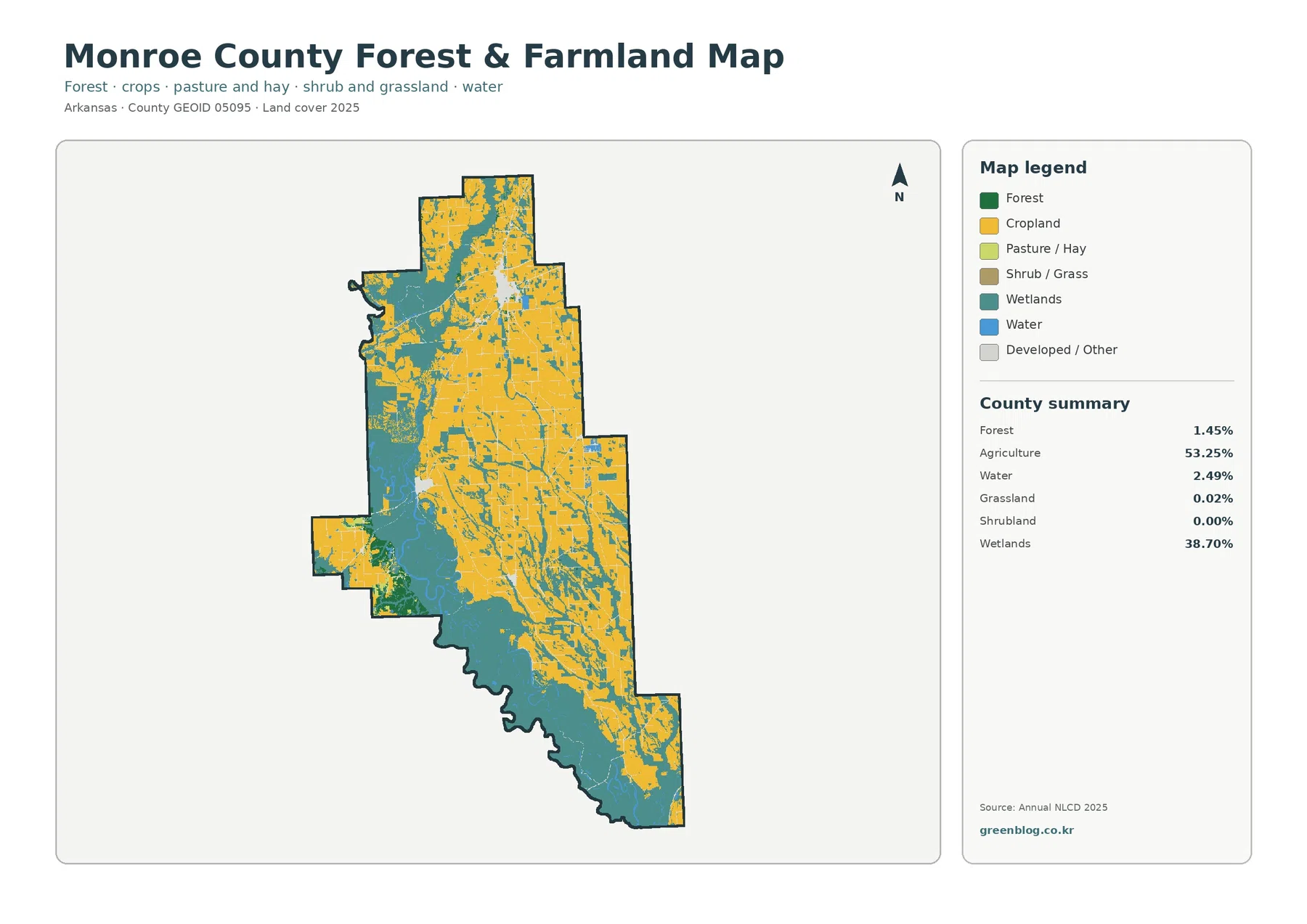
Large agricultural blocks are most continuous across the north and east. In the western and southern portions, wetland cover breaks agriculture into smaller pieces and produces more complicated edges. That difference is useful for classroom or planning-context graphics because it demonstrates how a single countywide percentage is assembled from very different local arrangements. Two counties could both report roughly 53% agriculture but have completely different field shapes and relationships to wetlands.
The 1.45% forest figure needs a cautious interpretation. It refers to cells classified in the forest category, not to every place where trees are present. A wetland can contain substantial tree cover and still be classified within a wetland class, and a 30-meter cell can contain several surface types while receiving only one predominant label. Monroe County’s low forest percentage therefore describes the classification balance, not a claim that woody vegetation is almost absent from the county.
Only 4.26% of cells differ between the 1985 and 2025 comparison classes
The change map compares the representative land-cover class in 1985 with the class in 2025. Monroe County’s overall class difference is 4.26%, leaving most of the county in the no-class-difference background. The summary also lists 0.69% classified to developed, 0.06% in the forest-loss category, 2.03% in the agricultural-loss category, and 0.83% in other difference. Those categories describe mapped class outcomes rather than the documented cause of each change.
The most visible concentrations are not spread evenly. Red cells associated with the developed category occur around the northern settlement cluster, while a noticeable yellow agricultural-loss patch appears in the western part of the county. Smaller colored cells are scattered through central and southern areas, including some wetland-related differences. The map is therefore useful for finding places where a closer historical check may be worthwhile.
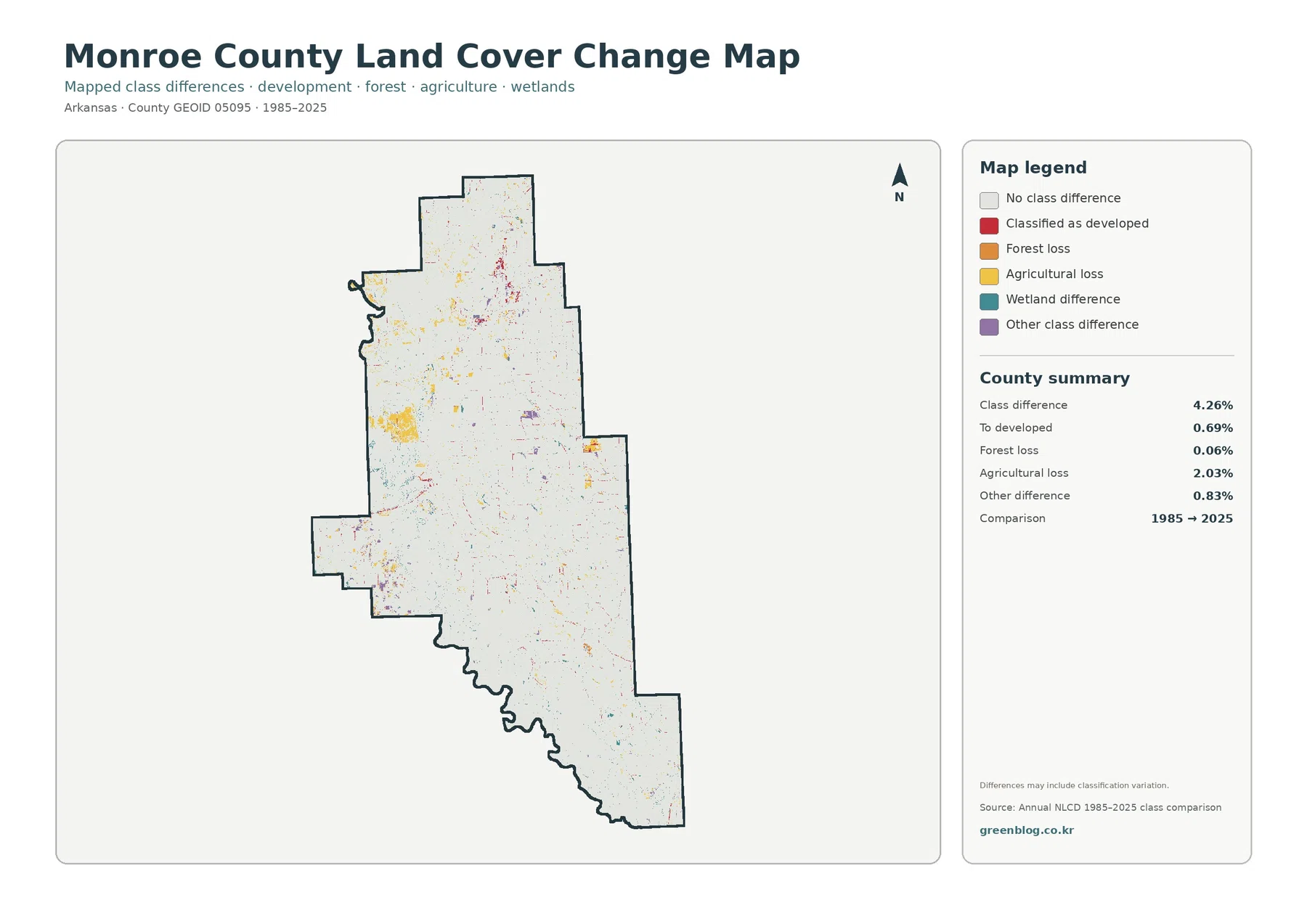
An agricultural-loss value of 2.03% should not be described as 2.03% of the county being abandoned farmland. It means cells mapped as agriculture in the earlier comparison are assigned to another representative class in 2025. Development, wet conditions, vegetation change, different management, and classification behavior near mixed boundaries can all contribute. Aerial photography, farm records, or local planning files are needed to identify the cause at a specific location.
The modest 4.26% overall difference also does not mean that the county experienced almost no real-world change over four decades. A field can switch crops many times while remaining agriculture in both endpoint years. A wetland can undergo hydrologic or vegetation changes yet remain within a wetland category. The change layer is best understood as a broad land-cover class comparison, not as a complete history of every landscape process.
Use the four maps as a sequence rather than asking one map to answer every question
For a quick county overview, begin with the general land-cover map and locate the main farm-wetland divide. Then use the impervious map to isolate the developed concentrations that are visually small on the general map. If the goal is to describe agricultural geometry, switch to the forest-and-farmland version, where the large field blocks and wetland interruptions are easier to see. Finish with the change map when the question involves how the 1985 and 2025 classifications differ.
A wetland-focused study can use a different sequence. Start with the general map to identify the broad western and southern wetland zones, compare them with open-water cells, and then use the forest-and-farmland map to see where agriculture approaches those wetland edges. The change map can identify locations with a different endpoint classification, but it cannot establish flood history or wetland jurisdiction. That information belongs in hydrologic and regulatory datasets.
For a settlement-focused presentation, the impervious map is the strongest visual. The main northern cluster can be compared against the nearly blank rural background, while the general map supplies the countywide developed share of 4.06%. This pairing prevents a common scale error: a town can be locally dense while the county containing it remains overwhelmingly agricultural and wetland at the county scale.
The download contains four original JPG files at the package’s supplied resolution
The ZIP contains one JPG for each map: 2025 general land cover, forest and farmland, impervious/developed land, and the 1985–2025 land-cover change comparison. According to the asset manifest, each original JPG is 2480×1754 pixels, while the WebP images used in the article are 1800×1273 pixels. The package does not mark the JPGs as meeting its A3 high-resolution reference, so the supplied dimensions should be checked against the intended print size before printing.
Because the files are separate, you can use only the map that matches the task. The general map works well for a county profile, the simplified forest-and-farmland map for farm-wetland comparison, the impervious map for developed clusters, and the change map for an endpoint comparison. Keeping the four maps separate also avoids crowding a presentation slide with several legends at once.
A 30-meter classification is excellent for county patterns but not for parcel decisions
USGS describes Annual NLCD as a raster product derived from Landsat imagery at 30-meter spatial resolution. Raster data divide the landscape into cells and assign a representative class or value to each cell. Real boundaries are more complicated. A single cell can contain a drainage ditch, a crop edge, scattered trees, a road, and a building while the map records only the predominant land-cover class.
Mixed cells are particularly relevant in Monroe County because wetlands and agricultural fields meet along long, irregular edges. Small wooded strips, narrow channels, farm roads, and isolated buildings can be absorbed into the dominant class of a 30-meter cell. The county summary is therefore appropriate for broad comparison, but it should not be used to calculate a parcel’s exact acreage or to resolve a property boundary.
The 2025 maps describe the classification year supplied in the package, and the change map uses the 1985 and 2025 endpoints. Construction, crop management changes, wetland conditions, vegetation recovery, or water-level changes after 2025 will not be represented. When a current site condition matters, recent aerial imagery and local records should be checked alongside the land-cover map.
Land cover is also different from zoning and legal land use. A cell classified as agriculture does not establish an agricultural zoning designation. A wetland-colored cell does not by itself establish a regulated wetland boundary. Developed land does not document a building permit or ownership. These maps describe the visible or modeled surface condition at county scale and should be paired with the appropriate legal, parcel, or regulatory source when a decision depends on those details.
Frequently Asked Questions
What is the largest 2025 land-cover class in Monroe County?
Agriculture is the largest class at 53.25%, followed closely enough to matter by wetlands at 38.70%. Developed land is 4.06%, water is 2.49%, and forest is 1.45%. Spatially, farms are most extensive across the north and east, while large wetland areas occupy much of the west and south.
Why is the wetland share so large on the Monroe County maps?
Monroe County includes part of the White River floodplain, and the U.S. Fish and Wildlife Service describes the Dale Bumpers White River National Wildlife Refuge as a landscape of bottomland hardwoods, lakes, streams, sloughs, and bayous. That setting helps explain the broad wetland context. The land-cover map does not show refuge or regulatory wetland boundaries, so those must be checked separately.
How can developed land be 4.06% when mean impervious surface is only 0.96%?
The two measures describe different things. Developed land can include vegetation and open ground mixed with houses and roads, while impervious surface estimates the share occupied by hard surfaces such as pavement and rooftops. A developed neighborhood can therefore have a much lower impervious percentage than a commercial or heavily paved area.
Does the 4.26% change value mean that exactly 4.26% of the county was physically transformed?
No. It is the share of cells with a different representative land-cover class in the 1985 and 2025 comparison. Real land conversion can contribute, but classification differences and mixed boundary cells can contribute as well. Aerial imagery or local records are needed to identify the cause of a specific mapped change.
What files are included in the Monroe County download?
The ZIP includes four original JPG maps: the 2025 general land-cover map, the forest-and-farmland map, the impervious/developed-land map, and the 1985–2025 land-cover change map. The article uses WebP previews so the maps can be reviewed before downloading the original JPG set.
Map File Information
The ZIP contains four original JPG maps for Monroe County: 2025 general land cover, forest and farmland, impervious/developed land, and 1985–2025 land-cover change.
- Included Files: Land cover, forest/farmland, impervious/developed land, and land-cover change maps
- File Type: One ZIP containing four JPG files
Related Maps
- A Craighead County Arkansas Land Cover Map
- Arkansas County Arkansas Land Cover Map
- Ashley County Arkansas Land Cover Map
Sources and References
- MRLC Annual NLCD Data — Official access to Annual NLCD land-cover, impervious-surface, and change products.
- USGS Annual NLCD Collection 1.2 Land Cover — Official documentation for the Annual NLCD land-cover collection, including the 2025 extension and 30-meter product framework.
- USGS: Annual NLCD Spatial Resolution — Explains that Annual NLCD is raster based and derived from Landsat imagery at 30-meter resolution.
- U.S. Fish & Wildlife Service: Dale Bumpers White River NWR — Official background on the White River floodplain, bottomland hardwood forest, lakes, streams, sloughs, and bayous in a refuge that includes Monroe County.
- University of Arkansas Extension: Monroe County Crop Demonstrations — County-specific agricultural material describing crop demonstrations and research trials for Monroe County producers.
- City of Brinkley — Official city information identifying Brinkley as a Monroe County community in the Arkansas Delta.
Green Map creates custom-edited map images using open geographic data sources such as geoBoundaries, Natural Earth, OpenStreetMap, and government open data.
These maps are edited visual materials, not raw data files, and are provided for education, documents, presentations, and graphic reference.