The share of males aged 80 and older varies dramatically across the 217 countries and economies with a 2025 World Bank observation. Monaco has the highest value at 14.55%, while Qatar has the lowest at 0.11%. The median is only 1.01%. In other words, the oldest male age group accounts for well over one in ten males in the highest observation but barely one in a thousand in the lowest.
The denominator matters. This indicator is the number of males aged 80 or older expressed as a percentage of the total male population, not the total population. Women are outside the denominator, and males aged 65–79 are outside the numerator. The measure therefore describes the age composition of the male population rather than the absolute number of very old men or the total share of everyone aged 65 and above.
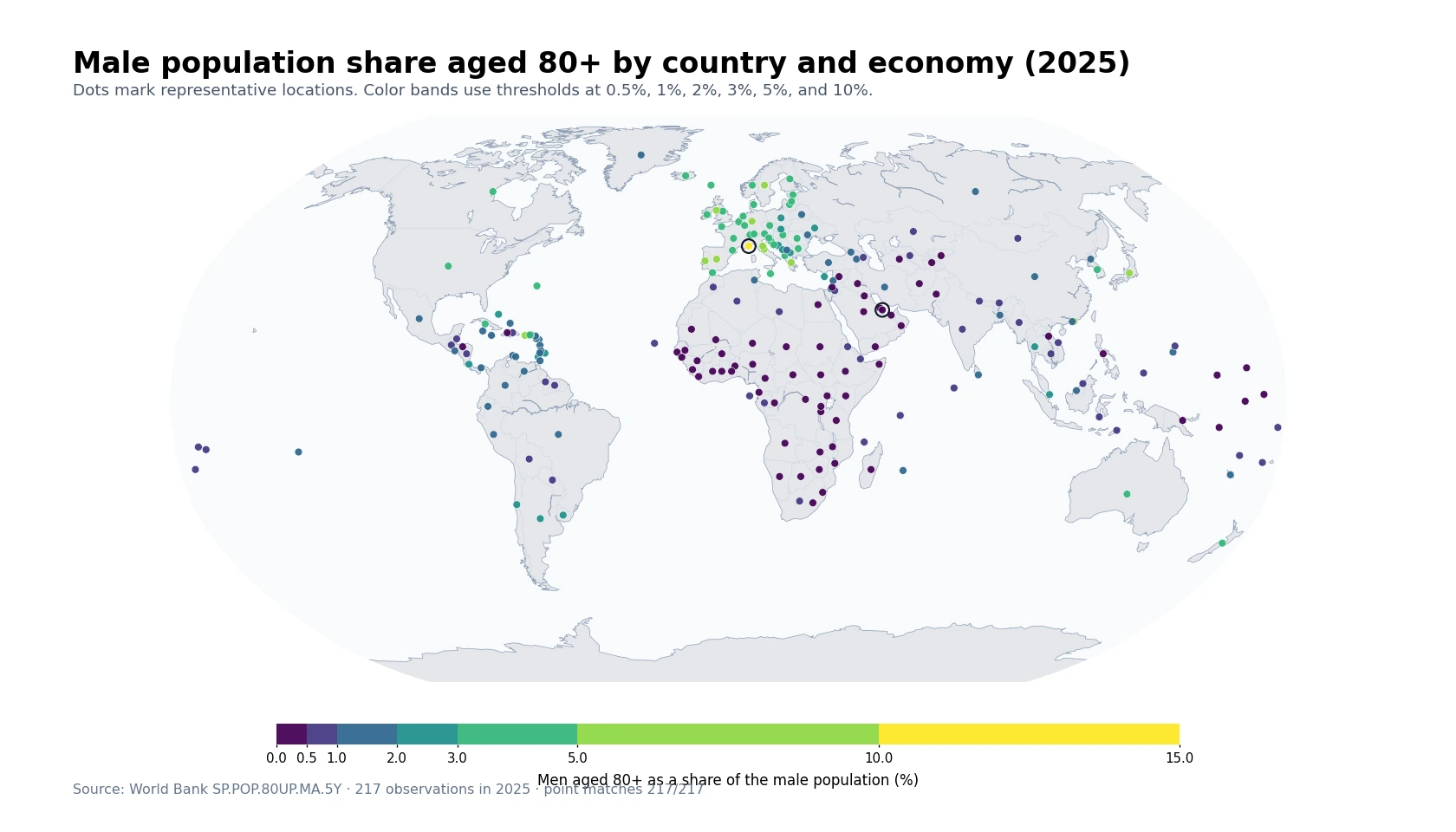
Table of Contents
Monaco is a clear outlier, followed by Japan and several European economies
Monaco stands far above the rest of the distribution at 14.55%. Japan is second at 8.20%, followed by Italy at 6.24%, Greece at 6.11%, Puerto Rico at 6.06%, and Germany at 5.97%. The gap between Monaco and Japan alone exceeds six percentage points, so the maximum should not be treated as representative of the high-income world. It is an extreme observation within a strongly right-skewed distribution.
The broader top end nevertheless shows a geographic pattern. Portugal, San Marino, the Isle of Man, Sweden, Spain, Austria, France, Switzerland, Denmark, and Finland all record comparatively large shares. Japan and Hong Kong stand out in East Asia. These values describe the accumulated presence of men who have survived to advanced ages relative to the size of all male age groups, but they do not by themselves identify why one economy has a larger share than another.
A high percentage is not the same as a large number of men aged 80 and older
Monaco illustrates the distinction between composition and scale. A 14.55% share in a very small population does not mean Monaco has the largest headcount of men aged 80 and older. A large country with a 2% or 3% share can still have many more men in this age group. Service planning for health care, long-term care, accessible transport, or housing therefore needs headcounts as well as percentages.
The percentage is still valuable because it controls for differences in the size of the male population. Headcounts tend to rank large countries highly simply because they have more people. Shares reveal something different: how prominent the 80-plus group is inside each male age structure. The two measures answer complementary questions and should not be substituted for one another.
Very low shares appear in both Sub-Saharan Africa and parts of the Gulf
Qatar has the lowest value at 0.11%, followed by Zambia at 0.12%, the Central African Republic at 0.13%, Nauru at 0.13%, and the United Arab Emirates at 0.14%. Chad, Niger, Burkina Faso, and Afghanistan are also close to 0.2%. The low end therefore combines places with very different demographic and migration histories.
In many Sub-Saharan African countries, large child and young-adult cohorts can make the total male denominator heavily weighted toward younger ages. In several Gulf economies, large flows of working-age male migrants can also expand the denominator. Similar percentages do not imply the same cause. This single indicator cannot separate the contributions of survival, births, migration, mortality shocks, or the changing size of younger male cohorts.
The highest and lowest observations are 14.44 percentage points apart
Monaco at 14.55% and Qatar at 0.11% are separated by about 14.44 percentage points. The highest share is roughly 133.6 times the lowest. That is an unusually wide relative spread for a single age indicator, reflecting how differently the oldest male ages are represented across current population structures.
| High rank | Country/economy | Share | Low rank | Country/economy | Share |
|---|---|---|---|---|---|
| 1 | Monaco | 14.55% | 1 | Qatar | 0.11% |
| 2 | Japan | 8.20% | 2 | Zambia | 0.12% |
| 3 | Italy | 6.24% | 3 | Central African Republic | 0.13% |
| 4 | Greece | 6.11% | 4 | Naoero | 0.13% |
| 5 | Puerto Rico (US) | 6.06% | 5 | United Arab Emirates | 0.14% |
| 6 | Germany | 5.97% | 6 | Chad | 0.18% |
| 7 | San Marino | 5.79% | 7 | Turkmenistan | 0.18% |
| 8 | Portugal | 5.76% | 8 | Niger | 0.19% |
| 9 | Isle of Man | 5.58% | 9 | Burkina Faso | 0.20% |
| 10 | Hong Kong SAR, China | 5.29% | 10 | Afghanistan | 0.21% |
The top ten mix European countries, East Asian economies, and separately reported territories. The bottom ten include several African countries alongside Gulf and Central Asian economies. Small differences within the table should not be overinterpreted: Zambia and the Central African Republic are both near 0.13%, while Germany, San Marino, and Portugal are clustered in the high-five-percent range.
The median is 1.01%, and the middle half spans 0.40% to 2.77%
Across all 217 observations, the mean is 1.76% and the median is 1.01%. The first quartile is 0.40% and the third quartile is 2.77%, so half of the reporting economies lie between those two values. The mean is much higher than the median because a small number of high observations, especially Monaco and Japan, pull the average upward.
| Share of males aged 80+ | Countries/economies | Share of 217 |
|---|---|---|
| Below 0.5% | 66 | 30.4% |
| 0.5% to <1% | 42 | 19.4% |
| 1% to <2% | 42 | 19.4% |
| 2% to <3% | 17 | 7.8% |
| 3% to <4% | 25 | 11.5% |
| 4% to <5% | 13 | 6.0% |
| 5% or more | 12 | 5.5% |
66 observations are below 0.5%, and another 42 are between 0.5% and 1%. Together, 108 of 217 observations are below 1%. Only 12 are at 5% or more. The map therefore uses uneven thresholds—0.5%, 1%, 2%, 3%, 5%, and 10%—so that the large concentration of low values is not visually compressed by Monaco’s extreme maximum.
The 80-plus indicator is narrower than the total share aged 65 and older
Men aged 65–69, 70–74, and 75–79 are not in the numerator. Two economies can therefore have similar 80-plus shares while having very different total populations aged 65 and older. For a broad assessment of population ageing, this indicator should be read alongside measures such as the total 65-plus share, median age, life expectancy, or old-age dependency ratios.
The age band is also open-ended rather than five years wide. An 80-year-old, a 90-year-old, and a man aged 100 or more all count in the same numerator. A high value can therefore reflect the accumulation of several older cohorts, not just the size of one birth cohort. The series does not split the 80-plus group into 80–84, 85–89, 90–94, or older ages, so it cannot show where within the oldest ages the concentration occurs.
Survival to advanced ages matters, but this dataset cannot assign causes
For the 80-plus male share to become large, substantial numbers of men must survive to advanced ages. Yet survival is only part of the arithmetic. The size of historical birth cohorts, later migration, mortality events, and the size of younger male cohorts all affect either the numerator or the denominator. A high percentage can be consistent with long survival, but it should not be used as a stand-alone score of health-system quality or longevity.
The reverse is equally important. A low share does not necessarily mean that very few men reach age 80. If a country has exceptionally large young or working-age male cohorts, the denominator can make the 80-plus group appear small even when its headcount is substantial. Economies with large male labour migration can be particularly sensitive to this denominator effect. Establishing a cause requires age-specific mortality, life expectancy, migration, and historical population data.
East Asia contains large differences within the same broad region
Japan has an 8.20% share and Hong Kong 5.29%, while Korea, Rep. is lower at 3.35%. China and other nearby economies also occupy different positions in the distribution. Geographic proximity therefore does not translate into a common 80-plus male share. Each population reflects a different history of births, survival, migration, and change in the size of younger male cohorts.
That is why a regional average can conceal more than it reveals for this indicator. Europe and parts of East Asia are visibly prominent on the map, but the country-level values show substantial variation inside both regions. Reading the map together with rankings and distribution statistics gives a more accurate picture than treating a continent as demographically uniform.
A 2025 cross-section cannot show whether the share is rising or falling
The dataset used here is a snapshot for one year. Every year, men who were 79 enter the 80-plus group while deaths remove people from the open-ended age band. The total male population also changes through births, deaths, and migration. An economy with a high 2025 value is not guaranteed to keep rising, and a low value does not imply that rapid growth is imminent.
Trend analysis requires repeated observations from the same series. The size of the 75–79 group can also provide useful context about the cohort approaching age 80, but actual future changes still depend on survival and migration. This article therefore describes the 2025 structure without forecasting future rankings or percentages.
The 217 observations are not a count of sovereign states
The World Bank country series includes sovereign states as well as separately reported economies and territories such as Hong Kong, Puerto Rico, the Isle of Man, and numerous islands. The number 217 should therefore be understood as the count of retained country/economy rows after aggregate regional and income-group entries are excluded, not as the number of sovereign countries in the world.
Each observation is linked to a representative map point, and 217 of 217 were successfully matched. Tiny places such as Monaco and San Marino can overlap with nearby points at world scale, so the table is the more precise way to read individual values. Map visibility does not determine whether an observation is included in the calculations.
Data source and calculation
The analysis uses 2025 observations from the World Bank API series SP.POP.80UP.MA.5Y. The World Bank indicator page provides the definition and country time series. The unit is men aged 80 and older as a percentage of the total male population.
Aggregate regional and income-group rows are excluded. All 217 country-and-economy rows contain a 2025 value, so no missing observation is replaced with zero and no earlier year is substituted. The maximum, minimum, rankings, mean, median, quartiles, range, and band counts are calculated directly from the same 217 observations.
Frequently Asked Questions
What does a 5% share of men aged 80+ mean?
It means about five of every 100 males in that country or economy are aged 80 or older. It does not mean that 5% of the total population consists of men aged 80+.
Does a higher 80+ male share mean a larger headcount?
Not necessarily. The indicator is a percentage of the male population, so a small economy can have a high share but fewer men aged 80+ than a large country with a lower percentage.
Can this indicator alone measure overall population ageing?
No. It describes the oldest male age group, but broader ageing analysis should also consider the total population aged 65+, median age, life expectancy, and absolute population counts.
Related Maps
Green Map creates custom-edited map images using open geographic data sources such as geoBoundaries, Natural Earth, OpenStreetMap, and government open data.
These maps are edited visual materials, not raw data files, and are provided for education, documents, presentations, and graphic reference.