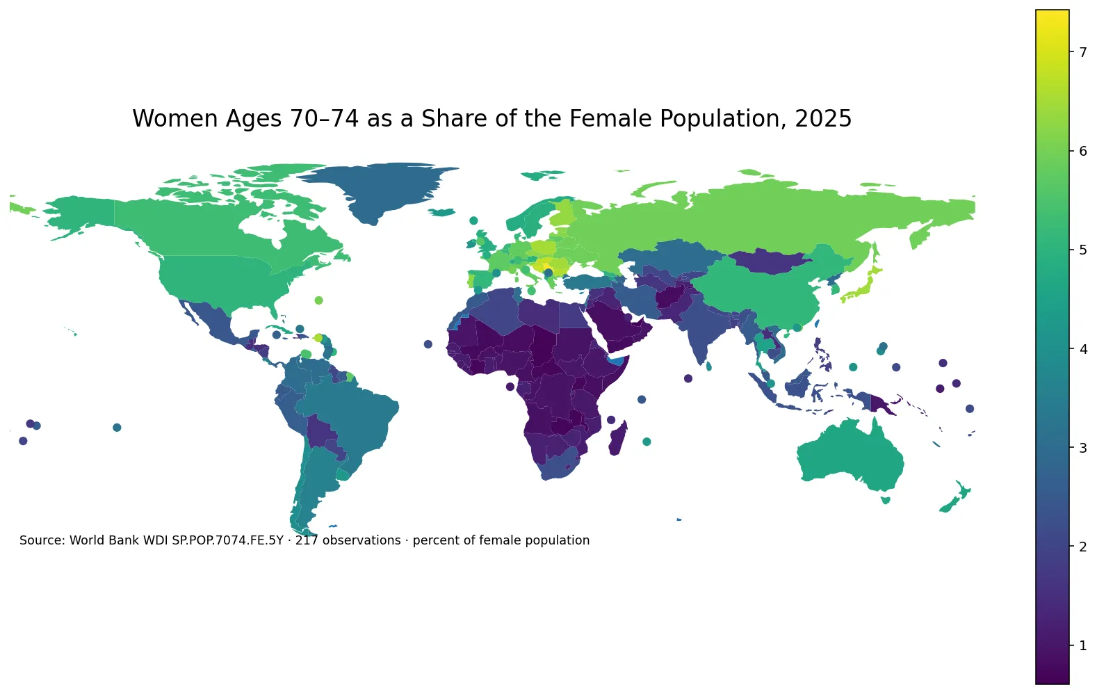
Women aged 40–44 make up a noticeably different share of the female population across countries and economies. In the 2025 World Bank observations used here, the range runs from just over 3% to more than 10%. The indicator is SP.POP.4044.FE.5Y, and its denominator is the total female population. A value of 6.5% therefore means that roughly 6 to 7 out of every 100 females in that reporting economy are between ages 40 and 44.
This is a cohort-composition measure rather than a headcount. Women who are 40–44 in 2025 were born roughly between 1981 and 1985, but the size of that cohort today has been shaped by more than births four decades ago. Survival, international migration, and the relative size of younger and older female cohorts all affect the percentage. The same number of women aged 40–44 can produce a different share if the rest of the female population has a different age structure.
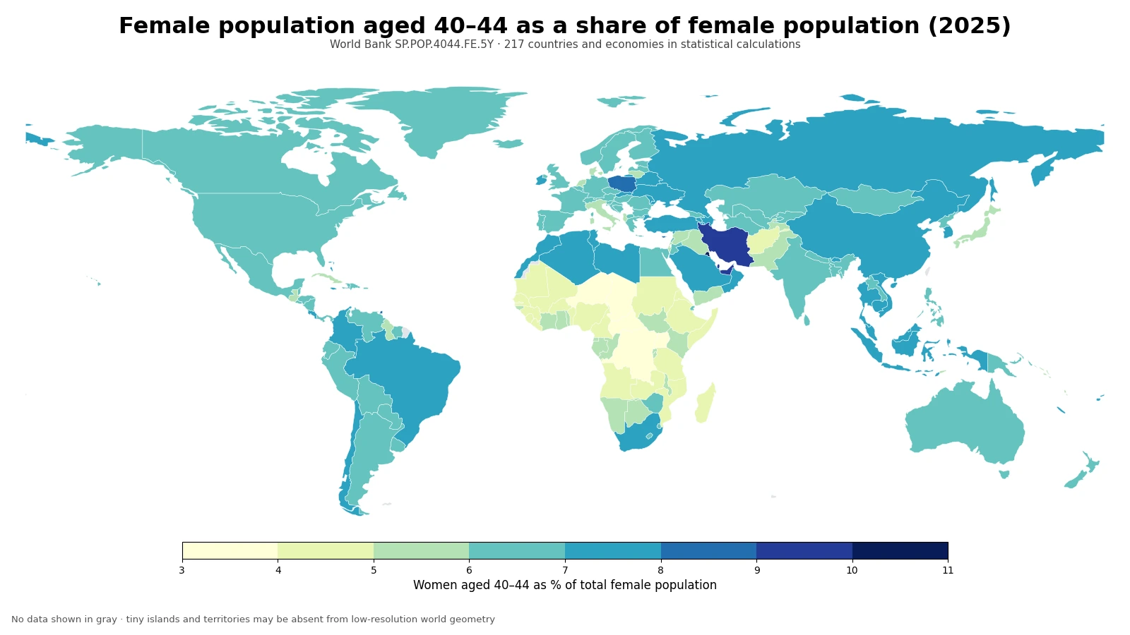
Table of Contents
The upper end mixes Gulf economies with several small territories and city economies
Kuwait has the highest reported 2025 share, while Qatar and the United Arab Emirates are also near the top. Iran is above 9%. The upper ranks are not exclusively Gulf economies, however: the British Virgin Islands, Cayman Islands, Hong Kong SAR, Macao SAR, the Maldives, and Trinidad and Tobago also appear among the largest values. That mix is a useful warning against treating the map as evidence of one universal cause.
At the lower end, the Central African Republic, Niger, Uganda, the Democratic Republic of the Congo, and Chad are among the smallest shares. Many countries in Sub-Saharan Africa appear in lighter map bands. A low percentage does not necessarily mean that the cohort has declined in absolute size. It can also occur when younger female cohorts are much larger, making women aged 40–44 a smaller fraction of the denominator.
The gap between the highest and lowest observations is about 7.47 percentage points
Kuwait records 10.51%, compared with 3.04% in the Central African Republic. The difference is about 7.47 percentage points. In practical terms, a single five-year cohort accounts for more than one-tenth of the female population in the highest observation but only about one-thirtieth in the lowest.
| Top rank | Country or economy | Share | Bottom rank | Country or economy | Share |
|---|---|---|---|---|---|
| 1 | Kuwait | 10.51% | 1 | Central African Republic | 3.04% |
| 2 | British Virgin Islands | 10.25% | 2 | Niger | 3.75% |
| 3 | Qatar | 9.79% | 3 | Uganda | 3.89% |
| 4 | Iran, Islamic Rep. | 9.36% | 4 | Congo, Dem. Rep. | 3.93% |
| 5 | Cayman Islands | 9.29% | 5 | Chad | 3.95% |
| 6 | United Arab Emirates | 9.14% | 6 | Afghanistan | 4.04% |
| 7 | Hong Kong SAR, China | 8.98% | 7 | Somalia, Fed. Rep. | 4.05% |
| 8 | Maldives | 8.79% | 8 | Eritrea | 4.06% |
| 9 | Macao SAR, China | 8.75% | 9 | Tuvalu | 4.19% |
| 10 | Trinidad and Tobago | 8.73% | 10 | Mali | 4.22% |
These are percentage rankings, not rankings by the number of women. Small territories can place very high because a particular age band is large relative to their own female population. A populous country with a 6% share may still have far more women aged 40–44 than a territory with a 10% share. The percentage answers a structural question—how thick is this cohort within the female population—not a scale question about how many people live there.
The typical economy is much closer to 6–7% than the extremes suggest
The mean across all 217 observations is 6.42% and the median is 6.44%. The first quartile is 5.63% and the third quartile is 7.10%, so the middle half of the observations fit inside a band of about 1.47 percentage points. The closeness of the mean and median indicates that the highest values do not pull the center of the distribution far away from the typical observation.
| Share band | Number of countries and economies | Share of 217 observations |
|---|---|---|
| Below 4% | 5 | 2.3% |
| 4% to under 5% | 25 | 11.5% |
| 5% to under 6% | 40 | 18.4% |
| 6% to under 7% | 85 | 39.2% |
| 7% to under 8% | 47 | 21.7% |
| 8% to under 9% | 9 | 4.1% |
| 9% to under 10% | 4 | 1.8% |
| 10% or more | 2 | 0.9% |
The 6% to under 7% band contains 85 economies, or 39.2% of the dataset. Another 47, or 21.7%, lie between 7% and 8%. Together those two bands account for 132 observations—about 60.8% of the total. Only two observations are at 10% or above. The map therefore contains a few visually striking high and low cases, but most reporting economies sit in a considerably narrower middle range.
The denominator is female population, not total population
This distinction changes how the number should be read. A 7% value does not mean that 7% of all residents are women aged 40–44. Men are excluded from the denominator. To convert the indicator into a share of the total population, additional information on the female share of the population would be required. The World Bank series is designed specifically to compare the internal age composition of female populations.
The indicator also should not be interpreted as evidence that women aged 40–44 are more numerous than neighboring age groups. To identify a bulge in the age profile, adjacent five-year bands such as 35–39 and 45–49 need to be examined alongside 40–44. The current measure isolates only one slice of the age distribution.
A common percentage can hide very different headcounts
Two economies can both report 7% while having radically different numbers of women in the cohort. If one has one million females and another has fifty million, equal shares imply very different numbers of people. That matters for questions about health services, employment, consumer markets, or any other issue where the scale of the population is important.
The reverse is also useful: headcounts alone are dominated by country size and may conceal age-structure differences. Percentages make it easier to compare population composition across economies of very different sizes. For demographic interpretation, the share and the absolute number are complementary rather than interchangeable.
Birth history, migration, survival, and the denominator can all shape the result
A large early-1980s birth cohort can contribute to a high 2025 share, but it is only one possible pathway. Selective migration during young adulthood or middle age can alter the cohort. Mortality between birth and age 40 also changes its surviving size. At the same time, growth or contraction in younger and older female cohorts changes the denominator even if the number of women aged 40–44 barely moves.
For that reason, the map cannot by itself identify why Kuwait, the British Virgin Islands, Iran, or Hong Kong SAR have high values, or why the Central African Republic and Niger are low. Explaining the pattern would require additional series on births, migration, mortality, and adjacent age groups. The safest interpretation is descriptive: these are the 2025 shares that result from several demographic processes acting together.
A 2025 cross-section is not a trend line
Age-band percentages naturally shift as cohorts move through the life course. Five years from now, much of today’s 35–39 group will enter the 40–44 band, while today’s 40–44 group will move into 45–49. A country that is high in 2025 may therefore be lower later even without a sudden demographic event. Establishing whether the share is rising or falling requires observations from multiple years.
It is also possible for the share and the headcount to move in opposite directions. The number of women aged 40–44 can remain stable while the percentage falls if the total female population grows faster. Conversely, the headcount can decline while the percentage rises if other female age groups shrink more quickly. Trend analysis should therefore keep numerator and denominator effects separate.
Tiny islands and territories may be clearer in the table than on the map
World Bank country series include separately reported economies and territories as well as sovereign states. Several of the highest observations belong to places that are too small to be visible at this map scale. Their data remain part of every statistical calculation even when the display geometry cannot show them clearly.
The low-resolution boundary set used for the map contains 173 country geometries, and 167 of them match a 2025 World Bank observation by ISO3 code. Statistical coverage is larger: the maximum, minimum, mean, median, quartiles, rankings, and band counts all use the full set of 217 observations. Map coverage and data coverage are therefore intentionally treated as separate concepts.
Data source and calculation
The analysis uses the World Bank API series SP.POP.4044.FE.5Y. The World Bank indicator page provides the definition and country-level time series. This comparison uses 217 countries and economies with a 2025 observation. The unit is women aged 40–44 as a percentage of the total female population.
All 217 source rows have a reported 2025 value, so no missing observation is replaced with zero and no earlier year is substituted. The ranking, mean, median, quartiles, range, and distribution bands are calculated directly from those values. The map uses a lower-resolution geographic layer only for visualization, which is why some tiny economies are represented in the statistics but not as visible polygons.
Frequently Asked Questions
What does a 7% value mean for this indicator?
It means about 7 out of every 100 females in that reporting economy are aged 40–44. It is not 7% of the total population.
Does a high share mean there are more women aged 40–44 in absolute numbers?
Not necessarily. This is a percentage of the female population, so a small economy can have a high share but a much smaller headcount than a large country.
Can the 2025 data show whether the share is increasing?
No. A single-year cross-section does not establish a trend. Multiple years of the same indicator are needed to determine whether the share is rising or falling.
Related Maps
Green Map creates custom-edited map images using open geographic data sources such as geoBoundaries, Natural Earth, OpenStreetMap, and government open data.
These maps are edited visual materials, not raw data files, and are provided for education, documents, presentations, and graphic reference.