Women ages 45–49 make up very different shares of the female population across countries and separately reported areas. Using 217 World Bank observations from the same year, the 2025 median is 6.03% and the simple mean is 5.81%. The range runs from 2.30% to 9.50%, a spread of about 7.19 percentage points. These percentages describe age composition: they show how much of each female population falls into the 45–49 age band, not how many women live there.
The official indicator is Population ages 45-49, female (% of female population), code SP.POP.4549.FE.5Y. The numerator is the number of females ages 45–49 and the denominator is the female population of all ages. A value of 6% means that about six of every 100 females are in this five-year age band. It is not the female share of the 45–49 population, and it is not the 45–49 share of the total male-and-female population. World Bank metadata identifies the UN Population Division’s World Population Prospects as the source and describes the series as annual midyear estimates.
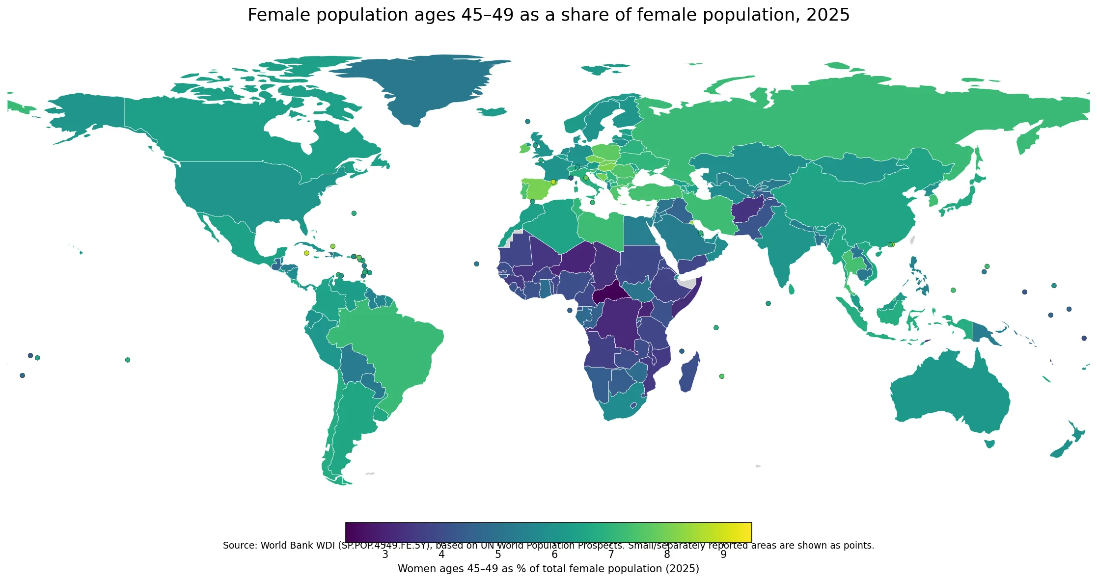
Table of Contents
The indicator measures the size of one five-year cohort within the female population
The distinction between a percentage and a headcount is important. A very populous country can have millions of women ages 45–49 while recording a middle-of-the-range percentage because its total female population is much larger. A small territory can have far fewer women in the age group but a higher percentage if that cohort occupies a larger part of its age structure. The map is therefore useful for comparing composition, but it cannot be used by itself to estimate the number of workers, patients, households, or service users in this age range.
Nor does a single five-year band summarize the whole middle-aged population. Two countries with the same 45–49 share can have quite different numbers of women ages 40–44 or 50–54. A country with a large population in its 20s and 30s can have many women ages 45–49 in absolute terms while the percentage remains modest. Adjacent age bands are needed when the question concerns the shape of the broader working-age population.
Age structure reflects the accumulated effects of past births, survival, and migration. The World Bank methodology notes that age-and-sex population estimates depend on demographic components such as fertility, mortality, and migration. This series does not contain the variables needed to separate those influences country by country, so the safest use of the map is descriptive: locate where the 45–49 female cohort is relatively large or small, then bring in additional demographic evidence before explaining why.
Half of the observations fall between about 4.71% and 6.76%
Giving every country or separately reported area equal weight, the first quartile is 4.71%, the median is 6.03%, and the third quartile is 6.76%. Half of the 217 observations therefore lie between roughly 4.71% and 6.76%. The simple mean, 5.81%, is slightly below the median because a noticeable group of low observations pulls the average downward. This is not a population-weighted global share; it is an arithmetic summary of 217 separate percentages.
| 2025 female population share ages 45–49 | Countries and separately reported areas |
|---|---|
| Below 4% | 28 |
| 4% to under 6% | 79 |
| 6% to under 8% | 101 |
| 8% or more | 9 |
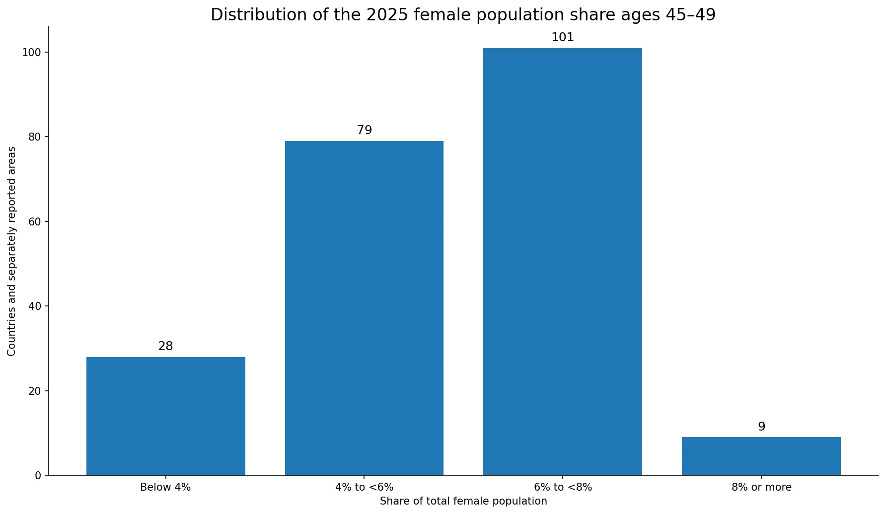
The 6% to under 8% band is the largest, containing 101 observations. Another 79 fall between 4% and 6%, while 28 are below 4%. Only 9 observations reach 8% or more. That distribution gives useful context to the map: most places are not near either extreme, and a value a little above 6% is much more common than a value above 8%.
High shares appear in parts of Europe and in several small or city-based economies
The five highest observations are the British Virgin Islands at 9.50%, the Cayman Islands at 8.78%, Andorra at 8.74%, Hong Kong SAR, China at 8.52%, and Kuwait at 8.36%. Several are small or separately reported economies. Their high percentages should not be confused with large headcounts: a relatively large age cohort can create a high share even when the total number of women is small.
Among larger European countries, a visible high-share group includes Hungary at 8.08%, Spain at 8.03%, Czechia at 8.01%, Bosnia and Herzegovina at 7.94%, and Poland at 7.71%. Portugal, Romania, and Bulgaria are also above 7%. Neighboring countries often occupy similar map bands, but the indicator alone cannot establish a single regional explanation because cohort size can be shaped by different combinations of historical births, survival, and migration.
Asia is mixed rather than uniform. Thailand is 7.34%, Indonesia 6.77%, Japan 6.66%, and China 6.52%. Kuwait stands above 8%, while other economies in the region sit closer to the global middle. The variation inside a broad region is a reminder that continental averages can hide substantial differences in the size of particular age cohorts.
Low shares are common across several Sub-Saharan African populations
The lowest observation is the Central African Republic at 2.30%. Uganda is 3.02%, Niger 3.05%, the Democratic Republic of the Congo 3.13%, and Somalia 3.19%. Chad and Afghanistan are also in the 3% range. These values mean that women ages 45–49 occupy a relatively small part of the female population; they do not measure the social or economic importance of the group.
A young age structure can reduce the percentage because the denominator contains many women in younger cohorts. Elsewhere, differences in past cohort size, survival, or migration can change the result. The present indicator does not identify which mechanism dominates in a given country. Explaining a low share requires additional evidence such as fertility histories, age-specific population counts, and migration data.
| Highest observations | Share | Lowest observations | Share |
|---|---|---|---|
| British Virgin Islands | 9.50% | Central African Republic | 2.30% |
| Cayman Islands | 8.78% | Uganda | 3.02% |
| Andorra | 8.74% | Niger | 3.05% |
| Hong Kong SAR, China | 8.52% | Democratic Republic of the Congo | 3.13% |
| Kuwait | 8.36% | Somalia | 3.19% |
Large populations make the difference between share and headcount especially clear
Among large countries, Brazil is 7.17%, Indonesia 6.77%, China 6.52%, Mexico 6.42%, Canada 6.32%, Australia 6.15%, the United States 6.06%, and India 6.05%. South Africa is 5.74% and Nigeria 4.00%. Similar percentages can represent very different numbers of people because the female population denominator varies enormously.
That difference matters when the question moves from demography to service planning. A percentage map can identify where the 45–49 cohort is relatively prominent, but employment programs, screening services, housing needs, and other practical questions require actual counts and often subnational location data. Two countries can both be near 6% while the number of women represented by that share differs by millions.
The denominator is female population, not total population or the 45–49 age group
This series uses females of all ages as the denominator. The corresponding male percentage is a separate indicator and should not be assumed to match. Differences in survival and migration by sex can alter the age profile of men and women even when they belong to the same birth cohort. A total-population share would require both sexes ages 45–49 in the numerator and the full population in the denominator.
The wording can also be reversed accidentally. “Women ages 45–49 as a share of female population” is not the same as “women as a share of people ages 45–49.” The latter is a sex-composition question within the age group. Checking the numerator and denominator is essential when comparing similarly named demographic indicators.
A common 2025 reference year makes the geographic comparison cleaner
Every one of the 217 observations used here is dated 2025, and the validated table has no missing values. That removes a common problem in international comparisons, where each country’s latest available value can come from a different year. On this map, a difference in shading cannot be explained simply by one place being observed several years earlier than another.
The 217 rows do not represent 217 sovereign states. The World Bank publishes some territories and separately reported areas as distinct economies. At the map scale used here, 170 observations can be joined to country polygons and 47 smaller or separately reported areas are represented by points. All 217 values remain in the summary statistics and distribution chart.
World Bank metadata lists the series as annual and identifies the UN Population Division’s World Population Prospects as its source. Population estimates involve demographic estimation, so very small decimal differences should not be treated like exact performance rankings. Broad ranges, quartiles, and geographic contrasts are more informative than claiming a meaningful difference between two values separated by only a few hundredths of a percentage point.
Source and interpretation notes
The indicator definition and methodological notes are available in the World Bank WDI metadata. A useful reading sequence is to start with the broad map pattern, use the quartiles and distribution to judge whether a value is unusual, and then add adjacent age bands or headcounts when the question requires a fuller picture of population structure. The 45–49 female share is informative, but it should not be turned into a direct measure of labor-force size, health status, fertility, longevity, or policy quality.
Frequently Asked Questions
What does a 6% share for women ages 45–49 mean?
It means about six of every 100 females in that country or area are ages 45–49. It is not the share of the total population and not a headcount.
Are all 217 observations from 2025?
Yes. Every observation used in the comparison is dated 2025, and the validated table has no missing values.
Does a high 45–49 female share mean a population is older overall?
Not necessarily. The indicator covers one five-year age band. Adjacent age groups and broader aging measures are needed to describe the full population structure.
Is the 5.81% mean a population-weighted global female share?
No. 5.81% is the simple unweighted mean of 217 country and area percentages, giving each observation equal weight.
Related Articles
These population-structure comparisons provide broader context for the size of the 45–49 female cohort.
- Old-Age Dependency Ratio by Country – 2025
- Age Dependency Ratio by Country – 2025
- Young-Age Dependency Ratio by Country – 2025
Green Map creates custom-edited map images using open geographic data sources such as geoBoundaries, Natural Earth, OpenStreetMap, and government open data.
These maps are edited visual materials, not raw data files, and are provided for education, documents, presentations, and graphic reference.