How many people age 65 or older are there for every 100 people in the conventional working-age group? World Bank World Development Indicators series SP.POP.DPND.OL, Age dependency ratio, old (% of working-age population), answers that question by comparing the population age 65+ with the population ages 15–64. It is commonly called the old-age dependency ratio.
The validated file is unusually clean for a global comparison because all 217 country and area observations are dated 2025. No older “latest available” values are mixed into the map. That makes the cross-country comparison more consistent, although the mean and median below are still simple unweighted statistics across country/area rows rather than a population-weighted world ratio.
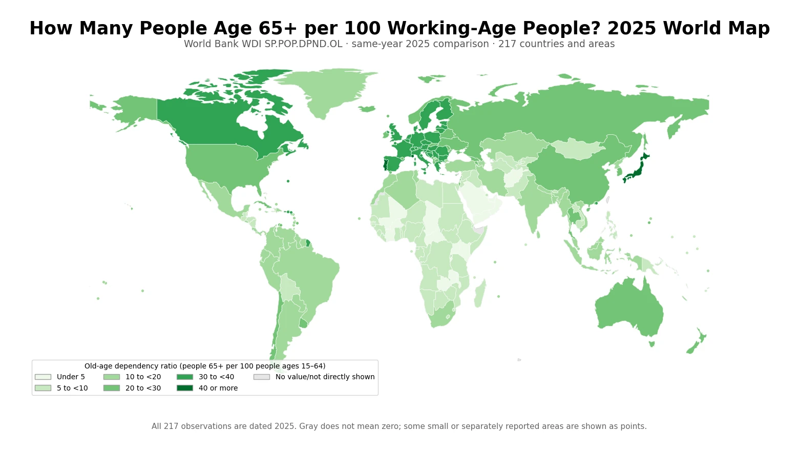
Table of Contents
What the old-age dependency ratio actually measures
The World Bank defines the indicator as 100 times the population age 65 and older divided by the population ages 15–64. A value of 30 therefore means roughly 30 people age 65+ for every 100 people in the 15–64 age group. The WDI unit is percent, but the “per 100 working-age people” wording makes the denominator easier to understand.
This is not the same as the percentage of the total population that is age 65+. The denominator excludes children and older adults, so a dependency-ratio value cannot be relabeled as an elderly share of total population. Both measures describe age structure, but they answer different questions.
The word dependency also needs care. The World Bank explicitly notes that dependency ratios describe population age composition, not actual economic dependency. Some people over 64 are employed, and many people ages 15–64 are students, unemployed, or outside the labor force. The ratio should not be read as a literal count of workers financially supporting retirees.
The 2025 median across 217 observations is 12.7
Giving every country or area row equal weight produces a simple median of 12.7 and a simple mean of 16.8. The middle half of the observations lies between about 6.8 and 26.5. The mean is higher than the median because a smaller group of high-ratio observations in the 30s, 40s, and above stretches the upper tail.
| 2025 ratio band | Countries/areas |
|---|---|
| Under 5 | 17 |
| 5 to below 10 | 68 |
| 10 to below 20 | 59 |
| 20 to below 30 | 34 |
| 30 to below 40 | 36 |
| 40 or more | 3 |
There are 17 observations below 5, 68 from 5 to below 10, and 59 from 10 to below 20. At the other end, 39 observations are at 30 or above and only 3 reach 40 or more. This broad distribution is why a map is more informative than a single global-sounding average.
Monaco and Japan sit at the top of the 2025 distribution
| Country or area | People age 65+ per 100 ages 15–64 |
|---|---|
| Monaco | 71.7 |
| Japan | 51.0 |
| Portugal | 40.0 |
| Puerto Rico (US) | 39.8 |
| Italy | 39.7 |
| Finland | 39.4 |
| Greece | 38.9 |
| Virgin Islands (U.S.) | 38.3 |
| Germany | 38.0 |
| Isle of Man | 37.8 |
Monaco has the highest observation at 71.7, followed by Japan at 51.0. Portugal is 40.0, Puerto Rico 39.8, Italy 39.7, Finland 39.4, Greece 38.9, the U.S. Virgin Islands 38.3, Germany 38.0, and the Isle of Man 37.8. These are ratios relative to the 15–64 population, not rankings of the absolute number of older people.
Several small or separately reported economies appear near the top. That is not a data error: the source reports them as separate statistical units. It does mean that “largest elderly population” would be the wrong label for this table. A headcount question needs a population-count series rather than a ratio.
The lowest observations fall between about 2 and 5
| Country or area | People age 65+ per 100 ages 15–64 |
|---|---|
| Qatar | 2.0 |
| United Arab Emirates | 2.2 |
| Zambia | 3.5 |
| Oman | 3.7 |
| Kuwait | 4.0 |
| Uganda | 4.1 |
| Chad | 4.1 |
| Saudi Arabia | 4.2 |
| Afghanistan | 4.4 |
| Central African Republic | 4.5 |
Qatar is lowest at 2.0, followed by the United Arab Emirates at 2.2, Zambia at 3.5, Oman at 3.7, Kuwait at 4.0, Uganda and Chad at about 4.1, Saudi Arabia at 4.2, Afghanistan at 4.4, and the Central African Republic at 4.5. Seventeen of the 217 observations are below 5.
A low ratio should not automatically be translated into a light fiscal burden or a stronger economy. Fertility, longevity, historical population structure, and migration can all shape the age composition, but this one series does not identify which mechanism produced a particular country value. The map is descriptive evidence about age structure, not a causal explanation.
Korea is 29.3 in the same 2025 comparison that puts Japan at 51.0
| Country | 2025 old-age dependency ratio |
|---|---|
| Japan | 51.0 |
| Italy | 39.7 |
| Germany | 38.0 |
| France | 36.8 |
| Spain | 32.9 |
| Canada | 31.3 |
| United Kingdom | 31.1 |
| Korea, Rep. | 29.3 |
| United States | 28.5 |
| Australia | 28.2 |
| Russian Federation | 27.3 |
| China | 21.4 |
| Brazil | 16.6 |
| Mexico | 12.6 |
| Indonesia | 11.1 |
| India | 10.8 |
| South Africa | 10.2 |
Korea records 29.3 people age 65+ per 100 people ages 15–64. That is slightly above the United States at 28.5 and Australia at 28.2, while Canada is 31.3 and the United Kingdom 31.1. Japan stands much higher at 51.0. Several large European countries are also in higher bands: Italy is 39.7, Germany 38.0, France 36.8, and Spain 32.9.
China is 21.4, Brazil 16.6, Mexico 12.6, Indonesia 11.1, India 10.8, and South Africa 10.2. Because every value in this table is dated 2025, the comparison does not have the reference-year mismatch that often affects “latest value” international datasets. Small differences still should not be treated as precise policy-performance rankings.
Europe and East Asia do not form a single uniform block
Many countries across Southern, Western, and Central Europe appear in the 30-to-40 range: Portugal 40.0, Italy 39.7, Finland 39.4, Greece 38.9, Germany 38.0, and France 36.8. Yet Ireland is 24.7 and Norway 29.4. Geographic proximity does not force countries into one age-structure band.
East Asia is also internally varied. Japan is 51.0, Korea 29.3, China 21.4, and Mongolia 8.6. Hong Kong SAR is 35.8, Macao SAR 21.2, and Singapore 19.2. These differences are useful for identifying where age structures diverge, but the map alone cannot establish why they diverge.
A higher ratio is not a direct measure of pension or welfare pressure
Old-age dependency ratios are frequently used as demographic context for discussions of pensions, health care, labor supply, and public finance. But SP.POP.DPND.OL itself contains none of those financial variables. It does not measure the number of pension recipients, employment among older people, tax revenue, health spending, household caregiving, productivity, or benefit rules.
A more complete economic analysis would combine the age ratio with employment-to-population measures, labor-force participation, population projections, life expectancy, pension-system information, and other fiscal data. The value of this map is narrower: it provides a synchronized 2025 view of one demographic relationship that can be used as a starting point for those broader questions.
The same-year 2025 coverage removes a major comparability problem
Every one of the 217 rows in the validated CSV is explicitly dated 2025. The map, band counts, mean, median, and ranking tables all use those same rows. No missing 2025 value is replaced with a 2024 or earlier observation, and no older value is relabeled as current. That is a stronger basis for a cross-country snapshot than a mixed-vintage latest-observation map.
There is still methodological uncertainty. The World Bank metadata explains that the age structure is based on the UN Population Division’s World Population Prospects, and that annual or single-age estimates may involve interpolation from five-year age groups and five-year-period data. Annual estimates therefore may not reproduce short-lived events or exact age composition perfectly. Broad differences are more defensible than overinterpreting tiny decimal-place rankings.
Data source and mapping method
The statistical source is World Bank WDI SP.POP.DPND.OL. The World Bank metadata glossary defines the measure as 100 × population age 65+ divided by population ages 15–64, reports it annually, and identifies the UN Population Division’s World Population Prospects plus World Bank staff estimates as the source framework.
All statistics above were calculated directly from the 217-row validated cleaned CSV. The simple mean is 16.8, median 12.7, minimum 2.0, and maximum 71.7. ISO3 codes were joined to a low-resolution Natural Earth boundary layer, filling 170 country polygons; 47 small or separately reported areas without a suitable polygon were added as points. Rows that cannot be drawn directly remain in the statistical calculations, and gray areas are never treated as zeros.
Frequently Asked Questions
What does an old-age dependency ratio of 29.3 mean?
It means there are about 29.3 people age 65 or older for every 100 people ages 15–64. It does not mean 29.3% of the total population is age 65+.
Are all observations on this map from 2025?
Yes. All 217 validated country and area observations are dated 2025, so older latest values are not mixed into the comparison.
Does a higher old-age dependency ratio mean workers literally support that many retirees?
No. The indicator describes age structure, not actual economic dependency. Employment, pensions, taxes, health spending, and household support require separate data.
What is Korea’s old-age dependency ratio in 2025?
The validated World Bank SP.POP.DPND.OL value for Korea is 29.3, meaning about 29.3 people age 65+ per 100 people ages 15–64.
Related Articles
- Global Population Growth Map – 2025 Country Comparison
- Global Urban Population Growth Map – 2025 Country Comparison
- Global Rural Population Growth Map – 2025 Country Comparison
Green Map creates custom-edited map images using open geographic data sources such as geoBoundaries, Natural Earth, OpenStreetMap, and government open data.
These maps are edited visual materials, not raw data files, and are provided for education, documents, presentations, and graphic reference.