Annual population growth in 2025 shows the direction and pace of population change across countries and economies on a comparable percentage scale. The World Bank SP.POP.GROW indicator defines growth for year t as the exponential rate of change between midyear population in year t-1 and year t. Positive values indicate growth, negative values indicate decline, and values close to zero indicate little net change in population size.
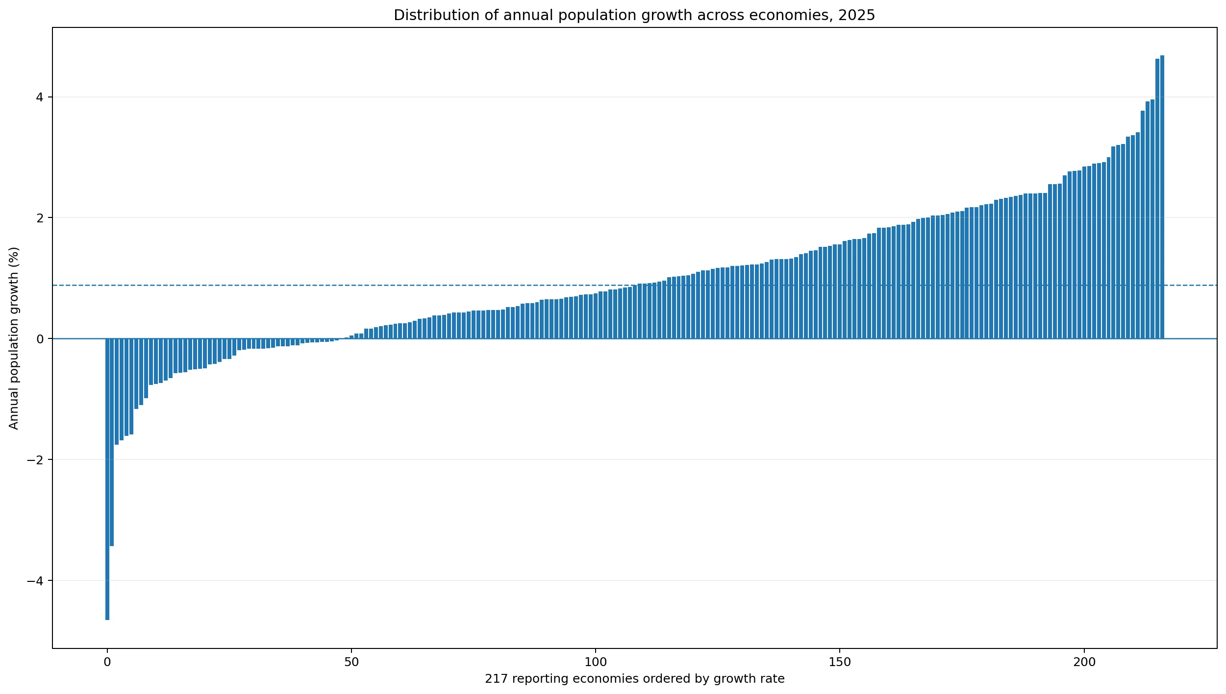
All 217 reporting economies have a 2025 value in the dataset, so there are no missing observations. The median is 0.89% and the mean is 0.98%. The first quartile is 0.17% and the third quartile is 1.88%. 168 economies have positive growth and 49 have negative growth, with 0 exactly at zero. The United Arab Emirates is highest at 4.68%, while St. Martin (French part) is lowest at -4.65%.
Population growth is not a birth-rate measure. The final annual change reflects births, deaths, international migration, and population-estimation adjustments. In places with large migration flows, especially small economies or labor-migration hubs, migration can materially alter the annual rate. The indicator shows the net population outcome but does not decompose the contribution of each component.
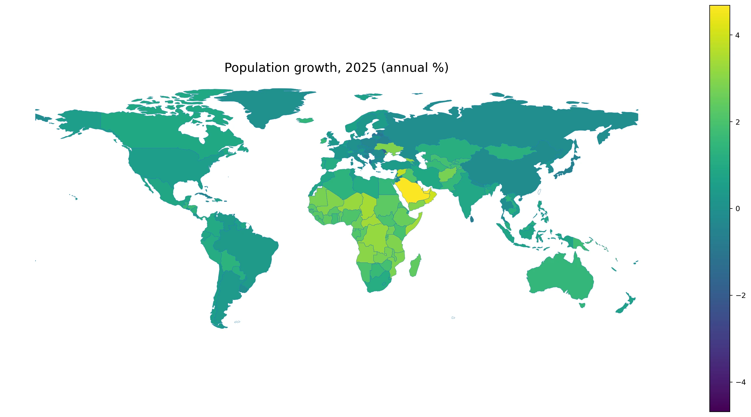
Table of Contents
Most economies grew, but population decline is still geographically visible
In 2025, 168 economies are above zero and 49 are below zero. Growth is therefore more common than decline, but the negative group is large enough to form clear clusters and outliers. The zero line is more than a visual divider: it separates economies whose population increased from those whose population contracted over the year.
There are 8 economies below -1%, 41 from -1% to below zero, 66 from zero to under 1%, 53 from 1% to under 2%, 37 from 2% to under 3%, and 12 at 3% or more. Most economies sit in moderate ranges rather than at the extremes.
| 2025 annual population growth | Economies |
|---|---|
| Below -1% | 8 |
| -1% to below 0% | 41 |
| 0% to under 1% | 66 |
| 1% to under 2% | 53 |
| 2% to under 3% | 37 |
| 3% or more | 12 |
The Gulf and parts of Sub-Saharan Africa stand out at the high end
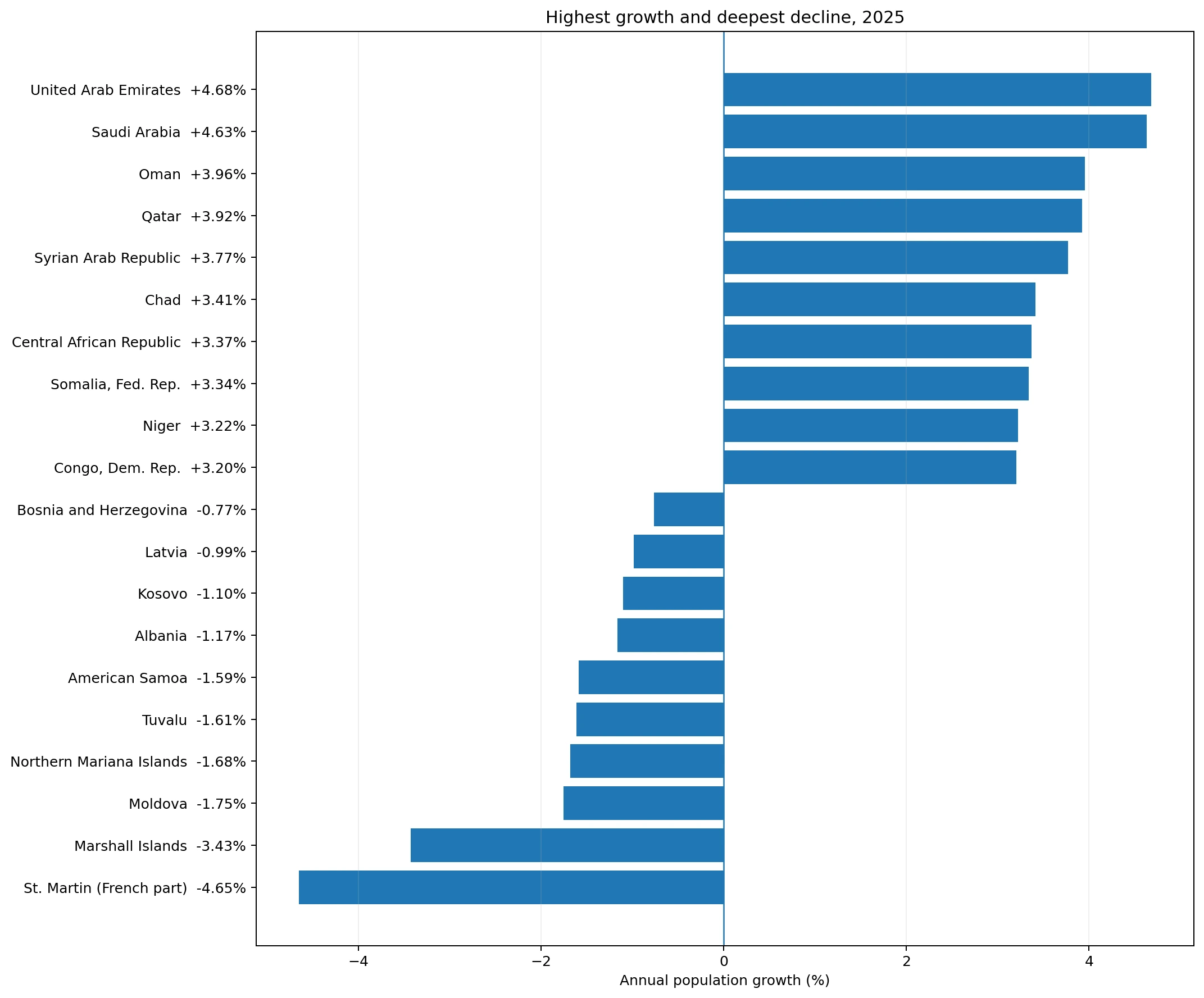
The United Arab Emirates has the highest growth rate at 4.68%, followed by Saudi Arabia at 4.63%, Oman at 3.96%, and Qatar at 3.92%. The Syrian Arab Republic is at 3.77%, Chad 3.41%, the Central African Republic 3.37%, Somalia 3.34%, Niger 3.22%, and the Democratic Republic of the Congo 3.20%.
The high Gulf rates should be interpreted with migration in mind, while high growth in several Sub-Saharan African economies can also be associated with younger age structures and strong natural increase. The indicator itself does not say how many percentage points came from births minus deaths versus net migration.
| Highest-growth economies | Annual growth |
|---|---|
| United Arab Emirates | +4.68% |
| Saudi Arabia | +4.63% |
| Oman | +3.96% |
| Qatar | +3.92% |
| Syrian Arab Republic | +3.77% |
| Chad | +3.41% |
| Central African Republic | +3.37% |
| Somalia, Fed. Rep. | +3.34% |
| Niger | +3.22% |
| Congo, Dem. Rep. | +3.20% |
The deepest declines include small economies and parts of Eastern Europe
St. Martin (French part) records the largest decline at -4.65%, followed by the Marshall Islands at -3.43%. Moldova is at -1.75%, the Northern Mariana Islands -1.68%, Tuvalu -1.61%, American Samoa -1.59%, Albania -1.17%, Kosovo -1.10%, Latvia -0.99%, and Bosnia and Herzegovina -0.77%.
The bottom group mixes very small island economies with Eastern European economies. In small populations, migration or statistical revisions can produce large percentage movements because the denominator is small. In Eastern Europe, long-running low fertility, aging, and outward migration are often relevant background factors, but the exact contribution of each component requires separate demographic data.
| Largest population declines | Annual growth |
|---|---|
| St. Martin (French part) | -4.65% |
| Marshall Islands | -3.43% |
| Moldova | -1.75% |
| Northern Mariana Islands | -1.68% |
| Tuvalu | -1.61% |
| American Samoa | -1.59% |
| Albania | -1.17% |
| Kosovo | -1.10% |
| Latvia | -0.99% |
| Bosnia and Herzegovina | -0.77% |
A rate near zero means small net change, not an absence of demographic movement
A population-growth rate near zero means that the combined effect of births, deaths, immigration, and emigration produced little change in total population size. Large flows can still exist underneath the net result. An economy can have substantial births and deaths, or large immigration and emigration, that largely offset one another.
Population decline also is not automatically a measure of economic failure. Demographic change affects labor supply, housing, education, health care, and public finance, but outcomes depend on age structure, productivity, migration composition, and policy. The growth rate is a structural descriptor rather than a welfare score.
Growth rates and population gains answer different questions
A small economy growing at 3% can add fewer people than a very large economy growing at 0.5%. The rate measures the speed of change relative to the existing population, while the absolute population change measures how many people were added or lost. Both are necessary when the practical size of demographic change matters.
The same logic applies to decline. A -2% rate in a small territory can look dramatic on the map while contributing little to the global population total. A much smaller negative rate in a large country can represent a larger absolute population loss.
One year should not be treated as a long-run trend
A high 2025 growth rate does not guarantee sustained high growth. Large migration episodes, return migration after conflict, policy changes, or revisions in population estimates can move a single-year rate sharply. A negative rate in one year likewise does not prove a permanent decline.
Long-run demographic direction is better assessed with a multi-year series. Looking at five or ten years can show whether an economy consistently stays above or below zero and whether the growth rate is accelerating or slowing.
The World Bank definition uses midyear population and the de facto population concept
The World Bank defines annual population growth using the exponential rate of change from midyear population in the previous year to midyear population in the current year. Population follows the de facto concept, counting residents regardless of legal status or citizenship. The measure is therefore not the same as a simple year-end headcount change or a change in the number of citizens.
Population estimates can also be revised when new census information or updated international estimates become available. For consistent comparison, the same data vintage and reference year should be used across economies.
Urban and rural growth rates reveal changes hidden by the national average
A country can have national growth of 1% while its urban population grows rapidly and its rural population declines. The reverse can also occur. National population growth compresses internal migration and urbanization into one total, so urban and rural population-growth indicators provide useful complementary views.
The three measures should not be added or subtracted mechanically because they refer to different population groups and geographic classifications. Used together, however, they show whether national population change is being accompanied by a redistribution between urban and rural areas.
Key takeaways
In 2025, 168 economies recorded positive population growth and 49 recorded decline. The median was 0.89%. The United Arab Emirates had the highest rate at 4.68%, while St. Martin (French part) had the lowest at -4.65%. High-growth observations were common in the Gulf and parts of Sub-Saharan Africa, while decline appeared in parts of Eastern Europe and several small island economies.
Annual population growth measures the pace of total population change relative to the existing population. It does not directly show the absolute number of people added or lost, the long-run trend, or the separate contribution of natural increase and migration. Those questions require total-population changes, multi-year data, and demographic components.
Frequently Asked Questions
What does a negative annual population-growth rate mean?
It means the midyear population declined from the previous year. The final change can reflect births, deaths, international migration, and estimation adjustments.
Is population growth the same as the birth rate?
No. Population growth is the net change in total population, while the birth rate measures births relative to population.
Were more economies growing or declining in 2025?
Of the 217 economies, 168 had positive growth and 49 had negative growth.
Does the highest growth rate mean the largest number of people added?
Not necessarily. A growth rate is relative to existing population size, so absolute population gains can be larger in a more populous country with a lower rate.
Related Articles
Green Map creates custom-edited map images using open geographic data sources such as geoBoundaries, Natural Earth, OpenStreetMap, and government open data. These maps are edited visual materials, not raw data files, and are provided for education, documents, presentations, and graphic reference.