The global electricity access map compares the share of each country or economy’s population that has access to electricity. It uses World Bank World Development Indicators series EG.ELC.ACCS.ZS and keeps a common 2024 reference year. The measure should not be confused with electricity generation, electricity consumption per person, power prices, renewable generation, or outage frequency; those answer different questions about an electricity system.
The packaged geography master contains 217 World Bank countries and economies, and 215 have a numeric 2024 observation. American Samoa and Kosovo are preserved as source-missing rows rather than imputed. Regional, income-group, and development aggregates are excluded. The 217-row scope is therefore not a count of sovereign states; it includes countries and separately reported economies or territories in the World Bank geography master.
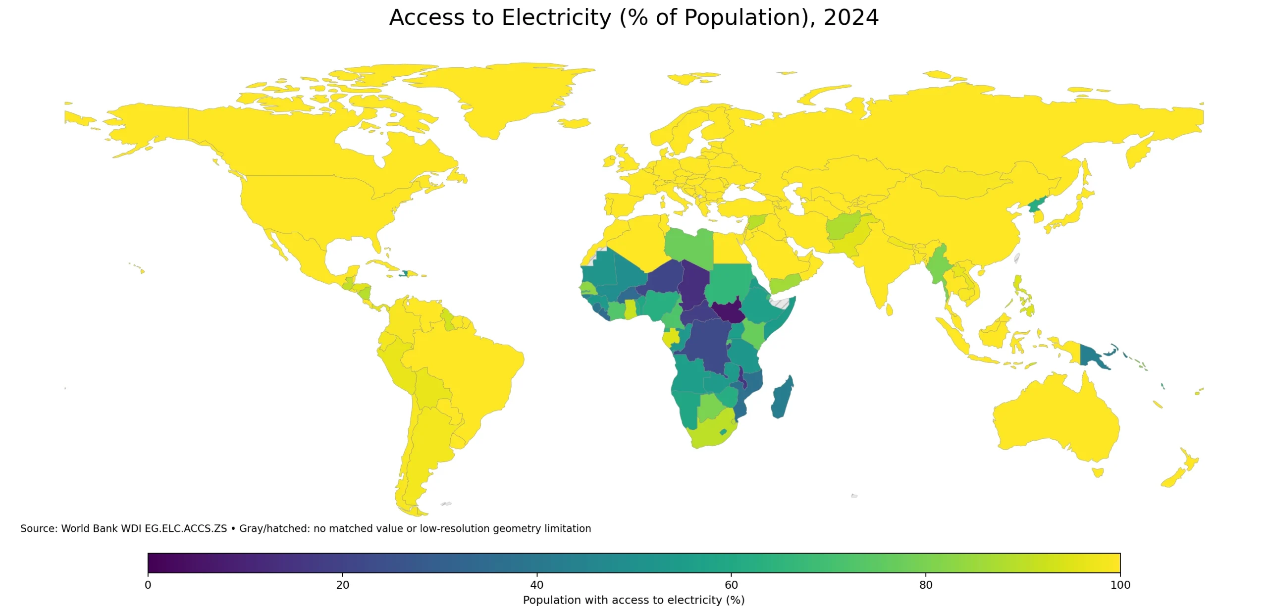
Table of Contents
What the electricity-access indicator measures
The World Bank defines the indicator as the percentage of population with access to electricity. The underlying electrification database draws on nationally representative household surveys, censuses, industry and government information, and international sources. In that sense, the indicator is closer to a population-and-infrastructure outcome than to a simple count of power plants, transmission lines, or generating capacity.
A single access percentage does not describe every dimension of electricity service. A country near 100% can still have differences in outage frequency, service hours, voltage quality, affordability, household consumption, or business reliability. The World Bank also publishes separate rural and urban access indicators. The values here combine the total population, so rural-urban gaps should not be inferred from this map alone.
Universal-access values dominate the 2024 distribution
Of the 215 numeric observations, 122 are reported at 100.0%. Another 93 are below 100%, 54 are below 90%, 41 are below 75%, and 15 are below 50%. The median is 100.0% because more than half of the country/economy observations sit at the reported universal-access ceiling.
| 2024 access range | Countries/economies | Share of 215 |
|---|---|---|
| 0–<25% | 7 | 3.3% |
| 25–<50% | 8 | 3.7% |
| 50–<75% | 26 | 12.1% |
| 75–<90% | 13 | 6.0% |
| 90–<100% | 39 | 18.1% |
| 100% | 122 | 56.7% |
The simple mean across the 215 observations is 88.8%. By contrast, the World Bank’s population-weighted World aggregate is 91.9% for 2024. The difference is expected: an unweighted country mean gives a small island economy the same weight as India or Nigeria, while the World aggregate reflects population size. The 88.8% figure is useful for describing the distribution of country observations; 91.9% is the appropriate headline when the question is the share of the world’s population with electricity access.
The lowest access rates are concentrated in Sub-Saharan Africa
South Sudan has the lowest reported 2024 value at 5.4%, followed by Chad at 13.4%, Malawi at 15.6%, the Central African Republic at 18.2%, and Burundi at 20.1%. Niger is 21.3% and the Democratic Republic of the Congo 22.5%. Nineteen of the twenty lowest observations are African countries; Papua New Guinea is the only non-African economy in that bottom-twenty set. That concentration is the strongest spatial pattern on the world map.
| Country or economy | 2024 access to electricity |
|---|---|
| South Sudan | 5.4% |
| Chad | 13.4% |
| Malawi | 15.6% |
| Central African Republic | 18.2% |
| Burundi | 20.1% |
| Niger | 21.3% |
| Congo, Dem. Rep. | 22.5% |
| Burkina Faso | 34.0% |
| Liberia | 34.9% |
| Mozambique | 36.9% |
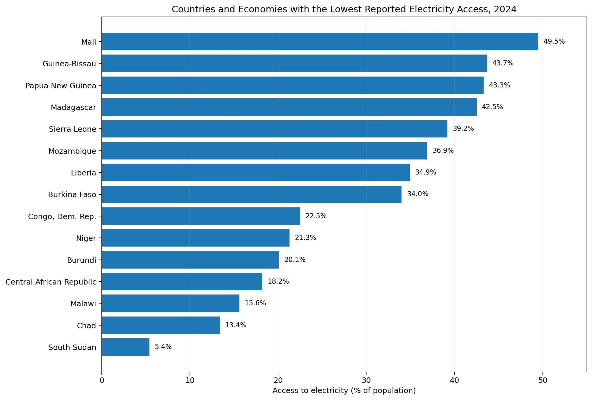
The regional concentration should not be turned into a claim that every African country has similar access. South Africa is 90.2%, Senegal 82.9%, and Rwanda 72.0%, while several countries are below 25%. Explaining the differences would require evidence on grid expansion, distributed solar, mini-grids, settlement patterns, conflict, public finance, utility capacity, and other country-specific factors. This map is strongest as a diagnostic tool: it identifies where the measured access gap is largest before deeper research begins.
A reported 99–100% still needs careful interpretation
India and Indonesia are both 99.9%, Brazil and Mexico 99.8%, and Bangladesh 99.5%. Those values sit very close to universal access on a percentage scale. Yet in a very populous country, even a few tenths of one percentage point can correspond to a substantial number of people. The packaged dataset does not include 2024 population counts, so this article does not manufacture an “unserved population” estimate by multiplying in a second unverified series.
A reported 100.0% should also be read at the source’s reporting precision and methodology. It does not mean every household experiences identical reliability, affordability, or quality. Electricity access is one dimension of infrastructure coverage. Outages, costs, consumption levels, generation mix, and grid quality require separate indicators.
How several large economies compare
The United States, China, Japan, South Korea, Germany, the United Kingdom, France, Canada, and Australia are reported at 100.0%. India and Indonesia are 99.9%, while Brazil and Mexico are 99.8%. The comparison changes more sharply for Pakistan at 95.7%, South Africa at 90.2%, Nigeria at 62.5%, and Ethiopia at 56.6%. Economic size alone does not determine whether a country has reached near-universal household electricity access.
| Economy | 2024 access to electricity |
|---|---|
| Ethiopia | 56.6% |
| Nigeria | 62.5% |
| South Africa | 90.2% |
| Pakistan | 95.7% |
| Bangladesh | 99.5% |
| Mexico | 99.8% |
| Brazil | 99.8% |
| India | 99.9% |
| Indonesia | 99.9% |
| United States | 100.0% |
| China | 100.0% |
| Japan | 100.0% |
| Korea, Rep. | 100.0% |
| Germany | 100.0% |
| United Kingdom | 100.0% |
| France | 100.0% |
| Canada | 100.0% |
| Australia | 100.0% |
Why the map and the statistical table should be read together
The visualization joins ISO-3 codes to a low-resolution Natural Earth country boundary layer. 169 polygons are directly filled from the 215 numeric observations. Statistical economies such as Aruba, Bermuda, and several Caribbean and Pacific islands can have valid 2024 values without appearing as distinct polygons at 1:110m scale. A gray or invisible area on a small world map therefore does not automatically mean the World Bank observation is missing.
All rankings, medians, means, and threshold counts in this article are calculated from the 215 numeric statistical rows, not only from the polygons visible in the image. This distinction prevents a cartographic simplification from quietly changing the statistical sample. The map is for spatial pattern recognition; the tables preserve the full country/economy comparison.
Data source and comparison method
The statistical values come from World Bank World Development Indicators series EG.ELC.ACCS.ZS. The WDI metadata glossary identifies the unit as percent of population, periodicity as annual, and the current reference period as 1990–2024. The low-resolution boundary concept and its treatment of country polygons were checked against Natural Earth Admin 0 – Countries.
The 2024 comparison year is retained because it is both the latest reference year in the current WDI metadata and a high-coverage common year in the supplied dataset: 215 of 217 master rows have values. The two missing rows are not filled with older observations, interpolation, or modelled values added by this article, and none of the packaged numeric observations were changed.
Frequently Asked Questions
Does this map show electricity generation or electricity use per person?
No. World Bank series EG.ELC.ACCS.ZS measures the percentage of the total population with access to electricity. Generation, consumption, prices, outages, and power quality are separate measures.
Why does the comparison use 2024?
The current WDI metadata extends the indicator through 2024, and the supplied common-year dataset has 215 numeric observations out of 217 country/economy master rows. That provides high coverage without mixing years.
Does a reported 100% mean everyone receives perfectly reliable electricity?
No. It is the reported access rate at the source methodology and precision. Reliability, outage frequency, affordability, consumption, and service quality require other indicators.
Is the 88.8% simple mean the global electricity-access rate?
No. It gives every country or economy equal weight. The World Bank’s population-weighted World aggregate is 91.9% for 2024.
Related Articles
These Green Map articles provide useful context for comparing electricity access with other global indicators and for locating the country with the lowest value in this dataset.
- Global GDP Growth Map – Country Patterns in 2025
- Global Unemployment Rate Map – Country Patterns in 2025
- South Sudan Map: 10 States and Three Administrative Areas
Green Map creates custom-edited map images using open geographic data sources such as geoBoundaries, Natural Earth, OpenStreetMap, and government open data. These maps are edited visual materials, not raw data files, and are provided for education, documents, presentations, and graphic reference.