Peoria County combines three very different land-cover settings within one Illinois county: broad farm country across much of the west and north, wooded ravines and bluffs near the Illinois River, and a large developed concentration around Peoria on the eastern side. The 2025 summary is led by agriculture at 59.51%, followed by forest at 19.33%, developed cover at 16.84%, water at 2.15%, and wetlands at 1.74%. The four maps on this page separate those patterns so they can be compared without treating the county as either purely rural or purely urban.
The WebP images are page previews. A single download box below provides the four original JPG maps for the 2025 land-cover view, forest and farmland view, impervious-surface view, and 1985–2025 class-difference view. Start with the general map for countywide proportions, switch to the forest and farmland map for the river-bluff landscape, and use the impervious map when the Peoria urban area is the main question.
Table of Contents
Farm country gives way to wooded ravines and a large urban riverfront
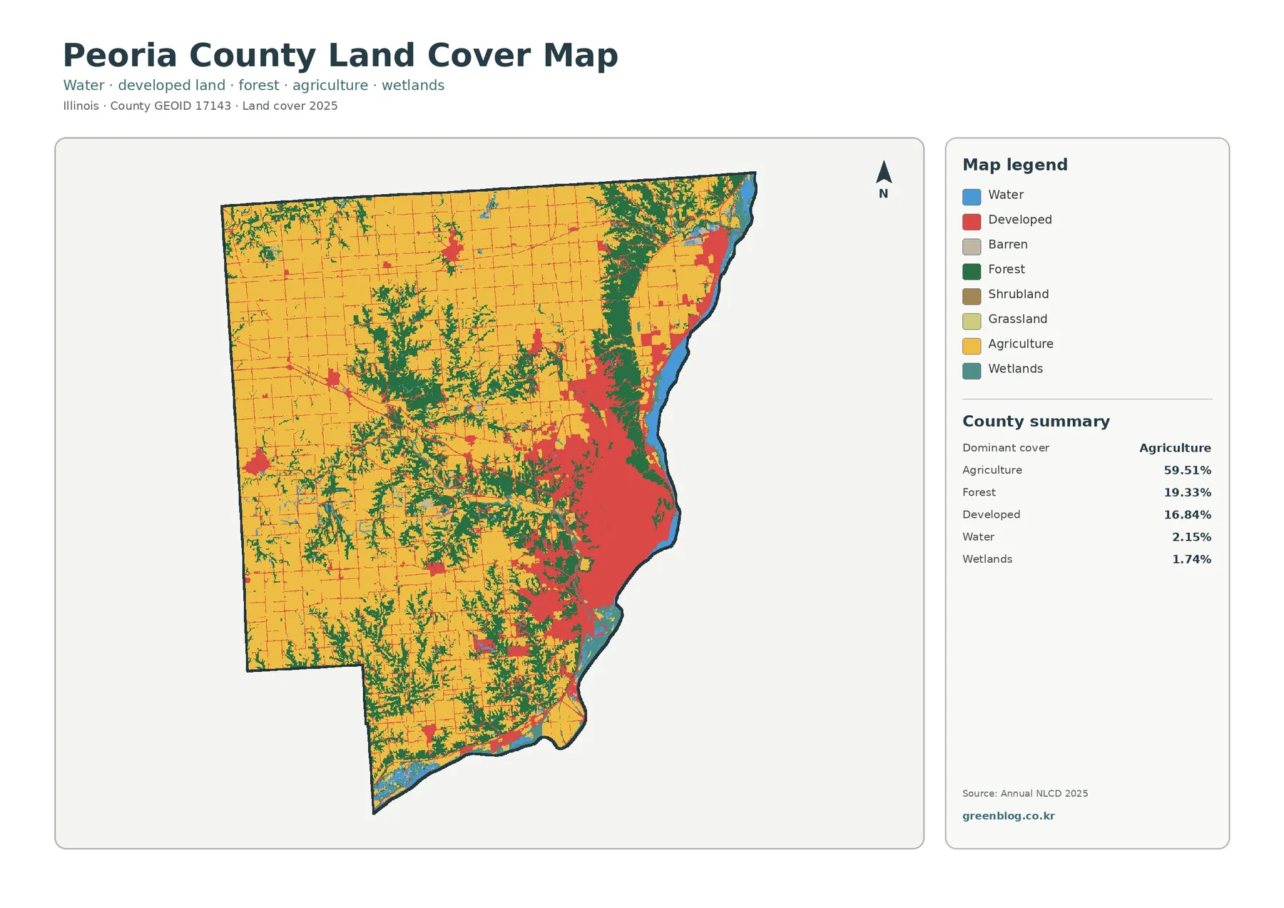
Agriculture is the dominant class, but it does not form one uninterrupted block. Large yellow areas cover much of the western and northern county, where straight road lines cross a relatively simple agricultural background. Moving toward the center, green forest branches into the fields along drainage corridors. The pattern becomes more complex again on the east, where forest, water, wetlands, and developed land occupy much more of the map. That transition is one of the clearest differences between Peoria County and an Illinois county where cropland remains dominant from edge to edge.
Forest accounts for 19.33% of the 2025 summary. Its location matters as much as the percentage. The broadest continuous forest follows the Illinois River side of the county and the steep, dissected terrain just inland from it. Elsewhere, forest tends to trace narrow valleys and stream corridors through the agricultural interior, especially across the central and southern portions. Small wooded pieces also occur in the northwest, but they are less connected than the extensive green areas near the river bluffs.
Peoria County’s Comprehensive Land Use Plan provides useful local context for that shape. The county describes wooded bluffs, the Illinois River, Spoon River, Kickapoo Creek, and other stream systems as major natural resources. The 2009 plan also reported more than 83,000 acres of forest, prairie, wetland, or savanna habitat at that time. Those figures are not interchangeable with the 2025 Annual NLCD percentages because the dates and classification methods differ. The plan is most useful here as evidence that steep river bluffs and stream corridors have long been recognized as important parts of the county’s landscape.
Developed cover reaches 16.84%, creating a much stronger urban signature than the countywide agricultural percentage alone might suggest. The largest red concentration lies on the eastern side around Peoria, spreading across a broad area next to the Illinois River. Another distinct developed cluster appears farther north along the river, while smaller settlement patches sit within the farm country to the west and north. Between those places, development thins into road lines and small nodes, making the difference between the Peoria urban core and rural parts of the county easy to see.
The forest-and-farmland view makes the Illinois River side stand out
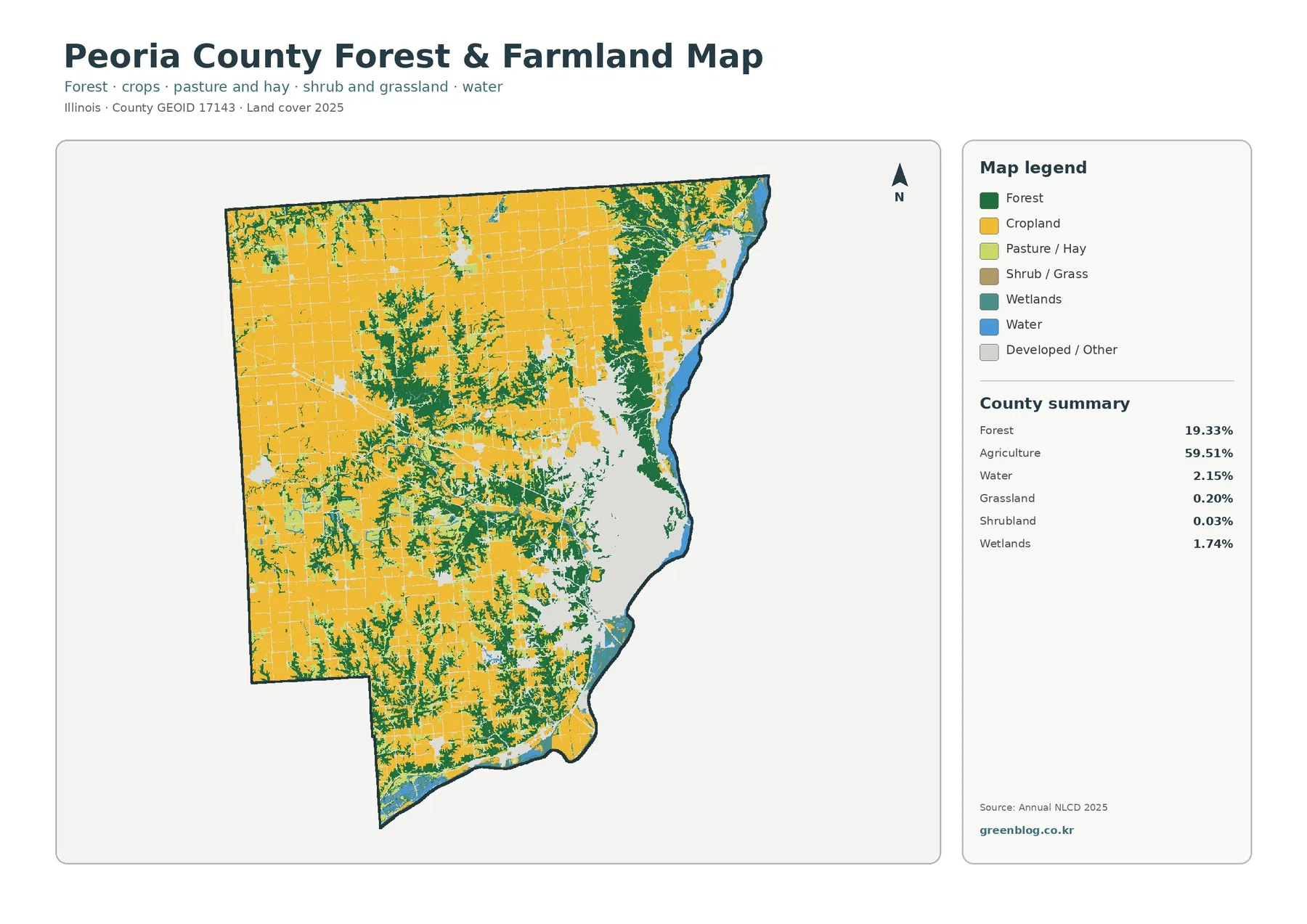
Removing much of the developed detail makes the relationship between agriculture and forest easier to follow. Cropland dominates the broad western and northern surfaces, while forest forms a connected green band near the Illinois River and a branching network through interior valleys. The county’s 59.51% agricultural share is therefore not evenly distributed. Some large farm areas contain only narrow wooded lines, while the eastern bluffs and central ravines contain much more forest within short distances.
The 2022 Census of Agriculture counted 989 farms and 278,241 acres of land in farms in Peoria County, including 226,052 acres of cropland. Those USDA figures describe farm operations and land in farms, not satellite land-cover classes. Annual NLCD’s 59.51% agriculture is a different measurement. Keeping the two datasets separate avoids a common mistake, while still allowing the agriculture census to provide useful context for why the broad yellow areas occupy so much of the county map.
Water covers 2.15% and wetlands 1.74% in the 2025 summary. Their countywide shares are modest, yet they are visually important because they are concentrated along the Illinois River and nearby low areas. Blue water forms a continuous eastern reference, and teal wetland patches appear near river margins and in smaller drainage settings. In the interior farm country, water and wetlands occur as much smaller pieces. That uneven placement helps explain why the eastern edge has a more varied land-cover mix than the western agricultural blocks.
This map also shows why land cover should not be confused with zoning. A yellow agricultural pixel describes what the surface was classified as, not whether a parcel is legally zoned for agriculture. Green forest is not a park or conservation boundary, and teal wetland does not establish a regulatory wetland determination. Peoria County Planning and Zoning maintains separate land-use and regulatory information for those questions.
Impervious cover separates the Peoria core from the rural road grid
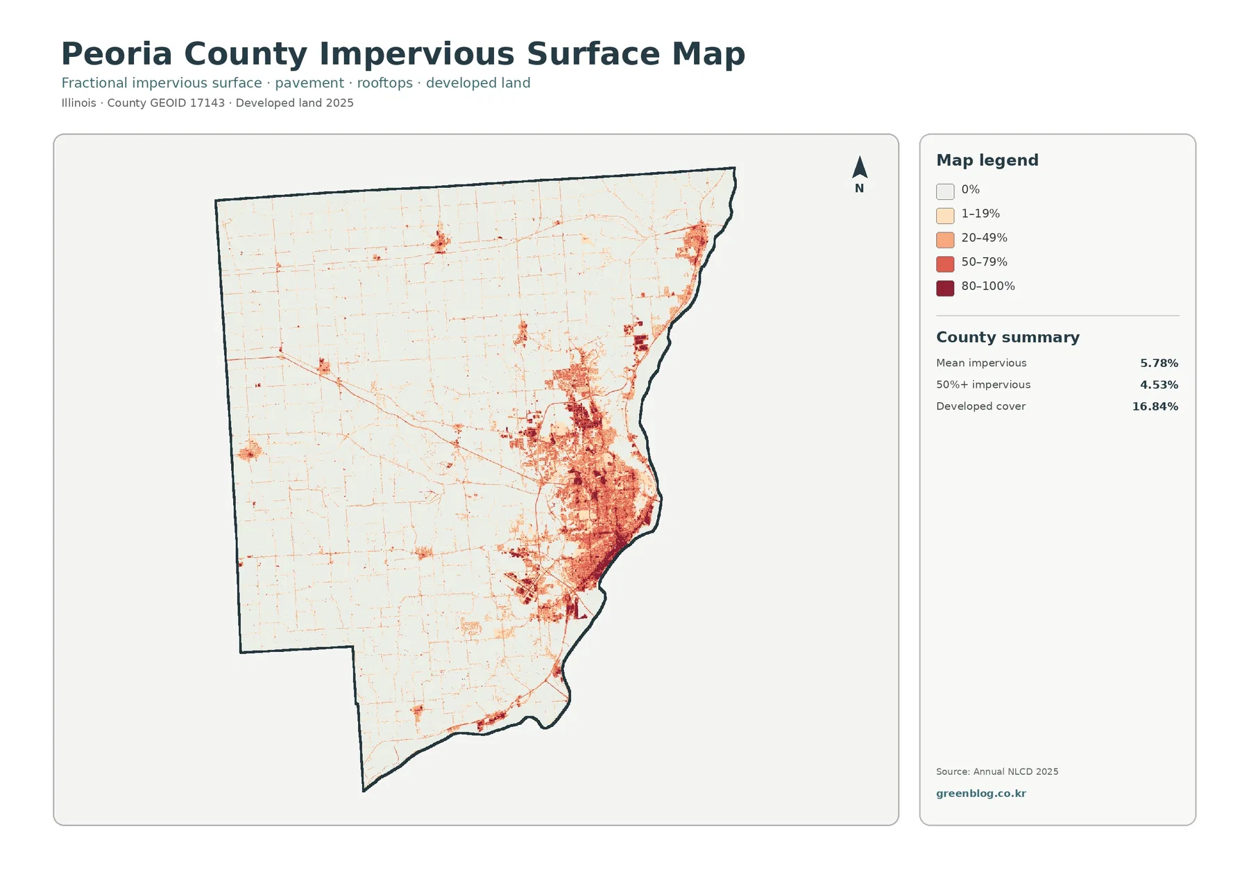
Impervious surface means pavement, rooftops, parking areas, and other hard surfaces that allow much less water to soak into the ground. The countywide mean impervious value is 5.78%, while 4.53% of the county is mapped with more than 50% impervious cover. Those numbers are not the same as the 16.84% developed land-cover class. Developed classes can contain lawns, trees, and other open surfaces, whereas the impervious map estimates the fraction of each cell occupied by hard material.
The difference is most obvious around Peoria. The general map merges a broad urban area into developed colors, but the impervious map breaks that area into a gradient. Darker cells form a dense concentration in the urban core and follow major transportation and commercial patterns, while lighter developed surfaces spread toward the edge. Outside the metro area, the map becomes mostly pale, with thin road lines crossing agricultural land and small clusters marking other communities.
A separate developed cluster along the northeastern river corridor is also visible, but it remains much smaller than the Peoria concentration. Farther west, hard surfaces are limited mainly to local settlements and roads. Wooded ravines in the central and southern county interrupt those linear patterns, producing a patchwork where roads and buildings occupy narrow spaces between forest and farmland. This makes the impervious map useful for explaining how the county’s urban form differs from its rural surface pattern without requiring parcel-level detail.
High impervious values should not be treated as a flood-risk map. Hard surfaces affect infiltration, but actual drainage and flood conditions also depend on rainfall, slope, soils, stormwater systems, and river levels. That distinction matters especially near the Illinois River. Regulatory flood zones, building decisions, and drainage studies require dedicated hydrologic and local planning data rather than a land-cover image alone.
The 1985–2025 difference map is dominated by several kinds of change
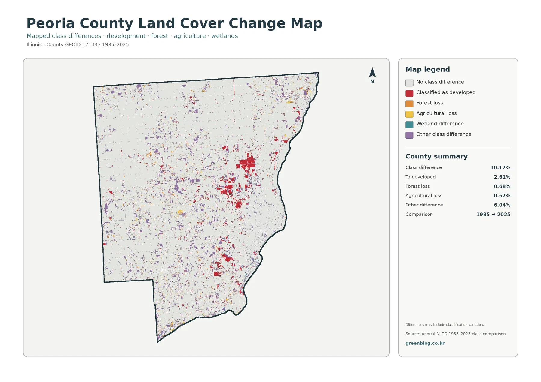
The map reports a total class difference of 10.12%. Of that, 2.61% is shown as changed to developed, 0.68% as forest loss, 0.67% as agricultural loss, and 6.04% as other class difference. The purple other-difference category is therefore larger than any single named loss or development category. Wetland difference is also part of the legend, but the summary does not print a separate percentage for it. It is better to leave that value unstated than to infer a precise number from the remaining total.
Red cells classified as developed form noticeable patches around the Peoria urban area and appear in other developed clusters, including the northeastern river corridor. Purple cells are much more widely scattered. They occur through farmland, along forest edges, and around the complicated boundary between urban and natural cover. Orange forest-loss and yellow agricultural-loss cells are present as smaller pieces. The distribution makes clear that the 10.12% total does not represent one uniform process across the county.
Annual NLCD is a 30-meter raster product, so a single cell can contain more than one real-world surface. A cell on a forest-farm edge, a narrow stream, or an urban fringe may be assigned to a different class in another year even when the ground changed only slightly. The map itself notes that mapped differences can include classification variation. This caution is especially relevant in Peoria County because riverbanks, wooded ravines, roads, and developed neighborhoods often meet within short distances.
The comparison also jumps from 1985 to 2025. It does not show exactly when a change occurred or whether a location changed more than once during the forty-year period. Investigating the timing of urban expansion around Peoria, a particular forest clearing, or an agricultural conversion would require intermediate Annual NLCD years, aerial imagery, and local records. The change map works well as a screening layer for where to look next, not as proof of a specific cause.
Four views help separate the county’s urban, agricultural, and river-bluff stories
For a county overview, the general land-cover map should usually come first. It places the 59.51% agricultural share beside the substantial 19.33% forest and 16.84% developed shares, while also showing how water and wetlands follow the Illinois River side. A second map can then answer the specific question. The forest-and-farmland view is better for the river bluffs and ravines, while the impervious view is better for the internal structure of the Peoria developed area.
The four-map set is particularly useful because Peoria County does not fit a simple rural-versus-urban label. Western farm blocks, eastern bluff forests, river water, and a large city are all prominent in the same county. Comparing the same outline across the maps makes those contrasts easier to explain than relying on one percentage table. It also helps avoid treating developed land, impervious surface, and legal land use as if they were the same concept.
Local planning provides another useful comparison. Peoria County’s comprehensive plan discusses agricultural preservation, environmental stewardship, and managed growth, while the Annual NLCD maps classify physical surface cover from remotely sensed data. A future land-use map may show policy intentions or permitted patterns, but the land-cover map shows what the surface was classified as in the selected observation year. The two sources can be used together for context, but one should never substitute for the other.
For environmental education, begin with the Illinois River and the broad forest belt beside it, then trace wooded drainage branches into the agricultural interior. The impervious map can be added to show how the Peoria urban area occupies a very different surface from the large farm blocks to the west. The change map then introduces a time dimension without claiming that every colored cell represents permanent development. This sequence keeps the discussion tied to patterns that are actually visible in Peoria County.
What the downloadable JPGs can show—and what they cannot
Land cover is a generalized surface classification. It does not identify ownership, parcel boundaries, zoning, building eligibility, or legal wetland limits. Cropland colors cannot identify a specific crop field with survey accuracy, and forest colors do not define public conservation land. Any parcel decision should be checked against Peoria County GIS, Planning and Zoning information, surveys, and the appropriate regulatory source.
Because the underlying classification uses raster cells, narrow features and mixed edges can be simplified. Small streams, thin tree lines, individual roads, and scattered buildings may be less precise than they appear on a parcel map or current aerial photograph. Enlarging the image does not create detail that was absent from the source classification. This is why the maps are best for countywide patterns, regional comparison, presentations, and introductory planning or environmental context.
Each downloadable JPG is 2480×1754 pixels, while the page previews are 1800×1273 WebP images. The asset manifest does not mark the JPGs as meeting an A3 high-resolution reference, so a large-format print should be tested at the intended size before use. The original dimensions are preserved rather than artificially enlarged or re-encoded to imply detail that the source does not contain.
Trying to place all four maps on one small page can make the legends and subtle river-edge patterns hard to read. A clearer approach is to choose the map that answers the main question and use a second map for comparison. The general view works for proportions, the forest-and-farmland view for bluff and valley vegetation, the impervious map for the Peoria urban surface, and the 1985–2025 map for locating class differences over time.
Frequently Asked Questions
What is the largest land-cover class in Peoria County?
Agriculture is the largest 2025 class at 59.51%. Forest follows at 19.33% and developed cover at 16.84%, with water at 2.15% and wetlands at 1.74%. The proportions do not mean the classes are evenly distributed: agriculture is strongest across the west and north, while forest, water, and developed land become much more prominent toward the Illinois River side.
Why is so much forest concentrated near the Illinois River side of the county?
The map places the largest connected forest areas along the Illinois River bluffs and in branching stream valleys. Peoria County’s comprehensive plan also identifies wooded bluffs and stream corridors as major natural resources. The green areas are land-cover classifications, however, not park boundaries or ownership lines.
Does the 10.12% class difference from 1985 to 2025 mean that much land was urbanized?
No. The map lists 2.61% as changed to developed, 0.68% as forest loss, 0.67% as agricultural loss, and 6.04% as other class difference, with wetland difference also represented in the legend. Classification variation can contribute to mapped differences, so the total should not be interpreted as a single measure of urban growth.
Map File Information
Download four original JPG maps for Peoria County: 2025 land cover, forest and farmland, impervious surface and developed land, and 1985–2025 land-cover class differences.
- Included Files: General land cover, forest and farmland, impervious/developed surface, and land-cover change maps
- File Type: Four original JPG map files bundled in one ZIP archive
- Intended Use: Printing, education, presentations, and map-based projects
Related Maps
- Adams County Illinois Land Cover Map
- Alexander County Illinois Land Cover Map
- Bond County Illinois Land Cover Map
Sources and References
- MRLC Annual NLCD Data
- USGS Annual NLCD Land Cover Classification
- U.S. Census Bureau TIGER/Line Shapefiles
- USDA 2022 Census of Agriculture — Peoria County Profile
- Peoria County Comprehensive Land Use Plan
- Peoria County Planning & Zoning
Green Map creates custom-edited map images using open geographic data sources such as geoBoundaries, Natural Earth, OpenStreetMap, and government open data. These maps are edited visual materials, not raw data files, and are provided for education, documents, presentations, and graphic reference.