In 2025, the female population aged 65–69 forms a noticeably different-sized cohort from one country or territory to another. The World Bank series SP.POP.6569.FE.5Y contains 217 country-level observations for the year. Bosnia and Herzegovina is at the upper end with 7.85%, while the United Arab Emirates is at the lower end with 0.97%. Rather than measuring all older women, the indicator asks one specific question: what fraction of all females belongs to the five-year age band from 65 through 69?
That narrow definition makes the series useful as a cohort map. It highlights where women who have just crossed age 65 occupy a relatively large place in the female age structure and where they remain a small slice of it. The result is not a general score of ageing, health, or longevity. It is a structural snapshot of one age band, which can be read alongside other age groups when a fuller demographic profile is needed.
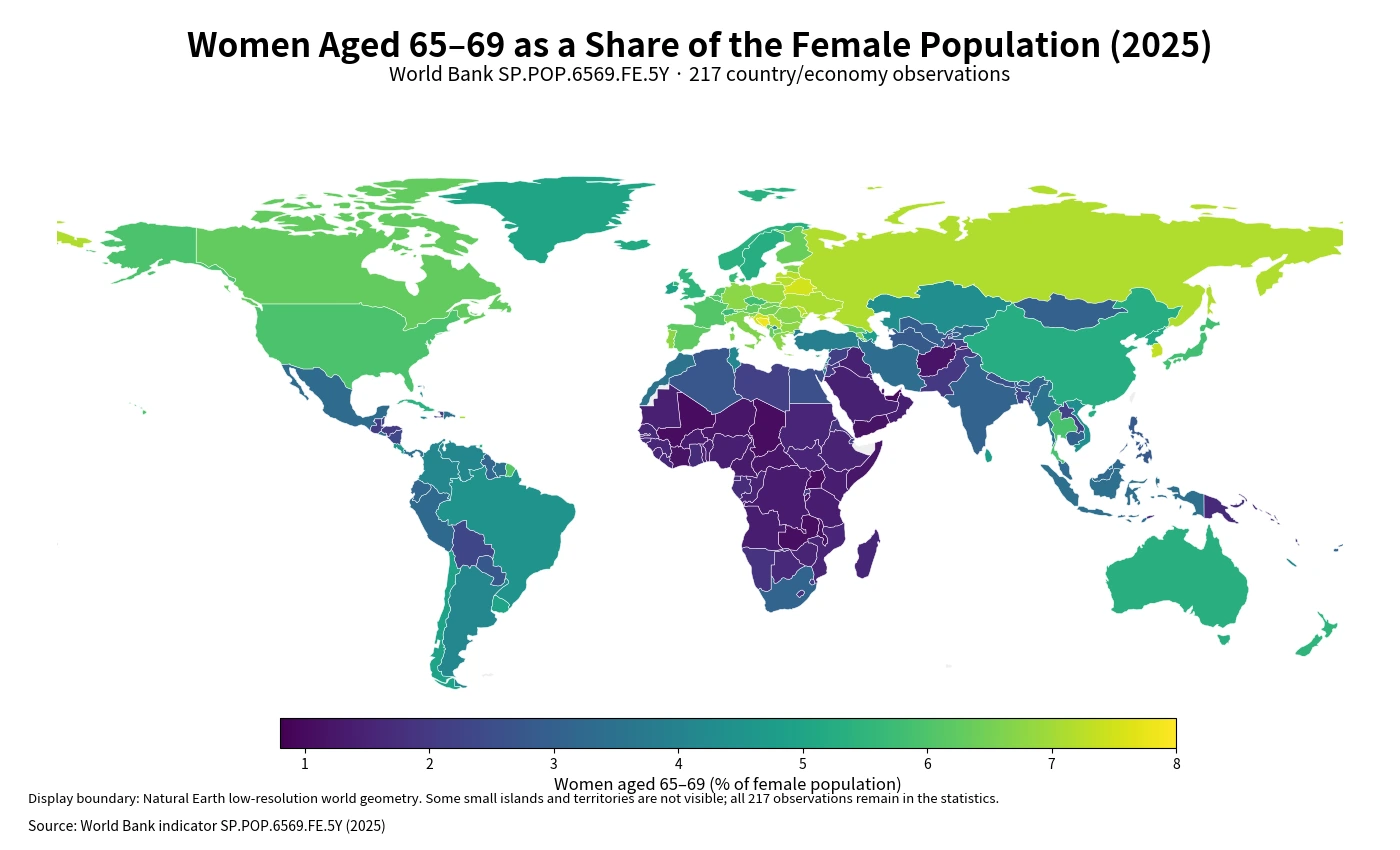
Table of Contents
A visible high-share belt runs through parts of Eastern Europe and the Balkans
The largest continuous high-share areas on the map are found in Eastern and Southeastern Europe. Bosnia and Herzegovina leads the full dataset, and Belarus and Croatia also exceed 7.4%. Moldova and Latvia are above 7.2%, while Lithuania and the Russian Federation sit just outside the top ten with values above 7.1%. The pattern does not stop at Europe: Hong Kong SAR, China is above 7.3%, and several Caribbean or Atlantic territories also appear near the top.
This mixture matters because a high value is not tied to one geographic setting. Some of the highest observations are large mainland countries, while others are small islands or territories. What they share in this indicator is only the outcome: women aged 65–69 occupy an unusually large fraction of the local female population. The demographic paths that produced those percentages may be very different.
The low end combines African countries with two Gulf economies
The bottom of the distribution has a different geography. Uganda, Chad, Mali, Zambia, Malawi, and Burundi all sit close to 1%, and Côte d’Ivoire is only slightly higher. The United Arab Emirates is the only observation below 1%, while Qatar is also near the bottom. A low percentage can occur when younger female cohorts are much larger than older ones, but the indicator alone cannot tell whether fertility, migration, survival, or another demographic process is mainly responsible.
For that reason, the map is most reliable as a description of structure, not as an explanation of cause. Two countries can both report about 1.1% while having very different birth histories and migration patterns. The safe comparison is the relative size of the 65–69 female cohort within each population; causal interpretation requires additional time-series and age-specific evidence.
From 0.97% to 7.85%: the ranking spans almost seven percentage points
The distance between the maximum and minimum is 6.87 percentage points. Put another way, the highest percentage is about 8.1 times the lowest. At the top of the range, the cohort is close to eight women out of every hundred females; at the bottom, it is about one out of every hundred. That is a substantial spread for an age band only five years wide.
| High rank | Country/economy | Share | Low rank | Country/economy | Share |
|---|---|---|---|---|---|
| 1 | Bosnia and Herzegovina | 7.85% | 1 | United Arab Emirates | 0.97% |
| 2 | Bermuda | 7.64% | 2 | Uganda | 1.03% |
| 3 | Belarus | 7.50% | 3 | Chad | 1.04% |
| 4 | Croatia | 7.44% | 4 | Mali | 1.05% |
| 5 | Virgin Islands (U.S.) | 7.38% | 5 | Zambia | 1.08% |
| 6 | Korea, Rep. | 7.35% | 6 | Malawi | 1.09% |
| 7 | Hong Kong SAR, China | 7.31% | 7 | Qatar | 1.09% |
| 8 | Moldova | 7.26% | 8 | Burundi | 1.14% |
| 9 | Aruba | 7.24% | 9 | Yemen, Rep. | 1.15% |
| 10 | Latvia | 7.23% | 10 | Cote d’Ivoire | 1.16% |
The top ten include Bosnia and Herzegovina, Belarus, Croatia, Moldova, and Latvia, as well as Bermuda, the U.S. Virgin Islands, Aruba, Hong Kong SAR, China, and Korea, Rep. The bottom ten are concentrated more heavily in Africa, with the United Arab Emirates and Qatar as notable exceptions. Because these percentages are standardized to each economy’s female population, the table should not be read as a list of where the greatest number of 65–69-year-old women live.
The middle of the dataset sits near 3.8%, not near the top-ten values
The median observation is 3.76%, and the mean is 3.88%. The first quartile is 1.97% and the third quartile is 5.63%, placing the middle half of observations between roughly 1.97% and 5.63%. This is useful context for the ranking: values above 7% are exceptional, while a country close to 3.8% is near the center of the 2025 distribution.
| Share band | Countries/economies | Percent of observations |
|---|---|---|
| Below 1% | 1 | 0.5% |
| 1% to under 2% | 55 | 25.3% |
| 2% to under 3% | 30 | 13.8% |
| 3% to under 4% | 26 | 12.0% |
| 4% to under 5% | 30 | 13.8% |
| 5% to under 6% | 29 | 13.4% |
| 6% to under 7% | 30 | 13.8% |
| 7% or more | 16 | 7.4% |
The largest band is 1% to under 2%, with 55 observations. Another 30 fall between 2% and 3%, while 46 are at 6% or more. Sixteen reach 7% or above. These counts show that the global picture is not dominated by a single typical level: there is a large low-share group, a broad middle, and a meaningful high-share tail.
What the percentage says—and what it leaves out
The denominator is every female in the reporting economy. A 6% value therefore means roughly six women aged 65–69 for every hundred females of all ages. It does not mean six percent of the total population, and it does not include men aged 65–69. This distinction is important when comparing the indicator with population pyramids or with statistics that use the whole population as the base.
The numerator is equally specific. Women aged 70 and older are not counted, so a high 65–69 share does not automatically imply a high share at ages 75, 80, or 85. The series is best treated as one slice of the age distribution. To describe overall population ageing, additional bands or broader indicators are needed.
The cohort is mostly made up of women born around 1956–1960
Age 65–69 in 2025 corresponds approximately to birth years 1956 through 1960. The size of that original birth cohort helps set the starting point for today’s percentage, but six decades of demographic change intervene. Survival determines how many members remain, migration can add or remove people from the cohort, and the later growth or contraction of younger female age groups changes the denominator against which the cohort is measured.
This means the indicator contains a long demographic memory without being a direct historical birth-rate measure. A country can have many surviving women from the late 1950s and still show a moderate percentage if later female cohorts are much larger. Conversely, a cohort can represent a high share in a population where younger groups have become smaller. The percentage captures the current balance among age groups, not one past event in isolation.
Country size disappears from the ranking, which is both useful and limiting
Using a percentage makes countries of very different population sizes comparable in structural terms. A large country does not automatically rank above a small territory simply because it has more people. That is useful for reading age composition, but it also means the ranking cannot answer questions about the absolute number of women who may need age-related services or support.
If the question concerns service demand, pension populations, or health-care capacity, age-specific headcounts should be added. If the question concerns the internal shape of the female population, this percentage is more informative. The same figure can therefore be highly useful in one analytical setting and incomplete in another.
Use the map for regional structure and the table for micro-territories
The statistical dataset contains several territories that are valid World Bank observations but are too small to display well on a global low-resolution map. Bermuda, Aruba, and the U.S. Virgin Islands are good examples. Their values remain in the rankings and summary statistics even when the map cannot show them as clearly as larger countries.
The boundary layer used for visualization matches 170 polygons directly to the World Bank observations by ISO3 code. The statistical calculations, however, retain all 217 values. The two numbers describe different things: one is map geometry coverage, and the other is data coverage. Using the map and table together avoids treating a cartographic limitation as missing statistical evidence.
A 2025 value is a checkpoint, not a forecast
The age structure will shift as cohorts move forward. Women aged 60–64 in 2025 will progressively enter the 65–69 band, while today’s 65–69 cohort will move into the next age group. The ranking can therefore change even if there is no sudden demographic event. A trend claim requires repeated observations across multiple years.
It is also possible for the number of women aged 65–69 and their percentage of the female population to move in opposite directions. The headcount may rise while the share falls if the denominator grows faster, or the headcount may fall while the share rises if other age groups contract more quickly. That is why a single percentage should be used to describe structure at a point in time rather than future direction.
Source and reproducible calculations
The figures come from the 2025 observations in the World Bank API series SP.POP.6569.FE.5Y. The World Bank indicator page provides the series definition and country time series. The unit is the percentage of the female population aged 65–69. Regional and income-group aggregate rows are excluded from the 217 observations used for the comparison.
Every one of the 217 rows has a reported value for 2025. No missing observation is converted to zero and no previous-year value is substituted. The maximum, minimum, mean, median, quartiles, ranking positions, and distribution-band counts are calculated from the same 217 observations. The world geometry is used only for display, so visual coverage is intentionally kept separate from the statistical calculations.
Frequently Asked Questions
What does a 7% value mean for this indicator?
It means that about 7 out of every 100 females in that reporting economy are aged 65–69. It is not 7% of the total population.
Does a higher 65–69 share mean the population is older overall?
Not necessarily. The indicator covers only one five-year age band, so broader measures of population ageing are needed for that conclusion.
Can the 2025 value show whether the share is increasing or decreasing?
No. A single-year cross-section does not establish a trend; multiple years of the same indicator are required.
Related Maps
Green Map creates custom-edited map images using open geographic data sources such as geoBoundaries, Natural Earth, OpenStreetMap, and government open data.
These maps are edited visual materials, not raw data files, and are provided for education, documents, presentations, and graphic reference.