The share of girls aged 5–9 in the female population varies from just over 3% to more than 15% across the 217 countries and economies reported for 2025. This analysis uses World Bank indicator SP.POP.0509.FE.5Y. A value of 10% means that about 10 of every 100 females in that reporting economy are between ages 5 and 9. It does not mean that girls aged 5–9 account for 10% of the total population, because males are not included in the denominator.
This five-year band overlaps substantially with primary-school ages, but the statistic is fundamentally a demographic composition measure. Children who are 5–9 in 2025 were born several years earlier, broadly around the late 2010s. Their current share reflects the size of those birth cohorts, survival, migration and the size of all other female age groups. It should therefore be read as a snapshot of cohort structure rather than a direct measure of current fertility.
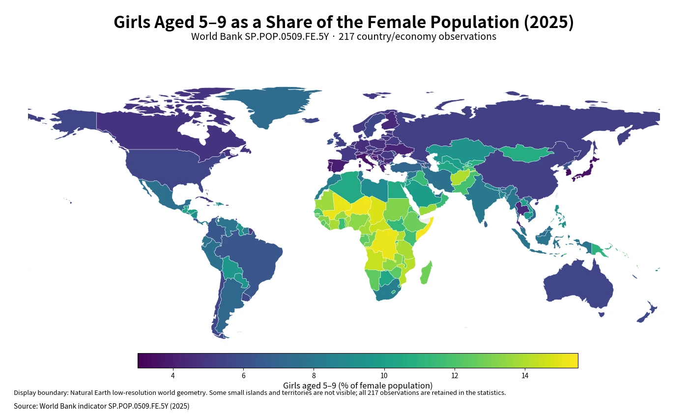
Table of Contents
The map separates very young female populations from older age structures
The most visible high-share cluster is in Sub-Saharan Africa. Somalia, Niger, Mali and the Democratic Republic of the Congo are all at or around 15%. At the other end, Hong Kong, Puerto Rico, Japan and several Southern European economies are near 4% or below. The contrast indicates how much space one recent childhood cohort occupies within each female population. It is a demographic difference in age structure, not a measure of whether one country is performing better than another.
The timing matters. A large 5–9 share cannot be equated with a high birth rate today because these children were born years before the 2025 observation. Recent changes in births will first appear in younger age bands. To explain the 2025 value, the more relevant evidence concerns cohort size at birth, subsequent survival and migration, and the number of females in all the other age groups that make up the denominator.
The top is above 14%, while the bottom is below 4%
Somalia has the highest observed value at 15.31%, while Hong Kong has the lowest at 3.05%. The gap is about 12.26 percentage points. Every economy in the top 10 is above 14%, while every economy in the bottom 10 is below 4%. In proportional terms, the same five-year cohort can represent roughly one in seven females in one place and only about one in thirty in another.
| High rank | Country or economy | Share | Low rank | Country or economy | Share |
|---|---|---|---|---|---|
| 1 | Somalia, Fed. Rep. | 15.31% | 1 | Hong Kong SAR, China | 3.05% |
| 2 | Niger | 15.19% | 2 | Puerto Rico (US) | 3.28% |
| 3 | Mali | 15.09% | 3 | Korea, Rep. | 3.30% |
| 4 | Congo, Dem. Rep. | 15.08% | 4 | Japan | 3.60% |
| 5 | Chad | 14.80% | 5 | Andorra | 3.66% |
| 6 | Central African Republic | 14.52% | 6 | Italy | 3.67% |
| 7 | Angola | 14.45% | 7 | San Marino | 3.72% |
| 8 | Burundi | 14.34% | 8 | Singapore | 3.94% |
| 9 | Mozambique | 14.16% | 9 | Portugal | 3.96% |
| 10 | Uganda | 14.06% | 10 | Sint Maarten (Dutch part) | 3.97% |
The ranking is about shares, not headcounts. A large country with a 6% value may contain far more girls aged 5–9 than a small territory at 14%. Percentages are useful for comparing the shape of age structures across very different population sizes. Questions about school places, health services or the number of children in a market require absolute population counts in addition to the share.
The median is 7.66%, but the distribution spans many bands
The mean across the 217 observations is 8.24% and the median is 7.66%. The first quartile is 5.21% and the third quartile is 11.21%, placing the middle half of the observations between about 5.21% and 11.21%. The mean sits above the median, consistent with a substantial group of high values in the 11–15% range. The extremes are striking, but the full distribution is more informative than a maximum-versus-minimum comparison alone.
| Share band | Number of economies | Share of 217 observations |
|---|---|---|
| Below 5% | 42 | 19.4% |
| 5% to under 7% | 53 | 24.4% |
| 7% to under 9% | 38 | 17.5% |
| 9% to under 11% | 27 | 12.4% |
| 11% to under 13% | 33 | 15.2% |
| 13% or more | 24 | 11.1% |
The largest band is 5% to under 7%, with 53 economies, or 24.4% of the dataset. Another 42 observations are below 5%. At the high end, 24 economies are at 13% or more and 33 fall between 11% and 13%. The result is not a single global pattern but a wide set of female age structures, from populations with very large child cohorts to those where older ages occupy much more of the denominator.
No single mechanism explains a high 5–9 share
The first mechanism is cohort size at birth. A relatively large number of births several years earlier can produce a thick 5–9 cohort later. The second is the denominator. Two economies can have similar numbers of girls aged 5–9 but different percentages if one has many more adult and older women. In that sense, the indicator depends on both the numerator and the age profile of the entire female population.
Migration and survival can also affect the observed share. Family migration can change the number of children and adults together, while age-specific migration patterns differ across economies. The indicator does not separate these mechanisms. Establishing why one country has a higher share than another requires additional evidence such as births, age-specific headcounts, migration and broader population structure.
This is a past-birth cohort measure, not today’s fertility rate
A common interpretation error is to treat the 2025 share as if it measured births occurring in 2025. It does not. A sharp decline in births during the most recent one or two years may barely affect the 5–9 group yet, because those newborn cohorts have not entered this age band. Likewise, a recent rebound in births would first appear among children under 5. The age band is therefore a lagged view of earlier births.
Comparing neighboring five-year bands can add useful context. If ages 0–4 are much smaller than ages 5–9, that may indicate that more recent birth cohorts are smaller, while the reverse pattern may suggest larger recent cohorts. Such comparisons still require caution because each band is a percentage and can be affected by migration and denominator changes. A time series or age pyramid provides a stronger basis for describing direction.
The denominator includes females only
The official measure divides girls aged 5–9 by the total female population. Boys are excluded from both numerator and denominator. Sex-specific differences in births, survival and migration can therefore produce a female share that is not exactly the same as the male share in the same economy. To measure all children aged 5–9 as a fraction of all residents, a total-population age indicator is needed instead.
Keeping this denominator explicit prevents a common reading mistake. An 8% value does not say that 8% of all residents are girls aged 5–9. It says that 8% of females are in that age group. That narrower question is still valuable because it allows female age structures to be compared consistently across countries with very different population sizes.
Education and child-service planning also needs headcounts
Ages 5–9 overlap with primary-school years in many education systems, so the indicator can help identify where younger cohorts are relatively prominent. It cannot by itself determine the number of classrooms, teachers or pediatric services required. A small economy with a 12% share can still have far fewer children than a large country with a 6% share. Operational planning needs absolute age-specific counts and subnational distribution as well as percentages.
School-age definitions also differ across countries. Entry ages, grade structures and enrollment patterns are not identical, so girls aged 5–9 should not automatically be treated as the number of primary pupils. Education statistics are needed for enrollment and attendance questions. This demographic measure is best used to understand the size of a childhood cohort within the female population.
Small islands and territories require map context
World Bank country series include separately reported territories and economies as well as sovereign states. That is why Hong Kong, Puerto Rico and Sint Maarten can appear beside much larger countries. In small populations, modest changes in births or migration can shift percentages more visibly, so extreme shares should be interpreted alongside the underlying population size.
The display map uses Natural Earth low-resolution geometry and links World Bank values to 170 of its 177 country polygons after standard ISO3 repairs. Some very small islands and territories are absent or not visible at world scale. None of those observations are removed from the statistics: all rankings, quartiles, averages and distribution bands use the full set of 217 World Bank rows.
Source and calculation
The analysis uses 2025 observations from the World Bank API for indicator SP.POP.0509.FE.5Y. The World Bank indicator page provides the official series definition and country-level history. Aggregate regions and income groups are excluded, leaving 217 reporting countries and economies with a 2025 value. The unit is girls aged 5–9 as a percentage of the total female population.
There are no missing values among these 217 rows. No observation is converted to zero and no earlier year is substituted. The maximum, minimum, mean, median, quartiles, rankings and distribution bands are calculated directly from the 2025 values. The cartographic display has less geographic detail than the statistical table only because low-resolution world geometry cannot visibly represent every small territory.
Frequently Asked Questions
What does a 10% value mean in this indicator?
It means about 10 of every 100 females in that reporting economy are aged 5–9. It does not mean that girls aged 5–9 are 10% of the total population.
Does a high 5–9 female share mean fertility is high today?
Not necessarily. The 2025 age group was born several years earlier, so the value reflects earlier cohort size plus survival, migration and the broader female age structure.
Can this percentage determine school demand by itself?
No. The share describes age composition. School planning also needs the absolute number of children, enrollment patterns and where children live within the country.
Related Maps
Green Map creates custom-edited map images using open geographic data sources such as geoBoundaries, Natural Earth, OpenStreetMap, and government open data.
These maps are edited visual materials, not raw data files, and are provided for education, documents, presentations, and graphic reference.