How widely do students reach a basic mathematics benchmark by the end of lower secondary education? The UNESCO Institute for Statistics (UIS) indicator MATH.LOWERSEC reports the percentage of students at the end of lower secondary education who achieve at least a minimum proficiency level in mathematics. It is a threshold measure, not an average test score. A value of 75% means that three quarters of the measured students reached the defined minimum level; it does not mean that the average mathematics score was 75 out of 100.
The 2022 extract contains 70 country and area observations. The median is 57.3% and the mean is 52.2%. There are 26 observations at 70% or above, 6 at 80% or above, and 11 below 20%. The gap between the highest observation, 91.56%, and the lowest, 7.56%, is exactly 84.0 percentage points, showing how wide the observed distribution is.
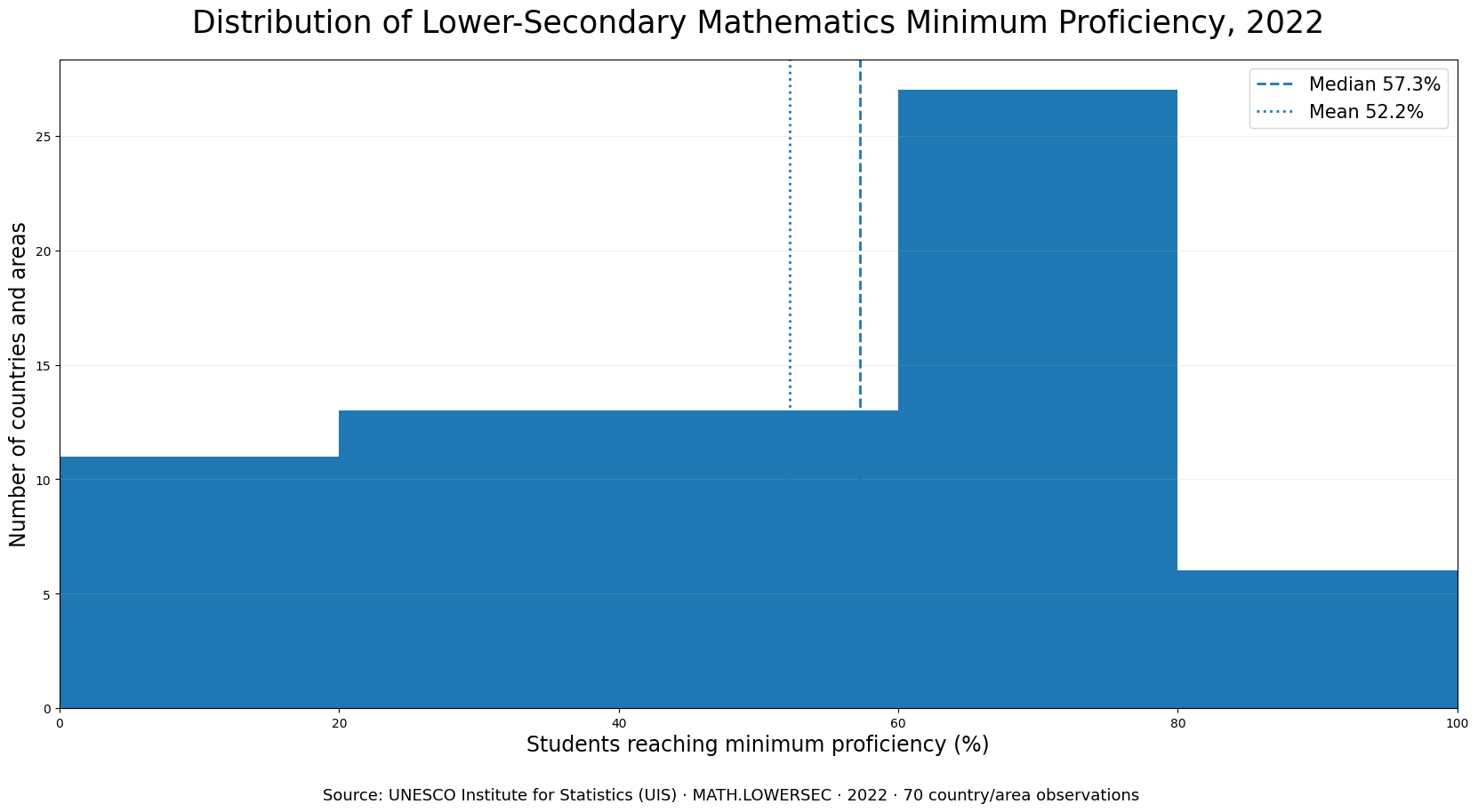
Table of Contents
The indicator measures a threshold share, not an average mathematics score
The wording of the indicator matters. “Proportion” means that each country or area is represented by the share of measured students who clear a defined minimum proficiency threshold. Two systems can have the same proportion above the threshold while having different score distributions above and below it. The measure therefore answers a narrower question than an average-score ranking: how many students reach at least the minimum level?
The data are for both sexes combined. They do not by themselves describe a gender gap, nor can they be used to compare boys and girls without a separate sex-disaggregated series. The indicator should also not be expanded to claims about every adolescent outside the measured education and assessment population. Interpretation is strongest when it stays within the published UIS definition.
The middle of the distribution is 57.3%, but the spread is unusually wide
The first quartile is 30.4% and the third quartile is 72.8%, producing an interquartile range of 42.3 percentage points. Even the middle half of observations stretches from roughly 30% to almost 73%. That makes a single “typical” percentage a poor summary of the entire set.
The mean of 52.2% sits about 5.1 percentage points below the median. The band counts help explain the shape: 11 observations are below 20%, 13 are from 20% to 39.9%, 13 from 40% to 59.9%, 27 from 60% to 79.9%, and six are at 80% or above. The distribution is therefore concentrated most heavily in the 60–79.9% range while still extending deep into much lower levels.
Twenty-six observations are at 70% or higher
The 70% threshold is reached by 26 countries and areas, equivalent to about 37.1% of the 70 observations. Macao SAR records 91.56%, Hong Kong SAR 86.16%, Estonia 85.03%, Ireland 80.97% and Switzerland 80.55%. These figures indicate broad attainment of the minimum mathematics benchmark within those reporting units.
They do not constitute a complete ranking of education quality. The indicator does not directly measure access to education, equity, teaching conditions, learning in other subjects, completion, post-school outcomes or the resources available to students. A high result on this one threshold measure is important evidence, but it is not a substitute for a multidimensional education profile.
Eleven observations fall below 20%
At the other end of the distribution, the Dominican Republic is at 7.56%, El Salvador 10.65%, Cambodia 11.99%, Guatemala 13.08%, Paraguay 14.54%, the Philippines 15.96%, Panama 16.14%, Jordan 17.15%, Indonesia 18.34%, Morocco 18.43% and Uzbekistan 19.31%. Together they represent 15.7% of the 70 observations.
A low percentage means that a large share of measured students did not reach the minimum threshold. It does not identify why. Curriculum, assessment participation, learning resources, household conditions and many other factors may matter, but those explanations require separate evidence. This comparison therefore treats the UIS values as outcomes to be described rather than as proof of any single causal mechanism.
The top-to-bottom gap is 84.0 percentage points
An 84.0-point spread is large enough that it should not be hidden behind the overall mean. Some reporting units have more than four fifths of students reaching the minimum level, while others have fewer than one fifth. Looking at the median, quartiles and threshold bands together gives a clearer picture than presenting only the highest and lowest positions.
The size of the gap is descriptive, not causal. It does not show which policy produced the difference, and it cannot separate the effects of schooling, socioeconomic background, assessment design or reporting coverage. A causal interpretation would require additional variables, repeated observations and a research design capable of distinguishing competing explanations.
Selected 2022 observations
| Country or area | Minimum math proficiency |
|---|---|
| Macao SAR | 91.56% |
| Hong Kong SAR | 86.16% |
| Estonia | 85.03% |
| Republic of Korea | 83.78% |
| Ireland | 80.97% |
| Switzerland | 80.55% |
| Canada | 78.37% |
| United Kingdom | 75.67% |
| Viet Nam | 71.84% |
| France | 71.20% |
| Germany | 70.50% |
| United States | 66.08% |
| Brazil | 26.62% |
| Indonesia | 18.34% |
| Philippines | 15.96% |
| Dominican Republic | 7.56% |
The table is a selected cross-section of the 70 observations, not a replacement for the full dataset. Macao and Hong Kong are retained as separate UIS reporting areas because that is how the source presents them. Countries without a 2022 value are not assigned zero and are not inserted into the ranking.
The middle of the table matters as much as the extremes
Values close to the median show that the distribution is not simply divided into a high-performing and a low-performing group. Brunei Darussalam is at 58.11%, Ukraine at 57.60% and Serbia at 56.94%. Greece is at 52.79%, Romania 51.44% and Kazakhstan 50.42%. Many observations therefore occupy a broad middle range rather than clustering near either endpoint.
Thirty-nine of the 70 observations are at or above 50%, but only 26 remain when the threshold is raised to 70%. This illustrates why arbitrary cutoffs should be used carefully. The official minimum-proficiency threshold defines what the indicator measures; additional 50%, 70% or 80% bands are useful for describing the distribution, not for creating new policy standards.
A single-year cross-section cannot show improvement or decline
Every observation used here is for 2022. The comparison can therefore show where reporting countries and areas sit relative to one another in that year, but it cannot establish whether any system improved or deteriorated. A trend analysis would need comparable MATH.LOWERSEC observations from multiple years.
Keeping the year fixed avoids mixing observations from different time points, which would create a different comparability problem. The trade-off is narrower coverage: only the 70 countries and areas with a 2022 value in this extract are included. The findings should be described as a same-year cross-section rather than a complete global time series.
The 70 observations are not the entire world
A missing country is not a zero. It simply does not have a 2022 observation in the dataset used for this comparison. That distinction is crucial because treating missing data as zero would artificially inflate the lower tail and produce false rankings. All counts in this article—such as 26 at 70% or above and 11 below 20%—refer only to the 70 available observations.
Using observations from other years could increase coverage, but it would also mix different reference periods. For a clean snapshot, this analysis keeps the year constant and accepts incomplete geographic coverage. Readers should therefore avoid extending the percentages to countries that are absent from the 2022 extract.
What the indicator can and cannot tell us about education systems
Minimum-proficiency attainment is useful for identifying the breadth of foundational mathematics learning near the end of lower secondary education. It can highlight where a large share of students clears the threshold and where many remain below it. It is also useful for selecting systems for deeper study or for tracking the same indicator over time when comparable years are available.
It cannot explain the mechanism behind the outcome. Education spending, teacher supply, attendance, household resources, curriculum and many other variables may be relevant, but relationships among them require separate analysis. It is especially important not to infer that a country with higher education spending must have a higher proficiency share, or that one low value is evidence of a single policy failure.
Why median and quartiles are more informative than a simple average
An average uses every value and is sensitive to extreme observations. The median is less affected by the tails and marks the middle of the ordered dataset. Here the mean is 52.2% while the median is 57.3%, so relying on the mean alone would place the apparent center lower than the median observation.
The quartiles reinforce the same point. Half of the observations lie between 30.4% and 72.8%, a span of 42.3 percentage points. That is a very broad middle range. International education comparisons benefit from showing this spread because a single headline average can hide how different the reporting systems actually are.
Small ranking differences should not be overinterpreted
Sorting country values creates an exact rank order, but neighboring observations can be separated by only a few hundredths or tenths of a percentage point. Finland is at 75.15%, Austria 75.14% and Belgium 75.05%. Treating those tiny differences as meaningful gaps in educational performance would give the ranking more precision than the comparison warrants.
The stronger conclusions are about broad bands and large gaps: the number of observations above 70%, the size of the group below 20%, the median, and the distance between the upper and lower tails. Those features remain informative without turning every decimal difference into a claim about system quality.
Data source and calculations
Country and area values come from the UNESCO Institute for Statistics MATH.LOWERSEC indicator for 2022. The published values are used directly as percentages; no rate transformation is applied. The mean, median, quartiles, threshold counts and 84.0-point range are calculated from the 70 reported values.
Missing observations are left missing rather than filled with zero. The source indicator explicitly describes the measure as a percentage, so the public interpretation uses percent even though one internal metadata field is generic. No causal claims are added beyond what can be supported by the supplied UIS observations.
Frequently Asked Questions
Does 70% minimum proficiency mean an average mathematics score of 70?
No. It means 70% of the measured students reached at least the UIS minimum proficiency threshold; it is not an average score.
What is the median in the 2022 data?
The median across the 70 country and area observations is about 57.3%, while the mean is 52.2%.
Are countries without a 2022 value treated as zero?
No. Missing observations remain missing and are excluded from the 2022 ranking and distribution calculations.
Can this indicator rank the overall quality of national education systems?
No. It measures one mathematics proficiency threshold near the end of lower secondary education and does not cover the full range of education quality or outcomes.
Related Articles
- Government Education Spending as a Share of GDP
- Post-Secondary Attainment for Adults 25+
- Bachelor’s-or-Higher Educational Attainment by Country
Green Map creates custom-edited map images using open geographic data sources such as geoBoundaries, Natural Earth, OpenStreetMap, and government open data.
These maps are edited visual materials, not raw data files, and are provided for education, documents, presentations, and graphic reference.