Men aged 70–74 account for very different shares of the male population around the world in 2025. Across the 217 World Bank country and economy observations in indicator SP.POP.7074.MA.5Y, Monaco has the highest share at 6.51% and Qatar the lowest at 0.33%. A value of 4% means that roughly four of every 100 males in that reporting economy are aged 70–74; it is not a share of the total population.
This narrow age band is useful because it isolates a specific cohort rather than combining everyone aged 65 or older. Most men who were 70–74 in 2025 were born between about 1951 and 1955. Their current share reflects the size of those birth cohorts, survival over seven decades, migration, and the size of all other male age groups in the denominator. The indicator therefore describes age structure, not a single score of population ageing or a direct measure of the number of older men.
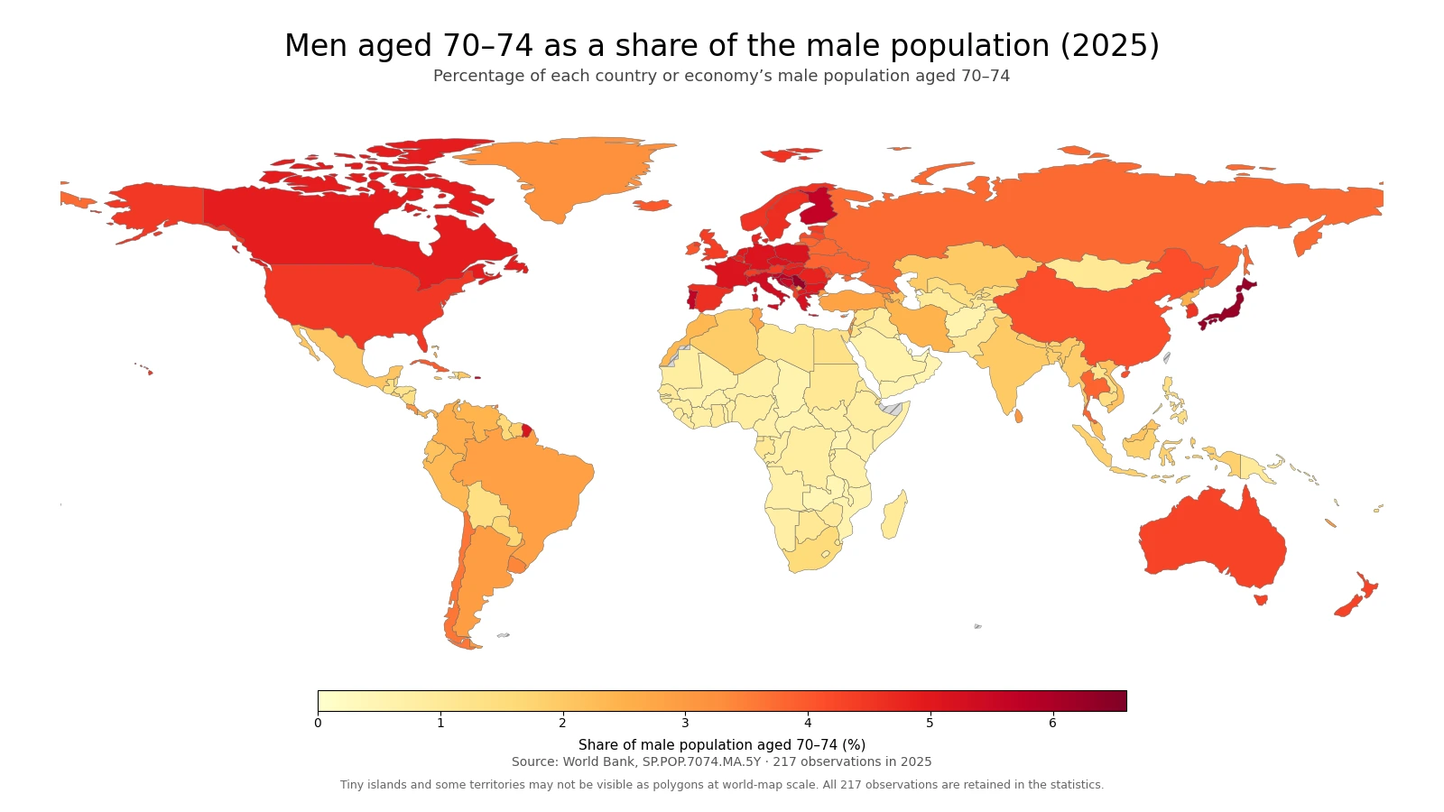
Table of Contents
The map concentrates higher values in Europe and parts of East Asia
The broadest visual pattern is a belt of relatively high values across much of Europe, with several East Asian economies also near the top. Monaco is at 6.51%, Hong Kong SAR, China at 6.48%, Serbia at 6.28%, and Japan at 6.27%. Croatia, Finland, Portugal, Slovenia, and Bosnia and Herzegovina are in the mid-to-high 5% range. Italy, France, and Germany are also above 5%, so the high-value area is not limited to one corner of the continent.
Several large developed economies sit above the world median without reaching the extreme top. Canada is 4.90%, the United States 4.47%, Australia 4.30%, and China 4.13%. Korea, Rep. is 4.54%, ranking 39th among the 217 observations. These percentages say that the 70–74 cohort occupies a relatively visible place in the male age structure, but they do not by themselves identify whether the main driver was a large birth cohort, improved survival, migration, or changes in younger age groups.
Low values form a different pattern. Qatar is at 0.33%, the United Arab Emirates at 0.38%, Oman at 0.53%, and Saudi Arabia at 0.66%. Zambia, Uganda, Mozambique, Chad, Malawi, Afghanistan, and the Central African Republic are also below 0.6% or only slightly above it. Similar percentages can arise from very different demographic systems: a very young population can make older cohorts small relative to the denominator, while large inflows of working-age men can also reduce the share of men in their early seventies.
The top-to-bottom gap is 6.19 percentage points
The distance between Monaco at 6.51% and Qatar at 0.33% is about 6.19 percentage points. The highest share is roughly 19.8 times the lowest. For a single five-year age band, that is a striking difference: in the highest observation, about one in fifteen males is aged 70–74, while in the lowest it is closer to one in three hundred.
| High rank | Country/economy | Share | Low rank | Country/economy | Share |
|---|---|---|---|---|---|
| 1 | Monaco | 6.51% | 1 | Qatar | 0.33% |
| 2 | Hong Kong SAR, China | 6.48% | 2 | United Arab Emirates | 0.38% |
| 3 | Serbia | 6.28% | 3 | Zambia | 0.46% |
| 4 | Japan | 6.27% | 4 | Uganda | 0.51% |
| 5 | Croatia | 5.79% | 5 | Oman | 0.53% |
| 6 | Finland | 5.66% | 6 | Mozambique | 0.55% |
| 7 | Portugal | 5.65% | 7 | Chad | 0.56% |
| 8 | Puerto Rico (US) | 5.63% | 8 | Malawi | 0.58% |
| 9 | Slovenia | 5.58% | 9 | Afghanistan | 0.58% |
| 10 | Bosnia and Herzegovina | 5.49% | 10 | Central African Republic | 0.59% |
The top ten mix sovereign countries, small territories, and separately reported economies. Monaco and Puerto Rico illustrate why the table should not be read as a ranking of headcounts: a small place can have a large percentage while containing far fewer men aged 70–74 than a populous country with a smaller share. The bottom ten likewise combine Gulf economies with several African countries. The common metric makes their age structures comparable, but it does not make the underlying demographic histories identical.
The median is 2.16%, and the middle half spans 1.01% to 4.02%
Across all 217 observations, the mean is 2.59% and the median is 2.16%. The first quartile is 1.01% and the third quartile is 4.02%, which places the middle half of reporting countries and economies between roughly 1.01% and 4.02%. The mean sits above the median because a smaller group of 5–6% observations pulls the upper tail upward, while a large number of countries remain below 2%.
| Share of males aged 70–74 | Countries/economies | Share of 217 |
|---|---|---|
| Below 0.5% | 3 | 1.4% |
| 0.5% to under 1% | 50 | 23.0% |
| 1% to under 2% | 51 | 23.5% |
| 2% to under 3% | 28 | 12.9% |
| 3% to under 4% | 30 | 13.8% |
| 4% to under 5% | 31 | 14.3% |
| 5% to under 6% | 20 | 9.2% |
| 6% or more | 4 | 1.8% |
The largest single band is 1% to under 2%, with 51 observations, followed almost immediately by 0.5% to under 1%, with 50. Together those two bands contain 101 of the 217 observations, or about 46.5% of the total. At the other end, only 24 observations are at 5% or higher, and just four exceed 6%. A 5% share is therefore not a routine global value for this age band; it marks an unusually large 70–74 cohort relative to the male population.
A low share can come from more than one demographic pathway
In countries with very young age structures, the denominator is dominated by children, teenagers, and younger adults, so men in their early seventies naturally make up a small fraction. That helps explain why several Sub-Saharan African countries are near the bottom. In some Gulf economies, however, the denominator can be enlarged by a very large working-age male population associated with international labour migration. The same 0.5% result can therefore describe very different population pyramids.
This is why cross-country rankings should be treated as descriptions rather than causal explanations. The percentage itself tells us how large the 70–74 male cohort is relative to all males. It cannot reveal, on its own, how much of the difference came from fertility seven decades ago, later-life mortality, outward migration, inward migration, or changes in younger cohorts. Those questions require age-specific population histories and migration or survival data, ideally over multiple decades.
The 2025 snapshot still carries the imprint of births in the early 1950s
A man aged 70 in 2025 was generally born in 1955, while a man aged 74 was generally born in 1951. The five-year cohort therefore links today’s age structure to demographic conditions from the early and mid-1950s. If those birth cohorts were large, some of that size can remain visible seventy years later. But the original cohort is reshaped continuously by mortality and migration, and its percentage is also affected by how large the rest of the male population becomes.
That denominator effect is important. Suppose two countries started with similar numbers of men from the 1951–1955 cohorts. If one later experienced rapid population growth among younger generations, the 70–74 group could become a smaller percentage even if its headcount remained substantial. If the other experienced low birth rates or younger-age population decline, the same cohort could occupy a larger percentage. A high share therefore does not automatically mean a very large absolute number of men in their early seventies.
One year cannot establish whether the share is rising or falling
The 2025 map is a cross-section. It cannot show a trend by itself. Five years later, many men who are 65–69 in 2025 will have moved into the 70–74 band, while the current 70–74 cohort will have moved into 75–79. Because the band is continuously replenished by a different birth cohort, the percentage can change even if broad demographic conditions seem stable. Determining direction requires a time series of the same indicator rather than a comparison of countries in one year.
The percentage can also move differently from the headcount. The number of men aged 70–74 might rise while their percentage falls if the total male population grows faster. The opposite can happen when the age-group headcount declines but the denominator shrinks even more. Any claim about growth, decline, or future pressure should therefore separate changes in the numerator from changes in the full male population.
Percentages and headcounts answer different practical questions
For comparing age structure across countries of very different sizes, the percentage is valuable because it reduces the simple effect of population scale. It helps answer, “How prominent is this age group within the male population?” It does not answer, “How many men aged 70–74 live there?” Monaco’s 6.51% is an age-structure statistic, not evidence that Monaco has more men in their early seventies than a much larger country with a 3% or 4% share.
Headcounts matter for planning the absolute scale of health care, long-term care, transport, housing, pensions, and other services. Percentages matter for understanding how those potential users fit into the broader population. Using both views avoids two common mistakes: assuming that a high share means a large number of people, or assuming that a large number in a populous country means the age group is unusually prominent in its population structure.
Small economies are easier to verify in the table than on a world map
World Bank country-level indicators include sovereign states as well as some separately reported economies and territories. Very small places such as Monaco, Hong Kong SAR, China, and Puerto Rico can be difficult to display as distinct polygons at a global scale. They are still included in the rankings and all summary statistics. A world map is best for seeing broad regional clustering, while tables and the underlying data are more reliable for checking a tiny territory’s exact value.
The low-resolution boundary layer used for the map directly matches 170 of the 217 observations by ISO3 code after standard boundary fixes. The statistical analysis uses all 217 observations. Grey map areas should not be interpreted as zero; they indicate a boundary without a directly joined observation or a geography that is not separately represented in the display layer. This separation between statistical coverage and display geometry keeps missing map shapes from becoming false zeroes.
Data source and calculation
The analysis uses the 2025 observations from World Bank API indicator SP.POP.7074.MA.5Y. The World Bank indicator page provides the series definition and country-level history. The unit is the percentage of the male population aged 70–74. Aggregate regional and income-group rows are excluded, leaving 217 country and economy observations for 2025.
Every one of the 217 rows has a 2025 value, so no missing observation was filled with zero and no earlier-year value was substituted. The minimum, maximum, rankings, mean, median, quartiles, and distribution bands were calculated from the same set of 217 values. The map uses a separate low-resolution world boundary layer only for display; all statistical statements in the text are based on the full World Bank observation set.
Frequently asked questions
What does a 4% share of men aged 70–74 mean?
It means about four of every 100 males in that country or economy are aged 70–74. It does not mean that the age group is 4% of the total population.
Does a higher 70–74 male share automatically mean a more aged population?
No. The indicator covers only one five-year age band. Broader measures such as the total 65-plus share, median age, or life expectancy are needed to describe population ageing more fully.
Why can Gulf economies and some African countries both have low shares?
Low shares can arise through different demographic pathways. A very young population can enlarge younger age groups, while large inflows of working-age men can also enlarge the male denominator.
Related Maps
Green Map creates custom-edited map images using open geographic data sources such as geoBoundaries, Natural Earth, OpenStreetMap, and government open data.
These maps are edited visual materials, not raw data files, and are provided for education, documents, presentations, and graphic reference.