The youngest female age group occupies very different shares of national female populations in 2025. Across 217 World Bank observations for indicator SP.POP.0004.FE.5Y, Chad records the highest share at 18.02%, while the lowest observation is 2.35%. The median is 7.09%. In other words, the same five-year cohort can account for nearly one in five females in one reporting economy and only a little more than two in every 100 in another.
The denominator matters. This indicator is the number of girls ages 0–4 expressed as a percentage of the total female population, not of the total population. It is also not a count of births or a headcount of young children. A large country can have a low percentage but still contain far more girls ages 0–4 than a small economy with a high percentage. The map and tables therefore describe age structure rather than population size.
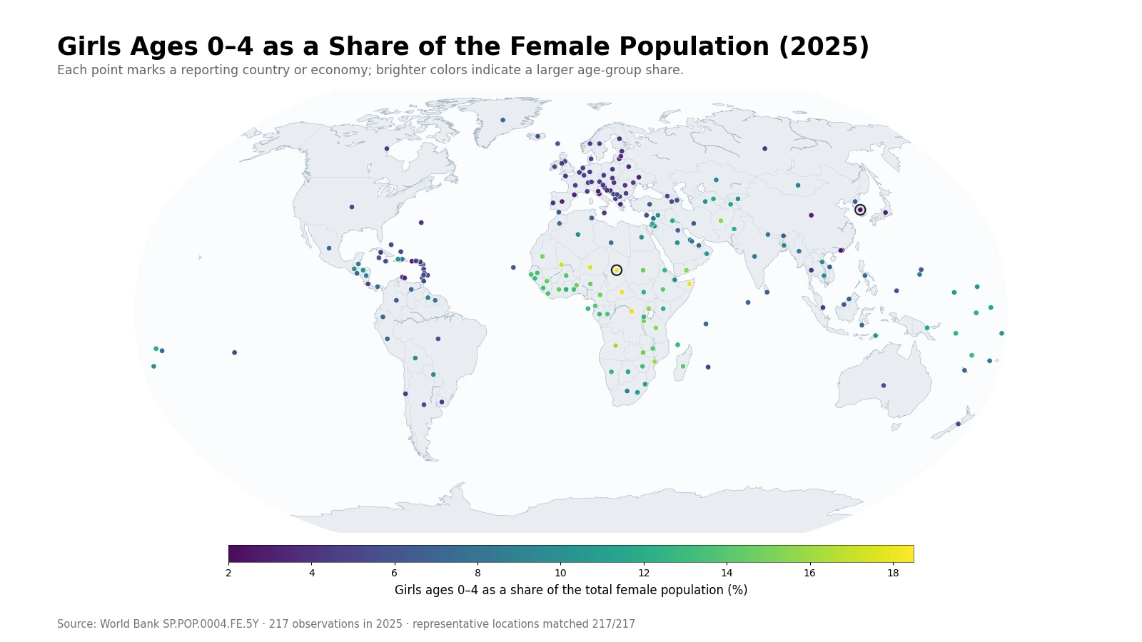
Table of Contents
The highest shares form a broad belt across parts of Africa
The top ten observations are Chad at 18.02%, the Central African Republic at 17.99%, Somalia at 17.97%, the Democratic Republic of the Congo at 17.76%, Niger at 17.57%, Mali at 17.21%, Angola at 16.29%, Mozambique at 16.00%, Uganda at 15.61%, and Tanzania at 15.59%. These are not isolated high points. Together they create a broad cluster from the Sahel through Central Africa and into East and southeastern Africa.
Because ages 0–4 are close to the present in demographic time, recent birth volume is an important part of the story. But the map is not a fertility-rate map. The size of the cohort in 2025 also reflects survival through early childhood, migration, and the size of every other female age group that makes up the denominator. A high share is best read as a thick youngest layer in the current female age structure, not as proof of one demographic cause.
This age share is related to recent births but is not a fertility measure
Girls who are 0–4 in 2025 were born during roughly the previous five years. If birth cohorts have recently become larger, the 0–4 band can become more prominent. If births have fallen, the youngest band may shrink relative to older female age groups. That relationship makes the indicator useful for spotting recent demographic change, but fertility indicators such as the total fertility rate or age-specific fertility rates use different numerators and denominators and should not be substituted for this measure.
Early-childhood survival and migration can also alter the observed share. Two places with similar numbers of recent female births can arrive at different 0–4 shares if survival differs or if adult women migrate in or out in large numbers. Family migration can move young children directly, while migration among older women changes the denominator. Those mechanisms are why the indicator is strongest as a description of age composition rather than a causal diagnosis.
Low shares appear in East Asia, Southern Europe, and several other economies
At the lower end, the 2.35% minimum is followed by Hong Kong at 2.50%, Puerto Rico at 2.74%, Japan at 3.03%, Ukraine at 3.10%, San Marino at 3.10%, Macao at 3.15%, Andorra at 3.17%, Italy at 3.21%, and China at 3.25%. Several East Asian and Southern European economies appear in this group, but the presence of Puerto Rico and Ukraine shows that low values are not confined to one geographic region.
A low percentage should not be read as “almost no young children.” China, for example, has a very large population, so a small age share can still correspond to a substantial headcount. Conversely, a small island or microstate can have a high percentage but relatively few girls ages 0–4 in absolute terms. Planning for childcare, immunization, pediatric care, or preschool places requires headcounts and local distribution in addition to the share shown here.
The top-to-bottom spread is 15.67 percentage points
The 217 observations range from 2.35% to 18.02%, a difference of 15.67 percentage points. Chad is about 7.7 times the lowest observation on this specific ratio. That comparison does not mean Chad has 7.7 times as many young girls. It means the youngest five-year cohort occupies a much larger portion of its female age structure.
| Top rank | Country or economy | Share | Bottom rank | Country or economy | Share |
|---|---|---|---|---|---|
| 1 | Chad | 18.02% | 1 | Korea, Rep. | 2.35% |
| 2 | Central African Republic | 17.99% | 2 | Hong Kong SAR, China | 2.50% |
| 3 | Somalia, Fed. Rep. | 17.97% | 3 | Puerto Rico (US) | 2.74% |
| 4 | Congo, Dem. Rep. | 17.76% | 4 | Japan | 3.03% |
| 5 | Niger | 17.57% | 5 | Ukraine | 3.10% |
| 6 | Mali | 17.21% | 6 | San Marino | 3.10% |
| 7 | Angola | 16.29% | 7 | Macao SAR, China | 3.15% |
| 8 | Mozambique | 16.00% | 8 | Andorra | 3.17% |
| 9 | Uganda | 15.61% | 9 | Italy | 3.21% |
| 10 | Tanzania | 15.59% | 10 | China | 3.25% |
The ranking preserves the World Bank reporting units, including territories and separately reported economies. That matters because age shares can be especially sensitive in small populations. The table is useful for identifying structural extremes, while population headcounts are the appropriate measure for comparing the number of girls who actually live in each place.
The middle half lies between 4.81% and 11.21%
The mean across all observations is 8.16%, while the median is 7.09%. The first quartile is 4.81% and the third quartile is 11.21%. Half of the reporting economies therefore fall within a fairly wide band of roughly 6.40 percentage points. The mean sits above the median because a substantial group of observations in the 12–18% range pulls the upper tail upward.
| Age 0–4 female share band | Countries and economies | Share of 217 observations |
|---|---|---|
| Below 5% | 60 | 27.6% |
| 5% to under 7% | 47 | 21.7% |
| 7% to under 9% | 27 | 12.4% |
| 9% to under 12% | 36 | 16.6% |
| 12% or more | 47 | 21.7% |
There are 60 observations below 5%, 47 from 5% to under 7%, 27 from 7% to under 9%, 36 from 9% to under 12%, and 47 at 12% or above. The large counts at both ends show why a single global average is not enough to describe the youngest female cohort. The map adds the geographic pattern, while the distribution table shows how many economies occupy each part of the range.
Comparing ages 0–4 with ages 5–9 can reveal the direction of recent cohort change
The 0–4 band is more informative when it is placed next to the 5–9 band. If the younger cohort is markedly smaller, that can be a clue that recent birth cohorts have contracted relative to the previous five years. If it is larger, the youngest layer may have thickened. This comparison is useful for demographic screening because adjacent age groups are close enough in time to show changes that a broad child-population measure can hide.
Even that comparison does not isolate a fertility trend by itself. The two cohorts were born in different periods and have experienced different survival and migration histories. A firm explanation requires age-specific population data across several years together with births, deaths, and migration. The value of the 0–4 share is that it tells us where the youngest female cohort is relatively prominent and where follow-up analysis may be most informative.
Gulf economies show substantial variation within one region
The Gulf is a useful example of within-region contrast. Qatar is at 8.74%, the United Arab Emirates at 7.30%, Kuwait at 6.77%, Bahrain at 7.68%, Oman at 10.33%, and Saudi Arabia at 9.70%. The spread is large enough that a regional label alone cannot describe the female age structure. Differences in recent births, family migration, the size of working-age female populations, and other age groups can all influence the ratio.
The indicator cannot quantify how much each mechanism contributes. A higher value in Oman than in Kuwait, for example, is an observed structural difference, not evidence for a specific migration or fertility explanation. Pairing the share with an age pyramid, female headcounts by five-year band, and net migration data is a better way to investigate the underlying causes.
A representative-point map keeps small reporting economies visible
A world choropleth can make tiny islands and city-sized economies almost disappear. The visualization therefore places all 217 observations at representative geographic points. Color encodes the 0–4 share, while point size is kept comparable and does not represent population. This design preserves statistical coverage for the Caribbean, Pacific islands, and other small reporting units while still making continental clusters visible.
Coordinates are used only for placement. They do not affect the rankings, mean, median, quartiles, or band counts. In dense regions, several markers can overlap at world scale, so the tables should be used for precise values. The map is primarily a pattern-finding tool that helps distinguish broad clusters from isolated outliers.
Data source and calculation
The analysis uses the 2025 observations from the World Bank API series SP.POP.0004.FE.5Y. The World Bank indicator page provides the official series definition. The unit is girls ages 0–4 as a percentage of the total female population.
All 217 country-and-economy rows have a reported 2025 value. No missing observation is replaced with zero and no earlier year is substituted. Minimum, maximum, mean, median, quartiles, rankings, range, and percentage-band counts are calculated directly from those 217 values. Because this is a one-year cross-section, it describes the current structure but does not establish whether a country’s share is rising or falling.
Frequently Asked Questions
What does a 10% value mean for this indicator?
It means about 10 out of every 100 females in that reporting economy are ages 0–4. It does not mean 10% of the total population are girls in this age group.
Does a high age 0–4 female share always mean high fertility?
No. Recent births matter, but early-childhood survival, migration, and the size of other female age groups also affect the percentage. Fertility should be evaluated with dedicated fertility indicators.
Can this share alone determine childcare or pediatric service demand?
No. Service planning also needs headcounts of young children, local geographic distribution, boys as well as girls, and information about the existing supply of services.
Related Maps
Green Map creates custom-edited map images using open geographic data sources such as geoBoundaries, Natural Earth, OpenStreetMap, and government open data.
These maps are edited visual materials, not raw data files, and are provided for education, documents, presentations, and graphic reference.