In 2025, women aged 60–64 make up very different shares of the female population across the world. The World Bank series SP.POP.6064.FE.5Y provides 217 country-and-economy observations for the year, ranging from about 1.4% to 8.4%. A value of 6% means that roughly six of every 100 females in that reporting economy are between ages 60 and 64. It is not the share of the total population and it is not the share of all women aged 60 or older.
This five-year band is useful because it sits immediately before the conventional 65+ threshold used in many ageing statistics. Most women in the 2025 group were born around 1961–1965. The percentage therefore carries the imprint of cohort size, survival to the early sixties, migration, and the size of younger and older female age groups that make up the denominator.
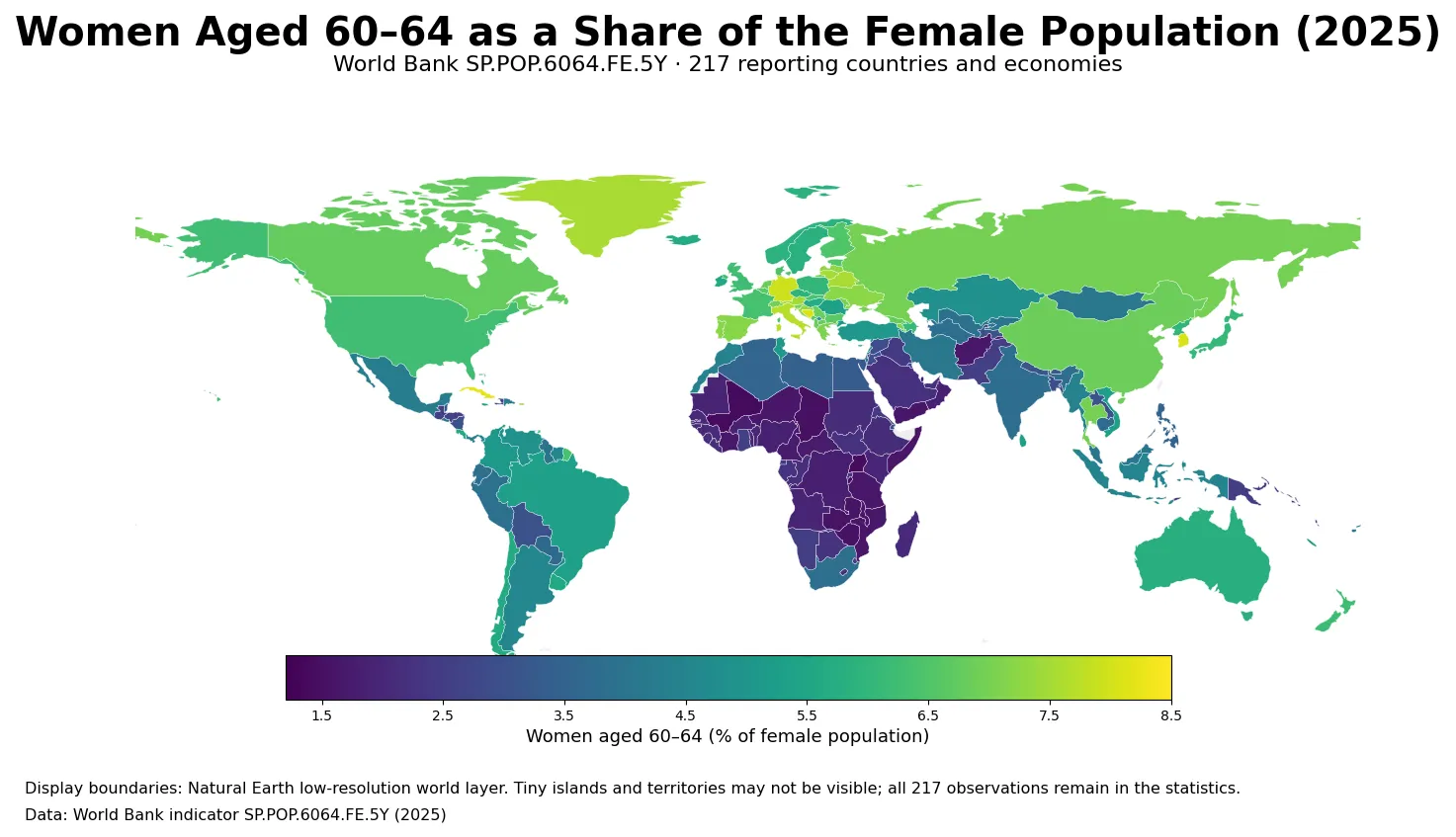
Table of Contents
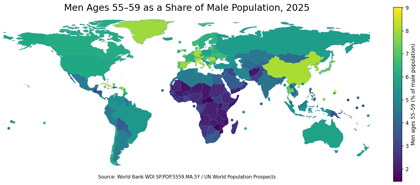
The map shows a strong contrast between older and younger age structures
Much of Europe appears in the upper half of the color scale, while several economies in East Asia and the Caribbean also stand out. Across a large part of Sub-Saharan Africa, the 60–64 female share is much lower. The pattern is consistent with very different age compositions, but the indicator does not identify a single cause. Historical birth cohorts, age-selective migration and survival can all change the size of the numerator, while growth in younger female cohorts can change the denominator.
That distinction matters when interpreting neighboring countries. Two economies can have similar current fertility or similar total population growth and still show different 60–64 shares because the women now reaching their early sixties were born roughly six decades ago. The map is therefore best read as a cohort-composition snapshot rather than a one-number summary of present-day demographic conditions.
Only six reporting economies are at or above 8%
The highest 2025 observation is Hong Kong SAR, China at 8.36%. The lowest is Mali at 1.38%, producing a spread of about 6.98 percentage points. The upper end includes a mix of large countries, small states and separately reported territories. The lower end is dominated by countries with much younger female age structures.
| High rank | Country or economy | Share | Low rank | Country or economy | Share |
|---|---|---|---|---|---|
| 1 | Hong Kong SAR, China | 8.36% | 1 | Mali | 1.38% |
| 2 | Cuba | 8.22% | 2 | Burundi | 1.40% |
| 3 | San Marino | 8.19% | 3 | Uganda | 1.43% |
| 4 | Bosnia and Herzegovina | 8.10% | 4 | Chad | 1.51% |
| 5 | Korea, Rep. | 8.07% | 5 | Zimbabwe | 1.52% |
| 6 | Aruba | 8.01% | 6 | Zambia | 1.55% |
| 7 | Virgin Islands (U.S.) | 7.98% | 7 | Tanzania | 1.60% |
| 8 | Bermuda | 7.97% | 8 | Niger | 1.62% |
| 9 | Germany | 7.96% | 9 | Somalia, Fed. Rep. | 1.62% |
| 10 | Sint Maarten (Dutch part) | 7.88% | 10 | Yemen, Rep. | 1.63% |
The table is a ranking of proportions, not headcounts. San Marino or Aruba can rank highly in percentage terms while containing far fewer women aged 60–64 than a populous country with a lower percentage. For service planning or market sizing, the absolute number of women in the age group is a separate quantity that should be examined alongside the share.
The global distribution is broad rather than tightly centered
Across all 217 observations, the median is 4.55% and the mean is 4.59%. The first quartile is 2.54% and the third quartile is 6.40%, so the middle half of reporting economies spans roughly 2.54% to 6.40%. That is a wide interquartile range for a single five-year band, which is why the world map shows substantial color variation rather than one dominant middle shade.
| Share of female population | Number of economies | Share of 217 observations |
|---|---|---|
| Below 2% | 25 | 11.5% |
| 2% to under 3% | 41 | 18.9% |
| 3% to under 4% | 26 | 12.0% |
| 4% to under 5% | 21 | 9.7% |
| 5% to under 6% | 39 | 18.0% |
| 6% to under 7% | 31 | 14.3% |
| 7% to under 8% | 28 | 12.9% |
| 8% or more | 6 | 2.8% |
The most populated band is 2% to under 3%, with 41 economies, followed closely by 5% to under 6%, with 39. Twenty-eight observations fall between 7% and 8%, while six are at 8% or above. The distribution therefore does not form a single narrow cluster. It reflects the coexistence of countries where early-sixties women remain a small cohort and countries where they represent a much thicker slice of the female population.
A high 60–64 share is not the same as a high 65+ share
The indicator is easy to confuse with a general ageing measure because the age band sits near retirement and older-age thresholds. But it answers a narrower question. An economy could have a large 60–64 cohort and a comparatively smaller 75+ population, or the reverse. The five-year share tells us where one cohort sits within the female age structure; it does not summarize the entire older population.
For broader ageing analysis, combine this measure with the female 65+ share, median age, life expectancy and neighboring five-year age bands. Those indicators help distinguish a temporary cohort bulge from a consistently older population structure. The 60–64 series is especially useful when ages 55–59 and 65–69 are available because the three bands show whether the early-sixties group is a local peak or part of a wider plateau.
The women-only denominator changes the interpretation
Every percentage here is calculated within the female population. Male age composition does not enter the denominator. Differences in survival and migration by sex can therefore produce a female 60–64 share that is not identical to the male share in the same economy. The indicator itself, however, cannot tell us how much of that difference comes from mortality, migration or past births.
This also means that the percentage should not be interpreted as the fraction of all residents who are women aged 60–64. To answer that question, a total-population denominator or sex-specific headcounts are needed. Keeping the denominator explicit prevents a common reading error when comparing demographic percentages.
The 2025 cross-section follows a cohort born in the early 1960s
Most members of the 2025 age band were born between roughly 1961 and 1965. Five years later, the same cohort will mostly occupy the 65–69 group. The measure therefore moves with the life course: a country can see its 60–64 share rise or fall simply because differently sized cohorts are entering and leaving the band. The map is not a fixed national characteristic.
A single-year value is also not evidence of a trend. To determine whether the share is increasing, decreasing or stable, the same indicator must be compared across multiple years. Present-day fertility cannot directly explain the 2025 value either, because today’s births will not enter this age group for six decades. Historical cohort size and subsequent demographic processes are much more relevant to the current cross-section.
Small territories require extra context
World Bank country series include separately reported economies and territories as well as sovereign states. That is why Aruba, Bermuda, the U.S. Virgin Islands and Sint Maarten can appear beside much larger countries. Their observations are legitimate, but percentages in small populations can move more visibly when a cohort or migration flow is modest in absolute terms.
The display map uses Natural Earth low-resolution geometry and links World Bank values to 170 of its 177 country polygons after standard ISO3 repairs. Very small islands and territories may be absent from the geometry or effectively invisible at global scale. None of those observations are removed from the statistics: the ranking, quartiles, range and distribution bands all use the full set of 217 World Bank rows.
Source and calculation
The analysis uses 2025 observations from the World Bank API for indicator SP.POP.6064.FE.5Y. The World Bank indicator page provides the official series definition and country-level history. Aggregate regions and income groups are excluded, leaving 217 reporting countries and economies with a 2025 value. The unit is women aged 60–64 as a percentage of the total female population.
No missing record is converted to zero and no earlier year is substituted. The maximum, minimum, mean, median, quartiles, rankings and distribution bands are calculated directly from the 217 reported values. Cartographic coverage is smaller than statistical coverage only because a low-resolution world boundary layer cannot visibly represent every small territory.
Frequently Asked Questions
What does a 6% value mean in this indicator?
It means about six of every 100 females in that reporting economy are aged 60–64. It is not 6% of the total population.
Does a high 60–64 female share automatically mean an economy has a high ageing rate?
No. This measure covers only one five-year band. Broader ageing measures such as the 65+ share and median age are needed for a fuller assessment.
Can the 2025 data show whether the 60–64 female share is rising?
No. A one-year cross-section cannot establish a trend. The same indicator must be compared across multiple years.
Related Maps
Green Map creates custom-edited map images using open geographic data sources such as geoBoundaries, Natural Earth, OpenStreetMap, and government open data.
These maps are edited visual materials, not raw data files, and are provided for education, documents, presentations, and graphic reference.