The share of men ages 55–59 varies sharply across the world even when every observation is aligned to the same year. In the 2025 World Bank data, the 217 country and separately reported area values have a median of 5.11% and an unweighted mean of 4.87%. The highest observation is 9.03% and the lowest is 1.46%, so this single five-year age band occupies very different amounts of the male population from one place to another.
World Bank series SP.POP.5559.MA.5Y is formally named Population ages 55-59, male (% of male population). The numerator is the number of men ages 55 through 59 and the denominator is the male population of all ages. A value of 7% therefore means that about seven of every 100 males are in that five-year age group. It is not the share of the total population, and it is not the share of men age 55 and older.
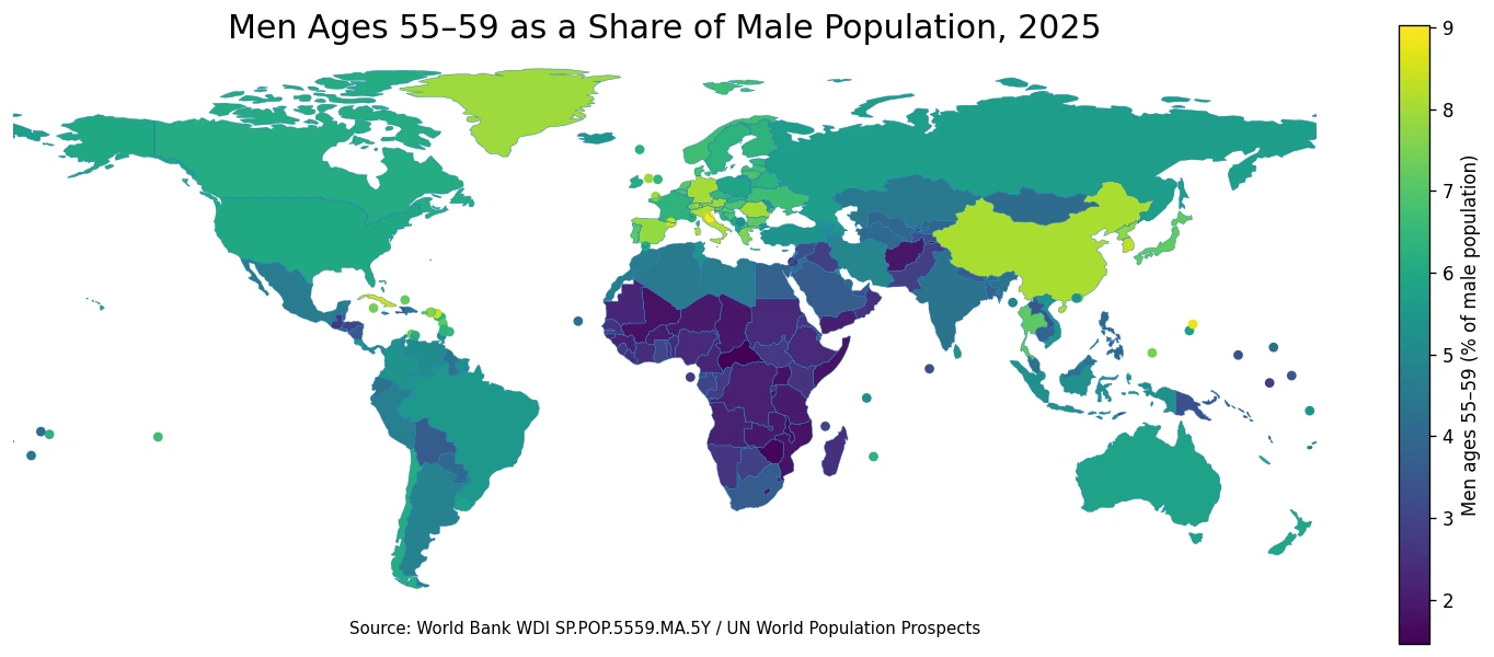
Table of Contents
What this age-band share measures
This is a composition measure rather than a headcount. A populous country can have millions of men ages 55–59 and still record only a middling percentage if its male population is much larger at other ages. A small territory can show a high percentage with a modest number of people. Anyone trying to compare the absolute number of men approaching their sixties would need a headcount series instead; this indicator is designed to show how large the 55–59 group is relative to the rest of the male population.
The narrow five-year band also matters. A large 55–59 share does not automatically mean that the 65+ population is large, because the size of the 60–64, 65–69 and older groups may be quite different. A low share does not automatically imply low survival to older ages either. It can also occur where younger cohorts are much larger, where migration has changed the adult age structure, or where the birth cohort that is now 55–59 was comparatively small.
The World Bank identifies the underlying source for this series as the United Nations Population Division’s World Population Prospects. That framework combines demographic evidence into age- and sex-specific population estimates and projections that can be compared on a common year. The broad differences are useful for understanding population structure, while tiny decimal differences should not be treated as a scorecard for policy performance or health outcomes.
Most 2025 observations fall between 2% and 8%
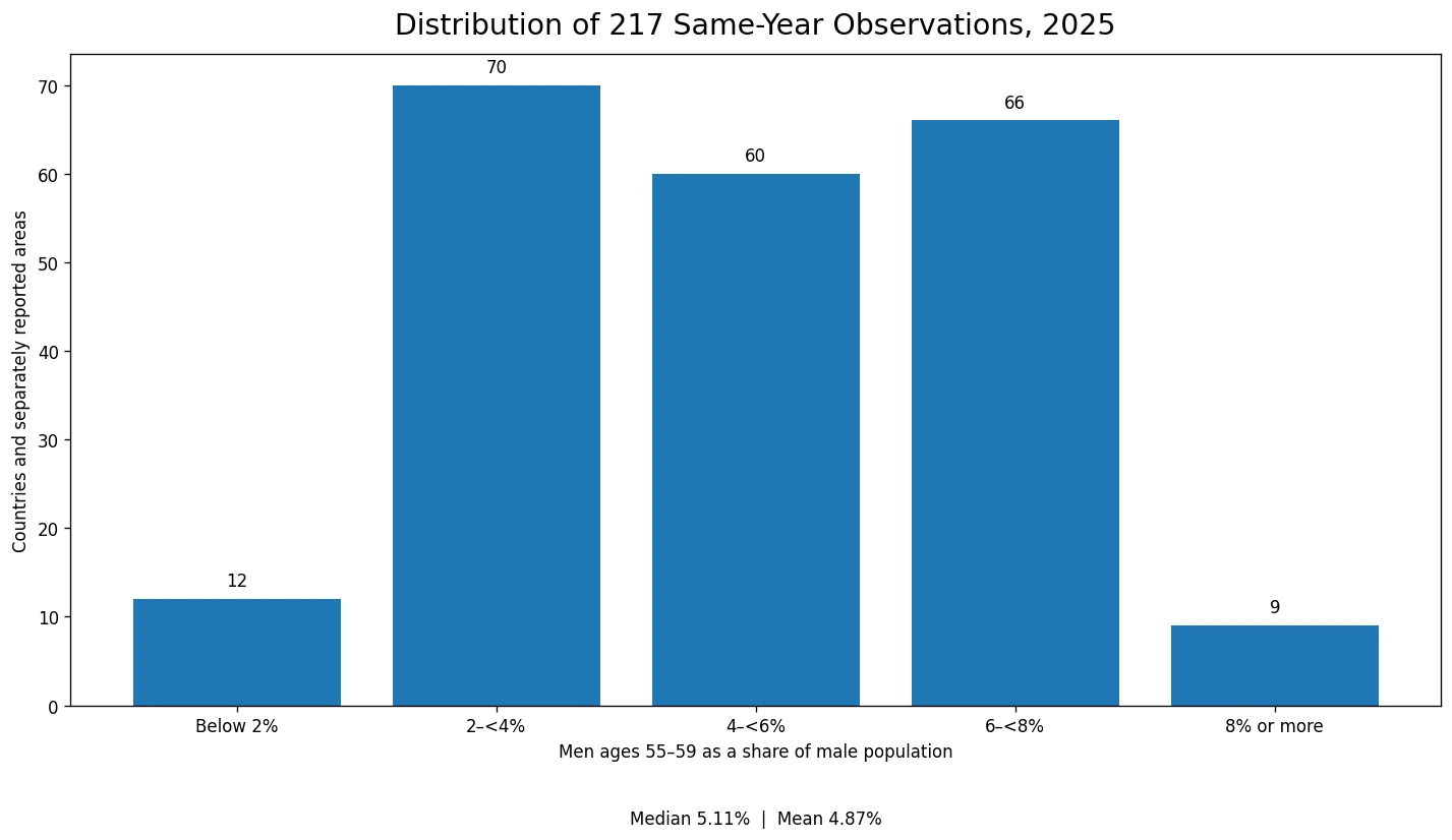
Across the 217 observations, the first quartile is 3.13%, the median is 5.11% and the third quartile is 6.40%. In other words, the middle half of the reported countries and areas lies between roughly 3.13% and 6.40%. The simple mean, 4.87%, is slightly below the median because a sizeable group of observations sits near the low end of the distribution. These summary statistics give every country or area the same weight; they are not a population-weighted global male age share.
| 2025 share of male population | Countries and separately reported areas |
|---|---|
| Below 2% | 12 |
| 2–<4% | 70 |
| 4–<6% | 60 |
| 6–<8% | 66 |
| 8% or more | 9 |
The 2–<4% band contains 70 observations, while 66 fall between 6% and 8% and 60 fall between 4% and 6%. Only 12 are below 2%, and only 9 reach 8% or more. The result is not a single tight cluster around one global norm. Instead, the common range spreads across most of the 2% to 8% interval, with relatively few observations at the two extremes.
Higher shares form visible clusters across much of Europe and parts of East Asia
The map shows a broad concentration of higher values across Europe. Italy is 8.16%, Germany 8.01%, Spain 7.84% and Austria 7.85%. Several other European countries sit in the 6–8% range. In East Asia, China is 8.06% and Japan 7.18%. Those figures tell us that the cohort now aged 55–59 occupies a relatively large slice of the male population, but they do not identify a single cause. Past birth cohort size, survival, migration and the size of surrounding age groups all contribute to today’s age structure.
Several Caribbean and small-island observations also stand near the upper end. Cuba is 8.52%, and a number of separately reported small areas are in the 7–8% range or above. Percentages in small populations need particular care: a high share does not imply a large absolute number of men ages 55–59. A relatively small cohort can represent a substantial percentage when the total male population is small or unevenly distributed across age groups.
At the lower end, many observations in central, eastern and southern Africa are close to 2% or below. The Central African Republic is 1.46%, Malawi 1.67%, Burundi 1.74% and Uganda 1.76%. Younger age structures can make a five-year group in the late fifties a smaller fraction of the total male population. Still, the indicator itself does not contain fertility, mortality or migration variables, so the map should be read as a description of the age structure rather than a complete explanation of why that structure exists.
The highest and lowest observations are separated by more than seven percentage points
The five highest 2025 observations are San Marino at 9.03%, the Northern Mariana Islands at 8.79%, Cuba at 8.52%, Sint Maarten (Dutch part) at 8.38% and Andorra at 8.38%. In practical terms, roughly eight to nine of every 100 males in those observations are in the 55–59 age band. Several of these are small populations, which is a reminder that a percentage ranking is not an absolute population ranking.
| Higher observation | 2025 share | Lower observation | 2025 share |
|---|---|---|---|
| San Marino | 9.03% | Central African Republic | 1.46% |
| Northern Mariana Islands | 8.79% | Zimbabwe | 1.56% |
| Cuba | 8.52% | Malawi | 1.67% |
| Sint Maarten (Dutch part) | 8.38% | Burundi | 1.74% |
| Andorra | 8.38% | Uganda | 1.76% |
The five lowest observations are the Central African Republic at 1.46%, Zimbabwe at 1.56%, Malawi at 1.67%, Burundi at 1.74% and Uganda at 1.76%. The gap between the maximum and minimum is about 7.57 percentage points, and the maximum is a little more than six times the minimum. That is a large difference in age composition, but it is not a ranking of living standards, demographic “success,” or health-system quality.
Why a 55–59 share can rise or fall
A five-year age share is shaped by several demographic processes that have accumulated over decades. If births were especially numerous about 55 to 59 years earlier, that large cohort can still be visible in the 2025 age structure. If later cohorts expanded rapidly, the same number of people ages 55–59 may account for a smaller percentage because the denominator grew. Differences in survival also change the number of people who remain in the cohort as it approaches age 60.
Migration can reshape the denominator as well. Places that attract large numbers of younger adult men may have a smaller 55–59 share because the male population is enlarged at younger working ages. Emigration from particular cohorts can work in the other direction. None of those mechanisms can be measured from this one indicator alone. A causal analysis would need age-specific population counts, fertility histories, survival or mortality measures, and migration data for the same population.
The male-only denominator is another reason not to generalize too far. The corresponding female age share is a separate series and can differ because survival and migration patterns are not identical by sex. This article therefore keeps the interpretation narrow: it compares the proportion of the male population that falls within ages 55–59 in 2025.
This is not the same as an old-age dependency ratio
People ages 55–59 are below the conventional 65+ threshold used in most old-age dependency measures. A large cohort in its late fifties can be relevant for understanding how the age structure may shift in the next decade, but it does not directly show the number of retirees, pension beneficiaries, or older dependents today. The old-age dependency ratio compares people age 65+ with the population ages 15–64, while this series uses all males as the denominator and isolates just one five-year band.
The policy implications are therefore not automatic. A high 55–59 share does not by itself prove that labor shortages, pension costs or health spending will be high. Employment at older ages, retirement rules, productivity, migration, health, household structure and public programs all matter. The map is most useful as a demographic starting point: it shows where the male age profile has a particularly large or small cohort approaching age 60.
Same-year coverage removes a major comparability problem
All 217 observations used here are dated 2025. That consistency matters because global datasets often mix the latest available year for each country, which can place a 2021 value next to a 2025 value and make a ranking look more precise than it is. In this case, the median, mean, quartiles, distribution bands and country comparisons are all based on the same calendar year.
For mapping, 166 observations could be joined directly to country polygons. The remaining 51 countries and separately reported areas are shown as point markers because a distinct polygon is unavailable or unreliable at the low-resolution world scale used for the graphic. Those points are not missing data: they carry the same 2025 percentage values and use the same legend. The statistical summaries use all 217 observations.
Data source and calculation method
Country values come from World Bank World Development Indicators series SP.POP.5559.MA.5Y. The World Bank identifies the United Nations Population Division’s World Population Prospects as the source. The official definition is the male population ages 55–59 expressed as a percentage of the total male population.
The median, mean, quartiles and band counts were calculated directly from the 217 values dated 2025. The 4.87% mean is an unweighted average across country and area rows, not a world population-weighted estimate. No missing observations were filled with zero, and the map uses the same percentage unit as the source series.
Frequently Asked Questions
What does a 55–59 male population share of 5% mean?
It means about five of every 100 males in that country or area are ages 55 through 59. It is not the share of the total population and not the share of all men age 55 or older.
Are all 217 observations from 2025?
Yes. Every observation used in the comparison is dated 2025, and the source table has no missing value among the 217 retained country and area rows.
Does a high 55–59 share automatically mean a country is more aged?
No. One five-year age band cannot describe the full age structure. The size of older and younger groups, past births, survival and migration also matter.
Is 4.87% the population-weighted global share of men ages 55–59?
No. It is the simple unweighted mean of the 217 country and area percentages. A population-weighted global share would require aggregating male population counts.
Related Articles
These 2025 population-structure comparisons answer closely related questions with different age denominators.
- Old-Age Dependency Ratio by Country – 2025
- Age Dependency Ratio by Country – 2025
- Young Age Dependency Ratio by Country – 2025
Green Map creates custom-edited map images using open geographic data sources such as geoBoundaries, Natural Earth, OpenStreetMap, and government open data.
These maps are edited visual materials, not raw data files, and are provided for education, documents, presentations, and graphic reference.