The female population share aged 35–39 varies widely across the 217 countries and economies with a 2025 World Bank observation. Qatar records the highest value at 12.92%, while the Central African Republic is lowest at 4.18%. The gap of 8.74 percentage points is substantial for a single five-year age band and immediately shows how differently female age structures can be shaped across places.
The denominator matters. This series measures women aged 35–39 as a percentage of the total female population, not as a percentage of all residents and not as a headcount. A smaller economy can therefore post a very high share while containing far fewer women in this age group than a large country with a lower percentage. The analysis below keeps that distinction visible throughout.
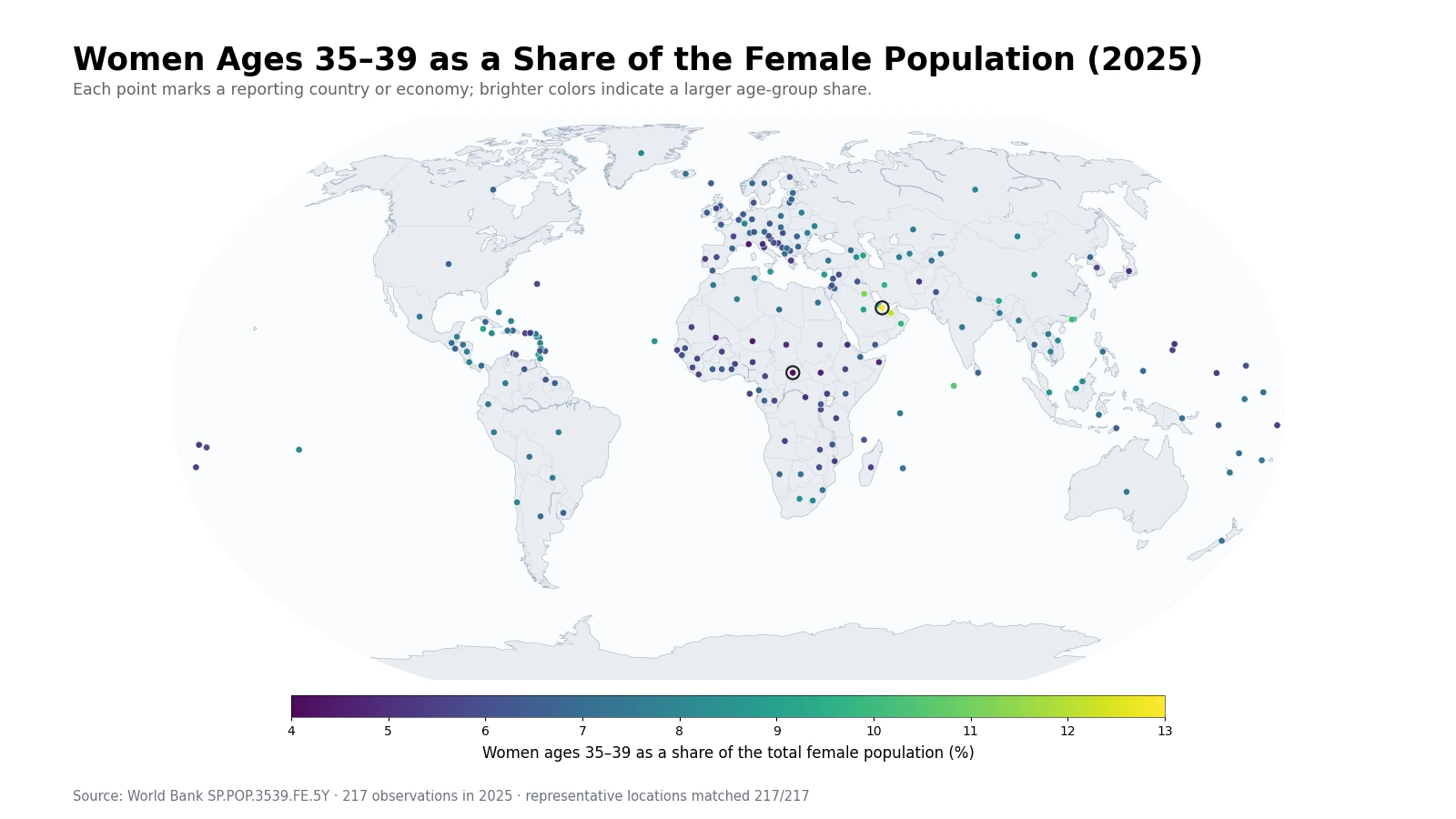
Table of Contents
The strongest concentration appears around the Gulf
The most coherent high-value cluster is in the Gulf. Qatar leads at 12.92%, the United Arab Emirates follows at 12.11%, and Kuwait is third at 11.17%. Bahrain, Oman, and Saudi Arabia also sit well above the global median. The fact that several neighboring reporting economies occupy the upper tail at the same time makes the regional pattern more informative than any one maximum on its own.
The indicator itself, however, does not tell us why the cluster exists. A 35–39 share can be influenced by the size of the birth cohort decades earlier, subsequent survival, international migration, and the size of younger and older female cohorts that form the denominator. Explaining the Gulf pattern would require those additional series; the present map identifies the pattern but does not assign a cause to it.
High values also appear outside the Gulf
The upper tail is geographically mixed. Maldives is at 10.52%, Macao SAR is at 10.23%, Iran is at 9.75%, the British Virgin Islands is at 9.46%, and Bhutan is at 9.21%. These places differ greatly in population size and demographic context, yet the age-group share places them in a similar statistical range. That is precisely why a percentage is useful for structural comparison and insufficient for judging scale.
A ranking by percentage should never be read as a ranking by the number of women aged 35–39. To answer a headcount question, the female population base and the absolute size of the age group are required. The percentage instead answers a composition question: how much space does this cohort occupy inside the female age profile of each reporting economy?
Low shares can come from very different age structures
The lower end contains two very different demographic profiles. The Central African Republic, Niger, South Sudan, Somalia, the Democratic Republic of the Congo, Mali, and Chad all have values around 4–5%. In a population with a very large number of girls and young women, a mid-adult cohort can represent a relatively small fraction of all females even if its headcount is sizable.
Monaco, San Marino, and Japan also appear near the lower end, but a low 35–39 share in an older population can arise for the opposite compositional reason: older female age groups take up more of the denominator. The same percentage can therefore describe fundamentally different age pyramids. It is safer to treat the indicator as one slice of the age distribution rather than as a shortcut label for “young” or “old” populations.
The top-to-bottom gap reaches 8.74 percentage points
Across all observations, the range runs from 4.18% to 12.92%. Qatar is about 3.1 times the Central African Republic on this particular share, although that ratio should not be confused with a difference in population size. A five-year cohort occupying roughly one eighth of the female population in one economy and about one twenty-fourth in another is a meaningful structural contrast.
| Top | Country or economy | Share | Bottom | Country or economy | Share |
|---|---|---|---|---|---|
| 1 | Qatar | 12.92% | 1 | Central African Republic | 4.18% |
| 2 | United Arab Emirates | 12.11% | 2 | Monaco | 4.46% |
| 3 | Kuwait | 11.17% | 3 | Niger | 4.53% |
| 4 | Maldives | 10.52% | 4 | South Sudan | 4.62% |
| 5 | Macao SAR, China | 10.23% | 5 | Somalia, Fed. Rep. | 4.78% |
| 6 | Bahrain | 9.97% | 6 | Congo, Dem. Rep. | 4.94% |
| 7 | Oman | 9.85% | 7 | Mali | 4.95% |
| 8 | Iran, Islamic Rep. | 9.75% | 8 | Chad | 4.95% |
| 9 | British Virgin Islands | 9.46% | 9 | San Marino | 4.97% |
| 10 | Bhutan | 9.21% | 10 | Eritrea | 4.98% |
The World Bank dataset includes sovereign states as well as separately reported territories and economies. The table preserves those reporting units rather than removing small places to create a sovereign-state-only ranking. Small populations can show relatively pronounced percentage changes, so the table is most useful when the share is considered alongside the size of the female population.
Most observations sit much closer to 6–8%
The extremes are visually striking, but the center of the distribution is compact. The mean is 6.89%, the median is 6.78%, the first quartile is 6.01%, and the third quartile is 7.60%. Half of the 217 observations therefore fall within a band of roughly 1.60 percentage points. The mean is slightly above the median because the 9–13% upper tail pulls the average upward.
| Women ages 35–39 share band | Countries and economies | Share of 217 observations |
|---|---|---|
| Below 5% | 10 | 4.6% |
| 5% to under 6% | 44 | 20.3% |
| 6% to under 7% | 67 | 30.9% |
| 7% to under 8% | 65 | 30.0% |
| 8% to under 9% | 17 | 7.8% |
| 9% to under 10% | 9 | 4.1% |
| 10% to under 11% | 2 | 0.9% |
| 11% to under 12% | 1 | 0.5% |
| 12% or more | 2 | 0.9% |
The 6% to under 7% band contains 67 observations, and the 7% to under 8% band contains 65. Together they account for 132 places, or 60.8% of the dataset. Only 10 observations are below 5%, while 14 are at 9% or above. A reader looking only at the brightest and darkest points would therefore overstate how dispersed the typical values are.
The cohort is roughly the group born from 1986 to 1990
Women aged 35–39 in 2025 are broadly from birth cohorts centered on 1986–1990. Birth volume during those years helps shape the cohort, but more than three decades separate birth from the 2025 observation. Survival and migration can change the cohort size along the way, while growth or contraction in every other female age group changes the denominator.
Age shares also move mechanically as cohorts advance. Much of the current 35–39 group will be in the 40–44 band five years later, while today’s 30–34 group will move into 35–39. A single cross-section is therefore excellent for comparing current structures but cannot establish whether the share is rising or falling. Trend claims require the same indicator across multiple years.
Female population is the denominator, not total population
A 7% value means approximately seven of every 100 females are aged 35–39. It does not mean seven of every 100 residents are women in this age band. Converting the indicator to a total-population share would require the female share of the overall population as an additional input. This denominator distinction is small in wording but large in interpretation.
The series also cannot be directly compared with the male 35–39 percentage as though both used one common denominator. The male indicator uses total male population. Questions about the number of women versus men in the age group need age-specific headcounts or a sex ratio, not two independently normalized percentages.
Adjacent age bands reveal whether 35–39 is a real cohort bulge
A high value becomes more informative when 30–34 and 40–44 are examined beside it. If all three bands are elevated, the economy may have a broadly thick adult-age segment rather than a distinctive 35–39 bulge. If 35–39 stands well above both neighbors, then a specific cohort effect or migration pattern becomes a more plausible subject for further investigation.
This is one reason not to stop at a country ranking. Age-structure indicators are most useful as a sequence. They can describe the shape of the population pyramid, highlight where a particular cohort is unusually prominent, and guide follow-up questions about labor supply, households, health services, or other topics without pretending that the age share itself answers those questions.
A point map keeps tiny reporting economies in the visual coverage
Many World Bank reporting economies are too small to be legible as polygons on a global map. Here, each of the 217 observations is tied to a representative geographic point. That approach preserves statistical coverage for islands and territories while still making regional clusters visible. In the Caribbean, Europe, and parts of the Pacific, multiple points can overlap because the geography is dense at a world scale.
Point size is not population size. All observations use comparable marker sizes so that color carries the percentage comparison. The map is best for recognizing spatial patterns, while the ranking and distribution tables are better for exact values. None of the map coordinates enter the statistical calculations.
Data source and calculation
The analysis uses the 2025 observations from the World Bank API series SP.POP.3539.FE.5Y. The World Bank indicator page provides the official definition and time series. The unit is women aged 35–39 as a percentage of the total female population.
All 217 country-and-economy rows contain a reported 2025 value. No missing observation is replaced with zero and no earlier year is substituted. The minimum, maximum, mean, median, quartiles, range, rankings, and percentage-band counts are calculated directly from those 217 values. Representative coordinates are used only to place markers on the map.
Frequently Asked Questions
What does a 7% value mean for this indicator?
It means about 7 out of every 100 females in that reporting economy are aged 35–39. It is not 7% of the total population.
Does a higher share mean a larger number of women ages 35–39?
Not necessarily. This is a percentage of the female population, so a small economy can have a high share but a smaller headcount than a large country.
Can the 2025 value show whether the share is increasing?
No. A single-year cross-section cannot establish a trend. Multiple years of the same indicator are needed to determine whether the share is rising or falling.
Related Maps
Green Map creates custom-edited map images using open geographic data sources such as geoBoundaries, Natural Earth, OpenStreetMap, and government open data.
These maps are edited visual materials, not raw data files, and are provided for education, documents, presentations, and graphic reference.