Colorado’s population pattern is defined less by a single statewide average than by a sharp contrast between the Front Range and the rest of the state. Dense census tracts cluster around Denver and Aurora, then continue north toward Boulder, Longmont, Fort Collins, and Greeley and south toward Colorado Springs and Pueblo. Large parts of the western mountains and eastern plains remain lightly populated. Looking at detailed density, city population, county totals, decade change, and county density together makes that uneven geography much easier to understand.
The maps also use two different time frames. Detailed density, major cities, county population, and county density rely on 2024 ACS 5-year estimates with 2024 TIGER/Line geography. The change map instead compares the 2010 and 2020 decennial Censuses. That distinction matters: a county’s 2010–2020 percentage change is historical decade change, not a 2024 ACS growth rate.
Table of Contents
Detailed density reveals a narrow north–south population spine
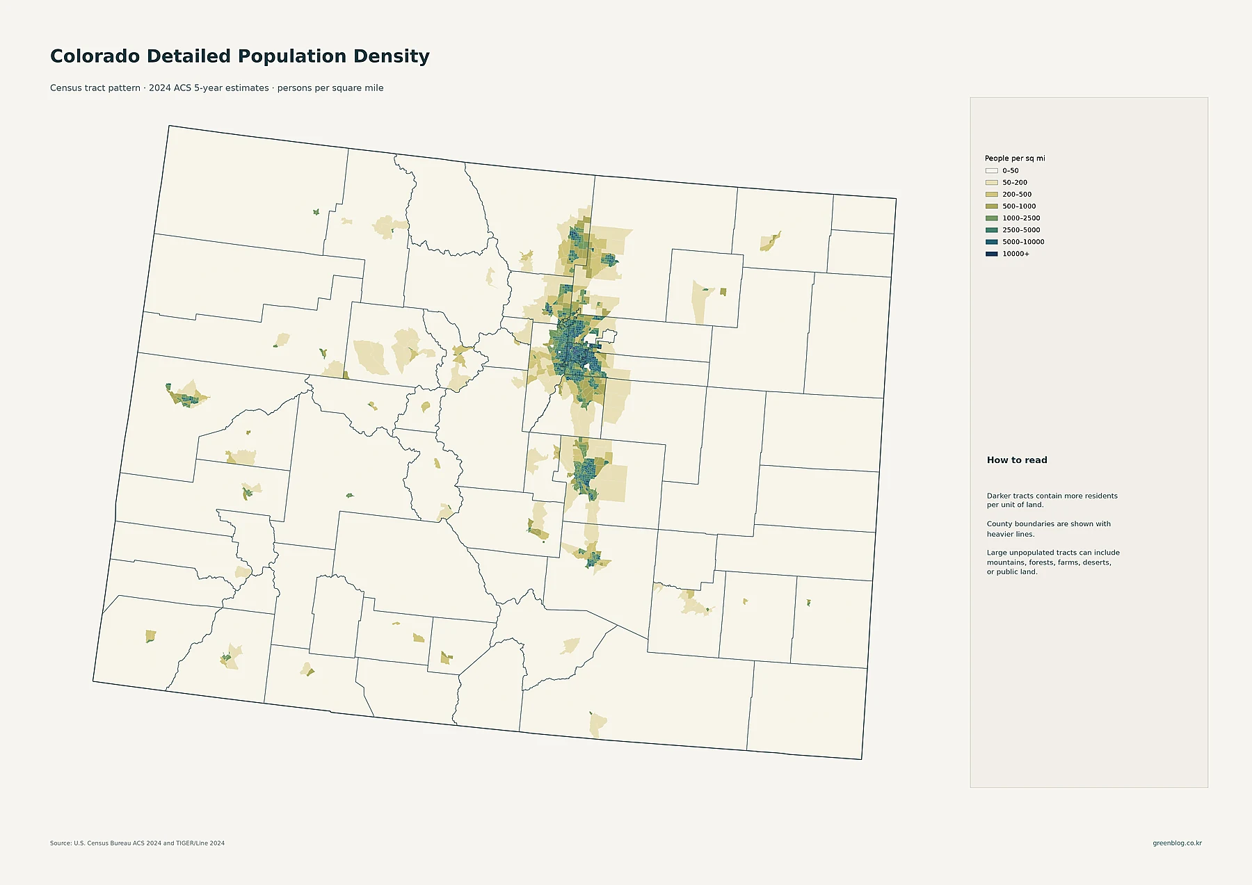
The tract map uses eight density classes, beginning at 0–50 people per square mile and ending at 10,000 or more. The darkest and most continuous patch surrounds Denver, where many adjacent tracts fall into high-density classes. That concentration extends into neighboring urban areas rather than stopping at a county line, which is one reason the tract view is more useful than a county average for locating where residents actually live.
North of Denver, additional dense clusters appear around Boulder and Longmont and continue toward Loveland, Fort Collins, and Greeley. South of the Denver area, Colorado Springs forms another large cluster, with smaller dense areas around Pueblo. Grand Junction stands out on the Western Slope as a compact concentration surrounded by much more lightly populated territory. Across many mountain and plains counties, the dominant colors are the lowest classes.
A pale tract should not automatically be read as uninhabited. The map notes that large tracts can contain mountains, forests, farms, deserts, or public land, so residents may occupy only a small portion of a large polygon. The tract map is therefore best used to compare concentration per unit of land rather than to decide whether a place has any population at all.
City circles show why the Front Range dominates the urban map
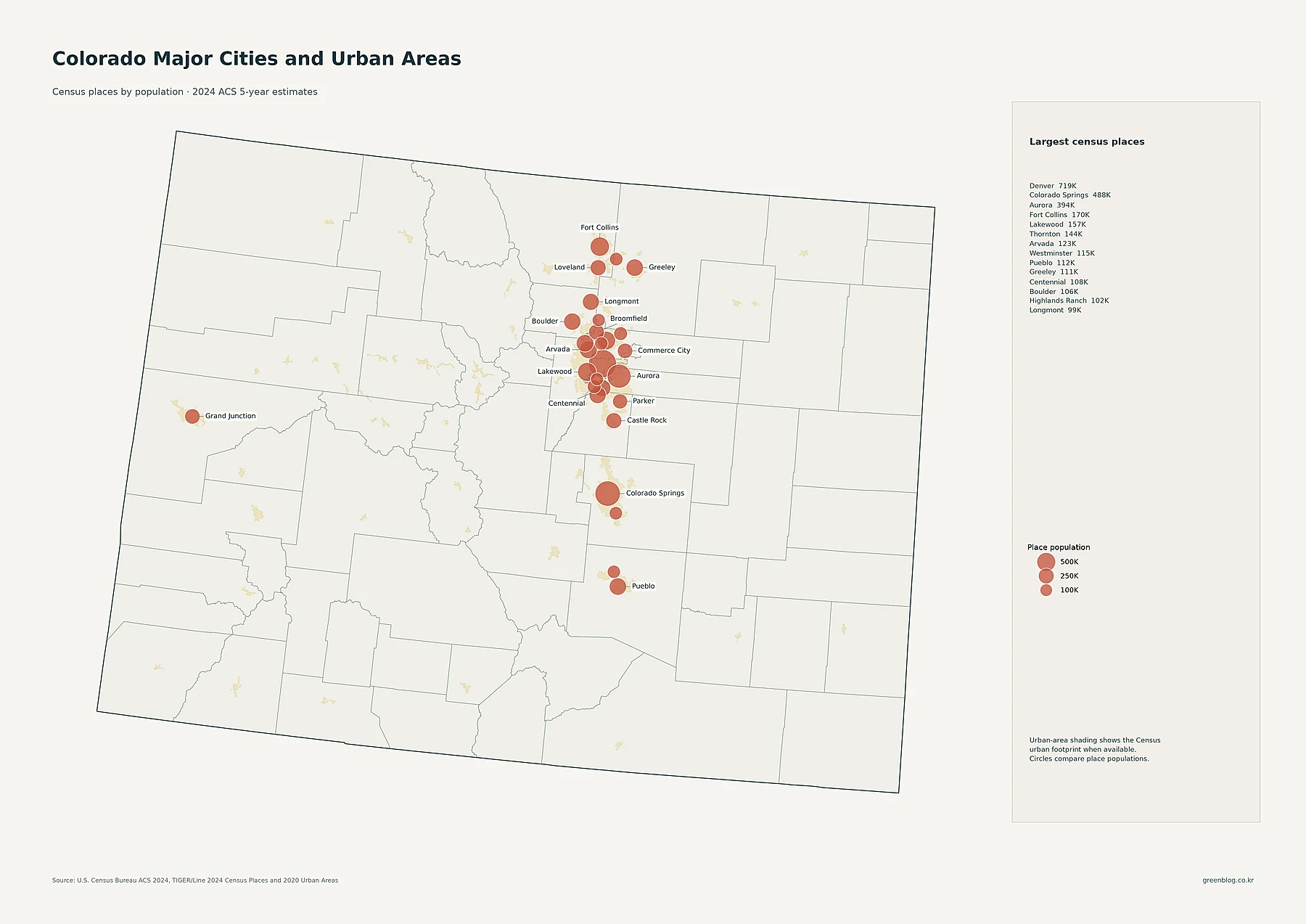
The city map changes the measurement from density to total population of individual census places. Denver is the largest listed place at 718,877 residents, followed by Colorado Springs at 487,887 and Aurora at 394,432. Fort Collins has 170,229, Lakewood 156,583, Thornton 144,187, Arvada 122,634, and Westminster 115,484. Pueblo, Greeley, Centennial, Boulder, Highlands Ranch, and Longmont are all around or above 100,000 in the supplied dataset.
The geography of those circles is more important than the ranking alone. Denver and Aurora sit inside the state’s largest concentration of overlapping cities and urbanized land. Moving north, Boulder, Longmont, Loveland, Fort Collins, and Greeley create a chain of separate population centers. To the south, Castle Rock leads toward Colorado Springs and then Pueblo. Grand Junction is the major western exception, standing apart from the dense Front Range sequence.
Circle size should not be confused with density. A large circle means a place has a large total population, while the pale urban-area shading describes a broader built-up Census footprint where available. A metropolitan region can contain several separate census places, so the population of one circle is not the same thing as the population of the entire metro area.
El Paso leads county population, but Denver leads county density
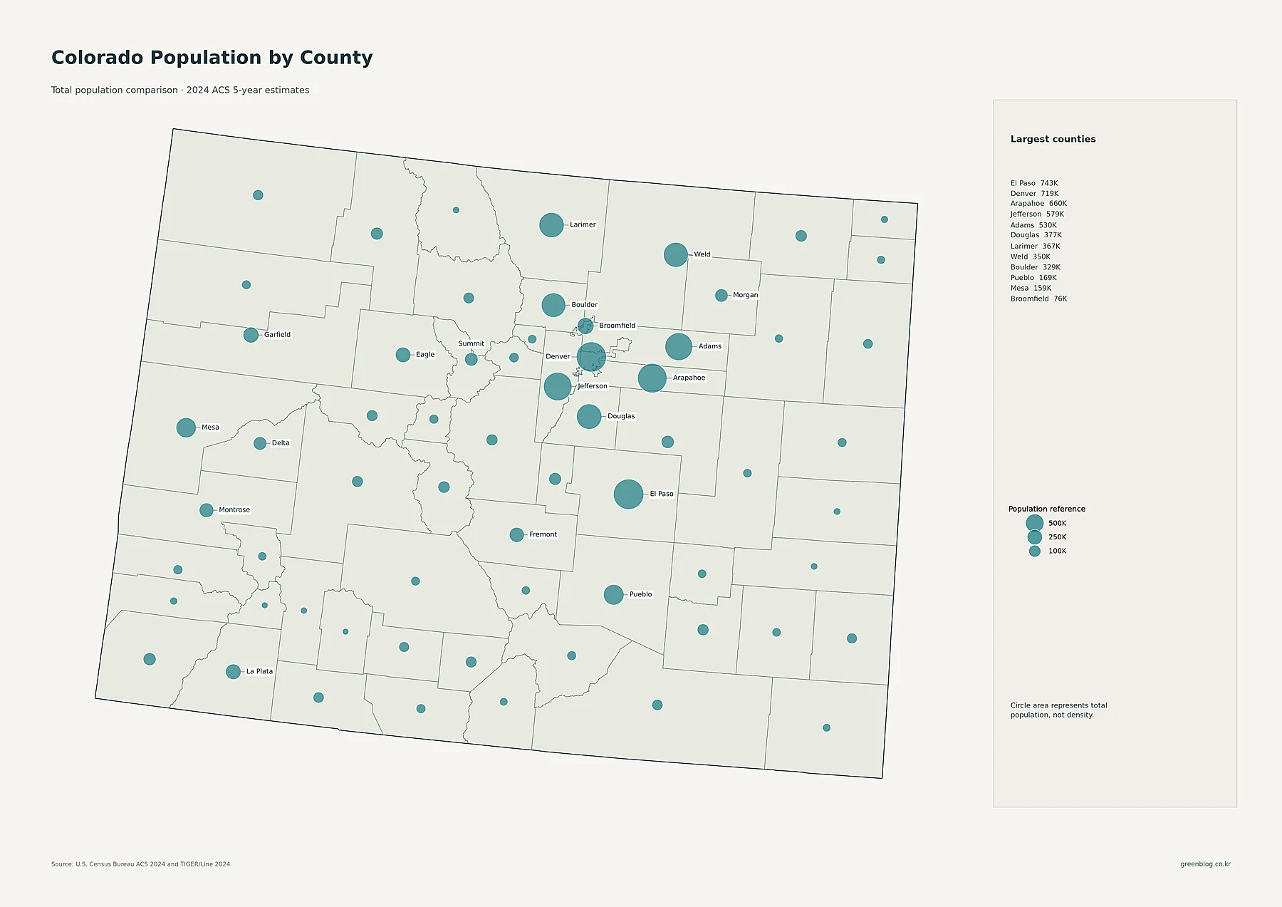
County totals produce a slightly different ranking from the city map. El Paso County is the largest in the supplied 2024 ACS dataset at 742,999 residents. Denver County follows at 718,877, then Arapahoe at 659,844, Jefferson at 579,377, and Adams at 530,225. Douglas has 377,150, Larimer 367,368, Weld 350,396, and Boulder 328,961. Again, most of the largest circles line up with the Front Range.
| County | 2024 ACS population | People per sq. mi. |
|---|---|---|
| El Paso | 742,999 | 349.4 |
| Denver | 718,877 | 4,696.3 |
| Arapahoe | 659,844 | 827.0 |
| Jefferson | 579,377 | 758.0 |
| Adams | 530,225 | 454.4 |
| Douglas | 377,150 | 448.5 |
| Larimer | 367,368 | 141.5 |
| Weld | 350,396 | 87.9 |
The table makes the population-versus-density distinction clear. El Paso has the largest total population, yet its average density is about 349.4 people per square mile. Denver has slightly fewer residents but averages about 4,696.3 per square mile because the county covers a much smaller area. Weld provides another contrast: roughly 350,000 residents are spread across a broad county, resulting in an average of only about 87.9 people per square mile.
The 2010–2020 decade map shows growth beside pockets of decline
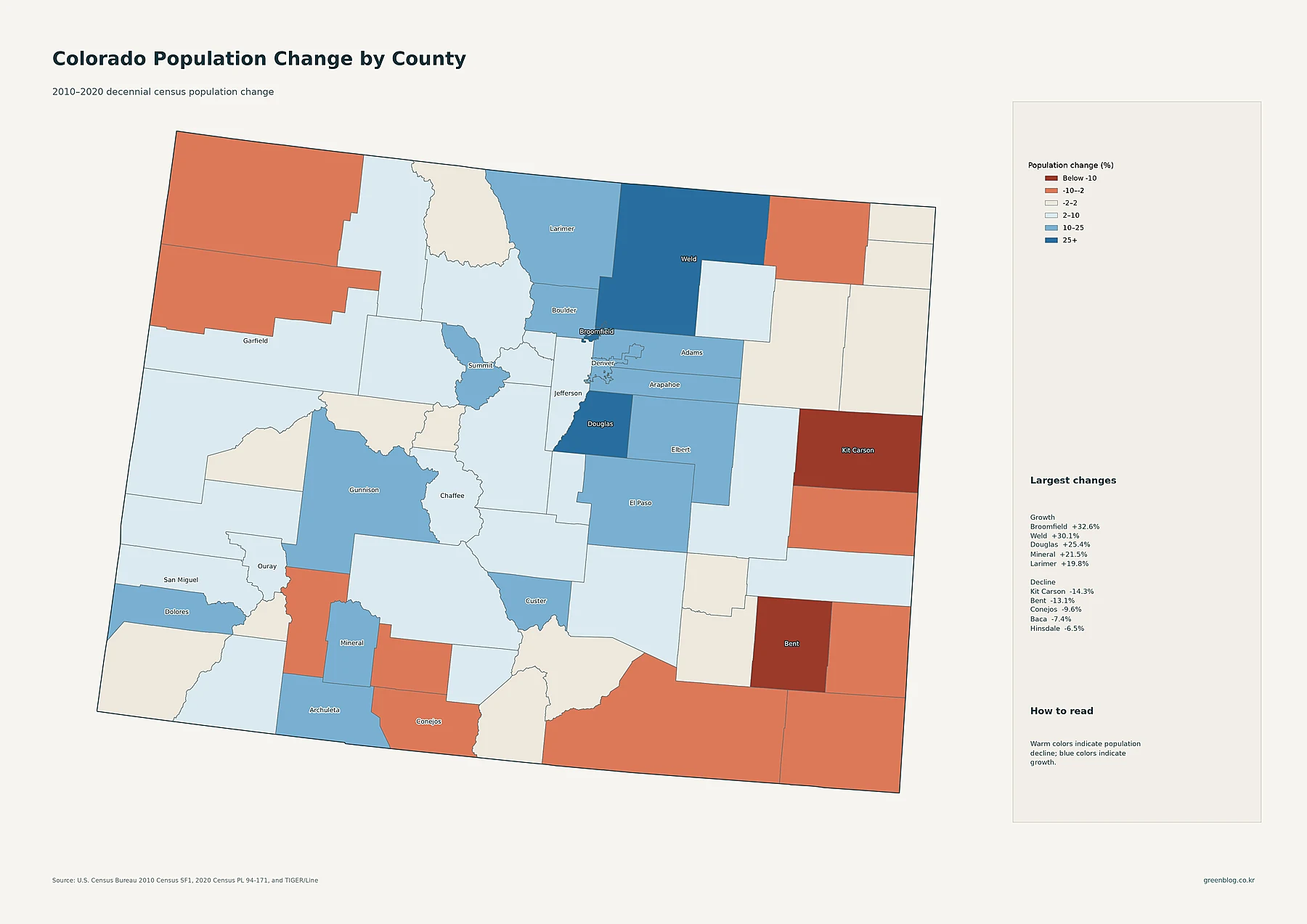
The strongest percentage gains listed on the map are Broomfield at +32.6%, Weld at +30.1%, Douglas at +25.4%, Mineral at +21.5%, and Larimer at +19.8%. Denver also grew by about 19.2%, from 600,158 residents in 2010 to 715,522 in 2020. Adams rose about 17.7%, El Paso 17.4%, and Arapahoe 14.5%. Much of the Front Range is therefore shaded in the map’s growth classes.
Growth was not universal. Kit Carson declined about 14.3%, Bent 13.1%, Conejos 9.6%, Baca 7.4%, and Hinsdale 6.5%. Several of the warm-colored counties are on the eastern or southern edges of the state, while blue counties cluster more strongly along the central urban corridor. The map identifies where change occurred, but it does not demonstrate the economic, housing, migration, or demographic causes of that change.
Percent growth can also be misleading without a population base. Mineral increased from 712 residents in 2010 to 865 in 2020, a gain of 153 people that produces a 21.5% growth rate. Denver and El Paso added far more people in absolute numbers even though their percentage rates were lower. For that reason, the change map is most useful when read beside the county population map rather than by itself.
County density turns the Front Range contrast into a single comparison
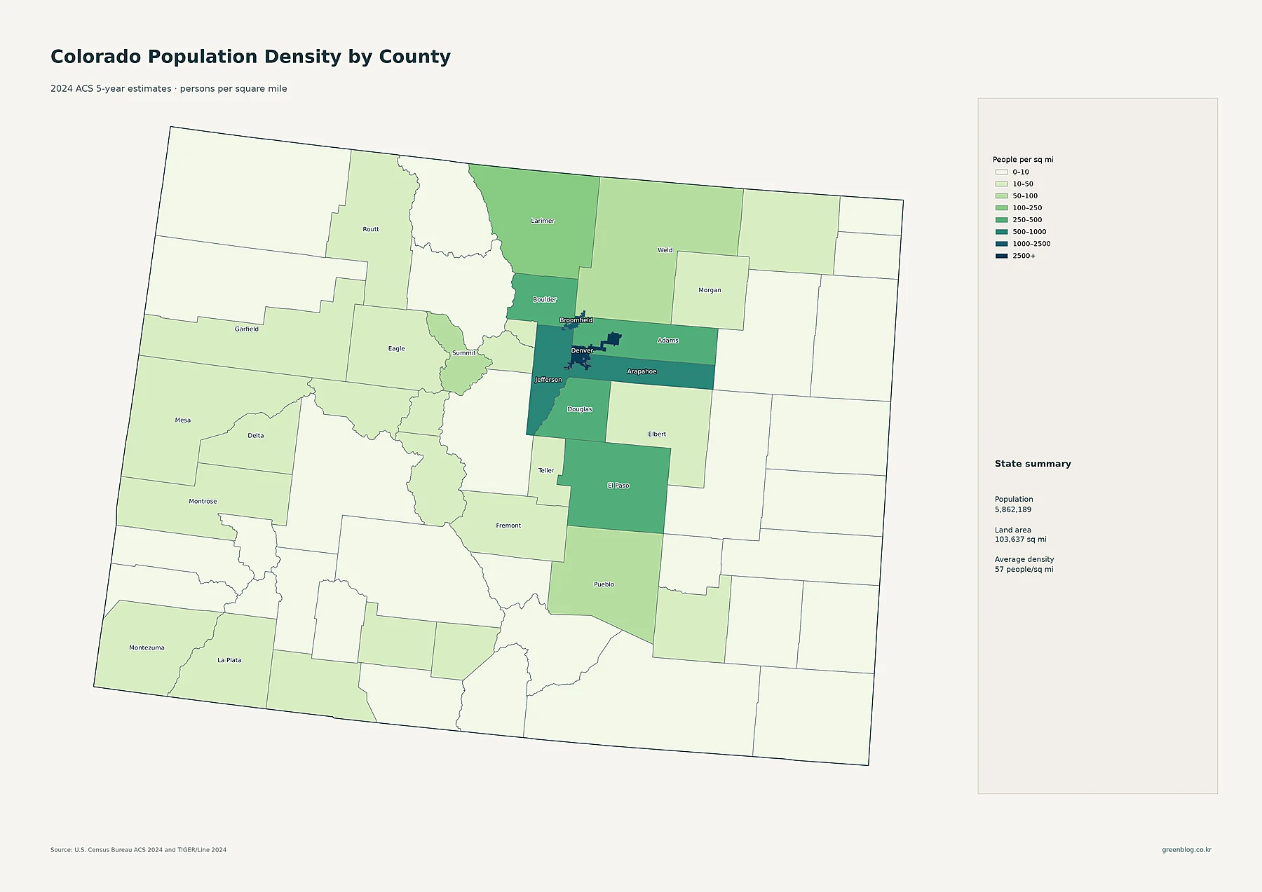
Denver is the clear county-density outlier at approximately 4,696.3 people per square mile. Broomfield is next at about 2,314.5. Arapahoe averages roughly 827.0, Jefferson 758.0, Adams 454.4, Boulder 452.9, Douglas 448.5, and El Paso 349.4. These dark classes form a compact block around Denver and then extend into other Front Range counties.
The state summary on the map reports a population of 5,862,189, a mapped land area of 103,637 square miles, and an average density of about 57 people per square mile. That average is a useful benchmark, but it is not a typical neighborhood density. It combines Denver’s thousands of residents per square mile with mountain and plains counties that can average only a few people per square mile.
This is why the tract and county-density maps answer different questions. County density is excellent for broad comparisons because every county is summarized by the same measure. The tract map is better for locating dense settlement inside a large county. A county can have a low overall average while still containing a compact town, and a high-density county can still include locally less dense sections.
A practical way to read the Colorado map set
- Start with tract density to locate the specific urban clusters along the Front Range and isolated western centers.
- Use city circles to compare the total populations of Denver, Colorado Springs, Aurora, Fort Collins, and other census places.
- Switch to county totals when the question is which counties contain the most residents, not which are densest.
- Use the decade-change map to compare 2010–2020 growth and decline without treating the percentages as 2024 estimates.
- Finish with county density to see how strongly Denver and nearby counties contrast with the broad low-density mountain and plains regions.
Together, the maps show a state with a low overall population density but a highly concentrated settlement system. Large cities, populous counties, and many of the densest tracts line up along the Front Range, while extensive western and eastern areas remain sparse. The decade map adds another layer by showing that some of the already important Front Range counties grew rapidly from 2010 to 2020, even as several rural counties lost population. Keeping totals, density, and percentage change separate is the key to reading that pattern accurately.
Download the Colorado population map collection
Colorado population and density map set
The collection includes detailed tract density, major cities and urban areas, county population totals, 2010–2020 county population change, and county population density.
Frequently asked questions
Which Colorado county has the highest population density in this dataset?
Denver County ranks first in the supplied 2024 ACS-based dataset at approximately 4,696.3 people per square mile. Broomfield is second at about 2,314.5, followed by a substantial gap to Arapahoe and Jefferson.
Why does El Paso have the largest county circle if Denver is much denser?
The proportional circles represent total population, not density. El Paso has an estimated 742,999 residents, slightly more than Denver’s 718,877, but those residents are spread over a much larger county. Denver’s smaller land area produces a much higher average number of residents per square mile.
Is the 2010–2020 county change map based on the 2024 ACS?
No. The change map compares the 2010 Census with the 2020 Census. The other maps use 2020–2024 ACS 5-year estimates and 2024 geography. They can be read together, but the values should not be treated as if they came from the same statistical period or product.
Related Maps
Sources
- U.S. Census Bureau — 2020–2024 American Community Survey 5-Year Estimates
- U.S. Census Bureau — 2024 TIGER/Line Shapefiles
- U.S. Census Bureau — 2010 Census Summary File 1 and Decennial Data
- U.S. Census Bureau — 2020 Census Redistricting Data (P.L. 94-171)
The values and interpretations above come from the supplied project data and the U.S. Census Bureau sources printed on the maps. ACS figures are survey estimates, while the 2010 and 2020 values used for county change are decennial Census counts, so the two statistical products should remain distinct when comparing periods.
Green Map creates custom-edited map images using open geographic data sources such as geoBoundaries, Natural Earth, OpenStreetMap, and government open data.
These maps are edited visual materials, not raw data files, and are provided for education, documents, presentations, and graphic reference.