Flagler County has a split visual character in the 2025 land-cover data. Wetlands are the largest class at 36.91%, forest follows at 28.17%, and developed land accounts for 15.41%. The developed footprint is concentrated on the eastern side, while forest, wetlands, water, and agricultural patches occupy much of the interior. Four maps on this page separate those patterns into a general land-cover view, a forest-and-farmland view, an impervious-surface view, and a 1985–2025 class-difference view.
The WebP images are intended for quick comparison on the page, and the four original JPG maps are available together in one ZIP below. They can be used to compare the eastern developed area with the wetter and more wooded interior, to locate the county’s agricultural patches, and to explain why developed cover is not the same thing as hard pavement. These maps classify the surface of the land; they are not parcel, zoning, ownership, permitting, or property-boundary maps.
Table of Contents
Why the eastern developed area looks larger than its countywide share
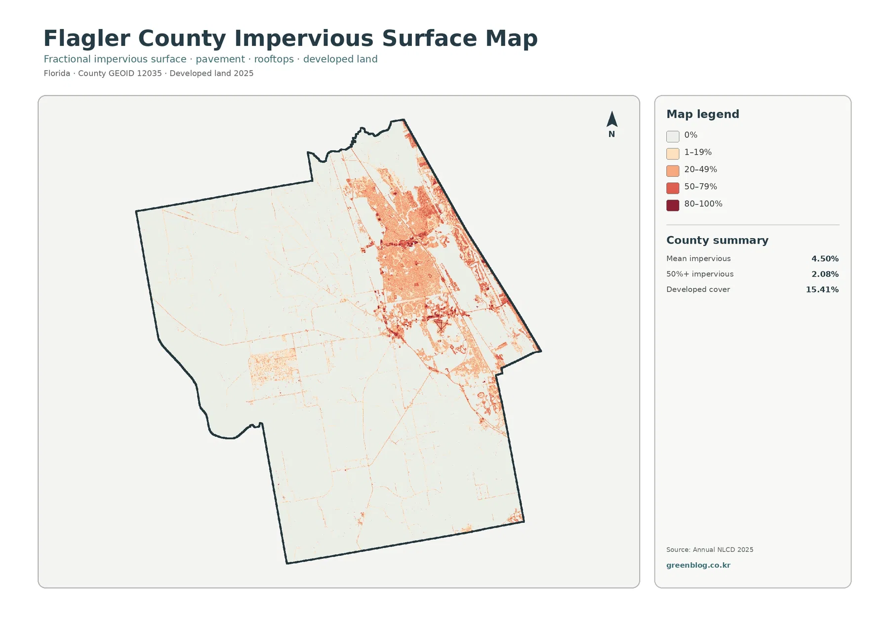
A useful way to begin with Flagler County is to look at the impervious layer before the broader land-cover map. The countywide mean imperviousness is 4.50%, and only 2.08% of the mapped area is at least 50% impervious. Those values are much lower than the 15.41% developed-land share because a developed class can contain lawns, trees, soil, and other surfaces that still absorb water. Imperviousness isolates the harder portion of that developed footprint.
Orange and red tones cluster strongly in the east and northeast. The darkest values are limited to relatively small pieces, while lighter impervious levels spread across a much larger developed area. A few thin roads and small developed patches appear inland, but they do not approach the continuity visible on the eastern side. This distribution makes development look visually dominant in one part of the county even though most of the county is not heavily paved.
The broad western and southern areas are mostly pale on this layer. Comparing them with the forest-and-farmland map explains why: those areas contain extensive wetlands, forest, farms, and other permeable surfaces. Pale colors do not mean that a place is untouched by people. Small roads, homes, and farm structures can be too narrow to dominate a 30-meter-class raster cell, or they can be mixed with vegetation inside the same cell.
For watershed or environmental education, the map is useful as a surface-condition comparison rather than a flood map. Students can place it next to the wetland distribution and see that the hardest surfaces are concentrated in a different part of the county from many of the broad natural areas. It does not calculate runoff, drainage capacity, or flood probability, so those questions require separate hydrologic and flood-hazard information.
The strongest presentation pairing is the impervious map with the general 2025 map. One identifies the full developed class, while the other shows how much of that developed area is actually covered by hard surface. Keeping both figures together prevents a common mistake: treating every developed pixel as if it were completely paved.
Wetlands lead the 2025 total, but forest covers much of the interior as well
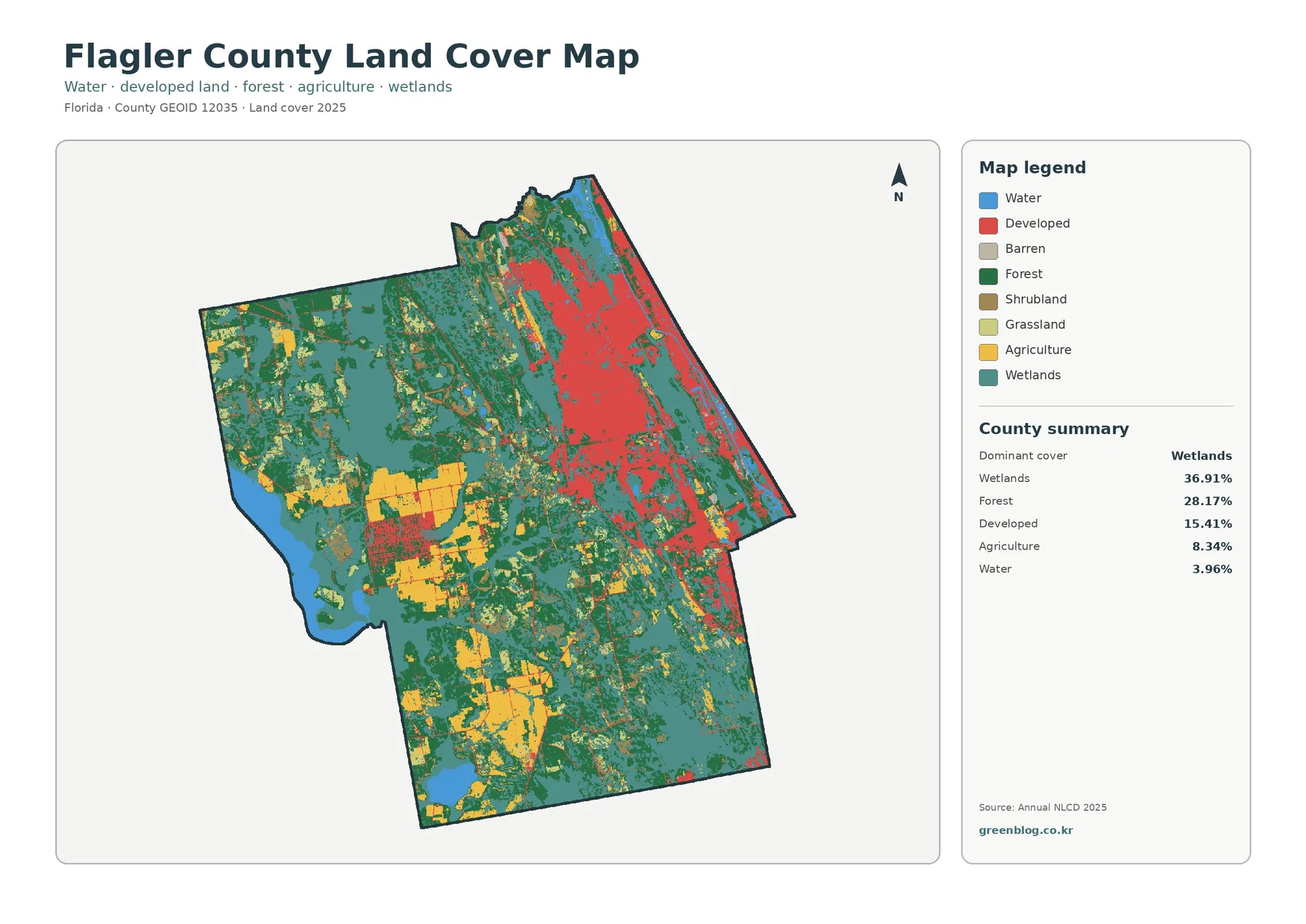
The general map puts the eastern development back into the wider county landscape. Wetlands are the largest class at 36.91%. Teal areas appear across the county rather than forming a single isolated block, with especially broad patches in the west, south, and interior. Wetlands repeatedly meet forest, agriculture, and developed land, which gives Flagler County a more mixed pattern than a simple coast-versus-interior split might suggest.
Forest contributes another 28.17%. Dark green is widespread through the western, central, and southern parts of the county. Together, forest and wetlands represent roughly two-thirds of the county’s mapped 2025 cover. That combined share is important because the bright developed color on the east can draw attention away from the much larger natural-cover area when the map is viewed at a small size.
Developed land covers 15.41%. It is not evenly scattered. A broad eastern concentration is the dominant developed feature, with smaller inland lines and clusters extending away from it. Location therefore matters as much as the percentage. A county with 15.41% developed cover can look very different when that development is concentrated in one large area rather than dispersed uniformly across the county.
Agriculture accounts for 8.34%. Yellow patches are most noticeable in the west-central and southwestern parts of the county, with additional blocks farther south. They tend to sit beside forest and wetlands rather than inside the largest eastern developed concentration. Water represents 3.96%, including larger blue areas toward the west and smaller water bodies and edge features elsewhere.
Open water and wetlands should be read separately. Water identifies exposed water surface, while wetland classes can include vegetated ground strongly influenced by water. Their colors often occur near one another, but combining them into a single number would erase a meaningful land-cover distinction. The general map is therefore the best starting point when a reader wants the complete county composition before focusing on any one theme.
Forest, farms, and wetlands form a working landscape west of the main development
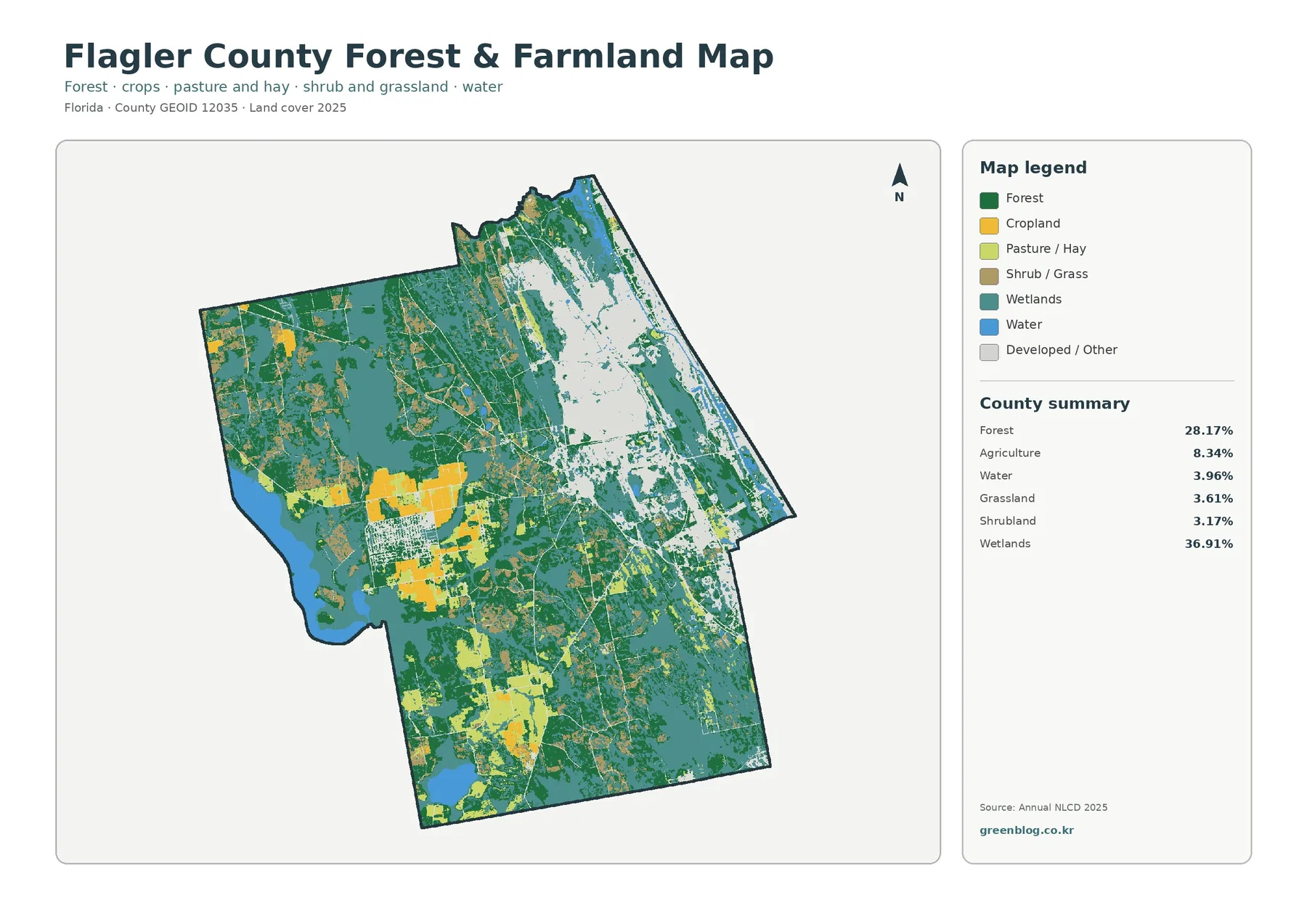
Removing much of the visual emphasis from developed land changes the way the interior reads. Forest remains extensive at 28.17%, but it is broken by wetland areas, agricultural blocks, roads, and other cover. The result is a patchwork rather than one continuous green mass. That distinction matters for habitat comparison, land-cover education, and any presentation that needs to show how wooded land sits beside wetter ground and working land.
Agricultural cover is 8.34%, yet its spatial concentration makes it easy to identify. Several larger yellow blocks stand out in the west-central part of the county, and another group appears farther south. The map does not identify individual farms or crops, but the UF/IFAS Extension Flagler County agriculture page provides useful local context. It describes county agriculture as including crops, pasture, livestock, and woodland components, with vegetables such as cabbage and potatoes among the crop types reported by the extension service.
That source-backed context should not be confused with what the pixels themselves prove. A yellow pixel on this map does not tell the reader which crop is present, who owns the land, or where a farm parcel begins and ends. It only belongs to an agricultural land-cover class in the supplied dataset. Parcel-level questions need cadastral records, current imagery, or other local sources.
Wetlands remain the largest class on this specialized view, which is useful because farms and forest can then be read in relation to the county’s wet ground. Teal areas surround or separate many green and yellow patches. In the southern half, broad wetland and forest zones are interwoven with smaller agricultural areas. The map therefore works well for explaining that agricultural production is part of a landscape that also contains substantial natural cover.
Flagler County’s Land Management program says the county manages natural resources across about 12,000 acres of parks, preserves, and natural areas. That official information adds local context to the broad forest and wetland presence seen in the map. The colored land-cover classes are not conservation boundaries, however, and no reader should assume that every forest or wetland pixel is county-owned or protected land.
The 1985–2025 layer records class differences, not a complete land-use history
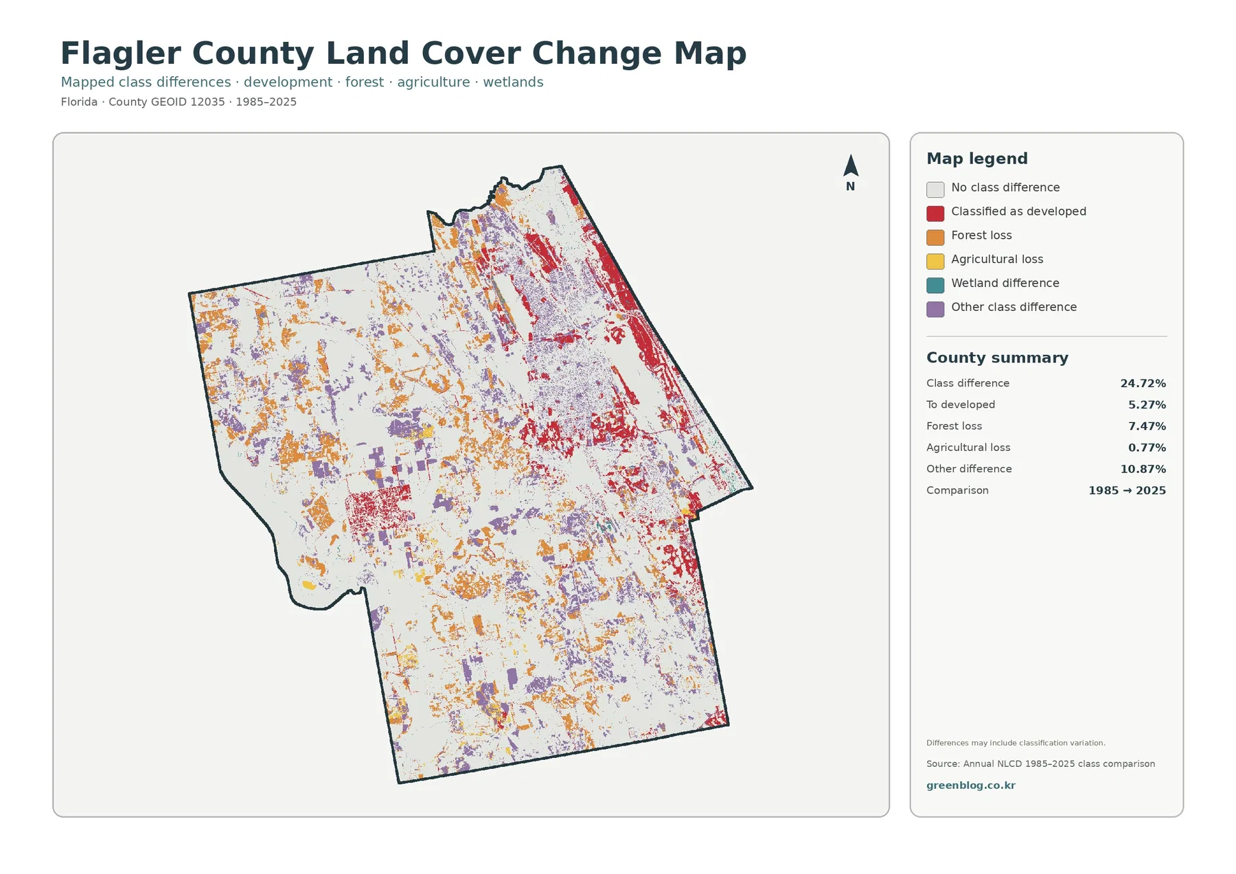
The supplied change map reports a 24.72% class difference between 1985 and 2025. White areas keep the same endpoint classification, while colored cells indicate a difference between the two years. Those differences are spread across the county. They are not limited to the eastern developed area, which is an important clue that the comparison includes changes among several vegetation and land-cover classes as well as development.
Cells classified as developed in the comparison account for 5.27%. Red is most prominent in the east and northeast, broadly matching the part of the county where current developed cover and impervious surfaces are most concentrated. Smaller red patches occur inland. The map can identify where endpoint classifications differ in this direction, but it cannot state the exact year when development occurred or identify the project that produced it.
Forest loss is listed at 7.47%, a larger share than the “to developed” category. Orange differences are scattered through the interior, including areas that remain largely natural in the 2025 map. Forest loss therefore should not be treated as a synonym for urbanization. A cell may shift from a forest class to agriculture, wetland, shrub or grass cover, another vegetation class, or a different classification outcome.
Agricultural loss is 0.77%, while other class difference is 10.87%. The map includes a specific warning that differences may include classification variation. Sensors, methods, mixed pixels, and class definitions can all contribute to endpoint differences. For that reason, 24.72% should not be quoted as the exact percentage of Flagler County that physically changed on the ground during the forty-year span.
A careful workflow is to locate a colored change cell, check the same place on the 2025 general map, and then review intermediate Annual NLCD years or historical imagery if the question requires a timeline. That approach turns the change layer into a screening tool rather than an unsupported claim about cause. It is especially useful for selecting places that deserve closer study.
How to choose the right Flagler County map for a report or lesson
Each map answers a different kind of question. The general land-cover map is best for the full county composition and the contrast between the developed east and the wetter, more wooded interior. The forest-and-farmland view simplifies the background so agricultural blocks and forest edges are easier to compare. The impervious map is the clearest option for hard-surface intensity, while the change map is intended for endpoint differences between 1985 and 2025.
Percentages and visual prominence should be interpreted together. Developed land is 15.41%, but its compact eastern concentration can make it look larger on the page. Wetlands cover 36.91%, yet they are divided among many patches and may feel less visually dominant at first glance. Forest has a similar effect because its 28.17% is spread over a broad interior area. A reader who relies only on color intensity can therefore misjudge the countywide ranking.
Annual NLCD is a raster product, meaning the landscape is divided into grid cells and each cell receives a classification or related value. Mixed pixels occur where several surface types fall within one cell. A narrow road beside forest, for example, may not appear with the exact width seen on the ground. That generalization is appropriate for county-level comparison but not for boundary surveys, property decisions, or site engineering.
The 2025 maps are snapshots of the supplied classification year. Development, vegetation management, farming changes, restoration, storms, or other events after that observation period may not be represented. The 1985–2025 comparison also does not preserve every intermediate step. A place could change more than once and still end with only one endpoint difference, or even return to the same broad class.
For printing, one large map with a readable legend is usually more useful than four tiny maps on a single page. A classroom presentation might begin with the general map, move to forest and farmland for the interior, and then use the impervious layer to explain the eastern developed area. The change map works best at the end, paired with a note that the colors identify class differences rather than verified causes.
Download the four original JPG maps
The download ZIP contains the four original JPG files used for this article: the 2025 general land-cover map, forest-and-farmland map, impervious/developed-land map, and 1985–2025 land-cover change map. Keeping the files separate makes it easier to choose the map that matches a report, print layout, lesson, or presentation instead of shrinking all four into one unreadable figure.
Use the general map for countywide context, the forest-and-farmland map for natural and agricultural cover, the impervious map for the eastern hard-surface pattern, and the change map for locating endpoint classification differences. The images remain generalized county-scale products, so enlarging a JPG makes the legend easier to read but does not create parcel-level detail that is absent from the source data.
Frequently Asked Questions
What is the largest 2025 land-cover class in Flagler County?
Wetlands are the largest class at 36.91%, followed by forest at 28.17%. Developed land accounts for 15.41%, agriculture for 8.34%, and water for 3.96%. The developed area is highly concentrated in the east, so it can appear more visually dominant than its countywide percentage suggests.
Why is developed cover 15.41% while mean imperviousness is only 4.50%?
Developed cover can include lawns, trees, bare soil, and other permeable surfaces along with pavement and rooftops. Imperviousness measures the hard-surface portion separately. Only 2.08% of the mapped county is at least 50% impervious, which shows that the most heavily hardened surfaces are concentrated within a larger developed footprint.
Does the 24.72% class difference mean that exactly 24.72% of Flagler County physically changed from 1985 to 2025?
No. The figure describes cells with different endpoint classifications, and the supplied map warns that classification variation can be included. The map lists 5.27% to developed, 7.47% forest loss, 0.77% agricultural loss, and 10.87% other difference. Intermediate-year data, historical imagery, and local records are needed to establish the timing and cause of a specific change.
Map File Information
The four original JPG land-cover maps for Flagler County, Florida are included together in one ZIP file.
- Included Files: Use only the versions confirmed in the article and supplied images
- File Type: Use the confirmed download contents
- Intended Use: Printing, education, presentations, and map-based projects
Related Maps
- Alachua County Florida Land Cover Map
- Baker County Florida Land Cover Map
- Bay County Florida Land Cover Map
Sources and references
- MRLC Annual NLCD Data – official access to Annual NLCD land-cover products
- USGS Annual NLCD Land Cover Classification – definitions for developed, forest, wetland, agricultural, water, and related classes
- Flagler County Protecting Natural Resources – county information on natural-area stewardship and resource management
- UF/IFAS Extension Flagler County Agriculture – local agricultural context, including crops, pasture, livestock, and woodland
- U.S. Census Bureau TIGER/Line Shapefiles – official geographic boundary reference
Green Map creates custom-edited map images using open geographic data sources such as geoBoundaries, Natural Earth, OpenStreetMap, and government open data.
These maps are edited visual materials, not raw data files, and are provided for education, documents, presentations, and graphic reference.