Perry County’s 2025 land-cover maps show a county where forest is the largest surface class but does not look the same from north to south. Forest accounts for 46.36% of the county, agriculture for 23.39%, and wetlands for 14.34%. Large forest blocks are most apparent across the northern and northeastern portions of the map, while farmland becomes much more prominent in the south and southwest. Wetlands thread through the middle and southern areas, creating a more varied pattern than the countywide percentages alone suggest.
Four original JPG maps are available in one download: general land cover, forest and farmland, impervious surface and developed land, and a 1985–2025 class-change map. Each JPG is 2480×1754 pixels, while the article uses lighter WebP previews for quick viewing. These maps describe what covers the ground surface. They do not establish parcel ownership, zoning, property lines, building rights, regulated wetland boundaries, or survey-grade locations.
Table of Contents
The 2025 pattern starts with 46.36% forest
The county summary identifies forest as the dominant class at 46.36%. Agriculture is a substantial second at 23.39%, followed by wetlands at 14.34%. Shrubland covers 5.58%, grassland 4.76%, developed land 4.33%, and water 1.11%. Those numbers provide a useful overview, but the map makes clear that these classes are not spread evenly. The northern half contains broad green forest areas, whereas the southern half has larger agricultural patches and a stronger mix of wetlands, grassland, shrubland, and smaller forest blocks.
| Reference | Annual NLCD 2025 |
|---|---|
| Forest | 46.36% |
| Agriculture | 23.39% |
| Wetlands | 14.34% |
| Shrubland | 5.58% |
| Grassland | 4.76% |
| Developed land | 4.33% |
| Water | 1.11% |
| Mean impervious | 0.59% |
| 50%+ impervious | 0.12% |
| 1985→2025 class difference | 38.91% |
One of the most useful ways to read Perry County is to compare the upper and lower parts of the county outline. The north and northeast are mostly dark green, with smaller agricultural and wetland interruptions. Moving south, yellow agricultural areas become larger and more frequent. The southwestern portion and the narrow southern extension contain much more open agricultural cover, although forest, wetlands, and grass-related classes remain interspersed. This north–south contrast is more informative than treating the 46.36% forest figure as a uniform blanket across the county.
What the general land-cover map reveals at a glance
The general map is the best starting point because it keeps forest, agriculture, wetlands, water, developed land, grassland, shrubland, and barren areas in the same view. The northern half is visibly forest-heavy. A different mixture appears through the central and southern areas, where agricultural patches occupy more space and wetland colors form irregular areas among forest and farmland. Developed land is present, but it does not dominate the county visually or statistically.
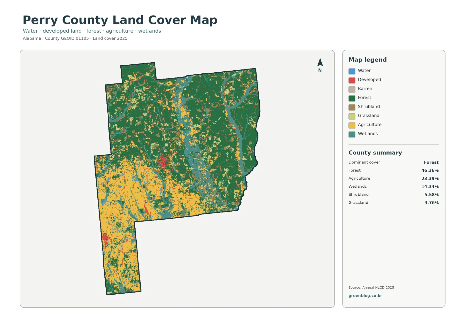
Wetlands deserve separate attention because their 14.34% share is much larger than open water at 1.11%. Teal wetland areas are visible through the center, along portions of the eastern side, and across the southern agricultural landscape. Blue open-water features are narrower and less extensive. Keeping these categories separate prevents a common mistake: treating every wet-looking area as open water or assuming that mapped wetlands automatically represent regulatory wetland boundaries.
Shrubland and grassland together add another visible layer of variation. They occur as smaller patches, often near transitions between forest, agriculture, and wetlands. On a reduced preview these colors can blend visually with neighboring classes, so the legend is important when examining small areas. The presence of several smaller classes also explains why the county cannot be described accurately as simply forest in the north and farmland in the south. The transition zone contains many mixed patches.
Southern farmland sits within a broader wetland and forest mosaic
The forest-and-farmland view makes the southern agricultural pattern easier to see because developed and other classes are pushed into the background. Large agricultural areas occupy the southwest and much of the southern extension. Farmland is also scattered through the central portion of the county, but it becomes less dominant toward the northeast, where forest forms larger connected blocks. The transition is gradual rather than a sharp dividing line, with fields, forest patches, wetlands, and open cover repeatedly meeting one another.
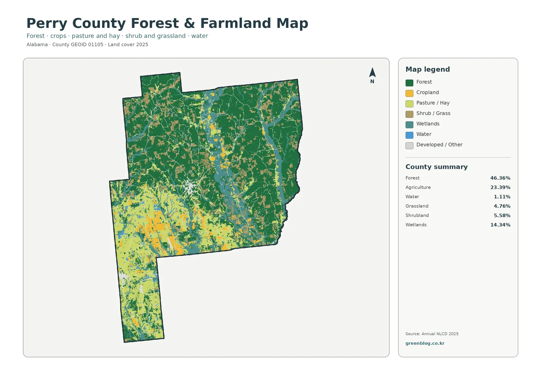
The legend separates cropland from pasture and hay, but the county summary supplies only the combined agriculture total of 23.39%. It is appropriate to compare the two agricultural colors visually, but not to invent separate acreage or percentage values for them. Forest, by contrast, forms broad and relatively continuous areas in the upper county. In the lower county it becomes more fragmented by agricultural and wetland classes, which is why the same countywide forest percentage can look very different from one part of the map to another.
For local context, the Alabama Cooperative Extension System maintains a Perry County Extension Office in Marion and provides access to agricultural and natural-resource information. That official county service is useful when a reader wants information beyond the map. It is not the source of the percentages printed on these images. The 2025 cover values in this article come from the supplied Annual NLCD map summaries, while the Extension link is included as a separate local reference.
Why the 14.34% wetland share matters on this map
Wetlands are the third-largest summarized cover type in Perry County. They form substantial irregular patches through the central and southern parts of the county and also appear in smaller areas farther north. In places, wetland color lies directly beside agricultural or forest cover. That arrangement is useful for classroom or regional comparisons because it shows that fields and forest do not occupy isolated zones. They share boundaries with wet ground and open-water features across many parts of the county.
Open water represents only 1.11%, so blue features are much less extensive than the teal wetland areas. A narrow water feature may also be difficult to see at county scale because the land-cover product uses raster cells rather than survey lines. A raster divides the landscape into regularly sized cells and assigns a representative class to each cell. When a small stream, forest edge, and field fall within the same cell, the display necessarily simplifies what exists on the ground.
This scale limitation is especially important around wetlands. The map can identify broad land-cover patterns, but it is not a substitute for field delineation, flood mapping, hydrologic analysis, or a regulatory wetland determination. Anyone working on drainage, construction, property boundaries, or permitting would need more detailed and purpose-specific information. For general reference, education, and county-to-county comparison, however, the wetland distribution is one of Perry County’s most distinctive features in the supplied 2025 map.
Impervious surfaces are concentrated in only a few small areas
Impervious surface means pavement, rooftops, parking areas, and similar surfaces that do not readily absorb rainfall. Perry County has a mean impervious value of 0.59%, and only 0.12% of the mapped area falls in the 50% or greater impervious category. Those values are much lower than the 4.33% developed-cover figure because a developed land-cover cell can still contain lawns, trees, bare soil, and other surfaces that allow water to infiltrate.
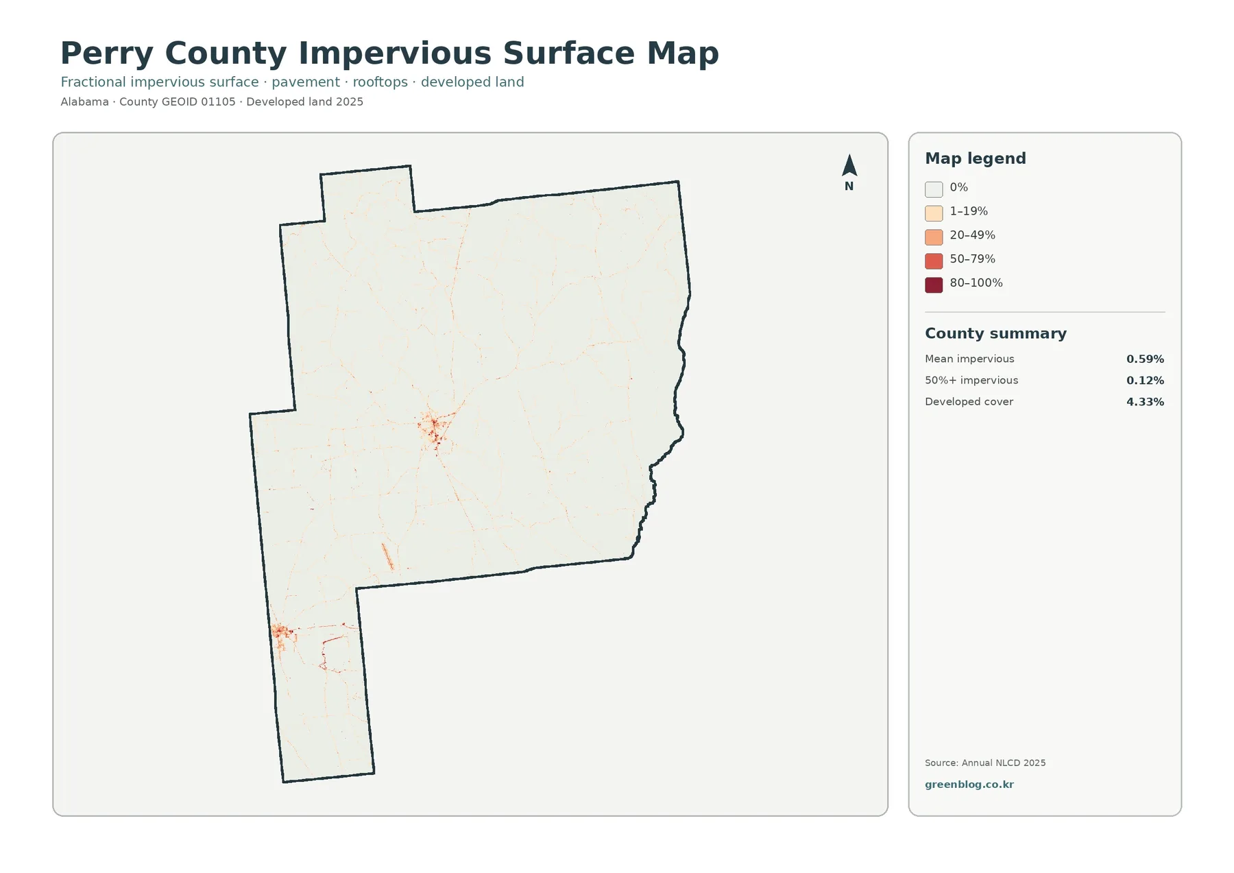
Most of the impervious map is extremely light, corresponding to zero or low fractional impervious cover. The clearest concentration appears near the central-western part of the county, and another smaller cluster is visible farther southwest. Thin lines and scattered points extend away from those centers, but broad high-impervious areas are not visible. Reading the map this way is more useful than relying on the countywide mean alone, because the average does not show where the built surfaces are actually concentrated.
Perry County’s official website lists county facilities and services in Marion. That local information helps establish a real geographic context for the central-western developed cluster, but the land-cover map itself does not label individual roads, buildings, or municipal boundaries. A red or orange raster cell should not be assigned to a specific courthouse, school, business, or road without a separate detailed map. The impervious layer is best used to compare the concentration and relative intensity of built surfaces.
The 1985–2025 comparison shows a 38.91% class difference
The change map compares the mapped class at each location in 1985 with the class assigned in 2025. The county summary reports a total class difference of 38.91%. Within that total, 8.24% is labeled forest loss, 5.89% agricultural loss, 0.66% change to developed, and 23.34% other class difference. Wetland difference also appears as a distinct legend category, but the supplied summary does not provide its own percentage. No separate value should be invented by subtracting the listed numbers from the total.
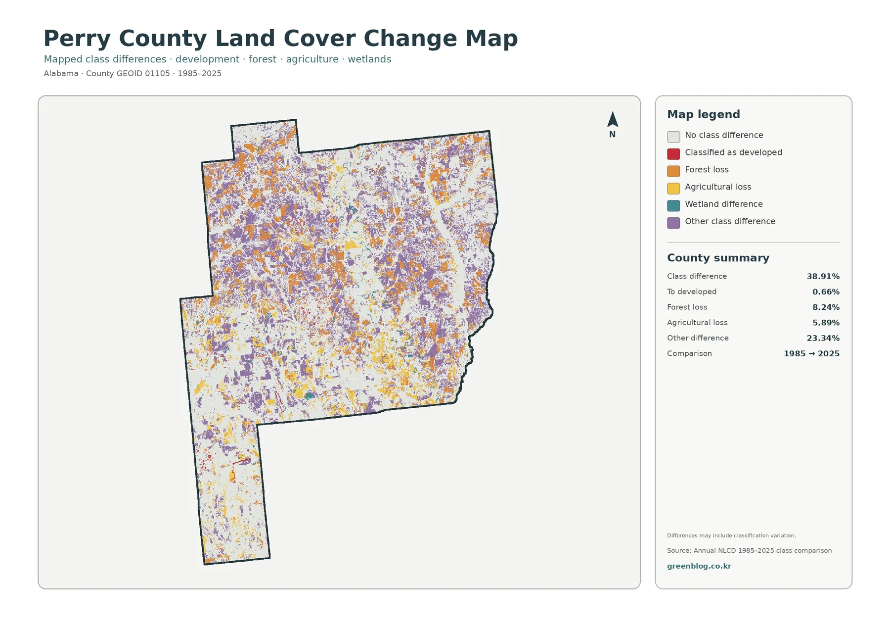
Orange forest-loss cells and purple other-difference cells are scattered across much of the county rather than confined to one corner. Yellow agricultural-loss areas also appear in multiple locations, including parts of the southern agricultural zone. Red cells classified as change to developed are much more limited, which is consistent with the small 0.66% summary value. The 38.91% total therefore should not be described as a development rate. It combines several kinds of class differences, most of which are not mapped as conversion to developed land.
Class differences also need to be interpreted cautiously. A mapped difference can reflect real land-cover change, but classification variation may contribute in some places, especially along mixed edges. A cell containing forest, field, and a narrow road can receive a different representative class at two dates even when the local story is more complicated than a complete conversion. To identify the year or cause of a specific change, intermediate imagery, local records, or other time-series data would be needed.
Choosing the most useful map for a specific task
Use the general land-cover map when the goal is to explain Perry County as a whole. It places the forested north, agricultural south, wetland areas, and developed patches in one view. The forest-and-farmland version is better for comparing rural cover because the agricultural classes stand out more clearly. The impervious map is the appropriate choice when the subject is pavement and built surfaces, while the change map should be reserved for a time comparison rather than mixed into a description of current 2025 cover.
- County overview: compare forest 46.36%, agriculture 23.39%, wetlands 14.34%, and developed cover 4.33% in one image.
- Rural landscape: focus on the broad northern forest and the stronger agricultural presence in the southwest and southern extension.
- Wetland context: separate the 14.34% wetland class from the much smaller 1.11% open-water share.
- Built surface: locate the few higher-impervious clusters instead of assuming the 0.59% mean is evenly distributed.
- Long-term comparison: read the 38.91% class difference by category and avoid equating it with urban growth.
For a presentation, pairing maps usually works better than shrinking all four onto one slide. A forest-and-agriculture discussion can use the general map first and then the forest/farmland map for detail. A development discussion can pair the general cover with the impervious map. A change lesson can begin with the current 2025 distribution and add the 1985–2025 map afterward, making it clear that current land cover and historical class difference answer separate parts of the analysis.
County comparisons should also use matching reference years whenever possible. Two counties can have similar forest percentages but very different spatial arrangements: one may contain a single large forest block while another has smaller forest patches separated by farms and development. Perry County’s maps are a good example of why location matters. Its forest percentage is high overall, yet the southern part of the county looks much more agricultural and wetland-rich than the northern part.
Reading notes and limits before using the files
Land cover and land use are related ideas, but they are not interchangeable. Land cover describes the visible surface class: forest, crops, wetland, water, developed surface, and similar categories. Land use describes how people use land for housing, agriculture, commerce, public facilities, or other purposes. A yellow agricultural cell is not a parcel boundary, and a developed cell is not proof that a site is commercially zoned. Property, tax, zoning, and permitting decisions require the appropriate county records.
The Annual NLCD product is raster data, so its strength is consistent regional comparison rather than parcel-scale detail. Small roads, narrow streams, tiny buildings, and mixed edges can be generalized. Increasing the display size makes the existing pixels easier to see but does not create additional ground detail. For that reason, the maps are well suited to education, overview graphics, presentations, and broad county comparisons, but not to surveying or engineering design.
The 2025 map represents a classification for that reference period. Later construction, harvest, agricultural activity, restoration, or wetland conditions are not automatically included. Where up-to-date site conditions matter, recent aerial imagery and local records should be checked. Similarly, the change map compares two endpoints and cannot show the exact sequence of events between 1985 and 2025. It identifies areas worth investigating rather than providing a complete history by itself.
Keep the legend and county summary visible when printing or cropping the images. Forest, wetlands, grassland, and shrubland can become harder to distinguish on a small display, and the impervious layer depends on several light-to-dark intensity classes. A map without its legend is much easier to misread. The larger JPG files preserve the full map layout and are the better choice for printing or presentation work where the summary panel needs to remain legible.
Download the four original Perry County JPG maps
The download ZIP contains four original JPG files corresponding to the previews in this article: 2025 general land cover, forest and farmland, impervious surface/developed land, and 1985–2025 land-cover change. Each file is 2480×1754 pixels. Because the maps use the same Perry County outline, a reader can switch between them and compare the same part of the county without changing geographic extent.
After downloading, keep the general map as the reference view and add the more specialized maps as needed. The forest/farmland image is useful for rural comparisons, the impervious image isolates built surfaces, and the change map highlights locations where the 1985 and 2025 classes differ. If the files are reused in another document, consult the underlying data providers for applicable terms and cite the source appropriately. Do not rely on these overview maps alone for legal, property, permitting, or engineering decisions.
Frequently Asked Questions
What is the largest land-cover class in Perry County?
Forest is the largest 2025 class at 46.36%. It is especially prominent across the northern and northeastern portions of the map. Agriculture is second at 23.39%, with its strongest visible presence in the southwest and southern extension.
Why is developed cover 4.33% while mean impervious cover is only 0.59%?
A developed land-cover cell can include lawns, trees, soil, and other permeable surfaces in addition to pavement and buildings. The impervious value measures the fraction covered by surfaces such as pavement and rooftops, so it can be much lower than the total area classified as developed.
Does the 38.91% 1985–2025 class difference mean that much of the county became developed?
No. Change to developed is listed separately at 0.66%. The total also includes 8.24% forest loss, 5.89% agricultural loss, 23.34% other class difference, and a wetland-difference category shown in the legend. The map is a class comparison, not a single development-rate measure.
What files are included in the download?
The ZIP contains four 2480×1754px JPG maps: 2025 general land cover, forest and farmland, impervious surface/developed land, and the 1985–2025 change map. The article uses WebP previews of the same map set for faster viewing.
Map File Information
Perry County land-cover JPG set
- Included Files: Use only the versions confirmed in the article and supplied images
- File Type: Use the confirmed download contents
- Intended Use: Printing, education, presentations, and map-based projects
Related Maps
- Autauga County Alabama Land Cover Map
- Baldwin County Alabama Land Cover Map
- Barbour County Alabama Land Cover Map
Sources and reference links
The percentages and mapped-change values used in this article come from the Annual NLCD 2025 and 1985–2025 comparison summaries supplied with the Perry County map package. MRLC and USGS provide the Annual NLCD data and land-cover classification references, while the U.S. Census Bureau TIGER/Line page is an official source for county boundary data. Perry County’s official website and the Alabama Cooperative Extension System Perry County office are included as local references. Those local pages add county context; they do not replace the land-cover dataset as the basis for the mapped percentages.
- MRLC Annual NLCD Data
- USGS Annual NLCD Land Cover Classification
- U.S. Census Bureau TIGER/Line Shapefiles
- Perry County, Alabama – Official Website
- Alabama Cooperative Extension System – Perry County Extension Office
Green Map creates custom-edited map images using open geographic data sources such as geoBoundaries, Natural Earth, OpenStreetMap, and government open data.
These maps are edited visual materials, not raw data files, and are provided for education, documents, presentations, and graphic reference.