Steuben County’s 2025 land-cover pattern is defined by two large surfaces rather than one: forest covers 53.61% of the county and agriculture accounts for 33.68%. Developed land is much smaller at 9.05%, but it forms visible clusters and narrow corridors that stand out against the rural background. The four maps on this page separate those patterns into current land cover, forest and farmland, impervious surface, and mapped class differences between 1985 and 2025.
The WebP images are intended for quick viewing on the page. A single ZIP download contains the four original JPG maps for printing, classroom work, presentations, and side-by-side county comparisons. Land cover describes what is physically covering the ground in the source classification; it is not a zoning map, parcel map, ownership record, or determination of what can legally be built on a property.
Table of Contents
A county split between forest and farm country
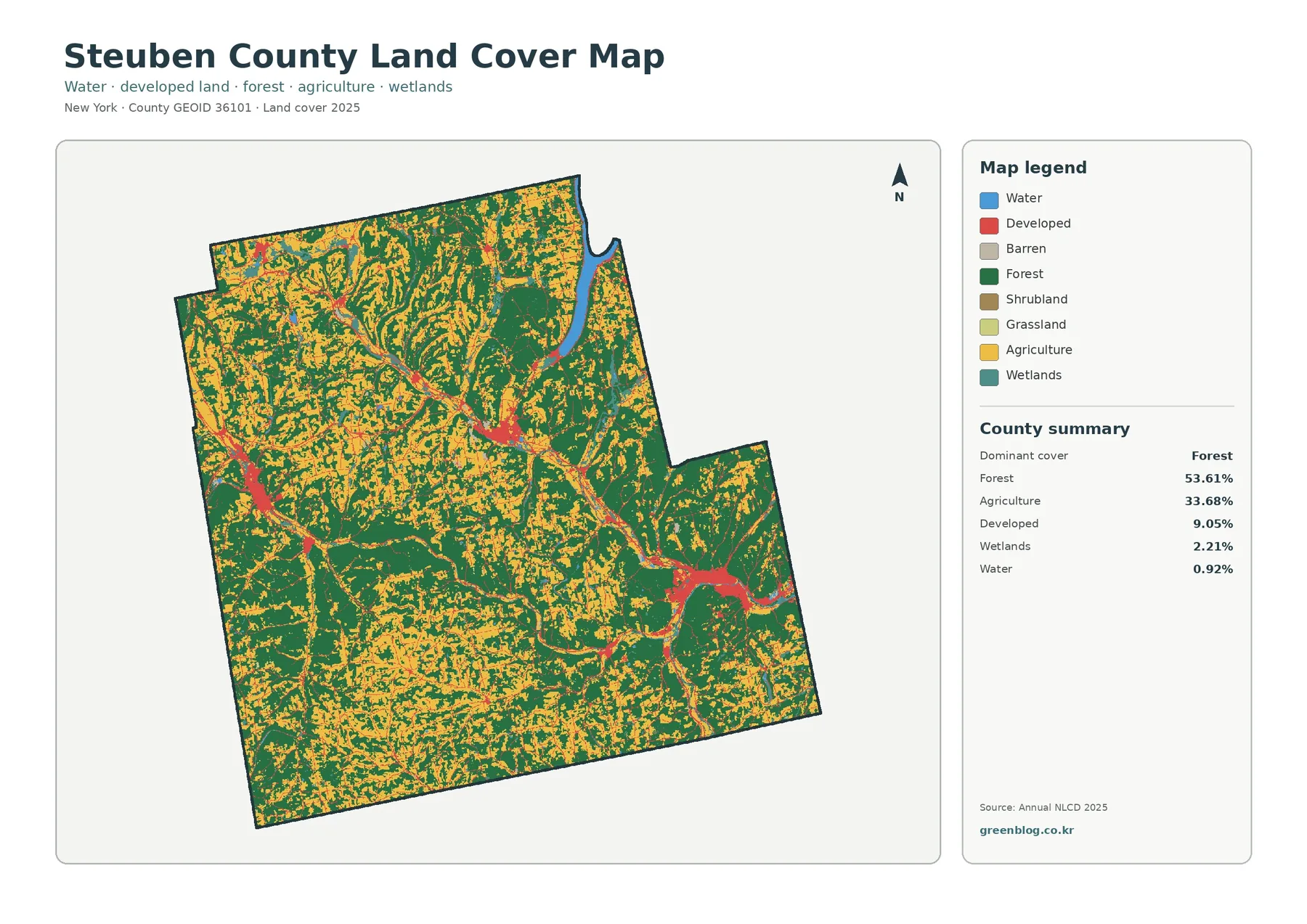
The first map makes the county-wide balance easy to see. Dark green forest occupies the largest share, with particularly broad blocks in the southern and southwestern parts of the county. Yellow agricultural cover is also extensive, especially across northern and central areas where it repeatedly alternates with wooded slopes and smaller forest patches. The county summary confirms what the colors suggest: forest is the dominant class at 53.61%, but agriculture at 33.68% is too large to treat as a secondary detail.
Developed cover represents 9.05% of the county. It does not form one continuous urban area. Instead, red clusters appear in a few distinct centers, including a large eastern concentration, a smaller north-central concentration, and additional settlements toward the west and southwest. Thin developed lines connect some of these areas. This pattern is important because a county-wide percentage can make development sound uniformly sparse even when individual communities have much denser surfaces.
Wetlands make up 2.21% and water 0.92%. Both percentages are small compared with forest and agriculture, yet water and wetland colors recur throughout the map and provide useful landmarks when following the same location across the other three views. A noticeable water body appears near the northeastern part of the county, while smaller water and wetland patches are scattered among farm and forest cover elsewhere.
Grassland and shrubland are minor categories in the companion forest-and-farmland summary, at 0.25% and 0.08% respectively. They may still appear in many small pieces because a small county-wide share can be distributed across numerous locations. For most readers, it is clearer to begin with the forest–agriculture balance, then add developed land, wetlands, water, and the smaller open-cover categories rather than trying to interpret every legend color at once.
The main lesson is geographic variation within one county. Steuben is not simply a forest county with a little farming, nor a farm county with wooded edges. Large wooded areas, broad agricultural zones, and compact developed centers overlap in a repeating pattern. That makes the county particularly useful for comparing how the same place changes when the map switches from general cover to farmland, impervious surface, and long-term class differences.
Why the forest and farmland map adds detail
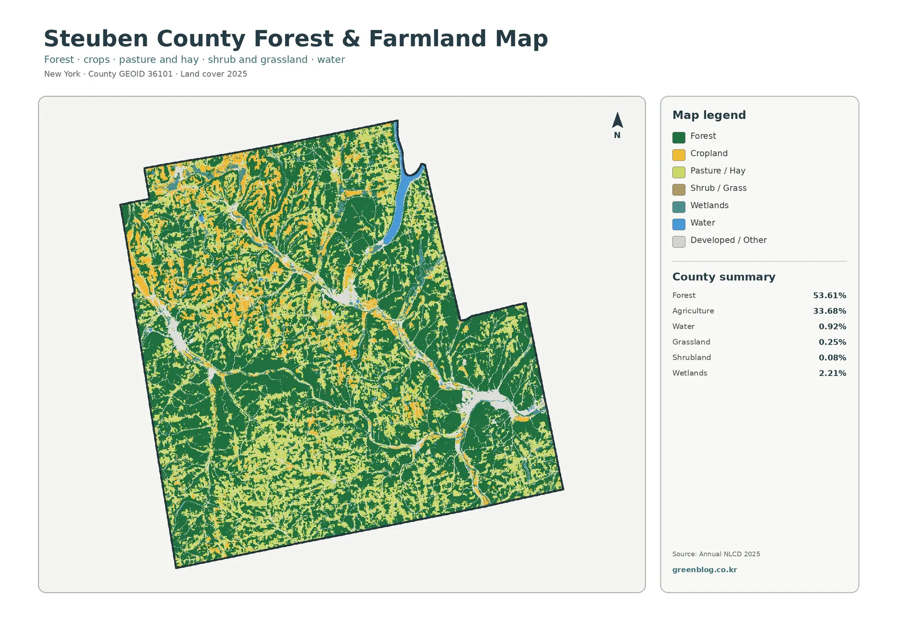
Removing the strong developed-land colors makes the rural pattern easier to follow. The south and southwest contain broad connected forest areas, while agricultural cover becomes more frequent across the north and through several central and western belts. The two classes are not separated by a clean boundary. Farm fields, woodland, wetlands, and small developed or other surfaces repeatedly meet one another, producing a patchwork that is more informative than the county averages alone.
Steuben County’s official agriculture page describes farming as a major part of the county’s economy and rural character. An official county agricultural plan also identifies strong farming concentrations in the northwest and southwest, along with activity in the Addison–Tuscarora, Pulteney–Wayne, Caton, and Hornby areas. It notes farming along the I-86 corridor between Corning and Bath as well. Those descriptions help explain why agricultural cover appears across several parts of the map rather than in one continuous block.
The same county plan discusses the Canisteo and Cohocton river valleys as important parts of the agricultural setting. That background is useful, but the land-cover image itself does not label every river or show field ownership. A yellow cell tells you that the source classification identifies agricultural cover at that location; it does not identify the crop, farm operator, agricultural district, soil quality, or property boundary.
Forest should be read with similar restraint. A green cell indicates forest cover, not a particular tree species, timber condition, ownership category, or protected status. The large southern forest blocks are therefore useful for seeing where tree cover is broad and connected at county scale, but they cannot tell you whether a specific tract is public land, private woodland, actively managed forest, or a conservation area.
For classroom comparison, select one farm-dominated area in the northwest and one forest-dominated area in the south. Record the surrounding wetland and water colors, then locate both places on the impervious-surface and change maps. Following identical reference points across all four images makes it much easier to understand what each layer adds and prevents the maps from becoming four unrelated pictures.
The simplified map is also useful when a presentation needs one clear message. A slide about rural land cover can focus on the 53.61% forest and 33.68% agriculture shares without the stronger urban color competing for attention. A separate slide can then use the impervious map to discuss where hard surfaces are concentrated. Keeping those questions separate usually produces a clearer explanation than asking one map to carry every topic.
Small developed centers stand out on the impervious map
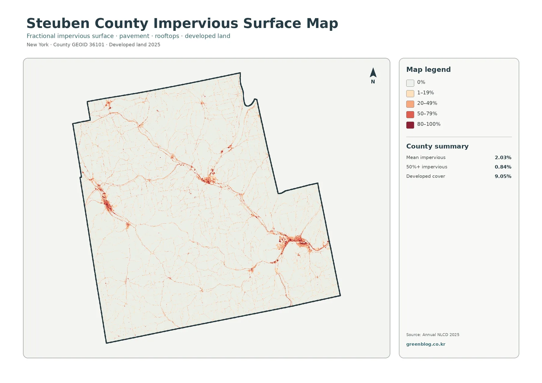
Impervious surface means pavement, rooftops, parking areas, and other hard cover that does not readily absorb rainfall. The county-wide mean is 2.03%, and areas with at least 50% impervious cover account for 0.84% of the county. Those values are much lower than the 9.05% developed-land share because “developed” and “impervious” measure different things. A developed cell can still contain lawns, trees, soil, and other surfaces that allow water to infiltrate.
Most of the map is pale, reflecting the county’s extensive forest and agricultural setting. Darker orange and red areas concentrate in a few compact centers, most visibly in the east, north-central area, west, and southwest. Fine linear traces extend between some centers. Their shape resembles roads and built corridors, but the image does not provide road names, lane counts, traffic volumes, or infrastructure classifications.
The official county agricultural plan places the I-86 corridor between Corning and Bath within an important landscape of farms and settlements. That contextual information helps readers orient themselves, but proximity on a map should not be turned into a cause-and-effect claim. The maps show that developed or impervious surfaces and rural cover occur near the same corridor; they do not prove that a particular highway produced a specific development pattern.
Comparing the general land-cover map with this one is the best way to avoid a common mistake. A broad red developed patch on the first map breaks into several impervious percentages here. Some cells have a high share of hard surface while nearby cells remain relatively open. It would therefore be incorrect to say that 9.05% of Steuben County is completely paved or roofed. The 2.03% mean describes a different measurement.
Impervious data can support lessons about runoff, watershed conditions, and urban development, but it is not a flood-risk or water-quality model. Two places with the same impervious percentage can behave differently because of slope, soil, drainage systems, vegetation, rainfall, and distance from streams. Use this map to locate concentrations of hard surface, then add the appropriate hydrology or infrastructure data for a more specific question.
When presenting the statistics, show both the 2.03% mean and the 0.84% share above 50% impervious. The first number gives county-wide context; the second helps explain why a few compact centers can be visually prominent even though the county as a whole remains mostly forest and farmland. Displaying both prevents a dense town center from being mistaken for the typical surface across the entire county.
What the 1985–2025 difference map can and cannot say
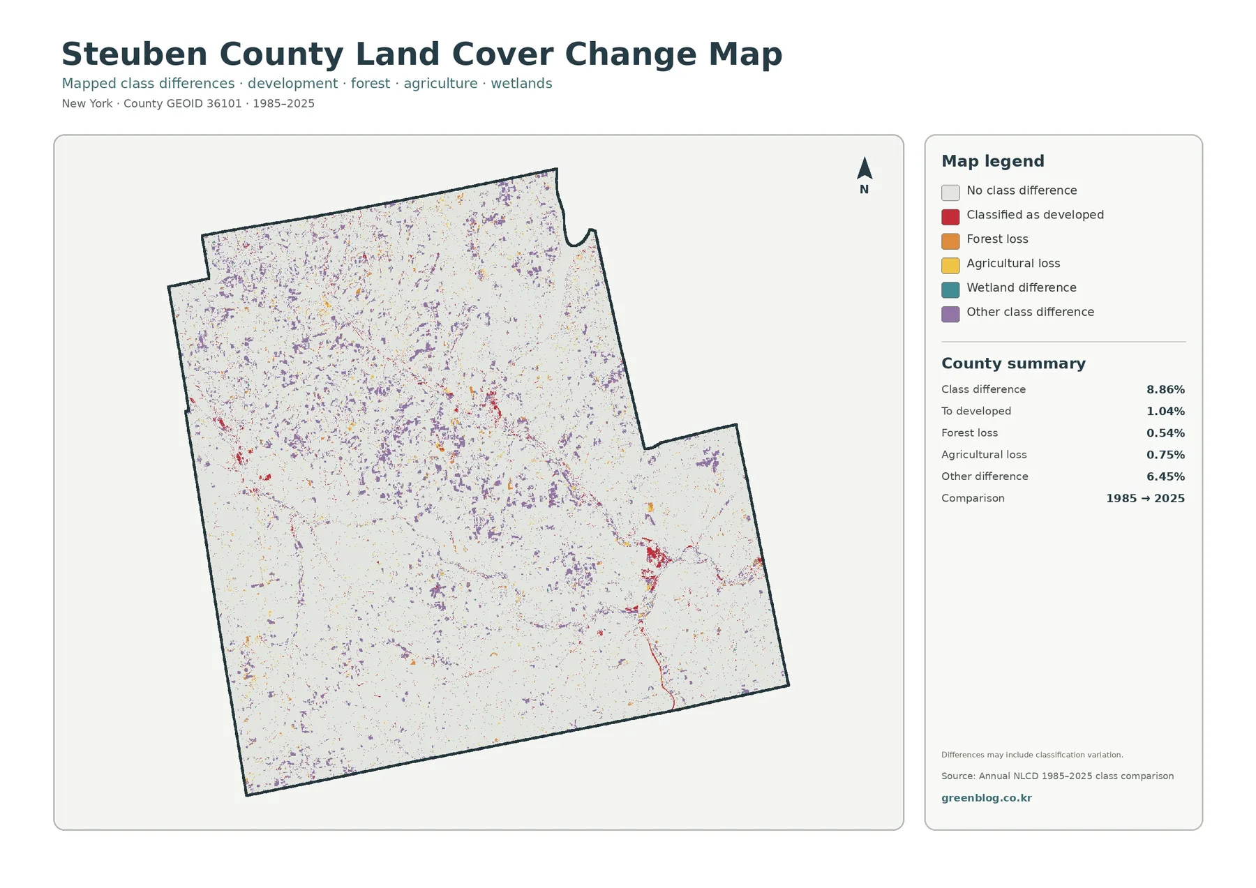
The change map compares classifications at two endpoints rather than showing every event during the forty-year period. Overall class difference is 8.86%. The summary identifies 1.04% as change to developed, 0.54% as forest loss, 0.75% as agricultural loss, and 6.45% as other class difference. Wetland difference is included in the legend, but the summary panel does not give a separate percentage, so it should not be invented from the remaining numbers.
Purple “other class difference” is the largest component and appears as many small patches across the county. That matters when interpreting the headline 8.86% figure. The total does not mean that 8.86% of Steuben County became developed land, lost forest, or left agriculture. Most of the mapped difference belongs to other classification changes, and the map itself warns that some differences may include classification variation.
Red change-to-developed cells are more noticeable around several current settlement centers and along some narrow corridors. Their 1.04% share is still much smaller than the current 9.05% developed cover. Current condition and long-term difference answer separate questions: one asks what the surface is classified as in 2025, while the other asks whether the endpoint classifications differ from 1985.
Forest-loss and agricultural-loss colors occur in scattered pieces rather than one county-wide front. A colored cell confirms an endpoint classification difference, not the reason for that difference. Logging, construction, field abandonment, natural disturbance, regrowth, and classification uncertainty are different possibilities that cannot be separated with this single image. Intermediate Annual NLCD years, aerial imagery, or local records are needed to reconstruct a specific site history.
A useful workflow is to begin with the 2025 land-cover map, move to the forest/farmland or impervious map for the current surface, and check the change map last. That sequence gives the colored change cell a present-day context. Starting with the change map alone makes it easy to overstate what a color means, especially in mixed forest–farm areas where small classification boundaries are common.
Two-endpoint comparison also misses temporary transitions. A place could change during an intermediate year and return to the same class by 2025, leaving no endpoint difference. Conversely, a mixed raster cell near a field or forest edge can be classified differently at the two endpoints even if the physical change is subtle. Treat the map as a screening tool for locations worth examining in more detail, not as a complete historical record.
Water, wetlands, and the rural mosaic
Water covers 0.92% and wetlands 2.21%, so neither category dominates the county statistics. They still matter when reading the landscape because both appear repeatedly between forest and agricultural patches. A conspicuous water body near the northeastern part of the map offers a useful orientation point, while smaller blue and wetland-colored areas occur across the interior. These features help readers keep their place when switching among the four map views.
Steuben County’s older agricultural planning material notes that Keuka Lake influences local growing conditions in its vicinity. That is helpful regional context, but the land-cover maps do not identify vineyard parcels or crop types. Agricultural cover near a water body should be described simply as mapped agriculture unless a separate agricultural source identifies the specific use. The same caution applies to small water and wetland patches that may have very different ecological or regulatory status.
NLCD wetland classification is not a legal wetland delineation. It is a remotely sensed land-cover class at raster scale. Regulatory wetlands can be mapped and evaluated under different methods, boundaries, and jurisdictional rules. For a classroom lesson or county overview, the wetland colors are useful for comparing where wet surfaces occur. For a permit, property purchase, drainage project, or site design, current agency data and site-specific review are required.
Water should be treated just as carefully. The blue cells identify water surface in the source classification, not depth, water quality, flood probability, public access, or ownership. Pairing the land-cover map with a dedicated hydrography or watershed dataset is the better choice when rivers, lakes, drainage networks, or flood processes are the main subject.
For general map reading, however, small water and wetland features add useful texture to the county’s rural pattern. They show that the large forest and agricultural percentages do not fill every space. Farms, woods, developed centers, wetlands, and water repeatedly meet at local edges, which is why a county average should always be read together with the actual distribution on the map.
Using the four maps for comparison and reference
Choose a visible reference point before comparing maps. A large eastern developed cluster, the north-central settlement, a northeastern water body, or a broad southern forest area can all work. Find the same place on each image and write down four observations: current land cover, the forest–farm balance, impervious intensity, and the type of endpoint class difference. This method turns the set into one coordinated reference instead of four separate illustrations.
For environmental education, a farm-heavy area and a forest-heavy area make a useful pair. Students can compare the amount of wetland or water nearby, note whether developed cover is clustered or sparse, and then see whether the change map marks any endpoint difference. The exercise teaches map interpretation without requiring the map to answer questions it was not designed to answer, such as crop yield, habitat quality, or land ownership.
For planning context, the maps can help identify broad areas that deserve closer study. A cluster of developed cover can be checked against impervious intensity, while an agricultural area can be compared with surrounding forest and wetland cover. The county Planning Department maintains geospatial information and works on agriculture and the natural environment, but these simplified land-cover maps should remain a starting layer rather than a substitute for official project-level GIS, zoning, infrastructure, or parcel data.
County-to-county comparisons require matching years and measures. Steuben’s 53.61% forest should be compared with another county’s forest share from the same land-cover year, not with that county’s impervious mean or an older dataset. The same rule applies to change figures: both endpoints and class definitions must be comparable. Reading the legend, year, and unit before comparing percentages prevents many common errors.
Presentation graphics benefit from using one map per question. Use the full land-cover map for a general county overview, the forest-and-farmland map for the rural pattern, the impervious map for hard-surface concentration, and the difference map for endpoint comparison. A clear caption with the map name and year is usually more useful than placing all four images on one small slide where legends become difficult to read.
Download the original JPG map set
The download package includes four JPG files: the 2025 land-cover map, forest and farmland map, impervious/developed-land map, and the 1985–2025 land-cover difference map. Each file carries its own title, legend, and county summary, which makes the images easier to reuse outside this page. They are suited to printing, lessons, reports, slide decks, and visual comparisons with other county maps.
If you need one overview image, start with the general land-cover map. Use the forest/farmland map when the main question is the balance between wooded and agricultural land. The impervious map is better for locating concentrations of pavement and rooftops, while the change map belongs in work that explicitly compares the 1985 and 2025 classifications. Selecting the map that matches the question keeps the explanation focused.
Keep the map title, legend, and year visible when cropping an image for a slide or document. Red tones mean different things on different maps: developed land on one, higher impervious percentage on another, and change to developed on the difference map. A short caption naming both the theme and year is enough to prevent those categories from being confused after the image is separated from this article.
The package uses the original map files supplied for this county rather than promising a specific print standard that the source does not claim. Before a large print, check the actual JPG dimensions and confirm that the legend text remains readable at the intended output size. The WebP previews are convenient for browsing; print-quality decisions should be made from the downloaded JPGs themselves.
Limits of a county-scale raster classification
Annual NLCD is raster data, meaning the landscape is divided into grid cells and each cell receives a cover class or impervious percentage. A cell along a forest edge, narrow road, field boundary, small wetland, or stream can contain more than one real surface. The classification generalizes that mixed area, so a colored boundary should not be treated as a surveyed parcel line.
County percentages are also summaries. Forest at 53.61% does not mean that every town is about half forest, and agriculture at 33.68% does not mean that one-third of every local area is farmland. The maps show strong internal differences, including broad southern forest, farm-rich northern and central areas, and compact developed centers. Percentages describe the whole county; the map pattern describes where those classes actually concentrate.
The current maps represent the 2025 classification, so conditions can change after that observation year. Crops, timber harvest, new construction, road work, and wetland edges can all change faster than a county reference map is updated. For a current site decision, compare the map with recent aerial imagery, local GIS, field information, or the appropriate agency records.
The 1985–2025 map has an additional limitation: it compares endpoints. The 8.86% class difference includes several categories, with “other class difference” alone accounting for 6.45%. It would be wrong to turn that total into a single narrative of development or natural-cover loss. Intermediate years and supporting evidence are necessary if the question is when, how, or why a specific place changed.
Finally, none of the four maps establishes ownership, zoning, agricultural-district status, conservation restrictions, tax parcels, or development rights. They are best used for county-scale orientation, education, comparison, and preliminary research. A land-cover pattern can suggest a useful next question, but the answer may require planning records, parcel data, wetland delineation, road information, or other specialized sources.
Frequently Asked Questions
What is the largest 2025 land-cover class in Steuben County?
Forest is the largest class at 53.61%, followed by agriculture at 33.68%. Developed land is 9.05%, wetlands 2.21%, and water 0.92%. Those county-wide percentages should be read with the map because the classes are not evenly distributed; broad southern forest and farm-rich northern and central areas look quite different.
Why is developed land 9.05% but mean impervious surface only 2.03%?
Developed land is a broader land-cover classification, while impervious surface estimates the share of pavement, rooftops, and other hard surfaces within mapped cells. A developed area can contain substantial grass, trees, and exposed soil, so the two numbers are not expected to match. Areas at or above 50% impervious cover account for 0.84% of the county.
Does 8.86% change mean that much of the county was developed?
No. The 8.86% figure is the total share of cells with different endpoint classifications between 1985 and 2025. Change to developed is 1.04%, forest loss 0.54%, agricultural loss 0.75%, and other class difference 6.45%. The map can include classification variation, so a site-specific history requires intermediate data or other evidence.
Map File Information
The ZIP contains four original Steuben County JPG maps covering 2025 land cover, forest and farmland, impervious/developed surfaces, and 1985–2025 mapped class differences.
- Included Files: Land Cover, Forest & Farmland, Impervious/Developed Land, Land Cover Change
- File Type: ZIP containing four original JPG map files
- Intended Use: Printing, classrooms, presentations, environmental reference, and county comparison
Related Maps
- Albany County Land Cover Map
- Allegany County New York Land Cover Map
- Bronx County New York Land Cover Map
Sources and reference data
The land-cover and impervious-surface interpretation uses the supplied Annual NLCD map summaries. County boundary and local agriculture/planning context can be checked through the official resources below.
- MRLC Annual NLCD Data – Annual NLCD products and data access
- USGS Annual NLCD Land Cover Classification – definitions of the land-cover classes
- U.S. Census Bureau TIGER/Line Shapefiles – official boundary and geographic reference data
- Steuben County Agriculture – official county agriculture and farmland information
- Steuben County Planning – county planning, GIS, agriculture, and natural-environment work
The percentages on this page come from the supplied 2025 map summaries and the supplied 1985–2025 class-difference map. Local planning and agriculture links provide background context; they do not turn a raster land-cover class into a zoning, parcel, or agricultural-district boundary.
Green Map creates custom-edited map images using open geographic data sources such as geoBoundaries, Natural Earth, OpenStreetMap, and government open data.
These maps are edited visual materials, not raw data files, and are provided for education, documents, presentations, and graphic reference.