Monroe County sits on the south shore of Lake Ontario, with Rochester forming a broad developed center while farmland, forest, and wetlands become much more visible toward the county’s outer areas. These maps focus on land cover: what is physically covering the ground, such as developed surfaces, crops, trees, wetlands, and water. The strongest contrast is between the Rochester-centered urban area and the agricultural landscape that spreads across much of the west, south, and eastern edge of the county.
This page includes four views: a 2025 land cover map, a forest-and-farmland map, an impervious surface map, and a 1985–2025 change map. The four original JPG maps are available in one download for printing, classroom use, presentations, and regional comparison. They are not zoning, parcel, ownership, or building-permit maps, so they should be used as broad landscape references rather than legal property records.
Table of Contents
A county split between a major urban center and working landscapes
Developed land holds the largest share in the 2025 summary at 41.13%. Agriculture follows at 31.81%, with forest at 15.11%, wetlands at 10.39%, and water at 1.22%. Those percentages do not mean that each class is evenly scattered. Development is strongly concentrated in and around Rochester, while large agricultural blocks become more common outside the central urban area. Forest and wetlands appear as recurring patches and corridors among those farmed and developed areas.
That arrangement is important because Monroe County is not simply an urban county with a thin rural fringe. A wide metropolitan footprint fills the center, while extensive farm country and green space remain visible within the same county boundary. The Lake Ontario shoreline anchors the northern side, and the county’s outer sections contain a much more open pattern than the central Rochester area. Reading the maps from center to edge makes this change in landscape especially easy to follow.
The 2025 land cover pattern
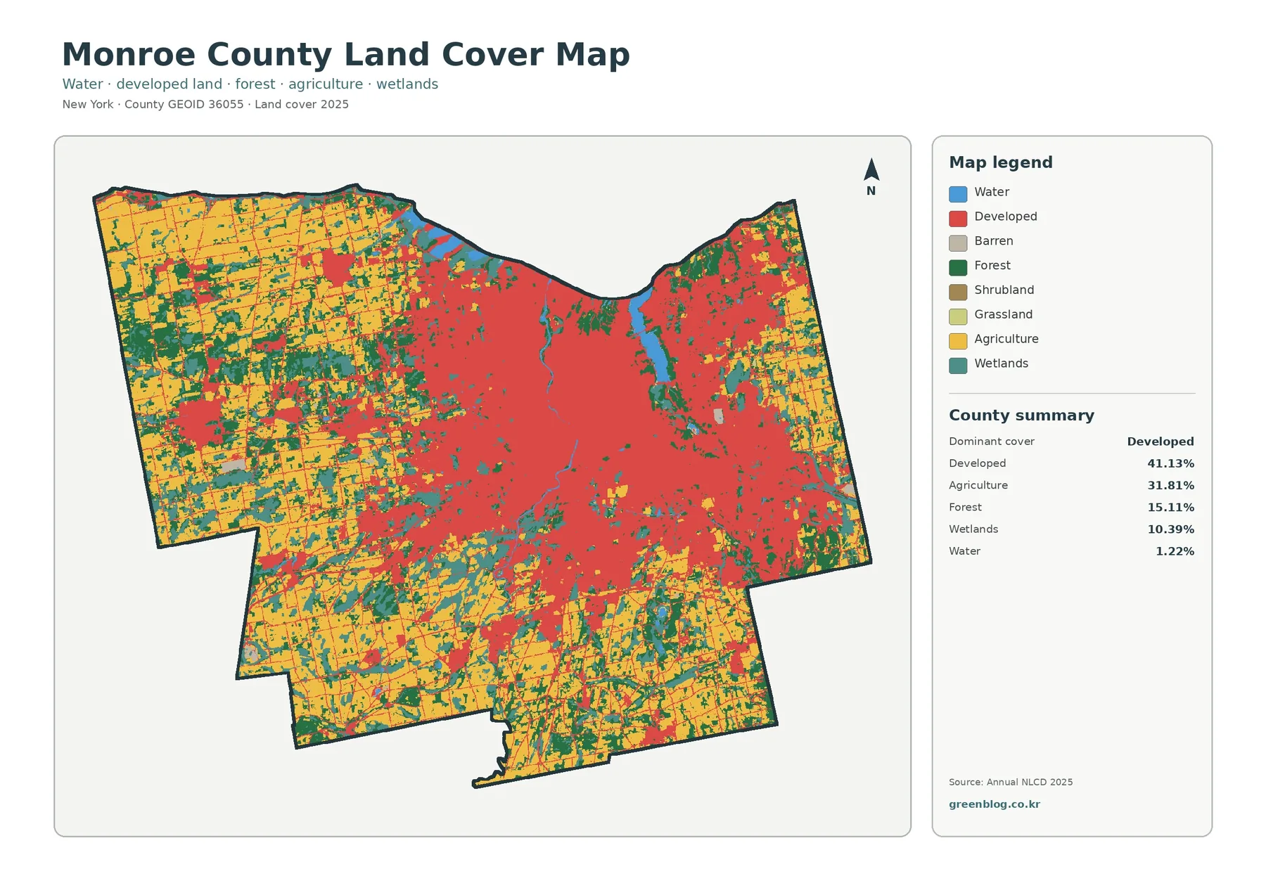
Rochester’s footprint stands out immediately on the general land cover map. Developed land forms a large central mass and continues toward the Lake Ontario shore as well as into several suburban and outlying settlement areas. Yellow agricultural areas dominate much of the western and southern county and remain important along the eastern side. This broad view works well as the starting map because it shows the major land cover classes together without requiring the reader to switch between separate themes.
Forest is less continuous than agriculture, but it is present throughout the county in substantial patches. Green areas break up the farm landscape in the west and south and also appear around the eastern edge. Wetlands, shown in a blue-green tone, occur in many smaller areas rather than in one single block. Some are close to water features or low-lying landscape settings, while others sit among agricultural or wooded land. The water category is only 1.22% of the county summary, so it is useful to distinguish mapped water inside the county from the much larger Lake Ontario surface beyond the county boundary.
Land cover should not be confused with legal land use. A developed classification tells the reader that built or disturbed surfaces are present, but it does not say whether a property is residential, commercial, industrial, or publicly owned. The same caution applies to agricultural classes: a satellite-based crop or pasture classification is not a parcel boundary. This distinction matters when the maps are used alongside planning documents or property information.
Farmland becomes clearer once the urban area is muted
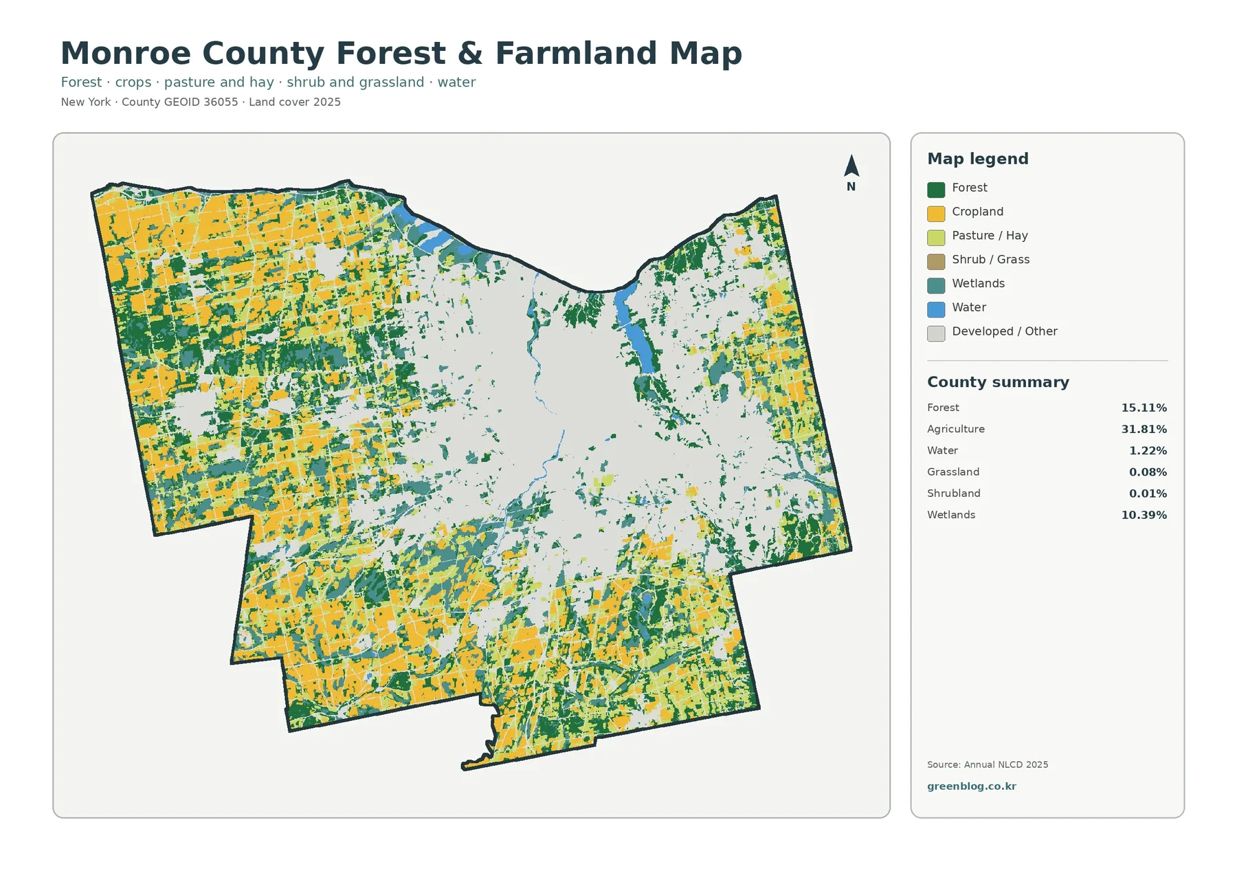
Once the central developed area is visually muted, farmland and woodland become much easier to trace. With developed and other land shown in a pale background, the county’s agricultural pattern is easier to trace. Cropland spreads across broad parts of the west and south and also appears in sizable areas to the east. In the northwest, farm fields form large blocks separated by a regular road pattern, while the central Rochester area remains comparatively open in this thematic view because development is no longer the main color.
Forest accounts for 15.11% of the county, and it often appears between or beside agricultural areas rather than as one uninterrupted forest tract. Larger green patches are visible in the western and southwestern parts of the county, with additional wooded areas in the south and east. That mixture helps explain why a single countywide percentage cannot describe the whole landscape. Some sections are strongly agricultural, some are urban, and others have a fine-grained combination of woods, farms, wetlands, and local development.
Wetlands make up 10.39% in the summary and remain visible even after the map is simplified around forest and farmland. They are scattered through several parts of Monroe County, including areas near drainage features and low-lying terrain. Broad wetland patterns are easy to identify here, but the image is not a regulatory wetland delineation. A parcel-level question requires current agency mapping, field work, and any other documentation required for that specific site.
Impervious surfaces reveal the intensity of Rochester’s development
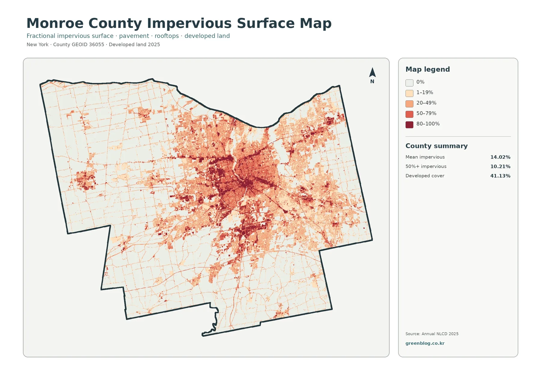
An impervious surface is a surface such as pavement, a parking lot, or a roof that does not readily absorb rainfall into the soil. Monroe County’s mean impervious value is 14.02%, while 10.21% of the county is shown at 50% impervious or higher. These numbers differ from the 41.13% developed-land figure because a developed class can include lawns, trees, and other pervious surfaces mixed with buildings and roads.
Dark impervious values cluster most strongly around Rochester and the surrounding urbanized area. They form a dense central pattern with extensions along developed corridors and additional clusters in outlying communities. Farther west, south, and east, most of the county becomes much lighter, although narrow road lines and small settlement centers remain visible. This makes the map especially effective for comparing the intensity of built surfaces rather than simply asking whether an area is classified as developed.
Linear patterns on this map often occupy the same places as major roads and connected development, but the image alone does not prove that a particular road caused nearby growth. It is safer to describe the spatial association: built surfaces and transportation corridors frequently appear together. For stormwater lessons, watershed discussions, or urban-versus-rural comparisons, this map provides a useful first look. Detailed drainage or flood analysis would still require elevation, soils, drainage infrastructure, and rainfall information.
What changed between 1985 and 2025
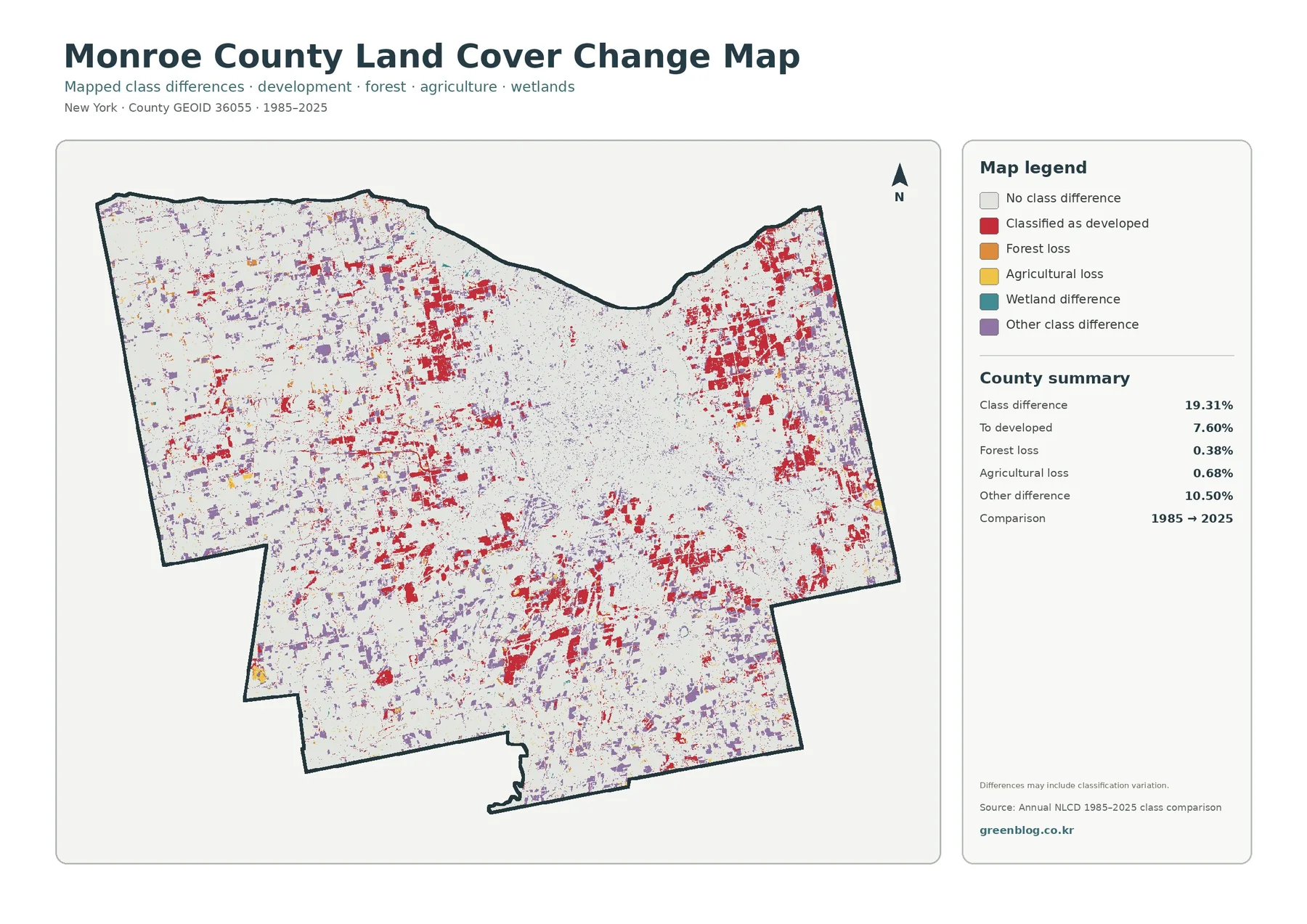
Comparing 1985 with 2025 adds a time dimension that the present-day maps cannot provide. A total of 19.31% is marked as a class difference. Of that, 7.60% is mapped as changing to developed, 0.38% as forest loss, 0.68% as agricultural loss, and 10.50% as other class difference. Large light areas indicate no class difference between the two comparison years, while colored patches identify locations where the classifications do not match.
Red development-change patches are distributed around the Rochester urban area and also appear near a number of outer settlement zones. The pattern is not confined to one edge of the city. Instead, changes appear around multiple parts of the metropolitan fringe and in smaller clusters farther from the center. Looking back at the current land cover and impervious maps helps place those red areas in context because many now sit within broader developed landscapes.
A change color is not automatically evidence of a specific development project or environmental loss. Satellite classifications can differ because of sensor conditions, seasonal appearance, mixed pixels, or changes in classification methods. Its legend also warns that some differences may reflect classification variation. For that reason, it is best used to locate areas worth a closer look rather than to assign a cause to every changed cell.
Reading the four maps as one set
Each view answers a different part of the same landscape question. The general map establishes the present-day balance among development, farming, forest, wetlands, and water. Muting the urban classes makes the rural pattern easier to see in the forest-and-farmland view. The impervious map separates lightly developed places from heavily paved and built areas. The change map then adds a time comparison, showing where the 1985 and 2025 classifications differ.
Western Monroe County is a good example of why the set is more informative than one map alone. The general view shows large agricultural areas mixed with development and forest. Field blocks and wooded patches stand out more clearly in the forest-and-farmland version. On the impervious map, most of the same area becomes pale except for road lines and concentrated settlement areas. The change map adds scattered development and other class differences, giving a longer-term context without replacing the present-day view.
Central Rochester presents the opposite pattern. Development dominates the general map, and the impervious map shows that much of the same area also contains the county’s highest concentration of hard surfaces. On the forest-and-farmland map, that central zone recedes into the background, allowing the surrounding green and agricultural land to stand out. Comparing those shifts in emphasis is one of the easiest ways to understand what each map contributes.
Lake Ontario provides a useful geographic reference
Monroe County and Rochester lie on the south shore of Lake Ontario in New York’s Finger Lakes region, a location also described by Monroe County Planning Services. The curved northern edge of the county is therefore more than a map outline; it provides a quick orientation cue. Development reaches close to the shoreline in the central north, while farmland and green space remain visible in other shoreline sections to the east and west.
County planning programs address land use, development, transportation, resource conservation, and other topics that go well beyond a land cover classification. That makes land cover useful as background rather than as a substitute for planning records. Someone reviewing a planning proposal can use these maps to understand the broad physical setting, then move to official land-use plans, regulations, project files, and site-specific information for decisions that require legal or current local detail.
Agriculture remains a major part of the county picture
Agriculture occupies 31.81% of the 2025 land cover summary, and the map shows why that share matters. Broad farmed areas remain visible outside the Rochester-centered developed zone, especially to the west and south. Cornell Cooperative Extension Monroe County also maintains local agriculture information, which provides useful context for the mapped farm landscape. The land cover layer, however, identifies surface classes rather than individual farms or ownership boundaries.
Classroom and presentation use is especially straightforward with the forest-and-farmland map because it simplifies Monroe County’s rural pattern. It reduces visual competition from developed classes and lets the viewer compare cropland, pasture or hay, forest, wetlands, and water more directly. It can also help explain why a county with a large metropolitan center can still contain extensive agricultural land within a relatively short distance of urban neighborhoods.
Download the original JPG map set
One ZIP download contains all four original JPG maps: general land cover, forest and farmland, impervious surface, and land cover change. Each image measures 2480×1754 pixels, which works well for screen viewing, classroom materials, and many print layouts. That gives more room than the web preview for reading the legend, comparing small clusters, or placing the map into a document or slide. Keeping the four files together also makes it easier to compare current cover with development intensity and long-term class differences.
For printing, scale the image to the page first and check that the legend remains readable. For presentations, keeping the legend and year visible prevents colors from being interpreted without context. These maps are designed for countywide patterns, so extreme zooming can make the raster classification look more precise than it really is. A parcel, building, or narrow roadside feature may be smaller than the underlying classification cell or may share a cell with another surface type.
Limits of a raster land cover map
Annual NLCD-style land cover is a raster dataset, meaning the surface is divided into grid cells and each cell receives a classification. A mixed pixel can contain more than one real-world surface, such as a road edge beside grass or a tree canopy beside a building. The displayed category is therefore a generalized representation, not a surveyed boundary. This is one reason the maps work best for countywide patterns and comparisons rather than property-line decisions.
Because the current map represents a specific observation and classification year, later development, restoration, farming, and vegetation change are not shown. The 1985–2025 map compares two endpoints rather than documenting every intermediate year, so it cannot show the full sequence of changes that may have occurred between them. For current site work, combine the map with newer imagery, local planning records, field observations, and any agency datasets relevant to the question.
Practical ways to use the maps
A quick countywide overview is easiest to get from the general land cover view. For agriculture, woodland, or the rural landscape outside Rochester, the forest-and-farmland version provides the clearest comparison. The impervious map is useful for discussing the concentration of pavement and rooftops, while the change map adds a historical comparison. Choosing one map for a focused question keeps a presentation simple; using all four works better when the goal is to compare several aspects of the same place.
Students can use the set to compare urban and rural land cover, identify where wetlands are interspersed with farms or forest, and discuss why developed land and impervious surface are related but not identical measurements. Researchers and planners can use the maps as a visual starting point before moving to more detailed datasets. Community presentations can use the countywide views to orient an audience before showing neighborhood-scale or parcel-scale material from other sources.
Frequently Asked Questions
What is the largest land cover class in Monroe County in this 2025 summary?
Developed land is the largest class at 41.13%. Agriculture is 31.81%, forest 15.11%, wetlands 10.39%, and water 1.22%. Development is most concentrated around Rochester, while agriculture and forest become more prominent toward the county’s outer areas.
Why is developed land 41.13% while mean impervious surface is only 14.02%?
Developed land can include a mixture of buildings, pavement, lawns, trees, and other surfaces. Impervious percentage focuses specifically on surfaces that resist water infiltration, such as roofs and pavement. The two measures describe related but different characteristics.
Does the 1985–2025 change map prove where development occurred?
It identifies locations where the classifications differ and includes areas mapped as changing to developed land, but it does not document individual projects or causes. Some differences can also reflect classification variation, so site-specific change should be checked with additional records or imagery. Map File Information Monroe County Land Cover Map JPG Files Map File Information Download the map files associated with this page for reference, printing, and compatible visual projects.
Map File Information
Download the map files associated with this page for reference, printing, and compatible visual projects.
- Included Files: Use only the versions confirmed in the article and supplied images
- File Type: Use the confirmed download contents
- Intended Use: Printing, education, presentations, and map-based projects
Related Maps
- Albany County Land Cover Map
- Allegany County New York Land Cover Map
- Bronx County New York Land Cover Map
Sources and references
- MRLC Annual NLCD Data – land cover and related datasets
- USGS Annual NLCD Land Cover Classification – classification guidance
- U.S. Census Bureau TIGER/Line Shapefiles – county boundary data
- Monroe County Planning Services – local geography, planning, and land-related context
- Cornell Cooperative Extension Monroe County Agriculture – local agriculture context
Green Map creates custom-edited map images using open geographic data sources such as geoBoundaries, Natural Earth, OpenStreetMap, and government open data.
These maps are edited visual materials, not raw data files, and are provided for education, documents, presentations, and graphic reference.