This Kenya Map shows the eight provinces used before the country’s present 47-county system. Central, Coast, Eastern, Nairobi, North Eastern, Nyanza, Rift Valley, and Western are the divisions printed on the labeled versions. They are useful for historical study, but they should not be described as today’s administrative boundaries.
The download offers three views built from the same portrait layout: a color reference, a monochrome reference, and an unlabeled outline. Each retains the former provincial geometry. The labeled editions also place Kenya beside South Sudan, Ethiopia, Somalia, Tanzania, and Uganda, and identify the Indian Ocean. Nairobi is so small at this scale that a leader line connects its name to the mapped unit.
The time distinction is precise. Kenya’s State Department for Devolution says the country remained divided into eight provinces until the Constitution was promulgated on August 27, 2010. Article 6 established 47 counties as the units of devolved government, and the devolved system became operational after the March 2013 general election. These images therefore document an earlier framework rather than the current one.
Table of Contents
Why This Kenya Map Shows Eight Regions
The former provinces divide the national shape into a few large areas. Rift Valley forms a long band from the northwest toward the south. Eastern covers much of the central and northern interior, North Eastern reaches the border with Somalia, and Coast follows the southeastern side. Central, Western, and Nyanza occupy smaller spaces around the center and west, while Nairobi appears as a tiny separate polygon.
That pattern cannot be translated into current administration by changing labels alone. A former province contained several areas that are now separate counties, and the old lines are much less detailed than a 47-county map. Names such as Turkana, Nakuru, Kiambu, Kisumu, and Mombasa do not appear as county units here. Anyone working with current governors, services, elections, budgets, or statistics needs a verified county map instead.
The outer labels establish regional orientation. Ethiopia and South Sudan sit above Kenya, Somalia lies to the east, Tanzania is below, and Uganda is to the west. The Indian Ocean is named along the coast. Blue or outlined water shapes can also be seen near the western and northwestern edges, but the artwork does not name them. It contains no road network, settlements, terrain, scale bar, or compass, so it is not a navigation map.
When the image is used with an older report, check the report’s date and terminology before drawing conclusions. A boundary that is historically correct for a provincial table may be unsuitable for a modern county dataset. Record the source period in a caption, legend, or file name, especially when old and current administrative material will appear in the same project.
Three Views of the Former Provincial Pattern
All three previews are 1200 by 1697 pixel WebP images. They share the national outline, coastline, internal divisions, top title, and “Administrative Boundaries” subtitle. Because the geometry stays fixed, the versions can be used as a sequence: identify regions in color, check names in monochrome, and then annotate the unmarked copy. The sequence compares presentation choices without quietly switching to a different boundary system.
The shared proportions also make side-by-side layouts straightforward. Keep each image at the same displayed width, align the page headers, and use captions to explain whether labels or color have been removed. Cropping too tightly can discard neighboring-country context, while stretching one version independently may suggest a geographic difference that is not present in the source artwork.
Color Reference View
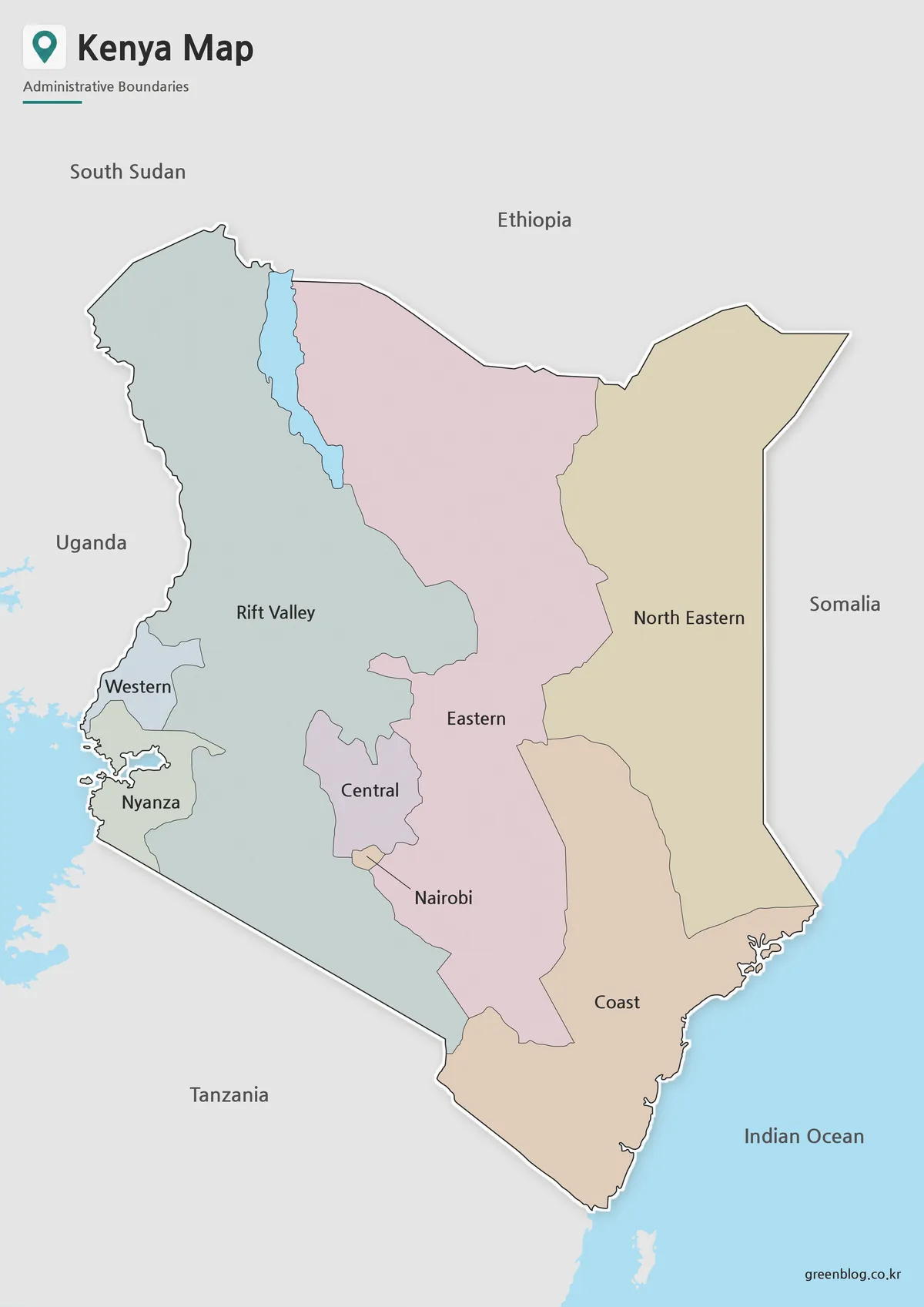
The color Kenya Map is the quickest version for locating the eight regions. Separate muted fills make narrow or adjoining units easier to distinguish, particularly Western, Nyanza, Central, and Nairobi. The palette is only a visual separator: it does not represent population, rainfall, language, elevation, voting, or any other data category.
Nairobi deserves a careful look. Its name sits outside the tiny shape, with short lines pointing back to the unit between larger neighbors. This convention shows Nairobi as one of the former provinces rather than as an ordinary city marker. For a slide or handout, keep the leader lines visible and avoid placing annotations over them.
Monochrome Labeled View
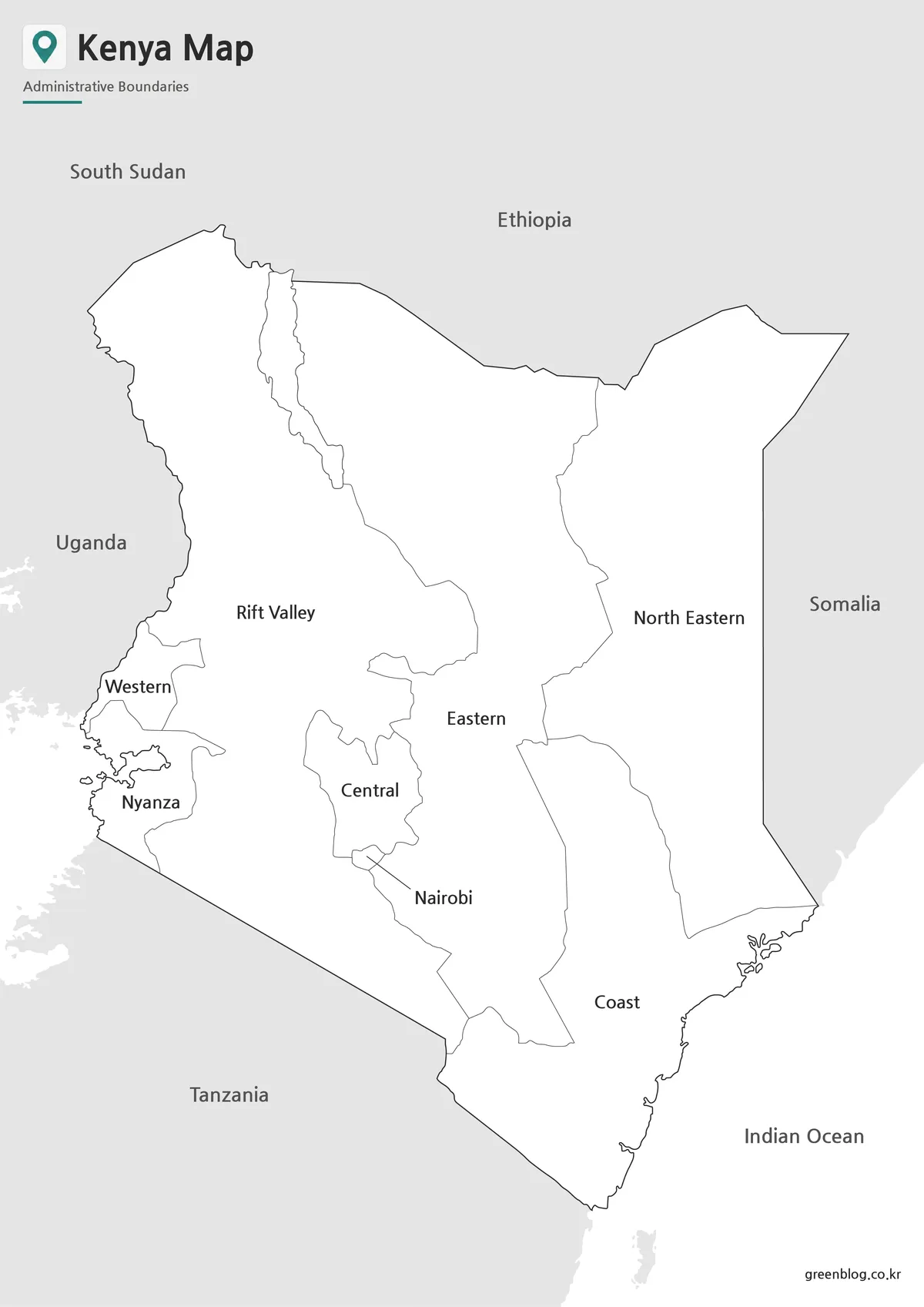
The black-and-white edition preserves every main label from the color view, including the surrounding countries, Indian Ocean, and Nairobi callout. Its lighter visual treatment leaves more room for pencil notes and uses less color ink. It is still a completed reference rather than an empty exercise because the historical names are already printed.
Pair it with a reading on constitutional change, or use it as an answer reference beside the outline. Before making a large batch of copies, test one page at the intended size. Strong photocopier contrast can thicken internal lines, and the compact details around Nairobi and western Kenya need enough space to remain legible.
Unlabeled Historical Outline
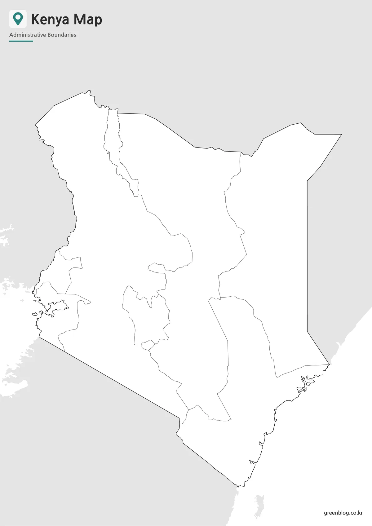
The blank Kenya Map removes provincial names, surrounding-country labels, the ocean name, Nairobi’s callout, and all colored fills. It keeps the coastline and the eight-part historical boundary pattern. The page header remains, which helps identify the subject even when learners or editors add their own labels.
Use this view for recalling the former provinces, marking broad historical regions, or creating a dated comparison graphic. Do not place 47 county names into the eight shapes: the result would imply boundaries that the base image does not contain. If current county work is the goal, begin with a current county outline.
The outline is a raster image, not a collection of independently selectable vector polygons. Text, arrows, and simple fills can be added in common document or graphics software, but extreme enlargement may soften thin edges. Keep the downloaded original unchanged and edit a duplicate so there is always a clean historical base to return to.
Build a Clear Eight-to-47 Comparison
A strong classroom or editorial comparison places this set beside a verified 47-county map. Label one panel “former provinces, until 2010” and the other “current counties.” Ask readers to compare the amount of boundary detail and identify how several counties occupy the space of one former province. The point is to understand administrative change, not to memorize obsolete units as current facts.
For a short activity, begin with the color reference, hide it, and have learners label the eight areas on the outline. Then reveal the monochrome version for checking. A second stage can match selected present-day counties to their broader historical province, provided an official current source is available. Requiring both a system name and a date makes the evidence easier to interpret later.
For archival or editorial use, save the explanatory caption with the image instead of relying on nearby page text. A concise note should identify the eight-unit provincial scheme, say that it predates the 47-county framework, and give the comparison source. That context protects the graphic from becoming misleading when it is copied into a new document or separated from the original article.
Choose the color image when immediate visual separation matters, the monochrome image when printed labels matter, and the outline when participants need to supply information themselves. None of the three supports route planning, precise distance measurement, or county-level data plotting. Captions should always state that the lines belong to the former provincial arrangement.
Frequently Asked Questions
What versions are included in this Kenya Map collection?
The collection includes a color map, a black and white map, and a blank outline map.
Can I print the Kenya Map in A3 size?
Yes. The map was prepared for A3-size use, making it suitable for enlarged printing and classroom reference.
Which Kenya Map version is best for editing?
The blank outline map is the best choice for editing. You can add colors, labels, routes, markers, or data points.
Is the black and white map good for worksheets?
Yes. The black and white version is designed for clean printing, notes, assignments, and classroom handouts.
What can I add to the outline map?
You can add city names, travel routes, regional colors, population data, tourism points, or infographic labels.
Map File Information
The archive contains the three historical province views presented above.
- Included Versions: Labeled color, labeled monochrome, and unlabeled outline
Related Maps
Additional Resources
- Kenya Devolution: County Information — Official background on the transition from eight provinces to 47 counties.
Green Map creates custom-edited map images using open geographic data sources such as geoBoundaries, Natural Earth, OpenStreetMap, and government open data.
These maps are edited visual materials, not raw data files, and are provided for education, documents, presentations, and graphic reference.