How important was the economic rent associated with crude-oil production relative to the size of national economies in 2021? Production volumes alone do not answer that question. A country can pump large quantities of oil and still show a modest rent-to-GDP ratio if production costs are high or the rest of the economy is very large. Conversely, a smaller economy can record a very high percentage when oil rent is large relative to GDP. This article uses World Bank World Development Indicators series NY.GDP.PETR.RT.ZS to compare oil rents as a share of GDP.
The source file contains 200 latest non-missing country and economy observations, but only 190 are dated 2021. The remaining ten observations come from 2020 or earlier. To keep the map, rankings, mean, median and distribution on a common time basis, the analysis below uses only the 190 observations from 2021. Older latest-available values are not pulled forward into the same-year comparison.
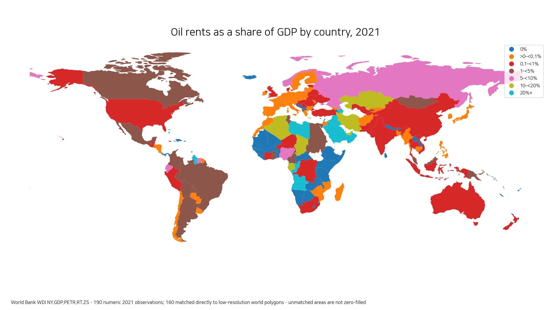
Table of Contents
Oil rents are not the same as crude-oil sales
The World Bank defines oil rents as the difference between the value of crude-oil production at regional prices and the total costs of production. In the broader natural-resource-rent methodology, the estimated price of a unit of the commodity is compared with average unit production cost, the resulting unit rent is applied to the physical quantity produced, and the result is expressed here as a percentage of GDP. The indicator is therefore different from gross oil sales, company accounting profit, government petroleum revenue, and crude-oil exports.
A high percentage means that the estimated economic rent from oil production was large relative to GDP in that year. Commodity prices, production costs, physical output and the GDP denominator all matter. Two countries with similar oil output can have different ratios when costs or economic size differ, while a large diversified economy can have substantial oil production but a low percentage because GDP is much larger.
150 of 190 observations are below 1% of GDP
The 190 same-year observations are extremely right-skewed. Their simple mean is 2.59%, while the median is only 0.014%. Seventy-six observations are reported as exactly 0%, and 150 are below 1%. Only 24 reach 5% or more, 18 reach 10% or more, and eight reach 20% or more. A relatively small group of very high values therefore pulls the average far above the median.
| Share of GDP | Countries/economies |
|---|---|
| 0% | 76 |
| >0–<0.1% | 44 |
| 0.1–<1% | 30 |
| 1–<5% | 16 |
| 5–<10% | 6 |
| 10–<20% | 10 |
| 20%+ | 8 |
Reported zero and missing data are not the same thing. The 76 zeros are numeric 2021 observations in the source. Ten additional economies in the latest-available file do not have a 2021 value and are excluded from the same-year statistics rather than being converted to zero. A reported 0% also does not prove that a country has no oil resources; it means the measured oil-rent share is zero at the scope and precision of this indicator.
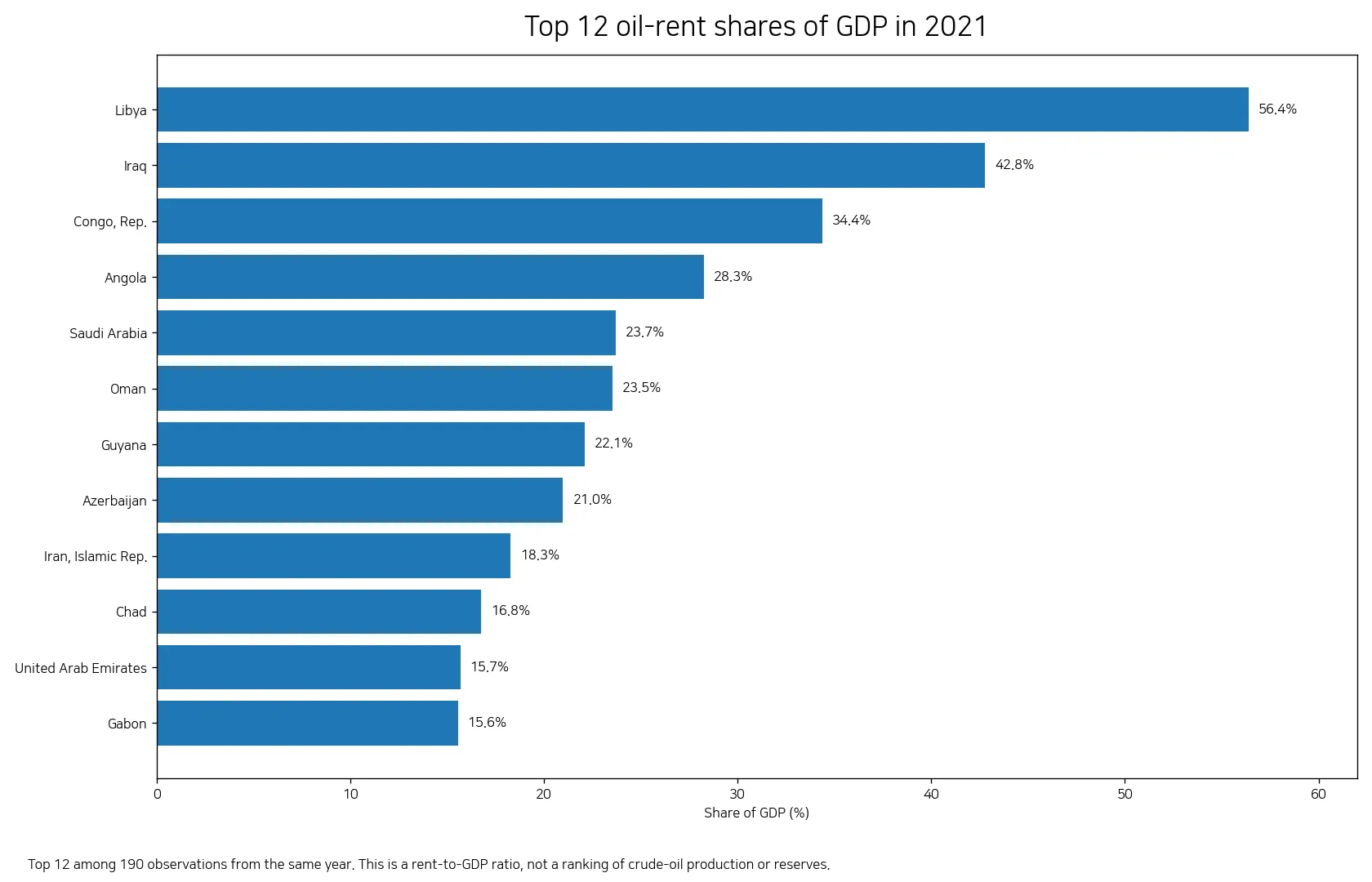
Libya and Iraq stand out, with many high values across the Middle East and North Africa
Libya records the highest 2021 value at 56.38% of GDP, followed by Iraq at 42.79%, Republic of the Congo at 34.38%, and Angola at 28.27%. Saudi Arabia reaches 23.69%, Oman 23.54%, Guyana 22.08%, and Azerbaijan 20.98%. Iran is at 18.27%, Chad 16.75%, the United Arab Emirates 15.67%, Gabon 15.56%, Qatar 15.28%, and Equatorial Guinea 14.94%.
| Country/economy | 2021 share of GDP |
|---|---|
| Libya | 56.38% |
| Iraq | 42.79% |
| Congo, Rep. | 34.38% |
| Angola | 28.27% |
| Saudi Arabia | 23.69% |
| Oman | 23.54% |
| Guyana | 22.08% |
| Azerbaijan | 20.98% |
The geographic pattern is especially visible across the Middle East and North Africa. Libya, Iraq, Saudi Arabia, Oman, Iran, the United Arab Emirates, Qatar and Algeria all exceed 10%. Around the Caspian and Eurasian region, Azerbaijan is at 20.98%, Kazakhstan at 14.84%, and the Russian Federation at 9.67%. A second concentration appears in parts of Central and West Africa, including Republic of the Congo at 34.38%, Angola at 28.27%, Chad at 16.75%, Gabon at 15.56%, Equatorial Guinea at 14.94%, and Nigeria at 6.25%.
Neighboring and oil-producing economies can still have very different ratios
Regional labels hide large country-level differences. In the Gulf, Saudi Arabia and Oman are both above 23%, while the United Arab Emirates and Qatar are around 15%. In North Africa, Libya is at 56.38%, compared with Algeria at 14.46%, Egypt at 2.99%, and Tunisia at 1.55%. In South America, Guyana reaches 22.08%, while Suriname is at 7.93%, Ecuador 6.40%, Colombia 3.42%, and Brazil 2.60%.
Those gaps should not be translated directly into a ranking of oil abundance. The ratio combines crude-oil prices, average production costs, physical production and GDP. The United States, for example, records 0.61%, while China is at 0.31%, India 0.33%, and Australia 0.26%. These low percentages do not show that their oil industries are necessarily small in absolute terms. Physical production in barrels, export volumes and reserves answer different questions.
A low or zero value does not describe oil consumption or reserves
An economy can have a low oil-rent share because domestic crude production is limited, because estimated rent is small relative to GDP, or because the production-cost and price relationship leaves little measured rent. The indicator also does not rise merely because a country consumes or imports large quantities of petroleum. It concerns domestic crude-oil production and the economic rent estimated from that production.
For the same reason, the map should not be read as a reserves map. Reserves are a geological stock, production is a physical flow, exports are trade values, and petroleum-related government revenue is a fiscal measure. Oil rents as a share of GDP are a separate economic indicator. Using the right measure for the question matters, particularly when comparing large diversified economies with smaller hydrocarbon-dependent ones.
The map directly represents 160 of the 190 statistical observations
All 190 numeric 2021 observations are retained for the statistics and rankings. Joining ISO-3 country codes to a simplified Natural Earth world boundary layer directly matches 160 of them to polygons. Several small islands, territories and very small states do not have a distinct polygon in this low-resolution geometry or do not match cleanly at world scale. Bahrain is a useful example: it has a high 2021 value but is too small to be visually prominent on a global choropleth.
That is why the map, bar chart and table serve different purposes. The map reveals broad spatial clusters, while the chart and table preserve small countries and outliers. A place that is not visibly shaded should not automatically be interpreted as missing from the statistical sample, and a country without a 2021 observation is never assigned another year’s value simply to fill the map.
A one-year rent ratio is not a long-run measure of dependence
Oil prices can change sharply from year to year, and production volumes and extraction costs also move. GDP changes at the same time. A country that is above 10% in 2021 could therefore occupy a different band in another period without any change in proven reserves. A trend analysis would require the same indicator across multiple years, with missing years kept separate and changes interpreted alongside commodity-price conditions.
A high percentage is also not an overall verdict on economic performance. It says that estimated oil rent was large relative to GDP in 2021. It does not show how much of that value accrued to the government, how it was distributed, whether the economy is diversified, how many jobs the sector supports, or what environmental costs accompanied production. Those questions require fiscal, industry, labor and environmental datasets in addition to this series.
Data source and calculation method
The numeric source is World Bank World Development Indicators series NY.GDP.PETR.RT.ZS. World Bank metadata defines oil rents as the difference between the value of crude-oil production at regional prices and total production costs, within a natural-resource-rent methodology that applies estimated unit rent to physical production and expresses the result here relative to GDP. Every mean, median, distribution count and ranking in this article is calculated from the 190 numeric observations dated 2021. Ten older latest-available observations are excluded from the same-year comparison.
Frequently Asked Questions
Are oil rents the same as crude-oil production?
No. World Bank NY.GDP.PETR.RT.ZS measures estimated economic rent from crude-oil production relative to GDP. Physical output, reserves, exports and government petroleum revenue are separate measures.
Which country has the highest 2021 oil-rent share of GDP?
Among the 190 numeric 2021 observations, Libya is highest at about 56.38% of GDP, followed by Iraq at about 42.79% and Republic of the Congo at about 34.38%.
Does a reported 0% mean a country has no oil?
No. It means the measured oil-rent share is reported as zero for this indicator. It does not directly describe geological reserves, oil consumption or imports.
Why are only 190 observations used when the latest-available file has 200?
Ten of the 200 latest non-missing observations are dated 2020 or earlier. They are excluded so the map, rankings and summary statistics compare the same reference year, 2021.
Related Articles
Green Map creates custom-edited map images using open geographic data sources such as geoBoundaries, Natural Earth, OpenStreetMap, and government open data.
These maps are edited visual materials, not raw data files, and are provided for education, documents, presentations, and graphic reference.