Natural gas rents account for very different shares of economic output across countries. In the 2021 World Bank comparison used here, 190 countries and separately reported economies have numeric observations. Exactly half of those observations—95—are recorded as 0%, while the other 95 are positive. At the upper end, a small group reaches well above 5% or even 10% of GDP, so the world map has a pronounced contrast between many very low values and a short upper tail. This indicator should not be read as a ranking of gas reserves or physical production. It measures the estimated economic rent from natural gas production relative to the size of GDP.
The World Bank indicator code is NY.GDP.NGAS.RT.ZS, formally titled Natural gas rents (% of GDP). The World Bank defines natural gas rents as the difference between the value of natural gas production at regional prices and total production costs. In the broader natural-resource-rent methodology, estimated unit rent is combined with the quantity produced and then expressed here as a share of GDP. That means the measure is not gross gas sales and is not the same as an accounting profit figure reported by energy companies. Prices, average production costs, output volumes and the size of the national economy all affect the ratio.
Table of Contents
The 2021 distribution is dominated by low values and a small high-rent tail
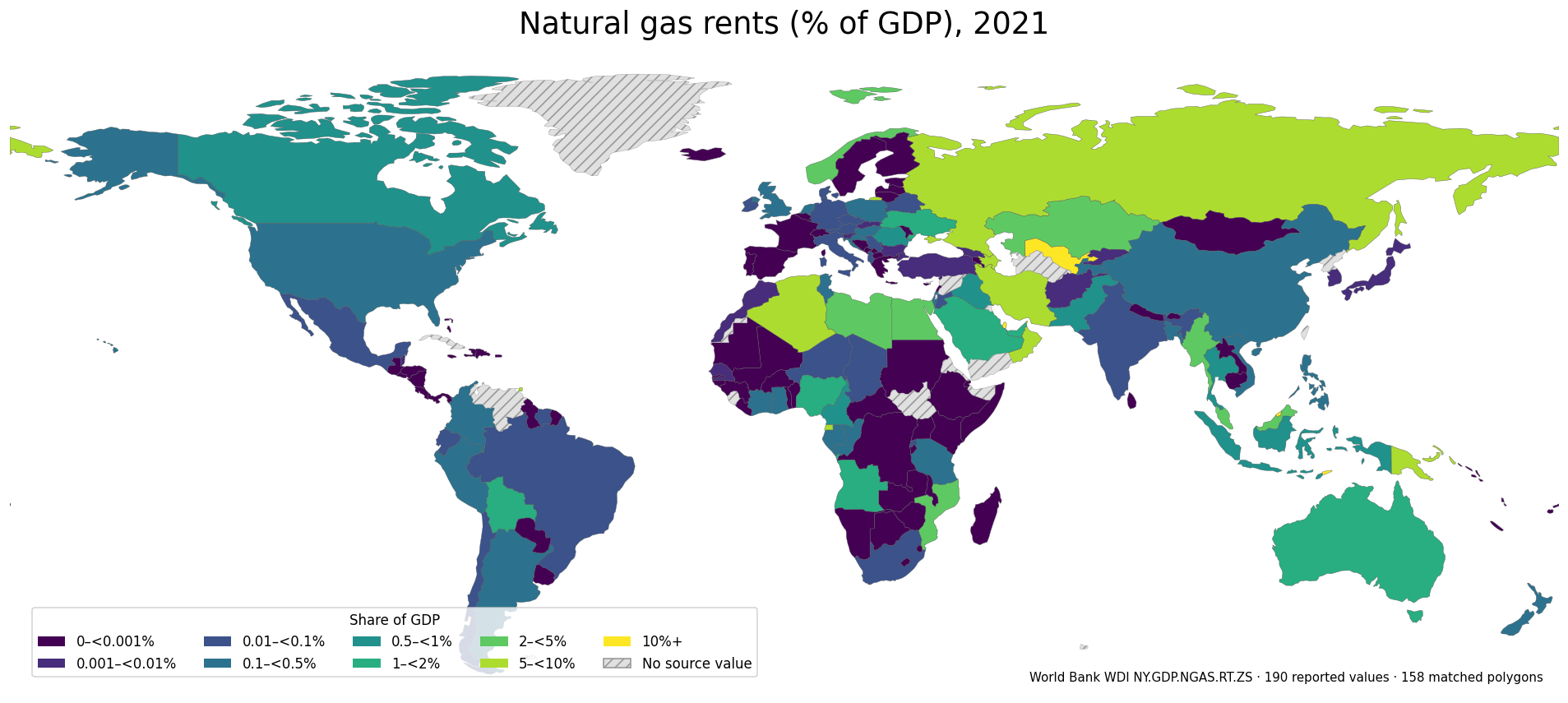
The distribution is extremely right-skewed. Of the 190 numeric observations, 95 are exactly 0%. Another 39 are above zero but below 0.1% of GDP. Together, 134 observations—about 70.5% of the sample—fall below 0.1%. Only 13 observations reach 5% or more, and just four exceed 10%. The unweighted mean is about 0.93%, while the median is effectively zero at roughly 0.00003%. The large gap between the mean and median is a clear sign that a small number of high observations pull the average upward.
| Share of GDP | Countries/economies |
|---|---|
| 0% | 95 |
| >0–<0.1% | 39 |
| 0.1–<0.5% | 22 |
| 0.5–<1% | 7 |
| 1–<2% | 7 |
| 2–<5% | 7 |
| 5–<10% | 9 |
| 10%+ | 4 |
This shape matters when the map is interpreted. A single continuous color scale from zero to almost 30% would allow the highest values to dominate the visual range and compress most countries into nearly indistinguishable shades. The map therefore separates the low ranges more finely while retaining distinct classes for 5–10% and 10% or more. A reported zero is also different from a missing observation. The source contains 27 rows without a 2021 value, and those missing values are not converted to zero. Treating them as zero would blur the difference between a measured zero and an unavailable observation.
Timor-Leste is highest at 29.38%, followed by Brunei, Qatar and Uzbekistan
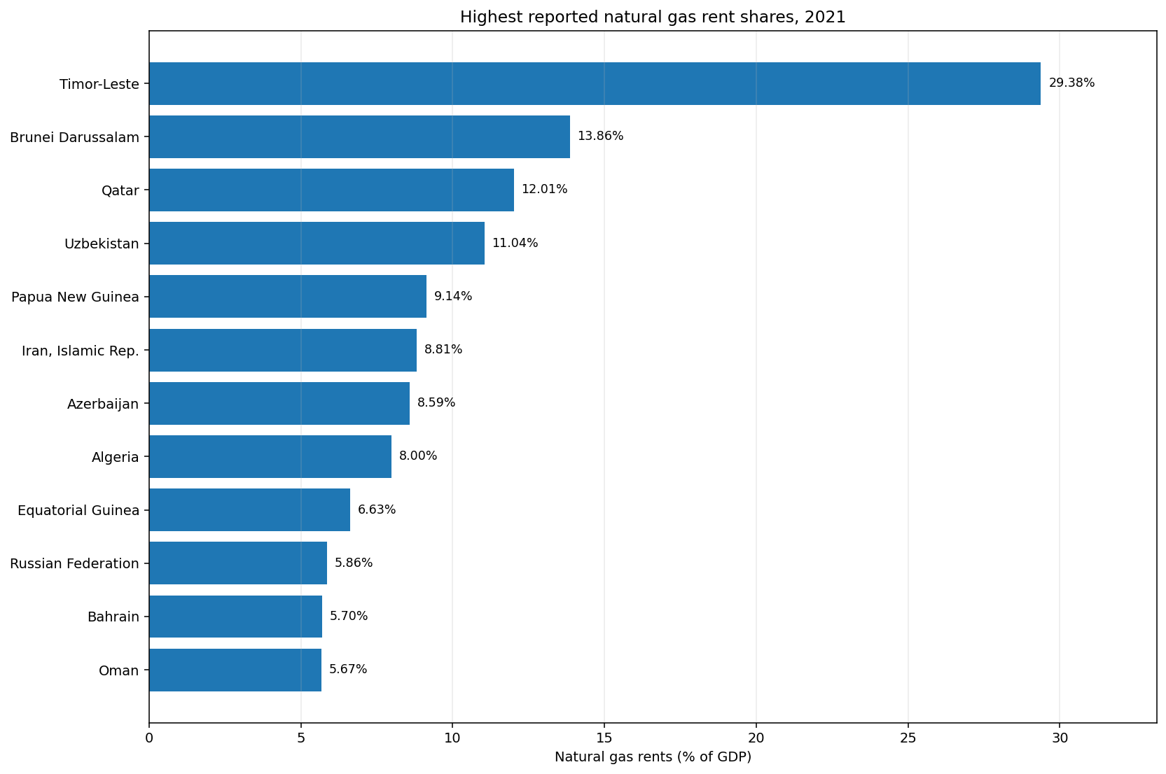
Timor-Leste has the highest 2021 value at 29.38% of GDP. Brunei Darussalam follows at 13.86%, Qatar at 12.01% and Uzbekistan at 11.04%; these are the only four observations above 10%. Papua New Guinea is next at 9.14%, followed by Iran at 8.81%, Azerbaijan at 8.59% and Algeria at 8.00%. Equatorial Guinea records 6.63%, the Russian Federation 5.86%, Bahrain 5.70% and Oman 5.67%. These rankings describe the rent-to-GDP ratio, not physical gas output. A smaller economy can show a larger percentage even when the absolute amount of rent is below that of a much larger producer.
| Rank | Country/economy | 2021 share of GDP |
|---|---|---|
| 1 | Timor-Leste | 29.38% |
| 2 | Brunei Darussalam | 13.86% |
| 3 | Qatar | 12.01% |
| 4 | Uzbekistan | 11.04% |
| 5 | Papua New Guinea | 9.14% |
| 6 | Iran, Islamic Rep. | 8.81% |
| 7 | Azerbaijan | 8.59% |
| 8 | Algeria | 8.00% |
| 9 | Equatorial Guinea | 6.63% |
| 10 | Russian Federation | 5.86% |
| 11 | Bahrain | 5.70% |
| 12 | Oman | 5.67% |
The high values are geographically dispersed but form several visible regional groupings. Qatar, Iran, Algeria, Bahrain, Oman and Libya stand out across the Middle East and North Africa. Uzbekistan and Azerbaijan are prominent across Central Eurasia and the Caucasus. Timor-Leste, Brunei, Papua New Guinea, Malaysia and Australia create another cluster across Southeast Asia and Oceania, while Trinidad and Tobago reaches 5.09% in the Caribbean. These clusters are useful spatial signals, but the map alone cannot establish why one country has a high ratio. Production volumes, regional prices, production costs and GDP all contribute to the result.
Neighboring countries can occupy very different parts of the scale
One of the most informative features of the map is the sharp contrast between nearby countries. In the Gulf, Qatar is at 12.01%, while the United Arab Emirates is at 1.96% and Saudi Arabia at 1.72%. Oman is higher at 5.67% and Bahrain at 5.70%. Kuwait does not have a numeric 2021 observation in this dataset, so it is not assigned a value for this comparison. The spread within one gas-producing region shows why geographic proximity or a shared energy-export profile does not guarantee a similar rent-to-GDP ratio.
North Africa shows another strong gradient: Algeria is at 8.00%, Libya 4.58% and Egypt 2.05%, while Tunisia is 0.49% and Morocco only 0.009%. In Central Asia, Uzbekistan reaches 11.04%, but Kazakhstan is at 2.04%, Tajikistan at 0.17% and the Kyrgyz Republic at 0.002%. Azerbaijan is 8.59% compared with Georgia at 0.009% and Armenia at 0%. In northern Europe, Norway is at 3.94%, while Sweden and Finland are 0% and Denmark is about 0.06%. The border-to-border differences are often much larger than a region-level label would suggest.
| Regional comparison | Higher observation | Nearby comparisons |
|---|---|---|
| Gulf | Qatar 12.01% | Oman 5.67% · Bahrain 5.70% · UAE 1.96% · Saudi Arabia 1.72% |
| North Africa | Algeria 8.00% | Libya 4.58% · Egypt 2.05% · Tunisia 0.49% · Morocco 0.009% |
| Central Asia | Uzbekistan 11.04% | Kazakhstan 2.04% · Tajikistan 0.17% · Kyrgyz Republic 0.002% |
| Caucasus | Azerbaijan 8.59% | Georgia 0.009% · Armenia 0% |
| Northern Europe | Norway 3.94% | Denmark 0.06% · Sweden 0% · Finland 0% |
Those geographic contrasts identify places where deeper energy and macroeconomic data would be useful, but they are not causal evidence. The ratio can change because of gas prices, average extraction and production costs, output volumes and the denominator—GDP. Exchange-rate movements can also affect nominal GDP comparisons when national accounts are converted and aggregated. A higher value than a neighboring country therefore does not prove larger reserves, greater efficiency or stronger economic performance. It simply shows that estimated natural gas rent was larger relative to GDP in that year.
A reported 0% does not mean a country has no natural gas
The fact that exactly half of the numeric observations are recorded at 0% requires careful interpretation. A zero in this indicator means the measured rent-to-GDP value is zero at the precision reported in the source; it does not prove that no natural gas exists geologically, that households and industry do not consume gas, or that the country has no gas infrastructure. The indicator concerns domestic natural gas production and the economic rent estimated from that production. An economy that imports most of its gas can consume large amounts while still having little or no domestic production rent.
The measure is also not equivalent to gas-export dependence. Export values can include gross sales revenue and reflect contract structures that are different from the World Bank rent methodology. Some produced gas is consumed domestically rather than exported. A large economy can have substantial gas production and still post a modest rent share because GDP is much larger, while a smaller economy can have a high percentage with a lower absolute amount of rent. Physical production, export receipts, energy-sector value added and fiscal revenue are separate indicators and should be used when those are the questions of interest.
What does “natural gas rent” actually measure?
The World Bank metadata provides a precise definition: natural gas rents are the difference between the value of natural gas production at regional prices and total costs of production. In the natural-resource-rent methodology, the price of a unit of the commodity is compared with the estimated average unit production cost. The resulting unit rent is applied to the physical quantity produced, and this indicator then expresses the estimated rent as a percentage of GDP. In plain language, it is closer to the economic surplus associated with extracting and producing natural gas than to total sales, reserves or company profits.
A high share is therefore not an automatic positive or negative verdict. It says that estimated natural gas rent was large relative to economic output in 2021. It does not tell us how the proceeds were distributed between governments, state-owned companies and private firms, whether the money was saved or invested, how many jobs the sector created, how exposed public finances were to gas-price swings, or what environmental costs accompanied production. Those questions require fiscal, corporate, labor, emissions, trade and governance data in addition to this single indicator.
Coverage and map limitations matter when comparing countries
The source table contains 217 country/economy rows for 2021. Numeric values are present for 190, while 27 are preserved as source-missing observations. All rankings, averages, medians, distribution counts and tables in this article use only the 190 numeric observations. The 27 missing rows are not filled with zero. This distinction is essential because the dataset also contains 95 genuine reported zeros. Combining those two states would overstate the number of zero-rent economies and distort both the distribution and the map.
For visualization, ISO-3 country codes are joined to a simplified Natural Earth world boundary layer. Of the 190 numeric observations, 158 match directly to visible polygons in that low-resolution geometry. Small islands, dependent territories and separately reported areas may have valid statistics but no distinct polygon large enough or separately represented at this map scale. The statistical ranking therefore remains based on all 190 numeric values rather than only the countries that can be colored on the map. Bahrain is a useful example: it is among the twelve highest observations but is too small to be visually prominent on a global map, so the bar chart and table are important complements.
How to use the 2021 map without over-reading it
The map is most useful for locating where natural gas rent had unusually large economic weight in 2021. Instead of focusing only on the top country, compare the 5%+ cluster with the 1–5% middle group and the much larger group below 0.1%. Several high-value areas appear in the Middle East and North Africa, Central Asia and the Caucasus, and parts of Southeast Asia and Oceania, but the within-region variation is substantial. The appropriate reading is therefore not “gas-producing regions are all dark,” but “a limited set of economies had natural gas rent that was large relative to their GDP in this year.”
A one-year map should not be treated as a long-run trend. Natural gas prices, extraction costs and production volumes can change sharply, while GDP also changes from year to year. The same country could occupy a different class in another period even without a major change in reserves. A trend analysis would need the same indicator across multiple years, with year-to-year changes calculated consistently and missing observations kept separate. This article deliberately holds the reference year fixed at 2021 so that the geographic comparison is not mixed with differences in observation timing.
Data source and calculation method
The numeric source is the World Bank World Development Indicators series NY.GDP.NGAS.RT.ZS. Rankings, the unweighted mean, the median and all distribution counts are calculated directly from the 190 numeric 2021 observations. The 27 source-missing rows remain missing. The World Bank metadata defines the measure as the difference between the value of natural gas production at regional prices and total production costs, within a broader natural-resource-rent methodology that applies estimated unit rent to the physical quantity produced and expresses the result here relative to GDP.
Frequently Asked Questions
What does natural gas rents as a share of GDP measure?
World Bank NY.GDP.NGAS.RT.ZS measures the estimated difference between the value of natural gas production at regional prices and total production costs, expressed as a percentage of GDP. It is not gross gas sales or a measure of reserves.
Which country or economy has the highest 2021 value?
Among the 190 numeric 2021 observations, Timor-Leste is highest at about 29.38% of GDP, followed by Brunei Darussalam at 13.86%, Qatar at 12.01%, and Uzbekistan at 11.04%.
Are reported zeros the same as missing data?
No. The dataset contains 95 numeric observations reported as exactly 0% and 27 separate rows with no 2021 value. Missing observations are preserved as missing rather than converted to zero.
Does a high percentage mean a country has larger gas reserves or production?
Not necessarily. The ratio depends on gas prices, average production costs, physical output and the size of GDP. Reserves and physical production require separate energy statistics.
Related Maps
Green Map creates custom-edited map images using open geographic data sources such as geoBoundaries, Natural Earth, OpenStreetMap, and government open data.
These maps are edited visual materials, not raw data files, and are provided for education, documents, presentations, and graphic reference.