The share of men aged 75–79 varies widely across the 217 countries and economies reported for 2025. In the World Bank series SP.POP.7579.MA.5Y, Japan has the highest value at 6.61%, while Qatar has the lowest at 0.17%. That gap does not describe the size of the countries. It describes how much of each place’s own male population falls inside one five-year age band.
The denominator matters. A value of 4% means that roughly four of every 100 males are 75–79, not that 4% of the total population is in that age group. A populous country can have a lower share but far more men aged 75–79 in absolute numbers, while a small territory can post a high share with a relatively small number of people. This indicator is therefore best used to compare age structure rather than service volumes or population size.
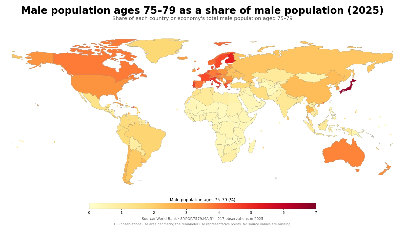
Table of Contents
Japan stands out, while several European countries form a high-share cluster
Japan is the clearest high-value case at 6.61%, followed closely by Monaco at 6.36%. Finland reaches 5.16% and the Isle of Man 5.12%. Italy, Portugal, Denmark and Sweden are also in the upper group, and Hong Kong records 4.55%. Puerto Rico, at 4.80%, shows that the upper end is not limited to Europe and East Asia.
This pattern should not be converted automatically into a general ranking of population ageing. The measure isolates men aged 75–79 rather than everyone aged 65 or older. A country with a large 65–69 group or a large 80-plus group can have a different position when only 75–79 is examined. The map is best read as the relative thickness of one male birth cohort at a particular point in time.
South Korea records 3.12% and ranks 44th among the 217 observations. That is above the global-country median of 1.27%, but well below Japan’s 6.61%. The comparison is descriptive only: this one age-share measure does not by itself indicate health outcomes, pension pressure, or the number of people who may need age-related services.
The distance between the highest and lowest observations is 6.44 percentage points
The difference between Japan at 6.61% and Qatar at 0.17% is about 6.44 percentage points. Expressed as a ratio, the Japanese value is roughly 39.2 times the Qatari value. Ratios can look dramatic when the denominator is very small, so the percentage-point gap is often the more stable way to describe the contrast.
| Top rank | Country or economy | Share | Bottom rank | Country or economy | Share |
|---|---|---|---|---|---|
| 1 | Japan | 6.61% | 1 | Qatar | 0.17% |
| 2 | Monaco | 6.36% | 2 | Zambia | 0.22% |
| 3 | Finland | 5.16% | 3 | Naoero | 0.25% |
| 4 | Isle of Man | 5.12% | 4 | United Arab Emirates | 0.26% |
| 5 | Puerto Rico (US) | 4.80% | 5 | Central African Republic | 0.27% |
| 6 | Italy | 4.76% | 6 | Chad | 0.28% |
| 7 | Portugal | 4.70% | 7 | Uganda | 0.29% |
| 8 | Hong Kong SAR, China | 4.55% | 8 | Mozambique | 0.33% |
| 9 | Denmark | 4.47% | 9 | Afghanistan | 0.33% |
| 10 | Sweden | 4.46% | 10 | Kuwait | 0.34% |
The lower end combines very different demographic settings. Qatar, the United Arab Emirates and Kuwait have unusually small shares of men aged 75–79, while Zambia, the Central African Republic, Chad, Uganda and Mozambique also sit near the bottom. Similar percentages do not imply similar population histories. In one setting, large working-age migrant populations may expand the male denominator; in another, very young age structures may make older cohorts a small part of the total.
Nauru is another reminder that small populations require care in interpretation. A modest change in births, survival or migration can move a five-year age share more noticeably when the underlying population is small. For small islands and territories, the table is often more informative than the world map because their land area is difficult to see at global scale.
Most observations remain below 2%
The simple mean across the 217 observations is 1.79%, while the median is only 1.27%. The first quartile is 0.57% and the third quartile is 2.82%, so the middle half of countries and economies lies between about 0.57% and 2.82%. The mean sits above the median because the distribution has a long upper tail formed by a relatively small group of 4–6% observations.
| Share of male population aged 75–79 | Number of observations | Share of 217 |
|---|---|---|
| Below 0.5% | 41 | 18.9% |
| 0.5% to <1% | 50 | 23.0% |
| 1% to <2% | 46 | 21.2% |
| 2% to <3% | 32 | 14.7% |
| 3% to <4% | 29 | 13.4% |
| 4% to <5% | 15 | 6.9% |
| 5% to <6% | 2 | 0.9% |
| 6% or more | 2 | 0.9% |
There are 41 observations below 0.5%, 50 between 0.5% and 1%, and 46 between 1% and 2%. Together, 137 of 217 observations, or 63.1%, are below 2%. Only 19 observations are at 4% or more, and just four are at 5% or more. A 5% share is therefore not a typical worldwide level; it marks a relatively thick 75–79 male cohort.
This skew is why a single average can be misleading. If 1.79% is treated as the only reference point, it hides the concentration of observations near 1% and the small number of much higher values. The median, quartiles and interval counts give a clearer picture of how unusual the upper-end cases really are.
The 75–79 band carries the demographic history of men born in the late 1940s
In 2025, men aged 75 were generally born around 1950 and men aged 79 around 1946. The current share therefore contains the long-run effects of the size of those birth cohorts, their survival over the following decades, and migration in or out of the population. Two countries that had similar numbers of male births in the late 1940s can still arrive at very different 2025 shares if mortality, migration or the size of younger generations evolved differently.
The denominator can change just as much as the numerator. Even if the number of men aged 75–79 is stable, rapid growth of younger male age groups can push the share downward. Conversely, the share can rise if younger cohorts shrink, even when the number of men aged 75–79 changes little. That is why a high share should not be translated directly into a statement that the 75–79 population “grew rapidly.”
Adjacent age bands can add context, but they should be measured rather than inferred. The men who are 70–74 in 2025 will move into 75–79 over the next several years, while the current 75–79 cohort will move into the 80-plus category. Because cohort sizes and survival differ, the next age band cannot be estimated reliably from this map alone. A time series is needed to discuss increase or decline.
Low shares can emerge from very different population structures
Qatar at 0.17%, the United Arab Emirates at 0.26% and Kuwait at 0.34% sit near the bottom, as do Zambia at 0.22%, Chad at 0.28% and Uganda at 0.29%. Those low values should not be treated as one demographic category. Gulf economies can have very large working-age male populations associated with international migration, while many Sub-Saharan African countries have age structures dominated by children and younger adults.
Both situations can make men aged 75–79 a small fraction of all males, but the mechanisms are not interchangeable. The indicator itself only shows the final numerator-to-denominator relationship. Explaining why a country is low or high requires additional evidence on fertility, survival and migration rather than an inference from color on the map.
A percentage answers a different question from an absolute population count
For cross-country age-structure comparisons, percentages are useful because they reduce the direct effect of total population size. Japan and Monaco have similar high shares, yet the number of men aged 75–79 is clearly not comparable in scale. Planning for hospitals, home care, mobility assistance or housing requires the absolute population count as well as the share.
The reverse is also true. Absolute counts naturally place very populous countries near the top, which can obscure whether a five-year age band is unusually large or small inside each country’s own male population. The share answers “how large is this cohort within the male population?” while the count answers “how many people are there?” The two measures complement rather than replace one another.
The world map is best for regional patterns, not tiny territories
The World Bank country series includes sovereign states as well as some separately reported economies and territories. Of the 217 observations, 166 could be shown with area geometry in the low-resolution world layer used here; the remainder are represented by points at their approximate geographic locations. All 217 observations are still included in the rankings and distribution statistics.
There are no missing 2025 values in this dataset, so pale colors should not be read as “no data.” They represent genuinely low percentages. The point markers are a display device for small or unmatched areas, not separate measurements. For places such as Monaco, the Isle of Man or small Caribbean and Pacific territories, the table gives a more precise reading than the map itself.
Data source and calculation
The analysis uses the 2025 observations from the World Bank API for SP.POP.7579.MA.5Y. The World Bank indicator page provides the country time series. The World Bank defines the measure as the male population aged 75–79 as a percentage of the total male population, with the underlying age-sex structure sourced from the United Nations Population Division’s World Population Prospects.
All 217 rows have a 2025 value, so no missing observation was converted to zero and no earlier-year value was substituted. The maximum, minimum, rankings, arithmetic mean, median, quartiles and interval counts are calculated directly from the same 217 observations. The arithmetic mean is an unweighted mean across reporting countries and economies; it is not the share of all men worldwide who are aged 75–79.
Frequently Asked Questions
What does a 3% share of men aged 75–79 mean?
It means that about three out of every 100 males in that country or economy are aged 75–79. It does not mean that 3% of the total population is in that age group.
Does a high 75–79 male share automatically mean a country is more aged overall?
No. The indicator covers only one five-year age band. Measures such as the total 65-plus share, the 80-plus share and median age are needed for a broader view of population ageing.
Why should the percentage and the absolute number of men aged 75–79 be examined separately?
The percentage shows how large the cohort is within the male population, while the absolute count shows how many people are actually in the cohort. Countries with very different population sizes can have similar percentages but very different counts.
Related Maps
Green Map creates custom-edited map images using open geographic data sources such as geoBoundaries, Natural Earth, OpenStreetMap, and government open data.
These maps are edited visual materials, not raw data files, and are provided for education, documents, presentations, and graphic reference.