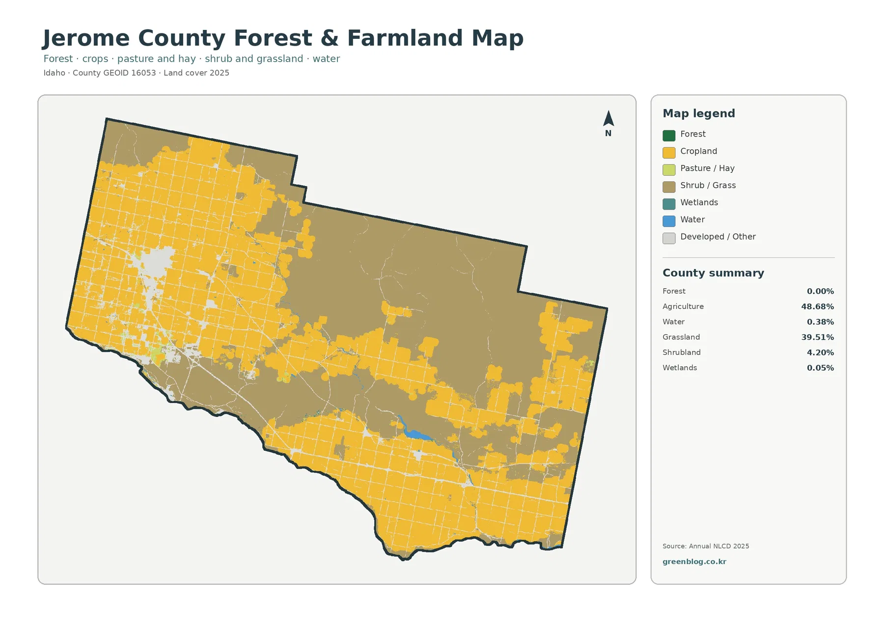
The four maps on this page cover Jerome County in south-central Idaho from different angles: present-day land cover, agriculture and open land, impervious surfaces, and mapped class differences from 1985 to 2025. The 2025 summary is dominated by agriculture at 48.68% and grassland at 39.51%. Those two classes do not form one uniform blanket. Large farm blocks occupy much of the west and south, while a broad open interior is more strongly associated with grassland and shrubland.
All four original JPG maps are available together in one ZIP farther down the page. The set is useful when you want to compare the urban concentration around Jerome with the surrounding farm grid, the less-developed central and northeastern interior, and the small amount of mapped water. These are land-cover maps, not zoning or parcel maps. They describe what broadly covers the ground in the source data and should not be used to decide ownership, legal land use, or whether a property can be developed.
Table of Contents
Start with the built footprint around Jerome
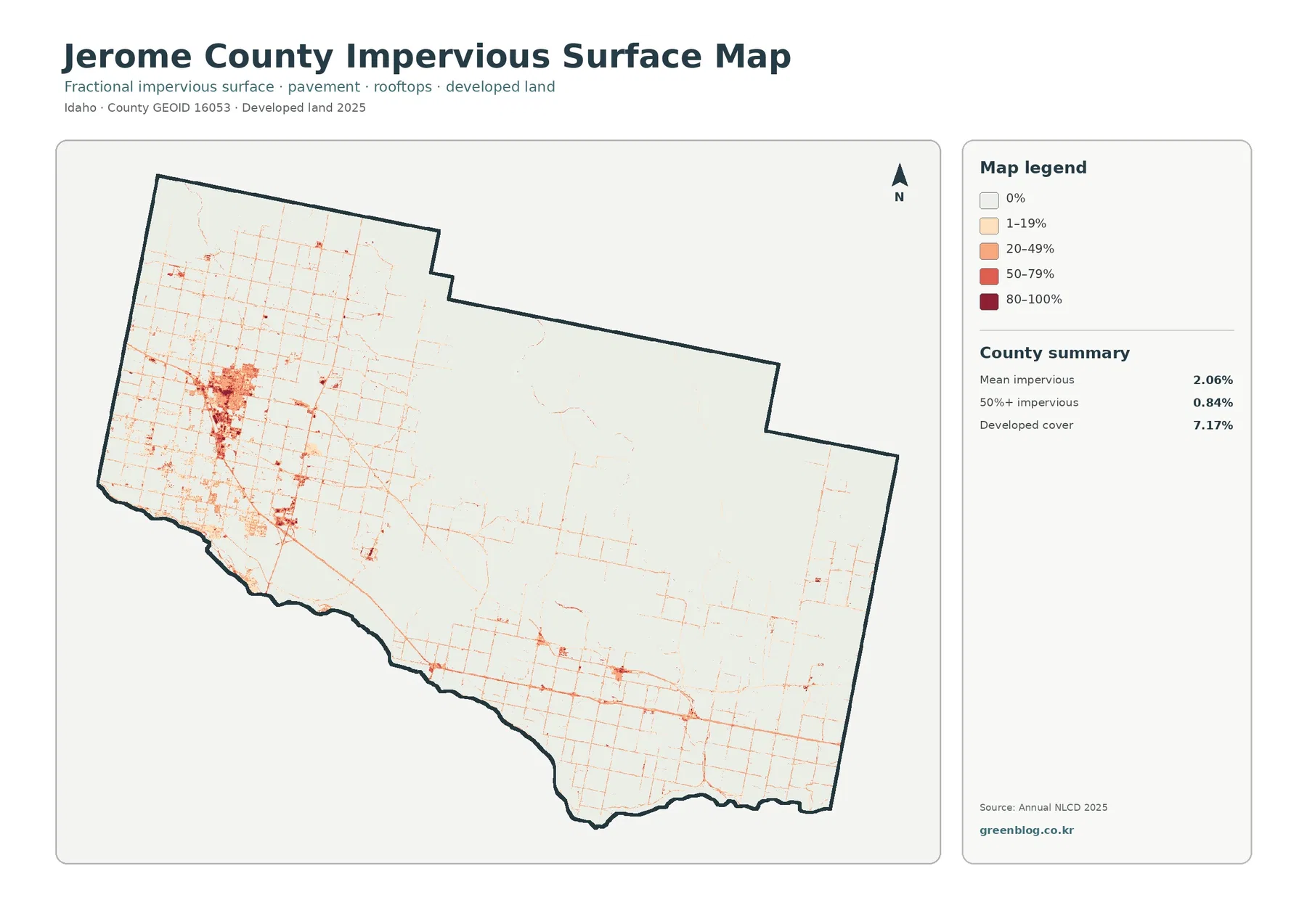
The impervious-surface view makes Jerome County’s main developed center immediately recognizable. Most of the county is pale because pavement and rooftops occupy a small share of the landscape overall, but a dense cluster of darker cells appears in the western part of the county around the city of Jerome. Thin lines extend outward through the surrounding agricultural area, tracing places where roads and other hard surfaces are concentrated. Smaller nodes appear farther east and south, but they are much less extensive than the Jerome cluster.
The map summary reports a mean impervious value of 2.06%, with only 0.84% of the county in cells that are at least 50% impervious. Developed land, however, accounts for 7.17% on the general land-cover map. Those numbers measure different things. The developed class identifies areas whose overall land-cover classification is developed, including lower-intensity settings, while fractional impervious data estimate the share of a cell covered by surfaces such as pavement or rooftops. A rural road corridor can therefore register some impervious surface without looking like a large urban block.
Interstate 84 crosses the southern part of Jerome County, and the Idaho Transportation Department documents the South Jerome interchange on that route. The linear impervious pattern visible south of Jerome is consistent with a major transportation corridor, but the map by itself does not establish why development occurred in a particular location. It is safer to describe roads, settlements, and impervious surfaces as occupying the same corridor unless a planning or historical source supports a causal explanation.
A county divided between farm blocks and open grassland
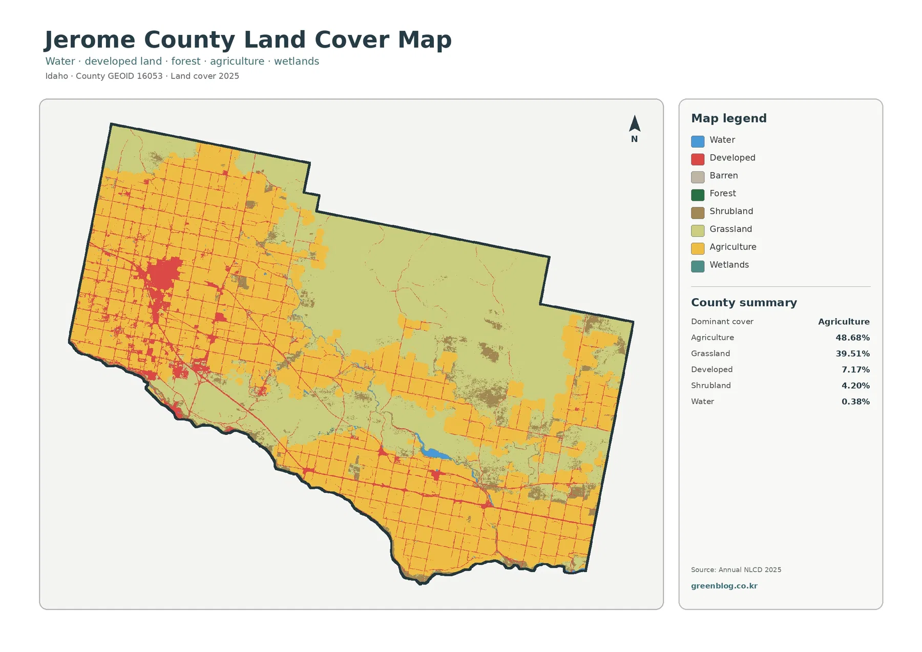
The general 2025 land-cover map shows why a single countywide percentage can hide important local differences. Agriculture is the largest class at 48.68%, but it is especially prominent across the western side, the southern belt, and several eastern blocks. Grassland accounts for 39.51% and covers much of the broad interior, particularly north and northeast of the main southern agricultural belt. Shrubland adds another 4.20% and appears in scattered patches within the more open parts of the county.
Developed land at 7.17% is visually concentrated rather than evenly spread. The largest red patch corresponds to Jerome, which the U.S. Census Bureau reference map places in the western part of the county. Eden and Hazelton are farther east and southeast, where the land-cover map shows smaller developed spots among agricultural and open-land classes. Water makes up only 0.38% of the county summary, so blue areas are limited, yet they remain useful landmarks when comparing the central-southern reservoir area and the Snake River boundary with nearby farm and grassland patterns.
This broad pattern also fits the local agricultural context documented by University of Idaho Extension. The county office describes irrigation as vital to crop production in Jerome County and notes a wide mix of crops, including alfalfa hay, silage corn, barley, wheat, sugar beets, potatoes, and beans. That background helps explain why the agricultural side of the map appears as large, organized blocks separated by straight roads and field boundaries. The land-cover image does not identify individual crops, however, so a yellow agricultural cell should not be treated as a crop-type map.
Why the forest-and-farmland view is useful here
Jerome County has almost no area summarized as forest in this map set: the forest-and-farmland map reports 0.00% forest. That does not mean the county contains no trees. Annual NLCD uses 30-meter raster cells and assigns a predominant land-cover class, so narrow tree rows, individual shelterbelts, residential trees, or small riparian stands may be absorbed into a surrounding class. The value is best read as evidence that forest is not a county-scale dominant cover, not as a claim that every acre lacks woody vegetation.
Removing many of the general-map categories makes the farm/open-land contrast easier to see. Cropland covers extensive western and southern blocks, with additional agricultural areas toward the east. The central and northeastern portion is much more strongly represented by shrub and grass colors. Patches of pasture or hay occur within the agricultural landscape, while wetlands account for only 0.05% in the county summary. Water is similarly limited at 0.38%, so the strongest visual story in this view is the boundary between cultivated ground and the much larger open interior.
Water is a small class but a useful reference point
The southern edge of Jerome County follows the Snake River in the Census Bureau geographic reference map, and Wilson Lake Reservoir is shown inside the county. Those features help orient the land-cover images even though water covers only 0.38% of the county summary. Small blue areas and narrow water-related features sit next to agricultural land in several places, making them useful for checking where cultivated blocks approach reservoirs, drainage routes, or the river boundary.
Jerome County agriculture depends heavily on irrigation, according to University of Idaho Extension, but the maps on this page are not irrigation-infrastructure maps. A narrow canal can be smaller than a 30-meter cell or share a cell with cropland, so it may not appear as a continuous blue line. Water visibility can also vary with the date of imagery and surface conditions. Anyone studying a specific canal, water right, diversion, or reservoir operation should move from this county overview to dedicated water-resource records rather than treating the land-cover classification as a precise hydrographic survey.
What changed between 1985 and 2025
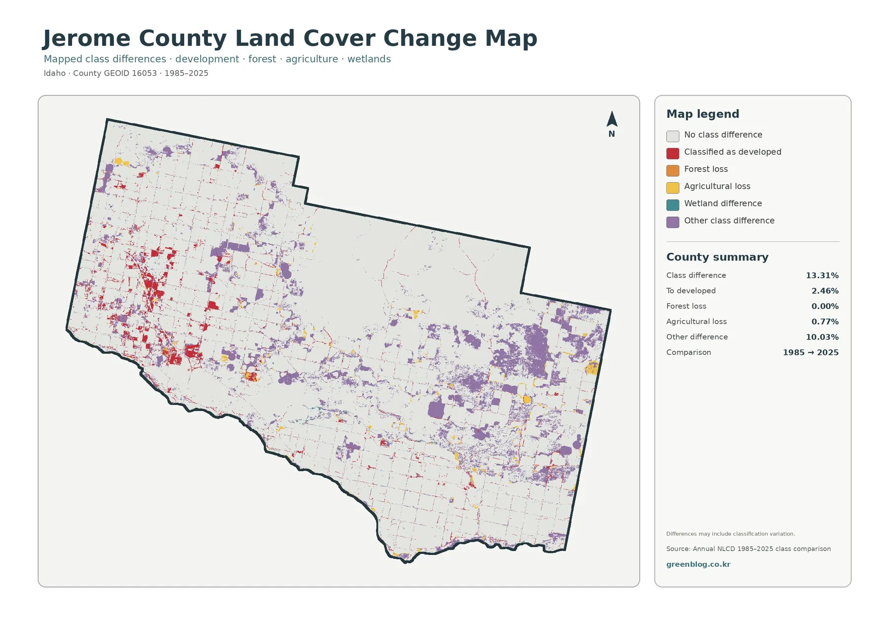
The change map compares land-cover classes at the beginning and end of the 1985–2025 period. It marks class differences across 13.31% of the county. Areas classified as becoming developed account for 2.46%, agricultural loss for 0.77%, forest loss for 0.00%, and other class differences for 10.03%. The large “other” share is important because it shows that the map is not simply a record of urban growth. Much of the mapped difference involves transitions among other land-cover classes or classification variation.
Red change pixels are most concentrated around the western urban area and appear in smaller strings and clusters along the developed network. Purple “other class difference” patches are more widespread in the eastern and central parts of the county. Yellow agricultural-loss areas are comparatively sparse. The map itself includes a caution that differences may include classification variation, so it would be a mistake to label every colored pixel as a confirmed land-use conversion without checking imagery or additional records.
A productive way to use this layer is as a screening map. If a red cluster around Jerome is relevant to a project, compare the 1985 and 2025 land-cover products, recent aerial photography, city boundaries, and planning records for that specific location. If a large purple patch in the east is the focus, inspect which classes are involved before describing the change. This workflow turns the map into a guide for where to investigate rather than a substitute for that investigation.
Choosing the right map for a specific task
Use the general land-cover map when the question is simply, “What covers the county now?” It keeps agriculture, grassland, shrubland, developed land, water, wetlands, barren ground, and forest in one view. For Jerome County, that makes the west-to-interior contrast immediately clear. If the question is specifically about cultivated ground versus open vegetation, the forest-and-farmland view removes much of the visual clutter and makes the farm blocks easier to compare with shrub and grass areas.
Use the impervious map when the built footprint matters more than the broad land-cover class. It is especially effective for comparing Jerome’s concentrated hard surfaces with the surrounding agricultural grid and the much lighter rural interior. The change map serves a different purpose: it identifies places where the 1985 and 2025 classifications differ. It should be paired with the 2025 map so readers can separate present condition from long-term difference rather than assuming that the change colors describe the current landscape by themselves.
For classroom or presentation use, the maps work well as a sequence. Begin with the 2025 overview, then simplify the agricultural/open-land pattern, move to impervious surfaces around Jerome, and finish with the long-period change layer. For print reference, keep the legend, year, county name, and map boundary visible. Cropping away the legend can make colors misleading, especially on the change map where red, yellow, purple, and teal represent specific difference categories rather than a simple scale from low to high.
Limits to keep in mind before using the maps
Annual NLCD is a raster product derived largely from Landsat imagery, and the U.S. Geological Survey describes the data as 30-meter resolution. Each cell therefore summarizes a square area rather than tracing every field edge, driveway, tree row, ditch, or building. A cell that contains more than one surface type can be assigned to the class that best represents the dominant signal. This generalization is appropriate for county-scale patterns but not for parcel measurement or site surveying.
Land cover also differs from zoning and legal land use. A cell classified as agriculture does not tell you its zoning district, owner, tax status, water entitlement, or development eligibility. Jerome County Planning & Zoning maintains separate zoning information and development procedures for those questions. The maps here are best used to compare broad surface patterns, identify places that deserve closer examination, and provide a consistent visual reference across the county.
Finally, the year matters. The 2025 map represents the source classification for that mapping year, so later construction, crop rotation, restoration, or other changes may not appear. The 1985–2025 layer compares two points in a long time series and cannot show every intermediate shift that occurred between them. For decisions that depend on current conditions, pair these maps with the newest available Annual NLCD release, recent aerial imagery, and current local records.
Frequently Asked Questions
What is the largest land-cover class in Jerome County?
Agriculture is the largest 2025 class at 48.68%, followed by grassland at 39.51%. Agriculture is especially prominent in the western and southern farm grid, while grassland is more extensive across the broad central and northeastern interior.
Why is developed cover 7.17% when mean impervious surface is only 2.06%?
They summarize different products. Developed cover is a land-cover classification that includes several development intensities, while mean impervious surface measures the fractional share of cells occupied by hard surfaces such as pavement and rooftops. A low-density developed cell can therefore add to developed acreage without being mostly impervious.
Does every colored pixel on the 1985–2025 change map represent confirmed land-use conversion?
No. The layer shows a difference in mapped land-cover class, and the map notes that classification variation may be included. Confirming the cause of a change requires checking the relevant annual products, aerial imagery, and local records for the location in question.
Sources and reference material
- U.S. Geological Survey – Annual NLCD Collection 1.2 Land Cover (2025 product coverage and description)
- U.S. Geological Survey – Annual NLCD spatial resolution (30-meter raster resolution)
- University of Idaho Extension – Agriculture in Jerome County (local agriculture and irrigation context)
- U.S. Census Bureau – 2020 Idaho Geographic Areas Reference Map (Jerome, Eden, Hazelton, Snake River, and Wilson Lake Reservoir)
- Jerome County Planning & Zoning (zoning and development information that is separate from land cover)
- Idaho Transportation Department – I-84 South Jerome Interchange (transportation context for the southern corridor)
Map File Information
Download one ZIP containing all four original JPG maps prepared for Jerome County, Idaho.
- Included Versions: Land cover, forest & farmland, impervious/developed land, and land cover change
- File Type: ZIP containing 4 JPG files
Related Maps
Green Map creates custom-edited map images using open geographic data sources such as geoBoundaries, Natural Earth, OpenStreetMap, and government open data. These maps are edited visual materials, not raw data files, and are provided for education, documents, presentations, and graphic reference.