This page provides four Madison County Alabama land cover maps and one ZIP containing the four matching original JPG files. At 35.47 percent, agriculture is the largest 2025 class, while developed cover is close behind at 28.14 percent and forest still occupies 26.63 percent. The result is a county with three strong landscapes at once: broad farmland in the north, an extensive Huntsville-centered developed area in the west and center, and large wooded blocks toward the east and south.
The four views separate general land cover, forest and farmland, impervious surface with developed land, and mapped class differences from 1985 to 2025. WebP previews are used for quick browsing on the page, while the 2480×1754-pixel JPG set is better for printing, classroom work, presentations, and larger reference layouts. These are county-scale land-cover products rather than parcel, zoning, ownership, or permitting maps.
Table of Contents
Built surfaces form the strongest western concentration
The impervious layer immediately shows how unevenly hard surfaces are distributed. Mean impervious cover is 8.58 percent across the county, and 5.81 percent of the mapped area reaches at least 50 percent impervious cover. Dark orange and red pixels cluster heavily in the western and west-central portion, then extend outward along thinner linear features. Large parts of the eastern side remain pale by comparison.
The county’s official website places the courthouse and service center in Huntsville, and the strongest developed concentration occupies the same broad western-central part of the county. The raster does not label individual streets or neighborhoods, so the safest interpretation is that the Huntsville-centered urban area contains the most continuous built-surface pattern. Smaller concentrations extend north, south, and southeast from that core.
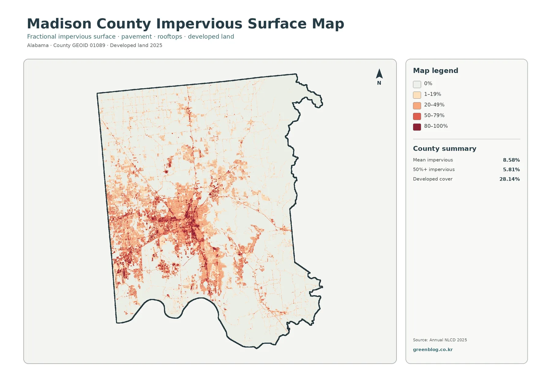
Developed cover reaches 28.14 percent, much higher than the mean impervious value. Those numbers are not interchangeable. A developed land-cover class can contain lawns, planted vegetation, and other open areas around buildings, whereas impervious percentage focuses on pavement, rooftops, and similarly hard surfaces inside each cell. Looking at both measures prevents the entire developed category from being treated as solid pavement.
Agriculture still occupies the largest share of the county
Even with the large urban footprint, agricultural cover remains first at 35.47 percent. The northern half contains the broadest and most continuous yellow areas, interrupted by smaller developed patches, wetlands, and forest. Agricultural cover also appears east and southeast of the main developed concentration, but those patches become more mixed with woodland as the county approaches its eastern side.
Forest accounts for 26.63 percent and is especially prominent along the eastern edge, where dark green forms long connected blocks. Additional woodland appears south of the central developed area and in several interior patches. Wetlands occupy 8.25 percent, often as narrow or irregular blue-green features crossing farmland and forest. Open water is only 0.89 percent, so the wetland class is far more extensive than open water on the countywide summary.
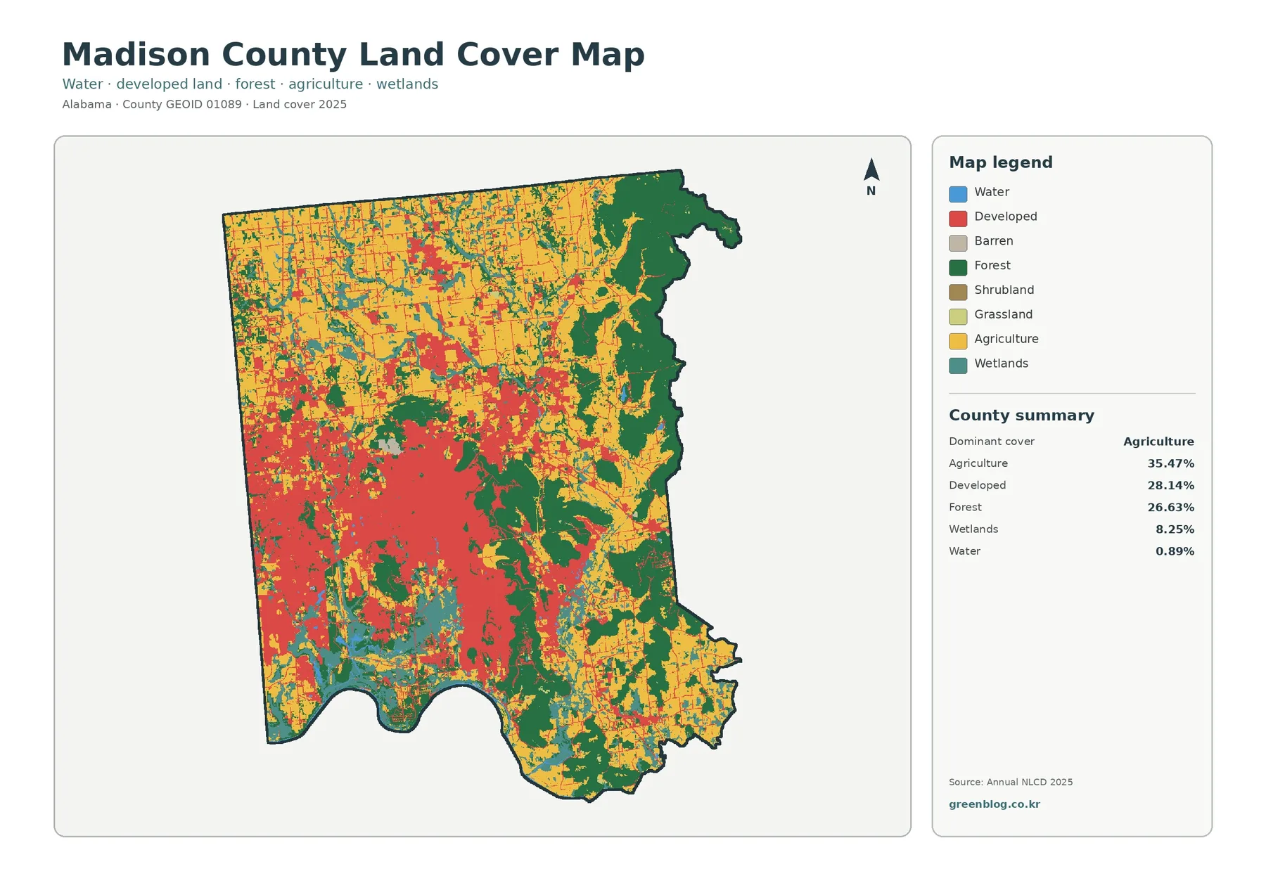
This three-way balance is one of the county’s most useful comparison features. The landscape is not simply urban, agricultural, or forested. Its western-central area has a dense developed pattern, the north retains a broad agricultural character, and the east contains much more continuous forest. Reading the entire shape rather than the summary percentages alone makes those contrasts easier to understand.
The simplified natural-cover view separates northern fields from eastern woodland
Removing most of the developed-class colors makes the relationship between farm and forest much clearer. Cropland and other agricultural cover dominate large parts of the north, while dark green woodland forms a long band along the east and additional blocks in the south. The western-central urban area appears mostly as a light “developed or other” background, which lets the remaining agricultural and forest patches inside and around it stand out more clearly.
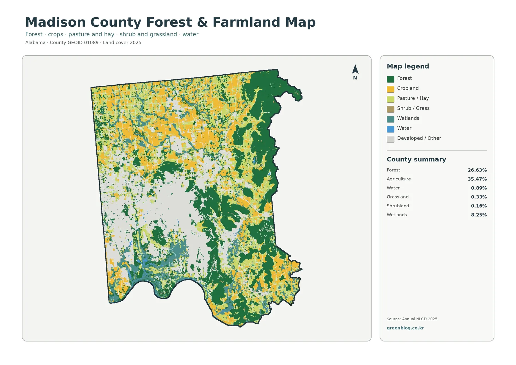
Grassland represents 0.33 percent and shrubland 0.16 percent, so neither class occupies a large countywide share. Their small patches still help explain transitions between woods, farms, and developed areas. Wetlands remain visible at 8.25 percent, particularly where they thread across otherwise agricultural or forested parts of the county. Water remains a separate 0.89 percent category and should not be merged with wetlands simply because both are shown in blue-green tones.
The agricultural class is not a farm-property boundary, and the forest class does not identify tree species or ownership. Each raster cell describes the surface category assigned from the land-cover data. The simplified product is therefore best for county-scale pattern reading, environmental education, or broad resource comparison rather than parcel-level decisions.
Long-term differences include development and other class changes
The 1985–2025 comparison marks 27.00 percent of the county as having a different mapped class between the two dates. Development is a major part of that total, but not the whole story. The “to developed” category accounts for 11.75 percent, forest loss for 1.34 percent, agricultural loss for 0.88 percent, and other class differences for 12.60 percent.
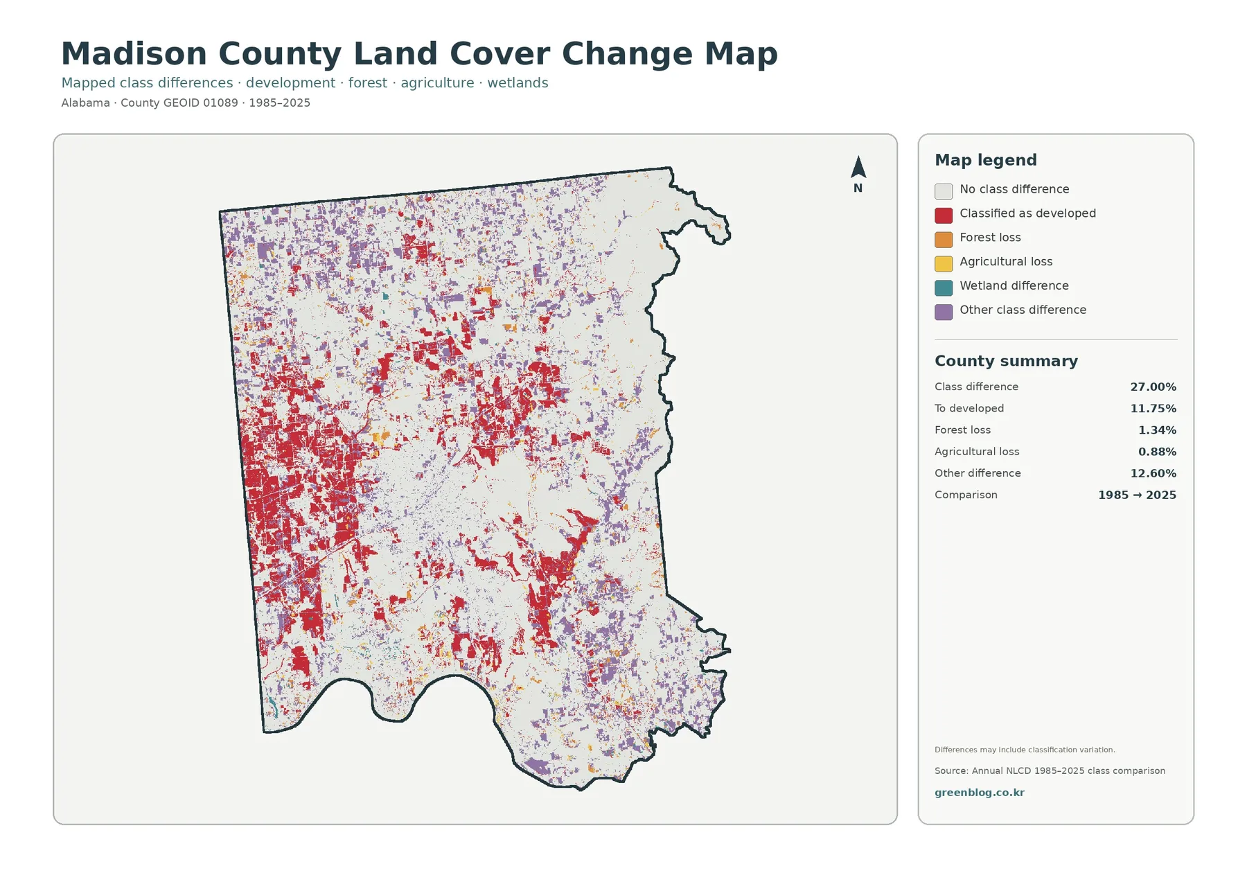
Red development-change pixels are extensive in the western half and appear in numerous smaller patches farther north and southeast. Purple “other difference” pixels are also widespread, particularly across the north and parts of the south. The two colors together explain why the overall difference total is much larger than any single category. A reader should not equate the full 27.00 percent with urban expansion.
The graphic also warns that mapped differences can include classification variation. A cell that receives a different label in 1985 and 2025 does not automatically prove a one-to-one physical conversion on the ground. Changes in imagery, classification rules, mixed pixels, or seasonal conditions may contribute. The layer works well for locating areas worth investigating, but detailed site history needs additional imagery or local records.
Why the four views are more useful together than alone
General land cover answers the broadest question: which surface classes dominate and where do they occur? The natural-cover view makes the northern farm belt and eastern forest easier to compare without the visual weight of the urban colors. Impervious data then isolates the hardest built surfaces inside the much larger developed category. Historical comparison adds a time dimension instead of repeating the present-day picture.
The western-central part of the county illustrates that sequence well. It appears as a large developed area in the general overview, but the impervious layer shows where built surfaces are especially dense and where lighter developed areas remain more permeable. Moving to the farm-and-forest view reveals agricultural and wooded fragments around the same urban region. The historical layer finally shows that some places changed class while others remained stable, without assigning one cause to every difference.
Across the north, agricultural color is visually dominant, yet wetlands, narrow developed features, and scattered woodland interrupt the farm pattern. Toward the east, forest becomes much more continuous and the impervious layer grows pale. Those contrasts make the county useful for teaching how a single administrative area can contain urban, agricultural, wetland, and forest landscapes in close proximity.
Using the files for classwork, presentations, and county comparison
A classroom exercise can begin with the three largest percentages: 35.47 percent agriculture, 28.14 percent developed cover, and 26.63 percent forest. Students can then identify the part of the county where each class is most visually dominant. A second step can compare developed cover with the 8.58 percent mean impervious value, which introduces the difference between a developed landscape class and the fraction of hard surface inside it.
For a presentation, one or two views usually communicate more than four tiny images on the same slide. Use the general overview for the full 2025 pattern, the forest-and-farmland version when the topic is open land and woodland, the impervious product for built-surface concentration, and the historical comparison when the question specifically involves 1985 to 2025. Keeping each image tied to a clear question reduces confusion between present conditions and change.
County-to-county comparisons should keep the metric consistent. Its 28.14 percent developed share can be compared with developed-cover percentages calculated from the same framework elsewhere. The 8.58 percent mean impervious value should be compared with the same impervious metric, not with a general urban-area percentage. The 27.00 percent class-difference figure belongs with other long-term layers using the same dates and definitions.
Download the four original JPG files
The ZIP contains four 2480×1754-pixel JPG files: general land cover, forest and farmland, impervious surface with developed land, and the 1985–2025 land-cover comparison. The WebP previews above are lightweight versions for quick page viewing. The JPG files are more useful for printing, larger presentation layouts, or zooming in on the legend and county pattern.
Keep the legend and date visible when an image is reused. Similar greens, yellows, and blue-green classes can be misread if the legend is cropped away, and the historical graphic loses important context when the comparison dates are removed. If a page or slide is small, using one full image with readable labels is usually clearer than shrinking all four into a single panel.
Limits of a county-scale land-cover product
These products are based on raster data, meaning the county is represented by many small square cells. Real forest edges, field boundaries, wetland margins, roads, and buildings do not always align with those square edges. A single cell can contain a mixture of vegetation, pavement, water, or soil, so narrow features may be generalized and exact parcel boundaries cannot be measured from these graphics.
The present-condition products summarize 2025. Changes that occurred after that observation period are not represented. The historical layer compares 1985 with 2025 rather than providing a continuous record for every year in between. Because classification variation can be part of the difference, the 27.00 percent value should be treated as a mapped class comparison rather than a complete inventory of physical land conversion.
Wetland cover also needs careful interpretation. The 8.25 percent mapped wetland class is not automatically equivalent to a regulatory wetland boundary. Likewise, the 28.14 percent developed class does not define zoning, development rights, or the legal extent of a city. Property, engineering, permitting, and regulatory decisions should rely on current records from the responsible agencies and site-specific information.
Frequently Asked Questions
What is the largest 2025 land-cover class in Madison County?
At 35.47 percent, agriculture ranks first. Developed cover is next at 28.14 percent, followed closely by forest at 26.63 percent.
Why is developed cover 28.14 percent when mean impervious cover is only 8.58 percent?
The developed class describes a broader built environment that can include lawns and other open surfaces, while impervious percentage measures hard surfaces such as pavement and rooftops inside each cell. They describe related but different characteristics.
Does the 27.00 percent long-term difference mean that all of that land was developed?
No. Only 11.75 percent is listed as changing to developed. The total also includes forest loss, agricultural loss, other class differences, and possible classification variation.
Map File Information
Madison County Land Cover Maps – 4 JPG Files
- Included Files: Use only the versions confirmed in the article and supplied images
- File Type: Use the confirmed download contents
- Intended Use: Printing, education, presentations, and map-based projects
Related Maps
- Autauga County Alabama Land Cover Map
- Baldwin County Alabama Land Cover Map
- Barbour County Alabama Land Cover Map
Data and reference sources
- MRLC Annual NLCD Data – official access point for the land-cover and long-term comparison products used in this article.
- USGS Annual NLCD Land Cover Classification – background and definitions for forest, agriculture, developed land, wetlands, and related classes.
- U.S. Census Bureau TIGER/Line Shapefiles – official geographic boundary data reference.
- Madison County, Alabama – History – official county background explaining Huntsville’s role as the county seat.
Green Map creates custom-edited map images using open geographic data sources such as geoBoundaries, Natural Earth, OpenStreetMap, and government open data.
These maps are edited visual materials, not raw data files, and are provided for education, documents, presentations, and graphic reference.