Hamilton County is dominated by natural cover rather than broad farm fields or large developed areas. The 2025 summary places forest at 82.73 percent, wetlands at 10.83 percent, and water at 4.69 percent. Developed cover accounts for 1.01 percent, while agriculture is only 0.03 percent. On the map, that balance appears as a nearly continuous green landscape broken repeatedly by lakes, wet areas, and a small number of settlement or road-related traces.
This page uses four views to separate those patterns: general land cover, forest and farmland, impervious surface and developed land, and mapped class differences from 1985 to 2025. WebP previews make the maps easy to inspect on the page, while the four original JPG files are available together in one ZIP for saving, printing, classroom work, and presentations. Reading the maps in sequence helps distinguish the county’s broad natural setting from its much smaller developed footprint.
Table of Contents
Forest, water, and wetlands shape the countywide view
Dark green forest fills most of Hamilton County in the general land-cover map. Blue water and teal wetlands interrupt that forest in many places, especially across the western and northwestern portions, but also through the center and south. The result is not a simple solid block of woodland. Instead, the visible pattern is a large forest matrix with lakes, wet corridors, and irregular openings woven through it.
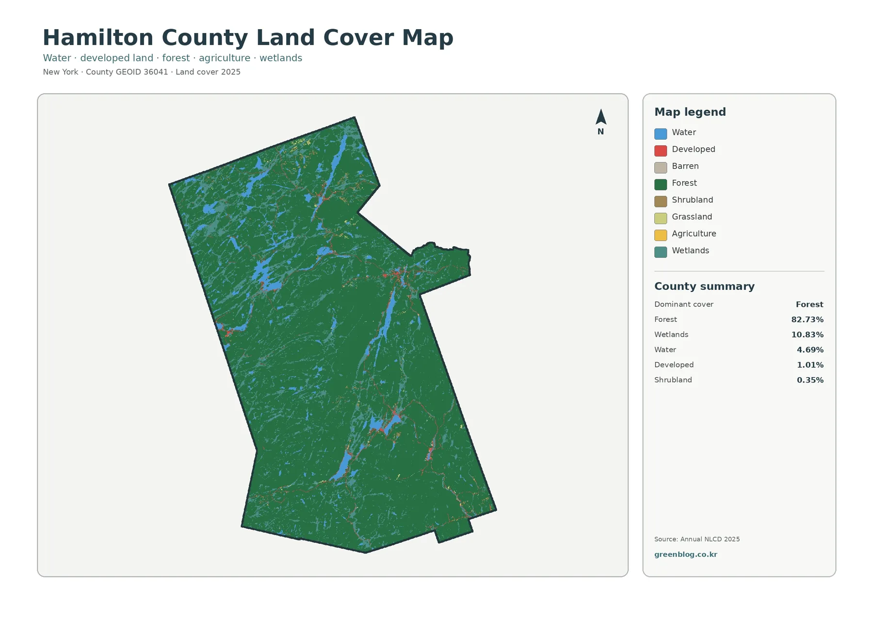
Countywide shares reinforce what the colors suggest. Forest covers 82.73 percent, wetlands 10.83 percent, water 4.69 percent, developed land 1.01 percent, and shrubland 0.35 percent. Those numbers matter most when paired with location. Water is not confined to one edge, and wetlands appear in multiple parts of the county rather than as one isolated block. Developed cover, by contrast, is visible as small clusters and thin connections rather than broad urban zones.
Land cover describes the physical surface seen by the classification system, not a property’s legal use or ownership. A forest cell may represent public or private woodland, and a wetland-colored cell does not by itself establish a regulatory boundary. This map is therefore well suited to county-scale comparison and environmental context, but it should not replace parcel surveys, zoning maps, ownership records, or site-specific wetland delineation.
The 2025 label is also important. These colors summarize a particular mapped observation period, so newer clearing, construction, vegetation growth, or shoreline changes may not appear. For a presentation or classroom exercise, the map provides a clear snapshot. For a current site decision, a reader should pair it with newer imagery and local records.
Farmland is nearly absent from a forest-heavy landscape
Simplifying the display to forest, farmland, wetlands, water, and a few secondary classes makes Hamilton County’s strongest contrast easier to see. Forest remains the overwhelming background, while agricultural colors are almost absent. The summary gives agriculture a share of just 0.03 percent. That does not mean there is no agricultural activity anywhere; it means very little of the county was classified as agricultural land cover in this dataset.
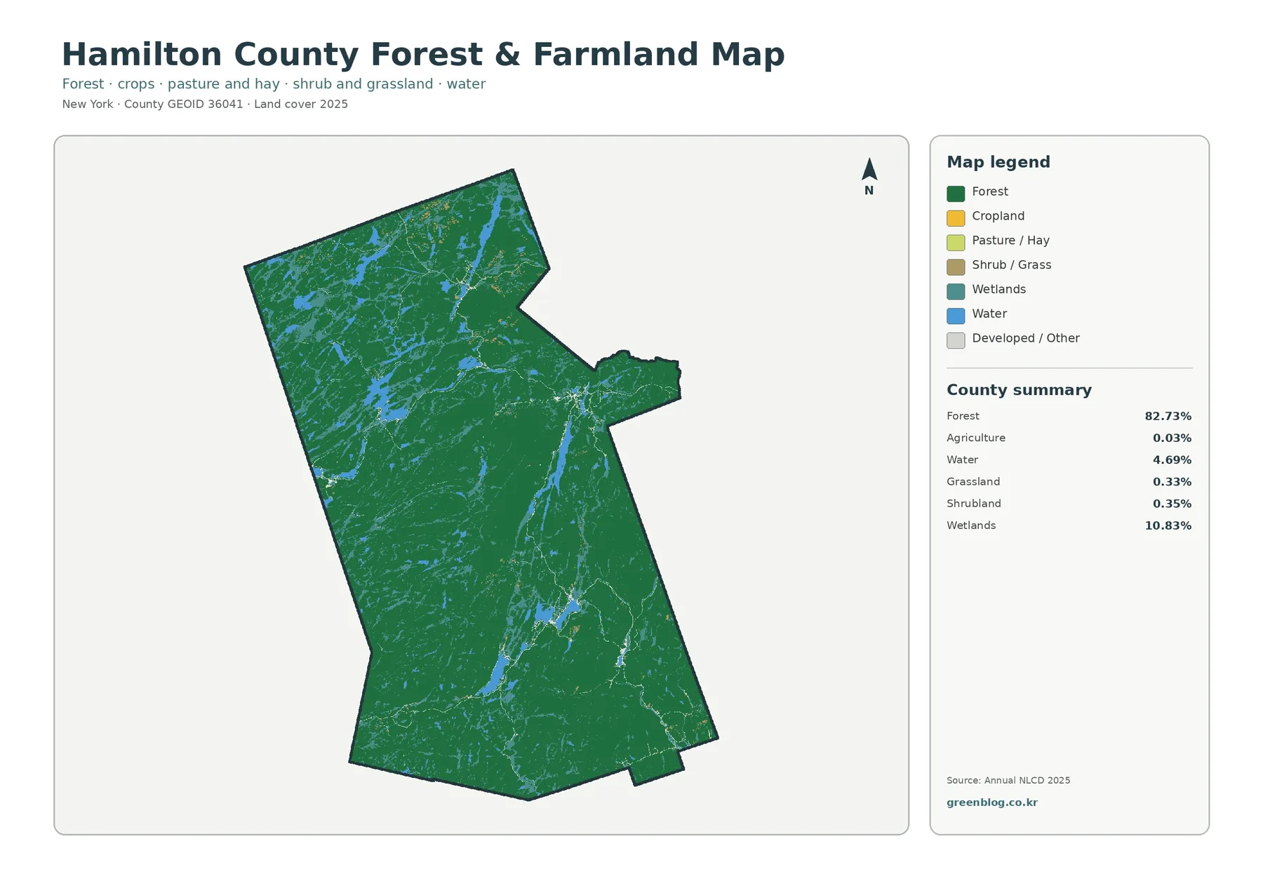
Wetlands at 10.83 percent form the second-largest mapped category in the county summary. Their distribution is fragmented and varied, often appearing near water or within the larger forest pattern. Open water adds another 4.69 percent. Together, those classes make the county look distinctly different from agricultural counties where large crop or pasture blocks create wide open areas between forest patches.
Small amounts of grassland and shrubland appear as secondary details. They may mark openings, edges, or mixed landscapes that are too limited to shape the countywide pattern. At this scale, a tiny colored patch is best treated as a clue rather than an exact field boundary. Narrow clearings and complicated shoreline vegetation can be generalized when raster cells are assigned a single representative class.
For habitat or watershed discussions, the close placement of forest, wetlands, and water can be more informative than the agricultural percentage alone. A teacher might ask students to identify where wetland colors cluster around water and then compare those areas with uninterrupted forest. A planner or researcher could use the same view to select broad areas for follow-up, while recognizing that the map does not provide legal wetland boundaries or detailed ecological condition.
Impervious cover appears in small, isolated networks
The impervious-surface view removes most of the forest and water colors so paved roads, rooftops, parking areas, and other hard surfaces become easier to locate. Hamilton County’s mean impervious share is only 0.18 percent. Areas with at least 50 percent impervious cover occupy 0.04 percent of the county, and the broader developed land class covers 1.01 percent. Those figures explain why the map is mostly pale.
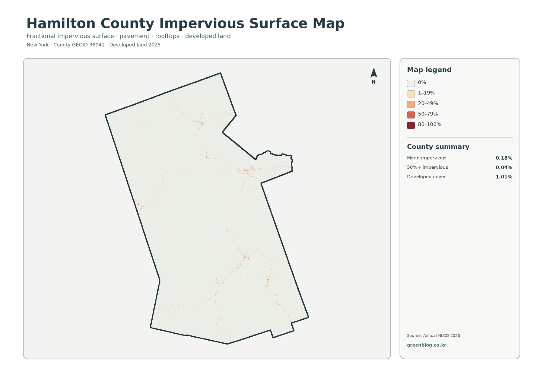
Several small concentrations stand out in the north, center, and southern portion of the county. Thin lines connect or extend from some of those clusters, consistent with the general appearance of roads and settlement corridors, but the map does not label every feature in enough detail to assign specific road or place names safely. What can be said directly is that impervious cover is spatially limited and concentrated rather than widespread.
That focused view is useful for watershed screening. Hard surfaces reduce the amount of ground available for direct infiltration, so comparing impervious clusters with nearby wetlands and water can help identify places that deserve closer stormwater study. The map does not predict flooding, however. Elevation, soils, drainage infrastructure, rainfall, stream conditions, and local engineering all affect runoff and must be evaluated separately.
A low countywide average can also hide sharp local differences. Most of Hamilton County contains forest, wetlands, or water, which pulls the overall impervious percentage downward. Within a small settlement cluster, individual raster cells may have much higher values. For that reason, 0.18 percent is useful for describing the county as a whole but should not be applied to a specific property or neighborhood.
1985–2025 differences remain scattered
The change map asks a different question from the current land-cover map: where did the mapped class differ between 1985 and 2025? The summary identifies class differences across 2.87 percent of Hamilton County. Change to developed cover accounts for 0.08 percent, forest loss for 0.58 percent, agricultural loss for 0.00 percent, and other class differences for 2.05 percent. Most of the county remains in the no-difference category.
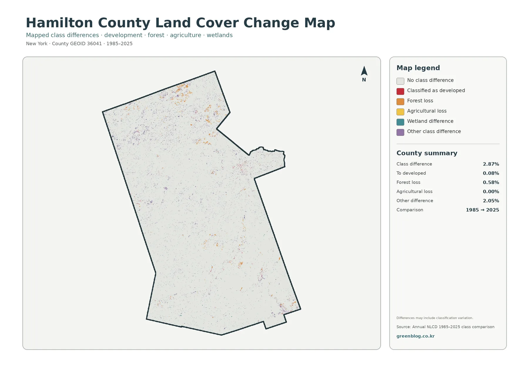
Colored differences occur as small patches and points across the north, center, and south. A few areas contain denser groups of change colors, but no single countywide band dominates the image. This scattered pattern makes the map useful as a screening layer. A reader can locate clusters first, then compare them with older aerial photographs, newer imagery, or local records to determine what may have happened at a particular site.
A mapped difference should not be treated automatically as evidence of construction, logging, wetland loss, or another specific event. Satellite observations from different years can vary with season, vegetation condition, image quality, and classification methods. Mixed pixels are another source of uncertainty: one raster cell may contain forest, water, wet vegetation, and a small clearing, yet the dataset must assign a representative class.
The 0.58 percent forest-loss category needs the same caution. It tells us that some cells moved away from a forest classification in the comparison, not why they changed. Likewise, agricultural loss at 0.00 percent should not be expanded into a claim that no agricultural change occurred anywhere. It means this countywide comparison recorded essentially no area in that specific loss category.
How to use the four maps together
A practical reading sequence begins with the general land-cover map. It establishes the basic relationship among forest, wetlands, water, and the small developed share. The forest-and-farmland view then simplifies the scene and makes the almost complete absence of agricultural cover easier to recognize. When development is the question, the impervious map strips away visual clutter and isolates the small clusters of hard surface. The change layer can be used last to see whether any of those present-day areas overlap with mapped differences between 1985 and 2025.
Different audiences may choose a different starting point. Environmental education often benefits from the general land-cover map because it contains the widest range of classes. A watershed lesson may move quickly to wetlands, water, and impervious surfaces. A presentation about long-term landscape stability can use the change map to emphasize that 2.87 percent is classified as different while the large majority remains unchanged in the comparison.
The downloadable JPG set makes those comparisons easier outside the webpage. One image can be inserted into a slide, another can be printed for a class exercise, and the change map can be kept beside the current land-cover map for visual comparison. Because all four files cover the same county, the reader can switch themes without changing geographic context.
Limits that matter when reading the maps
- Land cover classifies the visible surface; it does not establish ownership, zoning, tax status, parcel boundaries, or development rights.
- Raster cells generalize complex edges, so narrow roads, shorelines, wetland boundaries, and small clearings may not match their exact ground shape.
- Mixed pixels can contain more than one surface type even though the dataset assigns a representative class or impervious value.
- The 1985–2025 change map reports classification differences, not the cause of those differences.
- Changes after the 2025 observation period may not appear, so current site work should use newer imagery and local records when available.
Used within those limits, the maps provide a strong county-scale overview. They can support environmental education, broad watershed screening, habitat comparison, presentation graphics, and preliminary landscape review. They are less appropriate for parcel-level measurement or legal decisions. Knowing that distinction prevents a useful regional map from being asked to answer questions it was not designed to resolve.
Download Hamilton County map files
The download ZIP contains four original JPG maps: the 2025 general land-cover map, forest and farmland map, impervious surface and developed land map, and the 1985–2025 land-cover change map. The WebP versions in the article are optimized for quick viewing, while the JPG files are more convenient when the image itself needs to be saved, printed, placed in a presentation, or used as a reference beside other county maps.
Frequently Asked Questions
What is the largest land-cover class in Hamilton County?
Forest is the dominant 2025 class at 82.73 percent. Wetlands account for 10.83 percent and water for 4.69 percent, so the countywide pattern is overwhelmingly natural cover.
How much impervious surface does the county have?
The mean impervious share is 0.18 percent, and areas with at least 50 percent impervious cover occupy 0.04 percent of the county. Small local clusters can still have higher values than the countywide average.
Does the 2.87 percent change figure mean development?
No. The 2.87 percent figure covers all mapped class differences between 1985 and 2025. Only 0.08 percent of the county is summarized as change to developed cover; other categories include forest loss and other classification differences.
Map File Information
Get all four original Hamilton County land-cover JPG maps together in one ZIP archive.
- Included Files: Land cover, forest/farmland, impervious/developed land, and 1985–2025 change maps
- File Type: Original JPG maps in one ZIP archive
- Intended Use: Printing, education, presentations, and map reference
Related Maps
- Albany County Land Cover Map
- Allegany County New York Land Cover Map
- Bronx County New York Land Cover Map
Sources and reference data
- MRLC Annual NLCD Data – annual land-cover datasets and related downloads
- USGS Annual NLCD Land Cover Classification – land-cover class definitions and documentation
- U.S. Census Bureau TIGER/Line Shapefiles – county boundary data
Green Map creates custom-edited map images using open geographic data sources such as geoBoundaries, Natural Earth, OpenStreetMap, and government open data.
These maps are edited visual materials, not raw data files, and are provided for education, documents, presentations, and graphic reference.