Covington County’s 2025 land-cover pattern is dominated by forest, which accounts for 50.77% of the mapped area. Agriculture makes up 17.89%, wetlands 12.32%, and developed land 7.96%. This page uses four related maps to separate the broad land-cover picture from forest and farmland, impervious surfaces, and the mapped differences between 1985 and 2025.
The four original JPG maps are available together in one download near the middle of the page. The WebP images below are quick previews, while the JPG files are better suited to printing, classroom handouts, presentation graphics, and side-by-side county comparisons where the map labels and legend need to remain readable.
Table of Contents
Forest sets the overall pattern, but it is not continuous everywhere
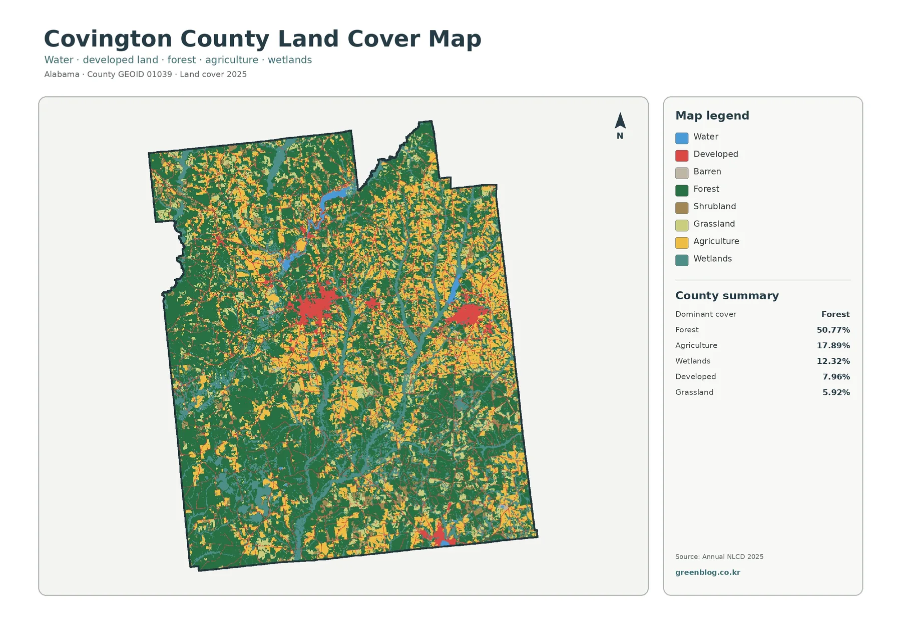
The general land-cover map makes the county’s dominant class easy to recognize. Dark green forest covers large parts of the map and forms especially broad blocks across much of the southern half and several western areas. The forest is not one uninterrupted sheet, however. Agricultural patches, wetlands, grassland, shrubland, and developed areas break it into a more varied pattern toward the center and north. This mix matters because a single countywide percentage can hide substantial differences in how the cover is arranged from one part of the county to another.
Agriculture is the second-largest mapped class at 17.89%. Yellow agricultural areas appear as repeated patches rather than one single broad agricultural belt. They are especially noticeable through northern and central portions of the map, where they alternate with forest and wetland cover. The classification identifies the surface as agricultural cover; it does not show individual farm ownership, field boundaries, or crop types. Those questions require parcel records or separate agricultural data.
Wetlands account for 12.32%, a large enough share to be one of the defining features of this map. Teal wetland areas often form narrow branching bands that cross forest and agricultural cover. They are visible through the central, eastern, and southern parts of the county. Open water itself represents only 0.91%, so looking only at blue water polygons would miss much of the water-related land-cover pattern. Reading wetlands together with open water gives a more complete view of where wetter surfaces occur in the classification.
Developed land covers 7.96% of the county. Instead of spreading evenly across the map, red developed areas form several distinct concentrations. A prominent cluster appears west of the county’s center, another lies farther east, and a smaller concentration is visible near the southern boundary. Thin developed lines and small spots connect or surround these centers. The map therefore suggests a county where development is concentrated around a few settlement and transportation areas rather than forming a continuous urban surface.
The forest-and-farmland view clarifies the rural mosaic
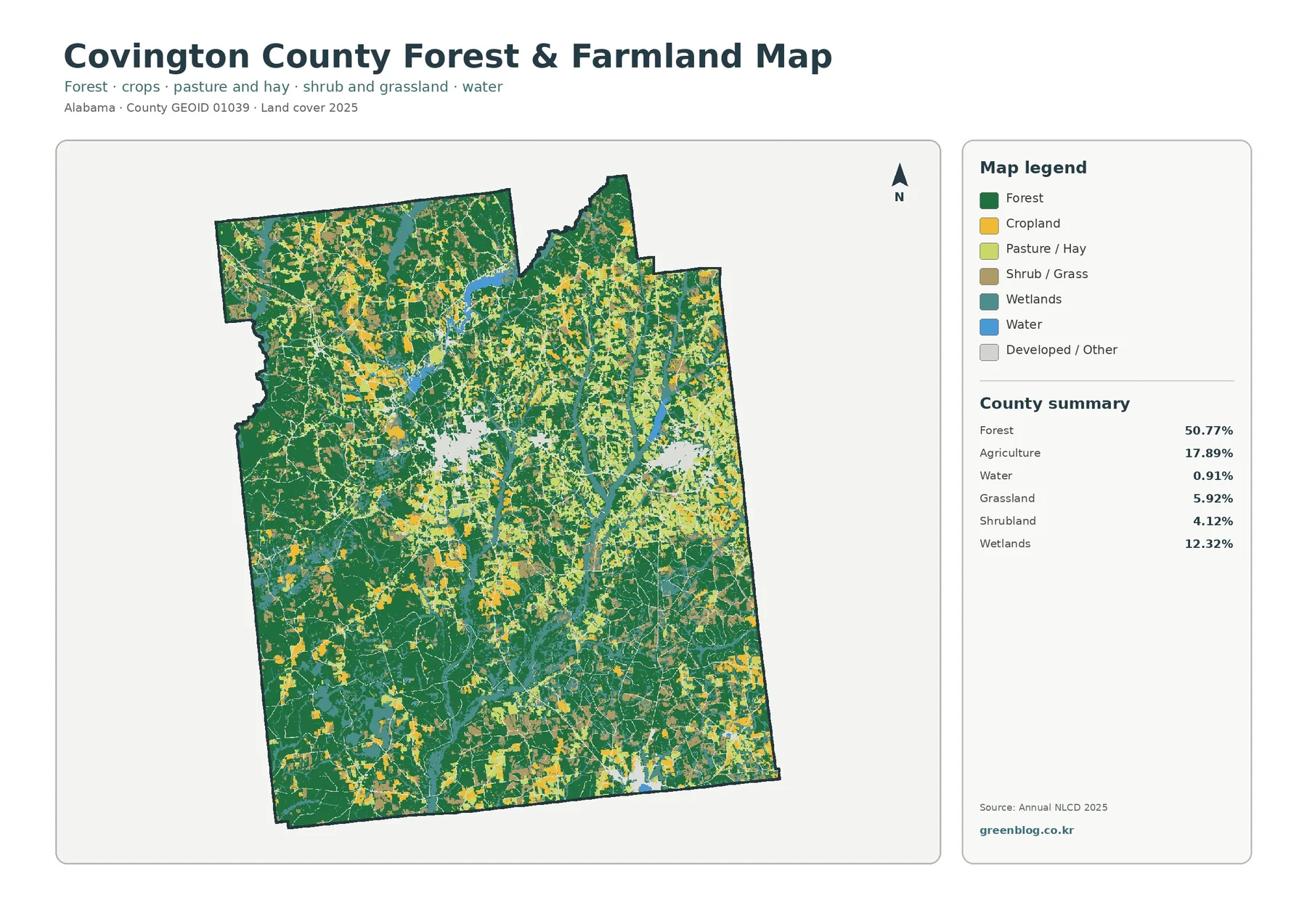
The forest and farmland map removes some of the visual competition among classes and makes the relationship between wooded and open land easier to compare. Forest still occupies 50.77%, but the simplified palette shows where broad green blocks remain relatively intact and where agricultural or open classes interrupt them. Large wooded areas are particularly evident across the south and west, while central and northern areas contain a finer mixture of forest, agriculture, wetlands, and developed or other cover.
Agricultural cover at 17.89% appears in many separate pieces. Some patches are relatively broad, but much of the agricultural pattern is interwoven with forest rather than isolated from it. This is useful for regional-scale comparison because it shows that the county is not divided into a simple forest half and farm half. Instead, wooded areas and agricultural cover repeatedly meet along irregular edges, with the balance shifting from place to place.
Grassland contributes 5.92% and shrubland 4.12%. These classes are smaller than forest or agriculture, yet they help explain the lighter open areas that occur between the two dominant covers. At the scale of the county map, they can indicate places where the surface is neither closed forest nor active agricultural cover. Their exact boundaries should not be treated as field-survey lines, because raster classification generalizes the landscape into cells and can place mixed ground into a single dominant class.
Wetlands are retained in this specialized view because they are too important to ignore when comparing forest and farmland. Their branching form cuts across green and yellow areas, showing that wetter cover often occurs beside or within the broader forest-agriculture mosaic. For an environmental lesson, this map can help explain why a county landscape should not be read as separate, isolated categories. Forest, agriculture, wetlands, grassland, and water can occupy neighboring cells within the same local setting.
Impervious surfaces reveal where development is most concentrated
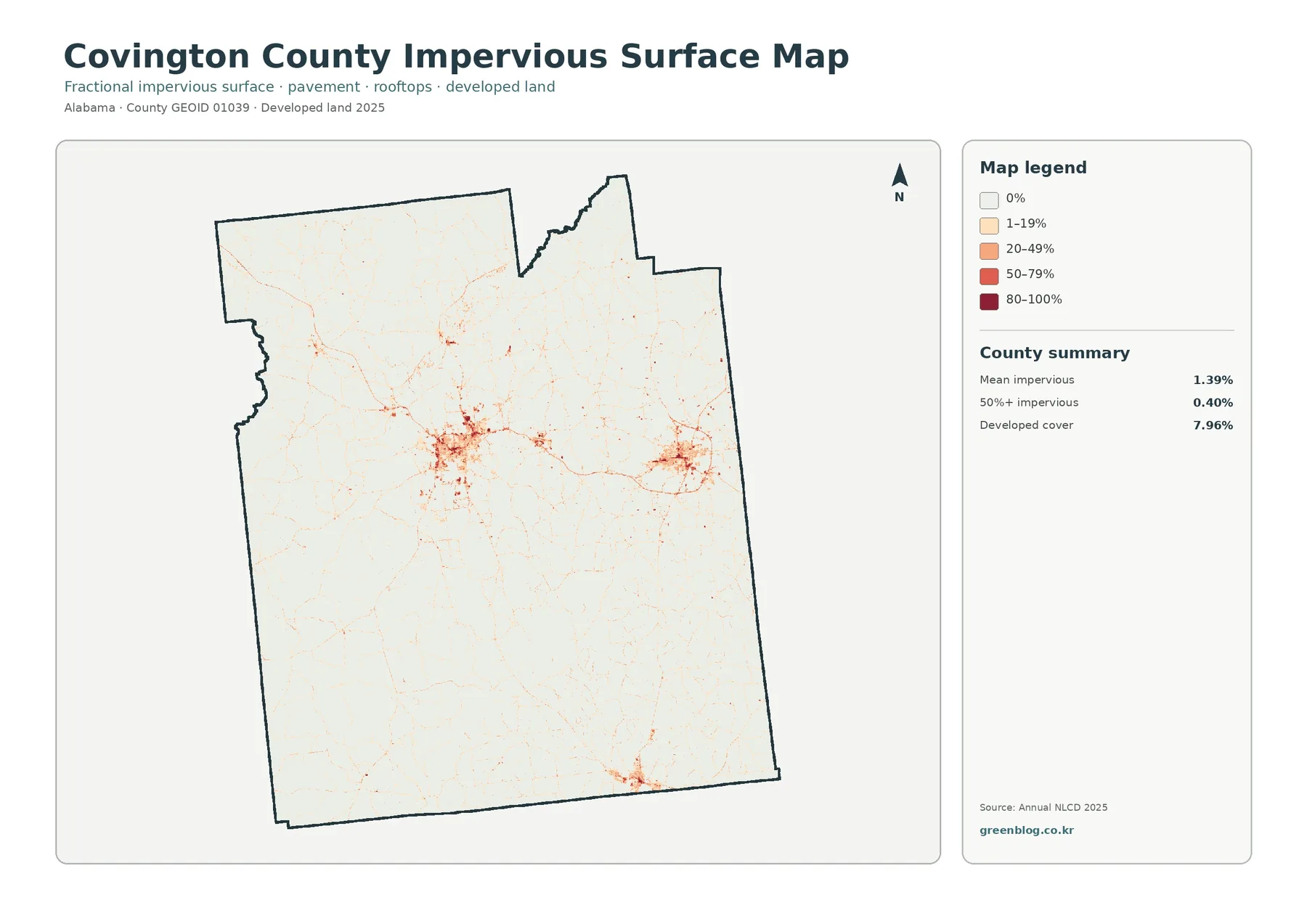
The impervious-surface map answers a different question from the developed-land class. An impervious surface is pavement, a rooftop, a parking area, or another surface that allows little water to soak into the ground. The countywide mean impervious value is 1.39%, and only 0.40% of the mapped area is at least 50% impervious. Most of the county therefore appears very light on this map, even though developed land accounts for 7.96% in the land-cover classification.
The strongest impervious concentration is visible in the west-central part of the county. A second clear cluster appears farther east, while a smaller compact area stands out near the southern boundary. Fine lines radiate from or pass through these clusters, consistent with narrow paved corridors. The important point is concentration: the map does not show a county blanketed by hard surfaces. Instead, higher impervious values are grouped around a limited number of centers and connecting routes.
The difference between 7.96% developed cover and a 1.39% mean impervious value is expected because the two measures describe different things. A developed land-cover class may contain lawns, trees, bare soil, or other permeable surfaces alongside buildings and roads. Impervious data estimates the share of hard surface within each raster cell. Comparing both maps therefore separates the broader footprint of development from the places where pavement and rooftops are most intense.
This map can support introductory watershed or stormwater discussions, but it does not by itself measure flood risk or drainage performance. Runoff depends on slope, soil, rainfall, drainage infrastructure, vegetation, and nearby channels as well as impervious cover. For planning or environmental education, the map works best as one layer to compare with terrain, hydrology, and local infrastructure rather than as a stand-alone hazard map.
The 1985–2025 comparison shows mapped class differences, not a simple growth rate
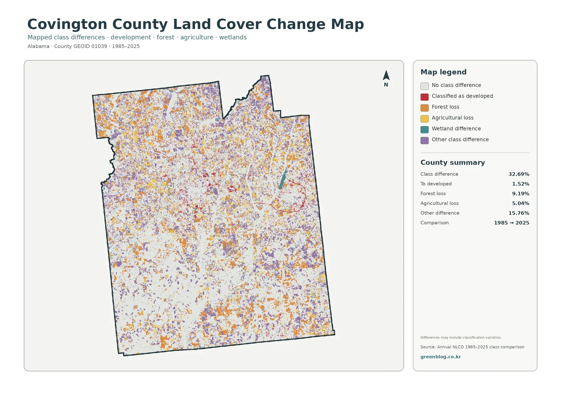
The change map compares classifications from 1985 and 2025. It marks a class difference across 32.69% of the county. Colored cells distinguish areas classified as developed in the later comparison, forest loss, agricultural loss, wetland differences, and other class differences. Pale areas indicate locations where the compared class did not change. Because the colored cells are distributed across much of the county, the map is best read as a collection of different transitions rather than a single expanding front.
The summary reports 9.19% as forest loss, 5.04% as agricultural loss, 1.52% as change to developed, and 15.76% as other class difference. That large ‘other’ category is an important warning against treating the map as a development map. Some differences may represent real land-cover transitions, while others can reflect classification methods, mixed pixels, image conditions, or small boundary shifts between categories.
A 32.69% class-difference figure does not mean that 32.69% of the county physically changed into an entirely different landscape. It means that the compared raster cells received different classifications in the two mapped years. A cell containing a mixture of trees and open ground, for example, might fall on one side of a class threshold in one year and another side in the comparison year. Narrow wetland or water boundaries can also shift in a raster representation.
A practical way to use the change map is to identify a colored cluster and then return to the 2025 maps. If an area is marked as forest loss, the current land-cover map can show whether that location is now agriculture, grassland, shrubland, developed land, or another class. If an area is marked as developed, the impervious map can show whether it also contains a strong hard-surface signal. Determining why a change occurred requires additional evidence such as aerial imagery, development records, forest-management information, or agricultural statistics.
How the four maps work together
Each map is most useful when it is treated as part of a set. The general land-cover map provides the full 2025 composition and makes the relative proportions of forest, agriculture, wetlands, development, grassland, shrubland and water easy to compare. The forest-and-farmland version simplifies that picture so the rural pattern is easier to follow. The impervious map separates the intensity of hard surfaces from the broader developed class, while the change map adds a historical comparison without pretending to identify causes.
For example, the west-central developed concentration is visible as red cover on the general map. On the impervious map, the same area contains the county’s strongest concentration of darker hard-surface values, surrounded by lighter cells. Looking at the change map afterward can show where later developed classification appears within or around that area. This sequence gives a more careful interpretation than assuming every red developed cell has the same density or the same history.
The southern part of the county offers a different comparison. Broad forest cover remains visually dominant there, but agricultural pieces, wetlands, grassland, and shrubland still interrupt the green. The forest-and-farmland map makes those interruptions easier to see. The change map then highlights places where the older and newer classifications differ, but it should not be used to label every colored patch as permanent forest clearing or farm abandonment without supporting evidence.
For classroom use, the set can support questions about scale and classification. Students can compare a countywide percentage with the actual distribution of the class, identify where multiple covers meet, and discuss why a developed class is not the same as a fully paved surface. For presentations, the repeated county outline lets a viewer switch among themes without having to reorient to a new geography each time.
Download the original JPG map set
The download contains the four original JPG maps represented by the previews on this page. They share the same county boundary and are designed for direct comparison. The JPG versions are useful when the map needs to be enlarged in a document or shown on a larger display, while the WebP previews are intended for fast viewing in the browser. The files are reference maps, not legal parcel or survey documents.
- 2025 general land-cover map — best for comparing all major mapped classes and the overall county pattern.
- Forest and farmland map — useful for examining the wooded landscape, agricultural patches, open cover, wetlands and water with a simpler legend.
- Impervious surface and developed land map — useful for locating concentrated hard surfaces and comparing them with the broader developed footprint.
- 1985–2025 land-cover change map — useful for finding where classifications differ between the two comparison years before checking those locations against the current maps.
The source JPG dimensions are 2480×1754 pixels. When placing them in a slide or printed document, keep the original aspect ratio so the legend and county outline are not distorted. Very large enlargement will eventually reveal the raster nature of the underlying data, so these maps are most appropriate for county-scale interpretation rather than inspection of individual parcels.
Reading the data responsibly
Land cover describes what is on the ground surface, not what the land is legally designated for. Forest, agriculture, wetland, water, developed land, grassland, and shrubland are mapped surface classes. They do not identify ownership, zoning, building rights, parcel boundaries, or the legal use of a property. A developed class also does not tell whether a site is residential, commercial, industrial, or institutional.
Annual NLCD is raster-based, meaning the landscape is represented by a grid of cells rather than surveyed property lines. A single cell can contain more than one real-world surface, but the classification must generalize that mixture. Small roads, narrow streams, scattered buildings, forest edges, and strips of grass can therefore be simplified. The line where one map color changes to another should be read as a generalized classification boundary, not an exact field boundary.
The 2025 maps represent the classification for that observation period and may not include changes that happened later. Construction, clearing, vegetation recovery, agricultural rotation, or wetland conditions can alter the surface after the mapped year. Historical comparison adds another layer of uncertainty because the quality of source imagery and classification approaches can differ over time. For decisions with legal, engineering, or site-specific consequences, current local data and field verification are necessary.
Frequently Asked Questions
What is the dominant land-cover class in Covington County?
Forest is the dominant 2025 class at 50.77%. Agriculture accounts for 17.89%, wetlands 12.32%, developed land 7.96%, grassland 5.92%, shrubland 4.12%, and water 0.91%. These values summarize the countywide raster classification and should not be used as parcel-level measurements.
Why is developed land 7.96% while mean impervious cover is only 1.39%?
They measure different characteristics. The developed land-cover class can include vegetation and other permeable ground within developed settings. Impervious data estimates the proportion of hard surface such as pavement and rooftops within each cell. A place can therefore be classified as developed without being completely impervious.
Does the 32.69% class difference mean that one-third of the county was physically transformed?
No. The figure describes cells that received different land-cover classifications in the 1985 and 2025 comparison. Some of those differences may reflect real changes, but classification variation, mixed pixels, imagery, and category boundaries can also contribute. The map is a screening and comparison tool, not a direct measurement of the cause or permanence of change.
What are the JPG files useful for?
They work well for county-level reference, environmental education, watershed discussions, presentation graphics, printed handouts, and comparisons with other thematic maps. They are not substitutes for surveys, zoning maps, parcel records, engineering studies, or other authoritative site-specific documents.
Map File Information
Covington County land cover map files The ZIP contains all four original JPG maps: 2025 land cover, forest and farmland, impervious surface and developed land, and the 1985–2025 class-difference map.
- Included Files: Use only the versions confirmed in the article and supplied images
- File Type: Use the confirmed download contents
- Intended Use: Printing, education, presentations, and map-based projects
Related Maps
- Autauga County Alabama Land Cover Map
- Baldwin County Alabama Land Cover Map
- Barbour County Alabama Land Cover Map
Sources and reference data
- MRLC Annual NLCD Data — official access point for Annual NLCD land-cover data and related products.
- USGS Annual NLCD Land Cover Classification — classification definitions and guidance for interpreting mapped land-cover classes.
- U.S. Census Bureau TIGER/Line Shapefiles — official geographic boundary data, including county boundary products.
Green Map creates custom-edited map images using open geographic data sources such as geoBoundaries, Natural Earth, OpenStreetMap, and government open data.
These maps are edited visual materials, not raw data files, and are provided for education, documents, presentations, and graphic reference.